Showing posts with label design. Show all posts

Monday, June 6, 2022

REVIEW: WINGBACK MECHANICAL PEN & PENCIL

REVIEW: WINGBACK MECHANICAL PEN & PENCIL

From the UK comes Wingback, a small and relatively young EDC-focused brand with a strong focus on creating sustainable, durable products that last, manufactured on UK soil! 

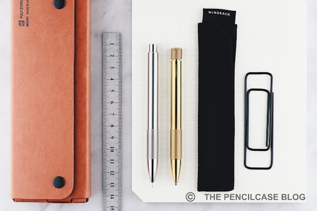
Wingback's commitment to sustainability and durability is immediately noticeable when unpacking their flagship writing products: the Wingback Mechanical Pen and Mechanical Pencil. No materials are wasted on packaging, as the pens come wrapped in a simple but durable Wingback-branded cloth sleeve - ecological, saves on shipping, and practical too. I like it! 

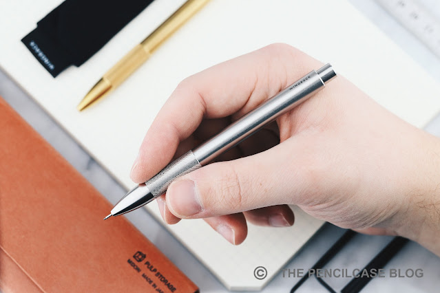
In the hand, the solid metal construction of both pen and pencil immediately gives off a feeling of longevity. Though small in size, the pen and pencil have a surprising amount of density  (especially the Mechanical Pen!) and substance to them, in part due to the all-custom, fully metal internal mechanisms. 
REVIEW: WINGBACK MECHANICAL PEN & PENCIL
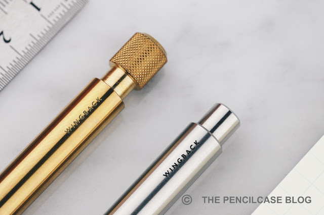
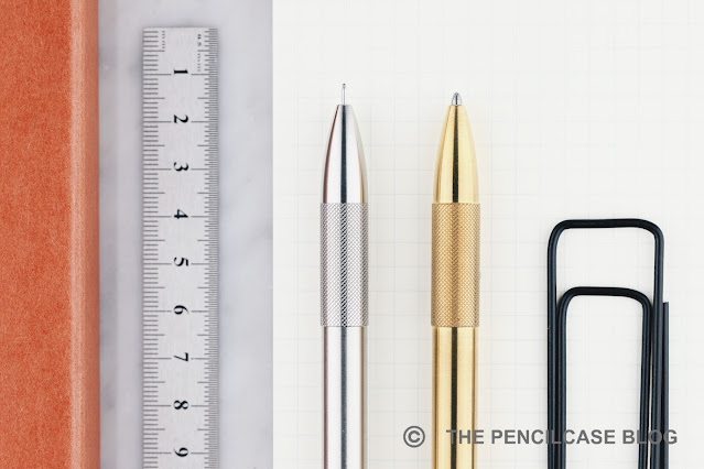
The design is kept very minimal, with a clear industrial and rugged look due to the knurled elements and pronounced, crisp chamfered edges all around. The surface of the mechanical pen(cil) is kept in its 'raw' machined state, you'll still be able to pick up on the CNC machining lines - which are extremely clean and precise. Going clipless is the only option here, so some uncontrolled rolling around on your desk is to be expected.

Wingback's entire product portfolio (which isn't super extensive, but still) is characterized by the same design language. Pronounced knurling, industrial rugged designs, and three distinct colorways to choose from: raw brass, raw stainless steel, or black-coated steel (a tough tungsten-carbide coating). Even some of their leather goods feature machined metal accents that tie their product designs together. I quite enjoy that level of consistency.
REVIEW: WINGBACK MECHANICAL PEN & PENCIL
... Although there's also one inconsistency on the Mechanical Pen that does look somewhat out of place. There's a subtle, yet noticeable (both tactile and visual) difference between the knurling on the section and the twist mechanism of the pen. The section's texture is less deeply cut and less aggressive to your fingers. It still adds some grip (though not as much as with more pronounced knurling), and it's more comfortable to hold for longer periods of time. Yet I don't quite understand why they didn't just match the texture on the twist mechanism.
REVIEW: WINGBACK MECHANICAL PEN & PENCIL
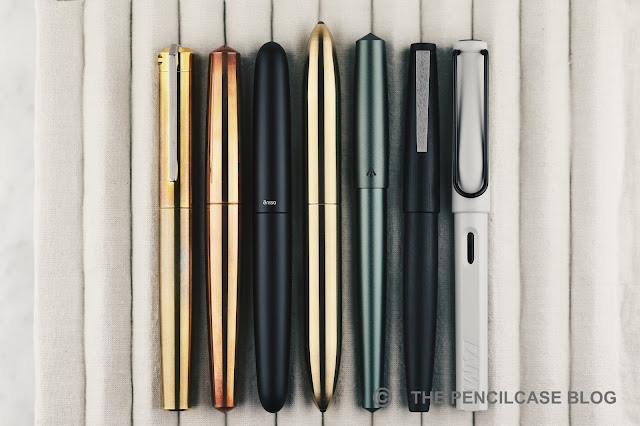
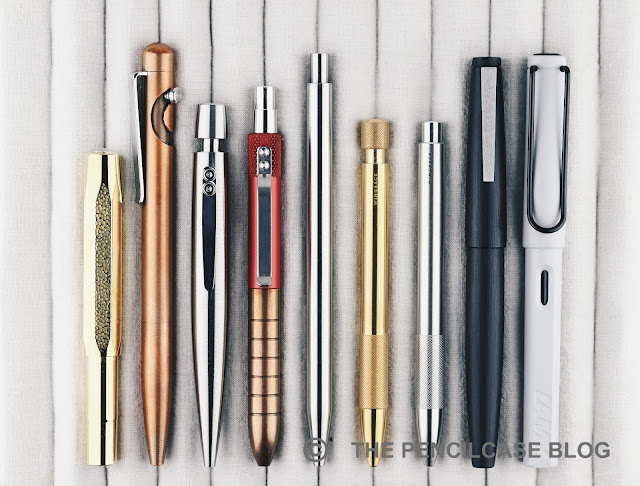
L to R: Kaweco Sport, Tactile Turn Glider, Ensso Giro, Karas EDK, Modern Fuel Pen, Wingback Mechanical Pen, Wingback Mechanical Pencil, Lamy 2000, Lamy Safari
The Wingback Mechanical Pen and Pencil are much smaller than I originally anticipated. I guess it's just one of those designs that don't really convey scale very well in pictures. Hence, the above size comparison ought to bring some clarification. As you can see, Wingback's pen design is quite compact in nature, hovering in-between full-sized and truly pocket-sized pens.
REVIEW: WINGBACK MECHANICAL PEN & PENCIL
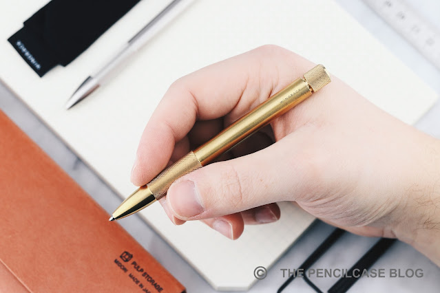
So, how 'pocketable' are we talking then? Both Mechanical Pen and Pencil share identical dimensions: 11.8cm (4.64") in length and 10 mm (0.39") in diameter. They do differ in weight, though. The pencil is the lightest, as the much larger mechanism takes up most of the internal space, whereas the pen is machined much thicker on the inside (which is what gives the pen that very dense feeling!). This translates into a weight of around 37 grams for the pencil (still by no means light for such a compact pencil!) and 50 grams for the pen. Of course, the choice between steel or brass will also make a slight difference (the brass options being heavier), though it'll only differ a few grams.

In terms of comfort, the more compact size of the Mechanical Pen and Pencil is noticeable but not bothersome. For my average-sized hands, neither pen nor pencil felt too short or uncomfortable to hold. You still get a writing experience similar to that of a full-sized pen. It's worth pointing out that the knurled section - while comfortable in diameter - sits quite far back on the barrel, so you'll tend to grip the pen a bit further back. For people with larger hands, that may make the difference between a comfortable pen, and one that disappears in your hand.
REVIEW: WINGBACK MECHANICAL PEN & PENCIL
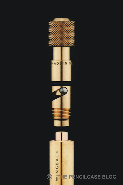
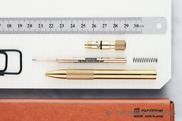
The Wingback Mechanical Pen is outfitted with a custom-made, solid metal, twist mechanism. It unscrews at the back (which is also how you change the refill) and is held securely in place with a rubber o-ring. The mechanism turns smoothly without play and has a very satisfying snap when it clicks into place. 
REVIEW: WINGBACK MECHANICAL PEN & PENCIL
The Pen comes equipped with a pressurized ("writes in all conditions") Fisher Space pen refill, and I have to say either Fisher upped their game or I've become more lenient towards ballpoint refills because I'm quite enjoying the writing experience. Granted, I'm still not a huge fan of ballpoint refills, but this one does lay down a smooth and relatively dark line of ink. Perhaps a bit more consistent than the average ballpoint pen, though still not quite as consistent as I'd like (hence, why I gravitate towards gel refills most of the time). Unfortunately, the Fisher Space refill is proprietary, so there's not a lot of leeway in terms of alternatives that will fit in the Wingback Mechanical Pen.
REVIEW: WINGBACK MECHANICAL PEN & PENCIL
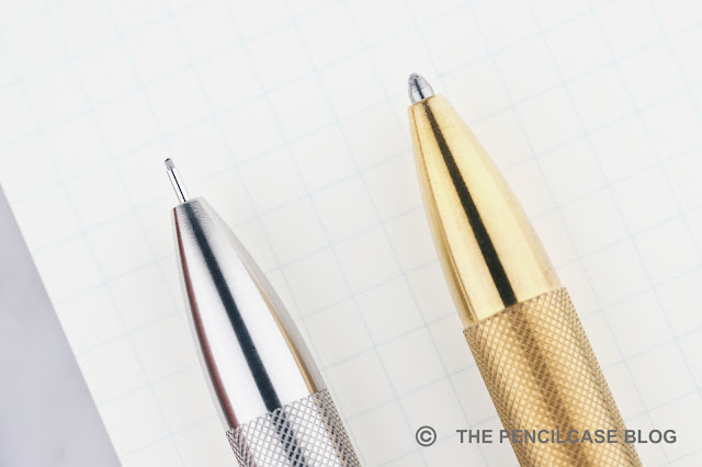
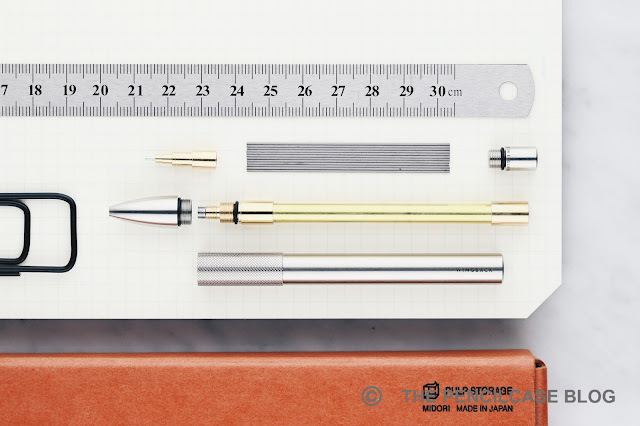
The Mechanical Pencil - just like the pen - also comes with an impressive custom-made internal mechanism. All-metal parts, again solidly put together with little to no play or rattle between the parts, and the knock has a nice soft click action. The tip also has a retractable lead pipe, an essential feature for an EDC pencil that's bound to live in your pocket. 

Refilling the pencil requires some disassembly, but Wingback deliberately designed the mechanism so that you don't have to refill it very often. The large mechanism holds an absurd amount of spare leads inside (the website says 40 pieces for the 0.7mm mechanism, which seems about right), so you can basically drop in an entire tube of fresh leads and be good to go for ages... well, depending on how much you write or sketch of course! 
REVIEW: WINGBACK MECHANICAL PEN & PENCIL
So there you have it: my first encounter with Wingback's products, and quite a positive one I must add. I appreciate their "Buy once" philosophy, and find that it is truly reflected in the impeccable production quality of their Mechanical Pen and Pencil. In terms of EDC, I have no doubt these pens will serve well for years to come. 

Pricing starts at 95 GBP (around 110€/ 120$) for either Pen or Pencil. A substantial price tag, but one that I feel is justified by the excellent build quality, and the fact that these products are made locally in the UK. The black steel version adds a specialized tungsten-carbide coating, which ups the price to a rather hefty 140 GBP (165€/ 175$)! 

As it stands, the Mechanical Pen and Pencil are the only writing-related products in Wingback's catalog, though I hope they'll expand the range further in their design style... perhaps with a full-sized pen, or even a fountain pen? That'd be neat.

Note: This product was provided by Wingback, free of charge, so I could write this review.  I was in no way influenced in the making of this review, the opinions shared in this review are completely my own! This post does not contain affiliate links.
REVIEW: WINGBACK MECHANICAL PEN & PENCIL

Sunday, November 21, 2021

ACCESSORIES FOR THE DESK: MAKERS CABINET HØVEL & IRIS REVIEW


ACCESSORIES FOR THE DESK: MAKERS CABINET HØVEL PENCIL SHARPENER & IRIS COMPASS REVIEW

As with so many hobbies, most things within the writing community aren't about making sensible financial decisions. Let's be honest, it's quite easy to be tempted into buying (ahem, hoarding) all kinds of pens, pencils, desk accessories, and gadgets that nobody really needs... but everybody wants! The two desk accessories by Makers Cabinet we'll be looking at, certainly categorize as such. I can't help but be quite enamored by these nifty tools. 

UK-based Makers Cabinet hit the market somewhere in 2017 (then as 'Brahman Design') and was started by three product design graduates. Aesthetics is the name of the game with Makers Cabinet. You'd think 'form follows function' is out of the door then, but after using the Makers Cabinet Høvel pencil sharpener and Iris compass, the meticulous attention to detail quickly becomes clear.

As aesthetics are a big part of the appeal of the Høvel and Iris, so let's start there...

ACCESSORIES FOR THE DESK: MAKERS CABINET HØVEL PENCIL SHARPENER & IRIS COMPASS REVIEW

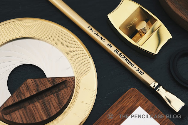
One key element returns throughout the entire product catalog of Makers Cabinet: all of their products are made out of brass! But as much as that ties together their different products, each item still very much brings its own unique look and feel. 

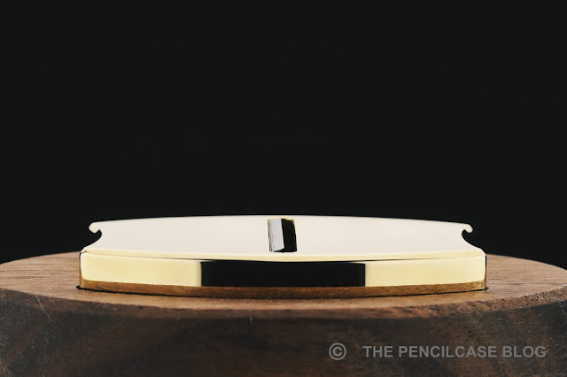
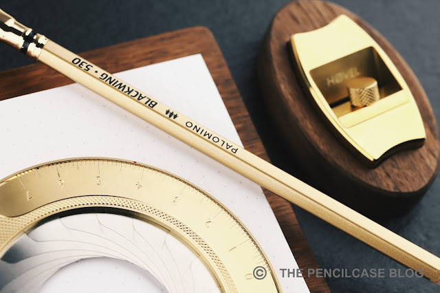
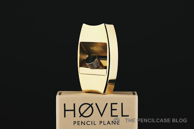
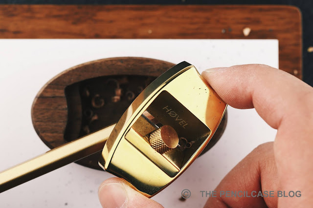
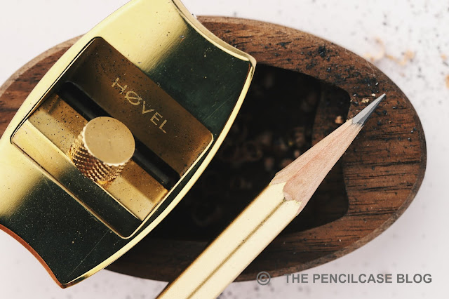
The Hovel - a very minimal, miniature interpretation of a wood planer - is a slick and sleek chunk of brass, with rounded edges and a highly polished finish. The rectangular cutout that houses the blade setup received a lightly sandblasted finish for a subtle contrast, it also has the 'Høvel' logo laser-engraved there.

ACCESSORIES FOR THE DESK: MAKERS CABINET HØVEL PENCIL SHARPENER & IRIS COMPASS REVIEW

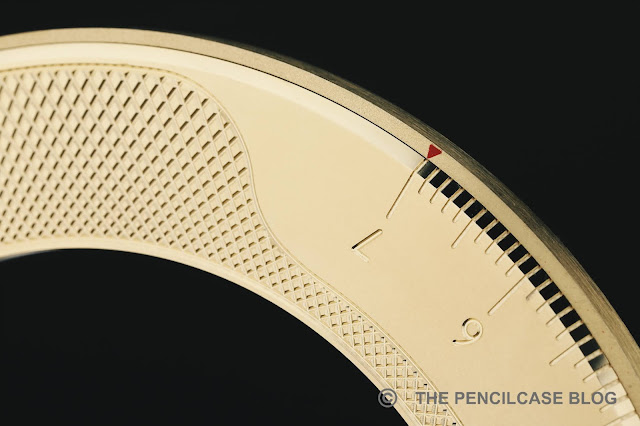
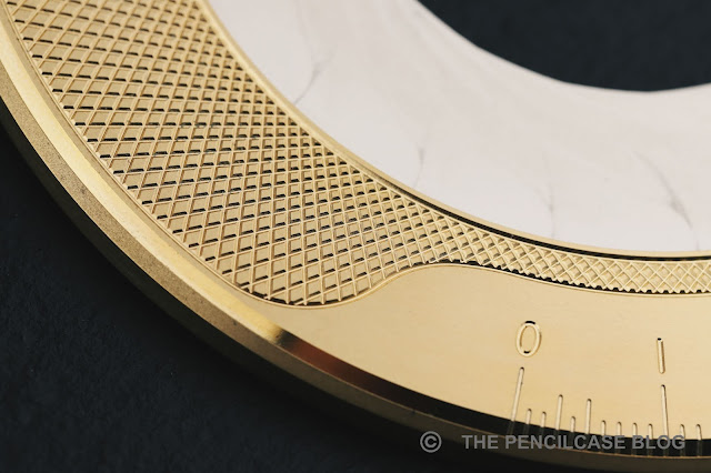
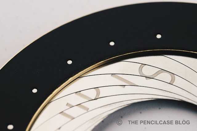
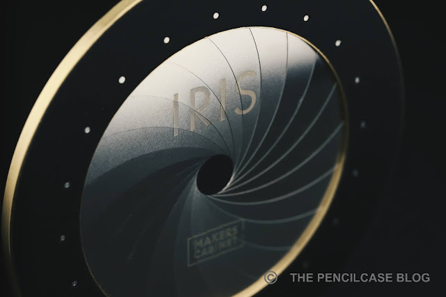
The Iris - a brilliantly overengineered take on the classic circle drawing compass - is quite the opposite in terms of design. Its crisp beveled edges, knurling, and mixture of finishes (machined finish, brushed, and sandblasted) interweave to create a distinctly industrial look and feel. One thing I noticed while using both products, is that the type of brass they use isn't very prone to tarnishing (even though it's not coated), I'm still waiting for the Høvel and Iris to take on a nice vintage appearance. 

ACCESSORIES FOR THE DESK: MAKERS CABINET HØVEL PENCIL SHARPENER & IRIS COMPASS REVIEW
The 'Makers Cabinet' and 'Iris' branding only appears when you close the blades of the Iris!

The solid brass construction creates a wonderfully hefty tactile appearance. So much so, that I'm constantly tempted to play with the Høvel as a worry stone... if it wasn't for the blade sticking out of the bottom (not quite so practical as a fidget toy!).

ACCESSORIES FOR THE DESK: MAKERS CABINET HØVEL PENCIL SHARPENER & IRIS COMPASS REVIEW

No, neither Iris nor Høvel are cheap products by any stretch of the imagination, but it has to be said that the production quality on both is really, really impressive. Machining is precise, assembly and fit and finish is flawless, finishing is cleanly done. I have no remarks, it's as simple as that. 

Especially on the Iris - a rather complex mechanical construction with a lot of moving metal parts - it's extra impressive how everything fits together perfectly and the diaphragm slides open and closed buttery smooth. The only remark I could make is that stainless steel diaphragm blades of the Iris do pick up scuffs from sliding over each other, but that's to be expected with these moving parts.

Let's move on to functionality, because yes, you really are getting more than just a good-looking paperweight for your money!

ACCESSORIES FOR THE DESK: MAKERS CABINET HØVEL PENCIL SHARPENER & IRIS COMPASS REVIEW
It doesn't take much practice to get nice and clean sharpening results.

Starting with the Høvel; it has been mocked in the past for its very concept: a plane for a pencil sharpener, why even?!? I must say, I was skeptical as well, and my view aligned with some reviews that stated it's awkward and unnecessarily difficult to use.

Though as soon as I started testing the Høvel myself, I found it surprisingly easy and intuitive to use. That does come with a slight sidenote that I often sharpen pencils with a pocket knife (I'm weird like that), so I do have some practice with unconventional sharpening techniques (that's undoubtedly my weirdest flex ever!). The alignment of the blade - just a millimeter below the plane surface - allows thin curls of wood to be shaved off using minimal pressure. With some practice, you can get straight and clean cuts and even make a nicely symmetrical point onto your pencil. 

The Høvel, just like a knife, gives you more freedom in varying the angle and shape of the pencil tip entirely to your liking, and it can also be used for oddly sized and shaped pencils that don't fit a traditional sharpener. The Høvel comes with a cute tiny package of 10 blades, which is more than enough to keep you sharpening for a while. 

ACCESSORIES FOR THE DESK: MAKERS CABINET HØVEL PENCIL SHARPENER & IRIS COMPASS REVIEW

One remark I have with the Høvel is that you have to hold it sort of precariously at the very edge to keep your fingers out of the way of your pencil, and the mirror-polished finish is quite slippery. Perhaps it would be useful if they'd add some knurling or texture to the sides of the Høvel. Maybe an idea for a future iteration? 

ACCESSORIES FOR THE DESK: MAKERS CABINET HØVEL PENCIL SHARPENER & IRIS COMPASS REVIEW

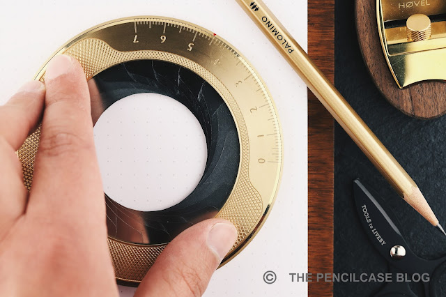
The Iris is probably my favorite of the two tools, and that's mostly due to the incredibly smooth and precise action of the 20-blade diaphragm opening and closing by turning the outer ring. It's very satisfying to play with! 

ACCESSORIES FOR THE DESK: MAKERS CABINET HØVEL PENCIL SHARPENER & IRIS COMPASS REVIEW

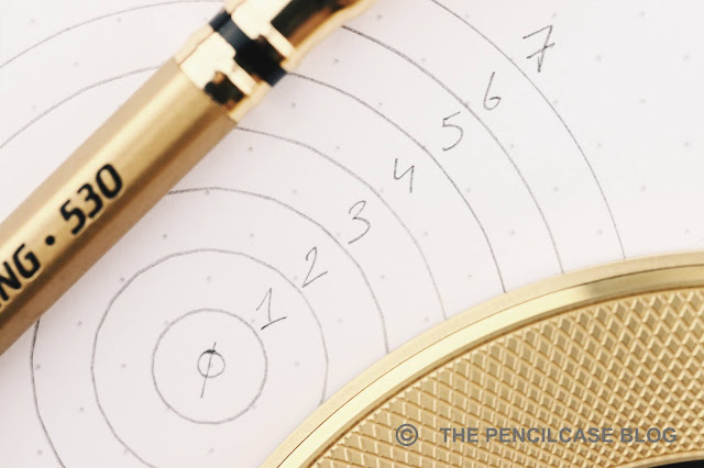
The centimeter scale on the outer edge enables you to precisely draw circles with a defined diameter, or measure them. Talking about that scale: I of course tested the accuracy, and it's accurate down to a millimeter or so. One slight caveat is that, even though the diaphragm has a lot of rounded blades, you always get a subtly 20-sided circle, not a perfectly round one. At some circle diameters it's more noticeable than others, though (circles above 5 cm appear perfectly round). With that said, I'd say the Iris is still perfectly suitable for drawing, sketching, or doodling. Anything but precise technical drawing. 

ACCESSORIES FOR THE DESK: MAKERS CABINET HØVEL PENCIL SHARPENER & IRIS COMPASS REVIEW

The rubber padding on the underside of the Iris keeps it firmly in place on the paper, which is necessary as the twist mechanism does require a fair bit of force to operate. 

ACCESSORIES FOR THE DESK: MAKERS CABINET HØVEL PENCIL SHARPENER & IRIS COMPASS REVIEW
The Høvel can also be placed upside-down in the wooden base and used as such

One more thing... Both the Iris and Høvel have a purpose-built walnut wooden base. With the Iris, it's included in the box (and doubles as a center-point finder when you place it within the Iris). The base for the Høvel, unfortunately, isn't included and adds an additional 14$ to the cost of the pencil plane. Frankly, I think the base for the Høvel should also be included in the price, as you miss out on a lot of functionality without it. For one, it protects the blade (and also your desk!) when not in use, but it also doubles as a pencil shavings tray, and a holder to place the Høvel upside down to sharpen your pencil with the Høvel on the table  (although I personally find it easier to use handheld). 

ACCESSORIES FOR THE DESK: MAKERS CABINET HØVEL PENCIL SHARPENER & IRIS COMPASS REVIEW

If price is no object, and you want something unique on your desk - certainly a conversation piece -, the Makers Cabinet Høvel (69€/ 80$) and Iris (120€/ 138$) are two tools (because despite the beautiful and unique design, that's still what they are) that are definitely worth checking out. Build quality is second to none, and I'm sure the Stria ruler and upcoming pencil extender 'Ferrule' will hold to the same high-quality benchmark Makers Cabinet has set for themselves. 

Better yet - with the upcoming Holiday season in mind - both the Iris and Høvel could make for ideal gifts for the design-minded writing or drawing enthusiasts that already have all the other essentials covered on their desk!

NOTE: These products were provided by Makers Cabinet, so I could write this review. I was in no way influenced in the making of this review, the opinions shared in this review are completely my own. This post does not contain affiliate links.

ACCESSORIES FOR THE DESK: MAKERS CABINET HØVEL PENCIL SHARPENER & IRIS COMPASS REVIEW

Tuesday, October 19, 2021

REVIEW: GRAVITAS ENTRY FOUNTAIN PEN

REVIEW: GRAVITAS ENTRY FOUNTAIN PEN

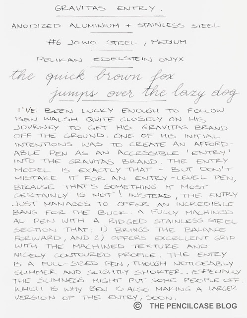
I've been lucky enough to be able to follow Ben Walsh quite closely on his journey to get the Gravitas brand off the ground. Chatting and exchanging ideas with him on the regular got me a glimpse of the creative mind behind the brand. Ever since starting Gravitas in 2020, one of Ben's goals was to create a more affordable fountain pen to stand alongside the self-titled 'Gravitas' fountain pen (reviewed HERE) that started the brand. A more accessible option into the Gravitas brand (and an entry point into fountain pens, in general), while still being able to live up to the highest quality standards. 

REVIEW: GRAVITAS ENTRY FOUNTAIN PEN

The Gravitas 'Entry' fountain pen is all those things - but it would be a mistake to call it an entry-level pen! Because that, it most certainly is not! Instead, the Entry manages to offer an incredible bang for the buck, a design that's easy on the eyes, and a lot of thoughtful design details I've come to expect from Ben's creations. 

REVIEW: GRAVITAS ENTRY FOUNTAIN PEN

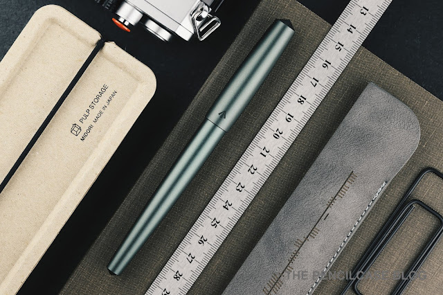
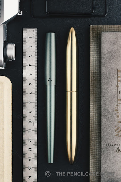
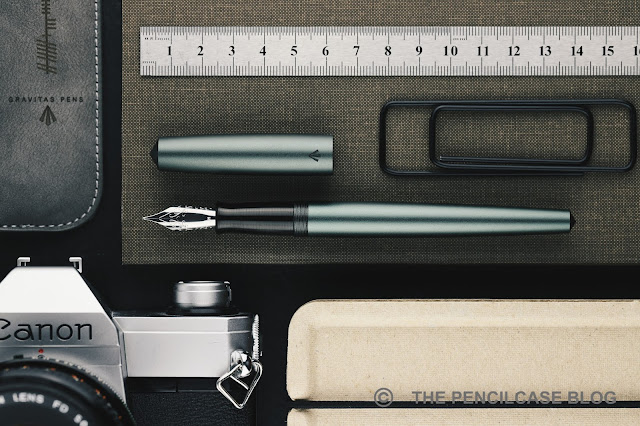
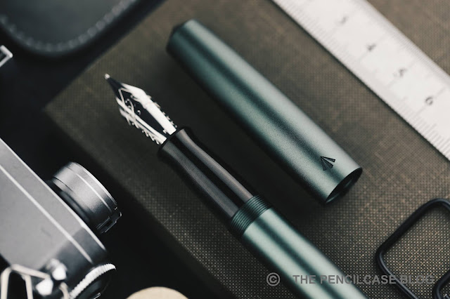
In the looks department, the sleek and nimble Entry is quite a departure from the chunky, ultra-minimal, torpedo-shaped Gravitas FP. The looks of the Entry are a bit more easily digestible, and perhaps even more traditional, which will undoubtedly make it appeal to a wider audience. It has a flat top design with rather sharp pointed finials on both ends (not that you could cut yourself on it, but they sure are pointy!). The cap has a slightly bulbous shape and is relatively short in comparison to the long and gently tapered barrel. The elegant, streamlined shape gives it somewhat of a brush pen vibe. 

REVIEW: GRAVITAS ENTRY FOUNTAIN PEN

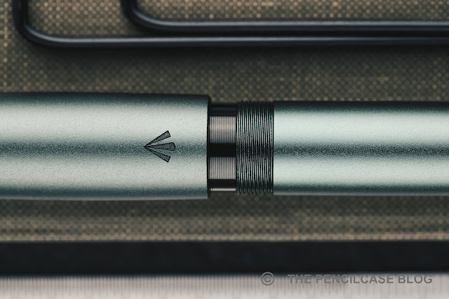
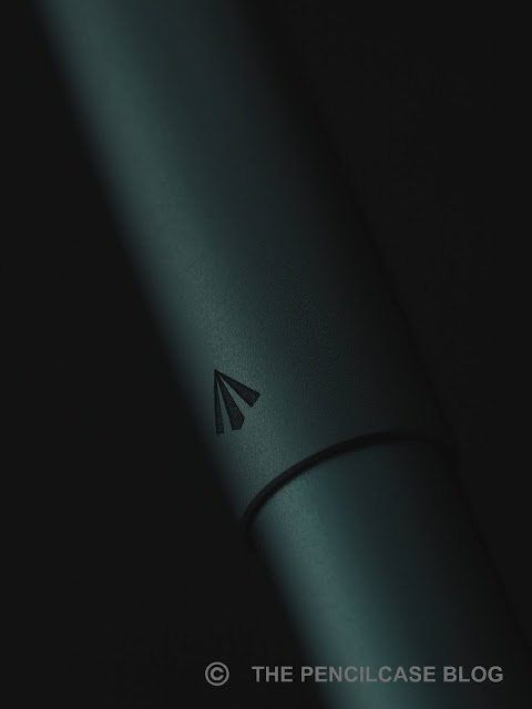
As for now, the Entry is available in a myriad of anodized colors on an aluminum basis. I chose the Olive grey colorway, which is a beautiful dark and muted green. If you want a bit more pop, look into the Gravitas signature 'Skittle' rainbow finish. The pen is bead blasted before being sent off to the anodizer, which creates a very smooth and satiny finish that I find very pleasant to the touch.

REVIEW: GRAVITAS ENTRY FOUNTAIN PEN
L to R: Karas Pen Co Ink, Namisu Nova, Ensso Piuma, Gravitas Gravitas FP, Gravitas Entry, Lamy 2000, Lamy Safari

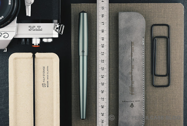
The Entry appears smaller but isn't. With a closed length of 14.5 cm (5.71"), it isn't all that much shorter than the oversized Gravitas FP. Uncapped, the Entry retains most of its length (13.8 cm/ 5.43"). Especially the narrower section (down to 9.8 mm/ 0.39" at the thinnest part of the taper) may trick you into thinking you're holding a much smaller pen. So if you prefer slightly thinner pens, the Entry has a high chance of appealing to you. At 31 grams, the Entry strikes a good balance between being nimble, yet offering just enough heft to let you know you're holding a solid metal pen. 

REVIEW: GRAVITAS ENTRY FOUNTAIN PEN
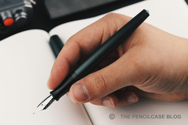
The smooth and streamlined transition from section to barrel offers a comfortable grip

The skinny tapered barrel of the Entry doesn't allow for the cap to be posted. But a pen this size doesn't really need to be posted anyway if you ask me. The Entry scores very high marks in the comfort department, with its long and gently tapered shape, a long section that transitions smoothly into a set of shallow and non-sharp threads. There's also no step that could interfere with your grip.

REVIEW: GRAVITAS ENTRY FOUNTAIN PEN

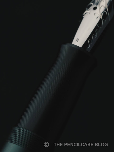
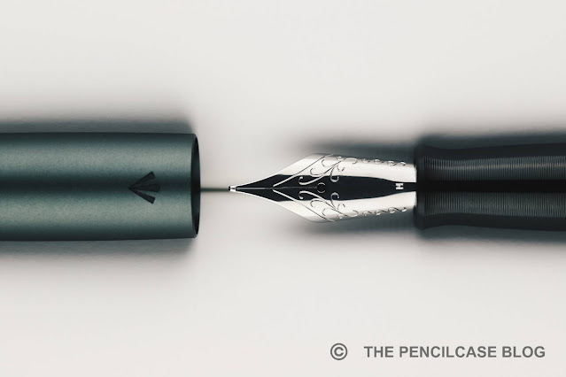
The stainless steel section deserves some attention here, as it really ties the entire pen together. The black-PVD coating provides a sleek look that pairs well with this anodized 'Grey Olive' colorway. If you're not a fan of metal sections, don't write the Entry off just yet! The section shape is similar to that of the Gravitas FP, but of course narrower. It has a nice gentle taper towards the nib, before flaring out again to catch your grip.

Talking about grip, this metal section is far from slippery! If you look closer, you'll notice the machined line pattern that runs around the entire length of the section. The pattern is very fine and not aggressive on your fingers, yet does an excellent job providing grip. The more dense stainless steel section, in combination with the aluminum barrel, shifts the center of gravity towards the grip section, creating a pen that feels lightweight and balanced in the hand.

REVIEW: GRAVITAS ENTRY FOUNTAIN PEN

The original Gravitas FP prototype I reviewed a year ago, came with a steel Bock nib. But in the meantime, Ben switched entirely to JoWo nibs. Since many similar brands (such as Ensso or Namisu) stick to Bock, it's nice to see Gravitas provide some diversity on the market. Along with every pen, a small handwritten test paper is included, implying that every pen passes through a final QC before being shipped out. And indeed, I have only positive things to say about the writing experience! 

REVIEW: GRAVITAS ENTRY FOUNTAIN PEN

The medium steel nib on this particular pen wrote beautifully smooth and hassle-free out of the box. Even though in my experience, JoWo tends to offer rather consistent, properly set-up nibs, I still appreciate that Ben takes the time to check each one individually just to be sure. 

REVIEW: GRAVITAS ENTRY FOUNTAIN PEN

As mentioned at the beginning of this post, the Gravitas Entry comes in at a fairly accessible price point of 60€. For that money, you receive a sleek, solid metal pen with a stainless steel PVD-coated section, topped off by a hand-tested JoWo nib. Despite being a full-sized pen, its noticeably slimmer and more streamlined profile will undoubtedly appeal to those that find the Gravitas FP just too big. 

On the flipside, the rather slim profile of the Entry could also put some people off (it certainly took me some time to get used to!), though Ben also thought of that and designed the 'Gravitas Sentry': a slightly larger version of the Entry pen for those who prefer a more beefy pen, but with the same design cues as the Entry.

This product was sent to me by Gravitas so I could write this review. I was in no way influenced in the making of this review, the opinions shared in this review are completely my own! This post does not contain affilate links.

REVIEW: GRAVITAS ENTRY FOUNTAIN PEN

Sunday, October 10, 2021

REVIEW: VENVSTAS MAGNA C/C FOUNTAIN PEN

REVIEW: VENVSTAS MAGNA C/C FOUNTAIN PEN

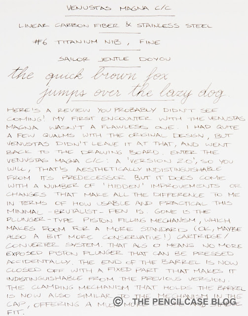
After too long of an unplanned hiatus (sorry!), we're back with a pen review you probably didn't see coming in a million years! Indeed my first encounter with the Venvstas Magna wasn't a flawless one, considering I had quite a few qualms with the original design. For me, those issues distracted from the impressive and unique looks of the Magna and ultimately made it a less enjoyable pen to use.

But Venvstas didn't leave it at that! Instead, they showed a very strong comeback with their latest version of the Magna: the Venvstas Magna CC. Here's the TL;DR, Venvstas improved on all the pet peeves I had with the original Magna fountain pen, and I really like the end result this time!

REVIEW: VENVSTAS MAGNA C/C FOUNTAIN PEN

The original Venvstas Magna -a piston-filled pen- managed to impress me with its brutalist, minimal design made entirely from matte brushed linear carbon fiber, with matte stainless steel accents. I did, however, have some issues with the construction: an open barrel allowing the piston plunger to be depressed accidentally, and a barrel closure that didn't actually hold the barrel closed very well.

The new CC version takes over the design of the original down to the absolute smallest detail, with no visual cues to distinguish between the two versions. At least not on the outside...

REVIEW: VENVSTAS MAGNA C/C FOUNTAIN PEN
The barrel closure is now much more robust

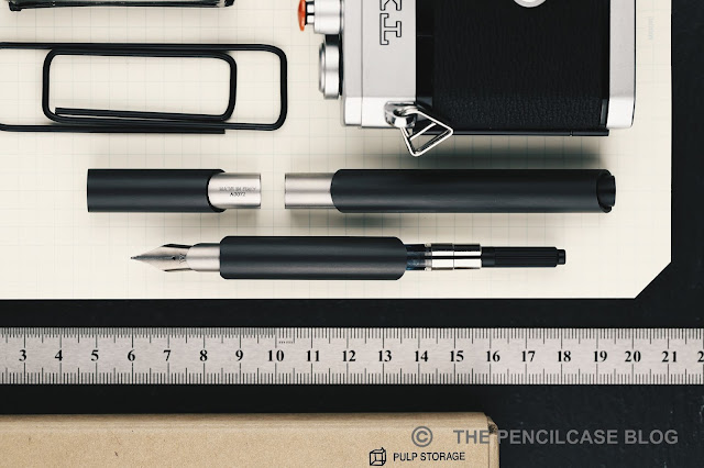
Remove the barrel, and you'll find that Venvstas exchanged the closure mechanism on the barrel for a clutch similar to the one used in the cap (which is much more robust), making the overall construction more secure and rattle-free. Especially when opening and closing the cap, the barrel is held on tight so it stays nicely in place. The updated closure also keeps the barrel and section aligned perfectly, which was another pet peeve I had with the piston-filled version. 

REVIEW: VENVSTAS MAGNA C/C FOUNTAIN PEN

But the main difference, as indicated in the name, is the switch from piston-filler to a simpler cartridge/converter system. Where the exposed piston plunger left opportunity for an inky mess with an accidental press (Ha! That rhymes!), the converter in the new version is now fully enclosed by a fixed black cylindrical finial that protrudes from the barrel. The cap can still post just like before, as the overall shape of the barrel did not change at all. The Magna CC uses a standard international converter, and so you can also switch between regular ink cartridges if you like. 

Yeah sure, on paper the switch to a standard cartridge-converter system may sound like a step backward, but believe me when I say that for this pen it makes perfect sense. The only thing you lose is ink capacity, going from the generous 2mL to whatever a standard cartridge or converter can hold (which is roughly 0.8 mL), but that's a trade-off I'll gladly make in return for peace of mind. And let's be honest, c/c pens are actually quite convenient to use unless you really write a lot!


L to R: Pelikan M805, Ensso Piuma, Leonardo Furore, Venvstas Magna CC, Lamy Dialog 3, Lamy 2000, Lamy Safari

The Magna CC takes on all dimensions from the piston-filled version: 15.5 cm (6.1") long capped, 14.6 cm (5.74") uncapped, and a comfortable diameter of 12 mm (0.47") across the entire length of the pen. One thing that did change: the Magna CC put on some weight (from 24g to 30g). 

The increase in weight makes for a pen that feels a bit more substantial and solid in the hand, more in line with what you'd expect to feel from a pen this size. The weight of the Magna is nicely balanced around the core of the pen, as most of the internals inside the section are stainless steel. The added heft, combined with the more robust barrel-section joint and lack of rattling, add to the solid feeling of the Magna CC. I also found that the overall fit and finish has become a bit more precise.

REVIEW: VENVSTAS MAGNA C/C FOUNTAIN PEN
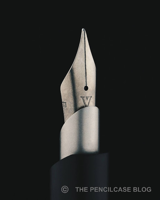
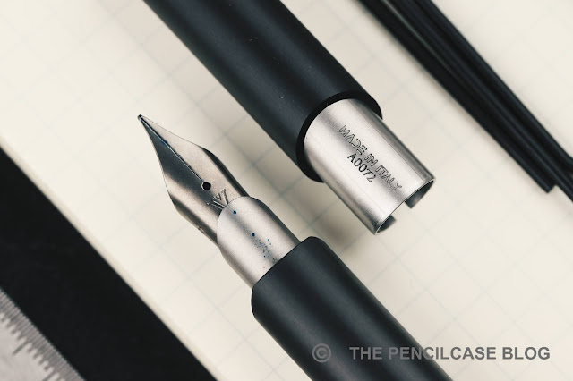
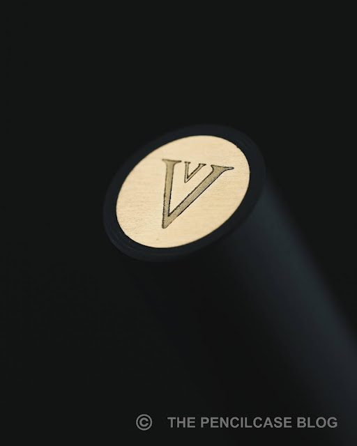
I like how the very minimal logo engraving is slightly hidden underneath the 'semi-hooded' part of the nib!

The Venvstas Magna comes equipped with a titanium nib as standard (a gold nib upgrade is also available). While the medium nib from before was a splendid writer, I wanted to try something finer this time. The fine nib came properly set up out of the box and runs true to size, if not slightly on the wider side. Ink flow is generous though not excessive. The F has a noticeable amount of pencil-like feedback, something the medium didn't have -though of course, that makes sense on a finer nib. 

REVIEW: VENVSTAS MAGNA C/C FOUNTAIN PEN
Some ink on the hooded part of the nib is not uncommon due to the design of the cap mechanism. 

This particular nib feels quite firm for a titanium one, although that's not uncommon. There always seems to be a rather wide variation in springiness among titanium nibs. 

REVIEW: VENVSTAS MAGNA C/C FOUNTAIN PEN
Made-in-house nib? Well this is certainly not a standard-issue Bock feed!

As far as I know, Venvstas claimed their nibs are made in-house (in any case, the feed is not a standard Bock type). If so, they sure do know how to make a good nib, my writing experience with the Magna has been excellent in both instances.

REVIEW: VENVSTAS MAGNA C/C FOUNTAIN PEN

If you recall the bottom line on my original review of the Venvstas Magna, I was hopeful. The Magna fell prey to what can best be described as a bit too much 'over-designing', choosing form over function. But there were clear opportunities for improvement to bring the Magna up to the standard I'd expect from a pen in this price range. I also promised that I'd change my opinion if they came through on an improved design... and they did! Needless to say, I'm beyond impressed that they carried out the improvements and changes I had in mind (and executed them flawlessly!), making the Venvstas Magna CC a pen I can 100% fully stand behind. 

The Venvstas Magna CC comes in at  239€/ 230$ without VAT (from our site sponsor Appelboom), conveniently also 10€ cheaper than the piston version. Between the two models, my choice for the Magna CC is clear. But if you're really willing to make some sacrifices in terms of usability and function to get the most 'purist' design object out of the Magna (the way the designer intended it), I suppose the piston-filled version would be the option for you.

Note: This product was sent by Venvstas, so I could write this review. I was in no way influenced in the making of this review, the opinions shared in this review are completely my own! This post does not contain affiliate links.

REVIEW: VENVSTAS MAGNA C/C FOUNTAIN PEN

Saturday, March 13, 2021

PAPER REVIEW: PONT NEUF NOTEBOOKS

PAPER REVIEW: PONT NEUF NOTEBOOKS
I was really happy to see Japanese stationery brand Kunisawa recently re-introducing themselves with a completely revised product lineup (read the re-review HERE!). Their confidence in the updated paper quality turned out to be absolutely justified, finally combining the stunning business-chic notebook designs with fantastic - consistent - quality Japanese paper on the inside. 

But alongside the updated Kunisawa products, they also sent a few other products that certainly didn't fit in. That's because, as I mentioned earlier, mother company Kawachiya Print also houses a second stationery brand: Pont Neuf!  
The contrast between Kunisawa and Pont Neuf doesn't need an explanation...
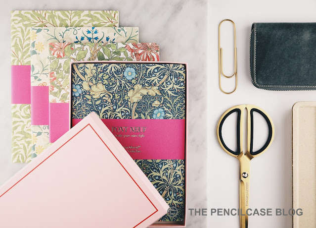
Pont Neuf is best described as the absolute polar opposite of Kunisawa's functional, subtle, business-appropriate designs. Instead, they go for bright, colorful, playful products. The most eye-catching being a selection of wild, fluffy, fabric-covered notebooks - extravagant (and quite high-end)! But also the notebooks I'll be showing today, which are a collaboration with Tokyo-based art Gallery Brain Trust, for a collection with William Morris design notebook covers.
PAPER REVIEW: PONT NEUF NOTEBOOKS
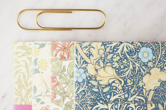
William Morris was a renowned 19th-century artist and craftsman and is perhaps best known for his hugely popular - to this day - botanical patterns. His designs were originally created for wallpaper decoration, but I think it works equally well on these notebooks, and it fits right in with the style Pont Neuf tries to convey. 
PAPER REVIEW: PONT NEUF NOTEBOOKS
Both the A5-sized slim staple-bound softcovers (64 pages) and thicker A5 hardcover notebooks (192 pages) in the William Morris collection each come with unique cover prints, four in total. The printing is high quality and detailed, and the colors - while certainly vibrant - aren't overdone. One minor detail: I say A5, but both notebooks are actually 195 x 138 mm, which is ever-so-slightly smaller than the traditional A5 size!
PAPER REVIEW: PONT NEUF NOTEBOOKS
While the softcovers come with simple, uncoated paper stock for the cover (which has a nice subtle debossed texture from the printing!), the hardcover notebooks are distinctly more upscale. The cover is made of textured, heavily coated (plastic?) paper with gold foil debossed details, gilded edges, and rounded corners. One downside about the stiff, plastic-like material used on the hardcover is that it cracks and frays a bit around the edges of the notebook, which deters from the otherwise pristine cover design, and gives the edges a slightly rough feel.
PAPER REVIEW: PONT NEUF NOTEBOOKS
Both notebook types are able to lay open quite flat
Inside, the Pont Neuf notebooks do match the minimalist approach of Kunisawa with un-numbered, dot-grid pages and pretty much nothing else. The hardcover does have one practical element that the thin softcover booklets don't have: a thin bookmark ribbon.
PAPER REVIEW: PONT NEUF NOTEBOOKS
The paper inside the Pont Neuf notebooks seems to be identical to the excellent paper we've already seen in the updated Kunisawa Find stationery, which is of course a good thing. 
PAPER REVIEW: PONT NEUF NOTEBOOKS
For those of you that didn't read my previous review, here's a short rundown of my findings on this new paper: it's a very smooth stock, more or less the same thickness as Rhodia (so around 80-85 gsm), and with a distinct yellowy-ivory tint to it. The paper shows excellent shading and sheen and doesn't budge to wet nibs or even ink swabs, with no bleedthrough and minimal showthrough (or ghosting) to speak of.
PAPER REVIEW: PONT NEUF NOTEBOOKS
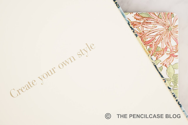
"Create your own style" an appropriate catchphrase for the eccentric Pont Neuf brand!
While I personally lean towards the minimal and clean aesthetics of the Kunisawa products, there is certainly something to be said for the more extravagant side of Pont Neuf's colorful collection of notebooks. The two brands work nicely side-by-side, offering unique products on two very distinct ends of the scale. Pricing is also comparable between the two brands, and - while certainly on the more premium side - is quite fair given the excellent paper quality and great design. The softcover notebooks retail for 5€/ 6$, and 25€/ 30$ for the hardcover.

Note: The products shown here were provided by Kunisawa, so I could write this review. I was in no way influenced in the making of this review, the opinions shared in this review are completely my own! This post does not contain affiliate links.
PAPER REVIEW: PONT NEUF NOTEBOOKS