Hey, I like minimal design. I'm all for it. But the thing is: minimal design is extremely unforgiving! The product has to be perfectly conceptualized, it has to be flawlessly executed. It has to give you that "Aha, I get it now!" moment, when you pick it up. That moment when you realize that it is so cleverly put together, it doesn't lack any of the features that are essential to making a good pen, but conversely has nothing excessive in the way of pure writing experience. Above all, I feel like minimal design should be hassle-free, maybe even soothing... I think you get the point.
Before we dive into the nitty-gritty of the Venvstas Magna fountain pen, let me start off by saying the premise of this pen is absolutely promising. But a cool concept is only half the effort towards a great product, and unfortunately, there are a number of small - maybe seemingly unimportant, but they add up - pet peeves that distract from the overall experience you'd expect from a 250$ pen. Even Venvstas' own website, which I visited while researching for this review, was itself a bit of a pet peeve. It's riddled with conflicting and wrong information: no the ink capacity isn't 3.2 mL. Yes, the cap does actually post. And no, the 79€ carbon fiber carrying case isn't actually included with the pen (bummer!). Update: The wrong information turned out to be a page about a previous iteration of the Magna. The error was communicated with Venvstas and updated to show the correct data!
Anyway, on to the pen!
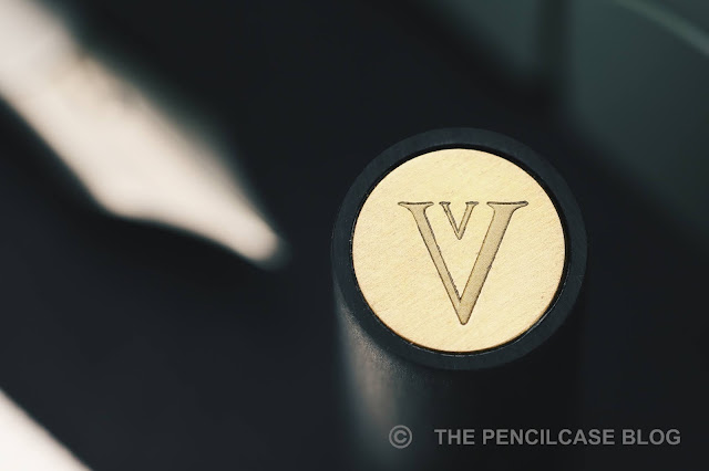
I do enjoy the overall design of the Venvstas Magna. It's positively minimal, with a tubular, linear carbon fiber exterior. The different pieces of the pen are separated by slanted angles, which gives quite a departure from typical fountain pen designs. Through some compromises (which I'll address later), the monolithic shape is interrupted only by two tiny set screws in the section (which hold the internals of the pen together), a brass coin adorns the cap finial and has the Venvstas double-V logo on it, and a nondescript black cylinder that extends slightly from another angled cut at the back of the barrel.
The main 'structural element' if you will, the outer carbon fiber (CF) shell, is nicely made from tubes of extruded linear carbon fiber composite (the extrusion process aligns the carbon fibers all in the longitudinal direction of the tube - quite neat!). The slanted angles on the carbon fiber parts are cut quite clean and precise, and all the pieces received a nice hand-brushed finish that is smooth and soft to the touch. Despite the brushed finish - the comparison with the Lamy 2000 is hard NOT to make here - the carbon fiber pieces don't match up to create a 'seamless' look, although I don't know if that's what Venvstas was aiming for in the first place.
In any case, I'd at least expect all parts to align properly, and that's where I hit a bit of a sore spot in the design of the Magna. Without going into too much detail, the way the steel 'guts' of the pen are connected to the CF section and the way the barrel attaches to that section, leaves wiggle room between all the parts. The nib assembly, but also the entire barrel (which only holds onto the steel inner mechanism) tends to shift/rattle around as a consequence.
Related to this, is that the barrel never really stays seated perfectly flush with the section. You could argue that that's a minor issue, but even the slightest misalignment is accentuated on a clean and straight design like this (see the image above, it's minor, and yet you can clearly see it's off!), and can be felt because the edges are rather sharp.
Contrary to the barrel, the cap holds on to the CF part of the section with a single steel 'spring' insert and has a positively tight tolerance to it (the edges of the steel insert are really sharp, though). It aligns perfectly flush and secure each time, showing that it is indeed possible to get a better fit.
What's even more, the cap is actually held in place tighter than the barrel, so when you accidentally hold the barrel and try to pull the cap off... you'll actually pull off the barrel. Yes, this is easily avoided by holding the pen only at the section when uncapping, yet I still - on multiple occasions - managed to pull the barrel off or slide it back enough to misalign it once again. If the barrel attached in the exact same way as the cap, it would not only be a more secure fit, but it'd also alleviate all of the aforementioned misalignment and wiggle issues I encountered.
My biggest gripe with the design is the fact that the back of the barrel is just open. Yes, there's a gaping hole in the back of this pen. The design of the back finial looks cool... until you realize that you're touching the piston's plunger and not just a fixed finial! About half a centimeter of the plunger is exposed through the back of the barrel, ready to be pressed by accident. Why create such a risk? There's potential for an inky mess around every corner: when you slide it into a pen case/pocket/bag, when you're fidgeting with the pen (let's admit it: we all do that unconsciously!), or when you post the cap (the steel spring also attaches the cap to the back of the barrel, but it can easily catch on the plunger and depress it about a centimeter).
Seeing that Venvstas' other, slightly smaller pen - the Venvstas Carbon T - has the same finial design but with an actual, fixed finial and not the piston plunger sticking out, I'd personally opt to decrease the ink capacity from the massive 2mL that it is now, shortening the piston mechanism and just putting the same fixed finial in the back as with the Carbon T. Problem solved, peace of mind restored!
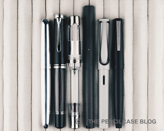
The Magna (Latin for 'large') is indeed a rather large pen. The diameter of the entire pen (12 mm/ 0.47") is quite normal I'd say, and sits comfortably in my hand. But with a length of 15.5 cm (6.1"), it's exceptionally long. Even uncapped, at 14.6 cm (5.74"), it's longer than most pens when capped! If that's still not enough for you, the cap can be posted (although as already mentioned, you run the risk of accidentally pushing the piston plunger) for a total length of 18 cm (7.08"). Needless to say, this pen is comfortably sized for pretty much any hand, and the mostly CF build keeps it comfortably lightweight (24g), too.
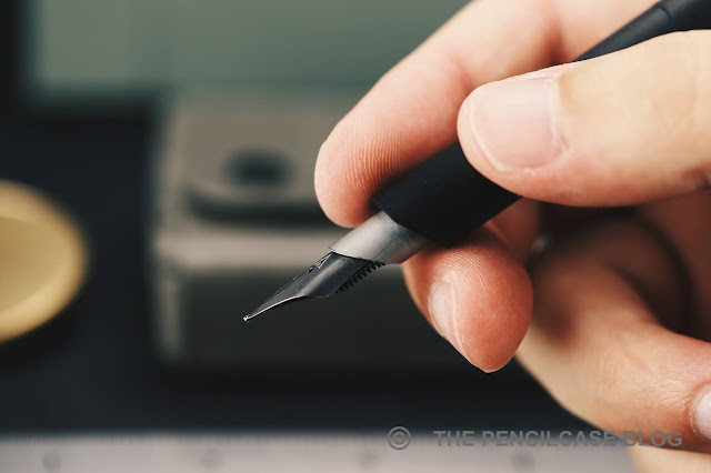
In terms of comfort, it's not at all a bad writer, but I found it remarkable how often I had to adjust my grip to not hold it right on the edge of the carbon fiber section. The nib sits recessed in a stainless steel tube (also cut at an angle, a nice touch!) that protrudes from the CF outer sleeve.
 |
| The section starts further back than on a typical pen with a #6 nib... |
 |
| ...which interferes with my grip |
But while the nib doesn't really extend that far out from the section, the angled cut on the bottom of the CF sleeve (where my middle finger rests) does run quite far back on the bottom of the section. That requires you to hold the pen further back relative to the nib, which takes some time to adjust to (and keep in mind that I already tend to hold my pens relatively far back anyway!).
The titanium nib (There's no coherent information about the nib supplier, but I assume it's Bock-made, despite it being paired with a feed that doesn't seem to be from Bock) has a clean appearance with very simple "V" branding in the middle - befitting of the overall minimal aesthetic of the pen. The nib on my test pen was excellent. A recent review from Anthony over at UK Fountain Pens pointed out different behavior, but my test pen wrote pretty much flawlessly out of the box. Ink flow is ample and consistent, the nib was properly tuned and aligned for a smooth writing experience, and the titanium nib provides a slightly cushioned writing experience.
The bottom line of the Venvstas leaves me wondering how much novel design is simply too much? As it stands, I feel like 249€/ 240$ without VAT (from our site sponsor Appelboom) is not a terribly high price considering you get a piston-filled pen with titanium nib (a 14k gold nib version is available at a 150€ premium). And the out-of-the-box design is interesting for sure, but it seems like they made peace with a few too many structural compromises to stay true to that purist design ideology. Compromises that continuously distraught me from the joy that I should've experienced from a unique product like this, but instead left me frustrated most of the time.
 |
| Space-age looks! |
The bottom line of the Venvstas leaves me wondering how much novel design is simply too much? As it stands, I feel like 249€/ 240$ without VAT (from our site sponsor Appelboom) is not a terribly high price considering you get a piston-filled pen with titanium nib (a 14k gold nib version is available at a 150€ premium). And the out-of-the-box design is interesting for sure, but it seems like they made peace with a few too many structural compromises to stay true to that purist design ideology. Compromises that continuously distraught me from the joy that I should've experienced from a unique product like this, but instead left me frustrated most of the time.
Nonetheless, Venvstas being a relatively young brand, coming from a one-man operation (now being made by an industrial manufacturer, though), I think there's still plenty of opportunity for improvement. A lot of the issues are seemingly easy to fix, IF Venvstas perhaps dares to step away from the envisioned ideal design in favor of a few more functional details. And if they do, I'll gladly revisit my opinion.


Lovely review. When you’re a picky pen enthusiast, all aspects need to be considered at this price point. My latest fountain pen acquisition was one of the best $32 ever spent. Cheers!
ReplyDelete