Showing posts with label affordable fountain pen. Show all posts

Tuesday, October 19, 2021

REVIEW: GRAVITAS ENTRY FOUNTAIN PEN

REVIEW: GRAVITAS ENTRY FOUNTAIN PEN

I've been lucky enough to be able to follow Ben Walsh quite closely on his journey to get the Gravitas brand off the ground. Chatting and exchanging ideas with him on the regular got me a glimpse of the creative mind behind the brand. Ever since starting Gravitas in 2020, one of Ben's goals was to create a more affordable fountain pen to stand alongside the self-titled 'Gravitas' fountain pen (reviewed HERE) that started the brand. A more accessible option into the Gravitas brand (and an entry point into fountain pens, in general), while still being able to live up to the highest quality standards. 
REVIEW: GRAVITAS ENTRY FOUNTAIN PEN

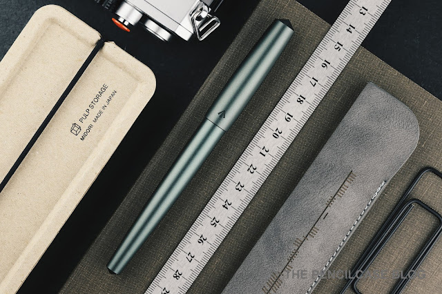
The Gravitas 'Entry' fountain pen is all those things - but it would be a mistake to call it an entry-level pen! Because that, it most certainly is not! Instead, the Entry manages to offer an incredible bang for the buck, a design that's easy on the eyes, and a lot of thoughtful design details I've come to expect from Ben's creations. 
REVIEW: GRAVITAS ENTRY FOUNTAIN PEN

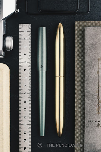
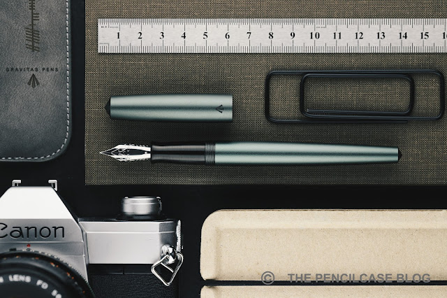
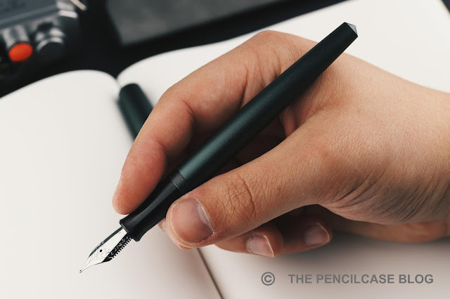
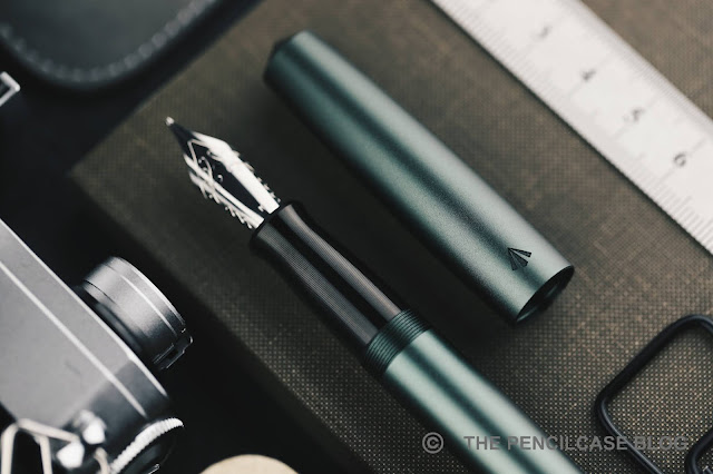
In the looks department, the sleek and nimble Entry is quite a departure from the chunky, ultra-minimal, torpedo-shaped Gravitas FP. The looks of the Entry are a bit more easily digestible, and perhaps even more traditional, which will undoubtedly make it appeal to a wider audience. It has a flat top design with rather sharp pointed finials on both ends (not that you could cut yourself on it, but they sure are pointy!). The cap has a slightly bulbous shape and is relatively short in comparison to the long and gently tapered barrel. The elegant, streamlined shape gives it somewhat of a brush pen vibe. 
REVIEW: GRAVITAS ENTRY FOUNTAIN PEN

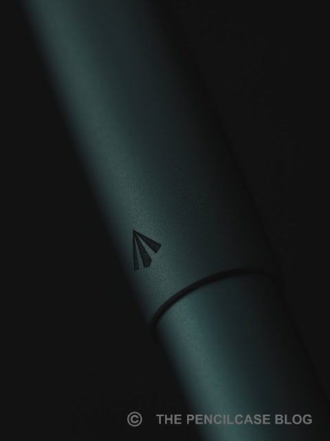
As for now, the Entry is available in a myriad of anodized colors on an aluminum basis. I chose the Olive grey colorway, which is a beautiful dark and muted green. If you want a bit more pop, look into the Gravitas signature 'Skittle' rainbow finish. The pen is bead blasted before being sent off to the anodizer, which creates a very smooth and satiny finish that I find very pleasant to the touch.
REVIEW: GRAVITAS ENTRY FOUNTAIN PEN
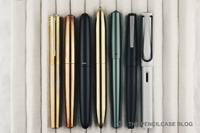
L to R: Karas Pen Co Ink, Namisu Nova, Ensso Piuma, Gravitas Gravitas FP, Gravitas Entry, Lamy 2000, Lamy Safari

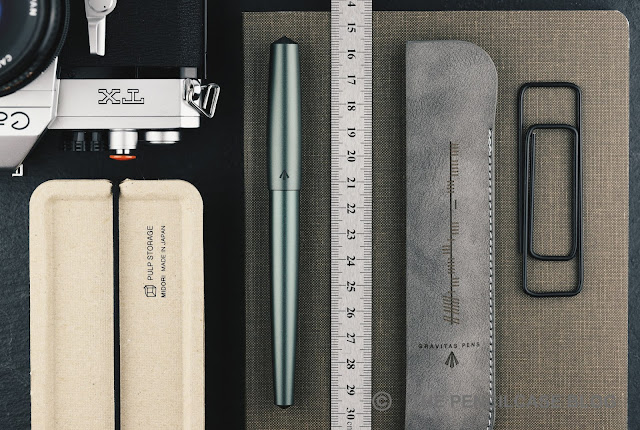
The Entry appears smaller but isn't. With a closed length of 14.5 cm (5.71"), it isn't all that much shorter than the oversized Gravitas FP. Uncapped, the Entry retains most of its length (13.8 cm/ 5.43"). Especially the narrower section (down to 9.8 mm/ 0.39" at the thinnest part of the taper) may trick you into thinking you're holding a much smaller pen. So if you prefer slightly thinner pens, the Entry has a high chance of appealing to you. At 31 grams, the Entry strikes a good balance between being nimble, yet offering just enough heft to let you know you're holding a solid metal pen. 
REVIEW: GRAVITAS ENTRY FOUNTAIN PEN
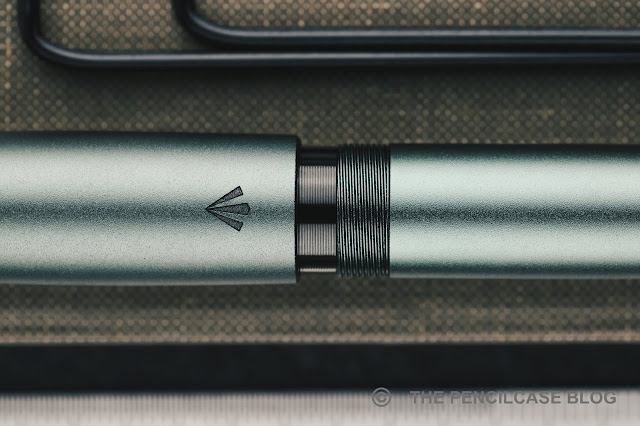
The smooth and streamlined transition from section to barrel offers a comfortable grip

The skinny tapered barrel of the Entry doesn't allow for the cap to be posted. But a pen this size doesn't really need to be posted anyway if you ask me. The Entry scores very high marks in the comfort department, with its long and gently tapered shape, a long section that transitions smoothly into a set of shallow and non-sharp threads. There's also no step that could interfere with your grip.
REVIEW: GRAVITAS ENTRY FOUNTAIN PEN

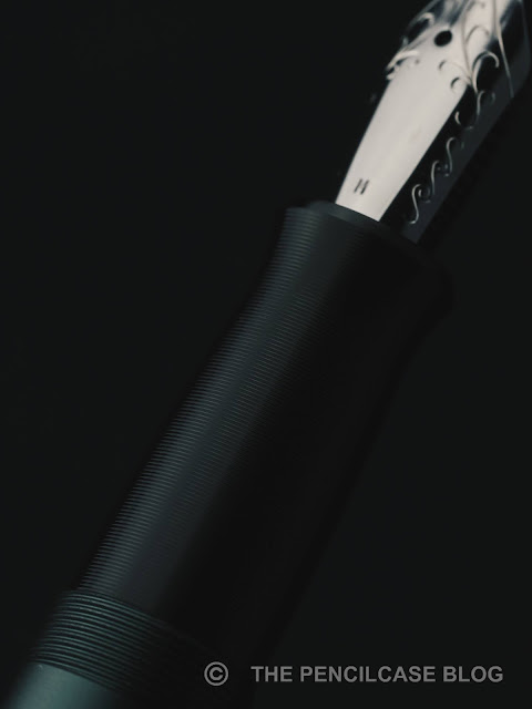
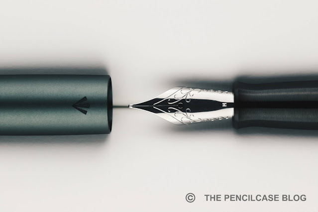
The stainless steel section deserves some attention here, as it really ties the entire pen together. The black-PVD coating provides a sleek look that pairs well with this anodized 'Grey Olive' colorway. If you're not a fan of metal sections, don't write the Entry off just yet! The section shape is similar to that of the Gravitas FP, but of course narrower. It has a nice gentle taper towards the nib, before flaring out again to catch your grip.

Talking about grip, this metal section is far from slippery! If you look closer, you'll notice the machined line pattern that runs around the entire length of the section. The pattern is very fine and not aggressive on your fingers, yet does an excellent job providing grip. The more dense stainless steel section, in combination with the aluminum barrel, shifts the center of gravity towards the grip section, creating a pen that feels lightweight and balanced in the hand.
REVIEW: GRAVITAS ENTRY FOUNTAIN PEN

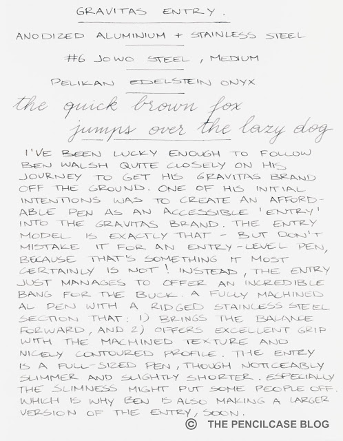
The original Gravitas FP prototype I reviewed a year ago, came with a steel Bock nib. But in the meantime, Ben switched entirely to JoWo nibs. Since many similar brands (such as Ensso or Namisu) stick to Bock, it's nice to see Gravitas provide some diversity on the market. Along with every pen, a small handwritten test paper is included, implying that every pen passes through a final QC before being shipped out. And indeed, I have only positive things to say about the writing experience! 
REVIEW: GRAVITAS ENTRY FOUNTAIN PEN

The medium steel nib on this particular pen wrote beautifully smooth and hassle-free out of the box. Even though in my experience, JoWo tends to offer rather consistent, properly set-up nibs, I still appreciate that Ben takes the time to check each one individually just to be sure. 
REVIEW: GRAVITAS ENTRY FOUNTAIN PEN

As mentioned at the beginning of this post, the Gravitas Entry comes in at a fairly accessible price point of 60€. For that money, you receive a sleek, solid metal pen with a stainless steel PVD-coated section, topped off by a hand-tested JoWo nib. Despite being a full-sized pen, its noticeably slimmer and more streamlined profile will undoubtedly appeal to those that find the Gravitas FP just too big. 

On the flipside, the rather slim profile of the Entry could also put some people off (it certainly took me some time to get used to!), though Ben also thought of that and designed the 'Gravitas Sentry': a slightly larger version of the Entry pen for those who prefer a more beefy pen, but with the same design cues as the Entry.

This product was sent to me by Gravitas so I could write this review. I was in no way influenced in the making of this review, the opinions shared in this review are completely my own! This post does not contain affilate links.
REVIEW: GRAVITAS ENTRY FOUNTAIN PEN

Sunday, April 4, 2021

REVIEW: LAMY SAFARI SAVANNAH & TERRACOTTA SPECIAL EDITIONS (2021)

REVIEW: LAMY SAFARI SAVANNAH & TERRACOTTA SPECIAL EDITION (2021) FOUNTAIN PENS
In the almost 8 years of existence of this website, I seem to have succeeded at - subconsciously - ignoring one of the most ubiquitous and widespread 'beginner' fountain pens on the planet: the Lamy Safari

Ok, I have done 'quick look' posts on some of the previous special editions throughout the years, but I've never actually made a complete and in-depth review about it. Despite that, the Lamy Safari has played an immense role in my pen journey throughout the years (and still does so today, as my father and I share a mutual hobby of collecting old special edition Safaris!), and it embodies a lot of what I seek in a true 'workhorse' pen. I guess, because it's so ubiquitous, the Safari is just a pen I've always taken for granted.

So today, while we take a look at 2021's Terracotta and Savannah special edition Lamy Safaris - two colors that immediately got me very excited! - I'll go a bit more in-depth on why I like this pen so much. Before we dive deeper into some of the details of the new Safari special editions, I'd like to thank sponsor of the blog, Penworld, for providing these pens for review!

REVIEW: LAMY SAFARI SAVANNAH & TERRACOTTA SPECIAL EDITION (2021) FOUNTAIN PENS
Unfortunately, EU customers don't get the same pretty packaging as the American and Asian regions (Why Lamy?), so enjoy this gratuitous detail shot of the cap finials instead!

Let's start at the beginning: the Safari is a textbook example of a love-it-or-hate-it design, but that's also what makes it so interesting. The Safari goes at the Bauhaus design with an extra dose of brutalism and modernism (strong Oscar Niemeyer vibes) added to the mix: pronounced flats and angles, exaggerated proportions,...

REVIEW: LAMY SAFARI SAVANNAH & TERRACOTTA SPECIAL EDITION (2021) FOUNTAIN PENS
... absurdly large 'paperclip' clip,
REVIEW: LAMY SAFARI SAVANNAH & TERRACOTTA SPECIAL EDITION (2021) FOUNTAIN PENS
... and in-your-face branding on the back of the barrel. And yet, somehow, there's something strangely attractive about it.
REVIEW: LAMY SAFARI SAVANNAH & TERRACOTTA SPECIAL EDITION (2021) FOUNTAIN PENS
The Safari has of course seen every single color of the rainbow over the years, but only two are true grail pens for the wintered Safari collector. Like so many Lamy Safari aficionados, my dad and I never found the two OG Lamy Safari colorways, Savannah and Terracotta (the two original colors released in 1980). To be honest, they may be a bit too grail-like, as prices for the original Savannah and Terracotta go insane on the second-hand market. That is, if you'd even find one for sale! Against all odds, Lamy seems to have actually listened to what the pen community wanted to see, so I'm VERY excited to see a re-release of the Savannah and Terracotta. Heck, for once they might really be listening, as we even saw rumors of a new colored 2000 (though I'll refrain from getting too excited about that just yet... they can still botch it like they did with the Bauhaus release!).

The argument you can hear left and right that this re-release will have a negative impact on the collectibility of the highly sought-after originals? I don't think so. True collectors will know how to spot the differences ('Germany' marking on the bottom, slightly different finial, etc), and the originals are so hard to find, I think this will just create even more awareness and demand to track those down...

In terms of how close the colors actually are to the originals? Well, I - unfortunately - don't own any of the originals, but from the few comparisons online, it seems that the Terracotta is quite spot-on, while the Savannah looks to be a touch less olive-green than the original (though in real life, it certainly looks olive-green to my eye). 
REVIEW: LAMY SAFARI SAVANNAH & TERRACOTTA SPECIAL EDITION (2021) FOUNTAIN PENS
The Safari is a medium-sized pen, fitting in perfectly with some of my other favorite starter pens, like the Pilot Metro, and TWSBI Eco. The Safari measures just shy of 14 cm/ 5.5" capped, and retains a comfortable size of 12.9 cm/ 5.1" when uncapped. It weighs just 17 grams in total, thanks to the all-plastic (ABS), injection-molded construction. The cap posts securely and rather deep (it covers the entire 'LAMY' logo), which - together with the light weight - makes this one of the more comfy pens to use posted.
REVIEW: LAMY SAFARI SAVANNAH & TERRACOTTA SPECIAL EDITION (2021) FOUNTAIN PENS
The section is nice and long, and transitions seamlessly (well, not seamless, but without a step... You get what I mean!) into the barrel. The diameter of the section is a bit tricky to translate into numbers, but it roughly tapers from 12 to 10 mm towards the nib. Talking about the section: just like the general design of the Safari, the section is quite controversial.

The pronounced triangular profile definitely favors a more 'traditional' tripod grip, so that's certainly something to keep in mind if you tend to hold your pen in a funky way. With my - fairly standard - grip, the Safari has always clicked very well. Even though shaped grips are typically regarded as a beginner feature, I still enjoy the controlled and precise grip it provides.
REVIEW: LAMY SAFARI SAVANNAH & TERRACOTTA SPECIAL EDITION (2021) FOUNTAIN PENS
The firm - but fairly quiet - snap cap, as well as the ink window through the barrel, are both useful features to have on a workhorse 'EDC' pen. Additionally, I find the Safari beats the AL-star (another controversial debate!) due to its sturdy and durable injection-molded ABS construction. Especially the matte finish on the Savannah and Terracotta (and many other Safari colorways), is particularly good at hiding signs of wear and tear, though they do become shinier over time! In contrast, I'm always a bit nervous about putting a dent or scratch in the thin aluminum construction of the AL-Star.
REVIEW: LAMY SAFARI SAVANNAH & TERRACOTTA SPECIAL EDITION (2021) FOUNTAIN PENS
Lamy nibs are well-known to provide a subtle amount of pencil-like feedback while you write, which I actually enjoy. They are very responsive, reliable nibs with a well-balanced ink flow. I especially enjoy the fine nibs, which lay down a nice medium-fine, crisp line of ink. In the grand scheme of things, Lamy's nibs aren't exceptional in any way, but they do what they have to do without hesitation, and they're easy and cheap to swap out, too. Certainly another reason why the Safari makes for a reliable workhorse pen!
REVIEW: LAMY SAFARI SAVANNAH & TERRACOTTA SPECIAL EDITION (2021) FOUNTAIN PENS
While I'm still a bit ashamed that it took me this long to do a full review of the Lamy Safari, I'm fairly confident that my general sentiment on them hasn't really changed in all those years. Ok, I may have found the last two years of the Safari special editions (the Pastel and Candy trio's) a bit lackluster, but the re-release of the iconic Terracotta and Savannah are a perfect way to reaffirm my love for the bold and playful - perhaps a bit fugly - workhorse of a pen that is the Lamy Safari. Yes, I think it still absolutely deserves its status as one of the best affordable fountain pens on the market.

The Safari Savannah and Terracotta comes in a choice of fountain pen, roller, and ballpoint, but not the mechanical pencil. In Europe, the special edition fountain pens retail for 20.9€ (at Site Sponsor Penworld, use discount code 'pencilcase' for 10% off!), which is about one euro more than the standard colorways. Overseas, the US price seems to be the same regardless of the color you choose, although you do pay more across the board, just under 30$.

Note: Penworld is a sponsor of this site. I received a discount on this purchase, which enabled me to write this review. I was in no way influenced in the making of this review, the opinions shared in this review are completely my own! This post does not contain affiliate links.
REVIEW: LAMY SAFARI SAVANNAH & TERRACOTTA SPECIAL EDITION (2021) FOUNTAIN PENS

Saturday, January 9, 2021

REVIEW: PARKER IM FOUNTAIN PEN + GIVEAWAY!

 REVIEW: PARKER IM FOUNTAIN PEN + GIVEAWAY!

In the 1900's, Parker used to be one of the brands to beat, with amazing pens - coveted to this day - like the Vacumatic, Duofold, and the Iconic Parker 51 (the latter actually making its return soon!). But the market has changed since then, and nowadays, Parker is no longer in the prominent position they once had. Especially among pen enthusiasts and collectors, their modern pens receive fairly little attention - understandable, as Parker has been focused on the low-to-mid tiers (like the quintessential, Parker Jotter), and especially recently directed their focus at a business-y 'young professionals'-type of audience. The really iconic models from back in the day are mostly gone nowadays, with the exception of the Duofold (which I reviewed HERE), although it seems to remain more in the background.

That's not a knock on Parker's business model, it just shows that they cater to a different, wider audience, not just the more avid enthusiasts like me and you. In fact, it's Parker's status as 'that one pen brand everyone knows' that makes their entry- and mid-level pens quite interesting to review. After all, pens like the Jotter and Parker IM are so prevalent, chances are that these have been, or will be, the gateway pen into the hobby for a lot of beginning pen enthusiasts! 
REVIEW: PARKER IM FOUNTAIN PEN + GIVEAWAY!
So let's take a look at the Parker IM, then. These pens were sent to me for review by Parker themselves. This model has been a fixture within Parker’s collection, with surprisingly little changes throughout the 10+ years of its existence. The IM today, still looks and feels very familiar to the IM I used to write with in high school back in 2009 or '10. 
REVIEW: PARKER IM FOUNTAIN PEN + GIVEAWAY!
The design of the IM represents a fairly simple and straight shape, with subtle tapers towards the chunky, unadorned finials that end in a flat top. 

The ballpoint mimics that design for the most part, down to the 'center band' that breaks up the transition from the straight barrel towards the strongly tapered, glossy plastic section. Parker went through a complete rebranding a few years ago, and that brought along a few minor changes to the design, such as the two thin lines in the center band, but mostly saw the introduction of new co
lorways and finishes. 
REVIEW: PARKER IM FOUNTAIN PEN + GIVEAWAY!
The standard version of the IM comes with a plastic section now
The most prominent change to the IM is the separation of the collection in two distinct tiers: the standard versions, and the 'premium' versions. While the IM that I had in high school (I lost it, unfortunately) had a brushed metal section (thus making it a fully metal pen), the standard IM now comes with a plastic section with plastic threads. Credit where credit is due: the plastic section shows no injection moulding marks, and is nicely polished. But the threads look like they could be a weak point in the design, and show some wear from threading into the metal barrel threads after a while. If you want a metal section, you have to bump up to one of the Premium finishes. The Premium IM looks quite different from the regular versions, finished with a geometric pattern engraved on the cap and barrel, it has a bit more, ehm, 'pizzazz'... but also comes at a rather substantial uptick in price. I'd keep my recommendation with the more subdued finishes of the standard versions.
REVIEW: PARKER IM FOUNTAIN PEN + GIVEAWAY!
In general, the IM is a very business-appropriate pen. The design is sober and unobtrusive, and the different colorways (with the exception of the more elaborate Premium finishes) are mostly subtle and dark tones that would work well in any professional environment. In that regard, Parker caters perfectly to its target audience, but perhaps they're not exciting enough for real pen-addicts? Talking about finishes, the pens that were sent to me are part of the latest 'Achromatic' collection. In their effort to modernize the brand, these black and grey matte finishes with sleek black PVD trims, fit right in. The black-on-black Achromatic is my personal favorite, for a very modern and unassuming look. 
REVIEW: PARKER IM FOUNTAIN PEN + GIVEAWAY!
L to R: TWSBI Eco, Faber-Castell Loom, Pilot Metropolitan, Parker IM ballpoint, Parker IM fountain pen/rollerball, Lamy Safari, Lamy 2000, Lamy Studio
From the size comparison shots, it shows that the IM is not a particularly large pen - at least the fountain pen and capped rollerball aren't. With a capped length of just 13.7 cm/ 5.39", and 11.8cm / 4.65" uncapped (the rollerball is a few mm longer when uncapped, measuring 12cm/ 4.73"). The section isn't too long and allows your grip to move forward towards the nib, which makes it a bit less obvious that the pen is really quite short. In this instance, posting the cap is actually a very valid way to create a more full-sized pen (although it may scratch the matte finish of the barrel in the long run). Posting transforms the IM into a 15.4cm/6.06" long pen, which is comfortable and not too long, and the balance remains very centered in the hand. The section is on the thinner side, tapering down to just 9mm/ 0.36" towards the front. It does transition quite nicely into the barrel, with a minimal step that's not at all bothersome in my grip. 
REVIEW: PARKER IM FOUNTAIN PEN + GIVEAWAY!
The ballpoint is a slightly different story, as it isn't particularly small at 13.6cm/ 5.36" closed, and 13.8cm/ 5.49" open, the barrel has a comfortable diameter a little over 11mm/ 0.44", though it tapers down rapidly if you hold it closer towards the front. 

The fountain pen and rollerball weigh 26 and 31 grams, respectively. The ballpoint is the lightest, weighing in at 23 grams total. That's not too heavy for mostly metal pens. But considering their smaller footprint, it's enough to make the IM feel solid and durable. Fit and finish are excellent on all pens. Two minor remarks I found: specifically on the all-black version, the matte black coating on the cap and barrel does tend to wear near the edges, showing the brass base material underneath. And the ballpoint has a slight rattle inside the mechanism when it's deployed, but it isn't too audible while writing.
REVIEW: PARKER IM FOUNTAIN PEN + GIVEAWAY!
The IM (fountain pen and rollerball) have a snap-cap. I've always liked how the cap of my old IM closed, and I'm happy to see that it still has that nicely damped and smooth action when you put the cap on, with a muffled but reassuring *clack* at the end. The cap sits on tight and secure, and there's no play or wobble to it.
REVIEW: PARKER IM FOUNTAIN PEN + GIVEAWAY!
The fountain pen uses Parker's proprietary refills, and requires a pretty expensive converter (not included) if you want to use bottled ink.
REVIEW: PARKER IM FOUNTAIN PEN + GIVEAWAY!
On the writing end, the capped rollerball (far left), and ballpoint (far right), are pretty much what-you-see-is-what-you-get. Parker obviously knows how to make a decent refill, and so both write quite well. The rollerball lays down a consistent, crisp, dark black line on good quality paper (rollerball refills have a tendency to feather on cheaper copy paper). The blue, 1.0mm ballpoint refill is also fairly standard-issue, with a line that's not as dark as I'd maybe like, but it's at least fairly consistent and writes without blobs or stutters. For the ballpoint, I'd be tempted to swap it out for a Parker-style gel ink refill, such as Parker's own gel refill - as I prefer gel ink over ballpoint.

The most interesting here is of course the fountain pen, so let's take a little more time to talk about that. First of all, the nib on the IM has seen quite a drastic change in shape and styling, coming from the narrow, almost tubular nib designs that Parker used to use on their lower-end offerings (The 2009 example on Parkerpens.net - a fantastic reference for old Parker models - shows what the old nib used to look like). This current version of the IM has a more normal, flared-out nib shape, and the three arrow-shaped lines engraved on the nib face offer a modern look that matches the rest of the IM's clean and simple design.

The nib - while larger than the old-style nib - is noticeably small (not uncommon for pens in this price range) but does perform exactly the way it should. The steel, black-coated nibs are nails and don't provide much character. Line widths run true to western sizes, but unfortunately, the IM only comes with F or M nib options. The nibs offer just a little feedback and are smoother than I expected (Black coatings usually add some 'texture' and create a bit more feedback). Ink flow is nicely balanced and keeps up without fault. More importantly, I was pleasantly surprised by the sheer reliability of this pen. The nib doesn't seem to dry out at all, even after a couple weeks of not being in use - I’m pleasantly surprised. 
REVIEW: PARKER IM FOUNTAIN PEN + GIVEAWAY!
The Parker IM is a no-nonsense pen, in a way that I'd perhaps come to expect from Parker. The design is inoffensive, business-appropriate, and - if I'm being critical - almost a bit unremarkable, if it weren't for the Achromatic color scheme that adds a modern and sleek look. I really don't have anything to complain about these pens though. They do what they're supposed to do, which is perhaps the most important aspect of a pen in this low-to-mid-tier price range! 

The Parker IM ballpoint, rollerball, and fountain pen retail for 28€/34$, 37€/45$ and 50€/61$ respectively (at our site sponsor Penworlduse discount code 'pencilcase' for 10% off your order!). While that's substantially more than I remember paying for my original IM fountain pen back in 2010, I think it's not an outrageous price, although it shouldn't be any higher (the Premium IM is an additional 30$, which is simply too much to justify for a metal section and different finish). It may be difficult for the Parker IM to stand out from the crowd in a price range where there's a lot of serious competition from pens like the Faber-Castell LoomLamy Lx, or even something like the more affordable TWSBI Eco, but that doesn't make the IM any less of a valid option to look into.

Now, for the GIVEAWAY...

Enter the Rafflecopter Widget below for your chance to win a full set of Parker IM Achromatic pens in black: one fountain pen (medium nib) + one rollerball + one ballpoint (total value 140$!). The prize in this giveaway is generously provided by Parker. Participating is simple: all you have to do for a chance to win, is enter in the Rafflecopter widget below and complete one or more tasks, easy peasy! The more tasks you complete, the more chances to win! This giveaway will run for one week, starting today.

a Rafflecopter giveaway

RULES: Open worldwide! Giveaway ends 17/1/2021. The winner will be chosen at random, and announced in a separate post. The winner will be contacted directly via email, if he/she fails to reply within one week, a new winner will be picked. Only entries with a valid email address are eligible to win. Invalid entries are denied. Giveaway open worldwide, but please note that shipping times will depend strongly on the destination, due to COVID restrictions.

This product was sent to me by Parker so I could write this review. I was in no way influenced in the making of this review, the opinions shared in this review are completely my own! This post does not contain affilate links.
REVIEW: PARKER IM FOUNTAIN PEN + GIVEAWAY!

Sunday, August 30, 2020

REVIEW: TWSBI DIAMOND 580 SMOKE ROSE GOLD II FOUNTAIN PEN REVIEW

Courtesy of Appelboom, a TWSBI Diamond 580 Smoke Rose Gold II (or RG II in short) landed on my desk. I have to admit, it's been a hot minute since I last reviewed a TWSBI... heck, it's been a hot minute since I last held a TWSBI in my hand! Not that I don't have a couple TWSBI's laying around, but for some reason, none of them have been in rotation in the past year or so. Maybe being spoiled for choice as a pen blogger is the main 'hindrance' (hey, you won't hear me complain!) that prevents me from picking up the sleek 580Al (review HERE), uber-functional and fun Eco (review HERE), or even the hugely underrated GO (that I probably should review at some point).
In my defense, TWSBI hasn't exactly been churning out new and innovative products in recent years.  Their last pen to really impress me was the Go, but that too was already quite a while ago. So perhaps I was just getting a bit bored. TWSBI's current strategy seems to involve exploring different, sometimes more luxurious, materials and trendy finishes for the existing models in their catalog, and you can hardly argue with the effectiveness of said strategy - every new special edition Eco colorway seems to sell like hotcakes (I too, have to admit being quite tempted by the new Cement Grey Eco)!
So, as I was saying, TWSBI occasionally takes one of their established models and puts them in a  more luxurious, shinier outfit. Seemingly in an effort to bump them up into a slightly more premium category. Yes, the Smoke Rose Gold II is the most expensive version of the Diamond 580 to date, but not so much so that it takes away from the value proposition we've come to expect from the Taiwanese brand.
If you can't see the ink sloshing around in the barrel, is it really a TWSBI?
The name of the TWSBI Diamond 580 Smoke Rose Gold II is about as self-explanatory as it is long: You get the demonstrator 580 you're probably familiar with by now, but with the inclusion of a smokey, translucent grey cap, section, and piston knob that contrasts against the transparent faceted barrel. Ultimately the color of the ink dictates the look of the pen, put a darker ink in it, and the result is an overall darker, sleek-looking pen, 
The darker resin is offset by a bit of bling that is the rose gold trim. Interestingly, the Smoke Rose Gold inherits the 580Al's aluminum piston mechanism - also rose-gold plated for the occasion - but not the 580Al's metal section. I guess too much rose gold would be too much. The plated aluminum of the piston has a slightly different color than the other rose gold plated trim, but it's not too distracting from the overall picture. Everything combined, this is a pretty stylish - and photogenic! - pen. I'm not gonna lie, that's not something I ever expected to say about a TWSBI! 
L to R: Platinum #3776 Century, TWSBI Diamond Mini, TWSBI Eco, TWSBI Diamond 580 RG II, Lamy Safari, Lamy 2000
Picking up the 580 to write instantly feels familiar again. The slight resistance in the first turn of the cap due to the rubber o-ring that seals it airtight, the subtle texture of the faceted barrel, and a reassuring bit of weight you might not immediately expect from a 'plastic' pen... Ah yes, this feels familiar! 

Over the years of me ignoring the Diamond 580, I almost forgot that this is a really comfortable pen to use! It's actually a fairly large pen, at 14.3 cm/ 5.63" capped, and 13 cm/ 5.12" uncapped. The grip is relatively short but has a decent diameter and comfy profile. The transition from section to barrel is only interrupted by a set of threads that are barely noticeable in the hand. Making it a comfortable pen to hold, even if you grip slightly higher up like I do. I find the 580 to be more than long enough to use unposted - Luckily because while the cap can post, it sits quite far back on the barrel and throws off the balance of the pen. 
Maybe the one thing, above everything else, that makes me wonder why I don't use my TWSBI's more often is the nib! All the way from the most inexpensive TWSBI Go, to this most decked-out model, I've never come across one that didn't write flawlessly out of the box. In particular, I have a soft spot for TWSBI's 1.1mm stub nibs (it's a shame they never brought back the excellent 1.5mm stub!). The 1.1mm stub on this 580 RG II - rose gold plated to match the rest of the pen - is no different. It's a consistent and smooth writer that provides a very precise and crisp line variation. The heavier ink flow of the stub nib pairs perfectly with the 580's large ink capacity.
It's impressive to realize that in all those years, the 50$ standard version of the TWSBI Diamond 580 is still... 50$! It never went up in price (at least not as far as I know). If standard versions aren't your cup of tea, the 85$ Smoke Rose Gold II is an easy upgrade to recommend. It's still a lot of pen for relatively little money, and the rose gold trim successfully adds some flair to the utilitarian-looking Diamond 580. 

As usual, pricing isn't quite consistent depending on where you are in the world. Pricing from EU-based retailers like Appelboom is unfortunately quite a bit higher across the board, with the RG II retailing for 109€ (105$ without VAT) - that's quite a mark-up! Regardless, in the current market where steel-nibbed pens regularly fetch 300$ or more, even the most expensive TWSBI is still an excellent bargain if you ask me. Now excuse me while I go fill up one of my own TWSBI's again!
Note: This product was sent on loan by our site sponsor Appelboom, so I could write this review. I was in no way influenced in the making of this review, the opinions shared in this review are completely my own! This post does not contain affiliate links.