Showing posts with label Appelboom pens. Show all posts

Friday, May 21, 2021

REVIEW: OPUS 88 JAZZ DEMONSTRATOR FOUNTAIN PEN

REVIEW: OPUS 88 JAZZ DEMONSTRATOR FOUNTAIN PEN
No matter how many Opus 88 pens go through my hands, time and time again I'm impressed with their fun designs and impeccable quality! I particularly enjoy seeing their demonstrator models whenever they come up with a new model, those always inevitably pop up, though sometimes only after a while. 

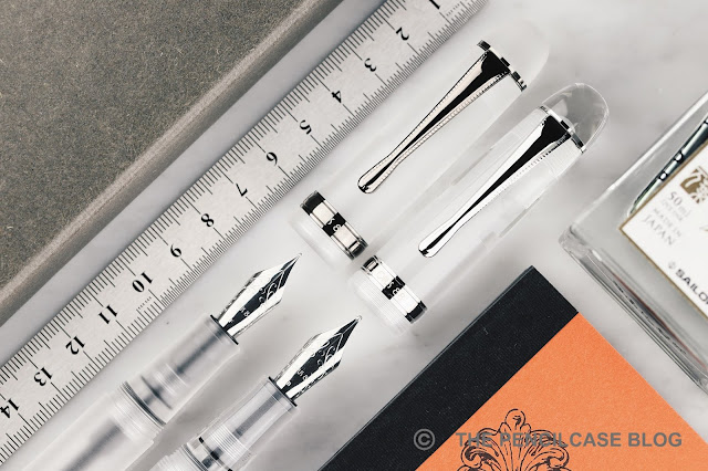
In the case of the Opus 88 Jazz, it took them a short while to move on from the translucent tortoiseshell acrylics they first released this model in, but they did make up for the lost time by immediately releasing two demonstrator versions instead of one: The Opus 88 Jazz 'Clear', and the frosted Jazz 'Holiday Clear'! My thanks go out to Opus 88 for sending me both pens to check out!
REVIEW: OPUS 88 JAZZ DEMONSTRATOR FOUNTAIN PEN
The Design of the Jazz is possibly one of the most 'classic' approaches to a fountain pen that we've seen from Opus, yet. It takes after traditional cigar-shaped pens, with a slightly tapered bulbous shape and large rounded finials. In fact, it has some likeness to the Penlux Masterpiece Grande I reviewed not too long ago (HERE)

The Jazz features a bit more ornamental trims than you typically find on an Opus pen, with a decorative band on the cap, above the clip (separate from the ring that actually connects the clip to the cap) and above the blind cap. 
REVIEW: OPUS 88 JAZZ DEMONSTRATOR FOUNTAIN PEN
The rounded center band is a new addition for Opus 88, and its minimal logo engraving perhaps looks a bit empty on the standard opaque colorways of the Jazz - but it does match to the clean look of the demonstrator versions, I find. The teardrop-shaped clip with knurled sides makes its return from one of the first pens that kicked things off for Opus, the Koloro. 
REVIEW: OPUS 88 JAZZ DEMONSTRATOR FOUNTAIN PEN
I firmly expected Opus to follow their current trend of releasing demonstrator pens with matte black trims, but the Jazz is the exception to that rule, with standard silver-colored trims. This once again adds to the more classic design of the Jazz, and it's not a bad choice IMHO, if not that it does make it the odd one out when put next to the Demonstrator and Omar Demonstrator.
REVIEW: OPUS 88 JAZZ DEMONSTRATOR FOUNTAIN PEN
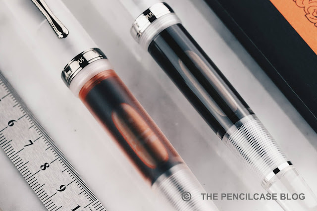
The Jazz 'Holiday Clear', which is the frosted/matte version of the Jazz demonstrator (I don't quite understand the reasoning behind the name?) gets ruthenium-colored trims - though polished, so still not quite like the matte black trims of the other Demonstrator pens. All demonstrator pens from Opus already come with frosted innards, though the addition of a matte finish on the outside gives the Holiday an even more uniform and opaque look, contrasting strongly with the polished, dark trims. Of course, the biggest difference is how the Holiday Jazz FEELS in the hand, the soft matte surface texture sets it apart completely from the other versions. The matte finish is quite uniform across the entire pen, living up to the excellent construction standards of Opus, once more.
REVIEW: OPUS 88 JAZZ DEMONSTRATOR FOUNTAIN PEN
L to R: Leonardo Momento Zero Grande Pura, Penlux Masterpiece Grande, Opus 88 Omar, Demonstrator, Jazz, Montblanc 149, Pelikan M805, Lamy Safari, Lamy 2000
It's no secret that Opus 88 likes to create large -very large-, oversized pens, so it'll come to no surprise that the Jazz is also a very big pen. Though, even besides the already large Demonstrator and Omar, the Jazz is still a decent bit longer. Strangely though, because of the more streamlined design, it doesn't feel too big (though of course that boils down to personal preference!).

At 15.1 cm/ 5.95", it's unapologetically oversized, though, that's more or less a given with Opus. Without the cap, you're left with a pen that's 13.3 cm/ 5.24" long, which is more than comfortable for even a large hand. If you're feeling adventurous, you could still post the cap, though it doesn't post awfully deep so you'll end up with a ridiculously long pen! At 28 grams, the Jazz is surprisingly quite a bit lighter than the smaller Opus 88 Omar. 
REVIEW: OPUS 88 JAZZ DEMONSTRATOR FOUNTAIN PEN
L to R: Opus 88 Demonstrator, Omar, Jazz
The section design of the Jazz is again (almost) identical to those on a lot of their other pens: a decently sized section with a nicely pinched taper that transitions smoothly into the threads. There's a bit of a step behind the threads and it can be quite sharp depending on how you hold the pen, a bit unfortunate on an otherwise very comfortable pen!
REVIEW: OPUS 88 JAZZ DEMONSTRATOR FOUNTAIN PEN
The barrel size of the Jazz is visibly shorter than the Demonstrator and Omar
Interestingly, despite the Jazz being the largest of the three, it still loses to the Demonstrator and Omar when it comes to ink capacity. You can actually see that the barrel part of the Jazz is noticeably shorter, likely due to the proportions of the pen. 
REVIEW: OPUS 88 JAZZ DEMONSTRATOR FOUNTAIN PEN
Now admittedly, 3 mL is hardly anything to scoff at, but it is indeed less than the 3.5mL of the other two models. The Japanese eyedropper filling mechanism continues to be a fantastic trade-off between huge ink capacity, while still keeping a practical advantage over traditional eyedroppers.
REVIEW: OPUS 88 JAZZ DEMONSTRATOR FOUNTAIN PEN
Compared to the last Opus 88 pen I reviewed -the Opus 88 Flow-, the Jazz returns to the camp of JoWo for the nib choice (in fact, all demonstrator models so far have exclusively used JoWo nibs). An excellent nib choice that also implies that this pen should be suited for conversion to a Pilot parallel nib (a fun feature I've discussed extensively in my review of the Omar). The broad nib I tested on the Jazz Clear worked flawlessly out of the box, and pairs great with the large ink capacity Japanese eyedropper.
REVIEW: OPUS 88 JAZZ DEMONSTRATOR FOUNTAIN PEN
The Opus 88 Jazz takes all the elements that I've liked before -and continue to like- about Opus' oversized, demonstrator, Japanese eyedropper-filled fountain pens, and crams it into a design that's actually remarkably traditional and 'normal' (for their doing). Their interpretation of a classic cigar-shaped fountain pen works well, even though it's not quite as eye-catching as the more unique styles of the Omar, Flow, or Bela. It's an inoffensive design and it works especially well in these two clear demonstrator finishes. As always, one of the main reasons of appeal for me continues to be the competitive pricing of Opus pens: for 108€/ 104$ (at site sponsor Appelboom, use discount code 'friend' for 10% off!), you really do get a whole lot of pen for your money!

Note: This product was sent by Opus 88, so I could write this review. I was in no way influenced in the making of this review, the opinions shared in this review are completely my own! This post does not contain affiliate links.
REVIEW: OPUS 88 JAZZ DEMONSTRATOR FOUNTAIN PEN

Sunday, October 11, 2020

REVIEW: LEONARDO CUSPIDE FOUNTAIN PEN

REVIEW: LEONARDO CUSPIDE FOUNTAIN PEN
I'm a huge fan of Leonardo Officina Italiana and I think it's more than safe to say that I'm not alone with that sentiment. Leonardo makes exceptionally good pens, that start at a - for this day and age - relatively good value-for-money price point. But apart from the incredibly popular Momento Zero (reviewed HERE) and Furore, they're also making a name for themselves in the higher segment - the price range where typical luxury Italian brands tend to (or used to) reside - with various limited and small-batch releases in the past year or two. Leonardo's higher-end pens are absolute attention-grabbers, and don't shy away from unique materials and finishes... their latest Cuspide being no exception!
REVIEW: LEONARDO CUSPIDE FOUNTAIN PEN
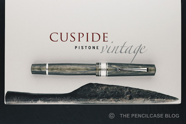
Standard packaging for the Cuspide, but it does depict the inspiration for the Cuspide material!
I typically tend to hesitate just long enough for those releases to sell out before I can empty my wallet on them, but just like with the Momento Zero Grande Art Deco, the Cuspide was an instant-buy for me. I immediately messaged Joost from Appelboom to secure a spot on the pre-order list - Thanks for penabling, Joost! 
REVIEW: LEONARDO CUSPIDE FOUNTAIN PEN
The new Cuspide is all about the material I think, and - to me at least - it falls right in line with a few other brands' recent efforts to bring innovative and unique materials to the table. I've talked before about Montegrappa's creation of Montegrappite, and Pineider's Arco Oak acrylic, both offering something that might be able to take over the holy grail status that celluloid enjoys right now.

The 'Cuspide' material is made up of multiple layers of colored acrylic, fused together with black resin. I went with the Olive Green finish, which is one of four colors available (along with Nocciola, Mineral Grey and Blue Sea), each of which is characterized by a very obvious pearlescent swirl. The layered pattern and contrast inside the material do indeed remind me of Omas' famed Arco Bronze and Arco Verde celluloid. The name 'Cuspide'  - or cusp - refers to the "rounded point" shape (hence the spear tip on the packaging!) that returns quite clearly in the layers of the material.
REVIEW: LEONARDO CUSPIDE FOUNTAIN PEN
The Olive green colorway, being the darkest of the four, is probably the least contrasting finish available, but the way the material is cut still brings out the 10 to 15 layers that make up the acrylic rods. I do quite like the toned down and rustic look of the Olive green though. The material is befitting for a model that overall harkens back strongly to classic fountain pen designs of the 20th century.

Trims on the Cuspide are available in gold or rhodium plating. The gold trim inevitably adds to the pens' vintage look. In the end, I went with the rhodium finish, which I think pairs extremely well with the Olive Green material.
REVIEW: LEONARDO CUSPIDE FOUNTAIN PEN
The Cuspide next to the Momento Zero Grande 2020 in the 'Sand' colorway - both fantastic materials!
The Cuspide isn't based on a model that's otherwise available as a standard edition from Leonardo. It's maybe easiest to compare it side by side to the Momento Zero Grande (I reviewed the old style MZ Grande HERE, but pictured above is the new 2020 version!), but you'll see that the design is not as similar as you might expect at first...
REVIEW: LEONARDO CUSPIDE FOUNTAIN PEN
The Cuspide doesn't have pointed finials, for example.
REVIEW: LEONARDO CUSPIDE FOUNTAIN PEN
The barrel doesn't have a long tapered shape like the Furore or even Momento Zero, but rather widens subtly towards the middle of the barrel, before tapering down slightly towards the piston knob. The keen eye might also notice that the narrow clip of the Cuspide is a bit longer than the one on the Momento Zero Grande.  
REVIEW: LEONARDO CUSPIDE FOUNTAIN PEN
The most notable difference between the Momento Zero Grande and Cuspide is of course the dramatic cap-to-barrel transition from the relatively thick cap to the much narrower barrel of the Cuspide. The harsh transition is quite a departure from the sleek and streamlined transition on the Momento Zero and Furore (Grande) - which is also really the only criticism I have about this pen. The cap lip is a bit TOO sharp. It's also the only negative mark in terms of fit and finish, that I could find. The pen as a whole is far from poorly made, but that cap lip definitely would've benefitted from just the slightest rounded edge, to make it a bit less harsh to the touch.
REVIEW: LEONARDO CUSPIDE FOUNTAIN PEN
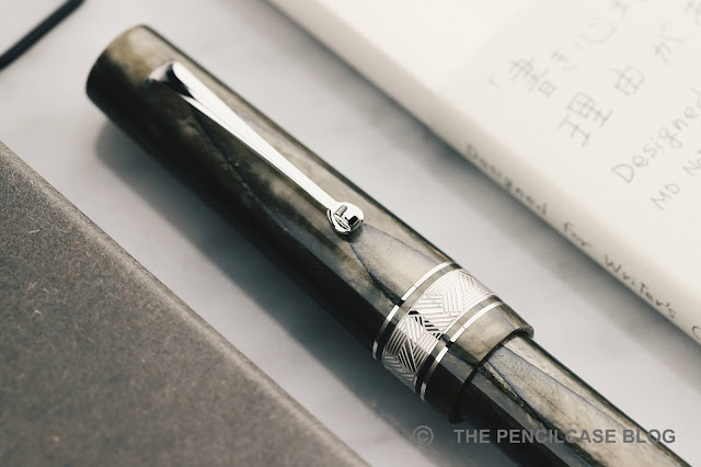
As with a lot of limited releases from Leonardo, the cap band gets a unique engraving to set it apart. I particularly like the "crosshatched" triangle pattern on the wide center band (accompanied by two adjacent thinner bands), the same pattern also returns on the band just above the piston knob. I found it especially quirky that the lines in the pattern are slightly irregular by design, so some lines are slightly wider than others - somehow it creates a slightly more intricate look. Another interesting detail - or lack thereof - is that the Cuspide isn't branded on the barrel as usual. In fact, the only branding on the entire pen is in the nib engraving. 
REVIEW: LEONARDO CUSPIDE FOUNTAIN PEN
The Cuspide's 'Classic' piston left, versus the MZ Grande's piston right.
As all larger pens in Leonardo's current lineup (the Cuspide is technically not called a 'Grande' model, but it is almost the exact same size as a Momento Zero Grande), the Cuspide comes equipped with a piston. Interestingly, it's not the same as those on the standard Momento Zero Grande and Furore Grande models. The so-called 'classic' piston mechanism has no metal internals, yet feels more substantial and precise when operating. The piston knob turns smoothly and with just the right amount of resistance to let you feel that you're actually doing something (in other words: it doesn't feel like a captured converter!). I don't know what exactly makes it Classic, but it works very well so I have no complaints here. The ink capacity is a bit lower: 1.2 mL, compared to the 1.5 mL of the regular piston mechanism. 
REVIEW: LEONARDO CUSPIDE FOUNTAIN PEN
L to R: Pelikan M1005, Maiora Impronte, Leonardo Momento Zero, Momento Zero Grande, Furore Grande, Cuspide, Lamy Safari, Lamy 2000
The Cuspide measures 14.8 cm/ 5.83" capped, and 13.4 cm/ 5.28" uncapped, which makes it just a smidge shorter than the MZ Grande, but it's still a considerably large pen. While the Cuspide's maximum diameter around the cap band is the same as on the MZ Grande (16.75 mm/ 0.66"), the barrel is notably narrower. At 30 grams, the Cuspide is fairly lightweight and nimble for its size and is about 5 grams less than the MZ Grande.
REVIEW: LEONARDO CUSPIDE FOUNTAIN PEN
Weird place to put the LE number, but the section design is great!
Underneath the cap, the Cuspide also sports an entirely different design. You get metal threads here, which is perhaps the only element on the entire pen that sort of breaks with the 'vintage' styling of the Cuspide. The threads aren't block-cut, but they aren't particularly sharp, either. The section transitions in one almost seamless flow into the threads, and then the barrel, so it's a fantastically comfortable pen to hold and write with. 

Talking about the section: it has a more traditional, slightly tapered design with a pronounced flare towards the nib, which is perhaps the first time Leonardo steps away from their typical two-stage section shape. The section doesn't taper down much, so with an average diameter of about 12.5 mm (0.5"), it's noticeably wider in the hand than the Momento Zero, where I find my grip gets pushed towards the narrower part of the section.
REVIEW: LEONARDO CUSPIDE FOUNTAIN PEN
The Cuspide comes with a Jowo- sourced 14k gold nib. Aesthetically speaking, it's not the most interesting nib to look at, but that's really the only criticism I can come up with. It would've been nice to see the crosshatched pattern also return on the nib imprint. Similar to the Grande models - sits on an ebonite feed that's made in-house, which is one of my favorite features of the 295€ MZ Grande, but it's even better paired with this excellent gold nib. I went with a broad nib here, which is rather stiff as most JoWo nibs tend to be, but it's glassy smooth and the ebonite feed provides an incredibly rich, wet flow (possibly even too wet for some!). 

It's smooth, it lays down a consistent, broad line, the feed keeps up perfectly, and the nib doesn't seem to dry out over the course of a couple days either... Except for looks, it's an excellent nib in any way possible IMHO. And no, before you ask, Appelboom's in-house nib specialist Anabelle doesn't tune any nibs on pens that I review (although if you purchase a pen from Appelboom, definitely make use of the free "tune & smooth" option on the order page, so you're sure every nib will perform as it should!).
REVIEW: LEONARDO CUSPIDE FOUNTAIN PEN
The Leonardo Cuspide is a limited edition of just 70 pieces per color. But even at the indisputably steep price of 850€ (820$ without VAT from Appelboom), I'm sure these will move fast! You can probably tell I'm having a hard time finding negatives about this pen - believe me, I tried! If anything, the Cuspide has to go against rather strong competition from Leonardo's own pens. The 295€ Momento Zero Grande for example (494€ with a gold nib, for apples-to-apples comparison): also a well-built pen with piston and ebonite feed that comes in a variety of lovely materials. Maybe that does cannibalize a few of their own sales, but it doesn't make the Cuspide any less great. I really enjoy the vintage-inspired design of the Cuspide (come to think of it, that's also what drew me to the Art Deco!), and the layered acrylic is stunning. Above all, the out-of-the-box writing experience is spot-on. What's not to like?
Appelboom pens
Note: Appelboom is a sponsor of this site. I received a discount on this purchase, which enabled me to write this review. I was in no way influenced in the making of this review, the opinions shared in this review are completely my own! This post does not contain affiliate links.
REVIEW: LEONARDO CUSPIDE FOUNTAIN PEN

Sunday, August 30, 2020

REVIEW: TWSBI DIAMOND 580 SMOKE ROSE GOLD II FOUNTAIN PEN REVIEW

Courtesy of Appelboom, a TWSBI Diamond 580 Smoke Rose Gold II (or RG II in short) landed on my desk. I have to admit, it's been a hot minute since I last reviewed a TWSBI... heck, it's been a hot minute since I last held a TWSBI in my hand! Not that I don't have a couple TWSBI's laying around, but for some reason, none of them have been in rotation in the past year or so. Maybe being spoiled for choice as a pen blogger is the main 'hindrance' (hey, you won't hear me complain!) that prevents me from picking up the sleek 580Al (review HERE), uber-functional and fun Eco (review HERE), or even the hugely underrated GO (that I probably should review at some point).
In my defense, TWSBI hasn't exactly been churning out new and innovative products in recent years.  Their last pen to really impress me was the Go, but that too was already quite a while ago. So perhaps I was just getting a bit bored. TWSBI's current strategy seems to involve exploring different, sometimes more luxurious, materials and trendy finishes for the existing models in their catalog, and you can hardly argue with the effectiveness of said strategy - every new special edition Eco colorway seems to sell like hotcakes (I too, have to admit being quite tempted by the new Cement Grey Eco)!
So, as I was saying, TWSBI occasionally takes one of their established models and puts them in a  more luxurious, shinier outfit. Seemingly in an effort to bump them up into a slightly more premium category. Yes, the Smoke Rose Gold II is the most expensive version of the Diamond 580 to date, but not so much so that it takes away from the value proposition we've come to expect from the Taiwanese brand.
If you can't see the ink sloshing around in the barrel, is it really a TWSBI?
The name of the TWSBI Diamond 580 Smoke Rose Gold II is about as self-explanatory as it is long: You get the demonstrator 580 you're probably familiar with by now, but with the inclusion of a smokey, translucent grey cap, section, and piston knob that contrasts against the transparent faceted barrel. Ultimately the color of the ink dictates the look of the pen, put a darker ink in it, and the result is an overall darker, sleek-looking pen, 
The darker resin is offset by a bit of bling that is the rose gold trim. Interestingly, the Smoke Rose Gold inherits the 580Al's aluminum piston mechanism - also rose-gold plated for the occasion - but not the 580Al's metal section. I guess too much rose gold would be too much. The plated aluminum of the piston has a slightly different color than the other rose gold plated trim, but it's not too distracting from the overall picture. Everything combined, this is a pretty stylish - and photogenic! - pen. I'm not gonna lie, that's not something I ever expected to say about a TWSBI! 
L to R: Platinum #3776 Century, TWSBI Diamond Mini, TWSBI Eco, TWSBI Diamond 580 RG II, Lamy Safari, Lamy 2000
Picking up the 580 to write instantly feels familiar again. The slight resistance in the first turn of the cap due to the rubber o-ring that seals it airtight, the subtle texture of the faceted barrel, and a reassuring bit of weight you might not immediately expect from a 'plastic' pen... Ah yes, this feels familiar! 

Over the years of me ignoring the Diamond 580, I almost forgot that this is a really comfortable pen to use! It's actually a fairly large pen, at 14.3 cm/ 5.63" capped, and 13 cm/ 5.12" uncapped. The grip is relatively short but has a decent diameter and comfy profile. The transition from section to barrel is only interrupted by a set of threads that are barely noticeable in the hand. Making it a comfortable pen to hold, even if you grip slightly higher up like I do. I find the 580 to be more than long enough to use unposted - Luckily because while the cap can post, it sits quite far back on the barrel and throws off the balance of the pen. 
Maybe the one thing, above everything else, that makes me wonder why I don't use my TWSBI's more often is the nib! All the way from the most inexpensive TWSBI Go, to this most decked-out model, I've never come across one that didn't write flawlessly out of the box. In particular, I have a soft spot for TWSBI's 1.1mm stub nibs (it's a shame they never brought back the excellent 1.5mm stub!). The 1.1mm stub on this 580 RG II - rose gold plated to match the rest of the pen - is no different. It's a consistent and smooth writer that provides a very precise and crisp line variation. The heavier ink flow of the stub nib pairs perfectly with the 580's large ink capacity.
It's impressive to realize that in all those years, the 50$ standard version of the TWSBI Diamond 580 is still... 50$! It never went up in price (at least not as far as I know). If standard versions aren't your cup of tea, the 85$ Smoke Rose Gold II is an easy upgrade to recommend. It's still a lot of pen for relatively little money, and the rose gold trim successfully adds some flair to the utilitarian-looking Diamond 580. 

As usual, pricing isn't quite consistent depending on where you are in the world. Pricing from EU-based retailers like Appelboom is unfortunately quite a bit higher across the board, with the RG II retailing for 109€ (105$ without VAT) - that's quite a mark-up! Regardless, in the current market where steel-nibbed pens regularly fetch 300$ or more, even the most expensive TWSBI is still an excellent bargain if you ask me. Now excuse me while I go fill up one of my own TWSBI's again!
Note: This product was sent on loan by our site sponsor Appelboom, so I could write this review. I was in no way influenced in the making of this review, the opinions shared in this review are completely my own! This post does not contain affiliate links.


Friday, August 21, 2020

REVIEW: OPUS 88 FLOW FOUNTAIN PEN

REVIEW: OPUS 88 FLOW FOUNTAIN PEN
With Opus 88 creating pens that LITERALLY look like a flower vase these days, it's quite clear that they don't mind thinking outside the 'conventional design' box from time to time. The new (ok, new-ish, I'm late to the game, as usual!) Opus 88 Flow shows some signs of the creative madness, but is all in all still a rather tame beast - and I like it for that! The Flow is more or less the perfect balance between the oversized footprint of the Demonstrator (reviewed HERE) and Omar (reviewed HERE), combined with the funky, colorful, occasionally whacky, design of pens like the Fantasia (reviewed HERE) and Flora.
REVIEW: OPUS 88 FLOW FOUNTAIN PEN
Of all the Opus pens, the Flow has perhaps the least 'flowing' shape, with a straight overall profile. The Flow does get creative with a mix of both a decagonal faceted cap and blind cap, and a round section and barrel. It's enough to create a unique pen, but doesn't overdo it (read: it's not a vase!). The design is emphasized by a colorful material choice, combining an opaque colored resin for the decagonal parts and section, and transparent swirled ('Flow-y') resin for the barrel so you can still see the ink inside. 
REVIEW: OPUS 88 FLOW FOUNTAIN PEN
The red colorway I have here is a clear departure from the colorless demonstrator Opus pens I tend to stick with. I would personally go for the slightly more understated grey colorway, but I do have to admit that this red/yellow/black color scheme is quite fun and catches the eye, especially when filled with an equally colorful ink!
REVIEW: OPUS 88 FLOW FOUNTAIN PEN
The Flow doesn't have decorative metal bands like the Omar does, but instead receives a shiny chrome coin insert in the cap finial, with the words 'Flow - Opus 88' laser-engraved on it. Opus has a tendency to use a different clip design for every pen they create, most of which I tolerate but don't particularly love. While the clip on the Flow does follow the overall straight profile of the pen quite well, the grooved design is a bit too much in my opinion. The Flow is perhaps a missed opportunity to go for a clipless design, since the faceted cap prevents the pen from rolling away uncontrollably. Besides, the Flow isn't an ideal candidate for vest or pocket carry anyway, as it's quite a big pen.
REVIEW: OPUS 88 FLOW FOUNTAIN PEN
L to R: Pelikan M1000, Esterbrook Estie Oversized, Opus 88 Omar, Opus 88 Flow, Lamy Safari, Lamy 2000
Talking about size, the Flow measures in at 14.9 cm/ 5.83" capped, and 13.6 cm/ 5.35" open. The section is relatively wide - just like the rest of the pen- and tapers down to 1.1 cm/ 0.43" at the thinnest point, before flaring out slightly. With an all-acrylic construction, the Flow is - unsurprisingly - a rather light pen for its size, at just 28 grams.

The words 'well-executed' and 'excellently put together' tend to fall out of my mouth when describing the Flow, because the build quality is excellent. I probably keep repeating it to death with every single Opus 88 pen I review, but it's simply true, and it's certainly one of the things I very much appreciate about their pens. In fact, it manages to put many higher-priced pens to shame!

Just like the other oversized models from Opus, the Flow borrows a few parts from existing Opus pens. A bit like how car manufacturers build different cars on the same platform: it's cheaper to manufacture, and the parts are tried and trusted! In this case, the Japanese eyedropper mechanism, and barrel are plucked directly from the Opus Demonstrator. 

I wrongfully assumed the section to also be identical to that on the Demonstrator and Omar, but it's actually noticeably shorter. Why they decided to change it up, I have no idea, especially because I really like the Demonstrator and Omar for their comfortable section design. That being said, the Flow's shorter section still has a decent size and comfortable shape, and the threads and step don't interfere too much with your grip. Along with its overall substantial size (the Flow isn't made for posting, but doesn't need it), a pleasantly girthy diameter, and lightweight all-resin construction, the Flow still takes a lot of the design ques that tend to make Opus pens excellent for long writing sessions.    
REVIEW: OPUS 88 FLOW FOUNTAIN PEN
As all Opus 88 pens, the Flow is a Japanese eyedropper. The back of the barrel unscrews as you would with a piston filler, but the "mechanism" inside is nothing more than a rod with an o-ring stopper at the end that plugs off the barrel when the pen is not in use, and prevents the pen from leaking. It's a brilliantly simple mechanism, and Opus implements it perfectly in all their pens: the large barrel of the Flow means you won't run out of ink anytime soon, and the o-ring on the section prevents leaks.
REVIEW: OPUS 88 FLOW FOUNTAIN PEN
Interestingly, Opus has recently made a switch to Bock nibs for some of their pens - a bit like Leonardo does. The only reason I could think of that warrants using both nib brands, would be to lower the dependence on a single supplier? In any case, the Flow only comes with a Bock nib, that means no more Pilot Parallell hack, no more swapping in the awesome Franklin-Christoph music nibs, and probably some people that will hold off on buying simply because it has a Bock writing end. 

The Bock nibs come with a simple laser-engraved logo engraved on the nib face, which looks cleaner and in my opinion suits the overall design of the pen much better than the classic flourishes engraved on stock JoWo nibs. It's a small detail, but I do appreciate it.
REVIEW: OPUS 88 FLOW FOUNTAIN PEN
Regardless of your nib preference swinging towards the Bock or JoWo camp, there's not much to say against the performance of this medium Bock nib. The Japanese eyedropper filling mechanism certainly does output a steady flow of ink, but it doesn't feel like it has a substantially wetter flow than any other Bock nib. The medium nib is nothing out of the ordinary, but it's smooth, responsive and... well, it does the job the same way a JoWo nib would. While Bock nibs at a certain point were noticeably more soft and flexible (giving them a slight edge over JoWo IMHO), I've found them to be much stiffer these days (but at the same time, also perhaps a bit more reliable?).
REVIEW: OPUS 88 FLOW FOUNTAIN PEN
The Opus 88 Flow is another cool and unique pen from the Taiwanese company. I especially like the mix of faceted and round profiles in the design. The swirly demonstrator acrylics add a playful character to the pen, although I'd love to see an all-clear demonstrator version of the Flow to match the clear Omar and Demonstrator models! 

At 116/ 135$ (at Appelboom. Sweeten the deal with 10% off using discount code 'friend') retail price, the Flow provides a hard-to-beat value. It's no secret, I continue to appreciate Opus 88's efforts in creating excellent quality products that turn heads, one way or another. And as long as they keep making those incredibly well-made, oversized, and most importantly, affordable fountain pens, I will happily keep reviewing them!
Appelboom pens
Note: This product was sent on loan by our site sponsor Appelboom, so I could write this review. I was in no way influenced in the making of this review, the opinions shared in this review are completely my own! This post contains affiliate links.
REVIEW: OPUS 88 FLOW FOUNTAIN PEN