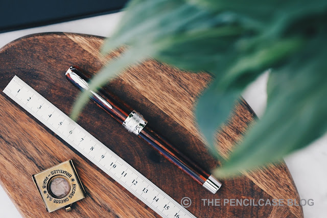
You know they say there's no such thing as negative advertisement? Well, ASC (Armando Simoni Club) proved this for me when they caused a bit of ruckus surrounding the -at that time- new Pineider La Grande Bellezza Arco Oak fountain pen... At that point, a pen that previously wasn't even on my radar, suddenly intrigued the hell out of me. I just had to check the Pineider out for myself to see what all that fuzz was really about. Did Pineider just use the reputation of Arco celluloid to make name for themselves, or did they really create a material that can compete with the ever-so scarce celluloid of all celluloids?
My thanks to La Couronne Du Comte for sending over this pen for me to check out!
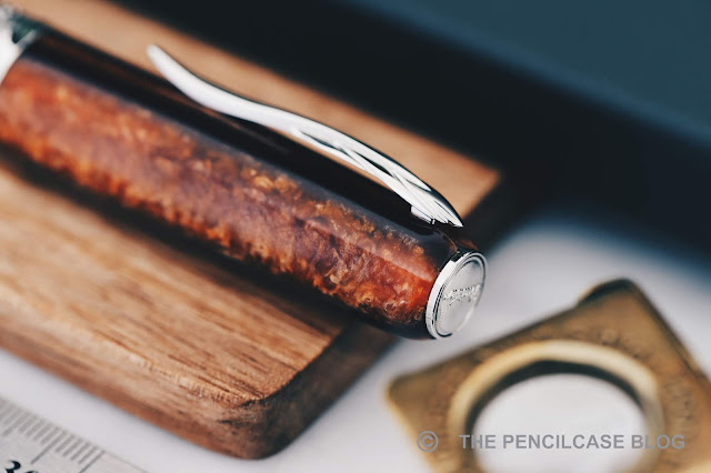
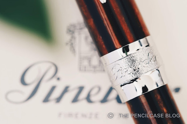
Pineider's Grande Bellezza is an interesting design. The cap is a cigar-like shape with rounded corners that ends in a flat medallion on the finial, while the barrel is fairly straight and ends in a slightly tapered, metal piston knob. The cap and barrel are visually separated by a very wide and ornately decorated center band. Details such as the center band or medallion cap finial are very obvious influences from Visconti. That of course makes total sense because Visconti's creative mastermind, Dante Del Vecchio, made the switch to Pineider a few years ago.

 |
| "The quick brown fox jumps over the lazy dog" |
 |
| Top to bottom: Omas Arco bronze celluloid, Pineider Arco resin, Montegrappa Shiny Lines celluloid. |
The star of the show is of course the 'Arco Oak' resin that was used for this limited edition of the Grande Bellezza. It's nice. It's not arco celluloid nice, but then again it also doesn't demand the same exhorbitant price that Arco celluloid does.
The Arco Oak has it's own charm. It shows depth and has plenty of chatoyance in the lighter brown layers, strongly dependent on how the light hits it. There's even a slight bit of translucency to it. Compared to arco celluloid, it's warmer in color, a bit darker too, and the layers are noticeably thicker and less crisply defined.
ASC bought the remaining stock of Omas' Arco celluloid, so they publicly expressed their discontent on social media when Pineider announced their take on Arco. My opinion? I don't think it hurts to have some competition from a new material on the market. But when push comes to shove, it's easy enough to tell the two apart. It's different enough so to not cause any reason for ASC to get nervous, and it certainly won't dethrone Arco celluloid. Yet in its own respect I think it's a very pretty material, and it clearly draws inspiration from the iconic celluloid.

 |
| L to R: Pelikan M805, Montegrappa Extra 1930, ASC Bologna Extra, Pineider La Grande Bellezza Arco, Lamy Safari, Lamy 2000. |

The metal section might scare some people off, but really it's quite a comfy one. The rhodium-plated metal is slick, but the section has a strong tapered shape and flares out towards the front to provide a positive stop for your fingers. There are no threads or annoying steps to get in the way of your grip. Behind the section you'll find a rather interesting ink window. It's basically a bunch of oval cutouts around the barrel that show the actual translucent ink window sitting recessed into the barrel. I looks like some kind of captured converter, but is non-removable of course. The edges of the ink window cutouts are a bit sharp, definitely noticeable when you grip the pen a bit higher up.
Talking about the filling mechanism, the piston knob is a bit odd. It's similar to the one found on the Montegrappa Extra, in that it doesn't screw in or out when it's turned. The piston operates smoothly, but doesn't have a very defined 'stop' like a normal piston mechanism where the piston knob just twists tight against the barrel -which is a bit odd.

The snap cap is one of my favorite design elements on the Grande Bellezza. Dante seems to have a thing for interesting capping mechanisms, because again magnetic caps are also quite commonly found on Visconti pens. This one is different from other magnetic caps I've used though. It uses a special configuration of magnets that attract and repel depending on the orientation. With about a quarter twist of the cap, the magnets push it off to almost create the feeling of a screw-on cap. It's a clever mechanism and it works quite well. The cap isn't held on super tight, but it doesn't open by itself or by accident.
Interesting seems to be the key word of this review, and it also describes the 14k hyperflex 'Quill' nib quite well. To quote Pineider: "The purpose of the new nib is clear..." -But it's most certainly not!
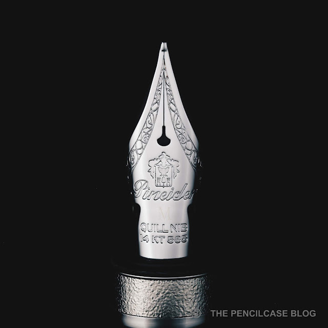 The nib has a classic imprint with the Pineider crest logo and some intricate flourishes. It has the geometry of a flex nib (long narrow tines, cutouts, special breather hole,...), and it's named Hyperflex for pete's sake! Yet oddly enough, Pineider doesn't actually market it as such. And they are right not to do so. Sure it allows for some line variation, but it's indeed not a true flex nib. More like semi-flex at best (although the line variation is probably better with the EF or F nibs, my test pen had a medium nib so that's not ideal).
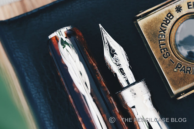 The nib seems a bit mushy to me. It's soft and has good snapback, but it doesn't feel super responsive. There is some pencil-like feedback when you write, which I find quite pleasant. Flow starts out quite heavy, but noticeably dials back after a few lines. It never really starves, but technically the feed (a stock plastic feed from Bock) could use some modification to keep up with the ink demand, especially when you push the nib for some line variation. It doesn't railroad too often when flexed, at least not when you take your time. To be honest, the Quill nib confuses me. Sure it's a pleasant writer for normal use, with the bouncy character providing comfort and subtle character to your writing. But then it also tries to be a flex nib and at the same time it doesn't... I don't quite follow in Pineider's reasoning.


The Pineider Grande Bellezza Arco Oak retails for 700€ (700$). That's a hefty 300€ premium for a piston filler and the Arco Oak resin. Of course if this was made from celluloid Arco, you'd probably be looking at a 1000$ pen, but that still doesn't make this a bargain. The Grande Bellezza is a limited edition of 888 pieces and has been around for a while, but can still be bought online (at least for the time being).
This product was provided on loan by La Couronne Du Comte, so I could write this review. I was in no way influenced in the making of this review, the opinions shared in this review are completely my own! This post contains affiliate links.


No comments:
Post a Comment