Showing posts with label La Couronne Du Comte. Show all posts

Tuesday, January 18, 2022

REVIEW: ONOTO MAGNA SEQUOYAH FOUNTAIN PEN

REVIEW: ONOTO MAGNA SEQUOYAH FOUNTAIN PEN
Oh boy, have I been eyeing Onoto pens for a loooong time, before finally pulling the trigger on this Onoto Magna Sequoyah LE last year! I'm kicking myself for not getting one sooner because these pens are everything they're hyped up to be, and then some... Although 'hype' is perhaps not the right word to use with Onoto, because they actually seem quite underrepresented within our community. As with other UK-based brands -like Conway Stewart or Yard-O-Led- Onoto seems to live somewhat in the shadows of the 'traditional' German, Italian or Japanese companies. It's anyone's guess as to why that is. But one thing is for sure, it definitely has nothing to do with the quality of their products, because Onoto certainly delivers in that regard!
REVIEW: ONOTO MAGNA SEQUOYAH FOUNTAIN PEN
Perhaps not coincidental, those three UK-based brands mentioned above have one thing in common: they all embody -what I'd consider- traditional British fountain pen design. Perhaps this more classic and conservative approach to fountain pen design might explain why they aren't more prominently represented on the market? But of course, that's down to personal taste. I, for one, really appreciate the display of Onoto's heritage within their products. 
REVIEW: ONOTO MAGNA SEQUOYAH FOUNTAIN PEN
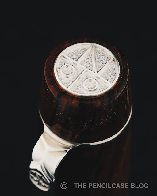
I love the stylized, modern-looking Onoto monogram in the sterling silver cap finial!
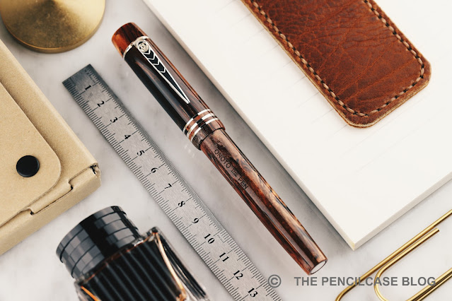
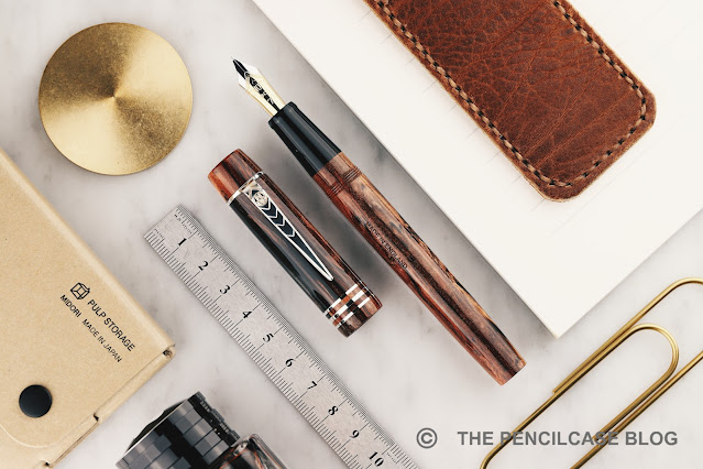
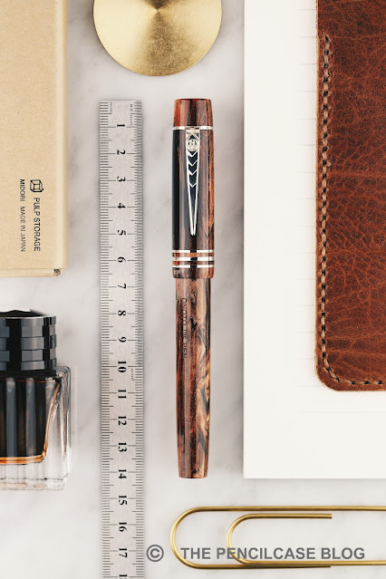
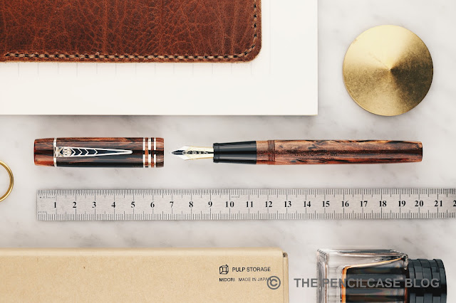
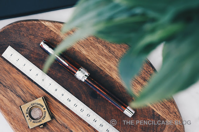
Talking about heritage: the Onoto Magna takes quite accurately after its vintage relative namesake. It's a fairly straightforward and simple flattop design, accentuated by sterling silver appointments. Like most other British brands, Onoto proudly displays their heritage and experience with sterling silver manufacture, which shines through -literally- on the precise details of the trim found on this pen. Every metal piece is made of silver: cap and barrel finials, the three cap rings, and a sterling silver clip with a raised chevron pattern. The silver appointments add a level of intricacy to the Magna's design, but are tastefully done and don't distract from the beautiful material this pen is made of.
REVIEW: ONOTO MAGNA SEQUOYAH FOUNTAIN PEN
While there's a myriad of choice in finishes for the Onoto Magna -from subtle and traditional solid color acrylics, to more colorful materials and even guilloché-engraved finishes-, for me this limited edition (200 pieces) 'Sequoyah' finish stands out as one of the most spectacular and eye-catching of them all. This was the pen I knew I had to have, from the moment I first laid eyes on it! 

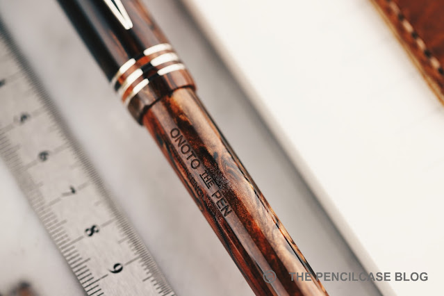
The pen is named after a Native American called 'Sequoyah', who established a written form of the Cherokee language. The material of the pen is inspired by the similarly-named Sequoia tree. The woodgrain-like brown acrylic is absolutely sublime. It has a surprising amount of shimmer in the warm, brown swirls, interlaced with dark streaks of solid black resin. The end result is a pen that genuinely looks like it's made from a piece of burlwood. 
REVIEW: ONOTO MAGNA SEQUOYAH FOUNTAIN PEN
The warm tone of the acrylic balances nicely against the sterling silver trims when the pen first arrives. But it doesn't take too long before a strong brown-ish patina (tarnish) begins to develop on the silver. While you can of course polish most of the trims with a jeweler's cloth to bring them back to shiny silver, it's not so easy to do so with the cap finial due to its deep texture and crisp edges. Therefore, it seems to me that the best option is just to let the material do its thing, with the patina bringing a very vintage-esque feeling to the pen.
REVIEW: ONOTO MAGNA SEQUOYAH FOUNTAIN PEN
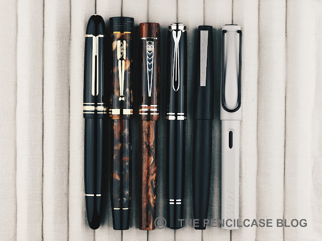
L to R: Montblanc 149, Conway Stewart Churchill, Onoto Magna Sequoyah, Pelikan M805, Lamy 2000, Lamy Safari
The Magna is an average-to-large pen, measuring 14 cm (5.53") closed - about the size of a Pelikan M800. I suppose the name 'Magna' (great) has more historical meaning than it is relevant on these current-day pens. With an uncapped length of 13.2 cm (5.19") it's a very decent size to use unposted. The cap can post if you really want to, but it makes for a considerably large 16.6 cm (6.54") pen.
REVIEW: ONOTO MAGNA SEQUOYAH FOUNTAIN PEN
Between this one and the few Onotos I briefly tried over the years, I've been consistently impressed with the absolutely impeccable build quality and finishing, as well as the excellent writing comfort they have to offer. The section has a comfortable diameter (12.5mm/ 0.49" at the back) with a straight taper towards the nib (down to 10mm/ 0.4"). The section transitions almost seamlessly into the barrel, where a set of rather shallow threads is the only thing that could possibly obstruct your grip - but it doesn't, because they're so well-finished. 
REVIEW: ONOTO MAGNA SEQUOYAH FOUNTAIN PEN
As a rather unique feature to finetune the writing comfort of the Magna, Onoto offers two weight options for the Magna pens, with an optional brass barrel, insert adding 7 grams to the 25 of the base version. I found my 25-gram version to be perfectly balanced in the hand, and light enough as to not cause any fatigue while writing. That said, because I do tend to lean towards heavier pens, I am curious to try out the 32g option at some point.
REVIEW: ONOTO MAGNA SEQUOYAH FOUNTAIN PEN
The Magna Sequoyah (and other versions of the Magna) fills using a standard international converter. Fine by me, though perhaps a bit plebeian on a pen as nice as this? There was once an option to upgrade to a plunger-filler I thought, but that no longer seems to be the case when I look at the Onoto site.
REVIEW: ONOTO MAGNA SEQUOYAH FOUNTAIN PEN
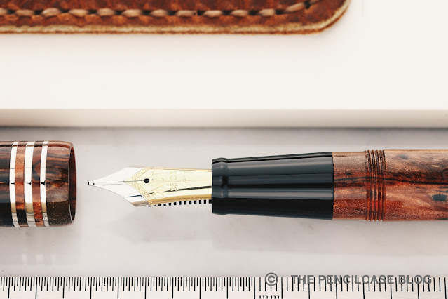
Another highlight (although if I'm honest, most aspects of this pen are highlights) of the Onoto Magna is the nib. I don't think they produce their own nibs in-house (it looks like a Schmidt nib unit?), but whatever they do, they do it right. The #6 (in Onoto numbers it's a #7 size) 18k gold nibs sits on a plastic feed that delivers a rich flow of ink, and it does so with flawless consistency. I went for a fine nib on the Sequoyah, and it's definitely a beefy western fine, so you might want to step down at least a size if you don't like your nibs to run wider. 
REVIEW: ONOTO MAGNA SEQUOYAH FOUNTAIN PEN
The fine nib on my pen is fantastically smooth and perfectly set up out of the box (and from what I can recall, so were the steel and gold nibs I tried in the past). The nib has a slight bit of bounce to it with normal writing pressure, but no real line variation to speak of. Particularly of note is that the nib doesn't seem to dry out, ever. I've had this pen inked up continuously for almost a year now, and there were times when it wasn't used for months, yet it always picked right up. 
REVIEW: ONOTO MAGNA SEQUOYAH FOUNTAIN PEN
I feel like I've been raving about this pen non-stop, but I can't help myself, it's simply THAT good! Nonetheless, to round up this review I did also find a couple minor quirks that are worth noting, though not particularly deal-breaking for me: For starters, the clip is pointy... a bit too pointy! I appreciate the overall shape and design, but the tip could've been rounded off just a bit more to prevent it from feeling sharp to the touch. I also fear it could damage fabrics if you clip it to a pocket a bit too incautiously. The second remark is one I've also read on Anthony's review of the Magna (UKFountainpens): the cap takes almost 3.5 full turns to unscrew. I'm not typically one to complain about this, but more than 3 turns really is quite a lot!
REVIEW: ONOTO MAGNA SEQUOYAH FOUNTAIN PEN
It took me a while, but I'm glad I finally pulled the trigger on an Onoto. The Onoto Magna Sequoyah manages to do so many things right, making for a fantastic all-around package. Beautiful burlwood-like acrylic, stunning sterling silver details, flawless construction, A+ writing comfort, and a perfectly tuned nib out of the box. It ticks all the boxes for me. 

The price of all that? A not-so-unreasonable 640€ (600$ without VAT for non-EU customers,  at La Couronne Du Comte. Use our discount code 'penthusiast' for 10% off!). I think that's a fair and competitive price for the complete package that the Onoto Magna has to offer. Also, note that that is the price for the 18k gold-nibbed version. On the Onoto website, you also have the option for a steel-nibbed version for 430€ (but the gold nib is where it's at, if you ask me!).
https://www.lacouronneducomte.com/
Note: La Couronne Du Comte is a sponsor of this site. I received a discount on this purchase, which enabled me to write this review. I was in no way influenced in the making of this review, the opinions shared in this review are completely my own! This post does not contain affiliate links.
REVIEW: ONOTO MAGNA SEQUOYAH FOUNTAIN PEN

Tuesday, October 8, 2019

REVIEW: PINEIDER LA GRANDE BELLEZZA ARCO FOUNTAIN PEN

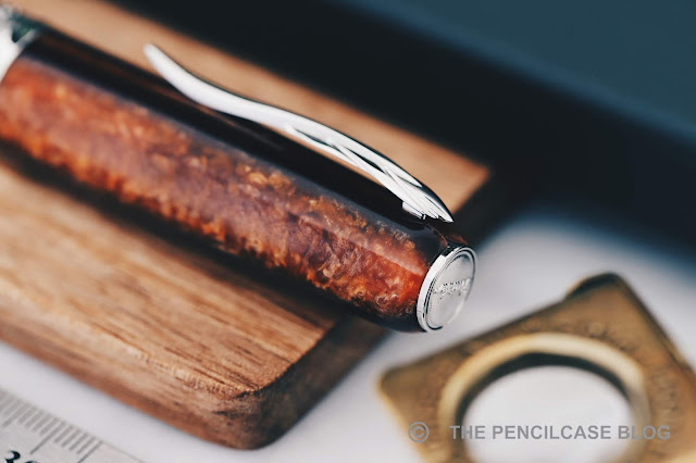
 Review: Pineider La Grande Bellezza Arco fountain pen
You know they say there's no such thing as negative advertisement? Well, ASC (Armando Simoni Club) proved this for me when they caused a bit of ruckus surrounding the -at that time- new Pineider La Grande Bellezza Arco Oak fountain pen... At that point, a pen that previously wasn't even on my radar, suddenly intrigued the hell out of me. I just had to check the Pineider out for myself to see what all that fuzz was really about. Did Pineider just use the reputation of Arco celluloid to make name for themselves, or did they really create a material that can compete with the ever-so scarce celluloid of all celluloids?

My thanks to La Couronne Du Comte for sending over this pen for me to check out! 
Review: Pineider La Grande Bellezza Arco fountain pen
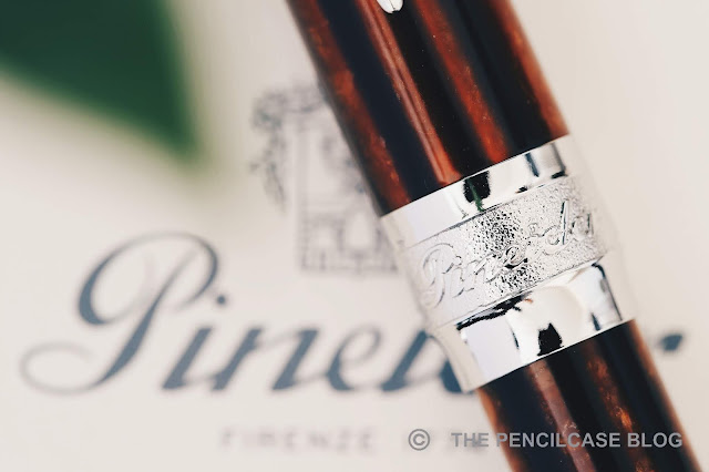
Pineider's Grande Bellezza is an interesting design. The cap is a cigar-like shape with rounded corners that ends in a flat medallion on the finial, while the barrel is fairly straight and ends in a slightly tapered, metal piston knob. The cap and barrel are visually separated by a very wide and ornately decorated center band. Details such as the center band or medallion cap finial are very obvious influences from Visconti. That of course makes total sense because Visconti's creative mastermind, Dante Del Vecchio, made the switch to Pineider a few years ago.
Review: Pineider La Grande Bellezza Arco fountain pen
The quill-shaped clip is another design element that really stands out. It looks slender and fragile from a distance, but it's actually solid metal and is spring-loaded so it's easy to clip onto something. The center band looks good from a distance, as I said very Visconti-esque with the writing in a textured background.
Review: Pineider La Grande Bellezza Arco fountain pen
"The quick brown fox jumps over the lazy dog"
But Pineider... please. 'The quick brown fox jumps over the lazy dog' engraved on the back of the center band? I write that in my reviews because I literally don't know what else I should write... surely there would've been other -less cliché- things Pineider could've put on there.
Review: Pineider La Grande Bellezza Arco fountain pen
Top to bottom: Omas Arco bronze celluloid, Pineider Arco resin, Montegrappa Shiny Lines celluloid.
The star of the show is of course the 'Arco Oak' resin that was used for this limited edition of the Grande Bellezza. It's nice. It's not arco celluloid nice, but then again it also doesn't demand the same exhorbitant price that Arco celluloid does.

The Arco Oak has it's own charm. It shows depth and has plenty of chatoyance in the lighter brown layers, strongly dependent on how the light hits it. There's even a slight bit of translucency to it. Compared to arco celluloid, it's warmer in color, a bit darker too, and the layers are noticeably thicker and less crisply defined.

ASC bought the remaining stock of Omas' Arco celluloid, so they publicly expressed their discontent on social media when Pineider announced their take on Arco. My opinion? I don't think it hurts to have some competition from a new material on the market. But when push comes to shove, it's easy enough to tell the two apart. It's different enough so to not cause any reason for ASC to get nervous, and it certainly won't dethrone Arco celluloid. Yet in its own respect I think it's a very pretty material, and it clearly draws inspiration from the iconic celluloid. 
Review: Pineider La Grande Bellezza Arco fountain pen
L to R: Pelikan M805, Montegrappa Extra 1930, ASC Bologna Extra, Pineider La Grande Bellezza Arco, Lamy Safari, Lamy 2000.
The Grande Bellezza measures 14.2cm (5.61") capped, and 13cm (5.11") uncapped. It's a large pen but not overly large, and has a comfortable girth. The metal parts on this pen certainly weigh in, with a total weight of 42 grams, although uncapped it's not too heavy and well-balanced in the hand. It's interesting to note that this piston-filler version of the Grande Bellezza is a few mm longer than the regular version due to the slightly different barrel design with the piston knob.
Review: Pineider La Grande Bellezza Arco fountain pen
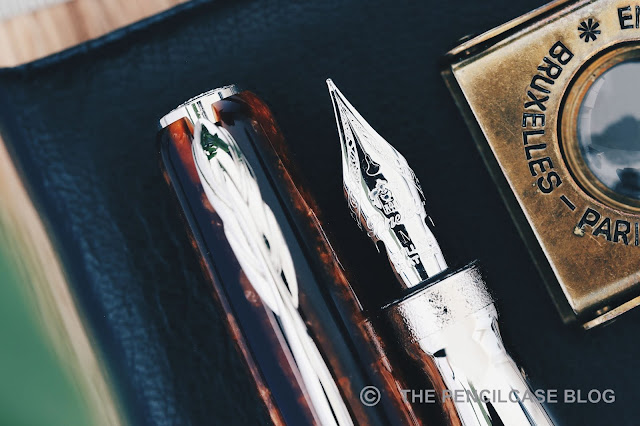
The metal section might scare some people off, but really it's quite a comfy one. The rhodium-plated metal is slick, but the section has a strong tapered shape and flares out towards the front to provide a positive stop for your fingers. There are no threads or annoying steps to get in the way of your grip. Behind the section you'll find a rather interesting ink window. It's basically a bunch of oval cutouts around the barrel that show the actual translucent ink window sitting recessed into the barrel. I looks like some kind of captured converter, but is non-removable of course. The edges of the ink window cutouts are a bit sharp, definitely noticeable when you grip the pen a bit higher up.

Talking about the filling mechanism, the piston knob is a bit odd. It's similar to the one found on the Montegrappa Extra, in that it doesn't screw in or out when it's turned. The piston operates smoothly, but doesn't have a very defined 'stop' like a normal piston mechanism where the piston knob just twists tight against the barrel -which is a bit odd. 
Review: Pineider La Grande Bellezza Arco fountain pen
The snap cap is one of my favorite design elements on the Grande Bellezza. Dante seems to have a thing for interesting capping mechanisms, because again magnetic caps are also quite commonly found on Visconti pens. This one is different from other magnetic caps I've used though. It uses a special configuration of magnets that attract and repel depending on the orientation. With about a quarter twist of the cap, the magnets push it off to almost create the feeling of a screw-on cap. It's a clever mechanism and it works quite well. The cap isn't held on super tight, but it doesn't open by itself or by accident.

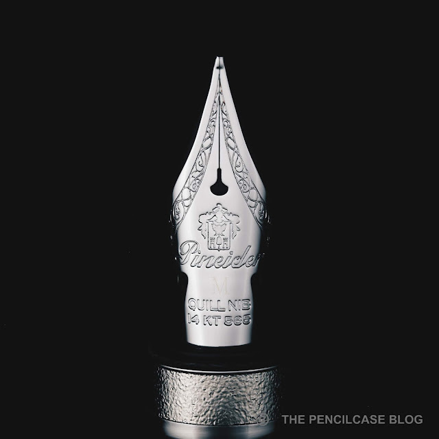
Interesting seems to be the key word of this review, and it also describes the 14k hyperflex 'Quill' nib quite well. To quote Pineider: "The purpose of the new nib is clear..." -But it's most certainly not!
Review: Pineider La Grande Bellezza Arco fountain pen
The nib has a classic imprint with the Pineider crest logo and some intricate flourishes. It has the geometry of a flex nib (long narrow tines, cutouts, special breather hole,...), and it's named Hyperflex for pete's sake! Yet oddly enough, Pineider doesn't actually market it as such. And they are right not to do so. Sure it allows for some line variation, but it's indeed not a true flex nib. More like semi-flex at best (although the line variation is probably better with the EF or F nibs, my test pen had a medium nib so that's not ideal).
Review: Pineider La Grande Bellezza Arco fountain pen
The nib seems a bit mushy to me. It's soft and has good snapback, but it doesn't feel super responsive. There is some pencil-like feedback when you write, which I find quite pleasant. Flow starts out quite heavy, but noticeably dials back after a few lines. It never really starves, but technically the feed (a stock plastic feed from Bock) could use some modification to keep up with the ink demand, especially when you push the nib for some line variation. It doesn't railroad too often when flexed, at least not when you take your time. To be honest, the Quill nib confuses me. Sure it's a pleasant writer for normal use, with the bouncy character providing comfort and subtle character to your writing. But then it also tries to be a flex nib and at the same time it doesn't... I don't quite follow in Pineider's reasoning.
Review: Pineider La Grande Bellezza Arco fountain pen
The Grande Bellezza is an interesting pen from a brand that wasn't on anyone's radar a couple years back. The arco resin is a respectable attempt at creating a more modern interpretation of Arco, and it looks good in its own right. But it's certainly not a definitive replacement of the 'real deal'.

The Pineider Grande Bellezza Arco Oak retails for 700€ (700$). That's a hefty 300 premium for a piston filler and the Arco Oak resin. Of course if this was made from celluloid Arco, you'd probably be looking at a 1000$ pen, but that still doesn't make this a bargain. The Grande Bellezza is a limited edition of 888 pieces and has been around for a while, but can still be bought online (at least for the time being).
This product was provided on loan by La Couronne Du Comte, so I could write this review. I was in no way influenced in the making of this review, the opinions shared in this review are completely my own! This post contains affiliate links.
Review: Pineider La Grande Bellezza Arco fountain pen

Friday, January 18, 2019

REVIEW: TWSBI ECO T FOUNTAIN PEN

Review: TWSBI Eco T fountain pen
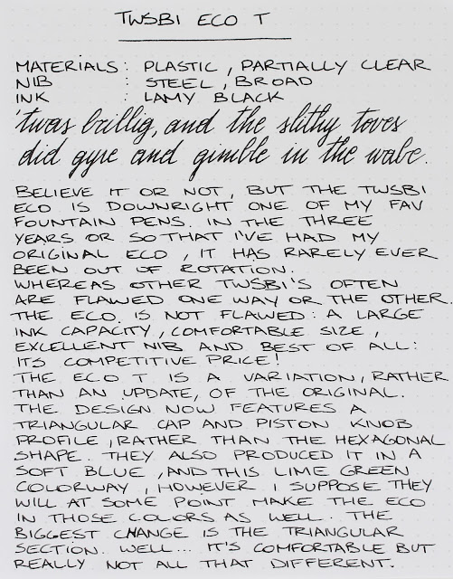
Believe it or not, but the TWSBI Eco (read my original review HERE) is perhaps one of my favorite everyday fountain pens. Sure, it won't win beauty contests, and it's not the most exciting writer in the world, but it's a powerhouse that simply functions extremely well. On top of that, the low price point makes it easily accessible for a large audience.

With the aptly named Eco T (T for Triangular), TWSBI aims to improve on the original design. Or well, maybe improve is a wrong way to put it. Rather, they are trying to make it more ergonomic for beginner fountain pen users, much like the Lamy Safari.
Review: TWSBI Eco T fountain pen
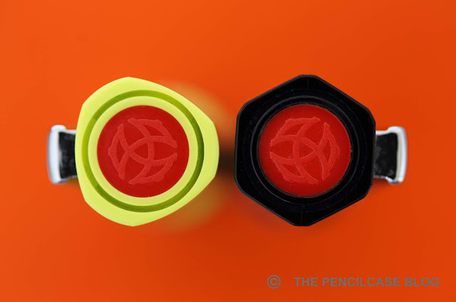
The design has largely remained the same, but the cap and blind cap now have a triangular profile instead of the hexagonal shape on the regular Eco. The grip section also has a slightly more triangular profile. Unfortunately, it's not an improvement on the rather meh design, but this yellow-green colorway is kind of fun (there's also a pretty neat light blue version available right now, but other than that, the color options aren't as varied as the regular Eco).
Review: TWSBI Eco T fountain pen
Can you see the difference? Left is the regular Eco, right is the Eco T
The more triangular shape of the section is supposedly to improve the ergonomics for beginner fountain pen users, but I found it difficult -if not impossible- to tell the new section on the Eco T apart from the old one (You be the judge in the photo above!). The improvement in ergonomics is equally minimal, but then again I never found the Eco to be uncomfortable in the first place. It guides your grip a bit more than the original, but not so much that it feels restrictive. It's definitely not as polarizing as the pronounced section shape of the Lamy Safari, so I think it should be a comfortable fit for most people.
Review: TWSBI Eco T fountain pen
L to R: Kaweco Brass Sport, TWSBI 580Al, TWSBI Eco, TWSBI Eco T, Lamy Lx, Lamy 2000
In terms of size, the Eco is a full-sized pen at 13,9 cm (5.5") closed and 13.2 cm (5.2") uncapped. The cap posts securely due to the rubber O-ring behind the piston knob, and it remains quite nicely balanced even when posted. However, I personally never felt the need to post the cap on this one. It's a lightweight plastic pen, coming in at 22g total, but it does feel surprisingly solid and sturdy.
Review: TWSBI Eco T fountain pen
The reason why I love the Eco (T) so much for everyday use is two-fold: For starters it's quite a tough pen. Even though it's one of the cheapest TWSBI offerings, it is also one of the most well-built and lacks the cracking issues that the more expensive models suffer(ed?) from. My original Eco is about three years old now, and it still stands strong after a LOT of use. The second reason I love the Eco is the massive ink capacity. The Eco is of course a piston-filler, and holds about 1.8ml of ink: more than twice the capacity of a standard international converter!
Review: TWSBI Eco T fountain pen
Not to forget, another good reason to look into TWSBI pens are the excellent nibs (I think they use JoWo nibs nowadays). I chose a broad nib on this particular pen, but have used pretty much all their nib sizes over the years and the writing experience is consistently reliable across the board. The broad steel nib is polished just enough to be both smooth and consistent. The ink flow is on the wetter side, but it's not a gusher. It's a stiff nib and it lacks character, but makes up for that with reliability. The rubber O-ring behind the threads helps to keep the cap tightly closed, but at the same time it also does an excellent job keeping the nib from drying out (even after multiple weeks of not being used, it starts up right away).
Review: TWSBI Eco T fountain pen
Even at 29$, you get a nicely presented package with wrench and silicon grease to service your pen
Few pens offer the kind of value for money that the TWSBI Eco does. More than 3 years after its release I still love everything about it: it holds up to everyday use, has a large ink capacity and writes reliably out of the box! The Eco T brings very little change to the original design, but why change something that is already quite excellent anyway? At 35€ (29$), it's one of the most affordable piston-filler fountain pens on the market. It's a great option, regardless of whether you are a long-time collector/user like me, or you just got into fountain pens and want to start using bottled ink.
Note: La Couronne Du Comte is a sponsor of this blog. I received this product free of charge. I was in no way influenced in the making of this review, the opinions shared in this review are completely my own! This post does not contain affilate links.
Review: TWSBI Eco T fountain pen

Wednesday, July 4, 2018

WINNER ANNOUNCEMENT: 5TH ANNIVERSARY GIVEAWAY #2

Winner announcement 5th anniversary giveaway #2
The second 5th Anniversary giveaway has come to an end! Thanks to everyone who participated, and big thanks to the kind folks over at La Couronne Du Comte, who sponsored this giveaway. Let's go straight to the announcement of the winners, because we have 11 prizes to give away!
La Couronne Du Comte
The Winners, as chosen by the Random number generator (in order of drawing): 

Roberta Toma
(@riropenne on Instagram)
Winner of the Faggionato PKS Turtle celluloid fountain pen!

Romina Peetz
Winner of a Leuchtturm A5 notebook!
Sean Y.
Winner of a Leuchtturm A5 notebook!
Andrew Young
Winner of a Leuchtturm A5 notebook!
Tatiana Ose
Winner of a Leuchtturm A5 notebook!
Fei Alangui
(@9Fei on Twitter)
Winner of a Leuchtturm A5 notebook !

Jon F.
(@batdoglouie on Instagram)
Winner of a set of Diamine inks!
Franka
(@dinnisje on Twitter)
Winner of a set of Diamine inks!
Johan O.
Winner of a set of Diamine inks!
Ana G Csiky
(@AnaCsiky on Twitter)
Winner of a set of Diamine inks!
Allyssa England
Winner of a set of Diamine inks!

Thanks again for all the support, and thanks for entering the giveaway! Didn't win this time, or missed out? Stay up-to-date on current giveaways by following The Pencilcase Blog on INSTAGRAMTWITTERGOOGLE+, or subscribe to the NEWSLETTER!

Friday, June 29, 2018

[CLOSED] 5TH ANNIVERSARY GIVEAWAY #2

[GIVEAWAY CLOSED] We're still celebrating the 5th anniversary of The Pencilcase Blog, and it's time for giveaway number two! Sponsored by La Couronne Du Comte, we're giving away not 1 but 11 (!) prizes! 
5th anniversary giveaway #2
(Middle image taken from La Couronne Du Comte)
The first prize is a wonderful handmade Faggionato Petrarque King size fountain pen in Turtle celluloid, next up are 5 Leuchtturm A5 journals, and last but not least 5 sets of Diamine ink (5 small bottles per set). Get those entries in fast, you won't want to miss this one!
RULES: Open worldwide! Giveaway ends 7/4/ 2018. Winners will be chosen via random.org, and announced in a separate post. The winners will be contacted directly via email, if he/she fails to reply within one week, a new winner will be picked. Only entries with valid email address are eligible to win. Invalid entries are denied.

Want to stay up-to-date on current giveaways? Follow The Pencilcase Blog on INSTAGRAMTWITTERGOOGLE+, or subscribe to the NEWSLETTER!

Tuesday, April 3, 2018

MONTBLANC MEISTERSTUCK 149 FOUNTAIN PEN REVIEW

Montblanc Meisterstuck 149 fountain pen review
Something strange happened: I bought a Montblanc! I'm generally not THAT big on MB pens, but still this felt like quite a milestone in my collection. You see, the Montblanc Meisterstück 149 is kind of an icon. It's a must-have for every real collector... or at least that's what they tell you!

To some extent, I definitely agree. The 149 is the ultimate depiction of a fountain pen. Ask anyone to draw a fountain pen from memory, and you'll get something like this. Hell, there's at least a dozen brands that decided to eh, well... 'mimic' the design of the Montblanc Meisterstück fountain pen, I guess that says plenty.
Montblanc Meisterstuck 149 fountain pen review
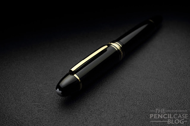
Montblanc's Meisterstuck line (including the classic 149) achieved its luxury status and name recognition all across the globe. This is largely due to their excellent marketing that has established their 'high-end' status as a brand. But it's also just because of the great aesthetics of their pens. You see, the Montblanc Meisterstück is kind of a crowd pleaser. It's a simple, black resin pen, gold trims (also available with platinum and rose gold trim, but the yellow gold started it all), and well...not much more.
Montblanc Meisterstuck 149 fountain pen review
On the outside there's of course the white star logo, and some decorative bands, including the triple band around the base of the cap. But other than that, it's a clean and clutter-free design. The simple cigar shape is easy on the eyes. Even for a large pen like this, nothing about the design feels extravagant or out of place. It's timeless and elegant, chic but not gaudy.
Montblanc Meisterstuck 149 fountain pen review
It's this delicate balance that makes it so attractive for a wide audience, especially for business people that want a classy pen. But of course that white star has also become a symbol for luxury and wealth, so everyone will see that you just spent a ton on a fountain pen. Depending on the situation, I guess that can be both good and bad. In my case, I think this 'status' associated with Montblanc detracts a bit from the overall experience. It's perhaps a bit too much of a class symbol instead of just a nice pen. 

But to get back to the point, the Meisterstück is a classy yet simple pen. So much so, that it may actually seem a bit boring, I guess? With all the colorful and over the top flashy pens that are on the market these days, I'm sure that 99% of us pen addicts would much rather like to see Montblanc use different and more exciting materials. If you ever saw Sarj's (aka. the one man pen show) Custom-made 149 in Omas Arco brown celluloid... oh boy that's something else!
Montblanc Meisterstuck 149 fountain pen review
L to R: Pilot 823, Pelikan M800, Pelikan M1000, Visconti Homo Sapiens OS, Montblanc 149, Lamy Safari, Lamy 2000
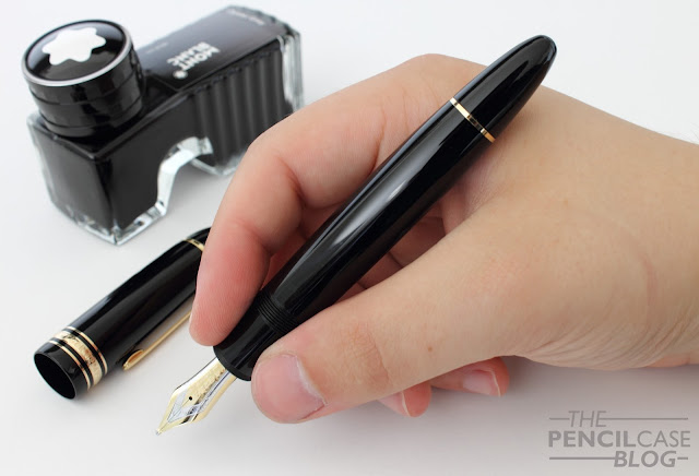
However, one thing is certain: when it comes to size, the 149 is far from boring. This is a truly oversized pen, measuring in at 14.7 cm (5.78") capped, and 13.2 cm (5.2") uncapped. With a width of around 1.6 cm (0.63") at the widest point, and 1.3 cm (0.51") at the section, it's a pretty fat pen.

Because of this girth, the 149 will be a bit too large for a lot of people. In terms of usability, I feel like the 146 does a better job at being a comfortable and versatile writer, with a more reasonable diameter while remaining a comfortable length (The 146 is actually not much shorter than the 149!).
Montblanc Meisterstuck 149 fountain pen review
The 149 has gone through countless iterations throughout the years. The early versions were coveted for their softer nibs and ebonite feeds, and some versions also had a metal piston mechanism. Later versions came with plastic mechanisms, but the current models are again equipped with a metal mechanism. In terms of durability that's a huge plus, but the weight of the pen also benefits from this. The 149 weighs 32 grams in total, and the barrel is slightly more substantial because of the mechanism. It doesn't throw off the balance, but it's just enough to let you know you're writing with a large pen. Same as with the Pelikan M800 and M1000, that metal mechanism makes the 149 feel more premium and durable, even though it's still a resin pen.
Montblanc Meisterstuck 149 fountain pen review
What it's all about for me is the nib. Dennis (from La Couronne Du Comte) showed me a couple different 149's with different nib sizes, but it was quite an easy choice. I obviously went for the biggest nib he had in stock, which is this fantastic double broad! 

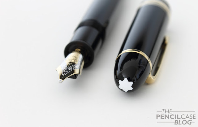
The #9 (which is MB language for a #8 size nib) two-tone 18k gold nib looks and writes fantastic. It may be my favourite part about the entire pen. The design of the nib face is classy and somewhat vintage-esque (The imprint design has remained largely the same throughout the years), and it's partially rhodium-plated to accentuate the design.

If I'm being really picky, perhaps the plating could've been done a bit more precise. The rhodium layer doesn't always perfectly align with the stamped design. But that's a minor detail, and you really have to look at it with a magnifying glass to see it.
Montblanc Meisterstuck 149 fountain pen review
Going for the BB nib was an obvious choice. I had tried a 149 with BB nib from a friend (Hey Marco! Check him out on Instagram!) and was immediately sold on the lush, wide and stub line characteristic this stock nib provides. The way these nibs are ground is quite interesting. The shape of the tipping material is almost identical to what you'd expect from a stub, instead of the usual round shape. Line variation is perhaps not as pronounced as with a 'real' stub. But on the other hand it is smoother and a bit more forgiving about the writing angle. The ink flow is rather heavy, which is good for a wide nib like this. Because of the size of the nib, it has a tiny bit of springiness, just to give the writing experience a 'cushioned' feel. It's definitely not a flexible nib by any means though. 
Montblanc Meisterstuck 149 fountain pen review
Overall, this is by far the best Montblanc nib I've used so far. Others were a bit inconsistent (a medium that wrote like a fine, and vice versa), but this one was exactly the way I expected it to be. The stub-like character makes it a bit more special and fun to write with than a normal round nib, which is a welcome extra on a pen in this price range. 
Montblanc Meisterstuck 149 fountain pen review
The 149 is a great pen. It's ultra-classy and stylish, and the writing experience has been nothing short of amazing. It writes like an 800 euro pen should, and then some. The fact that they still offer 'novelty' nib sizes, including a range of obliques and double broads, is also quite interesting for those that like something a little more exciting than fine or medium.

Yet I'm still having mixed feelings about the 149. I'm glad that I now own a Montblanc, but at the same time I don't feel like I need more of them. There are so many wonderful brands out there with more exciting designs and less jaw-dropping prices. It's a great pen, but it's not a pen that'll speak to everyone's imagination.

The Montblanc Meisterstück 149 retails for 775 EUR (yellow or rose gold trim) or 805 EUR for the platinum trim version (MSRP of 935-985 USD in the US), which is undoubtedly a lot of money. A lot of 149's are sold on the second hand market for a fraction of the cost. In this case, buying used is a great option if you want to make it a bit less painful for your wallet, but you have to know what to look for (and you should always be wary of fake Montblanc products that are unfortunately very common!)
Note: La Couronne Du Comte is a sponsor of this blog. This product was bought from LCDC with my own funds, and I was in no way solicited or influenced in the making of this post. This post does not contain affilate links.
Montblanc Meisterstuck 149 fountain pen review
I guess I'll never learn to NOT use light inks for my written reviews...