Showing posts with label luxury writing. Show all posts

Tuesday, January 18, 2022

REVIEW: ONOTO MAGNA SEQUOYAH FOUNTAIN PEN

REVIEW: ONOTO MAGNA SEQUOYAH FOUNTAIN PEN
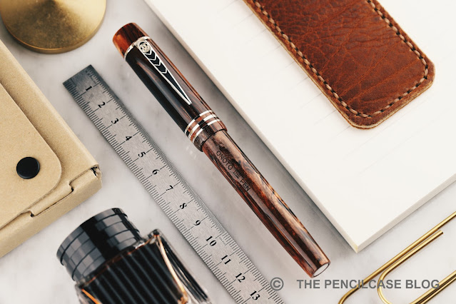
Oh boy, have I been eyeing Onoto pens for a loooong time, before finally pulling the trigger on this Onoto Magna Sequoyah LE last year! I'm kicking myself for not getting one sooner because these pens are everything they're hyped up to be, and then some... Although 'hype' is perhaps not the right word to use with Onoto, because they actually seem quite underrepresented within our community. As with other UK-based brands -like Conway Stewart or Yard-O-Led- Onoto seems to live somewhat in the shadows of the 'traditional' German, Italian or Japanese companies. It's anyone's guess as to why that is. But one thing is for sure, it definitely has nothing to do with the quality of their products, because Onoto certainly delivers in that regard!
REVIEW: ONOTO MAGNA SEQUOYAH FOUNTAIN PEN
Perhaps not coincidental, those three UK-based brands mentioned above have one thing in common: they all embody -what I'd consider- traditional British fountain pen design. Perhaps this more classic and conservative approach to fountain pen design might explain why they aren't more prominently represented on the market? But of course, that's down to personal taste. I, for one, really appreciate the display of Onoto's heritage within their products. 
REVIEW: ONOTO MAGNA SEQUOYAH FOUNTAIN PEN
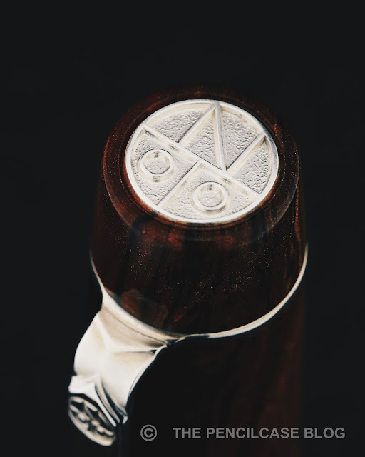
I love the stylized, modern-looking Onoto monogram in the sterling silver cap finial!
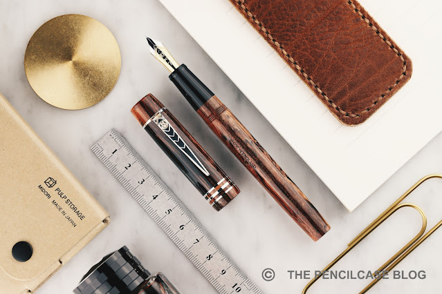
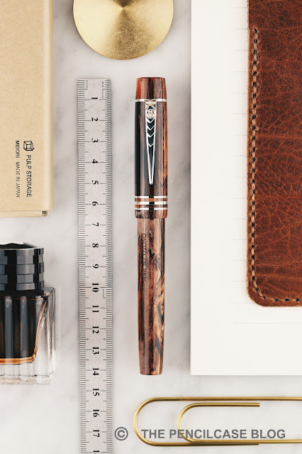
Talking about heritage: the Onoto Magna takes quite accurately after its vintage relative namesake. It's a fairly straightforward and simple flattop design, accentuated by sterling silver appointments. Like most other British brands, Onoto proudly displays their heritage and experience with sterling silver manufacture, which shines through -literally- on the precise details of the trim found on this pen. Every metal piece is made of silver: cap and barrel finials, the three cap rings, and a sterling silver clip with a raised chevron pattern. The silver appointments add a level of intricacy to the Magna's design, but are tastefully done and don't distract from the beautiful material this pen is made of.
REVIEW: ONOTO MAGNA SEQUOYAH FOUNTAIN PEN
While there's a myriad of choice in finishes for the Onoto Magna -from subtle and traditional solid color acrylics, to more colorful materials and even guilloché-engraved finishes-, for me this limited edition (200 pieces) 'Sequoyah' finish stands out as one of the most spectacular and eye-catching of them all. This was the pen I knew I had to have, from the moment I first laid eyes on it! 

The pen is named after a Native American called 'Sequoyah', who established a written form of the Cherokee language. The material of the pen is inspired by the similarly-named Sequoia tree. The woodgrain-like brown acrylic is absolutely sublime. It has a surprising amount of shimmer in the warm, brown swirls, interlaced with dark streaks of solid black resin. The end result is a pen that genuinely looks like it's made from a piece of burlwood. 
REVIEW: ONOTO MAGNA SEQUOYAH FOUNTAIN PEN
The warm tone of the acrylic balances nicely against the sterling silver trims when the pen first arrives. But it doesn't take too long before a strong brown-ish patina (tarnish) begins to develop on the silver. While you can of course polish most of the trims with a jeweler's cloth to bring them back to shiny silver, it's not so easy to do so with the cap finial due to its deep texture and crisp edges. Therefore, it seems to me that the best option is just to let the material do its thing, with the patina bringing a very vintage-esque feeling to the pen.
REVIEW: ONOTO MAGNA SEQUOYAH FOUNTAIN PEN
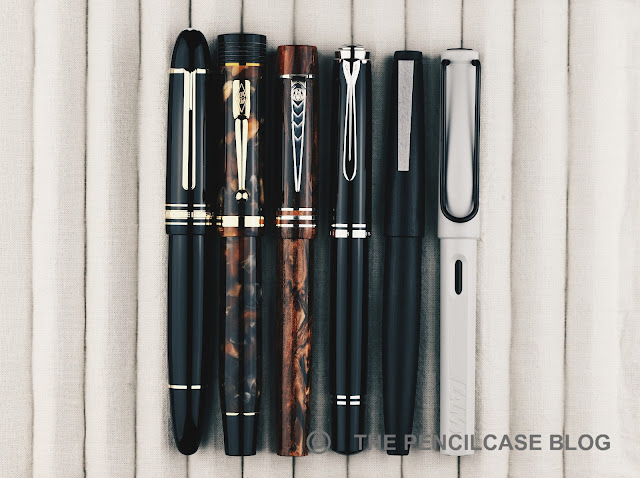
L to R: Montblanc 149, Conway Stewart Churchill, Onoto Magna Sequoyah, Pelikan M805, Lamy 2000, Lamy Safari
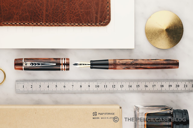
The Magna is an average-to-large pen, measuring 14 cm (5.53") closed - about the size of a Pelikan M800. I suppose the name 'Magna' (great) has more historical meaning than it is relevant on these current-day pens. With an uncapped length of 13.2 cm (5.19") it's a very decent size to use unposted. The cap can post if you really want to, but it makes for a considerably large 16.6 cm (6.54") pen.
REVIEW: ONOTO MAGNA SEQUOYAH FOUNTAIN PEN
Between this one and the few Onotos I briefly tried over the years, I've been consistently impressed with the absolutely impeccable build quality and finishing, as well as the excellent writing comfort they have to offer. The section has a comfortable diameter (12.5mm/ 0.49" at the back) with a straight taper towards the nib (down to 10mm/ 0.4"). The section transitions almost seamlessly into the barrel, where a set of rather shallow threads is the only thing that could possibly obstruct your grip - but it doesn't, because they're so well-finished. 
REVIEW: ONOTO MAGNA SEQUOYAH FOUNTAIN PEN
As a rather unique feature to finetune the writing comfort of the Magna, Onoto offers two weight options for the Magna pens, with an optional brass barrel, insert adding 7 grams to the 25 of the base version. I found my 25-gram version to be perfectly balanced in the hand, and light enough as to not cause any fatigue while writing. That said, because I do tend to lean towards heavier pens, I am curious to try out the 32g option at some point.
REVIEW: ONOTO MAGNA SEQUOYAH FOUNTAIN PEN
The Magna Sequoyah (and other versions of the Magna) fills using a standard international converter. Fine by me, though perhaps a bit plebeian on a pen as nice as this? There was once an option to upgrade to a plunger-filler I thought, but that no longer seems to be the case when I look at the Onoto site.
REVIEW: ONOTO MAGNA SEQUOYAH FOUNTAIN PEN
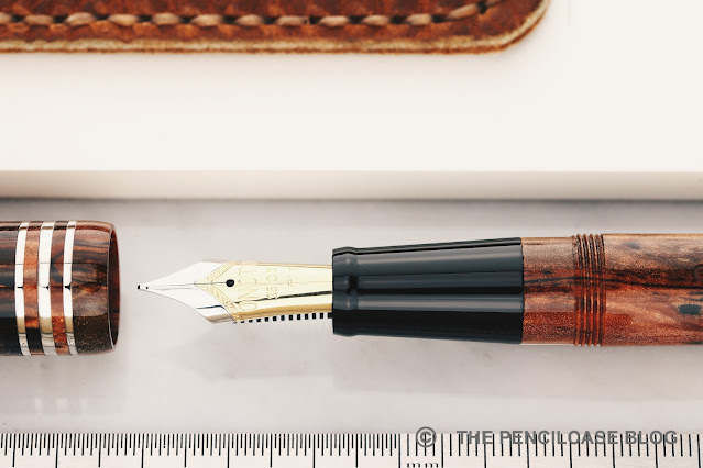
Another highlight (although if I'm honest, most aspects of this pen are highlights) of the Onoto Magna is the nib. I don't think they produce their own nibs in-house (it looks like a Schmidt nib unit?), but whatever they do, they do it right. The #6 (in Onoto numbers it's a #7 size) 18k gold nibs sits on a plastic feed that delivers a rich flow of ink, and it does so with flawless consistency. I went for a fine nib on the Sequoyah, and it's definitely a beefy western fine, so you might want to step down at least a size if you don't like your nibs to run wider. 
REVIEW: ONOTO MAGNA SEQUOYAH FOUNTAIN PEN
The fine nib on my pen is fantastically smooth and perfectly set up out of the box (and from what I can recall, so were the steel and gold nibs I tried in the past). The nib has a slight bit of bounce to it with normal writing pressure, but no real line variation to speak of. Particularly of note is that the nib doesn't seem to dry out, ever. I've had this pen inked up continuously for almost a year now, and there were times when it wasn't used for months, yet it always picked right up. 
REVIEW: ONOTO MAGNA SEQUOYAH FOUNTAIN PEN
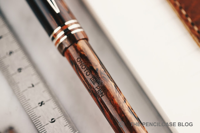
I feel like I've been raving about this pen non-stop, but I can't help myself, it's simply THAT good! Nonetheless, to round up this review I did also find a couple minor quirks that are worth noting, though not particularly deal-breaking for me: For starters, the clip is pointy... a bit too pointy! I appreciate the overall shape and design, but the tip could've been rounded off just a bit more to prevent it from feeling sharp to the touch. I also fear it could damage fabrics if you clip it to a pocket a bit too incautiously. The second remark is one I've also read on Anthony's review of the Magna (UKFountainpens): the cap takes almost 3.5 full turns to unscrew. I'm not typically one to complain about this, but more than 3 turns really is quite a lot!
REVIEW: ONOTO MAGNA SEQUOYAH FOUNTAIN PEN
It took me a while, but I'm glad I finally pulled the trigger on an Onoto. The Onoto Magna Sequoyah manages to do so many things right, making for a fantastic all-around package. Beautiful burlwood-like acrylic, stunning sterling silver details, flawless construction, A+ writing comfort, and a perfectly tuned nib out of the box. It ticks all the boxes for me. 

The price of all that? A not-so-unreasonable 640€ (600$ without VAT for non-EU customers,  at La Couronne Du Comte. Use our discount code 'penthusiast' for 10% off!). I think that's a fair and competitive price for the complete package that the Onoto Magna has to offer. Also, note that that is the price for the 18k gold-nibbed version. On the Onoto website, you also have the option for a steel-nibbed version for 430€ (but the gold nib is where it's at, if you ask me!).
https://www.lacouronneducomte.com/
Note: La Couronne Du Comte is a sponsor of this site. I received a discount on this purchase, which enabled me to write this review. I was in no way influenced in the making of this review, the opinions shared in this review are completely my own! This post does not contain affiliate links.
REVIEW: ONOTO MAGNA SEQUOYAH FOUNTAIN PEN

Monday, November 9, 2020

REVIEW: MONTEGRAPPA ZERO FOUNTAIN PEN

REVIEW: MONTEGRAPPA ZERO FOUNTAIN PEN
I was very excited about the Montegrappa Zero when it was first announced. Not in the least because it's the second pen Montegrappa has made available through their Configuratore platform (I appreciate how Montegrappa's Custom pens offer something completely unique in the pen industry!). But even in this off-the-shelf black/ruthenium colorway, I think it's a fantastic pen - one of my favorite designs so far, from the people in Bassano Del Grappa (The hometown of Montegrappa). 
REVIEW: MONTEGRAPPA ZERO FOUNTAIN PEN
From a distance, you'd be excused for thinking the Zero is a boring, normal pen. It's eerily normal, even, coming from the creators of the Chaos pen (and many other over-the-top designs). But there's more to the Zero than it lets off. Look closely, and the Zero actually has so many small details, it's really quite beautifully designed! The inspiration is clearly drawn from watch design, with an interplay of brushed and polished surfaces and beveled edges everywhere. 
REVIEW: MONTEGRAPPA ZERO FOUNTAIN PEN
The cap finial is a 3D Montegrappa logo, inset in a watch-like bezel, and topped off with sapphire glass - great attention to detail. Oh, and the metal trims on the Zero are machined from Br8 bronze, an alloy that's - you guessed it - popular in watchmaking!
REVIEW: MONTEGRAPPA ZERO FOUNTAIN PEN
Other than that, the Zero is indeed nothing too outrageous. It's a pretty sleek, modern design for Montegrappa, especially in this gunmetal and black finish (there's also an even more murdered-out 'Ultra Black' finish). The cap is straight, and the barrel tapers down gradually towards the back to allow for the cap to post. Trim rings are thick and prominent parts in the design, both on the finials, and the center band. The clip is rectangular, again with nicely beveled edges, and the Montegrappa logo engraved in cursive. The Zero perhaps looks a bit clunky from a distance, but the details are definitely there.
REVIEW: MONTEGRAPPA ZERO FOUNTAIN PEN
L to R: Platinum #3776, Leonardo Momento Zero, Pelikan M805, Montegrappa Zero, Tibaldi Perfecta, Lamy Safari, Lamy 2000
The Zero is a decently sized pen, a bit larger than - but overall comparable to - the Pelikan M800. It measures 14.3 cm/ 5.63" capped, and 12.9 cm/ 5.08" uncapped. The section has a comfortable diameter of around 10.5 mm/ 0.41". The zero weighs 32 grams in total, giving it just the right amount of substance, without being heavy. The barrel is tapered specifically to allow the cap to post, and it does so very securely (the inside of the cap has a plastic liner and threads, so it doesn't feel like you're damaging the barrel when you post. That being said, I don't really like the way the Zero balances in the hand with the cap posted. I don't know why, I just find it much more comfortable and balanced unposted, but maybe that's just me.
REVIEW: MONTEGRAPPA ZERO FOUNTAIN PEN
The metal block threads are crisp and cleanly cut, and received the same beveled edges and brushed finish as the rest of the trim - they certainly went out of their way to create a very uniform and coherent design down to even the smallest details. While the threads are certainly a bit sharper than on most Montegrappa pens (which are typically rounded off and buttery smooth!), you'll only notice that when you deliberately run your finger over them. While writing, the threads are unobtrusive, and actually offer a comfortable and gradual transition from section to the barrel. 
REVIEW: MONTEGRAPPA ZERO FOUNTAIN PEN
Montegrappa has always had great nib designs, but now the JoWo-made writing end also performs the part
The Zero, like all other Montegrappa pens these days, carries a Jowo-made nib (this one is steel, but a gold nib is available at a hefty 200€ premium). The fine nib seems to have a more balanced ink flow than some other Montegrappa pens I've tried recently, but that's not a bad thing. 
REVIEW: MONTEGRAPPA ZERO FOUNTAIN PEN
I find JoWo's finer end of the spectrum tends to have a bit more noticeable feedback, but it's certainly not nearly as pronounced as on Montegrappa's old nibs (which were dry and borderline scratchy). Overall, this fine nib is a very pleasant, balanced everyday writer. I've said it in every Montegrappa review I recently did, but I'll repeat it once more: Montegrappa's switch to JoWo has significantly bumped up the writing performance of their steel-nibbed pens! 
REVIEW: MONTEGRAPPA ZERO FOUNTAIN PEN
I've been thoroughly impressed with some of Montegrappa's more recent offerings (the highlight definitely being the Mia Meteor Storm, that I reviewed not so long ago!), and the Zero positions itself firmly at the top of my list. It's a distinctly more modern design than what we're used to from Montegrappa, but they made it their own by going all out on the small details - it's like a fine watch, but instead of telling the time, you can write with it. 

Also, like fine watches, the Zero isn't cheap - 350€/ 408$ (at Appelboom) is what you'll pay for a version like this, but of course, the cost can creep up when you start playing around with the Configuratore. That may make it a tough sell against the excellent MIA, but I'd still pick the Zero over Montegrappa's more affordable offerings like the Elmo (reviewed HERE) or Parola, any day of the week!
REVIEW: MONTEGRAPPA ELMO FANTASY BLOOMS FOUNTAIN PEN
Note: This product was sent on loan by our site sponsor Appelboom, so I could write this review. I was in no way influenced in the making of this review, the opinions shared in this review are completely my own! This post does not contain affiliate links.
REVIEW: MONTEGRAPPA ZERO FOUNTAIN PEN

Monday, October 26, 2020

REVIEW: OTTO HUTT DESIGN C FOUNTAIN PEN

REVIEW: OTTO HUTT DESIGN C FOUNTAIN PEN
Otto Hutt is celebrating their centennial anniversary, and they're taking the opportunity to make a push towards the higher end market. Pretty much their entire celebration year is built around a unique limited edition at a price point significantly higher than you'd typically expect from the German brand!    

Celebrating anniversaries with expensive limited editions seems to be a trend more than ever. Lamy released the 2000 50th anniversary Black Amber a few years ago, Platinum had their exuberantly priced Prime Platinum last year (at 10K, clearly not an easy pen to move, even though 'only' 100 were made!), very recently Diplomat announced the pricey 90th-anniversary celebration 'Zepp', and Otto Hutt celebrates its centennial with the all-new Design C. But limited editions are a tricky business to get right. Otto Hutt took a gamble with their new Design C, so how did they do? 
REVIEW: OTTO HUTT DESIGN C FOUNTAIN PEN
Before we start: when I say 'expensive', I mean expensive! The Design C is a 2500€ pen. It costs almost 5 times as much as their current flagship pen, the Design 07 (reviewed HERE), and it was admittedly very hard to shake that thought, while testing the Design C. A pricetag like that inevitably changes your perception about a product. I mean, they sent a pair of gloves along, urging me to be very careful with their review sample. That sort of sets the tone. 

On a completely unrelated sidenote, the attentive reader will have noticed that the Design C is the first Otto Hutt that's not marked by a number. Although in this case, the C is used as a Roman numeral, so it represents 100 - the 100th anniversary for Otto Hutt. Clever!
REVIEW: OTTO HUTT DESIGN C FOUNTAIN PEN
Let's actually look at the pen! The Design C is a complete overhaul of the design language of Otto Hutt. In a way, it follows closely to the latest Otto Hutt Design 03 (reviewed HERE). With the help of designer Mark Braun, an ultra-minimal pen is brought to the table in a way that suits their evolution towards more modern, and clean aesthetics. Effectively transitioning the brand away from the 'old' Otto Hutt with more traditional looks and a lot of silver finishes. But it's exactly that history in producing various writing instruments in silver that is still a big part of the concept of the Design C. It's a 71-gram chunk of solid sterling silver. 
REVIEW: OTTO HUTT DESIGN C FOUNTAIN PEN
Quite literally, This is quite a chunk of pen you're holding in your hand! Monolithic, straight and mostly featureless, with slightly domed - but unadorned - finials. It's extremely simple, yet certainly striking, in a way. The proportions of the Design C follow the golden ratio. But the golden ratio looks a bit weird on pen, so you get a design with a relatively short cap and long barrel.
REVIEW: OTTO HUTT DESIGN C FOUNTAIN PEN
Stripped of unnecessary features, the Design C is maybe most characterized by the two small solid 18k gold 'indices' right above and below the seam between cap and barrel. These two dots functionally act as a roll-stopper for both cap and barrel, but aesthetically they break up the, mostly unadorned, sterling silver surface of the Design C. 

I must say, the perfectly polished sterling silver surface is a bit daunting. It's a fingerprint magnet of course, but sterling silver also notoriously doesn't stay immaculate and beautifully polished! Call it patina, but after two or three days that pristine pen you see in the pictures started to look a bit less pristine... and yes, that's WITH the gloves and extremely careful handling!
REVIEW: OTTO HUTT DESIGN C FOUNTAIN PEN
 REVIEW: OTTO HUTT DESIGN C FOUNTAIN PEN
Some smaller details like the engravings on the piston knob are etched in a tiny and neat font, making them stand out very little in the grand scheme of things. Perhaps those engravings look a bit too clean though, it may have been nice if they had done those by hand, to signify the skill and craftsmanship that's involved in working with precious metals. Then again, it's a minimal design they were after, so I guess minimal branding fits the bill. 
REVIEW: OTTO HUTT DESIGN C FOUNTAIN PEN
The Design C comes presented in a very large presentation box. Included are a polishing cloth, a nice booklet, and a bottle of permanent blue ink, which seems to be a fairly nice darker blue color. I didn't dare to put a permanent ink in this loaner pen though, so I went with a more benign fill of Pelikan Edelstein Sapphire instead.    
REVIEW: OTTO HUTT DESIGN C FOUNTAIN PEN
Also included in the box is a custom leather pen case. It's wet-formed around the shape of the Design C, and it looks quite ok from afar. Unfortunately, the second you pick up the case, you'll immediately feel that it's not the kind of case you put a very expensive pen in. It feels light and cheap, and the edges are weirdly sharp, to the point where I think it might add more micro-scratches to the delicate finish of the Design C than it prevents (ok, maybe that's an exaggeration, but it still doesn't feel very premium). Additionally, it's a very awkward size for something that's custom-fitted for this specific pen. The entire case is bulky, and the flap extends extremely far beyond the actual length of the pen. Surely for a 2500$ pen, the case is overall underwhelming.
REVIEW: OTTO HUTT DESIGN C FOUNTAIN PEN
L to R: Ennso Piuma, Pelikan M1005, Montblanc 149, Otto Hutt Design 06, Design 07, Design C, Lamy Safari, Lamy 2000
REVIEW: OTTO HUTT DESIGN C FOUNTAIN PEN
The Design C is not a terribly large pen, but it's extremely dense and space-optimized. At 14cm/ 5.51" closed, the Design C fits right in with other Otto Hutt pens, that's to say: not too large. However, the C turns into a notably large pen when uncapped! Of all pens in this lineup, the Design C starts second to smallest in line, but ends up as the largest pen in the hand at 13.5cm/ 5.31". That's impressive and functional. 
REVIEW: OTTO HUTT DESIGN C FOUNTAIN PEN
The cap takes about two (very smooth!) turns to uncap. Underneath, the satin black section creates a stark contrast with the shiny silver outside. The stainless steel section is PVD coated, and at least on this well-tested sample that passed a lot of hands before me, the finish is still flawless so it seems durable enough to hold up. The wavy texture of the section is strongly reminiscent of the Lamy Persona/Imporium (reviewed HERE). It provides a secure grip, but it's quite uncommon so it definitely takes some time to get used to. There's a relatively steep step towards the barrel of the pen, but the section provides enough space so you don't have to rest your fingers on the step. Together with the comfortable diameter of 11-12 mm, the section is overall quite pleasant and comfortable to hold.

The solid silver and stainless steel construction of the Design C makes for an incredibly solid-feeling pen. Unfortunately, it's quite noticeably back-weighted, because of the complex mechanism for the filling system that we'll touch on in a minute. I'm quite ok with heavier pens, but the trick is having all that weight balance properly in your hand - the Design C is noticeably a bit off, in that regard.
REVIEW: OTTO HUTT DESIGN C FOUNTAIN PEN
The cause of the back-weighted balance is Otto Hutt's Pull+Twist piston filling mechanism, specially designed for this pen. It's a big selling point for the Design C. Undoubtedly a lot of engineering and designing effort went into its creation... But I'm simply not blown away by it. The piston engages by pulling the piston knob out a couple millimeters, after which it functions like a normal piston filler. It's more complex and finicky than it looks though, and the fiddling it takes to activate and deactivate the mechanism distracts from the user experience. When the mechanism is actually engaged and you're ready to fill the pen, it is a bit squeaky and feels very light and unsubstantial (like a captured converter, not a proper piston mechanism). There's a bit of play on the mechanism as well - not too surprising, given how many moving parts there are! - which sometimes rattles just the tiniest bit. As I said, kudos to Otto Hutt for trying to do something different... but I think it needs a bit more fine-tuning to feel as premium as it should.
REVIEW: OTTO HUTT DESIGN C FOUNTAIN PEN
The nib is a #6 18k gold one. It's made by JoWo and sits on a stock JoWo feed, but the nib design itself is completely custom. I quite like how it's two-tone, but the plating isn't separated by the imprint itself. Instead, only the o | h logo - Otto Hutt's new branding style - is centered on the nib, with a few simple lines surrounding it. It's quite different and not too cluttered - I like it. 

I like even better how it writes. A pretty regular JoWo experience, I guess, but JoWo makes killer gold nibs so that's not a bad thing. It's perfectly smooth, responsive, and definitely on the wetter side. It has a slight bit of bounciness to it for a cushioned writing experience. The nib also doesn't dry out over extended periods of time. Excellent marks for anything concerning the nib and overall writing experience. 
REVIEW: OTTO HUTT DESIGN C FOUNTAIN PEN
If you haven't read Antony's (UKFountainpens) interview with designer Mark Braun,  I'd suggest you go do that before reading on. It's interesting to get a look in the head of the designer, but it also highlights some of the marketing around the Design C that I don't get behind. 

For one, Mark Braun insists on categorizing the C as 'Democratic luxury'. In his eyes, you only need to buy this one, high-quality pen and have that for the rest of your life. Surely, that's an ideology. While this is most certainly an heirloom-quality pen, it is most likely not the only pen you'll ever buy, and especially not the only pen you'll use every day... Certainly, I wouldn't feel comfortable using a 2,5K pen every day of the week. I also don't think anybody who's not deeply into pens would shell out 2500$ on a whim, and have the Design C as their be-all-end-all pen. Having a heirloom-quality, EDC pen definitely doesn't mean it has to cost as much as the Design C. 

Secondly, using the term 'Democratic luxury' is also a bit contradictory. Being a piece of democratic luxury would imply moving away from a business model that uses limited availability and exclusivity as a way to control their brand image, and prices that intrinsically target only the lucky few. If 2500$ for a limited edition pen is no longer viewed as 'exclusive', please let me know, because that would mean my perception of pricing and accessibility is quite far off! Funnily enough, in his interview with Anthony, Mark Braun also admits that this pen is very expensive BECAUSE it is an anniversary edition and therefore more exclusive, which contradicts once again his entire reasoning.
REVIEW: OTTO HUTT DESIGN C FOUNTAIN PEN
Remember how I started this review, pointing out that even Otto Hutt's top-of-the-line Design 07 doesn't come nowhere near the Design C's hefty retail price of 2436€ (2380$ without VAT) from retailers like our site sponsor La Couronne Du Comte (Though you can get 10% off with our discount code 'penthusiast'!) While markups like these are certainly not unheard of for limited editions from well-established high-end brands like Montblanc, Namiki, etc., it's not something every brand can justify doing. Even though I'd consider Otto Hutt to be a premium brand, this is uncharted price territory for them, so they don't necessarily have the customer base and loyal following that expects to pay this much for a pen. TL;DR - It's not a Montblanc Writer's edition that can pull off an exorbitant price, 'just because'!

That being said, I think the Otto Hutt Design C is a good pen in most ways - except maybe the filling system - and even an exceptional pen in certain ways. I, for one, am obviously quite a big fan of the minimal and futuristic design approach they took, and for once I think it's an example of a pen where a collaboration with a famous designer DOES work out quite well (I'm looking at you, Visconti Iopenna!). I'm sure the target audience for this pen exists somewhere out there, but they may just have to still find Otto Hutt on their path. I'm definitely curious to see if the Design C marks the first step in an effort from Otto Hutt to position their brand (even more) upmarket!

Note: This product was sent on loan by Otto Hutt, so I could write this review. I was in no way influenced in the making of this review, the opinions shared in this review are completely my own! This post does not contain affiliate links.

Sunday, October 11, 2020

REVIEW: LEONARDO CUSPIDE FOUNTAIN PEN

REVIEW: LEONARDO CUSPIDE FOUNTAIN PEN
I'm a huge fan of Leonardo Officina Italiana and I think it's more than safe to say that I'm not alone with that sentiment. Leonardo makes exceptionally good pens, that start at a - for this day and age - relatively good value-for-money price point. But apart from the incredibly popular Momento Zero (reviewed HERE) and Furore, they're also making a name for themselves in the higher segment - the price range where typical luxury Italian brands tend to (or used to) reside - with various limited and small-batch releases in the past year or two. Leonardo's higher-end pens are absolute attention-grabbers, and don't shy away from unique materials and finishes... their latest Cuspide being no exception!
REVIEW: LEONARDO CUSPIDE FOUNTAIN PEN
Standard packaging for the Cuspide, but it does depict the inspiration for the Cuspide material!
I typically tend to hesitate just long enough for those releases to sell out before I can empty my wallet on them, but just like with the Momento Zero Grande Art Deco, the Cuspide was an instant-buy for me. I immediately messaged Joost from Appelboom to secure a spot on the pre-order list - Thanks for penabling, Joost! 
REVIEW: LEONARDO CUSPIDE FOUNTAIN PEN
The new Cuspide is all about the material I think, and - to me at least - it falls right in line with a few other brands' recent efforts to bring innovative and unique materials to the table. I've talked before about Montegrappa's creation of Montegrappite, and Pineider's Arco Oak acrylic, both offering something that might be able to take over the holy grail status that celluloid enjoys right now.

The 'Cuspide' material is made up of multiple layers of colored acrylic, fused together with black resin. I went with the Olive Green finish, which is one of four colors available (along with Nocciola, Mineral Grey and Blue Sea), each of which is characterized by a very obvious pearlescent swirl. The layered pattern and contrast inside the material do indeed remind me of Omas' famed Arco Bronze and Arco Verde celluloid. The name 'Cuspide'  - or cusp - refers to the "rounded point" shape (hence the spear tip on the packaging!) that returns quite clearly in the layers of the material.
REVIEW: LEONARDO CUSPIDE FOUNTAIN PEN
The Olive green colorway, being the darkest of the four, is probably the least contrasting finish available, but the way the material is cut still brings out the 10 to 15 layers that make up the acrylic rods. I do quite like the toned down and rustic look of the Olive green though. The material is befitting for a model that overall harkens back strongly to classic fountain pen designs of the 20th century.

Trims on the Cuspide are available in gold or rhodium plating. The gold trim inevitably adds to the pens' vintage look. In the end, I went with the rhodium finish, which I think pairs extremely well with the Olive Green material.
REVIEW: LEONARDO CUSPIDE FOUNTAIN PEN
The Cuspide next to the Momento Zero Grande 2020 in the 'Sand' colorway - both fantastic materials!
The Cuspide isn't based on a model that's otherwise available as a standard edition from Leonardo. It's maybe easiest to compare it side by side to the Momento Zero Grande (I reviewed the old style MZ Grande HERE, but pictured above is the new 2020 version!), but you'll see that the design is not as similar as you might expect at first...
REVIEW: LEONARDO CUSPIDE FOUNTAIN PEN
The Cuspide doesn't have pointed finials, for example.
REVIEW: LEONARDO CUSPIDE FOUNTAIN PEN
The barrel doesn't have a long tapered shape like the Furore or even Momento Zero, but rather widens subtly towards the middle of the barrel, before tapering down slightly towards the piston knob. The keen eye might also notice that the narrow clip of the Cuspide is a bit longer than the one on the Momento Zero Grande.  
REVIEW: LEONARDO CUSPIDE FOUNTAIN PEN
The most notable difference between the Momento Zero Grande and Cuspide is of course the dramatic cap-to-barrel transition from the relatively thick cap to the much narrower barrel of the Cuspide. The harsh transition is quite a departure from the sleek and streamlined transition on the Momento Zero and Furore (Grande) - which is also really the only criticism I have about this pen. The cap lip is a bit TOO sharp. It's also the only negative mark in terms of fit and finish, that I could find. The pen as a whole is far from poorly made, but that cap lip definitely would've benefitted from just the slightest rounded edge, to make it a bit less harsh to the touch.
REVIEW: LEONARDO CUSPIDE FOUNTAIN PEN
As with a lot of limited releases from Leonardo, the cap band gets a unique engraving to set it apart. I particularly like the "crosshatched" triangle pattern on the wide center band (accompanied by two adjacent thinner bands), the same pattern also returns on the band just above the piston knob. I found it especially quirky that the lines in the pattern are slightly irregular by design, so some lines are slightly wider than others - somehow it creates a slightly more intricate look. Another interesting detail - or lack thereof - is that the Cuspide isn't branded on the barrel as usual. In fact, the only branding on the entire pen is in the nib engraving. 
REVIEW: LEONARDO CUSPIDE FOUNTAIN PEN
The Cuspide's 'Classic' piston left, versus the MZ Grande's piston right.
As all larger pens in Leonardo's current lineup (the Cuspide is technically not called a 'Grande' model, but it is almost the exact same size as a Momento Zero Grande), the Cuspide comes equipped with a piston. Interestingly, it's not the same as those on the standard Momento Zero Grande and Furore Grande models. The so-called 'classic' piston mechanism has no metal internals, yet feels more substantial and precise when operating. The piston knob turns smoothly and with just the right amount of resistance to let you feel that you're actually doing something (in other words: it doesn't feel like a captured converter!). I don't know what exactly makes it Classic, but it works very well so I have no complaints here. The ink capacity is a bit lower: 1.2 mL, compared to the 1.5 mL of the regular piston mechanism. 
REVIEW: LEONARDO CUSPIDE FOUNTAIN PEN
L to R: Pelikan M1005, Maiora Impronte, Leonardo Momento Zero, Momento Zero Grande, Furore Grande, Cuspide, Lamy Safari, Lamy 2000
The Cuspide measures 14.8 cm/ 5.83" capped, and 13.4 cm/ 5.28" uncapped, which makes it just a smidge shorter than the MZ Grande, but it's still a considerably large pen. While the Cuspide's maximum diameter around the cap band is the same as on the MZ Grande (16.75 mm/ 0.66"), the barrel is notably narrower. At 30 grams, the Cuspide is fairly lightweight and nimble for its size and is about 5 grams less than the MZ Grande.
REVIEW: LEONARDO CUSPIDE FOUNTAIN PEN
Weird place to put the LE number, but the section design is great!
Underneath the cap, the Cuspide also sports an entirely different design. You get metal threads here, which is perhaps the only element on the entire pen that sort of breaks with the 'vintage' styling of the Cuspide. The threads aren't block-cut, but they aren't particularly sharp, either. The section transitions in one almost seamless flow into the threads, and then the barrel, so it's a fantastically comfortable pen to hold and write with. 

Talking about the section: it has a more traditional, slightly tapered design with a pronounced flare towards the nib, which is perhaps the first time Leonardo steps away from their typical two-stage section shape. The section doesn't taper down much, so with an average diameter of about 12.5 mm (0.5"), it's noticeably wider in the hand than the Momento Zero, where I find my grip gets pushed towards the narrower part of the section.
REVIEW: LEONARDO CUSPIDE FOUNTAIN PEN
The Cuspide comes with a Jowo- sourced 14k gold nib. Aesthetically speaking, it's not the most interesting nib to look at, but that's really the only criticism I can come up with. It would've been nice to see the crosshatched pattern also return on the nib imprint. Similar to the Grande models - sits on an ebonite feed that's made in-house, which is one of my favorite features of the 295€ MZ Grande, but it's even better paired with this excellent gold nib. I went with a broad nib here, which is rather stiff as most JoWo nibs tend to be, but it's glassy smooth and the ebonite feed provides an incredibly rich, wet flow (possibly even too wet for some!). 

It's smooth, it lays down a consistent, broad line, the feed keeps up perfectly, and the nib doesn't seem to dry out over the course of a couple days either... Except for looks, it's an excellent nib in any way possible IMHO. And no, before you ask, Appelboom's in-house nib specialist Anabelle doesn't tune any nibs on pens that I review (although if you purchase a pen from Appelboom, definitely make use of the free "tune & smooth" option on the order page, so you're sure every nib will perform as it should!).
REVIEW: LEONARDO CUSPIDE FOUNTAIN PEN
The Leonardo Cuspide is a limited edition of just 70 pieces per color. But even at the indisputably steep price of 850€ (820$ without VAT from Appelboom), I'm sure these will move fast! You can probably tell I'm having a hard time finding negatives about this pen - believe me, I tried! If anything, the Cuspide has to go against rather strong competition from Leonardo's own pens. The 295€ Momento Zero Grande for example (494€ with a gold nib, for apples-to-apples comparison): also a well-built pen with piston and ebonite feed that comes in a variety of lovely materials. Maybe that does cannibalize a few of their own sales, but it doesn't make the Cuspide any less great. I really enjoy the vintage-inspired design of the Cuspide (come to think of it, that's also what drew me to the Art Deco!), and the layered acrylic is stunning. Above all, the out-of-the-box writing experience is spot-on. What's not to like?
Appelboom pens
Note: Appelboom is a sponsor of this site. I received a discount on this purchase, which enabled me to write this review. I was in no way influenced in the making of this review, the opinions shared in this review are completely my own! This post does not contain affiliate links.
REVIEW: LEONARDO CUSPIDE FOUNTAIN PEN