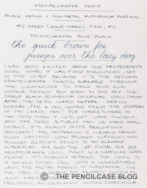
I was very excited about the Montegrappa Zero when it was first announced. Not in the least because it's the second pen Montegrappa has made available through their Configuratore platform (I appreciate how Montegrappa's Custom pens offer something completely unique in the pen industry!). But even in this off-the-shelf black/ruthenium colorway, I think it's a fantastic pen - one of my favorite designs so far, from the people in Bassano Del Grappa (The hometown of Montegrappa).
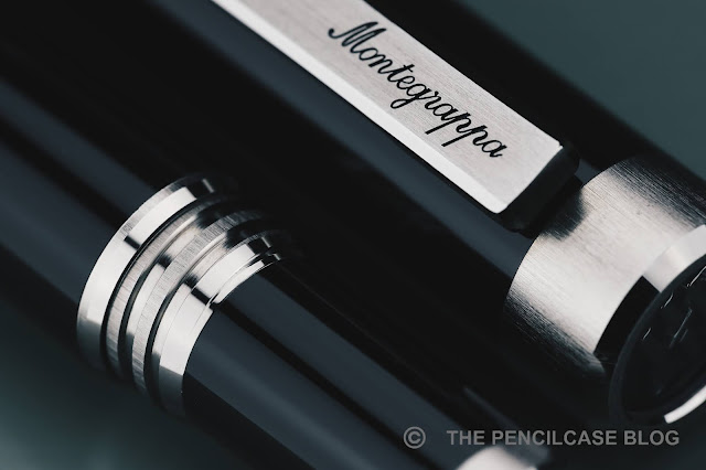
From a distance, you'd be excused for thinking the Zero is a boring, normal pen. It's eerily normal, even, coming from the creators of the Chaos pen (and many other over-the-top designs). But there's more to the Zero than it lets off. Look closely, and the Zero actually has so many small details, it's really quite beautifully designed! The inspiration is clearly drawn from watch design, with an interplay of brushed and polished surfaces and beveled edges everywhere.
The cap finial is a 3D Montegrappa logo, inset in a watch-like bezel, and topped off with sapphire glass - great attention to detail. Oh, and the metal trims on the Zero are machined from Br8 bronze, an alloy that's - you guessed it - popular in watchmaking!
Other than that, the Zero is indeed nothing too outrageous. It's a pretty sleek, modern design for Montegrappa, especially in this gunmetal and black finish (there's also an even more murdered-out 'Ultra Black' finish). The cap is straight, and the barrel tapers down gradually towards the back to allow for the cap to post. Trim rings are thick and prominent parts in the design, both on the finials, and the center band. The clip is rectangular, again with nicely beveled edges, and the Montegrappa logo engraved in cursive. The Zero perhaps looks a bit clunky from a distance, but the details are definitely there.
 |
| L to R: Platinum #3776, Leonardo Momento Zero, Pelikan M805, Montegrappa Zero, Tibaldi Perfecta, Lamy Safari, Lamy 2000 |
The Zero is a decently sized pen, a bit larger than - but overall comparable to - the Pelikan M800. It measures 14.3 cm/ 5.63" capped, and 12.9 cm/ 5.08" uncapped. The section has a comfortable diameter of around 10.5 mm/ 0.41". The zero weighs 32 grams in total, giving it just the right amount of substance, without being heavy. The barrel is tapered specifically to allow the cap to post, and it does so very securely (the inside of the cap has a plastic liner and threads, so it doesn't feel like you're damaging the barrel when you post. That being said, I don't really like the way the Zero balances in the hand with the cap posted. I don't know why, I just find it much more comfortable and balanced unposted, but maybe that's just me.
The metal block threads are crisp and cleanly cut, and received the same beveled edges and brushed finish as the rest of the trim - they certainly went out of their way to create a very uniform and coherent design down to even the smallest details. While the threads are certainly a bit sharper than on most Montegrappa pens (which are typically rounded off and buttery smooth!), you'll only notice that when you deliberately run your finger over them. While writing, the threads are unobtrusive, and actually offer a comfortable and gradual transition from section to the barrel.
 |
| Montegrappa has always had great nib designs, but now the JoWo-made writing end also performs the part |
The Zero, like all other Montegrappa pens these days, carries a Jowo-made nib (this one is steel, but a gold nib is available at a hefty 200€ premium). The fine nib seems to have a more balanced ink flow than some other Montegrappa pens I've tried recently, but that's not a bad thing.
I find JoWo's finer end of the spectrum tends to have a bit more noticeable feedback, but it's certainly not nearly as pronounced as on Montegrappa's old nibs (which were dry and borderline scratchy). Overall, this fine nib is a very pleasant, balanced everyday writer. I've said it in every Montegrappa review I recently did, but I'll repeat it once more: Montegrappa's switch to JoWo has significantly bumped up the writing performance of their steel-nibbed pens!
I've been thoroughly impressed with some of Montegrappa's more recent offerings (the highlight definitely being the Mia Meteor Storm, that I reviewed not so long ago!), and the Zero positions itself firmly at the top of my list. It's a distinctly more modern design than what we're used to from Montegrappa, but they made it their own by going all out on the small details - it's like a fine watch, but instead of telling the time, you can write with it.
Also, like fine watches, the Zero isn't cheap - 350€/ 408$ (at Appelboom) is what you'll pay for a version like this, but of course, the cost can creep up when you start playing around with the Configuratore. That may make it a tough sell against the excellent MIA, but I'd still pick the Zero over Montegrappa's more affordable offerings like the Elmo (reviewed HERE) or Parola, any day of the week!


No comments:
Post a Comment