Showing posts with label Japanese. Show all posts

Saturday, March 13, 2021

PAPER REVIEW: PONT NEUF NOTEBOOKS

PAPER REVIEW: PONT NEUF NOTEBOOKS
I was really happy to see Japanese stationery brand Kunisawa recently re-introducing themselves with a completely revised product lineup (read the re-review HERE!). Their confidence in the updated paper quality turned out to be absolutely justified, finally combining the stunning business-chic notebook designs with fantastic - consistent - quality Japanese paper on the inside. 

But alongside the updated Kunisawa products, they also sent a few other products that certainly didn't fit in. That's because, as I mentioned earlier, mother company Kawachiya Print also houses a second stationery brand: Pont Neuf!  
The contrast between Kunisawa and Pont Neuf doesn't need an explanation...
Pont Neuf is best described as the absolute polar opposite of Kunisawa's functional, subtle, business-appropriate designs. Instead, they go for bright, colorful, playful products. The most eye-catching being a selection of wild, fluffy, fabric-covered notebooks - extravagant (and quite high-end)! But also the notebooks I'll be showing today, which are a collaboration with Tokyo-based art Gallery Brain Trust, for a collection with William Morris design notebook covers.
PAPER REVIEW: PONT NEUF NOTEBOOKS
William Morris was a renowned 19th-century artist and craftsman and is perhaps best known for his hugely popular - to this day - botanical patterns. His designs were originally created for wallpaper decoration, but I think it works equally well on these notebooks, and it fits right in with the style Pont Neuf tries to convey. 
PAPER REVIEW: PONT NEUF NOTEBOOKS
Both the A5-sized slim staple-bound softcovers (64 pages) and thicker A5 hardcover notebooks (192 pages) in the William Morris collection each come with unique cover prints, four in total. The printing is high quality and detailed, and the colors - while certainly vibrant - aren't overdone. One minor detail: I say A5, but both notebooks are actually 195 x 138 mm, which is ever-so-slightly smaller than the traditional A5 size!
PAPER REVIEW: PONT NEUF NOTEBOOKS
While the softcovers come with simple, uncoated paper stock for the cover (which has a nice subtle debossed texture from the printing!), the hardcover notebooks are distinctly more upscale. The cover is made of textured, heavily coated (plastic?) paper with gold foil debossed details, gilded edges, and rounded corners. One downside about the stiff, plastic-like material used on the hardcover is that it cracks and frays a bit around the edges of the notebook, which deters from the otherwise pristine cover design, and gives the edges a slightly rough feel.
PAPER REVIEW: PONT NEUF NOTEBOOKS
Both notebook types are able to lay open quite flat
Inside, the Pont Neuf notebooks do match the minimalist approach of Kunisawa with un-numbered, dot-grid pages and pretty much nothing else. The hardcover does have one practical element that the thin softcover booklets don't have: a thin bookmark ribbon.
PAPER REVIEW: PONT NEUF NOTEBOOKS
The paper inside the Pont Neuf notebooks seems to be identical to the excellent paper we've already seen in the updated Kunisawa Find stationery, which is of course a good thing. 
PAPER REVIEW: PONT NEUF NOTEBOOKS
For those of you that didn't read my previous review, here's a short rundown of my findings on this new paper: it's a very smooth stock, more or less the same thickness as Rhodia (so around 80-85 gsm), and with a distinct yellowy-ivory tint to it. The paper shows excellent shading and sheen and doesn't budge to wet nibs or even ink swabs, with no bleedthrough and minimal showthrough (or ghosting) to speak of.
PAPER REVIEW: PONT NEUF NOTEBOOKS
"Create your own style" an appropriate catchphrase for the eccentric Pont Neuf brand!
While I personally lean towards the minimal and clean aesthetics of the Kunisawa products, there is certainly something to be said for the more extravagant side of Pont Neuf's colorful collection of notebooks. The two brands work nicely side-by-side, offering unique products on two very distinct ends of the scale. Pricing is also comparable between the two brands, and - while certainly on the more premium side - is quite fair given the excellent paper quality and great design. The softcover notebooks retail for 5€/ 6$, and 25€/ 30$ for the hardcover.

Note: The products shown here were provided by Kunisawa, so I could write this review. I was in no way influenced in the making of this review, the opinions shared in this review are completely my own! This post does not contain affiliate links.
PAPER REVIEW: PONT NEUF NOTEBOOKS

Sunday, February 28, 2021

REVIEW: TACCIA POLAR LIGHTS FOUNTAIN PEN

REVIEW: TACCIA POLAR LIGHTS FOUNTAIN PEN
We're taking a look at another new - to me - brand today: Taccia! Despite only having been around for about 20 years, the history of Taccia is rather convoluted. The TL;DR is that they started as a US-based company, but they're now part of a larger Japanese stationery conglomerate (Nakabayashi). 

Taccia's earlier products - mostly in the sub-200$ range - never really managed to captivate me. Though things certainly became a bit more interesting once they started getting into urushi, Raden, and maki-e, which seems to have really gained them some more traction within the pen community. Even though they might not (yet) enjoy the 'cult status' of big brands like Nakaya, Namiki, or Sailor in the Urushi game, Taccia's urushi work really deserves some attention, as I think they're doing some really interesting and creative things with traditional lacquering techniques! 
REVIEW: TACCIA POLAR LIGHTS FOUNTAIN PEN
Packaging is just packaging... But damn, this is a really nice box!
Some of those urushi and Raden techniques make an appearance on the Taccia Polar Lights fountain pen collection, which we'll be looking at today. My thanks go out to Catherine from Sakura Fountain Pen Gallery (one of our site sponsors!) for trusting me with these beauties for a short while!
REVIEW: TACCIA POLAR LIGHTS FOUNTAIN PEN
The Polar Lights pens are based on a standard ebonite base shape that Taccia uses for most of their urushi collections. The design of the pen itself is kept quite simple and straightforward (which isn't too uncommon for Urushi and maki-e pens, as it puts more emphasis on the urushi finish itself): a straight, cylindrical pen with flat finials. The barrel is quite long, which makes for a rather unusual cap-to-barrel ratio. The cap is slightly wider than the barrel, though it transitions smoothly into the barrel with a rounded off edge. 
REVIEW: TACCIA POLAR LIGHTS FOUNTAIN PEN
Taccia's urushi pens all have clips. Practical? Sure, but I find that clips tend to interfere with the urushi finish (especially on more complex Raden and maki-e finishes) so I'd have preferred a clipless option. Besides, it's not like I tend to casually clip thousand-dollar pens to my shirt pocket anyway (that's a bit too much livin' on the edge for my taste). That said, I do have to admit that this particular clip looks quite good. The curvy and rounded shape of the clip provides a stark contrast with the straight and angular design of the rest of the pen.
REVIEW: TACCIA POLAR LIGHTS FOUNTAIN PEN
As mentioned at the beginning of this review, Taccia's urushi pens really caught my eye through the wild and uncommon combinations of different lacquering techniques. For the Polar Lights series, the base is lacquered with an Akebono-like gradient of urushi that transitions from a dark color in the center, towards a brighter color at the finials. They overlaid that with precisely arranged Raden strips, applied lengthwise around the top of the cap and end of the barrel. 
REVIEW: TACCIA POLAR LIGHTS FOUNTAIN PEN
The Polar Lights is available in three colorways: red (Amairo Haruakane), green (Amairo Jiu), and blue (Amairo Hekiku), and they really outdid themselves on the colors of the urushi. The colors are vibrant, but not too bright, and the finish is consistent.
REVIEW: TACCIA POLAR LIGHTS FOUNTAIN PEN
Upon closer inspection, there's actually more to the finish than you may think. It looks like only the finials are red, green, or blue, and it fades out to black towards the center of the pen, but that's actually not true. It's very subtle, but the base color is actually dark green, red or blue, to match the rest of the pen. Less subtle are the Raden strips, which are color-matched to the pen (if I'm not mistaken, they do this by painting the back of the mother of pearl). The end result is a striking pen with more than enough shimmering Raden to get around, and yet it's not too crazy for my - typically subtle - taste.
REVIEW: TACCIA POLAR LIGHTS FOUNTAIN PEN
L to R: Montblanc 149, Scribo Feel, Eboya Houga L, Sailor Pro Gear, Taccia Polar Lights, Lamy 2000, Lamy Safari
The proportions of the Taccia Polar Lights are quite interesting. With 15 cm/ 5.9" capped, it sits comfortably amongst other large, oversized pens like the Montblanc 149. The straight, untapered shape of the Polar Lights doesn't allow for the cap to be posted. Though, with an uncapped length of 13.2 cm/ 5.2", I've never missed the ability to post the cap, anyway. 
REVIEW: TACCIA POLAR LIGHTS FOUNTAIN PEN
So they're not small, and not particularly slim either (though not quite as chubby as the Montblanc 149 or Eboya Houga Large, pictured above). BUT! The section is surprisingly narrow compared to the rest of the pen. At the narrowest point, it measures just 9.7 mm/ 0.38", which is a bit on the skinny side for my taste. 

With a narrow section like that, you do get quite a transition towards the barrel, but it's quite gradually stepped and the block threads aren't sharp, so you don't notice it too much in the hand. All in all, it's not an uncomfortable pen to write with, though I certainly would've preferred a slightly wider section. With a total weight of 30 grams, it's not too heavy for a pen this size.
REVIEW: TACCIA POLAR LIGHTS FOUNTAIN PEN
The Polar Lights fills via Sailor's standard cartridge converter. Frankly, these converters aren't the best on the market and the ink capacity isn't huge, but they do the job. And especially with one of Sailor's finer nibs, ink capacity isn't really a big concern, anyway. 
REVIEW: TACCIA POLAR LIGHTS FOUNTAIN PEN
On the inside of the cap, you'll find a spring-loaded inner cap, similar to those found on Wancher and Esterbrook pens, to prevent the nib from drying out. Though the implementation on the Taccia pens seems a bit more subtle (the spring tension isn't so strong) making it more practical and easy to use.
REVIEW: TACCIA POLAR LIGHTS FOUNTAIN PEN
A particularly interesting point about most, if not all, Taccia pens - and presumably also a firm selling point for those who like Japanese fountain pens - is that Taccia actually uses Sailor-made nibs in their pens. Western brands that manufacture their own nibs, don't typically share them with other brands, but it's cool to see that Sailor has a more open mindset towards this.
REVIEW: TACCIA POLAR LIGHTS FOUNTAIN PEN
L to R: Taccia Polar Lights, Sailor Pro Gear, Montblanc 149
REVIEW: TACCIA POLAR LIGHTS FOUNTAIN PEN
Again, the proportions of the Taccia are quite interesting. Look at that tiny nib!
What you get under the hood is a 14k gold, small bicolor nib, the same size as the nibs found on Sailor's 1911S or Pro Gear Slim. Yes, that's exactly how you'd imagine it in your head: a very tiny nib, on a pretty huge pen! Because the section tapers down quite strongly, the nib does manage to still look somewhat balanced on this massive pen. Though, needless to say, this pen at the very least deserved one of Sailor's larger 21k nibs. The nib received a custom engraving with the Taccia logo, and it's bi-color plated. 
REVIEW: TACCIA POLAR LIGHTS FOUNTAIN PEN
To be honest, the nib performance was not quite as spotless as I had anticipated. Although Japanese nibs are usually worshipped as the pinnacle of consistency (and to be honest, they typically are more consistent!), my experience with these nibs illustrated that any brand can have nib issues out of the box, not just Western brands. I tried two hard Fine (H-F) nibs, and the first one was considerably drier and finer out of the box, which in turn also made it more feedback-heavy. The second one matched my expectation pattern, with a more balanced ink flow, and a line width comparable to a narrow Western EF. To be fair, both nibs were consistent, skip-free writers, and the ink flow (though dry on one of the pens) never hesitated.
REVIEW: TACCIA POLAR LIGHTS FOUNTAIN PEN
The Taccia Polar Lights fountain pens sell for 875€ (incl. VAT, at our sponsor Sakura Fountain Pen Gallery). Oh, and it's a limited edition as well, with only 100 pieces per color being made. To call it a bargain would perhaps be a slight overstatement. But for an urushi pen with Raden decoration, that's actually quite a competitive price!

These products were provided on loan by Sakura Fountain Pen Galleryso I could write this review. I was in no way influenced in the making of this review, the opinions shared in this review are completely my own! This post does not contain affiliate links.
REVIEW: TACCIA POLAR LIGHTS FOUNTAIN PEN

Saturday, January 5, 2019

PAPER REVIEW: STALOGY 365 DAYS NOTEBOOK

Paper Review: Stalogy Editor's note 365 Days notebook
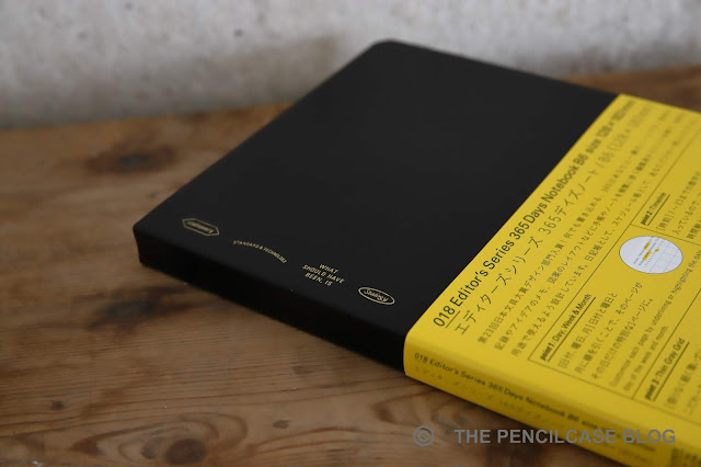
The world of Japanese stationery is vast, and from my -rather limited- experience, filled with a LOT of fantastic products. Stalogy is a new brand to me, but I'm glad I got introduced to their products back in September when I visited 'Buiten De Lijntjes', a stationery/lifestyle shop in the Netherlands! 

The product that was recommended to me by the shopkeeper was the Stalogy Editor's note 365 Days notebook. A seemingly simple and low-key notebook that didn't stand out much, apart from its bright-yellow packaging. It immediately reminded me of the Hobonichi journals, but it's in no way connected to them (at least as far as I know). 

"...Eliminating unnecessary ornamentation and function, we are taking a new look at what's really necessary, rediscovering essential elements and aiming to finally arrive at what should have existed all along. What should have been, is," -Stalogy

The Stalogy 365 journals are plain-looking, softcover notebooks with a black textured 'plastic' outside cover. A few Stalogy logo's and their slogan "what should have been, is" adorn the top left edge of the front cover, hot-foiled in gold. It's a fairly no-nonsense, industrial-looking product at first sight.
Paper Review: Stalogy Editor's note 365 Days notebook
One reason why I love Japanese stationery is their excellent eye for detail, and Stalogy definitely does not disappoint in that regard. The 365 notebook is flawlessly put together with a tight stitched spine and neatly cut edges. The 365 Days notebook comes in 4 form factors: B6, A6, B5 and B5. All versions come with a massive 368 pages, yet are only about as thick as a regular Leuchtturm notebook (which is only approx. 250 pages!). Reason for that is the extremely thin paper they use. I have the urge to say it's Tomoe River paper (probably the 68 gsm variant), but I couldn't find any information to back this up. 
Paper Review: Stalogy Editor's note 365 Days notebook
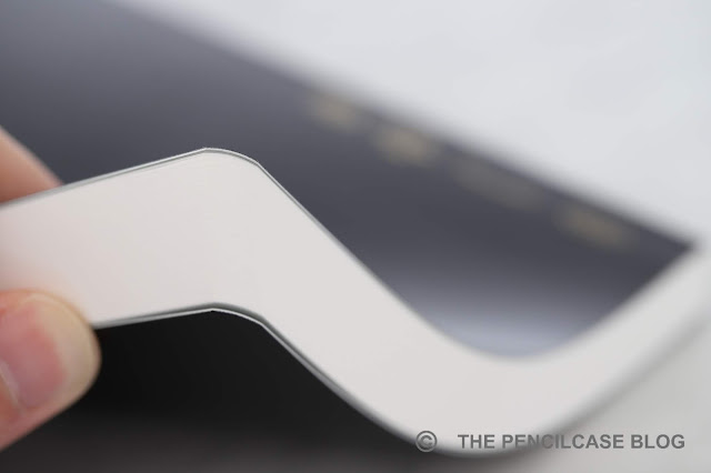
In use, the outside cover is flexible enough to fold almost 360° if you want to. The notebook lays open on itself, but it doesn't stay completely flat. I used the smaller B6 size and it's comfortable to use and take with you on the go, although I usually tend to go for slightly larger notebooks. 
Paper Review: Stalogy Editor's note 365 Days notebook
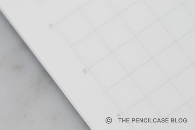
Again in true Japanese style, we're seeing a notebook with very little features. The pages have a faint grey grid printed on them (5x5 mm). The ruling is very pleasant to write on, and doesn't interfere when reading what you wrote down. The 365 Days -as the name suggests- is subtly optimized to be used as a bullet journal or agenda. 
Paper Review: Stalogy Editor's note 365 Days notebook
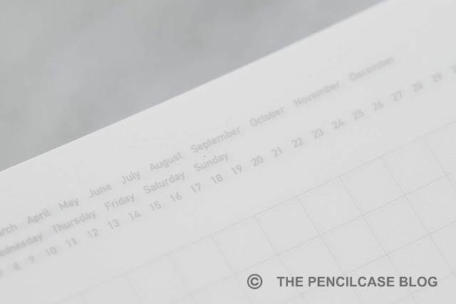
The top right of the page features a date system, and to the left of the grid you can find the hours 7 to 23 printed in a tiny and unobtrusive font. Together, these let you use the notebook as a planner where you can indicate the date and divide the page into the hours of the day (Unless you wake up before 7am, or have appointments after 11pm. In that case I guess you're out of luck...). It's a useful feature when you want to, but it doesn't get in the way when you want to use the notebook as something other than an agenda. Don't bother searching for a page marker, page numbers, index table... you won't find those here.
Paper Review: Stalogy Editor's note 365 Days notebook
One way to add structure to your notebook are the Stalogy stickers and sticky notes. They offer a wide variety of plastic post-it's and tab stickers, among which these small (5x5 cm) square see-through stickers (available in blank, ruled or grid). They are made of some sort of plastic film with an adhesive back, yet their textured surface makes it possible to write on them, even with fountain pen.
Paper Review: Stalogy Editor's note 365 Days notebook
These sticky notes let you add small notes or details throughout your notebook, without making a permanent mark. While I like the idea of these little 'add-ons', they do come at a considerable cost and I admittedly didn't find much use for them. They might be useful for bullet journalling, or important notes, though.
Paper Review: Stalogy Editor's note 365 Days notebook
Some interesting shading going on in some places where the ink meets the grid ruling. And look at that sheen!
The paper is very smooth to write on, and behaves perfectly with fountain pen (perhaps a bit too slick for pencil use). Ink is handled without feathering and very little bleedthrough (ink swabs, very wet writers and a few flex nibs could give bleedthrough, but all in all it's very well-behaved). Ink dries with a crisp edge and the paper brings out the best of the ink with rich shading and sheen. With the paper being relatively thin, you should expect quite a bit of showthrough, which makes it a bit less legible when you use both sides of the page (it's possible, but not ideal). Overall, if this isn't Tomoe River, at least it's a damn good copy. 
Paper Review: Stalogy Editor's note 365 Days notebook
Quite some showthrough but little to no bleedthrough...except with a sharpie of course
The Stalogy 365 is an all-round excellent notebook. It won't turn heads with its design, but the build quality is bar none, and the paper is great for fountain pen use. Unfortunately quality comes at a price, with these 365 Days notebooks starting at 26€ for the smallest A6, up to 39€ for the B5 size (in the US they can be had for less). Regardless of where you buy, these are a good bit more expensive than, say, a Leuchtturm notebook of the same size (though you do get about a third more pages). The stickers and post-its also come with a pretty price tag, with the see-through post-its coming in at a hefty 9€ (about 6.5$ in the US). While I'm not a huge fan of the accessories at that price, the 365 Days notebook definitely comes highly recommended!

This product was sent to me by Buiten De Lijntjes so I could write this review. I was in no way influenced in the making of this review, the opinions shared in this review are completely my own! This post does not contain affiliate links.
Paper Review: Stalogy Editor's note 365 Days notebook

Monday, February 12, 2018

WANCHER 'THE DREAM PEN' URUSHI FOUNTAIN PEN REVIEW

Wancher 'The Dream Pen' Urushi fountain pen review
Wancher. Chances are, you've seen this Japanese brand pass by on several blogs or social media in the past few weeks. And that's all due to the Kickstarter campaign for their latest product: 'The Dream Pen'

I don't know about you, but before their announcement of the Kickstarter, I had never really heard of the brand. They cleverly used a strong social media campaign to advertise the Kickstarter. And they also reached out to me, and about half a dozen other bloggers, to take a look at the early production prototypes of The Dream Pen. 

I have to give it to them, they did a very solid job with publicity and marketing for their Kickstarter campaign, which showed in the ridiculous pace at which their project got funded (and blew past their goal)!
Wancher 'The Dream Pen' Urushi fountain pen review
Anyway, I kind of missed the start of the Kickstarter with my review due to exams taking the upper hand. As it's a completely new brand to me, I had no clue what to expect so I didn't want to rush it either. It quickly became clear that Wancher is onto something impressive though. 'The Dream Pen' might be a slightly strange name, but after spending some time with it... there might be some truth in it.

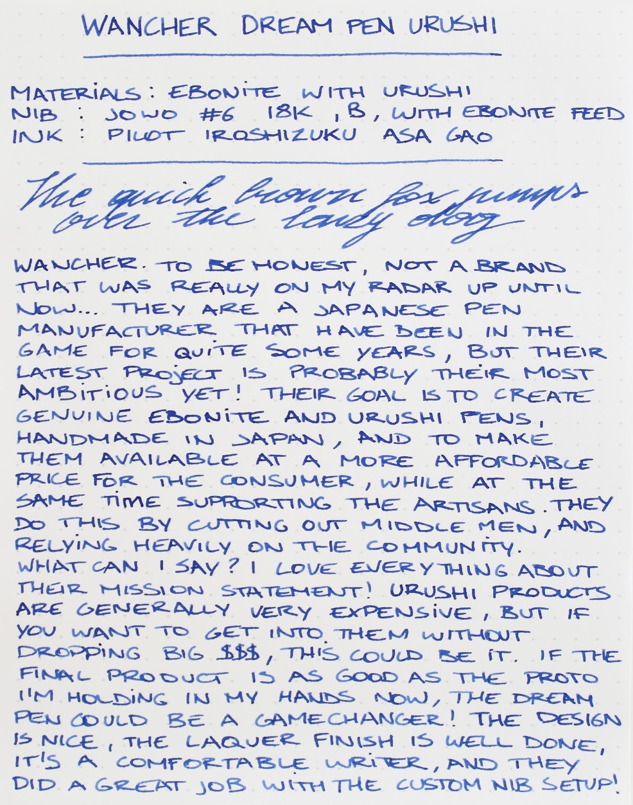
Let's start at the beginning. With The Dream Pen project, Wancher set out to make a true ebonite and urushi fountain pen at a competitive price (and even a Maki-e version, albeit at a serious premium). At the same time, they want to honor the Japanese craftsmen who specialise in Urushi and Maki-e, by including them in the manufacturing process instead of turning to large scale industrialized production methods.

At first, those two things don't seem to go together, low price but labor-intensive manual production? Wancher says they achieve this by diverging from the traditional marketing and retail scenario. Instead of investing in advertisement, and selling through distributors and retailers (who of course each want a profit margin), they sell directly through the public, and do their own advertisement.
Wancher 'The Dream Pen' Urushi fountain pen review
I'm not an economist, so I don't know how viable this plan is in the long run, but so far it seems as if they have everything exactly figured out. Their successful advertisement campaign says enough in that regard.

As a Japanese manufacturer, they have been in the pen industry for over 25 years. But despite having one or two urushi and maki-e products in their assortment, their focus seems to be mainly on more affordable pens. The Dream Pen is an 'affordable' Urushi pen, but affordable is relative of course. Other urushi pens like Nakaya or Danitrio, go for at least twice as much easily. Even with a price many times higher than most of their usual products, they still managed to stay far below the usual retail price for urushi products. 
Wancher 'The Dream Pen' Urushi fountain pen review
In the Kickstarter campaign, you have a wide variety of finishes to choose from. 'The True Ebonite',  made out of solid ebonite (without urushi finish). 'The True Urushi', solid urushi colors (red, blue, black, green, purple,...) and red Tamenuri. And finally 'The True Maki-e', urushi with a cherry blossom Maki-e finish. 

I received a production prototype of the black urushi finish. Even though it's not so much a photogenic pen (almost impossible to properly capture the lustre of this perfectly polished laquer), it's a sight to behold. The Dream Pen is a large, cigar-shaped pen. The cap is slightly wider than the barrel, so the cap doesn't sit flush against the barrel. It's very remniscent of a Danitrio Mikado round-top (but smaller) or Namiki Yukari. There are no markings or artist signatures on the barrel or cap, which gives the pen a clean and minimalist appeal.
Wancher 'The Dream Pen' Urushi fountain pen review
Underneath the cap, there's still a surprisingly large step towards the section. Considering the design with the wider cap diameter, they probably could've made this a little less pronounced. But on the upside, the walls of the cap are thick and the entire pen has a solid and robust feel in the hand. The step and threads are noticeable when you run your finger over them, but the transition from section to barrel is gradual. I found my grip to be more towards the front of the long and nicely tapered section, so I didn't personally encounter any discomfort during writing.

The urushi laquer is applied evenly and sanded and polished to perfection. I couldn't find any flaws in the finish on this review unit. I even let Catherine of Sakura Fountain Pen Gallery check it out. She's an expert on Japanese handmade pens, and she was very impressed with the quality of the craftsmanship. If Wancher can keep up this level of detail and finesse at their current pricing, they will have created something remarkable. I'd almost dare call it revolutionary, but in the grand scheme of things it's not yet on the level of a cure for cancer or world peace...sorry Wancher!
Wancher 'The Dream Pen' Urushi fountain pen review
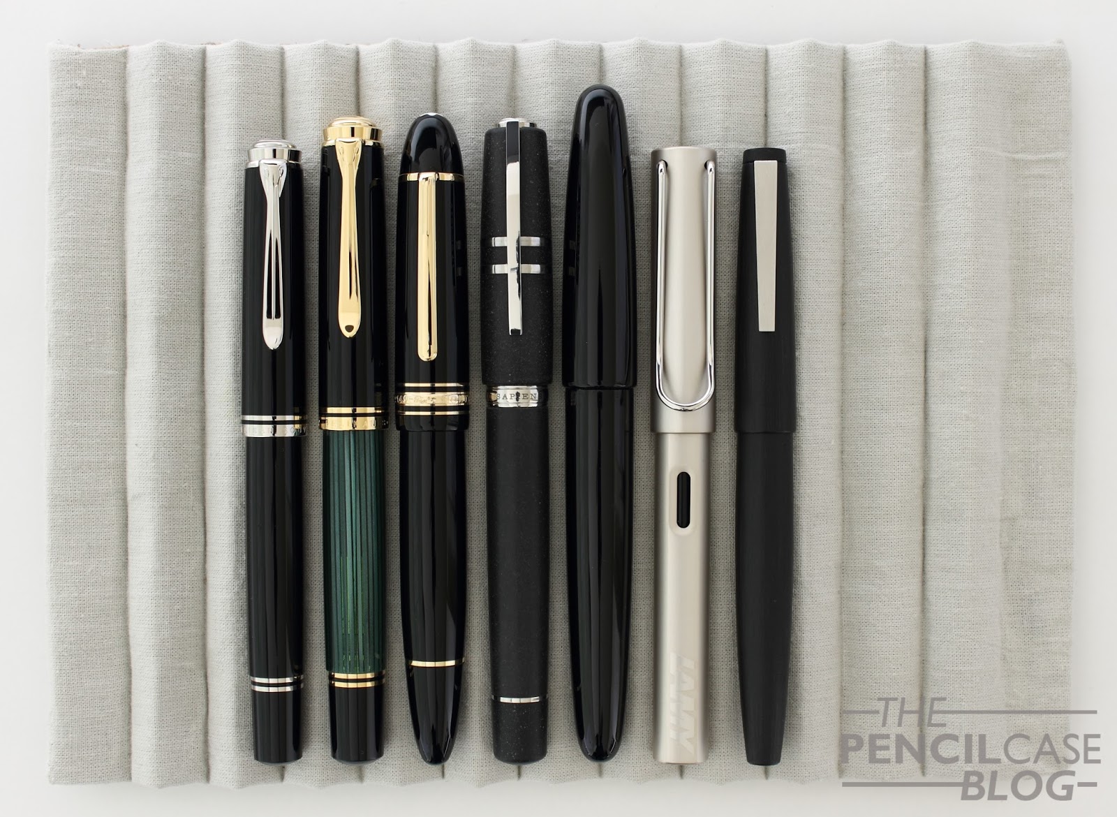
L to R: Pelikan Souverän M805, M1000, Montblanc 149, Visconti Homo Sapiens Oversize, Wancher The Dream Pen, Lamy Lx, Lamy 2000.
Wancher 'The Dream Pen' Urushi fountain pen review
Measuring 15.6cm (6.14") closed, and 13.2cm (5.20") uncapped, The Dream Pen is a serious pen. The cap cannot be posted, but since the pen is more than long enough as-is, I never felt like this was needed anyway. The widest part of the cap has a diameter of 1.7cm (0.67"), but the width drops down to a relatively average and comfortable 1.1cm (0.43"). A lot of urushi pens tend to be on the larger side, which makes it easier for intricate Maki-e patterns to be applied. But due to the lightweight ebonite construction (total of just 22 grams!), they remain comfortable and lightweight in use. 

Uncapping the pen, you can feel the spring-loaded insert in the cap. They used a similar system to the slip-and-seal mechanism Platinum uses in their 3776 pens, which prevents the nib from drying out. I found this feature to work excellent. The pen started each time, even after several days without use.
Wancher 'The Dream Pen' Urushi fountain pen review
For the writing end, Wancher decided on a pretty unique team-up with JoWo and Flexible Nib Factory. JoWo is of course well-known and widely used, and they produce excellent steel and gold nibs. But seeing Flexible Nib Factory involved was a pleasant surprise. This small startup company based in the US, specialises in custom feed and nib housings for existing nib/pen combinations. 

The resulting writing experience is honestly superb. The symbiosis of the 18k rhodium-plated gold nib (a broad nib in this case), and the precisely machined ebonite feed, make for a flawless setup. The nib is shockingly smooth but responsive with a wet ink flow due to the feed. A lot of superlatives, I know, but I honestly can't say a single bad thing about the business end of The Dream Pen. 
Wancher 'The Dream Pen' Urushi fountain pen review
Filling is done through a conventional standard international cartridge or converter. This is really my only hiccup I had with my review sample, as the converter that came included...wouldn't fit? A bit strange, but I suppose the custom nib unit has a slightly different diameter. I ended up using a Schmidt converter which fits snugly, but it works. 
Wancher 'The Dream Pen' Urushi fountain pen review
Of course you're probably curious to find out how 'affordable' they are exactly. The price obviously depends on the finish and choice of nibs. For a 'True Ebonite' pen with steel nib, the Kickstarter price is 155 EUR (185 USD), a gold nib adds 100 USD. The 'True Urushi' pens are available for 320 EUR (385 USD) and come with a 14k or 18k gold nib of choice. Finally the 'True Maki-e' will set you back 912 EUR (1100 USD). 
Wancher 'The Dream Pen' Urushi fountain pen review
Personally, I find the ebonite pens on the expensive side, given the retail price after the Kickstarter will go up even more. I think the true value is at the urushi pens, even the full retail price (450 USD) is still a lot lower than any other urushi pen currently on the market. The Maki-e I can't really judge on value for money, since the quality and technique of Maki-e has a great impact on its' value (literally the difference between a 1000 dollar pen, or a 40.000 dollar one!). 

Participating in a Kickstarter is of course always somewhat of a risk, especially with a brand that has never done this before. But since Wancher is not at all new to the business, I think they knew what they were getting into. If you want to get your feet wet into the world of urushi pens but don't feel like dropping big $$$ for it, The Dream Pen might very well be the way to go! I sincerely can't say enough positive things about it, if Wancher can make their promises true and deliver a product as good as the prototype I have in my hands right now, this can become a game changer for the Urushi fountain pen industry... especially if they can keep those prices low once the Kickstarter is over.

Want to join in on the Kickstarter? Better act fast: at the time of publishing this review, there's only a little over two weeks left on the clock... You can find the Kickstarter page HERE.

Note: This product was provided on loan by Wancher, free of charge, so I could write this review.  I was in no way influenced in the making of this review, the opinions shared in this review are completely my own! This post does not contain affilate links.
Wancher 'The Dream Pen' Urushi fountain pen review