Showing posts with label Wancher. Show all posts

Sunday, March 6, 2022

REVIEW: WANCHER SAND MATTE FOUNTAIN PEN

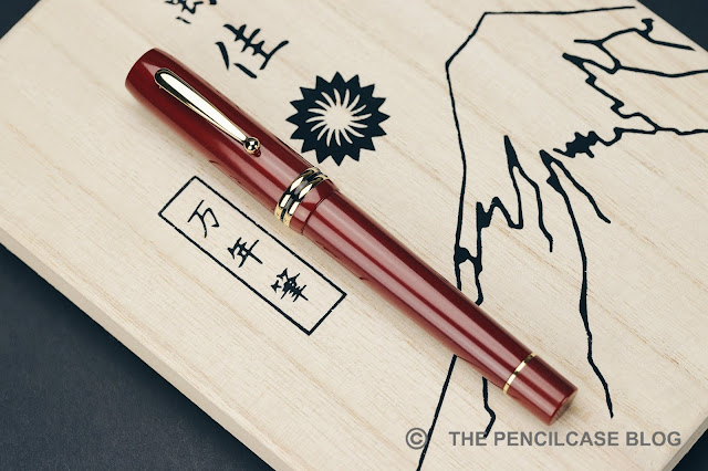
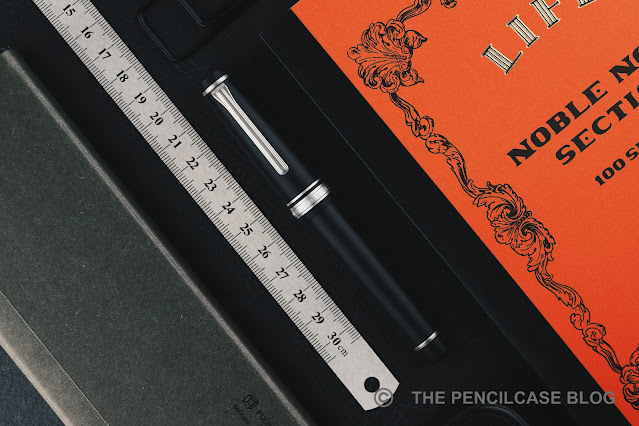
Wancher has quite a few years of experience in collaborating with Sailor. They've done a whole slew of special edition colorways, exclusive to Wancher's own online storefront, including the Sailor 1911 Turquoise that I reviewed almost four years ago. Today's pen though, the Wancher Sand Matte fountain pen, is quite the opposite of the colorful and playful Wancher-exclusive Sailors. The Wancher Sand Matte I (and Sand Matte II, which is the 1911L version) is not even advertised as a collaborative effort with Sailor! Though that's not as unusual as you might think.

Similar to a variety of Bungubox, Nagasawa Kobe,... store-exclusives, the Sand Matte is branded as a full-fledged Wancher pen, and comes with a few modifications that set it apart from a stock Sailor. At least that's what I assume because information on Wancher's website is quite sparse.
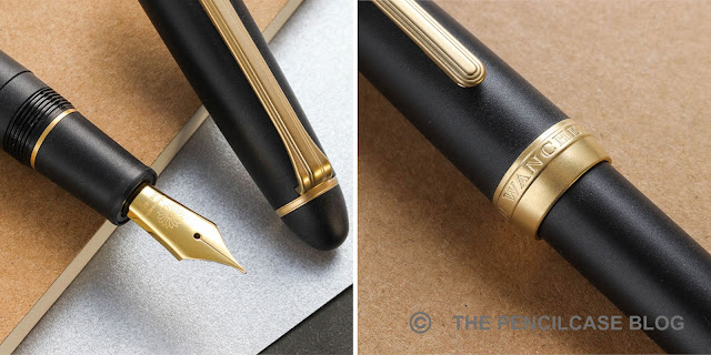
The custom 'Wancher' nib and cap band engraving on the Sand Matte II (Images taken from www.wancherpen.com)

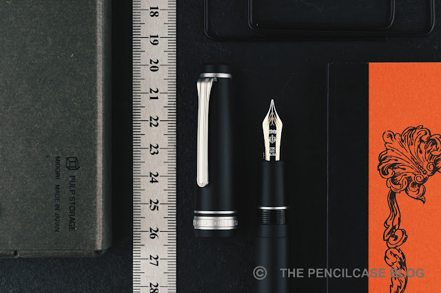
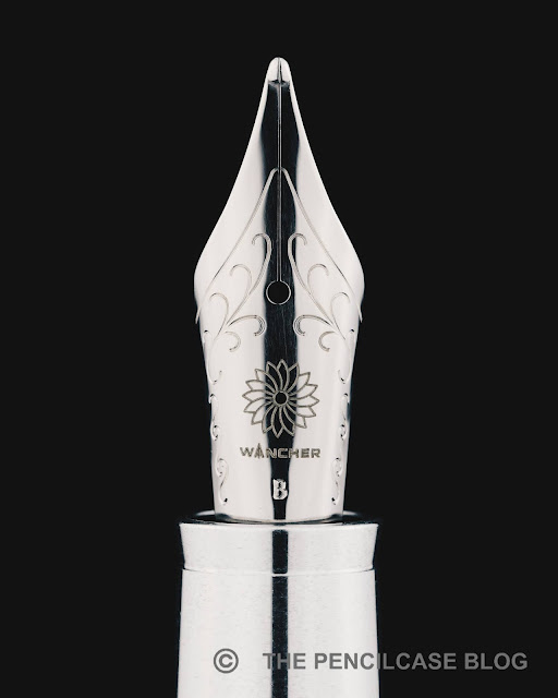
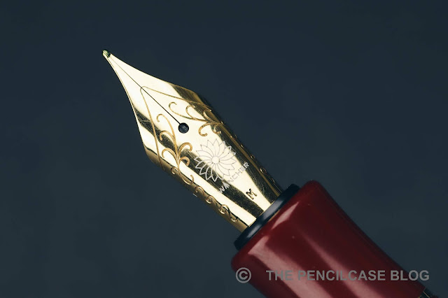
To make matters even more confusing, there seem to be a few differences between the pen I received for review and how they are shown on the website (possibly because this particular pen was sent to me quite a while ago already, so it could've been a pre-production version). The pen I was sent to review has the regular Sailor branding on the trims and nib. However, based on the product images of the slightly more recent Sand Matte II (the 1911L model), the trims are customized with Wancher's branding, and the nib is one of Sailor's custom nibs with the Wancher logo laser-engraved on it (similar to other store exclusives that have custom nibs). These small details set this pen apart from the normal Sailor special editions that Wancher sells.

I assume (and hope) that the same customizations are now also present on the Sand Matte I (the Pro Gear model). I hope Wancher makes these details a bit clearer on their website - it'd be nice to know exactly what you're buying!

The Sand Matte of course bears quite some resemblance to Sailor's own Pro Gear Imperial Black. From what I can tell (though I don't have an Imperial to compare them side by side, unfortunately), it seems the matte finish on the black resin parts of the pen is indeed similar.
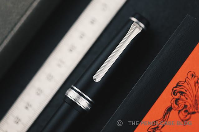
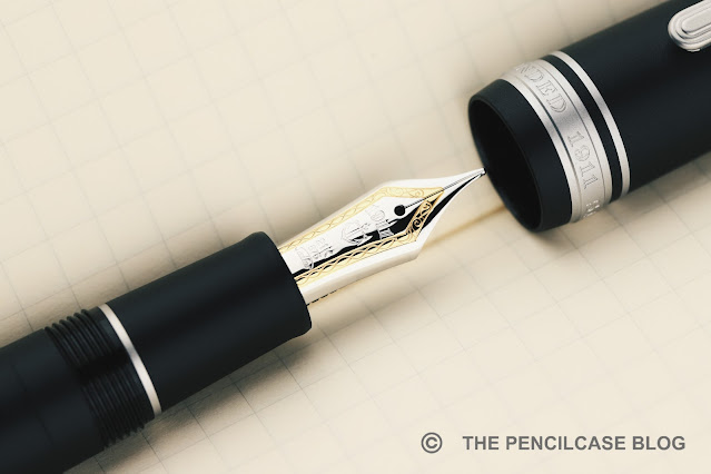
The trims are different though, as Wancher decided on treating the metal trims with a similar sandblasted finish to match the rest of the pen. The Sand Matte is available with both silver and gold-colored trims, but I find the silver trims to work best with this finish. I've seen a handful of Japan (store) exclusive Sailors that had matte trims before, but they tend to be elusive and damn near impossible to get! The matte trims are probably the coolest part about the Sand Matte (IMHO) and set it apart from the myriad of other Sailor exclusives out there. It gives the pen a sleek and modern look, and perhaps my only wish would be that they add the matte finish to the nib as well.

I've always been a fan of the Pro Gear's design, so it's no real surprise that the Sand Matte manages to captivate me with its clean and subdued looks. There are particular downsides to the matte finish though. From the second you pick it up, the matte surface will start wicking moisture and oils from your hands, which darkens the finish and makes it ever so slightly shinier. With heavy and prolonged use, the matte finish will slowly polish itself and become glossier due to abrasion from handling and oils from your hands. It's a bit similar to how a Visconti Homo Sapiens or Lamy 2000 changes with use. That's something to take into account, but in the Japanese mindset, let's call it Wabi-Sabi.
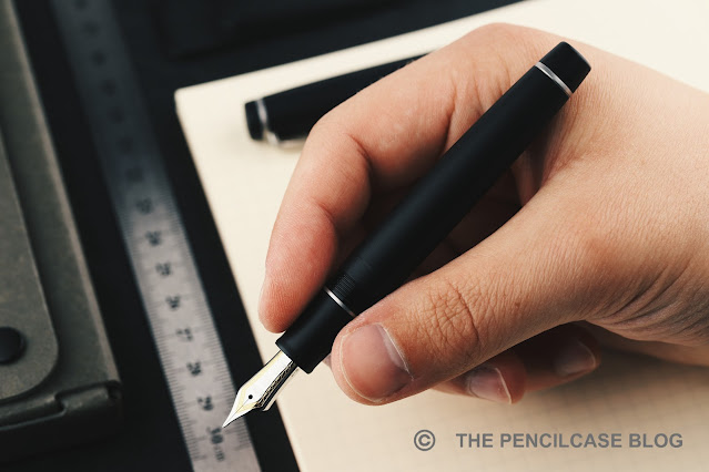
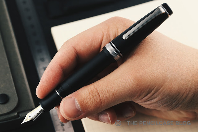
The Wancher Sand Matte is ergonomically at its best when you post the cap!
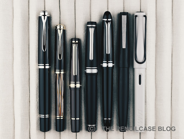
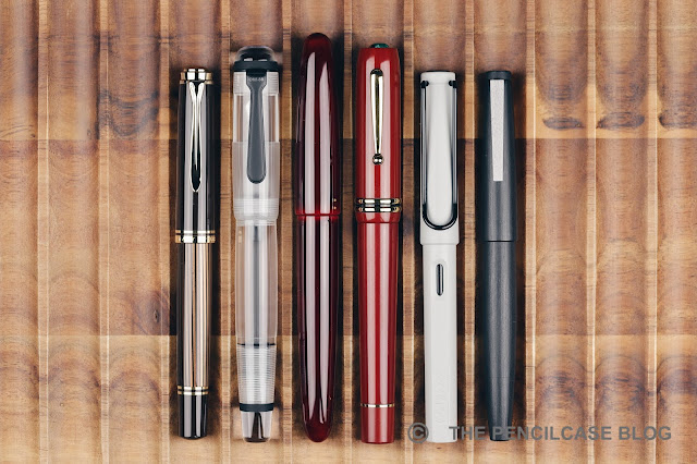
L to R: Pelikan M805, Pelikan M400, Sailor Pro Gear Slim Mini, Wancher Sand Matte, Sailor 1911L, Lamy 2000, Lamy Safari
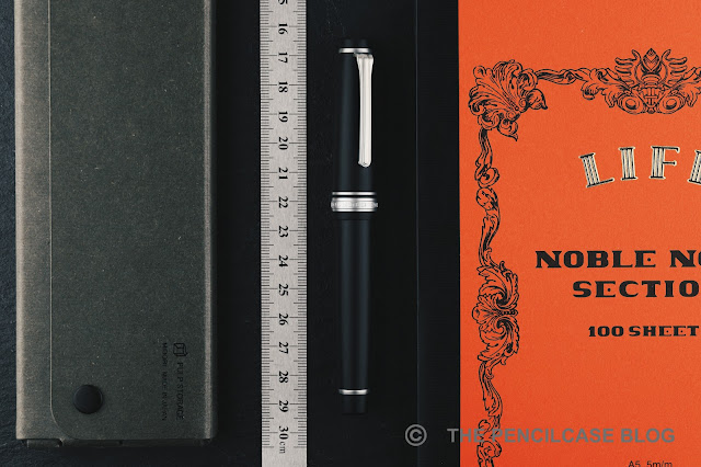
The Sand Matte is based on the full-sized Pro Gear model, which ironically means it's still a fairly small pen (I'd love to see this finish on a King Of Pen Pro Gear!). At 12.9 cm capped, and 11.5 cm uncapped it's a small pen and well outside my usual comfort zone. It's certainly usable unposted, especially if you don't have larger hands. If, like me, you tend to prefer large pens the Pro Gear is one of those rare pens that feel incredibly natural when posted. With the cap on the back, it measures 14.9 cm, and with a weight of 22 grams, it's light and nimble in the hand.
Build quality is at the typical level you'd expect from any Sailor pen. It's for the most part very well-made. The pen is lightweight but feels solid and durable. I was happy to find out that the matte surface finish somewhat helps to hide the injection-molding seams that you'll find on the grip section of any regular 1911 or Pro Gear, but they're still not entirely gone on the barrel, near the threads. 


Under the hood, we find a 21k gold Sailor nib, though as mentioned before I'm not sure whether the pen you'd order would come with a bicolor nib with Sailor engravings, or a monotone nib with the Wancher logo laser-engraved on it. Either way, the nib will be made by Sailor, it's just the finishing that differs.
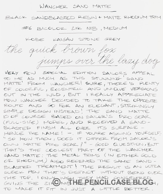
The writing experience shouldn't change, either. And that's to say: it'll write very, very well. My test pen came with a 'hard' medium (H-M) nib and it's a superb writer: smooth and with that lovely pencil-like Sailor feedback. I'm probably the last person to say Sailors are the be-all-end-all nibs on the market, but there's no denying that they're very good at creating reliable and consistent writers. The medium nib lays down a line width in between western fine and medium, which is a good starting point if you're unfamiliar with Japanese nibs.
I tend not to focus too much on special edition and store-exclusive Sailors - there are just too many to keep up! - but the Wancher Sand Matte was hard to pass on. The sleek all-matte finish adds a modern and clean look to the otherwise classic design of the Sailor Pro Gear. I continue to be a bit confused at how exactly the Sand Matte (version I) is finished in terms of nib and trim details, so I do hope Wancher makes that a bit clearer on their website.

At 320$, the Wancher Sand Matte is priced similarly to other versions of the Sailor Pro Gear. It even undercuts the Sailor Pro Gear Imperial black by a fair margin, at least when comparing pricing on the Western market. Though of course, you might have to add customs tariffs and taxes depending on where you're ordering from! I also appreciate that Wancher didn't make it super-elusive or hard to get a hold of one, it even seems like it'll be a permanent addition to their collection. 
NOTE: This product was provided by Wancher, so I could write this review. I was in no way influenced in the making of this review, the opinions shared in this review are completely my own. This post does not contain affiliate links.

Sunday, November 7, 2021

REVIEW: WANCHER PRIMO FOUNTAIN PEN

REVIEW: WANCHER PRIMO FOUNTAIN PEN

I'd like to say the Wancher Primo is a strange, unusual pen that I didn't see coming whatsoever. But then again, Wancher has never shied away from trying new things and stepping out of their comfort zone - like competitively priced Urushi with the Dream Pen (reviewed HERE), or the unique bakelite (!) Seven Treasures fountain pens (reviewed HERE). The Japanese brand has also dabbled in creating a titanium pen before (with the Dream Pen Ti), but it never seemed to have taken off (possibly due to the high price). 

With the Primo, however, they've approached the concept of a titanium pen from a very different angle. And while I don't love all aspects about it, Wancher did manage to incorporate quite a few very creative and original ideas! 

REVIEW: WANCHER PRIMO FOUNTAIN PEN

Take it out of the beautiful traditional Japanese wooden box, and the Primo immediately catches the eye with its minimal, quite futuristic, cylindrical shape, and prominent finials in contrasting material. The main highlight is the titanium cap and barrel, which have been sandblast-etched to create a random 'splattered' texture, and then anodized in different colors (Midnight Blue, Frosty Silver, Russet Brown, and Amethyst Purple). 

REVIEW: WANCHER PRIMO FOUNTAIN PEN
There's a subtle, but very pleasant tactility to the surface finish on the cap and barrel

The texture is unlike anything I've ever seen before. I really like how it creates a visual, as well as tactile, contrast between matte and polished surfaces.

REVIEW: WANCHER PRIMO FOUNTAIN PEN

But there are also things about the Primo I don't understand - And that starts with the finials. Designwise, I'm not fully on board with how the extremely large and prominent finials look. On the Frosty Silver version, the raw aluminum finials blend in relatively well with the titanium parts for a more understated look. On the other colorways, the raw aluminum finials make the Primo look sort of like a clunky magic wand -an asymmetrical one, at that- but that's of course down to personal taste.

Design reasons aside, the construction of the finials leaves me scratching my head. You see, the Primo is a very stately, bulky pen. It's also quite heavy (48 grams total). The aluminum section and finials are supposed to help reduce weight, but instead they made the finials so large and solid (they're barely hollowed out on the inside) that they actually increase the weight! This makes for a pen that's very noticeably balanced towards the finials, and well... not really all that light. 

REVIEW: WANCHER PRIMO FOUNTAIN PEN

The fact that the finials are so solid on the inside, also means they sort of get in the way of the nib and converter when closing the cap and barrel, respectively. It happens frequently that the nib will catch on the inside of the cap because of this. 

That also means there was no space left for a spring-loaded airtight inner cap, despite Wancher equipping most of their other pens with this handy feature. The cap seals off pretty well on its own, but the nib does seem to dry out a bit over extended periods of time, more so than other Wancher pens that do have the inner cap.

REVIEW: WANCHER PRIMO FOUNTAIN PEN
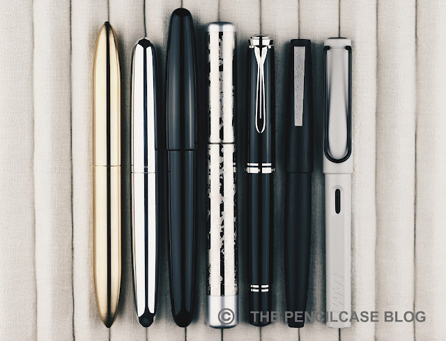
L to R: Gravitas fountain pen, Ensso Piuma, Wancher Dream Pen, Wancher Primo, Pelikan M805, Lamy 2000, Lamy Safari

Wancher doesn't scare away from making quite oversized pens, and the Primo illustrates that quite well. Measuring 14.7 cm (5.79") capped, and 13.6 cm (5.35") uncapped, it certainly isn't small to begin with, yet it's not quite as big as Wancher's own Dream Pen, for example. With the Primo, it's mainly the constant, wide diameter of 1.6 cm (0.63") across the entire pen, that really creates the oversized impression.

REVIEW: WANCHER PRIMO FOUNTAIN PEN

Going from the very wide barrel, there's a rather large step towards the metal section, which has a diameter of just 1.1 cm (0.43"). The section tapers down further to 1 cm (0.39"), with a short flared section at the end. The design of the section is almost entirely taken over from the Dream Pen (reviewed HERE), which means they deal quite well with the large step. The diameter gradually increases, first up to the threads, then a beveled ring, and finally the rounded edge of the barrel. 

There's one small -but important- detail the Primo didn't take over from the section design of the Dream Pen: the threads! Unfortunately, they took a step back towards traditional, v-cut threads, instead of the more comfortable and precise block threads from the Dream Pen. The threads are quite deep, which makes them especially noticeably if you hold your fingers on them. Despite the section being quite a decent, comfortable size, it's not always possible to avoid the sharp threads in your grip. 

REVIEW: WANCHER PRIMO FOUNTAIN PEN

The Primo comes equipped with a steel Jowo nib, but it did receive some (optional) upgrades to make it a bit less 'stock' in terms of looks and performance! First of all, the nibs are color-matched to the color of the pen itself. The plating treatment creates a somewhat pearlescent hue on the blue, purple, and brown nibs. The nib on the Frosty Silver Primo received matching rhodium plating instead of the bare stainless steel finish, which creates a brighter and more lustrous look.

Second are the optional ebonite feeds which, as I understand it, are still manufactured by Flexible Nib Factory. Although the two samples I was sent, both came with JoWo's stock plastic feeds, I've reviewed a couple of Wancher's Dream Pens with the ebonite feeds before, and they're a great addition to the already reliable writing experience JoWo nibs offer. You can't really go wrong with any of the feed options, but the ebonite feed (+30$ for black ebonite, +50$ for red ebonite) does give you a noticeably richer ink flow.

REVIEW: WANCHER PRIMO FOUNTAIN PEN

It's hard to put a final verdict on the Wancher Primo. The Wancher Primo retails for 250$, which is quite steep, especially once you factor in paying an additional 30 to 50 dollars for an ebonite feed. 

On one hand, considering the price point of the Primo, I feel like there are a few elements (mainly the clunky finial design and the sharp threads) where I feel like Wancher could've done a better job. On the other hand, I do think Wancher absolutely succeeded at creating a unique pen, one that easily catches the eye. Things like the textured barrel and cap, and the color-matched nibs, are perfectly executed and set this pen apart on the market. But on the other hand, I can't help but feel like Wancher missed the ball on a few particular design decisio

NOTE: This product was provided by Wancher, so I could write this review. I was in no way influenced in the making of this review, the opinions shared in this review are completely my own. This post does not contain affiliate links.

REVIEW: WANCHER PRIMO FOUNTAIN PEN

Sunday, February 9, 2020

REVIEW: WANCHER SEVEN TREASURES FOUNTAIN PEN

QUICK LOOK: WANCHER SEVEN TREASURES FOUNTAIN PEN REVIEW
Wancher managed to create quite a name for itself in the latest year or two. The Wancher Dream Pen and Dream Pen Urushi kicked things off with a hugely popular Kickstarter campaign: The premise was original and people -myself included- generally seemed to really like the pens that came forth from that. Two years later, it's time for another Kickstarter, and five days in (24 days left as of writing this) they already passed the 100.000$ mark with relative ease. 

Sure, in part that's because they seem to have the marketing aspect down and are omnipresent on social media (the fact that you're reading this review sort of illustrates the point). But of course, the quality has to be there as well. And if it's not too much asked we'd like to see something unique, too. Luckily, the Wancher Seven Treasures Shippoyaki fountain pen seems to deliver on all fronts! 
QUICK LOOK: WANCHER SEVEN TREASURES FOUNTAIN PEN REVIEW
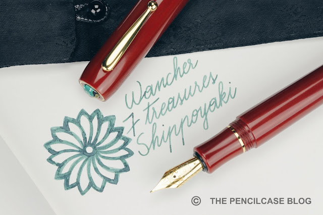
'Unique' certainly seems to be the strong suit of this pen. Ok, from afar it looks like a regular stately, flat-top pen. The large size of the pen is accentuated by the bulky, stout clip and two wide cap bands. The design is quite classy, it has a bit of an old-school Parker Duofold vibe to it.

The material this pen is made of is quite unseen in modern fountain pens: Bakelite! As a chemist, I was quite fascinated because Bakelite is often regarded as the first real fully synthetic plastic and it happens to be invented by a fellow-Belgian: Leo Baekeland! Bakelite is quite a strong material on itself, but here they opted for an even stronger composite Bakelite reinforced with paper and linen. The material has sort of a semi-polished finish and feels very pleasant in the hand.
QUICK LOOK: WANCHER SEVEN TREASURES FOUNTAIN PEN REVIEW
The real reason this pen classifies as unique is the cap finial. Wancher incorporates traditional Japanese artwork in a lot of their pens. With the Dream Pen they showcased Urushi, the Seven Treasures features a small glass inlay in the finial, made with a traditional cloisonné enamel technique called 'Shippo'. I'm not familiar with this kind of technique, but the artwork is made by Okagaki Yukie, who is apparently a reference when it comes to this technique.
QUICK LOOK: WANCHER SEVEN TREASURES FOUNTAIN PEN REVIEW
L to R: Pelikan M800, Opus 88 Omar, Wancher Dream Pen Urushi, Wancher Seven Treasures, Lamy Safari, Lamy 2000
The Seven Treasures is a large pen. At 15 cm (5,9") capped, and 13.2 cm (5,2") uncapped. With an overall weight of 39 g it's not a featherweight but doesn't weigh you down when you're writing either. Part of that weight comes from the thick-walled construction, giving the pen a durable and solid feel in the hand.

The section is quite comfortably shaped, but I wish it was a little longer because that would've moved the threads and step a bit further back. The transition towards the barrel isn't terrible, but it's a bit noticeable. The cap does post, but there's actually two reasons why I wouldn't suggest it: it's long enough by itself, and it posts onto the blind cap so you might actually operate the piston by accident.
QUICK LOOK: WANCHER SEVEN TREASURES FOUNTAIN PEN REVIEW
Talking about the piston mechanism... Wancher calls it a high-capacity piston mechanism, but I find that debatable. From my rudimentary measurements, it holds about 1 ml of ink, a bit more than a standard converter but not quite what I'd call 'high-capacity'. The mechanism feels like a captured converter to me, so the piston knob doesn't extend from the barrel when you operate the mechanism. My only gripe with this system is that the piston knob never really tightens down like with a normal piston-filled pen. Especially when you'd post the cap, it would be an easy mistake to twist it, leaving you covered in ink. For example, most Leonardo pens also have captured converters, but they covered the piston knob with a blind cap so you can't accidentally operate the mechanism.
QUICK LOOK: WANCHER SEVEN TREASURES FOUNTAIN PEN REVIEW
One nice detail Wancher thought about is the removable section to avoid staining the material when you fill the pen (Bakelite can take up moisture). It's quite a clever workaround and shows good attention to detail on Wancher's part.
QUICK LOOK: WANCHER SEVEN TREASURES FOUNTAIN PEN REVIEW
The Seven Treasures comes stock with a steel JoWo nib and feed, but you can upgrade the feed to ebonite for 30$ (or red ebonite for 50$) or an 18k gold Wancher nib for an additional 130$. The stock JoWo nib that I received performed flawlessly out of the box, and I really like this monotone gold-plated finish. The medium nib is very smooth and the feed keeps up nicely (although I would still upgrade for the ebonite feed anyway, while you're at it). If you want a more expressive writer, the optional gold Wancher nib offers more springiness and I've had good experiences with it in the past (Read my review HERE).
QUICK LOOK: WANCHER SEVEN TREASURES FOUNTAIN PEN REVIEW
The final verdict? I think Wancher scores two for two with the Dream Pen and now the Seven Treasures. Once again, they are not afraid to go outside of their comfort zone and manage to offer something quite unique to the fountain pen market. The Wancher Seven Treasures fountain pen brings a small but tangible piece of artwork to your desk, but is also an excellent daily writer to boot! The Bakelite construction is quite cool and the entire pen feels very well-made and solid.

The only real hurdle to the Seven Treasures is its price. Of course, you're paying a premium for the piece of Shippo artwork, but a full MSRP of 300$ it's feels perhaps a bit steep. The current Kickstarter prices are a better deal, starting at 240$ (Super-early bird backer prices of 210$ were already gone on the first day of the campaign, unfortunately!), but it's still not a cheap pen whatsoever. 

NOTE: This product was provided by Wancher, so I could write this review. I was in no way influenced in the making of this review, the opinions shared in this review are completely my own. This post does not contain affiliate links.
QUICK LOOK: WANCHER SEVEN TREASURES FOUNTAIN PEN REVIEW

Wednesday, August 28, 2019

REVISITING THE WANCHER DREAM PEN URUSHI FOUNTAIN PEN

REVISITING THE WANCHER DREAM PEN URUSHI
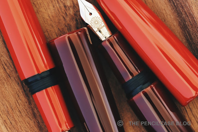
Wancher's Dream Pen True Urushi project left quite an impression on the community last year. For a very good reason of course. A way to get your hands on 'affordable' urushi fountain pens? Count me in! 

I reviewed one of the early prototypes of the Dream Pen Urushi back then (you can find this review HERE). But I wanted to revisit my original thoughts about it in a follow-up once the production pens that my father and I ordered, arrived. At this point I've had the Dream Pen with me for about five months, and it's been inked ever since it got here -that on itself is already quite a testimony to how much I like it. 
"...if Wancher can make their promises true and deliver a product as good as the prototype I have in my hands right now, this can become a game changer for the Urushi fountain pen industry..."
Back in early 2018, judging by the prototype they sent me, I knew Wancher had a great product in their hands. But of course at that point they still had to prove that they could provide the prototype-level quality on the final production version.
REVISITING THE WANCHER DREAM PEN URUSHI
Now having those final pens in hand, I think it's safe to say they succeeded in creating a quality product. The urushi laquer is perfectly applied, and the level of craftsmanship is easily on par with that of a Nakaya or Danitrio. The finish is smooth and consistent, perfectly polished, and the colors are vivid.

The pens come with a certificate on who actually did the urushi work: a laquerware studio in Wajima called Taya Shikkiten. Wajima is regarded as the capital of Urushi laquer, and has a high reputation for the quality laquer that comes from this region. 
REVISITING THE WANCHER DREAM PEN URUSHI
So how did Wancher manage to cut costs? I have a theory: Judging from my dad's Aka-Tamenuri ("Aka"=red, "Tamenuri"=pooled laquer) , and comparing it to a Nakaya in the same finish, the Dream Pen seems to have fewer laquer layers. Aka-Tamenuri is created by covering a red base color in many layers of semi-transparent smoke-grey laquer to create a darker finish. By sanding each layer, the edges reveal more of the red base, creating the effect of a pooled liquid on the surface of the pen. So in the case of the Dream Pen, less semi-transparent top layers create a more transparent finish and thus a lighter overall color. On the Shu ("Shu"=red) finish of my own Dream Pen, the fewer layers also show on the edges, where the black ebonite of the pen shows through slightly. 
REVISITING THE WANCHER DREAM PEN URUSHI
While this is just a hypothesis (read: I do not know if what I'm saying is actually true!), it would make sense. Urushi takes up to months to apply because many consecutive layers have to be applied, dried and sanded one by one. Cutting the amount of layers in half for example, would translate into twice the production capacity and half the cost. At the same time, I think the sacrifice of a few coats is relatively harmless and not at all detrimental to the quality. Urushi laquer is incredibly durable when it hardens, so the Dream Pen -regardless of how it was actually made- should last a very long time.

So what else is new? 

For one, the cap threads were updated since the original prototype. I already discussed this in my review of the Dream Pen Ebonite. The block threads are smooth and easy on the fingers. The step behind the threads is a considerable jump up from the section, and it's definitely noticeable. Although the edge is not super sharp because of the rounded edges that the urushi finish provides. Despite being a larger pen, I still find this a really comfortable writer. The section is nicely shaped and the ebonite construction is lightweight. 

Having had this pen inked up continuously, I can say the spring-loaded inner cap works great. I haven't had any issues with the nib drying out, and it starts up as soon as it hits the paper. 
REVISITING THE WANCHER DREAM PEN URUSHI
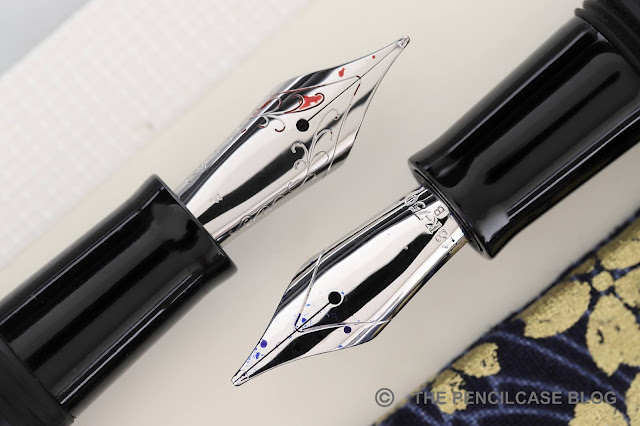
Left: Wancher 18k gold nib, Right: JoWo 18k gold nib.
Talking about the nib, this is really the highlight of the Dream Pen I think. After the Kickstarter there was some fuzz about Wancher not being able to outsource all nibs from JoWo, and they would reside to using their own, new 18k gold nibs on some orders. Some people were not at all pleased that this would mean their original nib choice would change....

Well having received one of Wancher's nibs (made in-house, which is pretty awesome), I can say I'm VERY glad that they took the decision to go this way! 
REVISITING THE WANCHER DREAM PEN URUSHI
The nib is fantastic. It's a straight-out perfect nib in almost any way. Like most Japanese nibs, it runs about one size finer than Western nibs, so my broad is more like a medium. However unlike most Japanese nibs, it's very smooth, has almost no feedback (compared to something like a Sailor, which has more of a pencil-like feedback) and provides a rather wet ink flow, regulated by the same custom ebonite feed from Flexible Nib Factory that we've seen before. It also has a distinct bouncy softness that adds some character to your writing. Wancher warns not to put too much pressure on it, but there is certainly some line variation with mild pressure.
REVISITING THE WANCHER DREAM PEN URUSHI
The only thing I don't like about it is the laser-engraving. For some reason it looks a bit fuzzy on my Wancher nib, whereas on the JoWo nibs it's perfectly crisp. Overall though, I think they made the Dream Pen even better by complementing it with their own gold nibs. If you order a True Urushi dream pen from their website now, they will automatically come with their own Wancher gold nibs.
REVISITING THE WANCHER DREAM PEN URUSHI
So that's it. I was a bit wary to put a final conclusion on Wancher's Dream Pen Urushi project, as I wasn't sure if they were going to be able to live up to the hype. Now I'm completely certain: Wancher created a beautiful pen with a fantastic nib to boot. Even at full retail price, they managed to keep the cost about 300$ below a comparable Nakaya. Even though a 450$ pen (480$ with ebonite feed) can hardly be called inexpensive, it's a great deal for the quality you get, and it serves as a fantastic gateway into Urushi pens! 

Note: This post does not contain affiliate links.

Thursday, July 25, 2019

REVIEW: WANCHER REVIVE VINTAGE JAPANESE FOUNTAIN PEN

REVIEW: WANCHER REVIVE VINTAGE JAPANESE FOUNTAIN PEN
Here's something you don't see pen brands do everyday: The vintage Japanese fountain pen project by Wancher! After their successful Dream Pen project (a final follow-up post of that will come soon), Wancher set out to breathe new life into a collection of vintage fountain pens of Japanese origin. The pens are supposedly part of the private collection of Wancher's founder mr. Okagaki and a group of collector-friends.
REVIEW: WANCHER REVIVE VINTAGE JAPANESE FOUNTAIN PEN
What they are doing is gathering a selection of ebonite and celluloid fountain pens and giving them a full service and repair. I don't know how they select which pens will be restored and sold, but they are going batch per batch (with a next batch being released for sale soon) and they listen to the community through social media for which types of pens, nibs and filling systems are most requested. The first batch consisted of some black ebonite fountain pens and a couple different celluloids including this green flecked one. 

The pen that was sent to me for review is marked "Record" on the clip, but I couldn't actually find anything on record (I love a terrible pun every now and then, sorry) about it. The nib imprint isn't much of a help either. It says "AMBA", but I assume it's something like an unbranded warranted nib. 

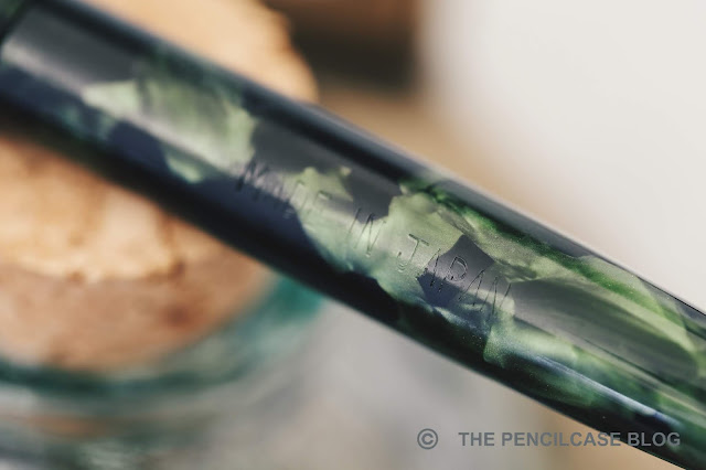
Now, to be honest I don't know much about vintage pens, but I do know that it actually looks like a direct copy of the Parker Vacumatic (third generation). It has a pointed cap finial jewel and plain rounded barrel finial. The clip and cap band also show a strong resemblance to the Vacumatic. Wancher calls this material green fleck celluloid, which is a really nice dark material with large, chatoyant green flecks. 
REVIEW: WANCHER REVIVE VINTAGE JAPANESE FOUNTAIN PEN
Right out of the box it's clear that the servicing was aimed at fixing structural damage and creating a functional, user-grade pen - not a pristine MINT collector's piece. You have to be a fan of Wabi-Sabi for this one, and I don't know if I am. I feel like the barrel should've received a quick buff to bring out the shine and depth of the green fleck celluloid, which is honestly a really good-looking material. The gold-plated trim is quite weathered and brassed, especially on the clip. There's no plating loss though. For a pen that's well over half a century old, it certainly held up quite nicely but it's not perfect.
REVIEW: WANCHER REVIVE VINTAGE JAPANESE FOUNTAIN PEN
L to R: Edison Beaumont, Pelikan 100n, Wancher vintage pen, Lamy Safari, Lamy 2000
Being vintage and Japanese, it's no surprise that this is a rather small pen. Capped it comes in at 12.7 cm (5") and 11.5 cm (4.5"). The diameter around the section is about 9 to 10mm (0.4"), not too wide but comfortable enough for me. The all-plastic construction makes it a really light pen. As someone who normally almost never posts his pens, this does balance absolutely perfectly with the cap on the back. It posts securely to a total length of 14.4 cm (5.66") while still being very light and balanced. Threads are super-shallow and completely flush with the section and barrel of the pen,very pleasant to hold in the hand.
REVIEW: WANCHER REVIVE VINTAGE JAPANESE FOUNTAIN PEN
The pen fills via a bulb-filler mechanism. With the brass sleeve over the latex sac, it reminds me a lot of the type of squeeze converters that -in my case- never seem to work very well. This one however,  works a treat and fills up completely in a couple of squeezes.
REVIEW: WANCHER REVIVE VINTAGE JAPANESE FOUNTAIN PEN
The steel nib (about #5 in size) has a two-tone design with arrow imprint -again, almost identical to the nib imprint on the Parker Vacumatic. It was slightly out of alignment on arrival, causing it to be quite scratchy. However with the tines properly aligned, it's a pretty decent writer and puts down a relatively wet, fine line about the size of a western fine/japanese medium. 

Overall, despite me not being an absolute vintage pen freak (Luckily! it's worse enough of an addiction with just modern pens!), I think it's a very nice pen overall. Although be it slightly on the expensive side considering the steel nib and overall condition of the pen. Prices vary depending on the material, but start upwards of 100$, especially the celluloid versions like this go for a bit more. If you're looking to adopt a vintage Japanese fountain pen and give it some more love, keep an eye out on the Wancher website for the next round vintage pens (at the bottom of the page you can sign up to get notified by email when the sale starts). On instagram you can follow Wancher and give your opinion on which vintage pens you'd like to see restored next!

UPDATE: The second round of sales will start August 1st at 9:59 EST!

NOTE: This product was provided by Wancher, so I could write this review. I was in no way influenced in the making of this review, the opinions shared in this review are completely my own. This post does not contain affiliate links.
REVIEW: WANCHER REVIVE VINTAGE JAPANESE FOUNTAIN PEN

Wednesday, October 31, 2018

REVIEW: WANCHER DREAM PEN TRUE EBONITE FOUNTAIN PEN

Review: Wancher Dream Pen True Ebonite fountain pen
Wancher left a very good first impression with me a couple months ago, when I reviewed the Dream Pen True Urushi (you can find this review HERE). But if you remember, I made a statement at the end of that review, with a very big IF: the pre-production prototype of the Dream Pen was fantastic, but of course that set the bar high for them, and I was curious to see if they could actually fulfill their promise of a premium quality Japanese pen at a reasonable price. I don't think I was being unreasonably skeptical back then. After all, the Dream Pen is probably Wancher's most ambitious project to date, and of course we want them to deliver what was promised.

The urushi side of the Dream Pen project encountered a few delays -let's be honest, that's to be expected with Kickstarters-, so we're still a few weeks away from the True Urushi Dream Pen. But  meanwhile, the True Ebonite version had a couple months head start, and Kickstarter rewards shipped out a while ago. Wancher sent me one to check out and compared to the True Urushi prototype, so big thanks to them.
Review: Wancher Dream Pen True Ebonite fountain pen
Since the True Urushi was still a prototype, this was also the first time I saw the actual retail packaging, and it's absolutely sublime! The light wood box is very similar to those from Nakaya or Sailor, and inside you'll find your pen in a nice velvet-lined pouch. Granted, the box isn't as well-built as a Nakaya box, and the pouch is not actual Japanes silk (just silk-screened fabric). Nevertheless, for the price of the Ebonite Dream, Pen I don't think you can find better packaging!
Review: Wancher Dream Pen True Ebonite fountain pen
Which is which?
The Wancher Dream Pen True Ebonite is almost impossible to tell apart from the True Urushi Dream Pen (at least the black urushi version I reviewed a while ago. You can find that review HERE). Put them side by side, and on photos you'll be hard-pressed to spot a difference. Even in real life, I occasionally had trouble keeping track of which is which. I suppose you could say that's a testimony to the high level of finishing of the Japanese ebonite. It's so well-polished that it almost has the same luster as the Urushi finish, although it lacks that liquid-like appearance that Urushi has.
Review: Wancher Dream Pen True Ebonite fountain pen
The level of finishing on the ebonite is top-notch!
Wancher has limited the color options to...black. So I bet a lot of people -me included- stepped up to the True Urushi version to get a more inspiring finish. Perhaps they might do different ebonite colorways in the future? That would definitely be interesting to see.

The Dream Pen obviously retains the shape of the prototype I reviewed earlier. Which is a good thing in my opinion. The long and fat, tapered cigar shape is simple. And despite the imposing size it's still an elegant, minimal design.
 Review: Wancher Dream Pen True Ebonite fountain pen
Review: Wancher Dream Pen True Ebonite fountain pen
L to R: Pelikan M805, Pilot 823, Pilot Justus 95, Wancher Dream Pen Ebonite, Lamy Safari, Lamy 2000
For precise weight and measurements, you can check out my review of the Dream Pen True Urushi (read it HERE), as those measurements will also hold true for this pen. It's a chunky pen in the hand, and it's easily long enough to use without posting (luckily, as it doesn't post!). Comfort is aided by a grip section that is considerably less bulky compared to the rest of the pen. Of course that means there's a step from barrel to section, but the transition is fairly gradual, instead of a hard step. Despite some sharp corners, the shape of the section never felt obstructive to my grip. 
Review: Wancher Dream Pen True Ebonite fountain pen
Prototype on the left, production model on the right
Compared to the prototype, the threads have gone from regular cut to block threads, which are a bit easier on the fingers. I did find the threads to have a bit more of a tendency to cross-thread when capping the pen, although it didn't occur very often (maybe 1 in 10 times).

Capping still requires a slight push because of the inner cap seal that prevents the nib from drying out. They did change it a little bit though, and it now doesn't require as much of a push compared to the prototype, making it a bit more intuitive to use.

The slip-seal inner cap also does its job, as I never experienced any issues with the nib drying out or having trouble starting.
Review: Wancher Dream Pen True Ebonite fountain pen
It has also been interesting to try out the steel JoWo nib paired with the Flexible Nib Factory ebonite feed. Where the Stock #6 JoWo nibs are are already excellent writers, the custom feed provides just that little bit extra. JoWo nibs maybe aren't THE most exciting nibs, but they definitely perform consistently, and the ebonite feed definitely helps pulling the writing experience to the next level. The fine nib is smooth and responsive, and the flow is consistent and rich. No complaints here!

The Wancher Dream Pen True Ebonite really delivered on my expectations, and it's a fantastic pen all around. While the Dream Pen True Ebonite was an excellent deal at the Kickstarter price of 175$, it's definitely on the more expensive side at full retail (230$). 

I'd say the price is justified through the excellent build quality, attention to detail, and the reliable nib. But more than anything, seeing the quality they delivered here gives me confidence that they can also live up to the hype of the True Urushi... I'm looking forward to it!

This product was sent to me by Wancher so I could write this review. I was in no way influenced in the making of this review, the opinions shared in this review are completely my own! This post does not contain affilate links.
Review: Wancher Dream Pen True Ebonite fountain pen