Showing posts with label Kickstarter. Show all posts

Friday, September 4, 2020

REVIEW: NEW STILFORM INK FOUNTAIN PEN

 REVIEW: NEW STILFORM INK FOUNTAIN PEN
Stilform is back with another Kickstarter campaign - this time with a new and improved version of the (Kosmos) Ink fountain pen. The German design brand has made quite a name for itself in just a few years. They chose a style and brand concept, and embraced it in their entire product line - I can appreciate when a brand knows the direction they want to go in. Also, it doesn't hurt if your signature style is as sleek, modern, and minimal as Stilforms' - yes, I am quite a fan! 

What's even better: they are dead-set on improving their products along the way. I've seen them do multiple updates on the original Kosmos pen (which was good to begin with, but was made more durable in later updates), and now the Kosmos Ink fountain pen (review HERE) gets a refresh (and is also no longer called the 'Kosmos' Ink, to differentiate itself from the Kosmos ballpoint model I suppose!). Did it really need a refresh? No. But did they make some interesting changes? Yes... So let's have a look! 
REVIEW: NEW STILFORM INK FOUNTAIN PEN
Top: new Ink, bottom: old Kosmos Ink
The design of the Ink remained largely the same: it's still a monolithic, pill-shaped pen with perfectly rounded finials. Two large flat sides along the entire length of the pen make it sit still on your desk.
REVIEW: NEW STILFORM INK FOUNTAIN PEN
Crisp machining and flawless finish
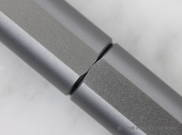
Where other pens go for a seamless transition between cap and barrel, the Ink embraces it with a nice double chamfer that mates the two parts perfectly. The polished finish on the chamfered edges breaks the matte, sandblasted finish of the all-titanium pen (the same contrasting finish can also be found on the anodized aluminium finishes). The new version of the Ink can also be had in a special, ultra-durable DLC-coated black titanium version, which looks really cool!
REVIEW: NEW STILFORM INK FOUNTAIN PEN
Top: new Ink, bottom: old Kosmos Ink
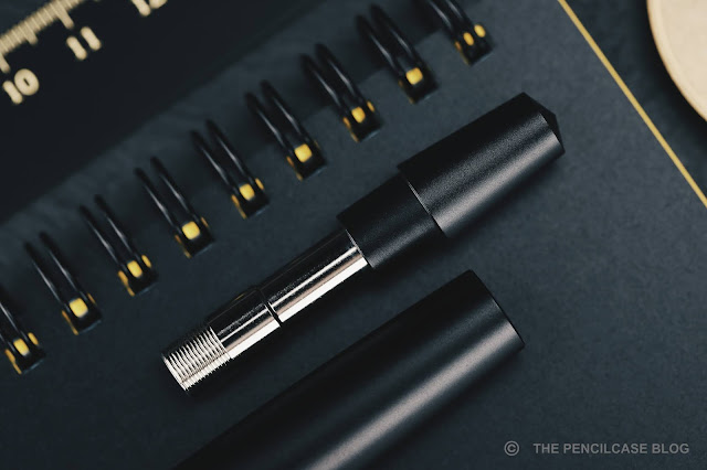
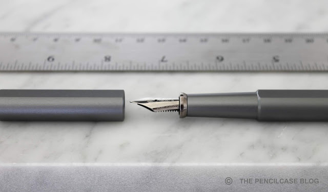
The main aesthetic difference can be found underneath the cap, where they refined the section design to hide the magnet. On the original Ink, the magnet was exposed and its shiny finish contrasted with the matte surface of the section. The new design incorporates the magnet in a housing that matches the material and finish of the rest of the pen, and also provides a slightly more pronounced flared shape. I don't completely understand why they chose to make the cover over the magnet a separate piece from the rest of the section, instead of integrating it into a more seamless, single piece (I suppose it has to do with how the pen is put together?).
REVIEW: NEW STILFORM INK FOUNTAIN PEN
The cover over the magnet also serves a functional purpose: It protects the magnet from ink and wear and tear, which apparently caused the magnet to rust on the original pen. The front of the magnet is still exposed though, so I'd suggest to fill the pen from the converter instead of dunking the entire section into ink, just to be safe. 
REVIEW: NEW STILFORM INK FOUNTAIN PEN
The back of the barrel now reads 'stilform' instead of 'KOSMOS', the font is quite large
Talking about the magnet: It's less strong on the updated Ink. Apparently, some people found the original too strong, but I liked the fact that it could only be opened by twisting the cap to make the magnets repel. The new Ink still stays closed well enough most of the time, but the cap can be pulled off more easily, and I've had a few occasions where I ended up with just the cap in my hand after trying to get it out of a pen case. The weaker magnet also makes the flat spots a bit less inclined to self-align perfectly when capping the pen. It's not a huge deal, but ideally I would've preferred if the magnet strength was somewhere in between the new and old version.
REVIEW: NEW STILFORM INK FOUNTAIN PEN
L to R: Ensso Piuma, Stilform Kosmos, Stilform Arc, Stilform Kosmos Ink, Stilform New Ink, Lamy Safari, Lamy 2000
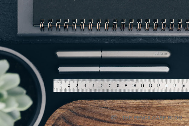
While I think the enclosed magnet is a nice aesthetic upgrade over the previous version, I don't think it's the new Ink's biggest merit. The larger overall size, however, is. The new Ink measures 14.5 cm/  5.71" capped, and 13.6 cm/5.35" uncapped. It's slightly wider overall, too, with a barrel diameter of 1.35 cm/ 0.53". Especially the slightly wider section (1 cm/ 0.39" at the thinnest part) is a welcome improvement and is a comfortable diameter to grip. With a larger pen also comes a bit more heft: the new Ink adds about 5 grams to the existing design, to make for a total weight of 43 grams - it has a reassuring density that I appreciate in most titanium pens. Logically, the aluminium version will be a good bit lighter, if that's your jam. 
REVIEW: NEW STILFORM INK FOUNTAIN PEN
To put those numbers in perspective: The new Ink is just 3 mm longer, and .7 mm thicker. While those differences may sound negligible, it does in fact give the pen a noticeably larger appearance and feel. Especially the wider section makes it a bit more comfortable for my hand, and I like the heft of the all-titanium construction. 
REVIEW: NEW STILFORM INK FOUNTAIN PEN
One thing I miss on the new version, is the addition of a #6-sized nib. The updated Ink design is more than large enough to accomodate a larger nib, which would make it more proportionate to the rest of the pen IMHO. Functionally, I have no complaints about the maller Bock #076 nib (Which is a slightly wider nib on the feed of a #5 nib, similar to those found on a TWSBI 580, for example). My test pen came with a steel nib in medium, and it has performed flawlessly out of the box. It's a very smooth, wet writer. I was especially surprised by how it doesn't dry out at all, even after more than a week of not being used, it picked up right away. One final detail about the nib that I quite appreciate: the nib unit is attached internally to a separate part behind the section, so that it can always be aligned to the facets on the barrel of the pen. 
REVIEW: NEW STILFORM INK FOUNTAIN PEN
The new Stilform Ink is currently on Kickstarter, with backer pledges starting at 65€ for the aluminium version, and 119€ for the titanium (about 20% off the future MSRP). That makes it all but the cheapest pen you'll find on the crowdfunding platform. But they don't feel overpriced either, especially since there's simply quite a lot to like about them: Stilforms ultra-minimalist aesthetic. Finely detailed machining. Unique use of magnetic mechanisms. And last but not least, Stilforms continued effort to improve their products... the Stilform Ink enjoys the same recipe that has made their products some of the most succesful Kickstarter pens around. Take a look at the current Kickstarter campaign, and you'll know I'm not kidding - almost 900 backers and over 100.000$ collected already in the first three days of the campaign! 

This product was sent to me by Stilform, so I could write this review. I was in no way influenced in the making of this review, the opinions shared in this review are completely my own! This post does not contain affiliate links.
REVIEW: NEW STILFORM INK FOUNTAIN PEN

Sunday, August 23, 2020

REVIEW: BEN WALSH DESIGN GRAVITAS FOUNTAIN PEN & GRAVITAS TWIST PEN

PEN REVIEW: BEN WALSH DESIGN GRAVITAS FOUNTAIN PEN & GRAVITAS TWIST PEN
I started chatting with Irish designer Ben Walsh about a year ago when all this was still a concept idea and a bunch of renders. Ben - who got into the pen making industry with unique, handmade concrete pens - wanted to create a metal pen from scratch, and he was actively engaging with the community to gather feedback. One year, and a lot of exchanged thoughts and ideas later, Ben has released his pen - I should say 'pens - out in the wild via a Kickstarter campaign that took off last week: Gravitas pens!

Now, if you know me and my reviews, you'll know that I have a sliiiiight tendency to get overly excited about cool metal pens, but believe me when I say this is a Kickstarter you HAVE to check out if you're even the slightest bit interested in this type of pens! If you still don't believe me after this review - no offense taken - check out Anthony's review over at UK Fountain Pens. Anthony likes it too, and he's a tough guy to convince!
PEN REVIEW: BEN WALSH DESIGN GRAVITAS FOUNTAIN PEN & GRAVITAS TWIST PEN
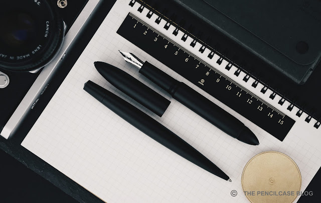
From afar, you might be forgiven for thinking of the Gravitas fountain pen and Gravitas 'Twist' capless rollerball as a 'been there, done that' design. True, nobody's reinventing the wheel here (not that anyone has done that in the pen industry for a very long time, I'd dare to say), but if anything the Gravitas pens are very good looking wheels! The Gravitas and Gravitas Twist pair up nicely side by side, but they are two relatively different pens in terms of design. 
PEN REVIEW: BEN WALSH DESIGN GRAVITAS FOUNTAIN PEN & GRAVITAS TWIST PEN
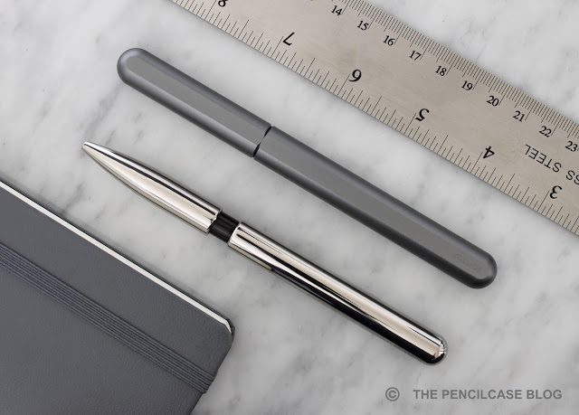
Let's start with the Gravitas fountain pen (and capped rollerball), which has a very pronounced torpedo shape with a girthy, straight cylindrical body. It tapers down sharply towards the cap and barrel finials into pointed ends... but instead of a point, you'll find a small silicon nitride ball on either end! 

Despite a somewhat tactical pen vibe, the finials' main intent is to provide a more durable design that could survive a drop better than a bare aluminium finial would. Compared to the more rounded cigar-shaped Ensso Piuma or Namisu Horizon - two comparable pens - the Gravitas has a much more robust and bulky appearance (probably because it IS robust and bulky), which I quite enjoy. 
PEN REVIEW: BEN WALSH DESIGN GRAVITAS FOUNTAIN PEN & GRAVITAS TWIST PEN
Yeah... too much is too much!
The clean, minimal design is interrupted by a threaded section on the back of the barrel. While I don't find the threads as visually distracting as I thought I would, I'm still happy to know that they will be dropped in the final production version. The Gravitas is more than long enough to be used without posting (in fact, it looks a bit silly with the cap on the back!) so you won't miss those threads at all. 
PEN REVIEW: BEN WALSH DESIGN GRAVITAS FOUNTAIN PEN & GRAVITAS TWIST PEN
Streamlined!
The Twist pen is a different beast altogether. It's sleeker, skinnier, and has a long and rounded taper towards the narrow tip of the pen. What sets the Twist apart is its flat spot that prevents it from rolling around. With respect to the center of the pen, the flat is angled towards the front of the pen (my photo's don't do this justice at all). This gives the pen a mean-looking 'stance' when it sits on a flat surface, with the tip angled downward - it's quite cool. 
PEN REVIEW: BEN WALSH DESIGN GRAVITAS FOUNTAIN PEN & GRAVITAS TWIST PEN
The twist mechanism of the Twist (the name certainly isn't far-fetched!) is of Schmidt make, the same as those found in Baron Fig's Squire. It has a pleasant action and feels quite solid (there's a slight rattle, but nothing too distracting). I do wish that the twist knob was a bit longer compared to the rest of the pen, to make it easier to reach and operate. Ben took note of this as well, when I and a couple other reviewers were asked to give input on these production prototypes, and so these changes will most likely end up in the final design. 
PEN REVIEW: BEN WALSH DESIGN GRAVITAS FOUNTAIN PEN & GRAVITAS TWIST PEN
While the idea is to expand the Gravitas collection with various materials and finishes (including really neat laser-etched graphics that cover the entire pen!), the Kickstarter starts off with three clean-looking anodized aluminium finishes: black, silver and gold. Even on these 'prototypes' (quite advanced proto's, but still...), the finish is immaculate. The aluminium base pen is bead-blasted to remove machining marks, and then anodized to give a smooth matte finish that is very pleasant to the touch.
PEN REVIEW: BEN WALSH DESIGN GRAVITAS FOUNTAIN PEN & GRAVITAS TWIST PEN
The Gravitas fountain pen...
PEN REVIEW: BEN WALSH DESIGN GRAVITAS FOUNTAIN PEN & GRAVITAS TWIST PEN
And the Gravitas Twist pen
PEN REVIEW: BEN WALSH DESIGN GRAVITAS FOUNTAIN PEN & GRAVITAS TWIST PEN
L to R: Baron Fig Squire, Karas Retrakt, Namisu Nova, Ensso Piuma, Gravitas fountain pen, Gravitas Twist pen, Lamy Safari, Lamy 2000
The Gravitas fountain pen is a fairly large pen, noticeably larger than most other metal pens from the likes of Ensso, Namisu, Karas... It measures 14.8 cm/ 5.81" capped, and 13.4 cm/ 5.28"  uncapped. The maximum diameter of 1.5 cm/ .59" runs along almost the entire length of the pen, which makes it look bulky and robust. Underneath the cap, you'll find a long, gently tapered section with a comfortable diameter (1.1 cm/ .43" even at the thinnest point) that flares out slightly towards the nib.
PEN REVIEW: BEN WALSH DESIGN GRAVITAS FOUNTAIN PEN & GRAVITAS TWIST PEN
Shallow threads and an angled transition towards the barrel create a comfortable writing experience 
The threads are shallow and fine, rendering them barely noticeable in the hand. The threads are single start on this prototype, and take a hefty three full turns to cap and uncap. The final production pen will get more common triple start threads that need fewer turns. One of my favorite practical design elements on the Gravitas is how the step towards the barrel is angled to make the transition much more gentle in the hand. It's an elegant and simple design decision that makes all the difference in terms of comfort, and yet you barely ever see it on other pens. It's a larger pen, so even the all-aluminium construction still comes in at 39 grams. I guess you could say the Gravitas has a reassuring... gravitas to it (terrible pun, I know), it sits nicely balanced in the hand.
PEN REVIEW: BEN WALSH DESIGN GRAVITAS FOUNTAIN PEN & GRAVITAS TWIST PEN
The Twist pen is a bit smaller than its capped companion, although in absolute terms it's still far from compact. At 14.1 cm/ 5.55" in length, and with a maximum diameter of 1.4 cm/ .55" it's a bit shorter than the fountain pen. Due to the more tapered shape of the Twist, it definitely appears smaller than it actually is. With a weight of 34 grams, it feels positively hefty in the hand, too.

In terms of comfort, both pens score high marks with me. The Gravitas fountain pen has a comfortable design, a lot of the small details, like the shape and size of the section, the subtle threads and angled transition towards the barrel, are the result of careful consideration on Ben's end, taking into account a lot of input he got from the community. The Twist actually has a unique angle (hah! got it?) in terms of comfort, with the flat spot providing a natural area to rest your thumb, index or middle finger (either way you rotate it, it sits comfortably in your hand). The stretched out, tapered design means you can hold it closer to the tip or further up, to get the grip diameter you prefer. 
PEN REVIEW: BEN WALSH DESIGN GRAVITAS FOUNTAIN PEN & GRAVITAS TWIST PEN
The Gravitas Twist comes loaded with Schmidt's P8127 rollerball refill. While that's not a bad refill, I've recently switched towards gel-based refills for my non-fountain pen writing. Luckily, the P8127 is similarly sized to standard Parker G2 refills (not to be confused with Pilot's G2!), which gives plenty of choices to swap refills to a ballpoint or gel refill (I've been using the Monteverde Ceramic gel refill, which fits perfectly and works quite well, even though it's not quite as fine as I'd like)
PEN REVIEW: BEN WALSH DESIGN GRAVITAS FOUNTAIN PEN & GRAVITAS TWIST PEN
The Gravitas fountain pen, on the other hand, warrants some explaining: While the prototype I have in my hand has a Bock nib - common for most metal pens you'll find on the market today - Ben made the switch to JoWo when he noticed the quality wasn't as consistent as he'd like with Bock. It's good to know that a strict QC is in place to ensure each nib functions as it should. As a lot of brands adopt stock JoWo and Bock nibs these days, individual QC is the way to provide that little extra that sets your brand apart. Ironically, the Broad Bock nib on this particular pen has been one of the smoothest, and wettest Bock nibs I've come across. But regardless, I think JoWo is the safer choice, and it's something different from what most other brands are doing!
PEN REVIEW: BEN WALSH DESIGN GRAVITAS FOUNTAIN PEN & GRAVITAS TWIST PEN
The Ben Walsh Design Gravitas pens are the result of a million small little details and considerate design choices. It has taken quite a few years, but the culmination of Ben Walsh's effort has led to two great-looking AND functioning pens (technically three, also counting the capped rollerball) that I can wholeheartedly stand behind. Maybe because I've had a teeny tiny say in how they turned out, but probably because they are just fantastic pens - simple as that! If I sound enthusiastic about them, that's because I am. 
PEN REVIEW: BEN WALSH DESIGN GRAVITAS FOUNTAIN PEN & GRAVITAS TWIST PEN
If you feel like supporting the Gravitas pens, you can check out the Kickstarter page until September 17th. The Gravitas Twist pen starts at 45€, and the capped Gravitas rollerball and fountain pen each start at 50€, which is very affordable. Even at future respective retail prices of 65 and 70 euros, I still think these are a killer deal. Enough blabbing already! I've already gone and put my money where my mouth is, and I think you should, too.

This product was sent to me by Ben Walsh Design so I could write this review. I was in no way influenced in the making of this review, the opinions shared in this review are completely my own! This post does not contain affilate links.
PEN REVIEW: BEN WALSH DESIGN GRAVITAS FOUNTAIN PEN & GRAVITAS TWIST PEN

Sunday, February 9, 2020

REVIEW: WANCHER SEVEN TREASURES FOUNTAIN PEN

QUICK LOOK: WANCHER SEVEN TREASURES FOUNTAIN PEN REVIEW
Wancher managed to create quite a name for itself in the latest year or two. The Wancher Dream Pen and Dream Pen Urushi kicked things off with a hugely popular Kickstarter campaign: The premise was original and people -myself included- generally seemed to really like the pens that came forth from that. Two years later, it's time for another Kickstarter, and five days in (24 days left as of writing this) they already passed the 100.000$ mark with relative ease. 

Sure, in part that's because they seem to have the marketing aspect down and are omnipresent on social media (the fact that you're reading this review sort of illustrates the point). But of course, the quality has to be there as well. And if it's not too much asked we'd like to see something unique, too. Luckily, the Wancher Seven Treasures Shippoyaki fountain pen seems to deliver on all fronts! 
QUICK LOOK: WANCHER SEVEN TREASURES FOUNTAIN PEN REVIEW
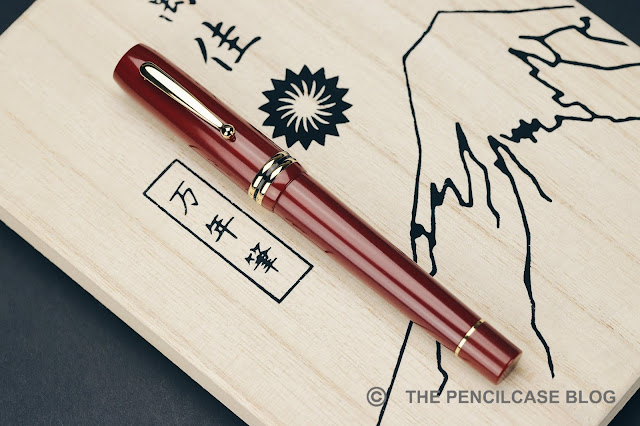
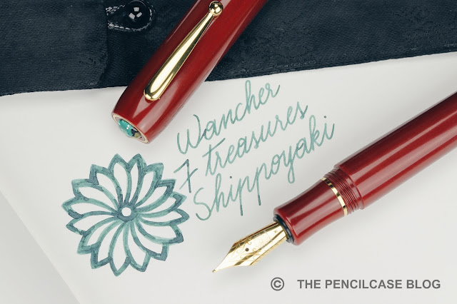
'Unique' certainly seems to be the strong suit of this pen. Ok, from afar it looks like a regular stately, flat-top pen. The large size of the pen is accentuated by the bulky, stout clip and two wide cap bands. The design is quite classy, it has a bit of an old-school Parker Duofold vibe to it.

The material this pen is made of is quite unseen in modern fountain pens: Bakelite! As a chemist, I was quite fascinated because Bakelite is often regarded as the first real fully synthetic plastic and it happens to be invented by a fellow-Belgian: Leo Baekeland! Bakelite is quite a strong material on itself, but here they opted for an even stronger composite Bakelite reinforced with paper and linen. The material has sort of a semi-polished finish and feels very pleasant in the hand.
QUICK LOOK: WANCHER SEVEN TREASURES FOUNTAIN PEN REVIEW
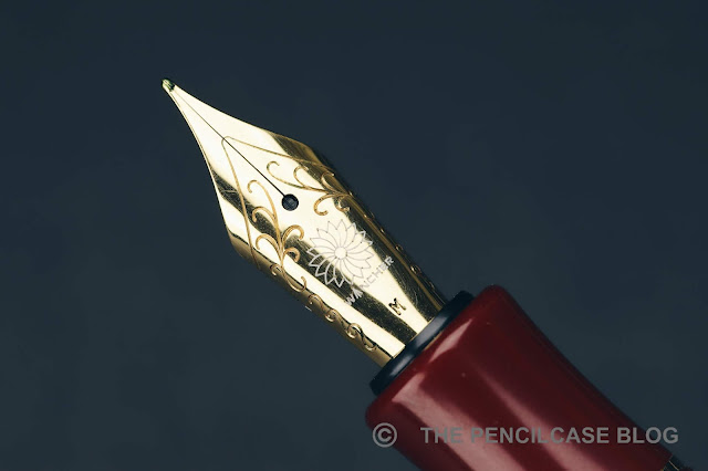
The real reason this pen classifies as unique is the cap finial. Wancher incorporates traditional Japanese artwork in a lot of their pens. With the Dream Pen they showcased Urushi, the Seven Treasures features a small glass inlay in the finial, made with a traditional cloisonné enamel technique called 'Shippo'. I'm not familiar with this kind of technique, but the artwork is made by Okagaki Yukie, who is apparently a reference when it comes to this technique.
QUICK LOOK: WANCHER SEVEN TREASURES FOUNTAIN PEN REVIEW
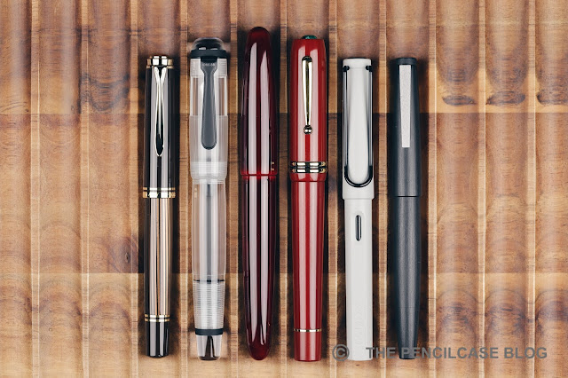
L to R: Pelikan M800, Opus 88 Omar, Wancher Dream Pen Urushi, Wancher Seven Treasures, Lamy Safari, Lamy 2000
The Seven Treasures is a large pen. At 15 cm (5,9") capped, and 13.2 cm (5,2") uncapped. With an overall weight of 39 g it's not a featherweight but doesn't weigh you down when you're writing either. Part of that weight comes from the thick-walled construction, giving the pen a durable and solid feel in the hand.

The section is quite comfortably shaped, but I wish it was a little longer because that would've moved the threads and step a bit further back. The transition towards the barrel isn't terrible, but it's a bit noticeable. The cap does post, but there's actually two reasons why I wouldn't suggest it: it's long enough by itself, and it posts onto the blind cap so you might actually operate the piston by accident.
QUICK LOOK: WANCHER SEVEN TREASURES FOUNTAIN PEN REVIEW
Talking about the piston mechanism... Wancher calls it a high-capacity piston mechanism, but I find that debatable. From my rudimentary measurements, it holds about 1 ml of ink, a bit more than a standard converter but not quite what I'd call 'high-capacity'. The mechanism feels like a captured converter to me, so the piston knob doesn't extend from the barrel when you operate the mechanism. My only gripe with this system is that the piston knob never really tightens down like with a normal piston-filled pen. Especially when you'd post the cap, it would be an easy mistake to twist it, leaving you covered in ink. For example, most Leonardo pens also have captured converters, but they covered the piston knob with a blind cap so you can't accidentally operate the mechanism.
QUICK LOOK: WANCHER SEVEN TREASURES FOUNTAIN PEN REVIEW
One nice detail Wancher thought about is the removable section to avoid staining the material when you fill the pen (Bakelite can take up moisture). It's quite a clever workaround and shows good attention to detail on Wancher's part.
QUICK LOOK: WANCHER SEVEN TREASURES FOUNTAIN PEN REVIEW
The Seven Treasures comes stock with a steel JoWo nib and feed, but you can upgrade the feed to ebonite for 30$ (or red ebonite for 50$) or an 18k gold Wancher nib for an additional 130$. The stock JoWo nib that I received performed flawlessly out of the box, and I really like this monotone gold-plated finish. The medium nib is very smooth and the feed keeps up nicely (although I would still upgrade for the ebonite feed anyway, while you're at it). If you want a more expressive writer, the optional gold Wancher nib offers more springiness and I've had good experiences with it in the past (Read my review HERE).
QUICK LOOK: WANCHER SEVEN TREASURES FOUNTAIN PEN REVIEW
The final verdict? I think Wancher scores two for two with the Dream Pen and now the Seven Treasures. Once again, they are not afraid to go outside of their comfort zone and manage to offer something quite unique to the fountain pen market. The Wancher Seven Treasures fountain pen brings a small but tangible piece of artwork to your desk, but is also an excellent daily writer to boot! The Bakelite construction is quite cool and the entire pen feels very well-made and solid.

The only real hurdle to the Seven Treasures is its price. Of course, you're paying a premium for the piece of Shippo artwork, but a full MSRP of 300$ it's feels perhaps a bit steep. The current Kickstarter prices are a better deal, starting at 240$ (Super-early bird backer prices of 210$ were already gone on the first day of the campaign, unfortunately!), but it's still not a cheap pen whatsoever. 

NOTE: This product was provided by Wancher, so I could write this review. I was in no way influenced in the making of this review, the opinions shared in this review are completely my own. This post does not contain affiliate links.
QUICK LOOK: WANCHER SEVEN TREASURES FOUNTAIN PEN REVIEW

Tuesday, November 6, 2018

REVIEW: GOOD MADE BETTER PENWELL TRAVELER PEN STAND

Review: Good Made Better Penwell Traveler pen stand
Not too long ago, I had a look at the Penwell from Good Made Better: a small wood or metal -nondescript- object that sits on your desk and turns any capped pen into a desk pen (find my review HERE). The idea is so simple that it makes you wonder why nobody had thought of this before. As Mike Dudek from The Clicky Post puts it: 
"It is something unique and something most pen lovers wouldn't think they'd need, but could probably use and enjoy."
But Dan's quest for making capped pens more user-friendly didn't end there! Enter: the Penwell Traveler! 
Review: Good Made Better Penwell Traveler pen stand. Traveler or Original, which one would you choose?
Traveler or Original, which one would you choose?
The Traveler is a more modern-looking -almost futuristic- iteration of the same concept: A suction pad base clings to your desk surface, and a foam tube on the inside nestles your pens and holds the cap in place while you write. the design is made of two pieces that swivel around a brass pivot screw, so you can adjust the angle at which it holds your pen, and it also folds closed when not in use.
Review: Good Made Better Penwell Traveler pen stand. L to R: Snow White Cerakote, tumbled aluminium and Storm Gray Cerakote
L to R: Snow White Cerakote, tumbled aluminium and Storm Gray Cerakote
Three finishes are available: tumbled aluminium with silver screw, Snow White cerakote with brass screw, and Storm Gray cerakote with silver screw. The two cerakote finishes are available in limited quantities, and the Gray version is already sold out, unfortunately. Cerakote is a durable ceramic coating, and it has a nice matte finish that is soft to the touch. Although my favourite is actually the tumbled raw aluminium version. 
Review: Good Made Better Penwell Traveler pen stand
The Traveler really is quite the logical next step for the Penwell, and it actually bridges an issue that I had with the original. The originall Penwell was pretty great when you're at your desk, but you're not ALWAYS at your desk when you write. Portability was close to non-existent, because even if you'd be willing to take the relatively large (it's not huge, but it's a clunky shape) Penwell with you in its' tin case, you'd still be left with the suction pad getting all messed up and grimy during transport. The Penwell Traveler -as the name suggests- is made to travel with you wherever you go.
Review: Good Made Better Penwell Traveler pen stand
It's more portable for two reasons: The first one is simply that it is a good bit smaller when closed, and the rectangular form factor makes it easy to pack in your bag. The second reason is the carrying case and protective cover that come along with it. I have early production samples of the Traveler, so I don't actually have the cover and case. But the idea is simple: the protective cover slips over the suction pad to protect it and keep it clean during transport, and the entire penwell can be tucked into the zippered case to keep it safe in transit. 
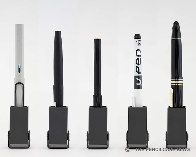
Review: Good Made Better Penwell Traveler pen stand. The Traveler accomodates a wide variety of pens: (L to R) Lamy Safari, Lamy 2000, Pentel Sign Pen, Pilot Vpen, Montblanc Meisterstuck 149.
The Traveler accomodates a wide variety of pens: (L to R) Lamy Safari, Lamy 2000, Pentel Sign Pen, Pilot Vpen, Montblanc Meisterstuck 149.
The foam sleeve on the Penwell Traveler is a new design, and is more of a 'one size fits all' shape that is tapered on one end, and narrower on the other end. Flipping it around gives some latitude in terms of what pen size will fit. It's definitely aimed at medium-sized pens, but larger pens -Even up to a Montblanc 149!- can fit too (though rather snugly.
Review: Good Made Better Penwell Traveler pen stand
Just like the original Penwell, the Traveler is an excellent accessory for your desk. It's not something you NEED, but you'll appreciate having it when you need to do a lot of writing. The fact that this new iteration of the Penwell is made to take with you, makes it a more versatile tool, perfect to take with you to the office or when out and about! 

The Kickstarter for the Penwell (LINK) Traveler has only about a week left on the clock, and is already funded way past the goal. Pricing starts at 37$ (32 EUR) for the tumbled Al finish, and 43$ (38EUR) for the Cerakote colorways (only the Snow White version is still available). That's a good bit lower than the regular Penwell, and I feel like it's a comfortable price point for an accesory like this.

This product was sent to me by Good Made Better so I could write this review. I was in no way influenced in the making of this review, the opinions shared in this review are completely my own! This post does not contain affilate links.

Thursday, June 28, 2018

REVIEW: STILFORM KOSMOS INK FOUNTAIN PEN

Review: Stilform Kosmos Ink fountain pen
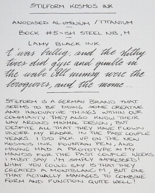
Stilform is a relatively new German design brand that creates original and innovative pens, while maintaining an ultra-minimal aesthetic. They create pens that are right up my alley (I'm a sucker for good design), but for some reason they have completely flown under my radar in the past couple years. Recently, I got the opportunity to try out the new Kosmos Ink fountain pen that is currently on Kickstarter (The Kickstarter campaign is now closed!). Having had a prototype in my hands for the past couple weeks, I must say I'm impressed! 

While writing this review, I was wondering how I could best describe the Kosmos Ink to give you an idea of what this pen is all about, and all of a sudden it struck me! Basically, Stilform created a pen similar to the Montblanc M, but one that actually does manage to combine form and function properly! If you read my review of the Montblanc M (Link), you'll know that I was not all that enthusiastic about the design. The flat side was pointless, the section was too short and the step from section to barrel annoyed me. 
Review: Stilform Kosmos Ink fountain pen
The Kosmos Ink looks futuristic, sort of like a monolithic object that came from outer space (the name Kosmos starts to make sense!). It's a simple, straight cylindrical design with nicely rounded cap and barrel finials. Cap and barrel meet into a cleanly chamfered edge. The inside of the cap lip is chamfered slightly as well, to ensure that the cap and barrel meet nicely when closed. 
Review: Stilform Kosmos Ink fountain pen
Nicely chamfered edges give some visual separation between cap and barrel
The Kosmos features flat sides too, just like the Montblanc M. However, on the Kosmos you can find one on either side, and they extend all the way from cap to barrel. In practice, this means that the Kosmos Ink won't have that nasty habit of rolling around, a feature that is particularly useful because the pen is designed to be clip-less (although a clipped version might become available as a stretch goal). The design is kept clean and simple. Apart from the word 'KOSMOS' engraved on one of the barrel's flat sides (the marking will be on the flat side of the cap in the final production model), you won't find any other engravings. 
Review: Stilform Kosmos Ink fountain pen
The main feature of the Kosmos Ink is the magnetic cap. It's not the type of closing mechanism you come across every day (The Montblanc M or some of the lower-end Visconti pens come to mind, but not much else). It's interesting because it's different, and the capping action is fun and playful.

It's a tricky mechanism to get right though, because those two flat sides have to align when closed. Luckily, Stilform worked some magnet magic and it works a treat! The cap closes with a reassuring, rather loud snap, and it requires a good amount of force to pull it off. Rather than yanking the cap straight off, you have to twist the cap about a quarter turn, which aligns the poles of the magnets in cap and section, pushing the cap off. Putting the cap back on is simple, as the magnets automatically align so that the flat sides always line up (and in practice they DO actually lign up fairly accurately!).
Review: Stilform Kosmos Ink fountain pen  
Review: Stilform Kosmos Ink fountain pen
L to R: Kaweco Brass Sport, Stulform Kosmos, Ensso Piuma, Stilform Kosmos Ink, Lamy Safari, Lamy 2000
In terms of dimensions, the Kosmos Ink is a rather large pen, but doesn't necessarily feel like that in the hand. It measures 14.2 cm (5.6") closed, and 13.8 cm (5.44") uncapped, the cap does not post. The diameter of the cap and barrel is a constant 1.3 cm (0.51"), and the section is a bit narrower at an average of 1 cm (0.39"). The aluminium version feels balanced in the hand, thanks in part due to the low weight of just 24g total. There's also a titanium version available which has a bit more heft (37g).
Review: Stilform Kosmos Ink fountain pen
What about comfort? Again comparing the Kosmos ink to the Montblanc M (not really a fair comparison, however more expensive doesn't always mean better!), the Ink has a much better section IMHO. It's fairly long and tapers down a bit. The diameter is slightly narrower than what I'm used to, especially near the nib, but it's quite a comfortable fit in the hand. There is a step down from the barrel, but the chamfered edge makes the transition a bit less harsh, and the section is large enough so there is plenty of space to comfortably hold it. 
Review: Stilform Kosmos Ink fountain pen  
The Kosmos Ink comes with a rather interesting choice of nib: the Bock 076. This size sits in between #5 and #6 in terms of size (#5.5?), and is the same as the nibs on the TWSBI 580. I think the slightly larger #6 nib would've looked good too on a pen of this posture, but the 076 doesn't feel out of place here. 

In terms of performance, I tend to prefer Bock's larger nibs. This 076 works quite well though, the fine nib is a smooth writer with a balanced flow. It starts right up when it hits the page, even though I did notice an occasional skip with fast writing (when writing a signature for example). 
Review: Stilform Kosmos Ink fountain pen
As of July 3th, the Kickstarter campaign ended with a total funding surpassing 250.000$! You can pre-order the Kosmos Ink through Indiegogo, and afterwards buy them directly via the Stilform website.

My final say? I'm really quite impressed with the prototype they sent me. I think they nailed the aesthetic, and implemented the magnetic closure perfectly. Compared to the much more expensive Montblanc M (which was a bit of a letdown), the Kosmos Ink fares a lot better. With Kickstarter/pre-order pricing starting at 65€ / 69$ (with a titanium option available at a premium) the Kosmos Ink is definitely worth a look, but you'll have to hurry because the funding ends in just a couple days!

This product was sent to me by Stilform, so I could write this review. I was in no way influenced in the making of this review, the opinions shared in this review are completely my own! This post does not contain affiliate links.
Review: Stilform Kosmos Ink fountain pen