Wednesday, September 30, 2020

REVIEW: SCHON DSGN POCKET SIX FOUNTAIN PEN

REVIEW: SCHON DSGN POCKET SIX FOUNTAIN PEN
Let me start off by saying the Schon Dsgn Pocket six has been perhaps the most fun I've had with a pen in recent history! Knowing that I tend to not use pocket pens very often  (simply not enough practical use for them in my daily carry), the fact that I've carried this pen with me more than anything else since I've received it, says quite a lot!

For those of you that don't know Ian Schon, man behind the brand, he's one of the most sympathetic minds in our industry. As an engineer and obsessed with the tiniest details, he's constantly showing new techniques and tricks he found to improve his products, on social media. I've always found this kind of "how it's made" content incredibly fascinating to follow, and especially lately when he started doing unique hammered finishes on the Pocket Six (P6), I was hooked!
REVIEW: SCHON DSGN POCKET SIX FOUNTAIN PEN
But, I'm getting ahead of myself! Let's take a look at the P6, shall we? Btw, thanks to Ian for sending a 'normal' brass version of the P6 along with the faceted copper pen I bought. Since the faceted Pocket Six is only available in limited quantities due to production capacity, it wouldn't make sense to review the faceted version standalone, because it might not be available continuously.
REVIEW: SCHON DSGN POCKET SIX FOUNTAIN PEN
The P6 carries over the sort of industrial minimal design language of the original Schon Dsgn ballpoint Pen (that I reviewed HERE), but I feel like it adds some welcome refinement, and slightly gentler lines to the design. The cap finial is subtly rounded for a softer look, and symmetry is still key with the machined line on the cap offsetting the break between barrel and cap - giving the illusion of a 'center band' - so that cap and barrel look like they're equally long (even though they're not). Underneath the cap, you get a nice concave section shape, which is more pleasant to hold than the straight and featureless section on 'the Pen'. 

Refined or not, you're still getting a machined metal pen, with a machined finish. Function before form, with exposed block threads at the back of the barrel, onto which the cap posts.
REVIEW: SCHON DSGN POCKET SIX FOUNTAIN PEN
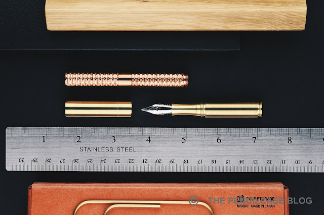
We haven't talked about the elephant in the room yet! Exotic finishes are sort of Ian's trademark, with crazy anodized options available for the aluminium version of the P6, but also this jaw-droppingly beautiful faceted version of the P6, available for the brass or copper versions! As I said earlier, I've been following Ian's journey in hand-finished hammered finishes (which I tried myself as well!), And then he completely caught me off-guard with this semi-irregular machined faceted finish! The way the light hits the geometric pattern... It's amazing in person, and the detail of the machined and hand-polished finish is ridiculous. I guess the photos will speak for itself! 
REVIEW: SCHON DSGN POCKET SIX FOUNTAIN PEN
The p6 is clipless, which was an omission on the original Schon Pen too, but that pen eventually received an update with a clipped version ('the clip', simple naming convention certainly is Ian's thing!). I'm not saying the P6 might not receive a similar upgrade later on, but technically I find it doesn't need a clip to function as a pocket pen. True pocket pens like this are small enough to carry IN your pants pocket comfortably, instead of being clipped to them, so I haven't found it a particularly big issue.
REVIEW: SCHON DSGN POCKET SIX FOUNTAIN PEN
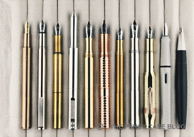
L to R: Milim Pro Pocket fp, Inventery Pocket fp, Ensso XS, Schon Dsgn Pen, Schon Dsgn P6, Kaweco Lilliput, Kaweco Supra, Kaweco Sport, Lamy Safari, Lamy 2000
REVIEW: SCHON DSGN POCKET SIX FOUNTAIN PEN
The P6 still comes out as one of the biggest pocket pens, despite its tiny form factor!
The P6 is tiny. Really tiny. Imagine tiny, and then make it a bit smaller still, that's how small this pen is! I had read up enough to think that I had a good idea of the size, but even I was thoroughly surprised when I saw it in real life for the first time. 

In hard numbers, the P6 translates into a pen that's 9 cm/ 3.55"  capped, and a convincing full-sized 13.2cm/ 5.2" when the cap is posted. The p6 is - in proportion to the length - a bit skinnier than I imagined, although it has to be said that 12.7 mm/ 0.5" is a very decent diameter for a small pen like this. Most notable of all: it's shorter than a Kaweco Lilliput... let's take a second to let that sink in! It's the absolute shortest pen I own, and yet when open and posted, it's comfortably sized in any possible way.
REVIEW: SCHON DSGN POCKET SIX FOUNTAIN PEN
'regular' concave section left, 'new' ridged section right
The P6 is now available with two section options to choose from, after some suggestions that a slightly girthier section would add to the comfort. The new, straight section is a complete redesign from the simple, concave shape of the regular version. The new section has a straight constant diameter of 9.9 mm/ .390", compared to the concave section which is just a millimeter narrower at the thinnest point, at 8.9 mm/ .350". It's noticeably longer and has a grooved texture along its' entire length, which is smooth and pleasant to hold. 

Aesthetically, I most definitely prefer how the concave section matches the rest of the pen's clutter-free design... But the larger section does make a fair point in terms of comfort, and even the slight difference in diameter is appreciated. The nib is seated noticeably deeper inside the section to account for the added length of the section itself. The slightly wider diameter of the new section also mates a bit better to the threaded section of the barrel, which makes for a more pleasing and smooth transition. The block threads are noticeable and there is a bit of a step towards the barrel, but given how much section real estate you get on such a small pen (especially with the new larger section!), comfort isn't bad at all for a pocket pen!
REVIEW: SCHON DSGN POCKET SIX FOUNTAIN PEN
A small detail that I particularly like on the P6 is the incorporation of a rubber o-ring on the inside of the cap. It seals against the small straight section in front of the threads (very similar to Karas' Sta-Fast system on the new Ink fountain pen!) and effectively keeps the nib from drying out, or keeps possible ink leaks contained (not that I had any issues with that so far). Just like with the Karas Ink, the o-ring also adds a smooth, reassuring resistance to the capping action.

The flipside of a super-duper-small pocket pen is that a converter obviously won't fit - except maybe one of those Kaweco converters, but those are more hassle than function - so you're limited to cartridges. Syringe-filling is the way I deal with that, but of course, it's a little less hassle-free than a piston or converter. 
REVIEW: SCHON DSGN POCKET SIX FOUNTAIN PEN
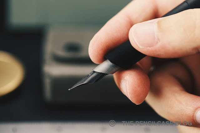
The P6 gets its name from the #6 sized nib it contains under the hood. It's impressive for a pen to be this compact, it's even more impressive that it also has a large nib! The nibs are stock JoWo, not engraved with any logo except for the standard flourishes that JoWo nibs have - which don't play well with the minimal character of the pen itself, but oh well...

So, one reason why I'm excited about JoWo nibs on a metal pen like this: it's always Bock. It's slim pickings in stock nib world anyway, and metal pens always seem to go for Bock. This is a little different. I feel like JoWo nibs are typically a bit less temperamental, a bit smoother, and maybe a bit stiffer. Stock nibs seem to be a bit of a 'meh' thing these days, and I get the tiredness of always seeing the same nibs (it's a bit boring to review, too!), But there's no denying you're getting a pretty spot-on writing experience. I did open up the tines if the broad steel nib ever so slightly though. It was on the dryer side before, not terrible, but I prefer it slightly wetter. 
REVIEW: SCHON DSGN POCKET SIX FOUNTAIN PEN
Now the really exciting stuff happens when you go swapping nibs. I knew way in advance what to put in the exotic faceted copper p6: an equally exotic nib from Franklin-Christoph's stable, their double-slit Music nib. Can I just say what an absolutely nuts combo this is? Good lord... I grinned all the way from here to Tokyo when I first put this pen to paper. It should probably be illegal to pack so much pen into such a small form factor!
REVIEW: SCHON DSGN POCKET SIX FOUNTAIN PEN
Lots of fun - and EDC practicality, let's not forget! - in a small package, I guess that should be the Schon Dsgn P6's bottom line, so I'll end with that. 

This small pen comes with a - comparatively - not so small price, ranging from 118$ for aluminium, 142$ for brass, and up to 162$ for copper (the ridged long section adds about 10-12$). In return, you are getting a pen that's made with care in Ian's own workshop and locally produced do warrant a premium in my opinion. With that in consideration, only the faceted pens really stand out to me as properly expensive (250$ to 270$). The reasoning behind the price jump is a considerably longer machining time and more hand-finishing involved in getting the finish as spectacular as it is. 270$ is certainly the most expensive metal pen I've ever purchased... But so far I have not had a single regret! 

NOTE: Some of the products featured in this review were provided by Schon Dsgn, so I could write this article. I was in no way influenced in the making of this review, the opinions shared in this review are completely my own! This post does not contain affiliate links.
REVIEW: SCHON DSGN POCKET SIX FOUNTAIN PEN

Sunday, September 27, 2020

REVIEW: ESTERBROOK JR FOUNTAIN PEN

REVIEW: ESTERBROOK JR FOUNTAIN PEN
Esterbrook finally came forward with what I thought would be the ideal pen for a revival of such an iconic, 'Americana' brand - a modern re-interpretation of the vintage Esterbrook J, called the Esterbrook JR (or 'J Reborn' in full). I think it's the product many of us were waiting for. I mean, why else would you take up the Esterbrook name, if not for establishing a tangible connection to what the brand used to represent almost eighty years ago?

But now that the JR is out, and I have one in-hand (Thanks to Esterbrook for providing this pen for review!), I'm not so sure anymore. There certainly seems to be a strong pro and contra camp formed around the new model, which I guess is to be expected when reviving such a vintage classic? It's a bit of a minefield. The die-hard fans will never be happy about a reimagined version, the uninitiated might not even recognize it as the pen it's supposed to represent.
REVIEW: ESTERBROOK JR FOUNTAIN PEN
The JR definitely being a reimagined design, instead of accurate reproduction, I can certainly see how the new design doesn't fully capture the style of the J, but I do feel like some of its essence is there. I'd show the old and new side by side, but unfortunately, I no longer have a vintage J to compare to the JR. I'm sure you've either seen one before or own one... If not, my very old review of the Esterbrook J might help you get a better idea.
REVIEW: ESTERBROOK JR FOUNTAIN PEN
I immediately liked the JR, for a couple reasons. It has a distinct vintage-y look, it's smaller than typical modern pens - harkening back to the days when pens used to be a good bit smaller as standard -, it has the characteristic ribbed texture clip, with ridges running along the length of the straight clip - maybe the one element that carries over almost directly from the vintage J. 
REVIEW: ESTERBROOK JR FOUNTAIN PEN
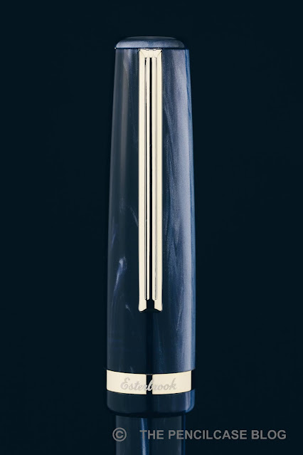
Nice pearlescence on the Denim Blue acrylic
The three colors available on release - 'Denim Blue', 'Tuxedo Black', and 'Carmine Red' - are all marbled, pearlescent materials that are also supposed to evoke the look of the original materials. They are nice - I even like this Denim Blue, even though I'm not typically a fan of blue pens - and match the vintage vibe excellently, although they're not quite as enticing and unique as the original.
REVIEW: ESTERBROOK JR FOUNTAIN PEN
infinity?
But then there are also a lot of design elements that take away from the Vintage J. For example, I'd wish the center band also came with the recognizable ridged pattern to match with the vintage design, but instead it's a rather plain-looking band with the Esterbrook logo laser-engraved on the front. The cap and barrel both have a metal coin finial, with the cap finial engraved with the "infinity" Esterbrook logo. I don't know why they call it that though, it doesn't look quite like ∞ to me? The finials are flat, instead of the ridged, slightly domed finials on the double-jewel Esterbrook J. 
REVIEW: ESTERBROOK JR FOUNTAIN PEN
But then above everything else, I'm most confused about the very straight and skinny barrel shape. It seems like a very odd decision if you want to remake the J - which had a much more gently tapered profile. It takes the overall design in a completely different direction, and I don't know if I like the abrupt transition from the wider cap to the skinny barrel. It's a bit clunky. The decorative ring on the barrel is also placed oddly high up, which makes the proportions of the JR feel even weirder. 
REVIEW: ESTERBROOK JR FOUNTAIN PEN
L to R: Kaweco Sport, Pelikan M205, Aurora Optima, Sailor Pro Gear, Esterbrook JR, Esterbrook Estie, Lamy Safari, Lamy 2000
REVIEW: ESTERBROOK JR FOUNTAIN PEN
The JR is described as a pocket pen, but I think that's a bit of a stretch. At just 12.6 cm/ 5" capped, and 11.8 cm/ 4.6" uncapped, it surely is a small pen, but it's no Kaweco Sport or Schon P6 either. In the size comparison, you can see that I found quite a few pens that closely match the dimensions of the JR: the Pelikan M200, Aurora Optima, and Sailor Pro Gear, all pens that sort of float in that limbo between pocket- and full-sized. The JR is a relatively slender pen, and the relatively wide cap accentuates the slim barrel even more. The section, with roughly a 10 mm (0.39") diameter, is narrow but not uncomfortably so.
REVIEW: ESTERBROOK JR FOUNTAIN PEN
For smaller hands, the JR might be comfortable to use without posting. But for me, it's one of the very few pens that I actually prefer to use posted (it posts very securely, btw). With the cap on the back, you get a very comfortable 15.2 cm/ 6" long pen, and the overall weight is low enough (18g total) so that even posting doesn't throw off the balance. 
REVIEW: ESTERBROOK JR FOUNTAIN PEN
In terms of comfort, the benefit of the massive step from the cap towards the barrel becomes obvious. Underneath the cap, you get absolutely zero transition from section to barrel. The threads aren't really noticeable either. The section shape of the JR is a peculiar ('peculiar' seems to be a keyword for the JR's design!) combination of a straight untapered part right in front of the threads and a very short pinched section closer towards the nib. The concave part is so short that only my index and middle finger actually grip there, while my thumb naturally rests a bit higher up. It's a comfortable pen to write with, but again the proportions are a bit odd. 
REVIEW: ESTERBROOK JR FOUNTAIN PEN
The writing end is a #5 JoWo nib. It's also engraved with the X-shaped Esterbrook logo, a.k.a "infinity"  (Yeah, the scientist in me has to put that under heavy air-quotes because it just doesn't feel right) logo. Anyway, you're looking at a stock, steel nib and I feel like I've already repeated myself a million times, talking about these. In any case, it's a decent, reliable performer (better than I expected maybe, I'm certainly a bit biased towards #6 size nibs performing slightly better, but maybe I was wrong?) and it's notably resistant to drying out, despite not having the spring-loaded inner cap like the Estie. It starts right up, even after sitting unused on my desk for a week or so, which is commendable. The medium nib is smooth but with just the right amount of feedback while you write. Ink flow is rather heavy. 

Even though the JR is really quite an excellent little writer as it stands, I think the Esterbrook MV adaptor (rumored to come soon) will help set this pen apart. Being able to fit vintage Esterbrook nibs in the JR definitely will add some character to the writing experience and bring it one step closer to the original. The gold trim of this 'Denim Blue' colorway might clash with the steel-colored vintage nibs, though?
REVIEW: ESTERBROOK JR FOUNTAIN PEN
It may seem that I'm giving the Esterbrook JR a hard time, and perhaps that's true. It's a good-looking, classic-styled design. Build quality and writing comfort are excellent. It's a good, hassle-free writer, with potential for offering a bit more character once the MV adaptor comes in. Those are all positive things when you look at the JR in its' own respect. But when you call your pen the Esterbrook 'J Reborn', comparisons with the original are inevitable, and that's maybe where it misses the ball for a lot of Esterbrook J fans. 

The JR has an MSRP of 180$. Retail prices seem to be pretty steady at 140$ in the US, but here in Europe, we're stuck at 175€ (essentially full MSRP!) from retailers like Appelboom or La Couronne Du Comte. The MV adaptor will most likely cost an additional 40$ extra. Frankly, I think the European price is too expensive. I feel like it would represent a better value around the 120€ mark, which would be more in line with the US pricing. Despite the JR being an overall good pen, at its' full MSRP, there's too much competition (even from Esterbrook's own Estie, which would be my choice at just 20€ more!) for it to really stand out from the pack.

NOTE: This product was provided by Esterbrook (Kenro), so I could write this review. I was in no way influenced in the making of this review, the opinions shared in this review are completely my own! This post does not contain affiliate links.
REVIEW: ESTERBROOK JR FOUNTAIN PEN

Thursday, September 24, 2020

REVIEW: VENVSTAS MAGNA FOUNTAIN PEN

REVIEW: VENVSTAS MAGNA FOUNTAIN PEN
Hey, I like minimal design. I'm all for it. But the thing is: minimal design is extremely unforgiving! The product has to be perfectly conceptualized, it has to be flawlessly executed. It has to give you that "Aha, I get it now!" moment, when you pick it up. That moment when you realize that it is so cleverly put together, it doesn't lack any of the features that are essential to making a good pen, but conversely has nothing excessive in the way of pure writing experience. Above all, I feel like minimal design should be hassle-free, maybe even soothing... I think you get the point.

Before we dive into the nitty-gritty of the Venvstas Magna fountain pen, let me start off by saying the premise of this pen is absolutely promising. But a cool concept is only half the effort towards a great product, and unfortunately, there are a number of small - maybe seemingly unimportant, but they add up - pet peeves that distract from the overall experience you'd expect from a 250$ pen. Even Venvstas' own website, which I visited while researching for this review, was itself a bit of a pet peeve. It's riddled with conflicting and wrong information: no the ink capacity isn't 3.2 mL. Yes, the cap does actually post. And no, the 79€ carbon fiber carrying case isn't actually included with the pen (bummer!). Update: The wrong information turned out to be a page about a previous iteration of the Magna. The error was communicated with Venvstas and updated to show the correct data!

Anyway, on to the pen!
REVIEW: VENVSTAS MAGNA FOUNTAIN PEN
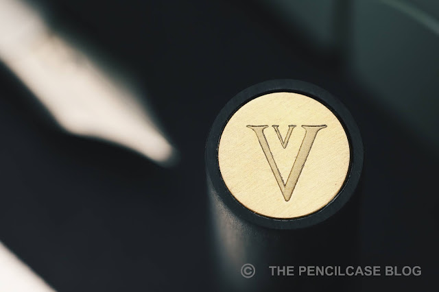
I do enjoy the overall design of the Venvstas Magna. It's positively minimal, with a tubular, linear carbon fiber exterior. The different pieces of the pen are separated by slanted angles, which gives quite a departure from typical fountain pen designs. Through some compromises (which I'll address later), the monolithic shape is interrupted only by two tiny set screws in the section (which hold the internals of the pen together), a brass coin adorns the cap finial and has the Venvstas double-V logo on it, and a nondescript black cylinder that extends slightly from another angled cut at the back of the barrel.
REVIEW: VENVSTAS MAGNA FOUNTAIN PEN
The main 'structural element' if you will, the outer carbon fiber (CF) shell, is nicely made from tubes of extruded linear carbon fiber composite (the extrusion process aligns the carbon fibers all in the longitudinal direction of the tube - quite neat!). The slanted angles on the carbon fiber parts are cut quite clean and precise, and all the pieces received a nice hand-brushed finish that is smooth and soft to the touch. Despite the brushed finish - the comparison with the Lamy 2000 is hard NOT to make here - the carbon fiber pieces don't match up to create a 'seamless' look, although I don't know if that's what Venvstas was aiming for in the first place. 

In any case, I'd at least expect all parts to align properly, and that's where I hit a bit of a sore spot in the design of the Magna. Without going into too much detail, the way the steel 'guts' of the pen are connected to the CF section and the way the barrel attaches to that section, leaves wiggle room between all the parts. The nib assembly, but also the entire barrel (which only holds onto the steel inner mechanism) tends to shift/rattle around as a consequence.
REVIEW: VENVSTAS MAGNA FOUNTAIN PEN
Related to this, is that the barrel never really stays seated perfectly flush with the section. You could argue that that's a minor issue, but even the slightest misalignment is accentuated on a clean and straight design like this (see the image above, it's minor, and yet you can clearly see it's off!), and can be felt because the edges are rather sharp. 
REVIEW: VENVSTAS MAGNA FOUNTAIN PEN
Contrary to the barrel, the cap holds on to the CF part of the section with a single steel 'spring' insert and has a positively tight tolerance to it (the edges of the steel insert are really sharp, though). It aligns perfectly flush and secure each time, showing that it is indeed possible to get a better fit. 
REVIEW: VENVSTAS MAGNA FOUNTAIN PEN
What's even more, the cap is actually held in place tighter than the barrel, so when you accidentally hold the barrel and try to pull the cap off... you'll actually pull off the barrel. Yes, this is easily avoided by holding the pen only at the section when uncapping, yet I still - on multiple occasions - managed to pull the barrel off or slide it back enough to misalign it once again. If the barrel attached in the exact same way as the cap, it would not only be a more secure fit, but it'd also alleviate all of the aforementioned misalignment and wiggle issues I encountered.
REVIEW: VENVSTAS MAGNA FOUNTAIN PEN
It's like the big red cartoon button that says 'DON'T PRESS'...
My biggest gripe with the design is the fact that the back of the barrel is just open. Yes, there's a gaping hole in the back of this pen. The design of the back finial looks cool... until you realize that you're touching the piston's plunger and not just a fixed finial! About half a centimeter of the plunger is exposed through the back of the barrel, ready to be pressed by accident. Why create such a risk? There's potential for an inky mess around every corner: when you slide it into a pen case/pocket/bag, when you're fidgeting with the pen (let's admit it: we all do that unconsciously!), or when you post the cap (the steel spring also attaches the cap to the back of the barrel, but it can easily catch on the plunger and depress it about a centimeter).
REVIEW: VENVSTAS MAGNA FOUNTAIN PEN
Seeing that Venvstas' other, slightly smaller pen - the Venvstas Carbon T - has the same finial design but with an actual, fixed finial and not the piston plunger sticking out, I'd personally opt to decrease the ink capacity from the massive 2mL that it is now, shortening the piston mechanism and just putting the same fixed finial in the back as with the Carbon T. Problem solved, peace of mind restored!
REVIEW: VENVSTAS MAGNA FOUNTAIN PEN
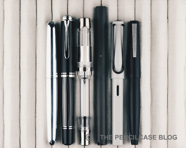
L to R: Ensso Piuma, Pelikan M1005, Conid Kingsize, Venvstas Magna, Lamy Safari, Lamy 2000
The Magna (Latin for 'large') is indeed a rather large pen. The diameter of the entire pen (12 mm/ 0.47") is quite normal I'd say, and sits comfortably in my hand. But with a length of 15.5 cm (6.1"), it's exceptionally long. Even uncapped, at 14.6 cm (5.74"), it's longer than most pens when capped! If that's still not enough for you, the cap can be posted (although as already mentioned, you run the risk of accidentally pushing the piston plunger) for a total length of 18 cm (7.08"). Needless to say, this pen is comfortably sized for pretty much any hand, and the mostly CF build keeps it comfortably lightweight (24g), too.
REVIEW: VENVSTAS MAGNA FOUNTAIN PEN
In terms of comfort, it's not at all a bad writer, but I found it remarkable how often I had to adjust my grip to not hold it right on the edge of the carbon fiber section. The nib sits recessed in a stainless steel tube (also cut at an angle, a nice touch!) that protrudes from the CF outer sleeve. 
REVIEW: VENVSTAS MAGNA FOUNTAIN PEN
The section starts further back than on a typical pen with a #6 nib...
REVIEW: VENVSTAS MAGNA FOUNTAIN PEN
...which interferes with my grip
But while the nib doesn't really extend that far out from the section, the angled cut on the bottom of the CF sleeve (where my middle finger rests) does run quite far back on the bottom of the section. That requires you to hold the pen further back relative to the nib, which takes some time to adjust to (and keep in mind that I already tend to hold my pens relatively far back anyway!).
REVIEW: VENVSTAS MAGNA FOUNTAIN PEN
Space-age looks!
The titanium nib (There's no coherent information about the nib supplier, but I assume it's Bock-made, despite it being paired with a feed that doesn't seem to be from Bock) has a clean appearance with very simple "V" branding in the middle - befitting of the overall minimal aesthetic of the pen. The nib on my test pen was excellent. A recent review from Anthony over at UK Fountain Pens pointed out different behavior, but my test pen wrote pretty much flawlessly out of the box. Ink flow is ample and consistent, the nib was properly tuned and aligned for a smooth writing experience, and the titanium nib provides a slightly cushioned writing experience.
REVIEW: VENVSTAS MAGNA FOUNTAIN PEN
The bottom line of the Venvstas leaves me wondering how much novel design is simply too much? As it stands, I feel like 249/ 240$ without VAT (from our site sponsor Appelboom) is not a terribly high price considering you get a piston-filled pen with titanium nib (a 14k gold nib version is available at a 150€ premium). And the out-of-the-box design is interesting for sure, but it seems like they made peace with a few too many structural compromises to stay true to that purist design ideology. Compromises that continuously distraught me from the joy that I should've experienced from a unique product like this, but instead left me frustrated most of the time.

Nonetheless, Venvstas being a relatively young brand, coming from a one-man operation (now being made by an industrial manufacturer, though), I think there's still plenty of opportunity for improvement. A lot of the issues are seemingly easy to fix, IF Venvstas perhaps dares to step away from the envisioned ideal design in favor of a few more functional details. And if they do, I'll gladly revisit my opinion.
Note: This product was sent on loan by our site sponsor Appelboom, so I could write this review. I was in no way influenced in the making of this review, the opinions shared in this review are completely my own! This post does not contain affiliate links.
REVIEW: VENVSTAS MAGNA FOUNTAIN PEN

Sunday, September 20, 2020

REVIEW: OTTO HUTT DESIGN 06 FOUNTAIN PEN

REVIEW: OTTO HUTT DESIGN 06 FOUNTAIN PEN
Together with the, quite well-known, Design 04 (review HERE), the Design 06 is probably one of the more popular pens that German manufacturer Otto Hutt makes - at least they are the first pens that come to my mind. But while the 04 is perhaps a rather particular design, probably not everyone's taste, the Design 06 seems more of a crowdpleaser. At least from my perspective, the 06 is about as inoffensive as pen design gets - I don't mean that in a negative way, it's just a very simple and elegant design. Maybe a bit more low-key, but very hard to knock. 
REVIEW: OTTO HUTT DESIGN 06 FOUNTAIN PEN
The 06 - again - shows off Otto Hutt's forte of combining a fairly classic overall design (a strongly tapered cigar-shaped profile with flat finials) with very modern, simplistic details and clean, minimal branding. 
REVIEW: OTTO HUTT DESIGN 06 FOUNTAIN PEN
Clip brothers!
Probably my favorite small design aspect that Otto Hutt gets right on many of their pens is their fantastically sturdy, spring-loaded clips - Yes, I am a stickler for clips, and this is once again an excellent one: it's extremely robust but still functional and it clips in pockets easily, all while still retaining a simple and minimal design. 
REVIEW: OTTO HUTT DESIGN 06 FOUNTAIN PEN
Especially in this black lacquer colorway, the Design 06 is a sleek and stylish pen with a certain 'ST Dupont-chic' flair (but more modern-looking than Dupont). It looks and feels more expensive than it really is, and would easily be suited for a formal or work environment. But again, Otto Hutt's balance between classic and modern design also shows in the available finishes: black with rhodium trim too boring? Pick one of the frosted colorways, or the rose gold or black PVD trims, and you instantly get a much more modern-looking pen.
REVIEW: OTTO HUTT DESIGN 06 FOUNTAIN PEN
L to R: Pelikan M1005, M805, Otto Hutt Design 04, Design 06, Design 03, Design 07, Lamy Safari, Lamy 2000
The Design 06 is a smaller pen, no surprises there, with Otto Hutt leaning almost exclusively towards smaller pens in their current portfolio (even the flagship Design 07, that I reviewed HERE, is still not an extremely large pen!). The 06 measures 13.8 cm/ 5.43" closed, the strongly tapered design wastes a lot of space inside the cap because you're left with a pen that's just 12 cm/ 4.73" when you take the cap off. That's cutting it close for me, being quite a bit shorter than what I'd consider my personal sweet spot.

Luckily, the 06's section design has an interesting profile with a very strong pinched shape (from 11.3 mm/ 0.45" near the threads to 8.7 mm/ 0.34" at the narrowest point!), which effectively pulls your grip towards the front of the nib and - despite being 'slippery' metal - keeps your fingers in place quite well.  Another beneficial side-effect of holding the pen so close towards the nib is that you'll bypass the step, because yes...there's quite a step behind the threads (and it's noticeable when you grip right on it).  The all-metal construction makes for a rather hefty 46 gram total, again a given throughout Otto Hutt's product catalog. Uncapped, the weight sits nicely balanced in the hand. The cap can be posted securely (and rather deep onto the barrel), which makes for a heavy pen but doesn't make it extremely back-heavy like I feared it would. 
REVIEW: OTTO HUTT DESIGN 06 FOUNTAIN PEN
Comfort-wise, this is a very peculiar pen. A lot of elements that don't sound comfortable at first, come together into a design that's surprisingly decent for everyday writing. Would I call this the most comfortable pen ever created? Well, no, obviously, but it's actually not half bad, and I could certainly use it for longer writing sessions without any problems.
REVIEW: OTTO HUTT DESIGN 06 FOUNTAIN PEN
If the overengineered clip is anything of an indication of the overall build quality, you'll know that the Design 06 is a very well-made pen. The sturdy all-metal build means this pen can take a beating. Every part is well-polished, the black lacquered finish is spotless, no rough edges to be found. It really is an exceptionally solid writing instrument that just exudes quality, which is something I've found true for every Otto Hutt I've used so far.

Before we move on to the writing performance, the threads on this pen deserve a small word of praise. The Design 06 is, as far as I can remember, the only pen I've ever seen that uses quadruple-start threads! It takes just half a turn to unscrew the cap, which is insanely fast, and yet it still closes securely. It's a seemingly small feature, but it's certainly useful if you need to take notes quickly during class or in a meeting. 
REVIEW: OTTO HUTT DESIGN 06 FOUNTAIN PEN
The steel #5-sized nib continues my positive streak of excellent nibs with Otto Hutt, this makes for four pens in a row that have all been excellent writers in their own respect. I've actually come full circle in my reviews of Otto Hutt pens: from a simple steel nib on the Design 04, to the 18k gold on the Design 03 (review HERE), a larger #6 18k gold specimen on the Design 07, and now back to steel, with a fine nib this time around. The bicolor plating fits this pen well, with its classic look, and it's cool that they color-match the trims when you go for a rose-gold or black PVD finish. 
REVIEW: OTTO HUTT DESIGN 06 FOUNTAIN PEN
The fine nib is a wet writer and with that, lays down a line that runs closer to even some Western mediums. I'm pretty sure Otto Hutt uses JoWo nibs, and that's definitely noticeable in terms of having a reliable writing experience. It dries out ever-so-slightly after longer periods of time, but always manages to find its bearings after the first stroke, so that's ok. I remember in my review of the Design 04, I mentioned that it's hard to recommend going for the more expensive gold nib option, and I still think that holds true. Yes, Otto Hutt's gold nibs are excellent - maybe a touch smoother and softer than their steel counterparts - but the steel nibs are nothing to scoff at.
REVIEW: OTTO HUTT DESIGN 06 FOUNTAIN PEN
The Otto Hutt Design 06 is a fairly unassuming pen. Where the 03, 04 and 07 are all a bit more different and unique, the 06 is understated and elegant, but still retains the extremely high build quality that I've seen on other Otto Hutt pens. While not the most comfortable pen in the world, the 06 still managed to exceed my expectations in terms of the overall writing experience, and of course you can be quite certain that the nibs will be excellent, steel or 18k.

I have a lot of positive things to say about the Design 06, so I'd say it offers very good value at 145€ MSRP from Otto Hutt's own online shop (It's in German, but Google's auto-translate does a pretty good job), although the price does creep up when moving into the matte colored finishes, and rose gold or black PVD trim options. The 110€ extra for a gold nib is certainly not a bad investment, but IMHO it's not necessary to get a great writing experience. 

NOTE: This product was provided by Otto Hutt, so I could write this review. I was in no way influenced in the making of this review, the opinions shared in this review are completely my own! This post does not contain affiliate links.
REVIEW: OTTO HUTT DESIGN 06 FOUNTAIN PEN