Showing posts with label Kenro Industries. Show all posts

Wednesday, November 25, 2020

REVIEW: MONTEGRAPPA ZERO CARAMEL FOUNTAIN PEN

REVIEW: MONTEGRAPPA ZERO CARAMEL FOUNTAIN PEN
If you recall my review of the Montegrappa Zero a couple weeks ago, you'll know that I'm quite a big fan of this new(er) model. Even more so, I think it's one of the better pens Montegrappa has released in recent years, despite looking pretty nondescript and maybe plain from a distance. Perhaps the Zero's apparent normalcy is Montegrappa's biggest achievement of all - It certainly is quite a departure from the eccentricity and bling you'd usually expect from them!
REVIEW: MONTEGRAPPA ZERO CARAMEL FOUNTAIN PEN
A short recap of the Zero: A straight, modern design with bulky and prominent bronze trims, beveled edges all around, contrasting and crisp brushed finishes, and as the - almost literal - cherry on top a sapphire-glass inlay in the cap finial that holds the Montegrappa logo. It's basically a watch but reincarnated in pen-shape, and yet all these unique details are hidden in plain sight - nothing feels excessive, out of place, or try-hard. 
REVIEW: MONTEGRAPPA ZERO CARAMEL FOUNTAIN PEN
Today we're looking at a different version of the Zero, this is the Montegrappa Zero Caramel, a US regional exclusive designed by US distributor Kenro. Luckily they were kind enough to send one across the pond for me to check out! 

Let's start with the elephant in the room: While the black/ruthenium version of the Zero fell straight under the 'modern and sleek' category, the Zero Caramel is an attention-grabber, to say the least. In watch equivalents, I think it would be a solid-gold Rolex. A bit gaudy, but you kinda want it anyway. That being said, while I certainly wouldn't ever actually buy a gold watch, the Caramel speaks to me in a way not too many flashy pens do. 
REVIEW: MONTEGRAPPA ZERO CARAMEL FOUNTAIN PEN
The Caramel gets its name from the unique Montegrappite resin used for this particular pen, and it's befitting for sure: streaks of white, yellow and golden, caramel brown run along the length of the pen, and create a sense of depth and texture (a bit of transparency, too) that I simply haven't seen very often before on an acrylic pen (I think it's best compared to Jonathon Brooks' Primary Manipulation, but more linear and with much finer and more delicate 'texture' inside the cast). I already was a fan of Montegrappite with the MIA Meteor Shower (review HERE), and the Caramel manages to live up to the expectation again. Personally, I find the Meteor Storm has a slightly more striking color palate (I tend to like darker, more muted colorways of course), but this Caramel certainly is nothing to scoff at!
REVIEW: MONTEGRAPPA ZERO CARAMEL FOUNTAIN PEN
For me, more so than caramel candy, the Zero Caramel reminds me of Mille-Feuille pastry. Both in color and the texture of the many layers of pastry goodness. Especially in the finials of the Zero, where the material is displayed at its best, you can clearly see the many thin streaks of colored resin that make up the Montegrappite.
REVIEW: MONTEGRAPPA ZERO CARAMEL FOUNTAIN PEN
Completely off-topic, but one of the major reasons why I especially like to deal with Kenro (and their daughter-brand Esterbrook) for reviews like this one, is their incredibly friendly and professional attitude, and not in the least their openness to criticism. As you can imagine, creating content involves a lot of back and forth with brands and pen stores, and there's an immense variation in the type of interactions you come across. Brands like Kenro are the kind of PR interactions I want to see, I think they reflect quite strongly their customer service and engagement in the community. Case-in-point: the Caramel pen they sent me had a crack in the cap upon arrival. Barely noticeable to the naked eye (and my camera), but it cracked right at the clip fixture, the thinnest, most fragile part of the cap. Kenro dealt with this swiftly though, and exchanged the pen straight away. 
REVIEW: MONTEGRAPPA ZERO CARAMEL FOUNTAIN PEN
Platinum #3776, Montegrappa MIA, Montegrappa Zero, Montegrappa Zero Caramel, Lamy Safari, Lamy 2000
For the full specs and size comparison of the Montegrappa Zero, I'd like to redirect you to my review of the regular Montegrappa Zero (HERE). You'll find all the technical information over there. For now, I'll just keep it at this: the Zero is a very comfortable pick for an everyday writer.
REVIEW: MONTEGRAPPA ZERO CARAMEL FOUNTAIN PEN
Still one of the best nib designs out there?
The nib is again, of course, a JoWo-made slab of steel, but gold-plated for the occasion. A solid 14k gold nib (with identical design) is also available. The gold nib adds a healthy premium over the already steep base price of the Zero - more on that later - and I find the steel JoWo nibs to perform just fine. The medium nib on my particular pen is downright excellent. It lays down a fairly wet, true-to-size western medium line, and writes consistently as I expect from JoWo. I can't help but feel like Montegrappa's JoWo nibs always tend to have a slight hint of - pleasant! - feedback to them, more so than other JoWo nibs... but it could also be my brain playing tricks with me, associating it with the old writing feel of Montegrappa's steel nibs?
REVIEW: MONTEGRAPPA ZERO CARAMEL FOUNTAIN PEN
Pricing... Well, I knew the Montegrappa Zero isn't a cheap pen, but I was still caught a bit off guard when I checked the Kenro website: the Montegrappa Zero Caramel has an MSRP of 495$ (695$ with the gold nib)! While retail prices vary (quite strongly) between 400 and 475$. Especially around the 400$ mark, that's more or less in line with what these pens cost in Europe. But even at that low-end of what the prices seem to fluctuate between, it's still without a doubt a very hefty price for a pen with a steel nib. 

I've praised the Zero before, and I'll do that again here. I still think it's a fantastic, and different design from Montegrappa. And especially this Caramel exclusive edition from Kenro is another fantastic showcase of Montegrappite resin! But to say that this is not an impulse buy... would be an understatement for sure. 

NOTE: This product was provided by Kenro, so I could write this review. I was in no way influenced in the making of this review, the opinions shared in this review are completely my own! This post contains affiliate links.
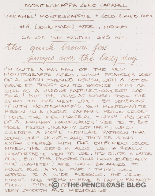
REVIEW: MONTEGRAPPA ZERO CARAMEL FOUNTAIN PEN

Sunday, September 27, 2020

REVIEW: ESTERBROOK JR FOUNTAIN PEN

REVIEW: ESTERBROOK JR FOUNTAIN PEN
Esterbrook finally came forward with what I thought would be the ideal pen for a revival of such an iconic, 'Americana' brand - a modern re-interpretation of the vintage Esterbrook J, called the Esterbrook JR (or 'J Reborn' in full). I think it's the product many of us were waiting for. I mean, why else would you take up the Esterbrook name, if not for establishing a tangible connection to what the brand used to represent almost eighty years ago?

But now that the JR is out, and I have one in-hand (Thanks to Esterbrook for providing this pen for review!), I'm not so sure anymore. There certainly seems to be a strong pro and contra camp formed around the new model, which I guess is to be expected when reviving such a vintage classic? It's a bit of a minefield. The die-hard fans will never be happy about a reimagined version, the uninitiated might not even recognize it as the pen it's supposed to represent.
REVIEW: ESTERBROOK JR FOUNTAIN PEN
The JR definitely being a reimagined design, instead of accurate reproduction, I can certainly see how the new design doesn't fully capture the style of the J, but I do feel like some of its essence is there. I'd show the old and new side by side, but unfortunately, I no longer have a vintage J to compare to the JR. I'm sure you've either seen one before or own one... If not, my very old review of the Esterbrook J might help you get a better idea.
REVIEW: ESTERBROOK JR FOUNTAIN PEN
I immediately liked the JR, for a couple reasons. It has a distinct vintage-y look, it's smaller than typical modern pens - harkening back to the days when pens used to be a good bit smaller as standard -, it has the characteristic ribbed texture clip, with ridges running along the length of the straight clip - maybe the one element that carries over almost directly from the vintage J. 
REVIEW: ESTERBROOK JR FOUNTAIN PEN
Nice pearlescence on the Denim Blue acrylic
The three colors available on release - 'Denim Blue', 'Tuxedo Black', and 'Carmine Red' - are all marbled, pearlescent materials that are also supposed to evoke the look of the original materials. They are nice - I even like this Denim Blue, even though I'm not typically a fan of blue pens - and match the vintage vibe excellently, although they're not quite as enticing and unique as the original.
REVIEW: ESTERBROOK JR FOUNTAIN PEN
infinity?
But then there are also a lot of design elements that take away from the Vintage J. For example, I'd wish the center band also came with the recognizable ridged pattern to match with the vintage design, but instead it's a rather plain-looking band with the Esterbrook logo laser-engraved on the front. The cap and barrel both have a metal coin finial, with the cap finial engraved with the "infinity" Esterbrook logo. I don't know why they call it that though, it doesn't look quite like ∞ to me? The finials are flat, instead of the ridged, slightly domed finials on the double-jewel Esterbrook J. 
REVIEW: ESTERBROOK JR FOUNTAIN PEN
But then above everything else, I'm most confused about the very straight and skinny barrel shape. It seems like a very odd decision if you want to remake the J - which had a much more gently tapered profile. It takes the overall design in a completely different direction, and I don't know if I like the abrupt transition from the wider cap to the skinny barrel. It's a bit clunky. The decorative ring on the barrel is also placed oddly high up, which makes the proportions of the JR feel even weirder. 
REVIEW: ESTERBROOK JR FOUNTAIN PEN
L to R: Kaweco Sport, Pelikan M205, Aurora Optima, Sailor Pro Gear, Esterbrook JR, Esterbrook Estie, Lamy Safari, Lamy 2000
REVIEW: ESTERBROOK JR FOUNTAIN PEN
The JR is described as a pocket pen, but I think that's a bit of a stretch. At just 12.6 cm/ 5" capped, and 11.8 cm/ 4.6" uncapped, it surely is a small pen, but it's no Kaweco Sport or Schon P6 either. In the size comparison, you can see that I found quite a few pens that closely match the dimensions of the JR: the Pelikan M200, Aurora Optima, and Sailor Pro Gear, all pens that sort of float in that limbo between pocket- and full-sized. The JR is a relatively slender pen, and the relatively wide cap accentuates the slim barrel even more. The section, with roughly a 10 mm (0.39") diameter, is narrow but not uncomfortably so.
REVIEW: ESTERBROOK JR FOUNTAIN PEN
For smaller hands, the JR might be comfortable to use without posting. But for me, it's one of the very few pens that I actually prefer to use posted (it posts very securely, btw). With the cap on the back, you get a very comfortable 15.2 cm/ 6" long pen, and the overall weight is low enough (18g total) so that even posting doesn't throw off the balance. 
REVIEW: ESTERBROOK JR FOUNTAIN PEN
In terms of comfort, the benefit of the massive step from the cap towards the barrel becomes obvious. Underneath the cap, you get absolutely zero transition from section to barrel. The threads aren't really noticeable either. The section shape of the JR is a peculiar ('peculiar' seems to be a keyword for the JR's design!) combination of a straight untapered part right in front of the threads and a very short pinched section closer towards the nib. The concave part is so short that only my index and middle finger actually grip there, while my thumb naturally rests a bit higher up. It's a comfortable pen to write with, but again the proportions are a bit odd. 
REVIEW: ESTERBROOK JR FOUNTAIN PEN
The writing end is a #5 JoWo nib. It's also engraved with the X-shaped Esterbrook logo, a.k.a "infinity"  (Yeah, the scientist in me has to put that under heavy air-quotes because it just doesn't feel right) logo. Anyway, you're looking at a stock, steel nib and I feel like I've already repeated myself a million times, talking about these. In any case, it's a decent, reliable performer (better than I expected maybe, I'm certainly a bit biased towards #6 size nibs performing slightly better, but maybe I was wrong?) and it's notably resistant to drying out, despite not having the spring-loaded inner cap like the Estie. It starts right up, even after sitting unused on my desk for a week or so, which is commendable. The medium nib is smooth but with just the right amount of feedback while you write. Ink flow is rather heavy. 

Even though the JR is really quite an excellent little writer as it stands, I think the Esterbrook MV adaptor (rumored to come soon) will help set this pen apart. Being able to fit vintage Esterbrook nibs in the JR definitely will add some character to the writing experience and bring it one step closer to the original. The gold trim of this 'Denim Blue' colorway might clash with the steel-colored vintage nibs, though?
REVIEW: ESTERBROOK JR FOUNTAIN PEN
It may seem that I'm giving the Esterbrook JR a hard time, and perhaps that's true. It's a good-looking, classic-styled design. Build quality and writing comfort are excellent. It's a good, hassle-free writer, with potential for offering a bit more character once the MV adaptor comes in. Those are all positive things when you look at the JR in its' own respect. But when you call your pen the Esterbrook 'J Reborn', comparisons with the original are inevitable, and that's maybe where it misses the ball for a lot of Esterbrook J fans. 

The JR has an MSRP of 180$. Retail prices seem to be pretty steady at 140$ in the US, but here in Europe, we're stuck at 175€ (essentially full MSRP!) from retailers like Appelboom or La Couronne Du Comte. The MV adaptor will most likely cost an additional 40$ extra. Frankly, I think the European price is too expensive. I feel like it would represent a better value around the 120€ mark, which would be more in line with the US pricing. Despite the JR being an overall good pen, at its' full MSRP, there's too much competition (even from Esterbrook's own Estie, which would be my choice at just 20€ more!) for it to really stand out from the pack.

NOTE: This product was provided by Esterbrook (Kenro), so I could write this review. I was in no way influenced in the making of this review, the opinions shared in this review are completely my own! This post does not contain affiliate links.
REVIEW: ESTERBROOK JR FOUNTAIN PEN