Showing posts with label Esterbrook. Show all posts

Wednesday, November 11, 2020

FPD 2020 GIVEAWAY WINNER ANNOUNCEMENT

FPD 2020 GIVEAWAY WINNER ANNOUNCEMENT
Our FPD 2020 giveaway has officially ended! Who will take home the fantastic swag bag from Esterbrook, complete with a brand new Esterbrook JR fountain pen, and NOOK pen case?


The winner, as chosen by the Random number generator: 

Sunny Chan


a Rafflecopter giveaway

Thanks again for all the support, and thanks for entering the giveaway! Didn't win this time, or missed out on the giveaway? Don't worry, there will of course be more giveaways in the future! Always stay up-to-date on current giveaways and new blog posts by following The Pencilcase Blog on INSTAGRAM, TWITTER, FACEBOOK or subscribe to the NEWSLETTER!

Thursday, November 5, 2020

FOUNTAIN PEN DAY 2020 GIVEAWAY!

FOUNTAIN PEN DAY 2020 GIVEAWAY! - Sponsored by Esterbrook
Even in a weird year like 2020, there are still certainties in life: one, of course, being that first Friday of November, it's Fountain Pen Day! Of course, you should always take good care of your fountain pens, but today is the day to do something extra: buy them flowers, or a box of chocolates... Ok, maybe that's a bit weird, just enjoy some peaceful writing today, or clean that one pen you've had inked in your pen case or desk drawer for far too long (we're all guilty of doing this, aren't we?), that's an option too!
FOUNTAIN PEN DAY 2020 GIVEAWAY! - Sponsored by Esterbrook
But let's start the FPD celebrations with a giveaway, shall we! With the help of Esterbrook and Fountain Pen Day, I've got a fantastic Esterbrook-themed swag bag to give to one lucky winner! The contents are pretty insane: one of Esterbrook's new JR fountain pens, an Esterbrook NOOK single pen case to keep it nice and cozy, a custom vintage Esterbrook-themed stamp (never thought I'd say this about a stamp, but it's super cool!), and of course a bunch of Fountain Pen Day stickers, pins and bookmarks, so you can show off your nerdiness in style! 
FOUNTAIN PEN DAY 2020 GIVEAWAY! - Sponsored by Esterbrook
Participating is simple. All you have to do for a chance to win, is enter in the Rafflecopter widget below and complete one or more tasks, easy peasy! The more tasks you complete, the more chances to win! This giveaway will run for five days, starting today.


RULES: Open worldwide! Giveaway ends 11/7/2020. The winner will be chosen via random.org, and announced in a separate post. The winner will be contacted directly via email, if he/she fails to reply within one week, a new winner will be picked. Only entries with valid email address are eligible to win. Invalid entries are denied.

Want to stay up-to-date on giveaways and new content? Follow The Pencilcase Blog on INSTAGRAMTWITTERFACEBOOK or subscribe to the NEWSLETTER!
FOUNTAIN PEN DAY 2020 GIVEAWAY! - Sponsored by Esterbrook

Thursday, October 29, 2020

PEN CASE REVIEW: ESTERBROOK NOOK V2

PEN CASE REVIEW: ESTERBROOK NOOK V2
Esterbrook released their own line of pen cases last year - the NOOK - but they literally revised it even before I had the chance to review it! The revised version however, the Esterbrook NOOK Navy - we'll call it v2 for now - is quite a strong departure from the concept of the original NOOK, in some cases for the better, in other instances... well, let's have a look, shall we?
PEN CASE REVIEW: ESTERBROOK NOOK V2
The looks have certainly changed quite drastically, not in the least because of the more structural changes they made to the way the case functions. If anything, the overall shape of the NOOK is still very much sizeable and bulky. It's also still of course a hard pen case, with a sturdy inner structure that provides rigidity to the case.

Stylistically though, the NOOK took quite a 180-degree turn from the very classic, cognac leather-look and paisley interior fabric of the first version, to a more modern and younger blue faux-leather and bright red fabric interior with the modern Esterbrook 'X' logo (yes, I still refuse to call that an 'infinity' logo) imprinted all over it. Not to mention the contrasting red stitching all over the exterior of the case!
PEN CASE REVIEW: ESTERBROOK NOOK V2
The magnetic pushbutton closure and double front flap design (not dissimilar from the split tailgate of some SUVs!) replaces the two-part construction of version one, and that's a good thing. One of the major issues with version one was the risk of sliding out the 'pen drawer' while holding the case upside down, and having your pens plain fall out. The new design prevents that by having a clear top and bottom, but also implements elastic bands throughout each slot, so the pens are secured in place even when the case is open. 
PEN CASE REVIEW: ESTERBROOK NOOK V2
The cutouts for the elastic could've been finished a bit cleaner
The elastic bands are both a good and a bad bullet point on my list. Good: the premise works, pens are indeed securely kept in place. Even smaller or shorter pens that would otherwise roam freely and happily throughout the case, stay put. But the flip side is that the elastic is placed in a somewhat awkward position, I feel. Being dead-center in the middle of the slots, you have to maneuver pens underneath it, and it can be a bit tricky or tight depending on the size of the pen. If they had moved the elastic down to about 1/3rd the height of the case, it probably would've been much easier to take pens in and out. 
PEN CASE REVIEW: ESTERBROOK NOOK V2
The slots at either side of the case are also a bit less easy to use, due to how the elastic is attached underneath the bottom of the case (see picture above), so you have to manually lift the elastic up to slide a pen underneath. It's - in essence - a functional design, but I think it could be implemented just a little bit better, still... maybe something for version three?
PEN CASE REVIEW: ESTERBROOK NOOK V2
Visconti Dreamtouch (top  left), Franklin-Christoph Penvelope 6 (top right), Esterbrook NOOK v2 (bottom left), Franklin-Christoph NPV (bottom right)
PEN CASE REVIEW: ESTERBROOK NOOK V2
Top to bottom: Franklin-Christoph NPV, Galen 10-pen case, Visconti Dreamtouch, Esterbrook NOOK v2, Franklin-Christoph Penvelope 6
The first NOOKs were absolutely massive, so luckily they managed to slim down version 2 just a bit. Make no mistake, these are still large cases though! Regardless of the version (1-, 2-, 3-, 6- and 12-pen capacity!), the NOOK cases are 17.2 cm/ 6.77" tall, and 3.5 cm/ 1.38" thick. The slots are all roughly 1.8-2 cm/ 0.75" wide. The 6-pen case is 14.7 cm/ 5.79" wide, but since those numbers are more than likely absolutely useless, I put it up against some other cases with a 6 pen capacity, and the similarly-sized Galen 10 pen case. The NOOK is the second-to-largest of the bunch, with only the Franklin-Christoph Penvelope 6 being a good bit larger still.
PEN CASE REVIEW: ESTERBROOK NOOK V2
In terms of size, the massive hardcover flap obviously takes up a ton of space when opened up (and obviously you want it open, to look at your pens!). I hoped they would've made it so the front flap can fold behind the back of the case (maybe even function as sort of a kickstand?), but that's not the case... maybe another idea for a future version three?
PEN CASE REVIEW: ESTERBROOK NOOK V2
L to R: Esterbrook JR, Estie, Estie Oversized, Montblanc 149, Pelikan M1005, Platinum #3776, Lamy 2000, Lamy Safari, Kaweco Sport, SCHON DSGN P6
The NOOK's large form factor has one obvious benefit: space! Despite being almost one centimeter less tall, the slots are still spacious at 15.8 cm/6.22" by 2 cm/ 0.79", enough to accommodate very large pens - like Esterbrook's own Estie Oversized (reviewed HERE), although the elastic makes getting those in and out a bit trickier. Only the single pen case is a bit of an outlier here, being less space-efficient and thus less convenient for larger and wider pens than its larger brethren! Overall, the slots are noticeably more padded than on the old version, and the fabric for the interior feels softer to the touch too. I definitely feel more comfortable putting expensive pens in this case than in version one.

Overall, in terms of functionality, the NOOK hits a real high note, maybe with exception of the somewhat unfortunate placement of the elastic. A lot of pen cases struggle finding a good balance between offering functionality for either very large, or very small pens. The NOOK is actually one of the first cases I'ce come across that manages to accomodate substantial pens, yet pocket pens don't get lost in a sea of space either! No matter what size, the NOOK offers excellent protection for your pens.
PEN CASE REVIEW: ESTERBROOK NOOK V2
My biggest gripe with version two of the NOOK is that it feels noticeably less premium than its predecessor, while still coming in at the same price. While the fake leather feels nice (a bit softer and more 'real' than the first version), fit and finish could definitely be better. The edges of the leather aren't always nicely trimmed and tucked in, and all parts of the case are glued (in some areas you can see the glue between two parts), with the stitching existing purely for aesthetic reasons.
PEN CASE REVIEW: ESTERBROOK NOOK V2
Aesthetically, the Esterbrook NOOK v2 is a bit more out there compared to the more classic styling of most other pen cases, but that's down to personal preferences. While the red and blue color scheme is perhaps not my first choice, I do enjoy the NOOK from a practical point of view. It has been a staple in my daily carry for a while now, and there's no denying that it does what it's supposed to do: protect pens! My biggest gripe with the NOOK v2 Navy is the MSRP. I feel like the construction quality is subpar with what I'd expect for a case that starts at 85€/ 85$ (single), and goes all the way up to 175€/ 175$ (12-pen) (from our site sponsor La Couronne Du Comte, get 10% off with discount code 'penthusiast'!). 

Perhaps Esterbrook took advantage of Visconti doing away with the reasonably priced Dreamtouch pen cases and replacing them with the much more expensive 'VSCT' leather collection, so the NOOK doesn't really have direct competition from other brands in their price range? That being said, I hope Esterbrook can find a way to up their build quality because that's where I feel this version of the NOOK still leaves something to be desired...

NOTE: This product was provided by Esterbrook (Kenro), so I could write this review. I was in no way influenced in the making of this review, the opinions shared in this review are completely my own! This post does not contain affiliate links.

PEN CASE REVIEW: ESTERBROOK NOOK V2

Sunday, September 27, 2020

REVIEW: ESTERBROOK JR FOUNTAIN PEN

REVIEW: ESTERBROOK JR FOUNTAIN PEN
Esterbrook finally came forward with what I thought would be the ideal pen for a revival of such an iconic, 'Americana' brand - a modern re-interpretation of the vintage Esterbrook J, called the Esterbrook JR (or 'J Reborn' in full). I think it's the product many of us were waiting for. I mean, why else would you take up the Esterbrook name, if not for establishing a tangible connection to what the brand used to represent almost eighty years ago?

But now that the JR is out, and I have one in-hand (Thanks to Esterbrook for providing this pen for review!), I'm not so sure anymore. There certainly seems to be a strong pro and contra camp formed around the new model, which I guess is to be expected when reviving such a vintage classic? It's a bit of a minefield. The die-hard fans will never be happy about a reimagined version, the uninitiated might not even recognize it as the pen it's supposed to represent.
REVIEW: ESTERBROOK JR FOUNTAIN PEN
The JR definitely being a reimagined design, instead of accurate reproduction, I can certainly see how the new design doesn't fully capture the style of the J, but I do feel like some of its essence is there. I'd show the old and new side by side, but unfortunately, I no longer have a vintage J to compare to the JR. I'm sure you've either seen one before or own one... If not, my very old review of the Esterbrook J might help you get a better idea.
REVIEW: ESTERBROOK JR FOUNTAIN PEN
I immediately liked the JR, for a couple reasons. It has a distinct vintage-y look, it's smaller than typical modern pens - harkening back to the days when pens used to be a good bit smaller as standard -, it has the characteristic ribbed texture clip, with ridges running along the length of the straight clip - maybe the one element that carries over almost directly from the vintage J. 
REVIEW: ESTERBROOK JR FOUNTAIN PEN
Nice pearlescence on the Denim Blue acrylic
The three colors available on release - 'Denim Blue', 'Tuxedo Black', and 'Carmine Red' - are all marbled, pearlescent materials that are also supposed to evoke the look of the original materials. They are nice - I even like this Denim Blue, even though I'm not typically a fan of blue pens - and match the vintage vibe excellently, although they're not quite as enticing and unique as the original.
REVIEW: ESTERBROOK JR FOUNTAIN PEN
infinity?
But then there are also a lot of design elements that take away from the Vintage J. For example, I'd wish the center band also came with the recognizable ridged pattern to match with the vintage design, but instead it's a rather plain-looking band with the Esterbrook logo laser-engraved on the front. The cap and barrel both have a metal coin finial, with the cap finial engraved with the "infinity" Esterbrook logo. I don't know why they call it that though, it doesn't look quite like ∞ to me? The finials are flat, instead of the ridged, slightly domed finials on the double-jewel Esterbrook J. 
REVIEW: ESTERBROOK JR FOUNTAIN PEN
But then above everything else, I'm most confused about the very straight and skinny barrel shape. It seems like a very odd decision if you want to remake the J - which had a much more gently tapered profile. It takes the overall design in a completely different direction, and I don't know if I like the abrupt transition from the wider cap to the skinny barrel. It's a bit clunky. The decorative ring on the barrel is also placed oddly high up, which makes the proportions of the JR feel even weirder. 
REVIEW: ESTERBROOK JR FOUNTAIN PEN
L to R: Kaweco Sport, Pelikan M205, Aurora Optima, Sailor Pro Gear, Esterbrook JR, Esterbrook Estie, Lamy Safari, Lamy 2000
REVIEW: ESTERBROOK JR FOUNTAIN PEN
The JR is described as a pocket pen, but I think that's a bit of a stretch. At just 12.6 cm/ 5" capped, and 11.8 cm/ 4.6" uncapped, it surely is a small pen, but it's no Kaweco Sport or Schon P6 either. In the size comparison, you can see that I found quite a few pens that closely match the dimensions of the JR: the Pelikan M200, Aurora Optima, and Sailor Pro Gear, all pens that sort of float in that limbo between pocket- and full-sized. The JR is a relatively slender pen, and the relatively wide cap accentuates the slim barrel even more. The section, with roughly a 10 mm (0.39") diameter, is narrow but not uncomfortably so.
REVIEW: ESTERBROOK JR FOUNTAIN PEN
For smaller hands, the JR might be comfortable to use without posting. But for me, it's one of the very few pens that I actually prefer to use posted (it posts very securely, btw). With the cap on the back, you get a very comfortable 15.2 cm/ 6" long pen, and the overall weight is low enough (18g total) so that even posting doesn't throw off the balance. 
REVIEW: ESTERBROOK JR FOUNTAIN PEN
In terms of comfort, the benefit of the massive step from the cap towards the barrel becomes obvious. Underneath the cap, you get absolutely zero transition from section to barrel. The threads aren't really noticeable either. The section shape of the JR is a peculiar ('peculiar' seems to be a keyword for the JR's design!) combination of a straight untapered part right in front of the threads and a very short pinched section closer towards the nib. The concave part is so short that only my index and middle finger actually grip there, while my thumb naturally rests a bit higher up. It's a comfortable pen to write with, but again the proportions are a bit odd. 
REVIEW: ESTERBROOK JR FOUNTAIN PEN
The writing end is a #5 JoWo nib. It's also engraved with the X-shaped Esterbrook logo, a.k.a "infinity"  (Yeah, the scientist in me has to put that under heavy air-quotes because it just doesn't feel right) logo. Anyway, you're looking at a stock, steel nib and I feel like I've already repeated myself a million times, talking about these. In any case, it's a decent, reliable performer (better than I expected maybe, I'm certainly a bit biased towards #6 size nibs performing slightly better, but maybe I was wrong?) and it's notably resistant to drying out, despite not having the spring-loaded inner cap like the Estie. It starts right up, even after sitting unused on my desk for a week or so, which is commendable. The medium nib is smooth but with just the right amount of feedback while you write. Ink flow is rather heavy. 

Even though the JR is really quite an excellent little writer as it stands, I think the Esterbrook MV adaptor (rumored to come soon) will help set this pen apart. Being able to fit vintage Esterbrook nibs in the JR definitely will add some character to the writing experience and bring it one step closer to the original. The gold trim of this 'Denim Blue' colorway might clash with the steel-colored vintage nibs, though?
REVIEW: ESTERBROOK JR FOUNTAIN PEN
It may seem that I'm giving the Esterbrook JR a hard time, and perhaps that's true. It's a good-looking, classic-styled design. Build quality and writing comfort are excellent. It's a good, hassle-free writer, with potential for offering a bit more character once the MV adaptor comes in. Those are all positive things when you look at the JR in its' own respect. But when you call your pen the Esterbrook 'J Reborn', comparisons with the original are inevitable, and that's maybe where it misses the ball for a lot of Esterbrook J fans. 

The JR has an MSRP of 180$. Retail prices seem to be pretty steady at 140$ in the US, but here in Europe, we're stuck at 175€ (essentially full MSRP!) from retailers like Appelboom or La Couronne Du Comte. The MV adaptor will most likely cost an additional 40$ extra. Frankly, I think the European price is too expensive. I feel like it would represent a better value around the 120€ mark, which would be more in line with the US pricing. Despite the JR being an overall good pen, at its' full MSRP, there's too much competition (even from Esterbrook's own Estie, which would be my choice at just 20€ more!) for it to really stand out from the pack.

NOTE: This product was provided by Esterbrook (Kenro), so I could write this review. I was in no way influenced in the making of this review, the opinions shared in this review are completely my own! This post does not contain affiliate links.
REVIEW: ESTERBROOK JR FOUNTAIN PEN

Monday, July 20, 2020

REVIEW: ESTERBROOK ESTIE SPARKLE OVERSIZED FOUNTAIN PEN

REVIEW: ESTERBROOK ESTIE SPARKLE OVERSIZED FOUNTAIN PEN
I typically wouldn't consider myself the target demographic for products that have the word 'sparkle' in their name. So when Bryan from Esterbrook (and Kenro, red.) offered to send over a sample of their new Estie Sparkle oversized, I was actually this close to declining. As a pen-reviewer, I try to stay unbiased as much as possible. But in this case, I was worried I'd be too heavily biased against the pen's aesthetic, given it's soooo far out of my comfort zone. Turns out I was dead wrong for thinking that.

As soon as the box opened, I gasped a little. DAMN. THIS. THING. IS. BEAUTIFUL!

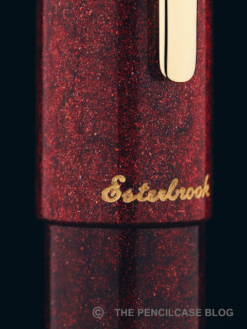
Don't forget, that's coming from the guy who, at the beginning of his pen-blogging career, didn't even think about straying away from colorless, black pens. I expected something obnoxiously gaudy and over the top, but instead this 'Garnet Red' Diamondcast Alumilite material (Made by McKenzie Penworks) strikes a perfect balance of bright red metallic particles captured in a deep, dark red (almost black in some places) acrylic. It sure does catch the eye when the light hits it, but it's really not as overpowering as I expected.
REVIEW: ESTERBROOK ESTIE SPARKLE OVERSIZED FOUNTAIN PEN
The white specks of diamond dust are subtle, but noticeable up close!
The unique thing about Diamondcast is that it is, well, made with real diamonds. Waste diamond dust from cutting gems, to be precise. The tiny white specks of diamond dust add an extra layer of sparkle to the red metallic flake that is best appreciated up close.

To be clear, this pen will not be everyone's cup of tea. But it wasn't too hard to persuade me, so  I guess everything is possible. On the other hand, if you're the kind of person that wants even more bling, the two other colorways ('Montana Sapphire' and 'Tanzanite Blue') are seemingly a bit more vibrant and in-your-face, at least going by the images I've seen online.
REVIEW: ESTERBROOK ESTIE SPARKLE OVERSIZED FOUNTAIN PEN
The Sparkle is a special edition that does command a rather hefty premium over the standard production colorways of the Estie (more on that later). However, apart from the Diamondcast material, the Estie Sparkle shares the exact same design as the regular Estie I reviewed a couple months ago (review HERE). That's a good thing if you ask me, because I really do enjoy the minimalist, clutter-free aesthetic of the Estie. The Oversized version of the Estie follows the same clean lines as the regular model, just overall a good bit bigger. The large size and clean design of the Estie oversized put all the emphasis on the striking Diamondcast material, and deservedly so. It really shines - literally!
REVIEW: ESTERBROOK ESTIE SPARKLE OVERSIZED FOUNTAIN PEN
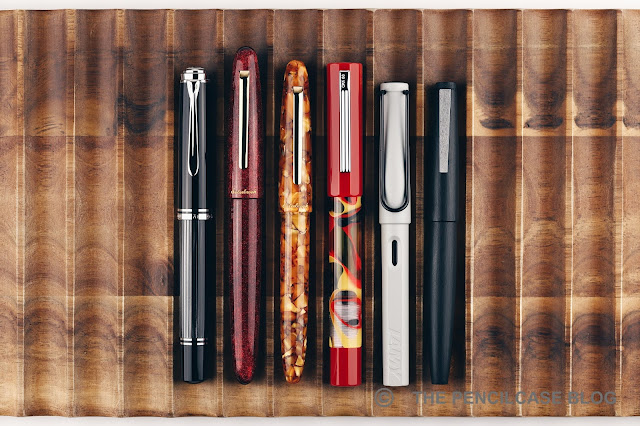
L to R: Pelikan M1005, Esterbrook Estie Sparkle OS, Estie Honeycomb, OPUS 88 Flow, Lamy Safari, Lamy 2000
What's also striking, is the size of the Estie Oversized! I probably should've seen that coming, since the regular model is already pretty much an oversized pen. But I was still quite surprised when I first opened the box. It's an absolutely huge pen, and especially the added width makes the oversized Estie feel considerably larger than its smaller sibling. Heck, it even makes a Pelikan M1000 or Montblanc 149 feel kind of small! Its size reflects in the weight as well. Since the barrel and cap walls are machined considerably thicker than on the regular model, it feels extremely solid in the hand, and should be able to withstand a good bit of (ab)use. It feels noticeably more substantial than the regular Estie, but at 33 grams it's still far from what I'd call heavy or unpleasant to use.
REVIEW: ESTERBROOK ESTIE SPARKLE OVERSIZED FOUNTAIN PEN
As far as I can tell, the Estie and Estie Oversized share the exact same section. I did find the Estie a particularly comfortable pen to use in my original review, but the copy-pasted section does introduce one caveat in the much larger (and wider) Oversized variant: where the regular Estie had almost no step at all - a huge plus in terms of comfort - the oversized adds its extra girth in the shape of a substantial step behind the all-metal section threads. While the block threads are subtle enough to go unnoticed in my grip, the step can definitely be felt depending on how you hold the pen. It's not an absolute dealbreaker for me, but in terms of absolute comfort, the regular Estie has a slightly more forgiving form factor.
REVIEW: ESTERBROOK ESTIE SPARKLE OVERSIZED FOUNTAIN PEN
The Estie Sparkle comes with the same JoWo-made steel nib and plastic feed as the regular Estie. The medium nib on my pen is perfectly smooth and lays down a rather wide and wet line. It's an excellent nib all-around, without a doubt, and the spring-loaded inner cap ensures a reliable ink flow that starts right up when you need it.

One negative is undoubtedly the rather high price of the Estie Oversized and this 'Sparkle' special edition in particular. The production run on these isn't particularly large I was told, so you do get something unique, but there's no denying that an MSRP of 395$ is quite a serious price hike over the 250$ base price of the oversized model (retail price of the Sparkle is 316$ from US vendors, 395€ from European vendors like La Couronne Du Comte or Appelboom). For a pen in that price range, I would've liked to see a gold nib as standard, or at least the option to upgrade to one. That shouldn't be too hard to do, given JoWo's gold and steel nibs are interchangeable, so I'm hoping Esterbrook will add this option at some point.

Being 'worth' that kind of money or not, is of course highly subjective and it maybe shouldn't depend solely on the nib material. Recently, we've seeing more and more brands jump into the higher echelons (+250$) with steel-nibbed pens, which rubs people the wrong way because these pens lack the perceived value that a gold-nibbed pen has. But let's be real here: apart from the prestige, the added value of the gold alloy is almost negligible, and performance-wise there's plenty of steel nibs - including this one - that can easily measure up to their gold counterparts.
REVIEW: ESTERBROOK ESTIE SPARKLE OVERSIZED FOUNTAIN PEN
If you can live with the price, the Esterbrook Estie Sparkle oversized is not only an excellent writer, it also pulls off a bold - but tasteful - aesthetic that surprised me in a pleasant way. I already liked the regular Estie, but they absolutely nailed it with the Sparkle, and I think they made the right choice to let the oversized model show off the color and depth of the Diamondcast material at its finest!

NOTE: This product was provided by Esterbrook (Kenro), so I could write this review. I was in no way influenced in the making of this review, the opinions shared in this review are completely my own! This post contains affiliate links.
REVIEW: ESTERBROOK ESTIE SPARKLE OVERSIZED FOUNTAIN PEN

Saturday, May 16, 2020

REVIEW: ESTERBROOK ESTIE HONEYCOMB FOUNTAIN PEN

REVIEW: ESTERBROOK ESTIE HONEYCOMB FOUNTAIN PEN
When Esterbrook -one of the most famous American pen brands from the 20th century- was revived back in 2014, it took the writing community by storm... A storm of criticism, that is! The rights to the Esterbrook brand name were bought by someone with an already so-so reputation in the industry, and the pens that came out of the revival had absolutely nothing to do with the original Esterbrook. To make matters worse, the pens seemed to lack quality, the designs were lackluster, and you could see from a mile away that they weren't even comfortable to write with. Needless to say, the revival didn't last very long, and as soon as the storm arrived, it also died down.

In 2018, Kenro (US distributor of Italian brands such as Aurora and Montegrappa) entered the stage and bought up the name to revive the brand once more, and it's safe to say their effort was received quite a bit better. 
REVIEW: ESTERBROOK ESTIE HONEYCOMB FOUNTAIN PEN
Although before I start, I do want to point out that I was surprised to see Kenro bring back Esterbrook with an entirely different design (at least for the Estie) that STILL doesn't carry any resemblance to the original brand heritage. Although they redeemed themselves by offering an optional section that takes the extensive suite of vintage Esterbrook nib units, I continue to find it odd that Esterbrook's vintage pens had such distinct designs and materials, yet they chose not to incorporate any of that in the new line of 'Estie' fountain pens. 
REVIEW: ESTERBROOK ESTIE HONEYCOMB FOUNTAIN PEN
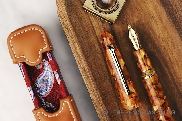
Look beyond that though, and the Estie is just an overall stunning pen. In a way it does fit in quite nicely with my keenness for minimal design: It's a torpedo-shaped design without even a single piece of metal trim other than the simple, straight clip. The acrylic material is the show-stopper here, the Honeycomb finish is by far the best-looking colorway in their current line-up - at least if you ask me. The warm, golden-brown flecked acrylic is slightly translucent, and the pearlescent bits scattered throughout play nicely in the light.
REVIEW: ESTERBROOK ESTIE HONEYCOMB FOUNTAIN PEN
The Esterbrook logo (which remains unchanged from the original, a nice detail) is tastefully engraved in cursive below the clip and is filled with metallic gold paint to match the rest of the trim and blend in quite nicely with the color of the pen itself.

The gold plating on the clip of my particular pen did tarnish a little bit after a few months of use. Nothing a few seconds of spare time and a polishing cloth couldn't deal with though, and the plating seems to have remained intact underneath. But ideally, I'd rather not see it tarnish in the first place. Then again, the Estie is far from the only (and certainly not the most expensive!) pen where I've seen gold platings tarnish.
REVIEW: ESTERBROOK ESTIE HONEYCOMB FOUNTAIN PEN
Underneath the cap are two metal decorative bands adorning the section, right above, and below the threads. The threads itself are also acrylic, at least on this 'standard'-sized version of the Estie. The small threaded section of acrylic is fixed in place between the two decorative bands by means of a silver-colored metal inner construction. The color of the metal inner barrel shines through the threads, giving it an ever-so-slightly different hue than the rest of the pen. It's a minor nitpicky detail, though. In comparison, the Estie oversized receives all-metal threads.
REVIEW: ESTERBROOK ESTIE HONEYCOMB FOUNTAIN PEN
L to R: Edison Beaumont, Edison Collier, Leonardo MZ Grande, Esterbrook Estie, Lamy 2000, Lamy Safari
Now that I mentioned the oversized version... you'd think the regular Estie would be a small pen in comparison, but interestingly it's not that small after all. Measuring 14.9 cm (6.87") capped, and 12.7 cm (5") opened. It's really quite a large pen already, although in diameter it's not outrageous (1.5 cm at the widest point of the cap). The section is rather long and has a fairly common diameter of 11 mm (0.4").
REVIEW: ESTERBROOK ESTIE HONEYCOMB FOUNTAIN PEN
The section has a very comfortable, subtly tapered shape. It transitions smoothly into the barrel over block threads that don't feel sharp, and a tapered metal ring. The overall weight of the Estie is kept low (24g) especially for such a large pen, which makes for a fatigue-free writing experience. Kenro has put a comfortable pen on the table with the Estie. It's large when capped, but has almost perfect dimensions when uncapped.

The Estie comes with a spring-loaded inner cap, similar to the ones found on some of Platinum's and Wancher's pens. It feels more like the mechanism that's used by Wancher, where the spring is substantially stronger and requires a noticeable push to catch the threads. It's something to get used to, but fact remains: the mechanism simply does what it's supposed to do, and keeps the nib primed to start writing straight away.
REVIEW: ESTERBROOK ESTIE HONEYCOMB FOUNTAIN PEN
The nib of the Estie is of JoWo's hand. It's a stock nib with simple branding laser-engraved on the nib face. I've never been a huge fan of laser-engraved nibs and in this case the combination between the stamped design of the stock JoWo nib and the laser-etched Esterbrook logo... It's not the best-looking nib I've ever seen (although not the worst, either). I do appreciate the fact that JoWo tends to fully gold-plate their steel nibs, instead of doing two-tone designs, which I think does fit the overall design of this pen better. 

As far as the actual writing experience goes though, I have absolutely nothing to complain about. JoWo's broad nibs seem to match particularly well with what I seek in a juicy, smooth, broad nib. The tipping is very round (a lot of broad nibs tend to have a more stubbish shape), which makes for a smooth and uniform line that I quite like with my print handwriting. For the n-th time, JoWo nibs are a bit stiff for my liking, but that doesn't distract from the very pleasant writing experience. This broad nib flies through a converter of ink in no time though, and the metal internal parts mean that you can't convert the Estie to an eyedropper for a higher ink capacity.

Of course one of the main selling points of the Esterbrook Estie - and as far as I can see the only real aspect that ties this pen in with the vintage Esterbook brand - is the option for a separate section (the 'MV adaptor') that can accommodate vintage Esterbrook nib units. This adaptor section costs 40$ (and is unfortunately only available in black) but should be well worth it if you want to breathe new life into the spare Esterbrook nibs that you may have laying around. 
REVIEW: ESTERBROOK ESTIE HONEYCOMB FOUNTAIN PEN
At least for a limited time, when you buy the Estie through selected retailers (in Europe, that would be Penoblo in Germany, who sent me this pen for review), you may also get a little (or rather, quite large) gift with your purchase: a custom insulated bottle (a good quality one, too!) with playful vintage-inspired Esterbrook prints all over it. I was a bit skeptical about the bottle promo at first, but I have to admit that mine has been with me to work every day since - thank you for keeping me hydrated, Esterbrook!
REVIEW: ESTERBROOK ESTIE HONEYCOMB FOUNTAIN PEN
Sure, I could nag on about the fact that Kenro sort of missed the opportunity to shape the Esterbrook rebirth a bit more in line with vintage Esterbrooks, but that doesn't change the fact that the Esterbrook Estie is a very nice pen in its own respect. Both in terms of looks and writing performance, there isn't really anything about the Estie that I didn't like... quite the opposite even. 

Perhaps my only gripe with the Estie is that, while it does a lot of things good - and I don't think you'll be disappointed by it -, it doesn't quite manage to excel or stand out. It makes the 195€ (156$ in the US) price tag feel perhaps a bit on the steep side. Especially since that 100-200$ range is a very competitive category to reside in, with some serious competition from brands like Leonardo Officina Italiana, Franklin-Christoph, Edison, Opus 88... You could even get into gold-nibbed pens for that kind of money.

NOTE: This product was provided by Esterbrook (Kenro) and Penoblo, so I could write this review. I was in no way influenced in the making of this review, the opinions shared in this review are completely my own! This post does not contain affiliate links.