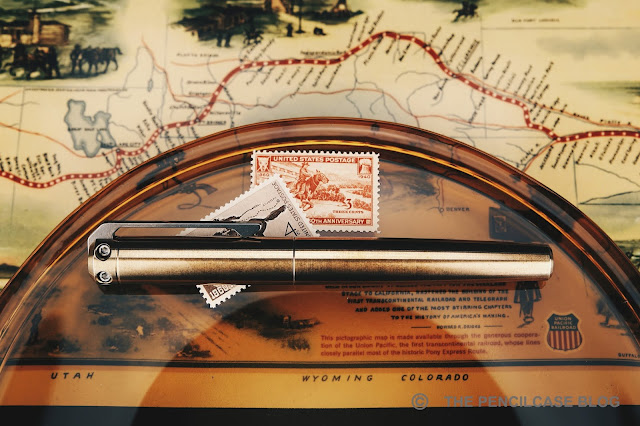
It was only very recently that I familiarized myself with the Karas Pen Co. INK fountain pen - A metal pen I considered buying at least a million times, because what metal pen collection would be complete without. A few months ago, I traded pens with a member of the Dutch FPNL Facebook group for a brass INK. A few weeks after that, Karas introduced the special edition Ink Pony Express, a precursor for the INK V2 that arrived just this week! So I OBVIOUSLY had to give that one a try as well, to see what's new!
When Karas sent over one of these special edition Pony Express pens, my initial intention was to review it as such, showing the Pony Express with all the accompanying paraphernalia that come with the pen, referencing the short-lived horse-powered courier service connecting Missouri and California from 1860 to 1861. For super-speedy
deliveries...in just ten days! (Given the instant
gratification zeitgeist, I find the story of Pony Express
delightfully ironic). But of course, me being slower than a sloth on sleeping pills (I felt like doing an alliteration!), this limited edition sold out long before I was ready to post about it. So instead, I decided to make this review about my first experience with the Karas Pen Co. INK fountain pen, and how V2 improves on it!

The INK V2 is - IMHO- a pretty significant update over the previous version.
And yet, from the outside you won't be able to tell the two apart. The INK has
always been a rather unique and recognizable pen though, so I think it's good
that they kept the rugged, industrial design language unchanged. While I
wouldn't describe the design as 'minimal', the overall shape of the pen is
kept very simple, with a straight cylindrical cap, and a featureless, round
barrel that tapers slightly towards the back.
The attention is immediately drawn towards the top of the cap, where the interesting stuff is happening: The massive stonewashed clip made from thick
stainless steel (note: the Pony Express has a similarly styled clip, made
out of titanium) makes the entire design of the pen. The clip runs through the
cap finial (extending a millimeter or so above the finial itself), and is
attached by two hex screws that are prominently visible from the side of the
cap.

|
|
Pony Express/V2 (top) vs. old INK (bottom), a noticeably beefier
profile |
When I think of Karas products, I think chunky and rugged vintage industrial looks, and the clip perfectly ties the INK in with that philosophy. Rugged is a keyword here, as it certainly doesn't look like the sort of clip that'll bend or break. It's a rather stiff clip, but the shape makes it surprisingly easy to use. On an interesting side-note, I noticed that the new clip has a
noticeably thicker profile than on the old INK. I'm not sure if that design carries over to the steel clips on the INK V2, or if it's specific to the titanium clip of the Pony Express?

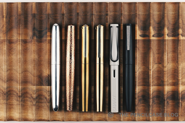 |
| L to R: Ensso Piuma, Namisu Nova, Karas INK, INK V2, Lamy Safari, Lamy 2000 |
The INK isn't just beefy, it's also heavy.
The aluminium version weighs a little over 40 grams, hefty but probably still
comfortable for a lot of people. The Pony Express I have in my hand is made of
bronze, which is comparable to the 'standard edition' brass and copper INK V2 in
terms of weight. All three of these surpass 110 grams total, which makes this probably one of the heaviest pens I've ever used. It's very heavy, for sure. And
yet it's still surprisingly manageable, which I think is at least partially
because of the comfortably shaped section design that provides a positive grip
on an otherwise slick, metal pen. The cap does not post, but I never missed
that.

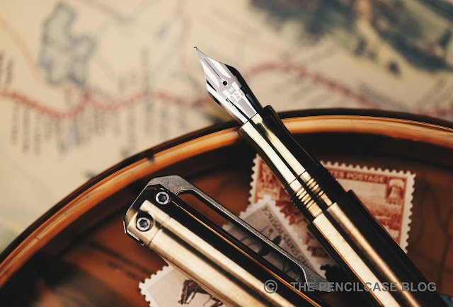 The nib, as mentioned, received an aesthetic overhaul with a completely
laser-etched design that spans the entire surface of the nib. They started
offering in the most recent years (my
REVIEW of the Karas Vertex
was the first time I saw them IRL), and it's a breath of fresh air amidst
all those JoWo nibs with a mismatch of traditional stamped scrollwork and a
tiny laser-etched logo in the middle (you'll undoubtedly know what I'm
talking about).


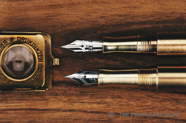 |
| V2 on top, old version below |
We're getting to the meat of this review, and why the INK V2 is such a
drastic improvement over the previous version. Through some clever internal reshuffling underneath the cap, the inside of the INK looks drastically different from what we're used to seeing. The 'old' INK was one of the first pens to my knowledge that implemented a full-sized #6 nib into a pen that was originally designed to hold a smaller #5 nib (Let's not forget, the pen I now call 'old' is actually already an updated version, that came out back in 2015, 2 years after the original). To make space for the nib, it was recessed 5 mm into the section.
In the meantime, Karas Pen Co. started doing custom laser-engraved designs on their nibs, so it's only reasonable that they'd like to show it off as best as they can. The section is therefore made shorter about 2 mm, and
the nib itself extends 2mm further, relative to the rest of the pen. The section retains the same pinched shape but is actually more comfortable to
hold, and that has everything to do with the threads right behind
it.
The threads were redesigned completely, which is the biggest merit of the
INK in my opinion. The old threads were extremely sharp and I found them
genuinely bothersome in my grip. The redesigned block threads have a
shallow and flat profile, making them very unobtrusive. It's a night and day difference over the old design and a welcome change. The step behind said threads is still very much present and remains noticeable in the hand, but the edge is rounded enough to the point where it's not
uncomfortably sharp.

Inside the cap, the V2 brings another change that has already been
implemented on other Karas pens: the 'Sta-Fast' cap system, as they call it. "The what now?" It's essentially just a rubber O-ring on the inside of
the cap, right behind the threads. It catches on the section with just the
right amount of friction to give a very satisfying resistance to
the final quarter turn when capping and uncapping the pen. Not only does
it make the cap stay put (indeed somewhat of an issue on the old
INK), it also creates an airtight seal to keep the nib from drying out.
Nifty!
Overall, aside from the improvements that the V2 brings, It seems to me that the machining quality and finishing has also been bumped up a notch.
Machining lines are still visible (giving the typical 'brushed' finish
that pretty much all metal pens have) but the finish is much tidier and consistent across the entire pen. A few sharp edges here and there that I
noticed on my old INK have also been addressed in the new version.


Underneath the very clean design, it's a stock Bock nib though. But! BIG
BUT! Karas has taken on to individually testing and adjust each and
every nib that leaves their factory. A small test sheet included with the pen reminds you of the extra mile Karas went into providing a more hassle-free writing experience. With Bock having the hit-or-miss
reputation that it does, I can't stress enough how much peace of mind
this brings (also for me as a reviewer, because I feel much more at ease
recommending a Bock nib if I know it has been individually tested and adjusted!).
The QC shows, because the writing experience has been nothing short of
excellent! The steel medium nib is glassy smooth yet remains
surprisingly responsive at the same time. The nib lays down a
true-to-size line. Ink flow is balanced, very consistent, and doesn't
run dry even with fast writing. No skipping or hard starting to speak
of, either (the latter probably in part due to the Sta-Fast cap!). Color me impressed.

It's taken me a while before trying the INK, but I'm glad I finally did!
The design strikes me as typically Karas: rugged, definitely EDC-minded,
but also with a quirky or unique edge that sets it apart - In this case,
the unique clip that really ties together the entire design for me.
What's more impressive, is that Karas basically took every point of
criticism I would've had about the old model, and improved on it, creating
a pen that leaves me surprisingly little opportunity to fault it. Build
quality and overall fit and finish are excellent, and clever details like
the Sta-Fast cap and redesigned section and threads show the amount of
thought that went into this redesign. Where I would've had my doubts with
the original INK, the INK V2 is now a pretty comfortable pen to use -
perhaps not perfect, but definitely much improved. And last but not least,
the individually checked and tuned nibs are a fantastic selling point in
and of itself.
The
Karas Pen Co. INK V2
starts at 95$ for the aluminium base model, and goes up to 185$ for the
copper version. That's considerably more expensive than comparable metal
pens from other brands. If I were reviewing the old INK, I would've made
cost an issue (perhaps it's the reason why I held off on this pen for so
long?). But in the case of the INK V2, I think the price is more than
justified.
This product was sent to me by
Karas Pen Co.
so I could write this review. I was in no way influenced in the making of
this review, the opinions shared in this review are completely my own!
This post does not contain affilate links.


Thanks for the review - I'd been toying with the idea of buying a V2 Ink, but went due a discounted Decograph instead. I understand, though, that the new grip sections fit the old pens (I have 3 or 4 of the previous iteration) - and Karas kindly agreed to send me a couple of them with my Decograph order!
ReplyDeleteThank you for reading Gordon! I wasn't aware that the new sections can be retrofitted to the V1! That would indeed make for a nice upgrade if you want to have the nibs displayed more prominently!
Delete