Sunday, August 30, 2020

REVIEW: TWSBI DIAMOND 580 SMOKE ROSE GOLD II FOUNTAIN PEN REVIEW

Courtesy of Appelboom, a TWSBI Diamond 580 Smoke Rose Gold II (or RG II in short) landed on my desk. I have to admit, it's been a hot minute since I last reviewed a TWSBI... heck, it's been a hot minute since I last held a TWSBI in my hand! Not that I don't have a couple TWSBI's laying around, but for some reason, none of them have been in rotation in the past year or so. Maybe being spoiled for choice as a pen blogger is the main 'hindrance' (hey, you won't hear me complain!) that prevents me from picking up the sleek 580Al (review HERE), uber-functional and fun Eco (review HERE), or even the hugely underrated GO (that I probably should review at some point).
In my defense, TWSBI hasn't exactly been churning out new and innovative products in recent years.  Their last pen to really impress me was the Go, but that too was already quite a while ago. So perhaps I was just getting a bit bored. TWSBI's current strategy seems to involve exploring different, sometimes more luxurious, materials and trendy finishes for the existing models in their catalog, and you can hardly argue with the effectiveness of said strategy - every new special edition Eco colorway seems to sell like hotcakes (I too, have to admit being quite tempted by the new Cement Grey Eco)!
So, as I was saying, TWSBI occasionally takes one of their established models and puts them in a  more luxurious, shinier outfit. Seemingly in an effort to bump them up into a slightly more premium category. Yes, the Smoke Rose Gold II is the most expensive version of the Diamond 580 to date, but not so much so that it takes away from the value proposition we've come to expect from the Taiwanese brand.
If you can't see the ink sloshing around in the barrel, is it really a TWSBI?
The name of the TWSBI Diamond 580 Smoke Rose Gold II is about as self-explanatory as it is long: You get the demonstrator 580 you're probably familiar with by now, but with the inclusion of a smokey, translucent grey cap, section, and piston knob that contrasts against the transparent faceted barrel. Ultimately the color of the ink dictates the look of the pen, put a darker ink in it, and the result is an overall darker, sleek-looking pen, 
The darker resin is offset by a bit of bling that is the rose gold trim. Interestingly, the Smoke Rose Gold inherits the 580Al's aluminum piston mechanism - also rose-gold plated for the occasion - but not the 580Al's metal section. I guess too much rose gold would be too much. The plated aluminum of the piston has a slightly different color than the other rose gold plated trim, but it's not too distracting from the overall picture. Everything combined, this is a pretty stylish - and photogenic! - pen. I'm not gonna lie, that's not something I ever expected to say about a TWSBI! 
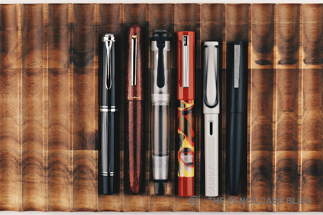
L to R: Platinum #3776 Century, TWSBI Diamond Mini, TWSBI Eco, TWSBI Diamond 580 RG II, Lamy Safari, Lamy 2000
Picking up the 580 to write instantly feels familiar again. The slight resistance in the first turn of the cap due to the rubber o-ring that seals it airtight, the subtle texture of the faceted barrel, and a reassuring bit of weight you might not immediately expect from a 'plastic' pen... Ah yes, this feels familiar! 

Over the years of me ignoring the Diamond 580, I almost forgot that this is a really comfortable pen to use! It's actually a fairly large pen, at 14.3 cm/ 5.63" capped, and 13 cm/ 5.12" uncapped. The grip is relatively short but has a decent diameter and comfy profile. The transition from section to barrel is only interrupted by a set of threads that are barely noticeable in the hand. Making it a comfortable pen to hold, even if you grip slightly higher up like I do. I find the 580 to be more than long enough to use unposted - Luckily because while the cap can post, it sits quite far back on the barrel and throws off the balance of the pen. 
Maybe the one thing, above everything else, that makes me wonder why I don't use my TWSBI's more often is the nib! All the way from the most inexpensive TWSBI Go, to this most decked-out model, I've never come across one that didn't write flawlessly out of the box. In particular, I have a soft spot for TWSBI's 1.1mm stub nibs (it's a shame they never brought back the excellent 1.5mm stub!). The 1.1mm stub on this 580 RG II - rose gold plated to match the rest of the pen - is no different. It's a consistent and smooth writer that provides a very precise and crisp line variation. The heavier ink flow of the stub nib pairs perfectly with the 580's large ink capacity.
It's impressive to realize that in all those years, the 50$ standard version of the TWSBI Diamond 580 is still... 50$! It never went up in price (at least not as far as I know). If standard versions aren't your cup of tea, the 85$ Smoke Rose Gold II is an easy upgrade to recommend. It's still a lot of pen for relatively little money, and the rose gold trim successfully adds some flair to the utilitarian-looking Diamond 580. 

As usual, pricing isn't quite consistent depending on where you are in the world. Pricing from EU-based retailers like Appelboom is unfortunately quite a bit higher across the board, with the RG II retailing for 109€ (105$ without VAT) - that's quite a mark-up! Regardless, in the current market where steel-nibbed pens regularly fetch 300$ or more, even the most expensive TWSBI is still an excellent bargain if you ask me. Now excuse me while I go fill up one of my own TWSBI's again!
Note: This product was sent on loan by our site sponsor Appelboom, so I could write this review. I was in no way influenced in the making of this review, the opinions shared in this review are completely my own! This post does not contain affiliate links.


Sunday, August 23, 2020

REVIEW: BEN WALSH DESIGN GRAVITAS FOUNTAIN PEN & GRAVITAS TWIST PEN

PEN REVIEW: BEN WALSH DESIGN GRAVITAS FOUNTAIN PEN & GRAVITAS TWIST PEN
I started chatting with Irish designer Ben Walsh about a year ago when all this was still a concept idea and a bunch of renders. Ben - who got into the pen making industry with unique, handmade concrete pens - wanted to create a metal pen from scratch, and he was actively engaging with the community to gather feedback. One year, and a lot of exchanged thoughts and ideas later, Ben has released his pen - I should say 'pens - out in the wild via a Kickstarter campaign that took off last week: Gravitas pens!

Now, if you know me and my reviews, you'll know that I have a sliiiiight tendency to get overly excited about cool metal pens, but believe me when I say this is a Kickstarter you HAVE to check out if you're even the slightest bit interested in this type of pens! If you still don't believe me after this review - no offense taken - check out Anthony's review over at UK Fountain Pens. Anthony likes it too, and he's a tough guy to convince!
PEN REVIEW: BEN WALSH DESIGN GRAVITAS FOUNTAIN PEN & GRAVITAS TWIST PEN
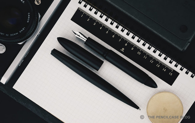
From afar, you might be forgiven for thinking of the Gravitas fountain pen and Gravitas 'Twist' capless rollerball as a 'been there, done that' design. True, nobody's reinventing the wheel here (not that anyone has done that in the pen industry for a very long time, I'd dare to say), but if anything the Gravitas pens are very good looking wheels! The Gravitas and Gravitas Twist pair up nicely side by side, but they are two relatively different pens in terms of design. 
PEN REVIEW: BEN WALSH DESIGN GRAVITAS FOUNTAIN PEN & GRAVITAS TWIST PEN
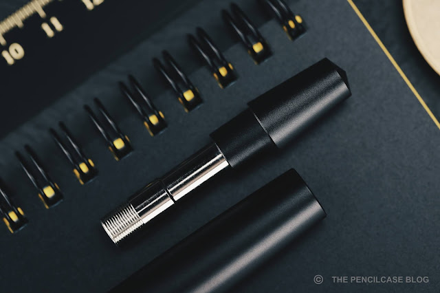
Let's start with the Gravitas fountain pen (and capped rollerball), which has a very pronounced torpedo shape with a girthy, straight cylindrical body. It tapers down sharply towards the cap and barrel finials into pointed ends... but instead of a point, you'll find a small silicon nitride ball on either end! 

Despite a somewhat tactical pen vibe, the finials' main intent is to provide a more durable design that could survive a drop better than a bare aluminium finial would. Compared to the more rounded cigar-shaped Ensso Piuma or Namisu Horizon - two comparable pens - the Gravitas has a much more robust and bulky appearance (probably because it IS robust and bulky), which I quite enjoy. 
PEN REVIEW: BEN WALSH DESIGN GRAVITAS FOUNTAIN PEN & GRAVITAS TWIST PEN
Yeah... too much is too much!
The clean, minimal design is interrupted by a threaded section on the back of the barrel. While I don't find the threads as visually distracting as I thought I would, I'm still happy to know that they will be dropped in the final production version. The Gravitas is more than long enough to be used without posting (in fact, it looks a bit silly with the cap on the back!) so you won't miss those threads at all. 
PEN REVIEW: BEN WALSH DESIGN GRAVITAS FOUNTAIN PEN & GRAVITAS TWIST PEN
Streamlined!
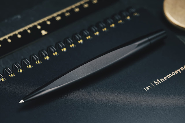
The Twist pen is a different beast altogether. It's sleeker, skinnier, and has a long and rounded taper towards the narrow tip of the pen. What sets the Twist apart is its flat spot that prevents it from rolling around. With respect to the center of the pen, the flat is angled towards the front of the pen (my photo's don't do this justice at all). This gives the pen a mean-looking 'stance' when it sits on a flat surface, with the tip angled downward - it's quite cool. 
PEN REVIEW: BEN WALSH DESIGN GRAVITAS FOUNTAIN PEN & GRAVITAS TWIST PEN
The twist mechanism of the Twist (the name certainly isn't far-fetched!) is of Schmidt make, the same as those found in Baron Fig's Squire. It has a pleasant action and feels quite solid (there's a slight rattle, but nothing too distracting). I do wish that the twist knob was a bit longer compared to the rest of the pen, to make it easier to reach and operate. Ben took note of this as well, when I and a couple other reviewers were asked to give input on these production prototypes, and so these changes will most likely end up in the final design. 
PEN REVIEW: BEN WALSH DESIGN GRAVITAS FOUNTAIN PEN & GRAVITAS TWIST PEN
While the idea is to expand the Gravitas collection with various materials and finishes (including really neat laser-etched graphics that cover the entire pen!), the Kickstarter starts off with three clean-looking anodized aluminium finishes: black, silver and gold. Even on these 'prototypes' (quite advanced proto's, but still...), the finish is immaculate. The aluminium base pen is bead-blasted to remove machining marks, and then anodized to give a smooth matte finish that is very pleasant to the touch.
PEN REVIEW: BEN WALSH DESIGN GRAVITAS FOUNTAIN PEN & GRAVITAS TWIST PEN
The Gravitas fountain pen...
PEN REVIEW: BEN WALSH DESIGN GRAVITAS FOUNTAIN PEN & GRAVITAS TWIST PEN
And the Gravitas Twist pen
PEN REVIEW: BEN WALSH DESIGN GRAVITAS FOUNTAIN PEN & GRAVITAS TWIST PEN
L to R: Baron Fig Squire, Karas Retrakt, Namisu Nova, Ensso Piuma, Gravitas fountain pen, Gravitas Twist pen, Lamy Safari, Lamy 2000
The Gravitas fountain pen is a fairly large pen, noticeably larger than most other metal pens from the likes of Ensso, Namisu, Karas... It measures 14.8 cm/ 5.81" capped, and 13.4 cm/ 5.28"  uncapped. The maximum diameter of 1.5 cm/ .59" runs along almost the entire length of the pen, which makes it look bulky and robust. Underneath the cap, you'll find a long, gently tapered section with a comfortable diameter (1.1 cm/ .43" even at the thinnest point) that flares out slightly towards the nib.
PEN REVIEW: BEN WALSH DESIGN GRAVITAS FOUNTAIN PEN & GRAVITAS TWIST PEN
Shallow threads and an angled transition towards the barrel create a comfortable writing experience 
The threads are shallow and fine, rendering them barely noticeable in the hand. The threads are single start on this prototype, and take a hefty three full turns to cap and uncap. The final production pen will get more common triple start threads that need fewer turns. One of my favorite practical design elements on the Gravitas is how the step towards the barrel is angled to make the transition much more gentle in the hand. It's an elegant and simple design decision that makes all the difference in terms of comfort, and yet you barely ever see it on other pens. It's a larger pen, so even the all-aluminium construction still comes in at 39 grams. I guess you could say the Gravitas has a reassuring... gravitas to it (terrible pun, I know), it sits nicely balanced in the hand.
PEN REVIEW: BEN WALSH DESIGN GRAVITAS FOUNTAIN PEN & GRAVITAS TWIST PEN
The Twist pen is a bit smaller than its capped companion, although in absolute terms it's still far from compact. At 14.1 cm/ 5.55" in length, and with a maximum diameter of 1.4 cm/ .55" it's a bit shorter than the fountain pen. Due to the more tapered shape of the Twist, it definitely appears smaller than it actually is. With a weight of 34 grams, it feels positively hefty in the hand, too.

In terms of comfort, both pens score high marks with me. The Gravitas fountain pen has a comfortable design, a lot of the small details, like the shape and size of the section, the subtle threads and angled transition towards the barrel, are the result of careful consideration on Ben's end, taking into account a lot of input he got from the community. The Twist actually has a unique angle (hah! got it?) in terms of comfort, with the flat spot providing a natural area to rest your thumb, index or middle finger (either way you rotate it, it sits comfortably in your hand). The stretched out, tapered design means you can hold it closer to the tip or further up, to get the grip diameter you prefer. 
PEN REVIEW: BEN WALSH DESIGN GRAVITAS FOUNTAIN PEN & GRAVITAS TWIST PEN
The Gravitas Twist comes loaded with Schmidt's P8127 rollerball refill. While that's not a bad refill, I've recently switched towards gel-based refills for my non-fountain pen writing. Luckily, the P8127 is similarly sized to standard Parker G2 refills (not to be confused with Pilot's G2!), which gives plenty of choices to swap refills to a ballpoint or gel refill (I've been using the Monteverde Ceramic gel refill, which fits perfectly and works quite well, even though it's not quite as fine as I'd like)
PEN REVIEW: BEN WALSH DESIGN GRAVITAS FOUNTAIN PEN & GRAVITAS TWIST PEN
The Gravitas fountain pen, on the other hand, warrants some explaining: While the prototype I have in my hand has a Bock nib - common for most metal pens you'll find on the market today - Ben made the switch to JoWo when he noticed the quality wasn't as consistent as he'd like with Bock. It's good to know that a strict QC is in place to ensure each nib functions as it should. As a lot of brands adopt stock JoWo and Bock nibs these days, individual QC is the way to provide that little extra that sets your brand apart. Ironically, the Broad Bock nib on this particular pen has been one of the smoothest, and wettest Bock nibs I've come across. But regardless, I think JoWo is the safer choice, and it's something different from what most other brands are doing!
PEN REVIEW: BEN WALSH DESIGN GRAVITAS FOUNTAIN PEN & GRAVITAS TWIST PEN
The Ben Walsh Design Gravitas pens are the result of a million small little details and considerate design choices. It has taken quite a few years, but the culmination of Ben Walsh's effort has led to two great-looking AND functioning pens (technically three, also counting the capped rollerball) that I can wholeheartedly stand behind. Maybe because I've had a teeny tiny say in how they turned out, but probably because they are just fantastic pens - simple as that! If I sound enthusiastic about them, that's because I am. 
PEN REVIEW: BEN WALSH DESIGN GRAVITAS FOUNTAIN PEN & GRAVITAS TWIST PEN
If you feel like supporting the Gravitas pens, you can check out the Kickstarter page until September 17th. The Gravitas Twist pen starts at 45€, and the capped Gravitas rollerball and fountain pen each start at 50€, which is very affordable. Even at future respective retail prices of 65 and 70 euros, I still think these are a killer deal. Enough blabbing already! I've already gone and put my money where my mouth is, and I think you should, too.

This product was sent to me by Ben Walsh Design so I could write this review. I was in no way influenced in the making of this review, the opinions shared in this review are completely my own! This post does not contain affilate links.
PEN REVIEW: BEN WALSH DESIGN GRAVITAS FOUNTAIN PEN & GRAVITAS TWIST PEN

Friday, August 21, 2020

REVIEW: OPUS 88 FLOW FOUNTAIN PEN

REVIEW: OPUS 88 FLOW FOUNTAIN PEN
With Opus 88 creating pens that LITERALLY look like a flower vase these days, it's quite clear that they don't mind thinking outside the 'conventional design' box from time to time. The new (ok, new-ish, I'm late to the game, as usual!) Opus 88 Flow shows some signs of the creative madness, but is all in all still a rather tame beast - and I like it for that! The Flow is more or less the perfect balance between the oversized footprint of the Demonstrator (reviewed HERE) and Omar (reviewed HERE), combined with the funky, colorful, occasionally whacky, design of pens like the Fantasia (reviewed HERE) and Flora.
REVIEW: OPUS 88 FLOW FOUNTAIN PEN
Of all the Opus pens, the Flow has perhaps the least 'flowing' shape, with a straight overall profile. The Flow does get creative with a mix of both a decagonal faceted cap and blind cap, and a round section and barrel. It's enough to create a unique pen, but doesn't overdo it (read: it's not a vase!). The design is emphasized by a colorful material choice, combining an opaque colored resin for the decagonal parts and section, and transparent swirled ('Flow-y') resin for the barrel so you can still see the ink inside. 
REVIEW: OPUS 88 FLOW FOUNTAIN PEN
The red colorway I have here is a clear departure from the colorless demonstrator Opus pens I tend to stick with. I would personally go for the slightly more understated grey colorway, but I do have to admit that this red/yellow/black color scheme is quite fun and catches the eye, especially when filled with an equally colorful ink!
REVIEW: OPUS 88 FLOW FOUNTAIN PEN
The Flow doesn't have decorative metal bands like the Omar does, but instead receives a shiny chrome coin insert in the cap finial, with the words 'Flow - Opus 88' laser-engraved on it. Opus has a tendency to use a different clip design for every pen they create, most of which I tolerate but don't particularly love. While the clip on the Flow does follow the overall straight profile of the pen quite well, the grooved design is a bit too much in my opinion. The Flow is perhaps a missed opportunity to go for a clipless design, since the faceted cap prevents the pen from rolling away uncontrollably. Besides, the Flow isn't an ideal candidate for vest or pocket carry anyway, as it's quite a big pen.
REVIEW: OPUS 88 FLOW FOUNTAIN PEN
L to R: Pelikan M1000, Esterbrook Estie Oversized, Opus 88 Omar, Opus 88 Flow, Lamy Safari, Lamy 2000
Talking about size, the Flow measures in at 14.9 cm/ 5.83" capped, and 13.6 cm/ 5.35" open. The section is relatively wide - just like the rest of the pen- and tapers down to 1.1 cm/ 0.43" at the thinnest point, before flaring out slightly. With an all-acrylic construction, the Flow is - unsurprisingly - a rather light pen for its size, at just 28 grams.

The words 'well-executed' and 'excellently put together' tend to fall out of my mouth when describing the Flow, because the build quality is excellent. I probably keep repeating it to death with every single Opus 88 pen I review, but it's simply true, and it's certainly one of the things I very much appreciate about their pens. In fact, it manages to put many higher-priced pens to shame!

Just like the other oversized models from Opus, the Flow borrows a few parts from existing Opus pens. A bit like how car manufacturers build different cars on the same platform: it's cheaper to manufacture, and the parts are tried and trusted! In this case, the Japanese eyedropper mechanism, and barrel are plucked directly from the Opus Demonstrator. 

I wrongfully assumed the section to also be identical to that on the Demonstrator and Omar, but it's actually noticeably shorter. Why they decided to change it up, I have no idea, especially because I really like the Demonstrator and Omar for their comfortable section design. That being said, the Flow's shorter section still has a decent size and comfortable shape, and the threads and step don't interfere too much with your grip. Along with its overall substantial size (the Flow isn't made for posting, but doesn't need it), a pleasantly girthy diameter, and lightweight all-resin construction, the Flow still takes a lot of the design ques that tend to make Opus pens excellent for long writing sessions.    
REVIEW: OPUS 88 FLOW FOUNTAIN PEN
As all Opus 88 pens, the Flow is a Japanese eyedropper. The back of the barrel unscrews as you would with a piston filler, but the "mechanism" inside is nothing more than a rod with an o-ring stopper at the end that plugs off the barrel when the pen is not in use, and prevents the pen from leaking. It's a brilliantly simple mechanism, and Opus implements it perfectly in all their pens: the large barrel of the Flow means you won't run out of ink anytime soon, and the o-ring on the section prevents leaks.
REVIEW: OPUS 88 FLOW FOUNTAIN PEN
Interestingly, Opus has recently made a switch to Bock nibs for some of their pens - a bit like Leonardo does. The only reason I could think of that warrants using both nib brands, would be to lower the dependence on a single supplier? In any case, the Flow only comes with a Bock nib, that means no more Pilot Parallell hack, no more swapping in the awesome Franklin-Christoph music nibs, and probably some people that will hold off on buying simply because it has a Bock writing end. 

The Bock nibs come with a simple laser-engraved logo engraved on the nib face, which looks cleaner and in my opinion suits the overall design of the pen much better than the classic flourishes engraved on stock JoWo nibs. It's a small detail, but I do appreciate it.
REVIEW: OPUS 88 FLOW FOUNTAIN PEN
Regardless of your nib preference swinging towards the Bock or JoWo camp, there's not much to say against the performance of this medium Bock nib. The Japanese eyedropper filling mechanism certainly does output a steady flow of ink, but it doesn't feel like it has a substantially wetter flow than any other Bock nib. The medium nib is nothing out of the ordinary, but it's smooth, responsive and... well, it does the job the same way a JoWo nib would. While Bock nibs at a certain point were noticeably more soft and flexible (giving them a slight edge over JoWo IMHO), I've found them to be much stiffer these days (but at the same time, also perhaps a bit more reliable?).
REVIEW: OPUS 88 FLOW FOUNTAIN PEN
The Opus 88 Flow is another cool and unique pen from the Taiwanese company. I especially like the mix of faceted and round profiles in the design. The swirly demonstrator acrylics add a playful character to the pen, although I'd love to see an all-clear demonstrator version of the Flow to match the clear Omar and Demonstrator models! 

At 116/ 135$ (at Appelboom. Sweeten the deal with 10% off using discount code 'friend') retail price, the Flow provides a hard-to-beat value. It's no secret, I continue to appreciate Opus 88's efforts in creating excellent quality products that turn heads, one way or another. And as long as they keep making those incredibly well-made, oversized, and most importantly, affordable fountain pens, I will happily keep reviewing them!
Appelboom pens
Note: This product was sent on loan by our site sponsor Appelboom, so I could write this review. I was in no way influenced in the making of this review, the opinions shared in this review are completely my own! This post contains affiliate links.
REVIEW: OPUS 88 FLOW FOUNTAIN PEN

Monday, August 17, 2020

REVIEW: OTTO HUTT DESIGN 07 FOUNTAIN PEN

So far, I've been pleasantly surprised by my encounters with Otto Hutt. So it only makes sense to look at their 'flagship', a pen that's perhaps even more elusive than the Design 03 I reviewed a few weeks ago (review HERE) - elusiveness being a recurring theme with Otto Hutt's gravely underrated product catalog - the Otto Hutt Design 07

Otto Hutt sent one over for this review, and I was immediately impressed, so I promptly purchased it. Right off the bat, it's obvious that this pen means business. It's the top-of-the-line design for the German brand, and it indeed feels like just that, showing off a lot of Otto Hutt's quality and craftsmanship - effectively the kind of thing you'd expect from a flagship pen. 
The impression of quality starts with the box. I'm a fan of good packaging design, even though I don't always show it here in my reviews. This one deserves a mention, however. The packaging is entirely made out of paper, but the satin white stock is finished with a fabric-like texture. A leather pull tab reveals two compartments in a fluid motion, with the pen in the topmost 'drawer', and a faux-leather pen sleeve, warranty booklet, and ink cartridges (in a matching paper box!) in the bottom one. At this point, I should probably mention that the pen I received still has the 'old' Otto Hutt branding (including the old logo on the pen, and packaging). So I don't know if the box remained the same after their recent rebranding!
Sliding open the box prominently displays the design 07, and as I said, I was immediately impressed. It's hard to not be a little stunned by it: you're greeted by a blindingly shiny, chunky, all-metal pen, with a design thats quite different from anything else I've come across before.

The 07 has a modern flat-top shape with a subtly curved taper to the cap and barrel. The classic, lined guilloché pattern on barrel and cap creates a rather traditional appearance. And yet the pen still looks and feels modern, largely because of the huge, oversized cap - which makes for an unusual cap-to-body ratio - and equally large, rectangular clip which is a chunky piece of solid metal (spring-loaded). The juxtaposition of modern and classic design elements is something that I see on many Otto Hutt designs, and I think it works very well on this pen. 
The design 07 is available in two drastically different finishes, which also differ slightly in price: the most expensive option comes with a cap and barrel made out of 925 sterling silver, true to the heritage of the brand. The option I have here is slightly less expensive, but in my opinion, strengthens the modern-vs-classic clash that I described above. The entire pen is made out of brass, then platinum plated. The guilloché on barrel and cap is then covered in multiple layers of a grey transparent lacquer, which gives it a more grey-ish color that contrasts slightly to the platinum trim. The lacquer is perfectly applied and as glossy as the platinum trim surrounding it. Unlike the glass-like feeling of urushi, the 07's lacquered finish feels soft to the touch, almost plasticky perhaps. Nonetheless, it's very durable and seems to hold up well to normal use. Over the couple of months that I've been using this pen, it doesn't even show the slightest scratch. It does show fingerprints though... but I probably should've seen that coming.

In my experience with the brand so far, I'd put Otto Hutt on the same level as Diplomat, Faber-Castell, Dupont - that's to say, excellent build quality, well-put-together with quality materials, and flawless finish... Or, well, almost flawless in this case. The original pen Otto Hutt sent me had an issue where some of the brass base material showed through the platinum plating on the center band. Their repair service promptly sent a replacement cap, but it too has some inconsistency in the color of the plating, again only on the center band. I'm not quite sure what caused just the center band to have issues twice, especially since the rest of the pen is absolutely spotless. On a positive note, my exchange with the repair service went smooth and fast, something I definitely cannot say about a lot of other brands!
L to R: Pelikan M800, Otto Hutt Design 04, Design 06, Design 03, Design 07, Lamy Safari, Lamy 2000
Somewhat atypical to what you'd expect from a flagship, the design 07 isn't a huge, oversized pen. That puts it in line with design 01 through 06 (Don't you just love how very German Otto Hutt's naming convention is?), none of which are very large pens. The best comparison I found was in the Lamy 2000. The Design 07 is identical in length to the 2000, both capped and uncapped (13.9 cm/ 5.47" capped, 12.4 cm/ 4.88" uncapped). Come to think of it, the Lamy 2000 also has a somewhat similar overall shape - but of course, the Design 07 is a good chunk wider overall. The 07 weighs 62 grams total. That's heavy, but not nearly as heavy as some other all-brass pens. Besides, a good chunk of its weight in the cap alone. So while the 07 is definitely hefty in the hand, it's not actually as bad as you might think.
For those who don't like metal sections, well... I guess the photos say plenty. The section is as slippery, shiny, metal-y as it gets, but the pinched shape and comfortable diameter make up for a lot in my opinion. The threads aren't too obtrusive, and there is a small step towards the barrel, but it's minor. Regarding comfort, the 07 is easily one of the best Otto Hutt pens I've used so far. The overall size is a comfortable fit for me, although perhaps not for larger hands. The cap can be posted to get some extra length, but the pen becomes rather back-heavy and I honestly wouldn't want to risk marring the beautiful finish on the barrel. 

I've used four Otto Hutt pens so far, and all have been nothing short of excellent in terms of writing quality. The Design 07 is the only Otto Hutt that has a larger #6-sized nib, but it's otherwise identical. The design on the nib is exactly the same as on the smaller one: a beautiful art-deco-ish pattern and beautiful bicolor plating.
I went out of my comfort zone and tried the EF nib. The JoWo-made 18k gold nib is stiff (typical JoWo), and lays down a true-to-size western extra-fine line. Some feedback is to be expected on a fine nib like this, but it's the pleasant kind of feedback that all Otto Hutt nibs seem to have. The ink flow is consistent and just slightly on the wetter side. The nib is perfectly tuned, doesn't skip, hard start, or run dry. It's in many ways a perfect nib. Yes, that's a weighty statement, but at this point, I'm confident to say that Otto Hutt does something very right in the writing department!
Unlike other flagship pens, the Design 07 lacks an 'exotic' filling system. Instead, you'll find a no-frills cartridge/converter system. Perhaps a bit underwhelming for a pen this price, but oh well, it does the job. 
The Otto Hutt Design 07 is a beautiful pen that deserves 'flagship' status. But at the same time, it also has the more practical size, writing comfort, and, well... price, that places it amongst pens like the Pelikan M800 or Montblanc 146 - it's a pen that will most likely appeal to a wider audience than a lot of other over the top flagship pens. 

The Design 07 has an MSRP of 520€ for the platinum-plated, and 580€ for the sterling silver version. The retail price is a bit lower, at 500€ and 550€ respectively (at La Couronne Du Comte, with an extra 10% off using the discount code 'Penthusiast'!). I think that's a decent price, but the only thing holding back the Otto Hutt Design 07 is its own fairly limited brand recognition and availability (especially outside Europe!), as opposed to the hugely popular Pelikans or Montblancs it tries to compete with. At least for now that's an issue. But Otto Hutt knows it, and they are actively trying to grow their brand (the recent rebranding being a first step in creating a more modern and appealing brand), an endeavor they should be able to succeed at, given the excellent product catalog they can build upon.

Note: Otto Hutt provided this product at a discount, so I could write this review. I was in no way influenced in the making of this review, the opinions shared in this review are completely my own! This post does not contain affiliate links.