Showing posts with label writing. Show all posts

Monday, September 4, 2023

PAPER REVIEW: AJOTO POCKET PAPER NOTEBOOK

PAPER REVIEW: AJOTO POCKET PAPER NOTEBOOK
Ajoto - the British design brand known for THE pen - has expanded their product catalog with a selection of premium notebooks. Their new "Pocket Paper" notebooks landed on my doorstep a few weeks ago. With the crowdfunding live on Kickstarter as we speak, it's about time to have a quick look at what you can expect from these new products...
PAPER REVIEW: AJOTO POCKET PAPER NOTEBOOK
The Pocket Paper collection comprises three different notebook types, or rather paper types, accompanied by a custom leather cover and pen holder. All three notebooks share the same external design: softcover (heavy black cardboard stock) with an exposed bound spine that creates an interesting look, but more importantly, a flexible notebook that opens flat without needing too much convincing.
PAPER REVIEW: AJOTO POCKET PAPER NOTEBOOK
The notebook's lay-flat properties come from the unique Swiss-style binding, a design I've only ever seen on the rather obscure Fantasticpaper Color notebooks (reviewed HERE)
PAPER REVIEW: AJOTO POCKET PAPER NOTEBOOK
The Swiss binding does have one downside: Because the paper is only attached to the right side of the cover, the left sides of the pages are unsupported and hover in the air a bit. So keep in mind that writing on the reverse side of the pages is a bit awkward. That is, at least until you're past halfway through the notebook.
PAPER REVIEW: AJOTO POCKET PAPER NOTEBOOK
The Pocket Paper project has apparently been in the works for several years, and I think it shows in the attention to detail of the final product. The packaging is minimalistic and clean, and the notebooks itself reflect the same design style. Minimal branding is visible on the front, just the Ajoto hallmarks stamped in the bottom corner of the cover. The first page has embossed lines (not actually printed) to jot down content details or "return-if-found" information. It's all very tastefully done.

Interestingly, Ajoto chose a very non-standard size for their notebooks. At 17.2 cm tall, and 10.5 cm wide, it's distinctly taller than your average notebook. In fact, it's as wide as an A6, while being as tall as the larger B6 format. For comparison, Midori's large travelers notebook measures 12 by 22 cm.

As they found out in their journey of creating 'the perfect notebook', there's no such thing as one perfect notebook! That's why they're offering three different paper types, to cater to different needs:
PAPER REVIEW: AJOTO POCKET PAPER NOTEBOOK#1 Notebooks come with 116 pages of a rather thick 120 gsm paper. This notebook is pencil/ballpoint/gel pen-oriented, which is clearly noticeable from the coarser paper texture. It can take some fountain pens with finer nibs, but it's not focused on fountain pen use. It's also not the paper to render inks in a particularly nice way, as they mostly fall flat. 

To me, the #1 notebook compares closest to a Leuchtturm or Baron Fig notebook; fountain pens CAN be used, but it's not their main focus. #1 Makes a lot of sense in Ajoto's product lineup since they're focused on making rollerball pens, which pair well with this paper.
PAPER REVIEW: AJOTO POCKET PAPER NOTEBOOK
#2 Is a smooth fountain pen-friendly paper. The notebook has 126 pages (slightly more than the #1) of a slightly thinner 100 gsm paper (which is still distinctly heavy for general writing paper). This paper is also noticeably more white than the other two paper stocks (which are a light cream color). #2 can handle a variety of fountain pen nibs and ink swabs like a champ.

PAPER REVIEW: AJOTO POCKET PAPER NOTEBOOK
Dry times are longer on the #2 paper, but in return you get excellent shading and sheen characteristics!
Inks dry nicely with strong, crisp shading and a good amount of sheen. That does come at the drawback of extended drying times, but that's to be expected. There's some showthrough on the back of the page, but no bleedthrough (except with heavy ink swatches).
PAPER REVIEW: AJOTO POCKET PAPER NOTEBOOKPaper #3 is made for sketching and drawing. The notebook contains far fewer pages (only 62) of a much heavier 190g stock. It's quite unconventional paper for a notebook but I can imagine it being a very popular option for (urban) sketching, as it can easily withstand heavy ink and aquarel applications. Fountain pen actually works very well on this paper, too!
PAPER REVIEW: AJOTO POCKET PAPER NOTEBOOK
Ink swatches look great on it, and there's absolutely no bleedthrough whatsoever. Also, the pages don't warp much when using water because the paper is so thick. If you don't mind the lesser page count and want something to experiment with fountain pen inks (maybe a swatch book?), This one could be a very interesting option!

PAPER REVIEW: AJOTO POCKET PAPER NOTEBOOK
An overview of the bleedthrough/ghosting you can expect from the different notebooks, from left to right: #1, #2 and #3
All in all, I'm very impressed with the overall quality of Ajoto's first steps into the paper world, and I really like their concept with different paper types for different use cases!

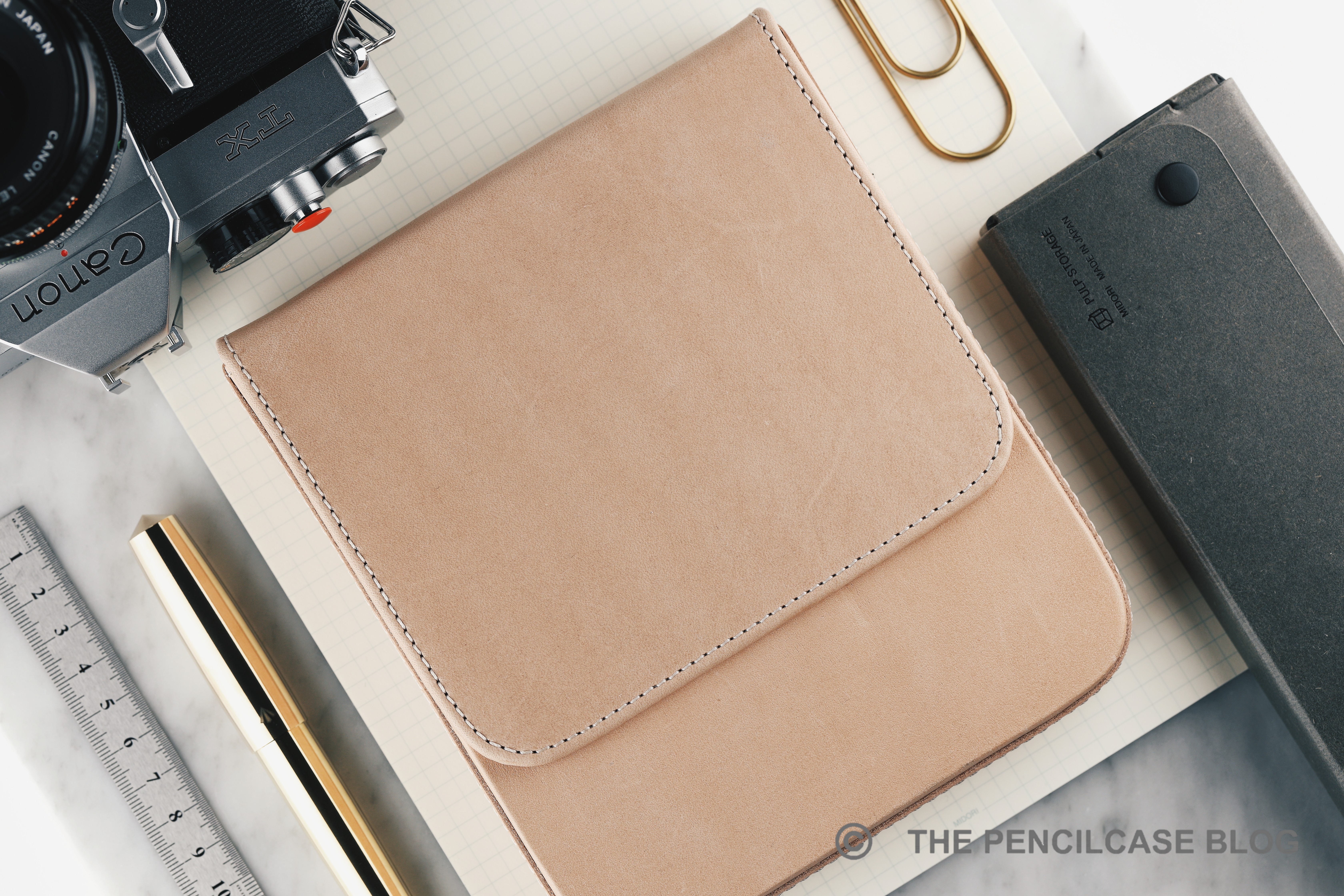
I do have two remarks though: For one, I think the heavy card stock covers aren't quite up to the standards I'd expect from a 23€ notebook (MSRP, the pre-order price on Kickstarter is 18€). Something a bit more durable would be nice, especially since these notebooks are designed for pocket carry. Extra durability can be obtained in the form of Ajoto custom leather covers for the Pocket Paper, though at an MSRP of 95.95€, they add a hefty chunk of change to the overall cost. 

Secondly, all three paper types are currently only offered in an unruled blank version. Ruled/grid/dot paper options for #1 and #2 will only be made available if certain stretch goals are met during the Kickstarter - I wish they just made those options available straight away. While blank paper absolutely makes sense for the creative-focused #3 paper, #1 and #2 could definitely use a subtle ruling to help structure your writing. 

Note: This product was provided by Ajoto, free of charge, so I could write this review. I was in no way influenced in the making of this review. The opinions shared in this review are completely my own! This post does not contain affiliate links.

Thursday, March 16, 2023

REVIEW: GALEN LEATHER MAGNUM OPUS PEN CASE

REVIEW: GALEN LEATHER MAGNUM OPUS PEN CASE | The Pencilcase Blog
Galen Leather has been a staple within our community for several years now. Along the way, I've tested and reviewed a fair amount of their products. The consensus always boils down to Galen being exceptionally good at creating a well-thought-out, unique, and affordable product. Galen's Magnum Opus pen cases (which translates to "masterpiece"), feel like a step in a different direction for the Istanbul-based brand. Affordability may not have been a top priority this time around. Instead, they went all-out on creating a beautifully made and highly practical means to store and carry your pens!

While that may sound like a bit too much praise for a pen case (hah, that rhymes!), I genuinely think the Magnum Opus comes close (and maybe even surpasses) my all-time favorite, the now-discontinued Visconti's Dreamtouch case - which, up until today, remains my baseline for a great pen case.
REVIEW: GALEN LEATHER MAGNUM OPUS PEN CASE | The Pencilcase Blog
Why am I so lyrical about this case? Well, there are a couple things I look for in a pen case. Sturdiness is the most important one, I want my pens well-protected at all times. Finishing, and especially soft, pen-friendly finishing on the interior of the case, is my second pet peeve. Why protect your pens with a case, if the case itself feels like it'll scratch them up?

It just so happens that the Magnum Opus does those two things almost flawlessly, and it does so while looking stylish and minimalist, to boot! From the outside, the Magnum Opus is a super-clean-looking hard leather case. It's completely made out of smooth leather that's soft to the touch (available in both 'regular' leather finishes and Galen's signature 'smokey' leather), stitched all around, with a stealthily hidden magnetic closure. The outer shell is very stiff, meaning there's no chance of your pens getting crushed in transport or from un-gentle handling.

The Magnum Opus comes in two variants. However, when I picked up mine at the Dutch Pen Show a few years ago, the newer, zippered version wasn't introduced yet. The zippered version seems to share the same internals as this one, but obviously has a zippered closure instead of magnets. The zippered version can also stand up straight on a desk, which is probably the biggest differentiator between the two.
REVIEW: GALEN LEATHER MAGNUM OPUS PEN CASE | The Pencilcase Blog
L to R, on the top row: Galen 10-pen case, Galen Magnum Opus 6-pen, Galen Old School 5-pen.
Bottom row: Esterbrook Nook 6-pen, Visconti Dreamtouch 6-pen, Franklin-Christoph Penvelope 6
REVIEW: GALEN LEATHER MAGNUM OPUS PEN CASE | The Pencilcase Blog
The Magnum Opus has quite a chunky profile, especially compared to the Dreamtouch case
Galen's cases are typically quite compact and space-optimized, but this one isn't. The Magnum Opus is a beefy case, as can be seen in comparing them side-by-side to some other 5 and 6-pen options. While that seems like good news for people who want to carry large pens, it's not entirely that straightforward. The Magnum Opus has a very similar capacity to the Visconti Dreamtouch case. So purely in terms of efficiency, the Dreamtouch case still wins. Then again, the two-part design of the Magnum Opus, with its removable inner tray, eats away some of the interior space.
REVIEW: GALEN LEATHER MAGNUM OPUS PEN CASE | The Pencilcase Blog
L to R: Visconti Homo Sapiens (large), Pelikan M805, Montblanc 149, Leonardo MZG Art Deco 2021, Lamy 2000, Pilot Capless LS
So what can you fit in the Magnum Opus, then? Well, normal pens like a Pelikan M800, Lamy 2000, or Visconti Homo Sapiens aren't an issue whatsoever. The Magnum Opus can fit a lot of oversized pens too, but 'oversized' isn't exactly a very precise definition. Galen's own website states pens 16cm (6.3") long, and up to 1.6cm (0.63") in diameter will fit, and this matches my own experience with the case. So, even very long pens like the Leonardo Momento Zero Grande (about 15.5cm/ 6.1") fit easily because they're not extremely wide. On a sidenote, I noticed that for some reason the Leonardo MZG Art Deco 2021 limited edition (pictured above) is a bit longer than usual, and at 16 cm it's at the absolute limit of this case. 
REVIEW: GALEN LEATHER MAGNUM OPUS PEN CASE | The Pencilcase Blog
It's the thickness of some pens that might be a more limiting factor (especially for pens with a beefy clip). A classic, 'chunky' pen like the Montblanc Meisterstuck 149 proves to be a fairly tight squeeze. The Montblanc is quite wide around the cap band (1.6 cm/ 0.63"), which causes it to sit snug against the sides of the case (something my OCD brain would rather avoid, even though I doubt the microfiber and leather interior of the case will cause any harm). 
REVIEW: GALEN LEATHER MAGNUM OPUS PEN CASE | The Pencilcase Blog
Both exterior and interior are nicely put together. Even the interior parts you can't really see, seem to be finished with care. The color-matched stitching is done clean, straight and even. The microfiber lining is super soft and comfy for your pens, and there are no sharp edges or hard surfaces that could damage your pens. Also, the leatherwork on the hard 'shell' of the case is done cleanly and ensures that your pens only come into contact with smooth microfiber or leather surfaces. 

I can see why Galen called it the Masterpiece, they really outdid themselves on the construction of this one. I have quite a good eye for flaws or imperfections, and I genuinely couldn't find anything to complain about!
REVIEW: GALEN LEATHER MAGNUM OPUS PEN CASE | The Pencilcase Blog
The Magnum Opus doesn't have any unnecessary details or ornamentation, but it's the small details that really add to the premium look and feel. Details like the tight and crisp molded edges of the case stand out to me. Everything is so precise and clean! It feels like a much more expensive product than it actually is.
REVIEW: GALEN LEATHER MAGNUM OPUS PEN CASE | The Pencilcase Blog
At 109$ (about 103€) for the 6-pen, or 159$ (€150) for the larger 12-pen variant, the Galen Leather Magnum Opus is priced at the top of Galen's product portfolio... And it shows! It sets a new bar for the brand in my opinion. And considering what you're getting, I think it's worth every cent.

Construction is just that bit more refined (I literally couldn't spot a single flaw), it's good-looking and minimalistic, yet also refined in its details. And what's more important, once again Galen knows exactly what customers want: durable and sturdy protection for your pens, but at the same time an easy way to display your pens, thanks to the removable insert. It accommodates considerably large pens better than most other options on the market today. And while the footprint of the Magnum Opus is perhaps a bit larger than I would've liked, it's not unreasonable for its two-part design.  

Disclaimer: This product was bought with my own funds. This review was in no way sponsored or influenced by Galen Leather. This post does not contain affiliate links.
REVIEW: GALEN LEATHER MAGNUM OPUS PEN CASE | The Pencilcase Blog

Sunday, March 6, 2022

REVIEW: WANCHER SAND MATTE FOUNTAIN PEN

Wancher has quite a few years of experience in collaborating with Sailor. They've done a whole slew of special edition colorways, exclusive to Wancher's own online storefront, including the Sailor 1911 Turquoise that I reviewed almost four years ago. Today's pen though, the Wancher Sand Matte fountain pen, is quite the opposite of the colorful and playful Wancher-exclusive Sailors. The Wancher Sand Matte I (and Sand Matte II, which is the 1911L version) is not even advertised as a collaborative effort with Sailor! Though that's not as unusual as you might think.

Similar to a variety of Bungubox, Nagasawa Kobe,... store-exclusives, the Sand Matte is branded as a full-fledged Wancher pen, and comes with a few modifications that set it apart from a stock Sailor. At least that's what I assume because information on Wancher's website is quite sparse.

The custom 'Wancher' nib and cap band engraving on the Sand Matte II (Images taken from www.wancherpen.com)

To make matters even more confusing, there seem to be a few differences between the pen I received for review and how they are shown on the website (possibly because this particular pen was sent to me quite a while ago already, so it could've been a pre-production version). The pen I was sent to review has the regular Sailor branding on the trims and nib. However, based on the product images of the slightly more recent Sand Matte II (the 1911L model), the trims are customized with Wancher's branding, and the nib is one of Sailor's custom nibs with the Wancher logo laser-engraved on it (similar to other store exclusives that have custom nibs). These small details set this pen apart from the normal Sailor special editions that Wancher sells.

I assume (and hope) that the same customizations are now also present on the Sand Matte I (the Pro Gear model). I hope Wancher makes these details a bit clearer on their website - it'd be nice to know exactly what you're buying!

The Sand Matte of course bears quite some resemblance to Sailor's own Pro Gear Imperial Black. From what I can tell (though I don't have an Imperial to compare them side by side, unfortunately), it seems the matte finish on the black resin parts of the pen is indeed similar.

The trims are different though, as Wancher decided on treating the metal trims with a similar sandblasted finish to match the rest of the pen. The Sand Matte is available with both silver and gold-colored trims, but I find the silver trims to work best with this finish. I've seen a handful of Japan (store) exclusive Sailors that had matte trims before, but they tend to be elusive and damn near impossible to get! The matte trims are probably the coolest part about the Sand Matte (IMHO) and set it apart from the myriad of other Sailor exclusives out there. It gives the pen a sleek and modern look, and perhaps my only wish would be that they add the matte finish to the nib as well.

I've always been a fan of the Pro Gear's design, so it's no real surprise that the Sand Matte manages to captivate me with its clean and subdued looks. There are particular downsides to the matte finish though. From the second you pick it up, the matte surface will start wicking moisture and oils from your hands, which darkens the finish and makes it ever so slightly shinier. With heavy and prolonged use, the matte finish will slowly polish itself and become glossier due to abrasion from handling and oils from your hands. It's a bit similar to how a Visconti Homo Sapiens or Lamy 2000 changes with use. That's something to take into account, but in the Japanese mindset, let's call it Wabi-Sabi.

The Wancher Sand Matte is ergonomically at its best when you post the cap!
L to R: Pelikan M805, Pelikan M400, Sailor Pro Gear Slim Mini, Wancher Sand Matte, Sailor 1911L, Lamy 2000, Lamy Safari
The Sand Matte is based on the full-sized Pro Gear model, which ironically means it's still a fairly small pen (I'd love to see this finish on a King Of Pen Pro Gear!). At 12.9 cm capped, and 11.5 cm uncapped it's a small pen and well outside my usual comfort zone. It's certainly usable unposted, especially if you don't have larger hands. If, like me, you tend to prefer large pens the Pro Gear is one of those rare pens that feel incredibly natural when posted. With the cap on the back, it measures 14.9 cm, and with a weight of 22 grams, it's light and nimble in the hand.
Build quality is at the typical level you'd expect from any Sailor pen. It's for the most part very well-made. The pen is lightweight but feels solid and durable. I was happy to find out that the matte surface finish somewhat helps to hide the injection-molding seams that you'll find on the grip section of any regular 1911 or Pro Gear, but they're still not entirely gone on the barrel, near the threads. 


Under the hood, we find a 21k gold Sailor nib, though as mentioned before I'm not sure whether the pen you'd order would come with a bicolor nib with Sailor engravings, or a monotone nib with the Wancher logo laser-engraved on it. Either way, the nib will be made by Sailor, it's just the finishing that differs.

The writing experience shouldn't change, either. And that's to say: it'll write very, very well. My test pen came with a 'hard' medium (H-M) nib and it's a superb writer: smooth and with that lovely pencil-like Sailor feedback. I'm probably the last person to say Sailors are the be-all-end-all nibs on the market, but there's no denying that they're very good at creating reliable and consistent writers. The medium nib lays down a line width in between western fine and medium, which is a good starting point if you're unfamiliar with Japanese nibs.

I tend not to focus too much on special edition and store-exclusive Sailors - there are just too many to keep up! - but the Wancher Sand Matte was hard to pass on. The sleek all-matte finish adds a modern and clean look to the otherwise classic design of the Sailor Pro Gear. I continue to be a bit confused at how exactly the Sand Matte (version I) is finished in terms of nib and trim details, so I do hope Wancher makes that a bit clearer on their website.

At 320$, the Wancher Sand Matte is priced similarly to other versions of the Sailor Pro Gear. It even undercuts the Sailor Pro Gear Imperial black by a fair margin, at least when comparing pricing on the Western market. Though of course, you might have to add customs tariffs and taxes depending on where you're ordering from! I also appreciate that Wancher didn't make it super-elusive or hard to get a hold of one, it even seems like it'll be a permanent addition to their collection. 

NOTE: This product was provided by Wancher, so I could write this review. I was in no way influenced in the making of this review, the opinions shared in this review are completely my own. This post does not contain affiliate links.

Sunday, November 29, 2020

INK REVIEW: ROBERT OSTER AUSTRALIS LIMITED EDITION INKS + GIVEAWAY!

INK REVIEW: ROBERT OSTER AUSTRALIS LIMITED EDITION

I was quite surprised when I realized that I haven't done an ink review in over two years! I guess I've just been more than occupied with all the (fountain) pens, pen cases, and notebooks. With well over 200 bottles, and more creeping in every year, I surely haven't forgotten about ink, I'm just very bad at reviewing them (If you really want to deep-dive into inks, I highly recommend Mountain of Ink. Kelli does an incredible job over there with 1000+ comprehensive ink reviews!).

But when Bookbinders Design (an Australian stationery and design store) contacted me and asked if I was interested in trying the Limited edition Robert Oster Australis inks, I obviously couldn't say no - I'm a big fan of Robert Oster inks, they're a permanent fixture in my rotation of inked pens. What's even more, Bookbinders is offering a full set of the Australis inks to one of our readers, so read on to the end to participate in this inky giveaway!

The Australis Limited Edition inks comprise a set of four colors (individually available), inspired by the hues of Australian nature, the ocean, the vegetation and I'd like to assume Australis Oak is inspired by the characteristic color of Uluru. Or at least, that's what I make of it, because there's no real backstory to go along with these four limited edition inks (there's also no info on how limited they are). Then again, finding inspiration in the colors of Australia's continent is nothing new for Robert Oster. They are proud of their Australian roots, so the Australis inks fit right in a wide variety of other Australia-inspired inks (like Aussie Gold, Sydney Darling Harbour, Australian Sky Blue, etc).
INK REVIEW: ROBERT OSTER AUSTRALIS LIMITED EDITION
Australis Hydra is a teal-ish turquoise blue just like the Australian ocean. I'd tend to catalog it closely to the excellent Lamy Turquoise, but Hydra actually has a noticeably more green hue than what I'd call a 'true' turquoise. 
INK REVIEW: ROBERT OSTER AUSTRALIS LIMITED EDITION
Australis Rose is a dusty pink, which is a color that Robert Oster typically does very well (such as the excellent Cherry Blossom). 
INK REVIEW: ROBERT OSTER AUSTRALIS LIMITED EDITION
Australis Tea is a fairly vibrant light green, that leans slightly towards to the yellow side of the spectrum. 
INK REVIEW: ROBERT OSTER AUSTRALIS LIMITED EDITION
Finally, Australis Oak is a light burnt orange/ terracotta. It's probably my favorite color of the lot, as I do tend to favor brown and orange inks in general.
INK REVIEW: ROBERT OSTER AUSTRALIS LIMITED EDITION
In general, the Australis inks are a bit 'dusty' and tend to lean towards slightly lower saturation and lighter color, though I'd still classify all four colors as bright and vibrant. Perhaps Hydra is just a tad bit more saturated and vibrant than the others, which also makes it the most legible color for normal writing. Needless to say, I wouldn't categorize any of the Australis inks as office-appropriate... at least I wouldn't use them at work (but maybe that says more about my boringness than the qualities of the ink?).
INK REVIEW: ROBERT OSTER AUSTRALIS LIMITED EDITION
Hydra, with its higher saturation, is also the only ink to exhibit a subtle pink sheen, but only in the wetter ink swabs or perhaps in really wet nibs. In my written samples on Rhodia paper, the sheen didn't really show through. Australis Oak, Rose, and Tea, all have a decent amount of shading. Hydra shades as well, but I find it not quite as pronounced as with the other three, since it already has a darker base color. All four inks show a nice crisp, dark outline where the ink is allowed to pool, a characteristic that I particularly enjoy.

The Australis inks are well-behaved. They dry with crisp and clean outlines, without a noticeable tendency to feather. I did see some slight bleeding on Rhodia paper, but only with the ink swabs, for normal writing that's a non-issue. As Robert Oster inks tend to go, the Australis colors all exhibit fairly average wetness. It's not problematic or bothersome, but they certainly do feel a touch drier to write with. 
INK REVIEW: ROBERT OSTER AUSTRALIS LIMITED EDITION
I must say, I thoroughly enjoy the more muted palette of the Australis inks. None of the colors really stand out too much - no bright sheen or wildly unusual colors - but they make for a nice set. The Australis inks also tie in very well with the other muted and dusty colors in the Robert Oster catalog (like Lemongrass, Green Olive, Dusky Pink, and Summer Storm, to just name a few of my personal favorites). In fact, these muted tones are exactly the type of inks that draws me towards their brand. On top of that, Robert Oster inks are generally consistent, high-quality inks, and the large 50mL bottles are priced fairly, I find. At Bookbinders, Robert Oster inks retail for 21.95 AUD, which (after exchange rates) is surprisingly consistent with both the European (16.5€), and US (17$) pricing. 

Now, for the Giveaway...

Enter the Rafflecopter Widget below for your chance to win a full set of the Robert Oster Australis inks. This giveaway is generously sponsored by Bookbinders Design Australia. Participating is simple: all you have to do for a chance to win, is enter in the Rafflecopter widget below and complete one or more tasks, easy peasy! The more tasks you complete, the more chances to win! This giveaway will run for one week days, starting today.

RULES: Open worldwide! Giveaway ends 11/7/2020. The winner will be chosen at random, and announced in a separate post. The winner will be contacted directly via email, if he/she fails to reply within one week, a new winner will be picked. Only entries with a valid email address are eligible to win. Invalid entries are denied. Giveaway open worldwide, but please note that shipping times will depend strongly on the destination, due to COVID restrictions.

This product was sent to me by Bookbinders Design Australia so I could write this review. I was in no way influenced in the making of this review, the opinions shared in this review are completely my own! This post does not contain affilate links.
INK REVIEW: ROBERT OSTER AUSTRALIS LIMITED EDITION

Sunday, September 27, 2020

REVIEW: ESTERBROOK JR FOUNTAIN PEN

REVIEW: ESTERBROOK JR FOUNTAIN PEN
Esterbrook finally came forward with what I thought would be the ideal pen for a revival of such an iconic, 'Americana' brand - a modern re-interpretation of the vintage Esterbrook J, called the Esterbrook JR (or 'J Reborn' in full). I think it's the product many of us were waiting for. I mean, why else would you take up the Esterbrook name, if not for establishing a tangible connection to what the brand used to represent almost eighty years ago?

But now that the JR is out, and I have one in-hand (Thanks to Esterbrook for providing this pen for review!), I'm not so sure anymore. There certainly seems to be a strong pro and contra camp formed around the new model, which I guess is to be expected when reviving such a vintage classic? It's a bit of a minefield. The die-hard fans will never be happy about a reimagined version, the uninitiated might not even recognize it as the pen it's supposed to represent.
REVIEW: ESTERBROOK JR FOUNTAIN PEN
The JR definitely being a reimagined design, instead of accurate reproduction, I can certainly see how the new design doesn't fully capture the style of the J, but I do feel like some of its essence is there. I'd show the old and new side by side, but unfortunately, I no longer have a vintage J to compare to the JR. I'm sure you've either seen one before or own one... If not, my very old review of the Esterbrook J might help you get a better idea.
REVIEW: ESTERBROOK JR FOUNTAIN PEN
I immediately liked the JR, for a couple reasons. It has a distinct vintage-y look, it's smaller than typical modern pens - harkening back to the days when pens used to be a good bit smaller as standard -, it has the characteristic ribbed texture clip, with ridges running along the length of the straight clip - maybe the one element that carries over almost directly from the vintage J. 
REVIEW: ESTERBROOK JR FOUNTAIN PEN
Nice pearlescence on the Denim Blue acrylic
The three colors available on release - 'Denim Blue', 'Tuxedo Black', and 'Carmine Red' - are all marbled, pearlescent materials that are also supposed to evoke the look of the original materials. They are nice - I even like this Denim Blue, even though I'm not typically a fan of blue pens - and match the vintage vibe excellently, although they're not quite as enticing and unique as the original.
REVIEW: ESTERBROOK JR FOUNTAIN PEN
infinity?
But then there are also a lot of design elements that take away from the Vintage J. For example, I'd wish the center band also came with the recognizable ridged pattern to match with the vintage design, but instead it's a rather plain-looking band with the Esterbrook logo laser-engraved on the front. The cap and barrel both have a metal coin finial, with the cap finial engraved with the "infinity" Esterbrook logo. I don't know why they call it that though, it doesn't look quite like ∞ to me? The finials are flat, instead of the ridged, slightly domed finials on the double-jewel Esterbrook J. 
REVIEW: ESTERBROOK JR FOUNTAIN PEN
But then above everything else, I'm most confused about the very straight and skinny barrel shape. It seems like a very odd decision if you want to remake the J - which had a much more gently tapered profile. It takes the overall design in a completely different direction, and I don't know if I like the abrupt transition from the wider cap to the skinny barrel. It's a bit clunky. The decorative ring on the barrel is also placed oddly high up, which makes the proportions of the JR feel even weirder. 
REVIEW: ESTERBROOK JR FOUNTAIN PEN
L to R: Kaweco Sport, Pelikan M205, Aurora Optima, Sailor Pro Gear, Esterbrook JR, Esterbrook Estie, Lamy Safari, Lamy 2000
REVIEW: ESTERBROOK JR FOUNTAIN PEN
The JR is described as a pocket pen, but I think that's a bit of a stretch. At just 12.6 cm/ 5" capped, and 11.8 cm/ 4.6" uncapped, it surely is a small pen, but it's no Kaweco Sport or Schon P6 either. In the size comparison, you can see that I found quite a few pens that closely match the dimensions of the JR: the Pelikan M200, Aurora Optima, and Sailor Pro Gear, all pens that sort of float in that limbo between pocket- and full-sized. The JR is a relatively slender pen, and the relatively wide cap accentuates the slim barrel even more. The section, with roughly a 10 mm (0.39") diameter, is narrow but not uncomfortably so.
REVIEW: ESTERBROOK JR FOUNTAIN PEN
For smaller hands, the JR might be comfortable to use without posting. But for me, it's one of the very few pens that I actually prefer to use posted (it posts very securely, btw). With the cap on the back, you get a very comfortable 15.2 cm/ 6" long pen, and the overall weight is low enough (18g total) so that even posting doesn't throw off the balance. 
REVIEW: ESTERBROOK JR FOUNTAIN PEN
In terms of comfort, the benefit of the massive step from the cap towards the barrel becomes obvious. Underneath the cap, you get absolutely zero transition from section to barrel. The threads aren't really noticeable either. The section shape of the JR is a peculiar ('peculiar' seems to be a keyword for the JR's design!) combination of a straight untapered part right in front of the threads and a very short pinched section closer towards the nib. The concave part is so short that only my index and middle finger actually grip there, while my thumb naturally rests a bit higher up. It's a comfortable pen to write with, but again the proportions are a bit odd. 
REVIEW: ESTERBROOK JR FOUNTAIN PEN
The writing end is a #5 JoWo nib. It's also engraved with the X-shaped Esterbrook logo, a.k.a "infinity"  (Yeah, the scientist in me has to put that under heavy air-quotes because it just doesn't feel right) logo. Anyway, you're looking at a stock, steel nib and I feel like I've already repeated myself a million times, talking about these. In any case, it's a decent, reliable performer (better than I expected maybe, I'm certainly a bit biased towards #6 size nibs performing slightly better, but maybe I was wrong?) and it's notably resistant to drying out, despite not having the spring-loaded inner cap like the Estie. It starts right up, even after sitting unused on my desk for a week or so, which is commendable. The medium nib is smooth but with just the right amount of feedback while you write. Ink flow is rather heavy. 

Even though the JR is really quite an excellent little writer as it stands, I think the Esterbrook MV adaptor (rumored to come soon) will help set this pen apart. Being able to fit vintage Esterbrook nibs in the JR definitely will add some character to the writing experience and bring it one step closer to the original. The gold trim of this 'Denim Blue' colorway might clash with the steel-colored vintage nibs, though?
REVIEW: ESTERBROOK JR FOUNTAIN PEN
It may seem that I'm giving the Esterbrook JR a hard time, and perhaps that's true. It's a good-looking, classic-styled design. Build quality and writing comfort are excellent. It's a good, hassle-free writer, with potential for offering a bit more character once the MV adaptor comes in. Those are all positive things when you look at the JR in its' own respect. But when you call your pen the Esterbrook 'J Reborn', comparisons with the original are inevitable, and that's maybe where it misses the ball for a lot of Esterbrook J fans. 

The JR has an MSRP of 180$. Retail prices seem to be pretty steady at 140$ in the US, but here in Europe, we're stuck at 175€ (essentially full MSRP!) from retailers like Appelboom or La Couronne Du Comte. The MV adaptor will most likely cost an additional 40$ extra. Frankly, I think the European price is too expensive. I feel like it would represent a better value around the 120€ mark, which would be more in line with the US pricing. Despite the JR being an overall good pen, at its' full MSRP, there's too much competition (even from Esterbrook's own Estie, which would be my choice at just 20€ more!) for it to really stand out from the pack.

NOTE: This product was provided by Esterbrook (Kenro), so I could write this review. I was in no way influenced in the making of this review, the opinions shared in this review are completely my own! This post does not contain affiliate links.
REVIEW: ESTERBROOK JR FOUNTAIN PEN