Showing posts with label Japan. Show all posts

Sunday, March 6, 2022

REVIEW: WANCHER SAND MATTE FOUNTAIN PEN

Wancher has quite a few years of experience in collaborating with Sailor. They've done a whole slew of special edition colorways, exclusive to Wancher's own online storefront, including the Sailor 1911 Turquoise that I reviewed almost four years ago. Today's pen though, the Wancher Sand Matte fountain pen, is quite the opposite of the colorful and playful Wancher-exclusive Sailors. The Wancher Sand Matte I (and Sand Matte II, which is the 1911L version) is not even advertised as a collaborative effort with Sailor! Though that's not as unusual as you might think.

Similar to a variety of Bungubox, Nagasawa Kobe,... store-exclusives, the Sand Matte is branded as a full-fledged Wancher pen, and comes with a few modifications that set it apart from a stock Sailor. At least that's what I assume because information on Wancher's website is quite sparse.
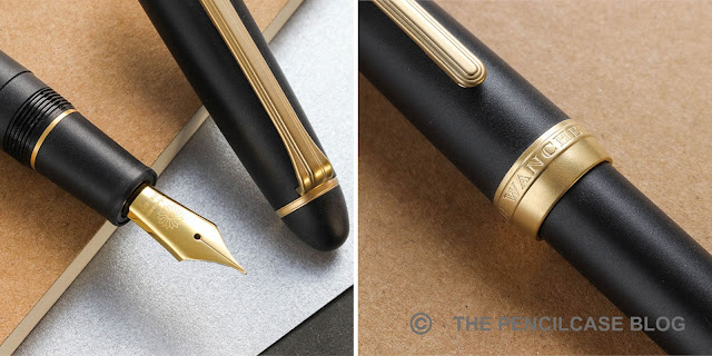
The custom 'Wancher' nib and cap band engraving on the Sand Matte II (Images taken from www.wancherpen.com)

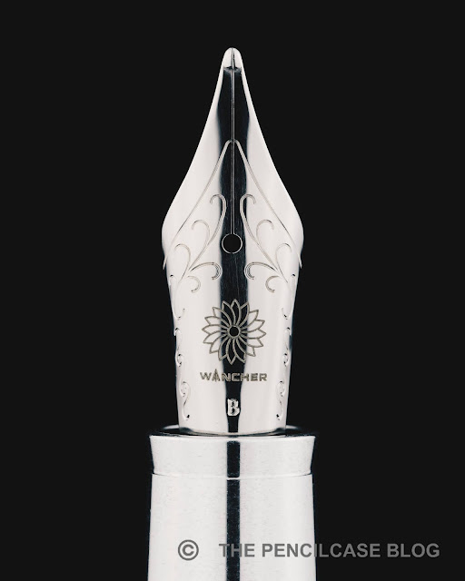
To make matters even more confusing, there seem to be a few differences between the pen I received for review and how they are shown on the website (possibly because this particular pen was sent to me quite a while ago already, so it could've been a pre-production version). The pen I was sent to review has the regular Sailor branding on the trims and nib. However, based on the product images of the slightly more recent Sand Matte II (the 1911L model), the trims are customized with Wancher's branding, and the nib is one of Sailor's custom nibs with the Wancher logo laser-engraved on it (similar to other store exclusives that have custom nibs). These small details set this pen apart from the normal Sailor special editions that Wancher sells.

I assume (and hope) that the same customizations are now also present on the Sand Matte I (the Pro Gear model). I hope Wancher makes these details a bit clearer on their website - it'd be nice to know exactly what you're buying!

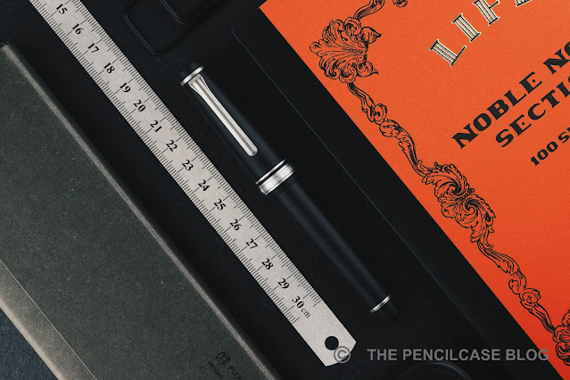
The Sand Matte of course bears quite some resemblance to Sailor's own Pro Gear Imperial Black. From what I can tell (though I don't have an Imperial to compare them side by side, unfortunately), it seems the matte finish on the black resin parts of the pen is indeed similar.
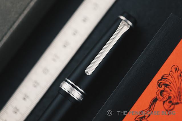
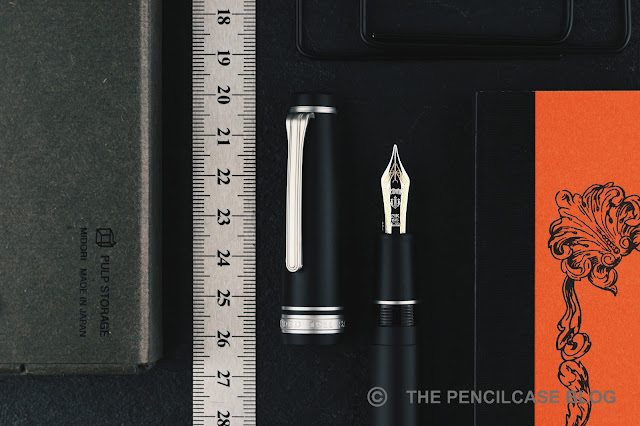
The trims are different though, as Wancher decided on treating the metal trims with a similar sandblasted finish to match the rest of the pen. The Sand Matte is available with both silver and gold-colored trims, but I find the silver trims to work best with this finish. I've seen a handful of Japan (store) exclusive Sailors that had matte trims before, but they tend to be elusive and damn near impossible to get! The matte trims are probably the coolest part about the Sand Matte (IMHO) and set it apart from the myriad of other Sailor exclusives out there. It gives the pen a sleek and modern look, and perhaps my only wish would be that they add the matte finish to the nib as well.

I've always been a fan of the Pro Gear's design, so it's no real surprise that the Sand Matte manages to captivate me with its clean and subdued looks. There are particular downsides to the matte finish though. From the second you pick it up, the matte surface will start wicking moisture and oils from your hands, which darkens the finish and makes it ever so slightly shinier. With heavy and prolonged use, the matte finish will slowly polish itself and become glossier due to abrasion from handling and oils from your hands. It's a bit similar to how a Visconti Homo Sapiens or Lamy 2000 changes with use. That's something to take into account, but in the Japanese mindset, let's call it Wabi-Sabi.
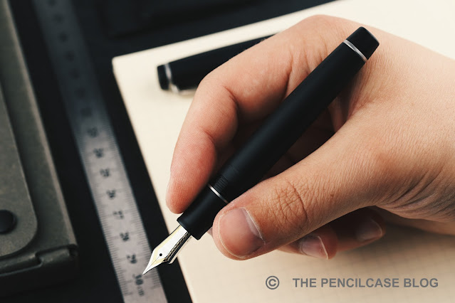
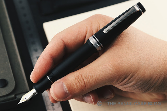
The Wancher Sand Matte is ergonomically at its best when you post the cap!
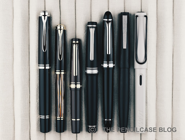
L to R: Pelikan M805, Pelikan M400, Sailor Pro Gear Slim Mini, Wancher Sand Matte, Sailor 1911L, Lamy 2000, Lamy Safari
The Sand Matte is based on the full-sized Pro Gear model, which ironically means it's still a fairly small pen (I'd love to see this finish on a King Of Pen Pro Gear!). At 12.9 cm capped, and 11.5 cm uncapped it's a small pen and well outside my usual comfort zone. It's certainly usable unposted, especially if you don't have larger hands. If, like me, you tend to prefer large pens the Pro Gear is one of those rare pens that feel incredibly natural when posted. With the cap on the back, it measures 14.9 cm, and with a weight of 22 grams, it's light and nimble in the hand.
Build quality is at the typical level you'd expect from any Sailor pen. It's for the most part very well-made. The pen is lightweight but feels solid and durable. I was happy to find out that the matte surface finish somewhat helps to hide the injection-molding seams that you'll find on the grip section of any regular 1911 or Pro Gear, but they're still not entirely gone on the barrel, near the threads. 


Under the hood, we find a 21k gold Sailor nib, though as mentioned before I'm not sure whether the pen you'd order would come with a bicolor nib with Sailor engravings, or a monotone nib with the Wancher logo laser-engraved on it. Either way, the nib will be made by Sailor, it's just the finishing that differs.
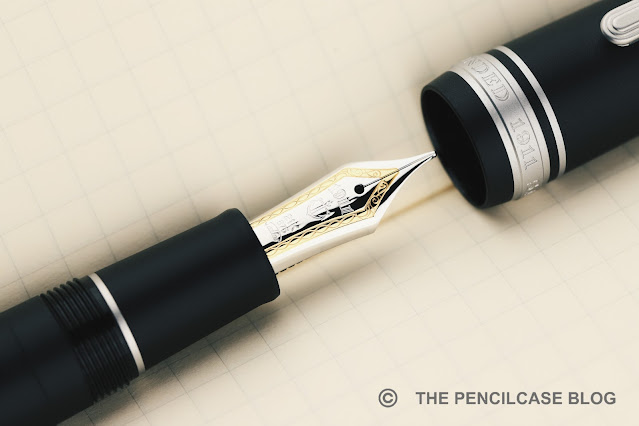
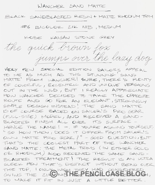
The writing experience shouldn't change, either. And that's to say: it'll write very, very well. My test pen came with a 'hard' medium (H-M) nib and it's a superb writer: smooth and with that lovely pencil-like Sailor feedback. I'm probably the last person to say Sailors are the be-all-end-all nibs on the market, but there's no denying that they're very good at creating reliable and consistent writers. The medium nib lays down a line width in between western fine and medium, which is a good starting point if you're unfamiliar with Japanese nibs.
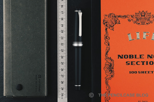
I tend not to focus too much on special edition and store-exclusive Sailors - there are just too many to keep up! - but the Wancher Sand Matte was hard to pass on. The sleek all-matte finish adds a modern and clean look to the otherwise classic design of the Sailor Pro Gear. I continue to be a bit confused at how exactly the Sand Matte (version I) is finished in terms of nib and trim details, so I do hope Wancher makes that a bit clearer on their website.

At 320$, the Wancher Sand Matte is priced similarly to other versions of the Sailor Pro Gear. It even undercuts the Sailor Pro Gear Imperial black by a fair margin, at least when comparing pricing on the Western market. Though of course, you might have to add customs tariffs and taxes depending on where you're ordering from! I also appreciate that Wancher didn't make it super-elusive or hard to get a hold of one, it even seems like it'll be a permanent addition to their collection. 
NOTE: This product was provided by Wancher, so I could write this review. I was in no way influenced in the making of this review, the opinions shared in this review are completely my own. This post does not contain affiliate links.

Sunday, November 7, 2021

REVIEW: WANCHER PRIMO FOUNTAIN PEN

REVIEW: WANCHER PRIMO FOUNTAIN PEN

I'd like to say the Wancher Primo is a strange, unusual pen that I didn't see coming whatsoever. But then again, Wancher has never shied away from trying new things and stepping out of their comfort zone - like competitively priced Urushi with the Dream Pen (reviewed HERE), or the unique bakelite (!) Seven Treasures fountain pens (reviewed HERE). The Japanese brand has also dabbled in creating a titanium pen before (with the Dream Pen Ti), but it never seemed to have taken off (possibly due to the high price). 

With the Primo, however, they've approached the concept of a titanium pen from a very different angle. And while I don't love all aspects about it, Wancher did manage to incorporate quite a few very creative and original ideas! 

REVIEW: WANCHER PRIMO FOUNTAIN PEN

Take it out of the beautiful traditional Japanese wooden box, and the Primo immediately catches the eye with its minimal, quite futuristic, cylindrical shape, and prominent finials in contrasting material. The main highlight is the titanium cap and barrel, which have been sandblast-etched to create a random 'splattered' texture, and then anodized in different colors (Midnight Blue, Frosty Silver, Russet Brown, and Amethyst Purple). 

REVIEW: WANCHER PRIMO FOUNTAIN PEN
There's a subtle, but very pleasant tactility to the surface finish on the cap and barrel

The texture is unlike anything I've ever seen before. I really like how it creates a visual, as well as tactile, contrast between matte and polished surfaces.

REVIEW: WANCHER PRIMO FOUNTAIN PEN

But there are also things about the Primo I don't understand - And that starts with the finials. Designwise, I'm not fully on board with how the extremely large and prominent finials look. On the Frosty Silver version, the raw aluminum finials blend in relatively well with the titanium parts for a more understated look. On the other colorways, the raw aluminum finials make the Primo look sort of like a clunky magic wand -an asymmetrical one, at that- but that's of course down to personal taste.

Design reasons aside, the construction of the finials leaves me scratching my head. You see, the Primo is a very stately, bulky pen. It's also quite heavy (48 grams total). The aluminum section and finials are supposed to help reduce weight, but instead they made the finials so large and solid (they're barely hollowed out on the inside) that they actually increase the weight! This makes for a pen that's very noticeably balanced towards the finials, and well... not really all that light. 

REVIEW: WANCHER PRIMO FOUNTAIN PEN

The fact that the finials are so solid on the inside, also means they sort of get in the way of the nib and converter when closing the cap and barrel, respectively. It happens frequently that the nib will catch on the inside of the cap because of this. 

That also means there was no space left for a spring-loaded airtight inner cap, despite Wancher equipping most of their other pens with this handy feature. The cap seals off pretty well on its own, but the nib does seem to dry out a bit over extended periods of time, more so than other Wancher pens that do have the inner cap.

REVIEW: WANCHER PRIMO FOUNTAIN PEN
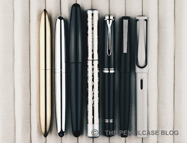
L to R: Gravitas fountain pen, Ensso Piuma, Wancher Dream Pen, Wancher Primo, Pelikan M805, Lamy 2000, Lamy Safari

Wancher doesn't scare away from making quite oversized pens, and the Primo illustrates that quite well. Measuring 14.7 cm (5.79") capped, and 13.6 cm (5.35") uncapped, it certainly isn't small to begin with, yet it's not quite as big as Wancher's own Dream Pen, for example. With the Primo, it's mainly the constant, wide diameter of 1.6 cm (0.63") across the entire pen, that really creates the oversized impression.

REVIEW: WANCHER PRIMO FOUNTAIN PEN

Going from the very wide barrel, there's a rather large step towards the metal section, which has a diameter of just 1.1 cm (0.43"). The section tapers down further to 1 cm (0.39"), with a short flared section at the end. The design of the section is almost entirely taken over from the Dream Pen (reviewed HERE), which means they deal quite well with the large step. The diameter gradually increases, first up to the threads, then a beveled ring, and finally the rounded edge of the barrel. 

There's one small -but important- detail the Primo didn't take over from the section design of the Dream Pen: the threads! Unfortunately, they took a step back towards traditional, v-cut threads, instead of the more comfortable and precise block threads from the Dream Pen. The threads are quite deep, which makes them especially noticeably if you hold your fingers on them. Despite the section being quite a decent, comfortable size, it's not always possible to avoid the sharp threads in your grip. 

REVIEW: WANCHER PRIMO FOUNTAIN PEN

The Primo comes equipped with a steel Jowo nib, but it did receive some (optional) upgrades to make it a bit less 'stock' in terms of looks and performance! First of all, the nibs are color-matched to the color of the pen itself. The plating treatment creates a somewhat pearlescent hue on the blue, purple, and brown nibs. The nib on the Frosty Silver Primo received matching rhodium plating instead of the bare stainless steel finish, which creates a brighter and more lustrous look.

Second are the optional ebonite feeds which, as I understand it, are still manufactured by Flexible Nib Factory. Although the two samples I was sent, both came with JoWo's stock plastic feeds, I've reviewed a couple of Wancher's Dream Pens with the ebonite feeds before, and they're a great addition to the already reliable writing experience JoWo nibs offer. You can't really go wrong with any of the feed options, but the ebonite feed (+30$ for black ebonite, +50$ for red ebonite) does give you a noticeably richer ink flow.

REVIEW: WANCHER PRIMO FOUNTAIN PEN

It's hard to put a final verdict on the Wancher Primo. The Wancher Primo retails for 250$, which is quite steep, especially once you factor in paying an additional 30 to 50 dollars for an ebonite feed. 

On one hand, considering the price point of the Primo, I feel like there are a few elements (mainly the clunky finial design and the sharp threads) where I feel like Wancher could've done a better job. On the other hand, I do think Wancher absolutely succeeded at creating a unique pen, one that easily catches the eye. Things like the textured barrel and cap, and the color-matched nibs, are perfectly executed and set this pen apart on the market. But on the other hand, I can't help but feel like Wancher missed the ball on a few particular design decisio

NOTE: This product was provided by Wancher, so I could write this review. I was in no way influenced in the making of this review, the opinions shared in this review are completely my own. This post does not contain affiliate links.

REVIEW: WANCHER PRIMO FOUNTAIN PEN

Saturday, October 14, 2017

DANITRIO MIKADO FLAT-TOP FOUNTAIN PEN REVIEW

Danitrio Mikado Flat-top fountain pen review
When you think about it, there really aren't that many pen brands out there that focus solely on handlaquered urushi and Maki-e fountain pens. Off the top of my head I only know two: Nakaya and Danitrio! Of course there are others, but these two account for the majority of the pens that you will come across. 

Especially Nakaya is by far one of the most well-known brands out there, but I think that is mainly due to their more reasonable pricing. I've personally always found Danitrio's designs to be more interesting, unfortunately they do come at a cost!
Danitrio Mikado Flat-top fountain pen review
One of the designs from this American/Japanese brand (While the craftsmen and techniques are Japanese, their HQ is in California) that I have always been particularly fond of is the Mikado flattop. And it just so happens that I got the opportunity to try one, courtesy of Sakura Fountain Pen Gallery, so big thanks to them! 

Danitrio puts out a lot of very unique and intriguing designs: from a straight cylinder, or a dodecagonal faceted pen, to a pen with a ridiculously bulbuous shape (almost as if the pen is about to explode). They have a thing for exaggerated shapes, and even more so for very large pens! There are a couple relatively smaller and more 'normal' designs as well, but even those can be considered 'oversized' compared to typical western pens.

The Mikado has, what I think is a relatively traditional design, But it's the size that makes it special. It has a slightly bulbuous cigar shape, with flattened ends as the name suggests. 
Danitrio Mikado Flat-top fountain pen review
The Mikado doesn't have facets, and it has a single-color urushi paintjob. It can be had clipless or with clip, with the clip itself also often being laquered to match or contrast the rest of the pen. Danitrio only uses a single clip design for all their pens. The simple, curved shape matches the design of the Mikado particularly well.

I'm drawn to the simplicity of the Mikado. The reddish-brown urushi on this pen is called 'Ki-Dame', and it's made with the Tame-Nuri technique. I'm writing this as if I know a bunch about these laquering techniques, but I honestly don't understand a single word!

What I do understand is that urushi can be quite deceiving. In this case, Ki-dame stands for yellow Tame-Nuri laquer, however this doesn't look much like yellow at all. With the Tame-Nuri technique, a colored base layer -yellow in this case- is covered with multiple colorless layers. The colorless layers start out as a smoke brown color, but under the influence of light they become completely colorless over time. This means that, over use, the pen will become lighter and the yellow base color will show through more. An interesting bit of Wabi-Sabi!
Danitrio Mikado Flat-top fountain pen review
The yellow base color of the Ki-Dame Tame-Nuri adds some depth to the finish
Urushi laquer is applied in many thin layers, and each layer is sanded before the next one is applied. The cool thing with Tame-Nuri finishes is that the edges of the pen have a thinner layer of laquer, so the base color shows through more. This contrast is simple yet playful, and it provides some visual interest to an otherwise monotone pen. I like the combination of a big pen with a subtle finish like this. It's a stately pen and it's quite an eye-catcher, but it doesn't overdo it.
Danitrio Mikado Flat-top fountain pen review
Each pen has a maker's signature at the bottom of the pen
As I said earlier, Danitrio makes some pretty big pens. 'Big' might even be an understatement. Put the Mikado next to any standard 'western' pen -even a large one like the MB 149- and it completely dwarfs them!

There's actually a pretty sound explanation for why these pens are often so large. You see, most Danitrio pens -including the Mikado- are also used as a basis for Maki-e laquer art. The bigger the pen, the more intricate paintings can be made on it.

An oversized pen like this might not be everyone's cup of tea, and it sure isn't practical to take with you as it doesn't fit most pen cases. But from a comfort point of view, it does get away with it's size quite well. And with this I mean that, despite the size, it actually manages to be quite a comfortable pen to hold and write with.
Danitrio Mikado Flat-top fountain pen review
L to R: Pelikan M800, Montblanc 149, Danitrio Mikado, Danitrio Takumi, Lamy Safari, Lamy 2000
Coming in at 16.3 cm (6.42") closed, and 14.2 cm (5.49") without the cap, and with a diameter of 2cm (0.78") at the widest point of the cap, this really is unlike anything else! The section is a good bit less wide, compared to the rest of the pen that is. With a total weight of 45g (27g uncapped), it feels solid but it's far from heavy. Of course that's to be expected from an ebonite pen.
Danitrio Mikado Flat-top fountain pen review
In terms of comfort, I actually like the bulky overall shape. The section may be a little on the short side, given that there's a relatively large step behind the threads. But all in all it hasn't bothered me that much when in use. The wider diameter of the section makes me grip the pen more relaxed, as opposed to having a death-grip on thinner pens. But that could just be me. Suffice to say, I didn't ever think about posting the cap, it's obviously more than long enough without that.
Danitrio Mikado Flat-top fountain pen review
A quick word about the filling system: the Danitrio Mikado is equipped with a Japanese eyedropper. It's the first time I ever used this specific filling system. A Japanese eyedropper is similar to a normal eyedropper, but additionally it features an integrated mechanism that resembles a vac filler. Inside the barrel, you'll find a plunger that closes off the ink flow towards the feed. But instead of operating the plunger up and down to fill the pen -as you would with a vacuum filler-, the only function of the plunger is to act as an ink shut-off.

To fill the pen, you simply unscrew the section and fill the entire barrel with ink using an eyedropper or syringe. To write, you unscrew the blind cap at the back of the barrel a few turns to move the plunger away from the feed, which allows the ink to flow. Usually, vac fillers can be used without loosening the blind cap. But especially when I picked up the pen after a day of not being in use, I found the flow quite dry and it would hard start without the shut-off valve opened.
Danitrio Mikado Flat-top fountain pen review
love the design of the large #8 nib!
You might think pens like this are just for show, but nothing is less true! Danitrio equips their pens with German Bock nibs, and they are absolutely fantastic in every way! The Mikado is a large pen, so it comes with the larger #8 nib. I love the two-tone design, it's by far the most beautiful I've ever seen, and the intricate design is meticulously plated to create the two-tone design.

But they don't just look great, they write great as well. Of course you shouldn't expect anything less on a 1500 dollar pen, but this 18k nib is tuned to absolute perfection. The large nib sits on an ebonite feed that provides a generous (sometimes perhaps a bit too generous) and consistent ink flow. I encountered a hard start every now and then, when the pen had been unused for a while. But I suspect this is most likely due to the ink shutoff which causes the remaining ink in the feed to dry out. The nib itself is not to blame for this, as it wouldn't hard start when I'd open up the valve before putting the pen to paper. In any case, a gentle shake was is all it took to get the flow back to normal again.As I said, I do recommend opening up the piston knob each time you write.

The nib is smooth, very smooth even. Yet despite the above mentioned occasional hard start, I never had any issues with skipping or inconsistency. Smoothness vs. consistency is a balance that proves to be difficult to maintain, yet Danitrio does this quite well.
Danitrio Mikado Flat-top fountain pen review
1575 Euros, that's the pricetag we're looking at here. Undoubtedly a ridiculous amount of money to spend on a pen, but knowing the amount of craftsmanship and time that went into making it, kind of justifies the price for me. It's a bit rich for my blood for now, but a Danitrio Mikado has definitely been added to the (ever growing) wishlist! 

This product was sent to me on loan by Sakura Fountain Pen Gallery so I could write this review. I was in no way influenced in the making of this review, the opinions shared in this review are completely my own! This post does not contain affilate links.
Danitrio Mikado Flat-top fountain pen review