Showing posts with label metal pen. Show all posts

Wednesday, September 7, 2022

REVIEW: MODERN FUEL BOLT ACTION PEN

REVIEW: MODERN FUEL BOLT ACTION PEN, THE PENCILCASE BLOG
Several years ago I reviewed (HERE) a then-Kickstarter project for what was - and continues to be - arguably the most overengineered mechanical pencil I've ever seen, by US-based brand Modern Fuel. The precise machining and meticulous details of the Modern Fuel Pencil got me hooked. While their products aren't exactly cheap, I do feel confident that they are as close to heirloom quality as they get. I was really curious to find out if the same would hold true for their newer products, in particular the Modern Fuel Bolt Action pen. (Spoiler alert: it does!)
REVIEW: MODERN FUEL BOLT ACTION PEN
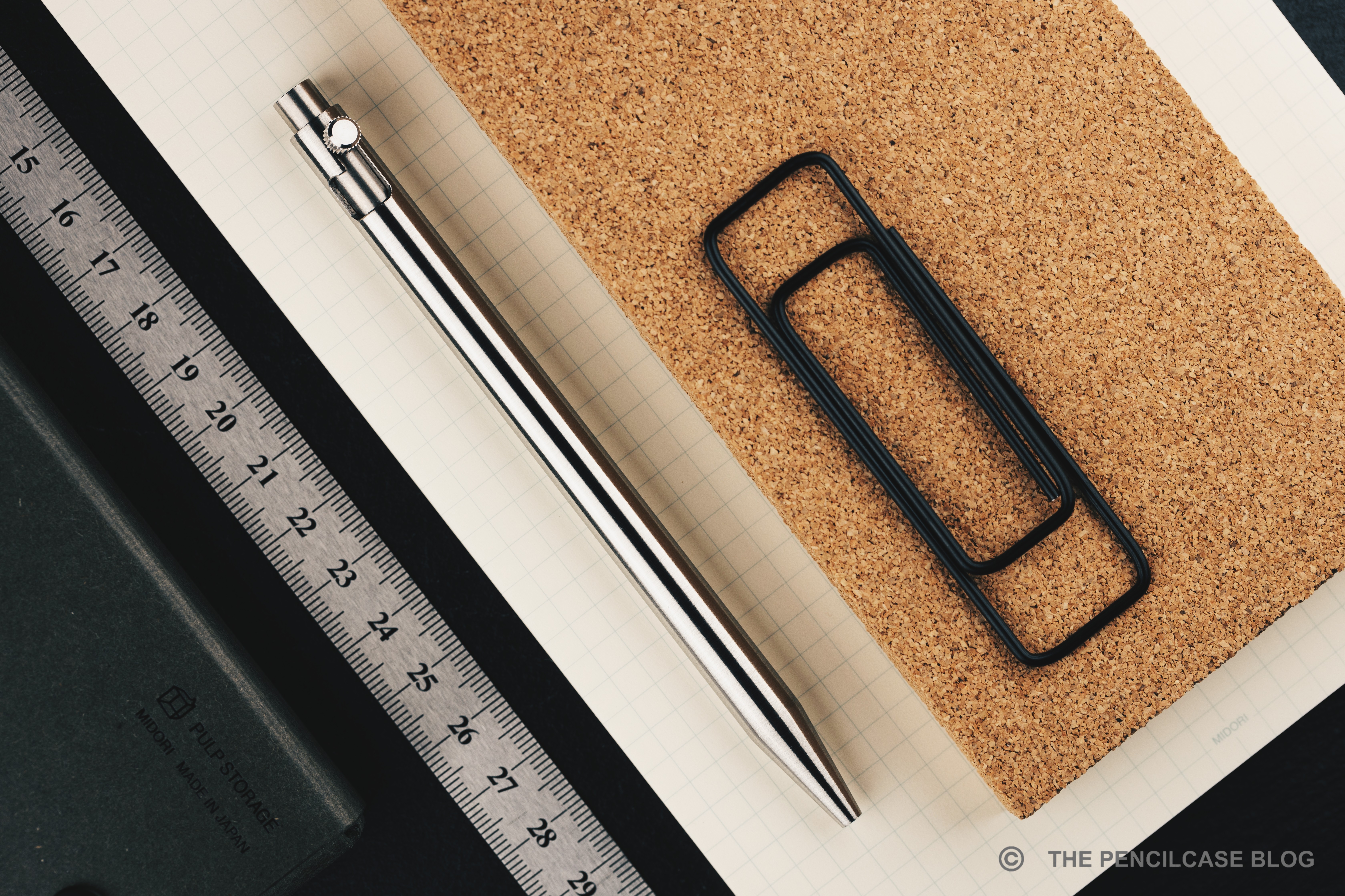
Designwise, Modern Fuel has a set-in-stone design language: sleek and clean aesthetic that runs across all of their products. While I compared mechanical pencil to an overengineered version of the Bic pencil, that comparison obviously doesn't hold true for the Bolt Action pen, but through the same, straight cylindrical profile, same thickness, tip shape and almost identical length, it's not hard to see where the design inspiration comes from. The entire pen received a hand-brushed finish, which adds a bit of random texture to the otherwise clean and modern look of the pen.
REVIEW: MODERN FUEL BOLT ACTION PEN
Other than that, the Bolt Action shares a very similar shape with Modern Fuel's own ballpoint 'Pen'. It has a j-shaped cutout for the bolt mechanism (obviously), but also a knock button on the back. 
REVIEW: MODERN FUEL BOLT ACTION PEN
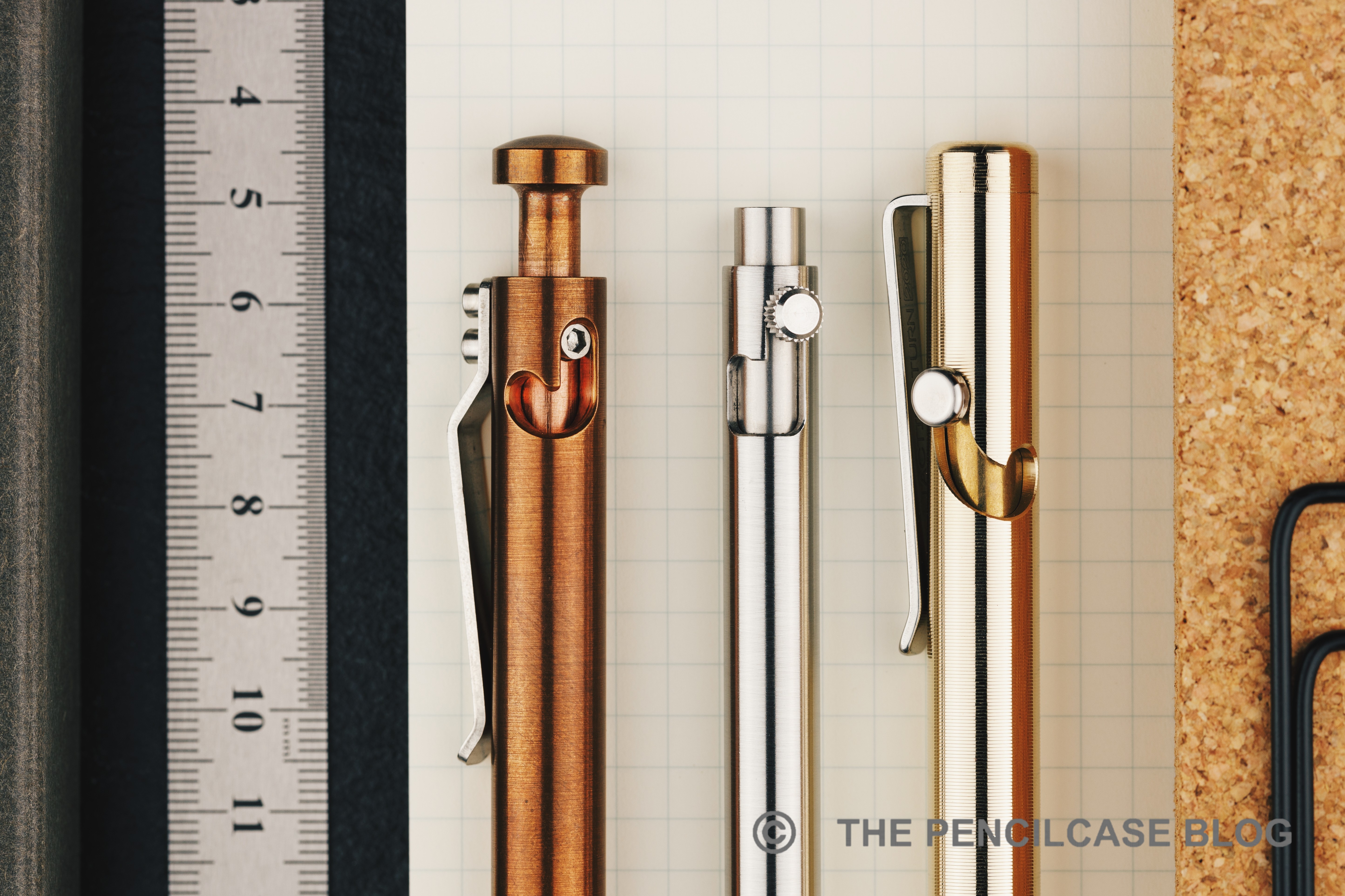
The Modern Fuel Bolt Action's mechanism is essentially a hybrid between those found on the Karas and Tactile Turn Bolt Action pens
However, unlike the Karas Bolt Action pen, the knock doesn't serve an actual purpose (other than aesthetics). It completely retracts into the body when you engage the pen (and sits perfectly flush - a really nice detail!), making it impossible to activate the bolt-action mechanism just by pressing the knock. You'll really want to use the actual bolt for that. The bolt itself is a small cylindrical button with very crisp knurling on the side, almost like a small cog (The knurling actually serves a dual purpose!). The mechanism has surprisingly little travel, so it engages quickly with one swift motion.
REVIEW: MODERN FUEL BOLT ACTION PEN
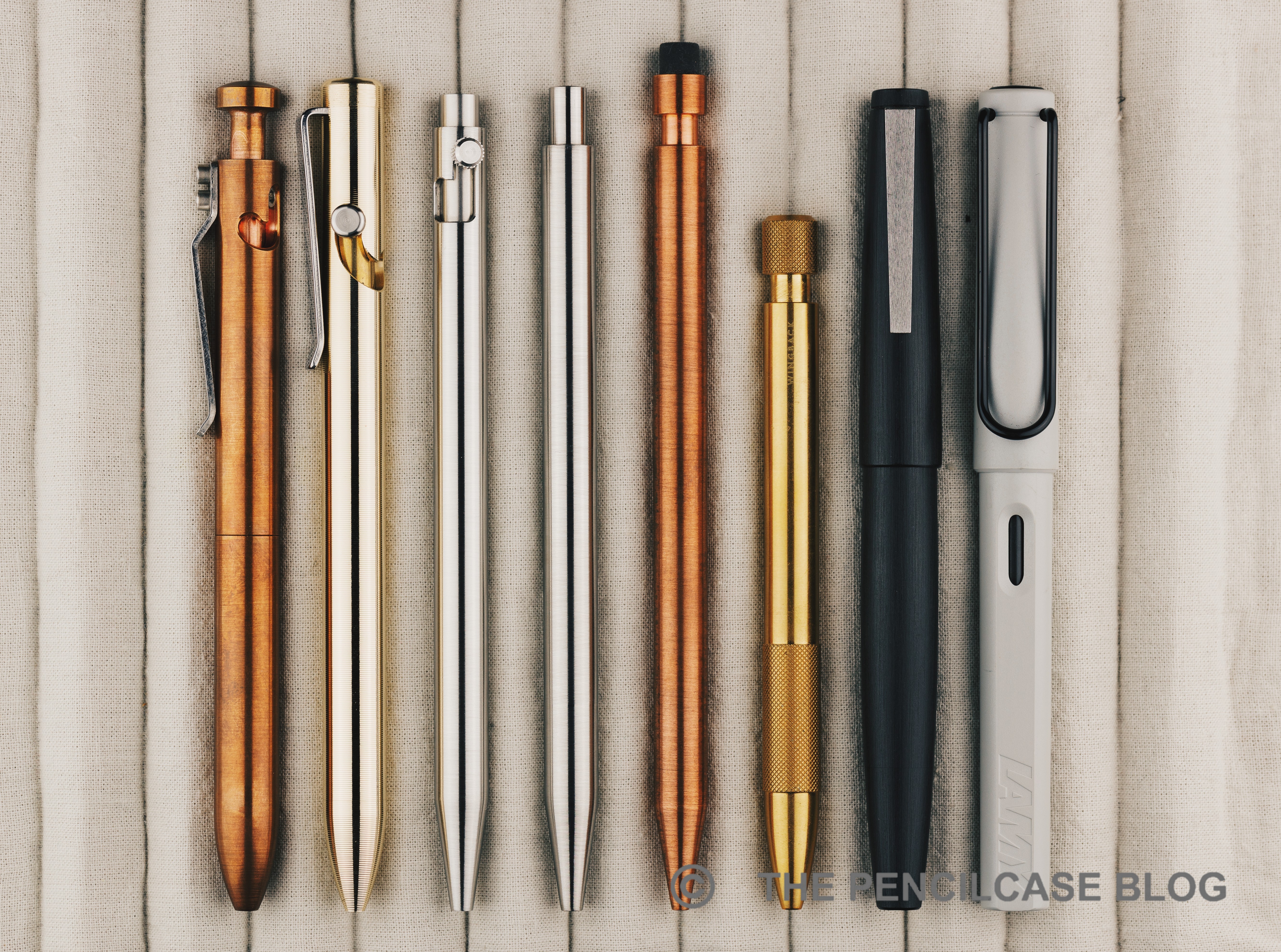
L to R: Karas Bolt Action, Tactile Turn Bolt Action, Modern Fuel Bolt Action, Modern Fuel Pen, Modern Fuel Pencil, Wingback Mechanical Pen, Lamy 2000, Lamy Safari
REVIEW: MODERN FUEL BOLT ACTION PEN
The Bolt Action looks nimble, mostly thanks to the fairly slender design (9.3mm/ 0.37"). It measures 13.8 cm/ 5.43", down to 13.6 cm/ 5.73" when the bolt mechanism is engaged, so it's definitely a full-sized pen, just noticeably narrower than some of the competition (by comparison, the Tactile Turn Bolt is 11mm). All Modern Fuel products are available in either stainless steel, titanium, bronze, or copper. I was sent the steel version of the Bolt Action, which weighs 36 grams. It strikes a good balance between feeling solid yet nimble in hand. Interestingly, no weight measurements are given on Modern Fuel's website, but according to my guesstimate calculations, the titanium version should come in around 20 grams, with the bronze and copper versions both around 40 grams.
REVIEW: MODERN FUEL BOLT ACTION PEN
Machining is top-notch on this pen. Nothing rattles around when you write, and the tolerance on the tip is so small that there's almost no wiggle room for the refill. Same can be said for the bolt-action mechanism, which fits precisely in the barrel, yet moves smoothly up and down and engages with a satisfying 'snick'. The bolt is fun to play with, but the knurled edges are quite sharp so you do feel that on your finger after a while (maybe to prevent you from getting distracted for too long!)
REVIEW: MODERN FUEL BOLT ACTION PEN
Modern Fuel's Bolt Action pen is much sleeker and low-profile than comparable Tactile Turn (top) or Karas Pen Co (bottom) offerings
Modern Fuel ships this pen with a Pilot G2 refill as standard. I like the G2 refill a lot, but the Modern Fuel Bolt Action is also a very nice housing for it. It's a massive departure from the chunky and heavy copper Tactile Turn Bolt Action (the older-style Glider) that I daily. And it looks super sleek on the desk. While I'm personally not particularly bothered by it, the biggest complaint could be the all-smooth metal barrel. While the brushed finish adds a little to the grip (it's better than a polished metal finish), it can still become a bit slippery after a while.
REVIEW: MODERN FUEL BOLT ACTION PEN
When I say this pen is over-engineered, I mean it! The Bolt Action pen arrives with an 11-page manual, and you'll probably want to hang on to it. Like with the pencil, part of the beauty of Modern Fuel's products is that there's no obvious way to disassemble the Modern Fuel Bolt Action. The body and tip are all a single piece of metal, so the only way to get to the refill is through the mechanism. But how? Well, included in the box are a few small parts (all metal, by the way!), including a little wrench with what looks like a geared hole on one end. That hole fits precisely on the cog-shaped bolt to help unscrew it, and out pops the entire mechanism. 

The biggest engineering feat is that, despite it being such a slender and seemingly simple pen, the Bolt Action can accommodate anything from a Fisher Space or standard Parker G2, up to refill types that are even longer than a Pilot G2 (think: certain rollerball refills, etc.). Adjusting the pen to fit those different size refills is done with the other end of the little wrench-tool, which doubles as a screwdriver to tighten or loosen a long threaded set screw on the inside of the bolt mechanism to control how far it protrudes (This can also serve as a fine-tune mechanism to have the refill tip extend more or less from the tip of the pen, according to your personal preference!). 
REVIEW: MODERN FUEL BOLT ACTION PEN
You'll want to hang onto the instruction booklet for this one!
For very short refills like the Fisher-Space, a black metal adapter is included in the box, while an included shorter set screw allows accommodating very long refills. They even added a longer spring to better suit different refills. 

Perhaps the only thing missing in the box is a clip, contrary to the slide-on clip included with the regular pen and pencil. However, there's a simple reason for that: the slide-on clip can't work because it would interfere with the bolt mechanism on the side of the barrel. That means you'll have to go clipless with this one, perhaps a bit unfortunate for a pen that's otherwise quite pocketable!
REVIEW: MODERN FUEL BOLT ACTION PEN
MSRP on the Modern Fuel Bolt Action starts at 150$ for the bronze pen, up to 200$ for the all-titanium version. As said, Modern Fuel products don't come cheap, but I continue to be amazed at their design ingenuity and machining perfection. The looks of the Bolt Action are sleek and unobtrusive, making it even more impressive when you see all the practical engineering going on inside!

Note: This product was provided by Modern Fuel, free of charge, so I could write this review. I was in no way influenced in the making of this review. The opinions shared in this review are completely my own! This post does not contain affiliate links.
REVIEW: MODERN FUEL BOLT ACTION PEN

Thursday, August 18, 2022

REVIEW: GRAVITAS SENTRY FOUNTAIN PEN

REVIEW: GRAVITAS SENTRY FOUNTAIN PEN
I'm a total sucker for Gravitas pens if you hadn't noticed yet, an addiction fueled by the fact that Ben Walsh (founder of Gravitas Pens) always seems to know exactly what I want in a pen! The last Gravitas pen I reviewed was the Entry, quite a while ago: a well-rounded design, tough construction, great ergonomics, all at a reasonably wallet-friendly price point. 

One of the unique things about the Entry is its slender form factor, something you don't often see on metal fountain pens. Though with my personal preference for oversized pens, I imagined how cool it would be to have a slightly more oversized version of the Entry... Luckily, Ben was already one step ahead of me and by the time I published my review of the Gravitas Entry, he had released this: the Gravitas Sentry! 
REVIEW: GRAVITAS SENTRY FOUNTAIN PEN
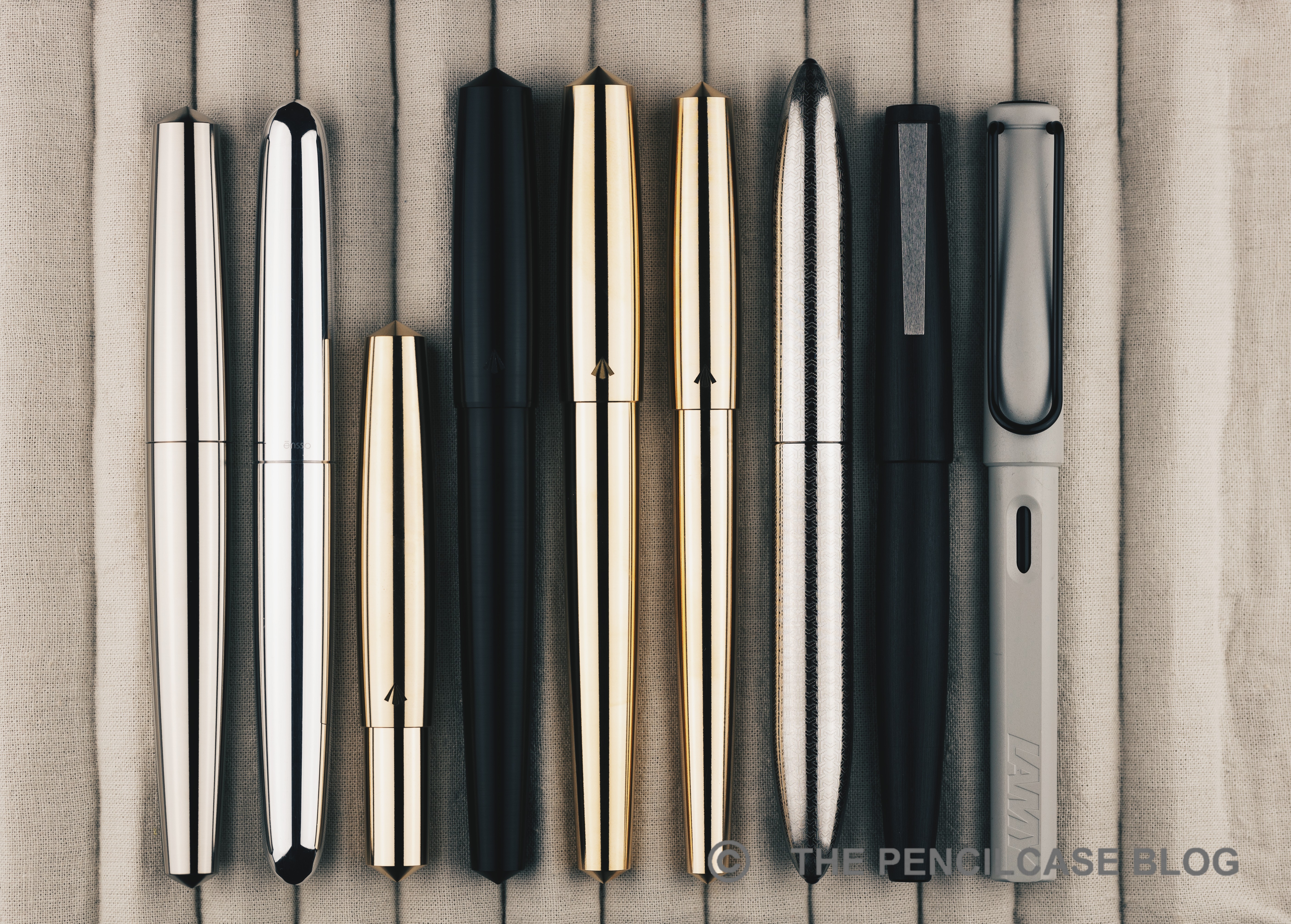
From an aesthetic point of view, the Sentry is probably one of my favorite pens of the moment, at least as far as metal pen designs go. Admittedly, the Entry already ticked a lot of boxes for me, so there wasn't much I'd change about it. It shares the simple flat-top design with pointed finials of the Entry. The cap-to-body ratio of the Sentry is still noticeably exaggerated, with a long barrel and shorter-than-usual cap, which creates a pleasing imbalance in the design. Compared to the Entry, the Sentry just gained some weight (literally). Everything is a bit wider, which is especially noticeable on the barrel: gone is the almost paintbrush-like, thin barrel of the Entry, which is now noticeably thicker, though with a similar gentle taper to it. 
REVIEW: GRAVITAS SENTRY FOUNTAIN PEN
Put them side by side, and the Entry appears even more slender! The Flagship model, on the other hand, makes even the Sentry look dainty!
I find the added bulkyness gives the Sentry more pleasing overall proportions than the rather slim Entry. It's hard to put a finger on it, but the way Gravitas executed the flat-top, pointed finial design on the Sentry is just very pleasing to the eye. The Sentry is not quite as minimal and brutalist as the Namisu Nova (which remains another personal favorite). Also within Gravitas' own range of pens, the Sentry definitely feels more refined and elegantly shaped compared to the super-robust and bulky 'Flagship' fountain pen.
REVIEW: GRAVITAS SENTRY FOUNTAIN PEN
Just like the smaller Entry, the Sentry is unadorned on the outside, apart from the clean and minimal Gravitas logo engraved right above the cap edge. The large Sentry is an ideal canvas to show off the laser-etched designs that Gravitas is known for, though so far only the 'Skittles' Sentry can be ordered with etched designs on it (though I'm certain that'll change in the future).

Just like the Entry, the Sentry is available in a plethora of colors and materials: a bunch of anodized aluminium colors, as well as the special 'Skittles' finish, brushed stainless steel, and polished brass or copper.
REVIEW: GRAVITAS SENTRY FOUNTAIN PEN
Under the cap, we again find the PVD-coated black stainless steel sections that are also on the Entry. The black section provides some visual contrast, especially against the raw steel, copper, and brass versions of the Sentry. I would've hoped for matched section materials to create a more seamless look, though I do agree with Ben's reasoning that the steel section partially mitigates the 'penny smell' typically associated with brass and copper pens. The section has machined grooves for grip, a feature that is now standard on all of Gravitas' fountain pen designs (including the original 'Flagship' fountain pen).

Machining on the edges and finials is super-crisp (Some have even described the pointed finials of the Entry and Sentry as 'sharp'. While they sure are pointy, I wouldn't go as far as saying you can actually hurt yourself on them.), showing off the very precise machining and tight construction tolerances, a constant throughout all of Gravitas' pens. 
REVIEW: GRAVITAS SENTRY FOUNTAIN PEN
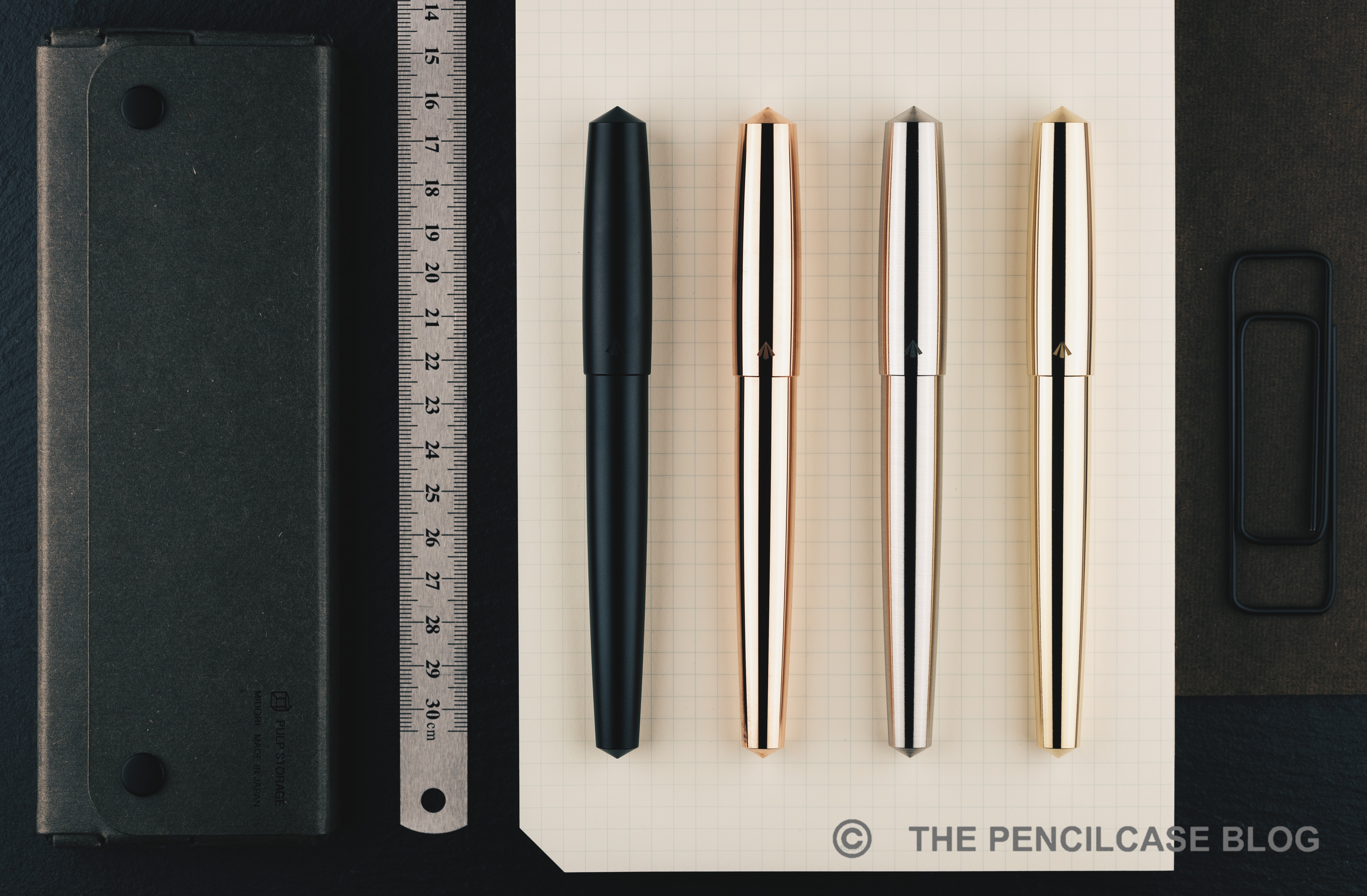
L to R: Namisu Nova, Ensso Piuma, Gravitas Pocket, Gravitas Delrin, Gravitas Sentry, Gravitas Entry, Gravitas Flagship, Lamy 2000, Lamy Safari
REVIEW: GRAVITAS SENTRY FOUNTAIN PEN
But also in terms of writing comfort, the Sentry scores high marks. Though that comes with the disclaimer that I always tend to gravitate towards large and oversized pens. The features I already enjoyed about the Entry remain: a grippy concave, ridged section, a smooth and comfortable transition towards the barrel, and threads that are hardly noticeable in your grip. 

The Sentry and Entry are much closer in length than I first thought, only about a millimeter apart (the Sentry measures 14.6 cm/ 5.75", the Entry 14.5 cm/ 5.71"). Uncapped, the Sentry still measures 13.9 cm/ 5.47", plenty long enough to fit comfortably in any hand. Posting the cap is technically possible, but makes little sense. It doesn't extend the pen very much, yet adds a whole lot of weight that you definitely don't need.
REVIEW: GRAVITAS SENTRY FOUNTAIN PEN
Sentry on the left, Entry in the middle, and Flagship on the right, note how the Sentry's section is even wider than that of the Flagship!
Roughly 2 mm added to the overall diameter, that's the key difference between the Sentry and Entry. While that may not sound like much, it drastically changes how the Sentry looks and feels. The added diameter continues in the section, which is a substantial 13 mm/ 0.51" at the widest point (even at the narrowest point, the section still measures a generous 11 mm/ 0.43"). Together with the pronounced concave curve in the section profile, the added thickness makes the Sentry a very comfortable and fatigue-free pen to write with, whereas the Entry feels a bit narrow at times - at least in my hand.

The Sentry being an oversized and chonky pen made out of metal, you can of course expect some weight. If you don't like too much heft, turn straight to the aluminium version for your best bet at a fairly nimble pen - even that one, due to its stainless steel section, still weighs in at a hefty 40 grams! For the stainless steel, brass and copper versions, the total weight jumps up to 84, 89 and 94 grams respectively. 

It goes without saying that the Sentry caters specifically to those that like large, heavy and oversized pens. If you're not certain about what type of pen you prefer, the Entry remains an easier pen to recommend to a wider audience, because of its more middle-of-the-road dimensions.
REVIEW: GRAVITAS SENTRY FOUNTAIN PEN
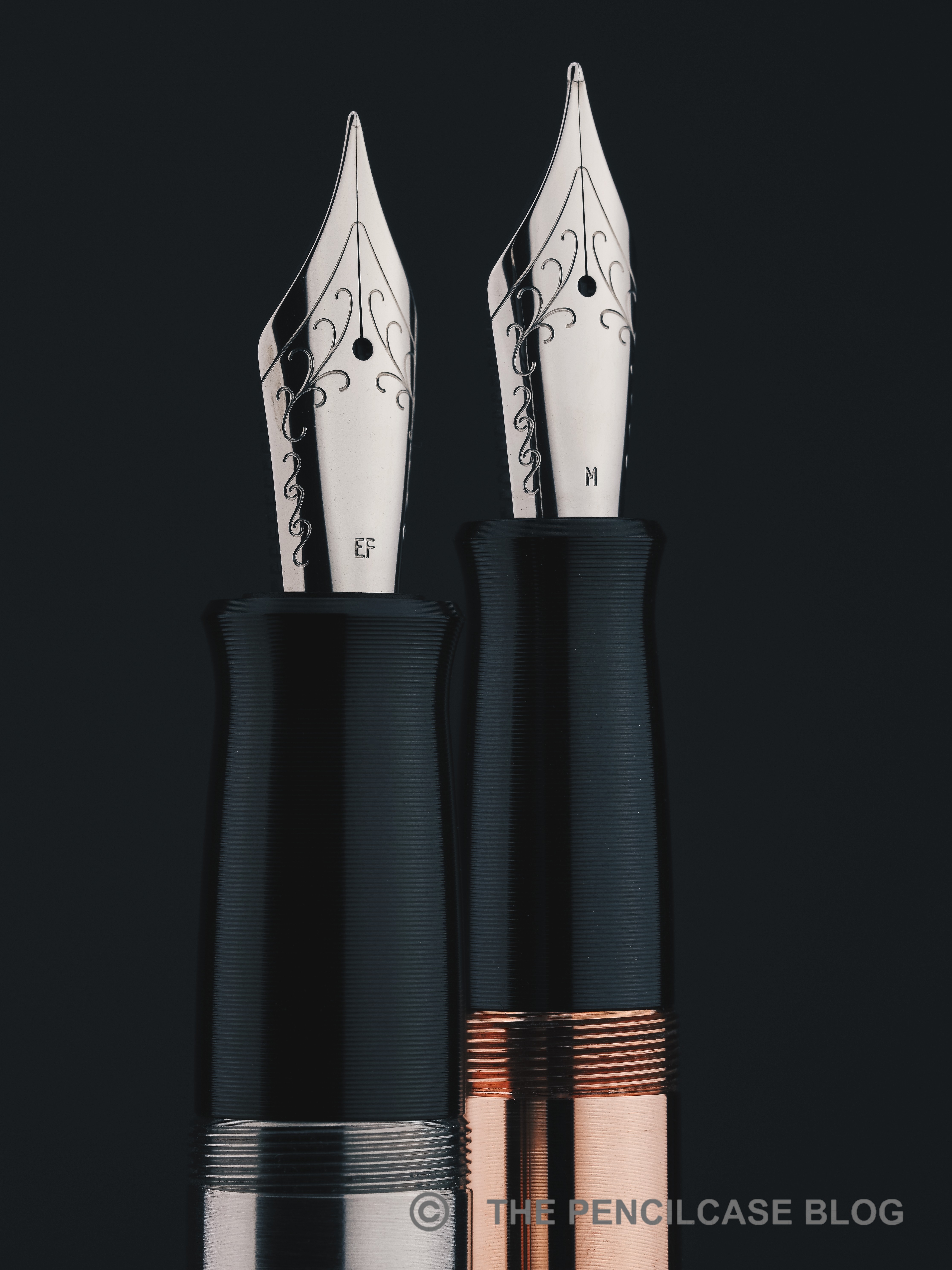
*Note that these are JoWo nibs, not the new nibs that Gravitas now uses!
Not pictured here (because I got these pens a while ago!) are the new custom nibs that Gravitas now uses. Due to supply issues with JoWo, Ben recently made the decision to design his own nib units and have them manufactured by a different supplier (though to the same spec as the JoWo nib units, so nib units can still be interchanged). 

Unfortunately the new nibs are a tad smaller than JoWo's #6, but compared to the flourished design of JoWo's nibs, they do provide a more clean and minimal look with just the stamped (not laser-etched!) Gravitas logo on them. The new nibs are tuned very well (something Ben does in-house for all his nibs). It's quite smooth, with a line width that runs a touch finer compared to JoWo and Bock (I tried the fine and it's definitely more like a JoWo extra fine). Ink flow also seems to be a bit more towards the balanced side compared to similar JoWo nibs. 
REVIEW: GRAVITAS SENTRY FOUNTAIN PEN
The Gravitas Sentry starts at 95€ for the anodized aluminium versions, steel or brass versions move up to 100€, while the copper version comes in at 105€. While that does put the Sentry at a slight premium over the Entry (which starts at 80€ for the aluminium versions), both pens are close enough in price to not let that be the main differentiator between the two. 

The choice then boils down to a simple matter of preference, between the very reasonably-sized Entry or the oversized -though very comfortable!- Sentry. To nobody's surprise, I think both are great pens, but my personal choice definitely goes to the Sentry. It has rapidly become a new personal favorite, and I expect it to remain a top pick in my daily carry for quite a while!

Some of the products featured in this review were sent to me by Gravitas. I was in no way influenced in the making of this review, the opinions shared in this review are completely my own! This post does not contain affilate links.
REVIEW: GRAVITAS SENTRY FOUNTAIN PEN

Monday, August 8, 2022

REVIEW: ENSSO PIUMA POCKET FOUNTAIN PEN

REVIEW: ENSSO PIUMA POCKET FOUNTAIN PEN
The first half of 2022 has been a hectic one for me. Between ramping up the pace on my PhD project, teaching courses, grading papers, guiding student interns, and preparing for my first scientific conference last month, little time (and energy, to be honest) remained to direct towards new reviews - sorry! 

Anyway, I decided to pick up again with a review of a product that I really, REALLY like. Somewhat contradictory, for someone who keeps telling himself that he doesn't like pocket pens, I do find myself -surprisingly often- enjoying the heck out of them! Over the last few years, there has been a surge of fascinating and novel pocket pens, but probably one of my favorite ones to date is the one we'll be looking at today: the Ensso Piuma Pocket. 
REVIEW: ENSSO PIUMA POCKET FOUNTAIN PEN
The Piuma Pocket perfectly embodies what I like to see in a pocket-sized pen: no compromises (or at least, as few as possible!). Ensso went with sort of a top-down approach here: taking their known and loved full-sized Piuma fountain pen and turning it into a very pocketable design. But it's not just a scaled-down version of a full-sized pen, nor is it an exercise in pushing dimensions dangerously close to the edge of usability (like what you see on the extremely small Ensso XS or Kaweco Lilliput). The Piuma Pocket doesn't trade off portability for comfort; you're not confronted with a pen that, even posted, is barely long enough to hold comfortably, has a ridiculously narrow and short section or a tiny #5 nib. Instead, Ensso created one of the shortest pocket pens out there, simply by clever implementation of a postable cap, and by taking design elements that work (such as the overall cigar shape, or fantastically comfortable grip of the full-sized Piuma fountain pen) and building a pen around that. 
REVIEW: ENSSO PIUMA POCKET FOUNTAIN PEN
The overall shape of the Piuma Pocket is indeed very reminiscent of the Piuma. The barrel is short and the cap takes up most of the length, as if they took the full-sized Piuma and cut off half the barrel. The Piuma Pocket looks rather stout because its diameter is almost identical to that of the regular Piuma, so  it's quite a bit wider than your average pocket pen. The back of the barrel has a short, threaded section, with very shallow and unobtrusive block threads that don't break too much with the overall clean design of the pen. Talking about the threads: they're short and smooth, making capping and posting the pen swift and easy.
REVIEW: ENSSO PIUMA POCKET FOUNTAIN PEN
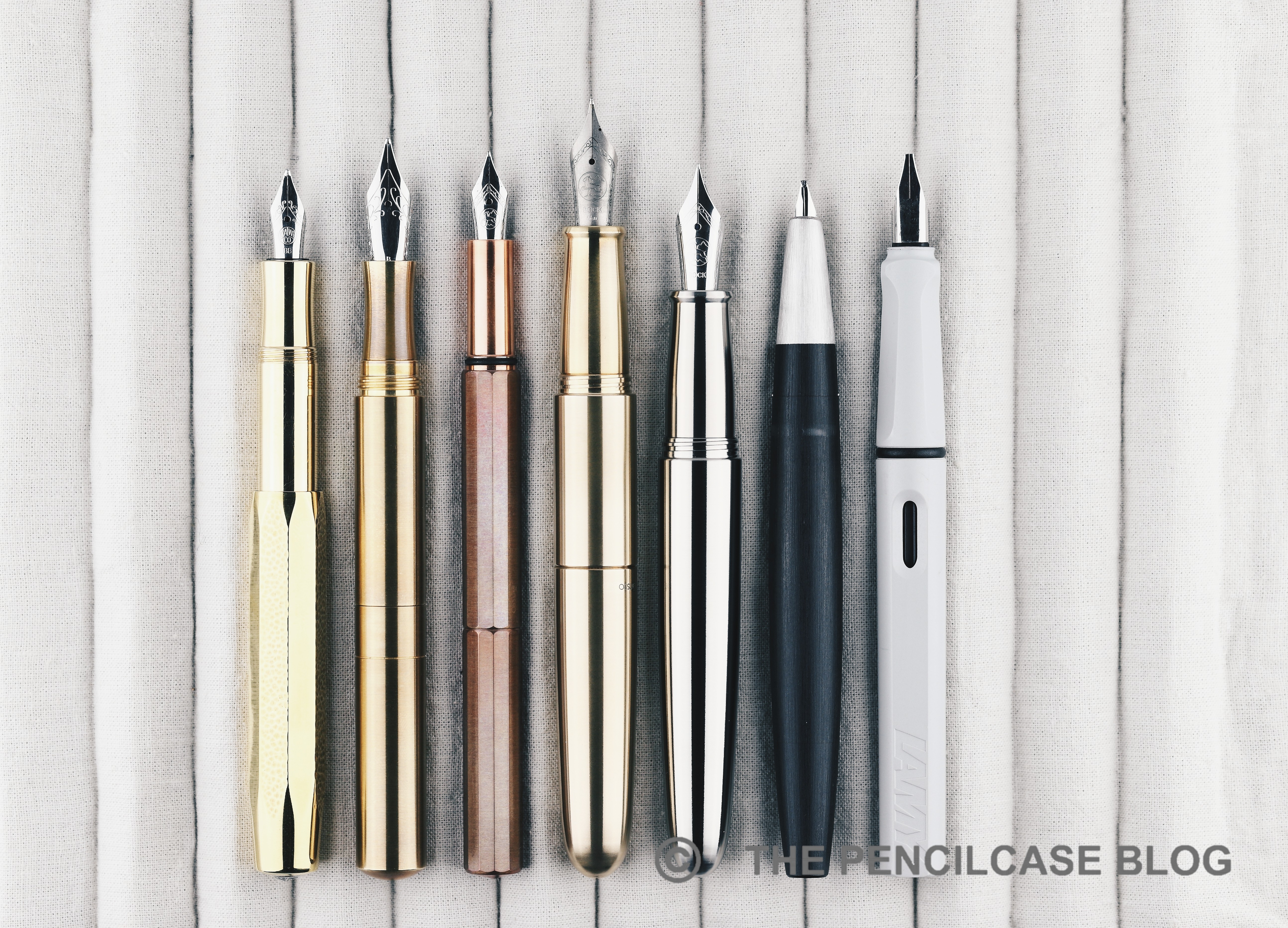
L to R: Kaweco Sport, Schon DSGN P6, Ensso XS, Ensso Piuma Pocket, Ensso Piuma, Lamy 2000, Lamy Safari
REVIEW: ENSSO PIUMA POCKET FOUNTAIN PEN
L to R: Kaweco Sport, Schon DSGN P6, Ensso XS, Ensso Piuma Pocket, Ensso Piuma, Lamy 2000, Lamy Safari
REVIEW: ENSSO PIUMA POCKET FOUNTAIN PEN
Even though I did say that Ensso didn't go above and beyond to create the smallest possible design, they still somehow managed to make the Piuma Pocket very, very small! At 9.3 cm capped, it's shorter than Ensso's own XS or a Kaweco Sport, and just a hair taller than the super-compact Schon DSGN P6! Even better: when write-ready, the posted cap on the back boosts the length of the Piuma Pocket up to a whopping 13.9 cm. To give some perspective, that's half a centimeter longer than the P6, and about the same size as a capped Lamy 2000! 
REVIEW: ENSSO PIUMA POCKET FOUNTAIN PEN
Posted, the Piuma Pocket transforms into a very large pen!
So, maybe it's even a bit too long? They certainly could've shaved off a few millimeters and still end up with a perfectly comfortable pen for most, if not all, hands. As mentioned, the Piuma Pocket does look and feel noticeably wider than most pocket pens, because it takes over the exact diameter of the regular Ensso Piuma, which is around 15 mm at the widest point. The Piuma Pocket feels incredibly solid in the hand. It seems like they took extra care machining all parts with thicker walls for extra robustness, never a bad idea for a pocket pen! So, regardless of which metal you choose, these pens have some noticeable heft to them (aluminium: 24 g, titanium: 38 g, brass: 67 g). There's now also an ebonite version though, which weighs in at a dainty 12 grams - for those who like the design of the Piuma Pocket, but not the heft.
REVIEW: ENSSO PIUMA POCKET FOUNTAIN PEN
The Ensso Piuma (left) and Piuma Pocket share an almost-identical section design
Take the cap off, and you're greeted by an almost one-to-one copy of the section found on the regular Ensso Piuma. And that's where I think this design really shines. Could Ensso have slimmed the Piuma Pocket down to make it even more portable? Sure, but I'm glad they didn't trade writing comfort for that extra bit of pocketability - I highly doubt that those few millimeters in diameter wouldn't have made a difference anyway. Instead, now you're getting a proper, full-sized section that is extremely comfortable in the hand. The pen in its entirety is just very comfortable to hold, and plenty long enough of course. There's a slight step behind the section and threads, but the edge is sufficiently rounded off for it to not be all that intrusive in my grip. In terms of writing comfort, this pen is a 10/10 for me. 

Of course, one limitation can't be circumvented when designing a pen of this size, and that's the filling system. With barely any space to spare, standard international cartridges are the only way to go on this pen. Pretty much par for the course on a pocket pen, and so not a dealbreaker for me, but note that even something like the Mini converter from Kaweco simply won't work (Kaweco's old aerometric mini converters should fit, but they're... well, not great). 
REVIEW: ENSSO PIUMA POCKET FOUNTAIN PEN
The new ebonite Ensso Piuma and Ensso Piuma Pocket
REVIEW: ENSSO PIUMA POCKET FOUNTAIN PEN
The ebonite pens have a similar machined satin finish as Ensso's metal pens
HOWEVER! Ensso did just release the Piuma and Piuma Pocket in ebonite. The ebonite version of the Piuma Pocket comes with an O-ring attached to the barrel threads, so it lends itself perfectly to eye-droppering!
REVIEW: ENSSO PIUMA POCKET FOUNTAIN PEN
On the other hand, because Ensso started from the full-sized Piuma, they did manage to fit in a full-sized #6 Bock nib on the Piuma Pocket. We're seeing somewhat of a general trend towards pocket pens with larger nibs. I fully agree with that change, as I generally find Bock's #6 nibs offer a better writing experience than their #5 counterparts. They also offer the Pocket with a titanium nib as an add-on, which bumps the writing experience up another notch (at least, if you're a fan of the slightly bouncier feel of Ti nibs). I reviewed this particular pen with a fine titanium nib, and while it's noticeably stiffer than some titanium nibs I've come across in the past, it did come perfectly tuned to my liking, straight out of the box. It's pencil-like (as all titanium nibs are) yet surprisingly smooth, and has a nice rich ink flow.
REVIEW: ENSSO PIUMA POCKET FOUNTAIN PEN
Am I inclined to call the Ensso Piuma Pocket the best pocket pen I've ever used? Yes! I know that's a substantial claim to make... but it simply ticks all the right boxes for me! It's a pocket pen that doesn't feel like one when you're writing with it, exactly how it should be! Construction is super-durable. Form, or rather size, does not overtake function here, and yet it remains just as pocketable. And as the cherry on top, you get a large #6 nib. With the added introduction of an ebonite version, you've also got plenty of material options to pick from, depending on your personal preferences.

Ensso typically makes their pens available in batches, so most models are only available periodically. At the time of writing, the titanium Piuma Pocket is available for pre-order at a nice discount (89$ from 139$) - which is a great deal for a solid titanium pocket pen. The new ebonite Piuma and Piuma pocket were just released on Kickstarter and are now available on the Ensso website for pre-order. Their full retail price will be 172$ once they are released (premium Japanese Nikko ebonite is expensive!), but you can still get in on the pre-order Kickstarter price of 79$! 
Note: Ensso is a sponsor of The Pencilcase Blog. This product was provided by Ensso, so I could write this review. I was in no way influenced in the making of this review, the opinions shared in this review are completely my own! This post does not contain affiliate links.
REVIEW: ENSSO PIUMA POCKET FOUNTAIN PEN

Sunday, November 7, 2021

REVIEW: WANCHER PRIMO FOUNTAIN PEN

REVIEW: WANCHER PRIMO FOUNTAIN PEN

I'd like to say the Wancher Primo is a strange, unusual pen that I didn't see coming whatsoever. But then again, Wancher has never shied away from trying new things and stepping out of their comfort zone - like competitively priced Urushi with the Dream Pen (reviewed HERE), or the unique bakelite (!) Seven Treasures fountain pens (reviewed HERE). The Japanese brand has also dabbled in creating a titanium pen before (with the Dream Pen Ti), but it never seemed to have taken off (possibly due to the high price). 

With the Primo, however, they've approached the concept of a titanium pen from a very different angle. And while I don't love all aspects about it, Wancher did manage to incorporate quite a few very creative and original ideas! 

REVIEW: WANCHER PRIMO FOUNTAIN PEN

Take it out of the beautiful traditional Japanese wooden box, and the Primo immediately catches the eye with its minimal, quite futuristic, cylindrical shape, and prominent finials in contrasting material. The main highlight is the titanium cap and barrel, which have been sandblast-etched to create a random 'splattered' texture, and then anodized in different colors (Midnight Blue, Frosty Silver, Russet Brown, and Amethyst Purple). 

REVIEW: WANCHER PRIMO FOUNTAIN PEN
There's a subtle, but very pleasant tactility to the surface finish on the cap and barrel

The texture is unlike anything I've ever seen before. I really like how it creates a visual, as well as tactile, contrast between matte and polished surfaces.

REVIEW: WANCHER PRIMO FOUNTAIN PEN

But there are also things about the Primo I don't understand - And that starts with the finials. Designwise, I'm not fully on board with how the extremely large and prominent finials look. On the Frosty Silver version, the raw aluminum finials blend in relatively well with the titanium parts for a more understated look. On the other colorways, the raw aluminum finials make the Primo look sort of like a clunky magic wand -an asymmetrical one, at that- but that's of course down to personal taste.

Design reasons aside, the construction of the finials leaves me scratching my head. You see, the Primo is a very stately, bulky pen. It's also quite heavy (48 grams total). The aluminum section and finials are supposed to help reduce weight, but instead they made the finials so large and solid (they're barely hollowed out on the inside) that they actually increase the weight! This makes for a pen that's very noticeably balanced towards the finials, and well... not really all that light. 

REVIEW: WANCHER PRIMO FOUNTAIN PEN

The fact that the finials are so solid on the inside, also means they sort of get in the way of the nib and converter when closing the cap and barrel, respectively. It happens frequently that the nib will catch on the inside of the cap because of this. 

That also means there was no space left for a spring-loaded airtight inner cap, despite Wancher equipping most of their other pens with this handy feature. The cap seals off pretty well on its own, but the nib does seem to dry out a bit over extended periods of time, more so than other Wancher pens that do have the inner cap.

REVIEW: WANCHER PRIMO FOUNTAIN PEN
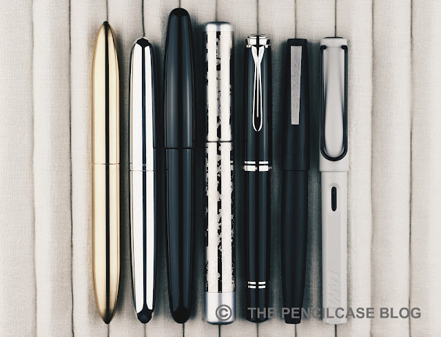
L to R: Gravitas fountain pen, Ensso Piuma, Wancher Dream Pen, Wancher Primo, Pelikan M805, Lamy 2000, Lamy Safari

Wancher doesn't scare away from making quite oversized pens, and the Primo illustrates that quite well. Measuring 14.7 cm (5.79") capped, and 13.6 cm (5.35") uncapped, it certainly isn't small to begin with, yet it's not quite as big as Wancher's own Dream Pen, for example. With the Primo, it's mainly the constant, wide diameter of 1.6 cm (0.63") across the entire pen, that really creates the oversized impression.

REVIEW: WANCHER PRIMO FOUNTAIN PEN

Going from the very wide barrel, there's a rather large step towards the metal section, which has a diameter of just 1.1 cm (0.43"). The section tapers down further to 1 cm (0.39"), with a short flared section at the end. The design of the section is almost entirely taken over from the Dream Pen (reviewed HERE), which means they deal quite well with the large step. The diameter gradually increases, first up to the threads, then a beveled ring, and finally the rounded edge of the barrel. 

There's one small -but important- detail the Primo didn't take over from the section design of the Dream Pen: the threads! Unfortunately, they took a step back towards traditional, v-cut threads, instead of the more comfortable and precise block threads from the Dream Pen. The threads are quite deep, which makes them especially noticeably if you hold your fingers on them. Despite the section being quite a decent, comfortable size, it's not always possible to avoid the sharp threads in your grip. 

REVIEW: WANCHER PRIMO FOUNTAIN PEN

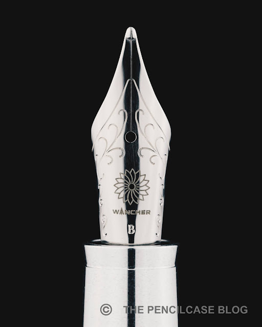
The Primo comes equipped with a steel Jowo nib, but it did receive some (optional) upgrades to make it a bit less 'stock' in terms of looks and performance! First of all, the nibs are color-matched to the color of the pen itself. The plating treatment creates a somewhat pearlescent hue on the blue, purple, and brown nibs. The nib on the Frosty Silver Primo received matching rhodium plating instead of the bare stainless steel finish, which creates a brighter and more lustrous look.

Second are the optional ebonite feeds which, as I understand it, are still manufactured by Flexible Nib Factory. Although the two samples I was sent, both came with JoWo's stock plastic feeds, I've reviewed a couple of Wancher's Dream Pens with the ebonite feeds before, and they're a great addition to the already reliable writing experience JoWo nibs offer. You can't really go wrong with any of the feed options, but the ebonite feed (+30$ for black ebonite, +50$ for red ebonite) does give you a noticeably richer ink flow.

REVIEW: WANCHER PRIMO FOUNTAIN PEN

It's hard to put a final verdict on the Wancher Primo. The Wancher Primo retails for 250$, which is quite steep, especially once you factor in paying an additional 30 to 50 dollars for an ebonite feed. 

On one hand, considering the price point of the Primo, I feel like there are a few elements (mainly the clunky finial design and the sharp threads) where I feel like Wancher could've done a better job. On the other hand, I do think Wancher absolutely succeeded at creating a unique pen, one that easily catches the eye. Things like the textured barrel and cap, and the color-matched nibs, are perfectly executed and set this pen apart on the market. But on the other hand, I can't help but feel like Wancher missed the ball on a few particular design decisio

NOTE: This product was provided by Wancher, so I could write this review. I was in no way influenced in the making of this review, the opinions shared in this review are completely my own. This post does not contain affiliate links.

REVIEW: WANCHER PRIMO FOUNTAIN PEN