Showing posts with label penaddict. Show all posts

Sunday, September 20, 2020

REVIEW: OTTO HUTT DESIGN 06 FOUNTAIN PEN

REVIEW: OTTO HUTT DESIGN 06 FOUNTAIN PEN
Together with the, quite well-known, Design 04 (review HERE), the Design 06 is probably one of the more popular pens that German manufacturer Otto Hutt makes - at least they are the first pens that come to my mind. But while the 04 is perhaps a rather particular design, probably not everyone's taste, the Design 06 seems more of a crowdpleaser. At least from my perspective, the 06 is about as inoffensive as pen design gets - I don't mean that in a negative way, it's just a very simple and elegant design. Maybe a bit more low-key, but very hard to knock. 
REVIEW: OTTO HUTT DESIGN 06 FOUNTAIN PEN
The 06 - again - shows off Otto Hutt's forte of combining a fairly classic overall design (a strongly tapered cigar-shaped profile with flat finials) with very modern, simplistic details and clean, minimal branding. 
REVIEW: OTTO HUTT DESIGN 06 FOUNTAIN PEN
Clip brothers!
Probably my favorite small design aspect that Otto Hutt gets right on many of their pens is their fantastically sturdy, spring-loaded clips - Yes, I am a stickler for clips, and this is once again an excellent one: it's extremely robust but still functional and it clips in pockets easily, all while still retaining a simple and minimal design. 
REVIEW: OTTO HUTT DESIGN 06 FOUNTAIN PEN
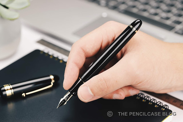
Especially in this black lacquer colorway, the Design 06 is a sleek and stylish pen with a certain 'ST Dupont-chic' flair (but more modern-looking than Dupont). It looks and feels more expensive than it really is, and would easily be suited for a formal or work environment. But again, Otto Hutt's balance between classic and modern design also shows in the available finishes: black with rhodium trim too boring? Pick one of the frosted colorways, or the rose gold or black PVD trims, and you instantly get a much more modern-looking pen.
REVIEW: OTTO HUTT DESIGN 06 FOUNTAIN PEN
L to R: Pelikan M1005, M805, Otto Hutt Design 04, Design 06, Design 03, Design 07, Lamy Safari, Lamy 2000
The Design 06 is a smaller pen, no surprises there, with Otto Hutt leaning almost exclusively towards smaller pens in their current portfolio (even the flagship Design 07, that I reviewed HERE, is still not an extremely large pen!). The 06 measures 13.8 cm/ 5.43" closed, the strongly tapered design wastes a lot of space inside the cap because you're left with a pen that's just 12 cm/ 4.73" when you take the cap off. That's cutting it close for me, being quite a bit shorter than what I'd consider my personal sweet spot.

Luckily, the 06's section design has an interesting profile with a very strong pinched shape (from 11.3 mm/ 0.45" near the threads to 8.7 mm/ 0.34" at the narrowest point!), which effectively pulls your grip towards the front of the nib and - despite being 'slippery' metal - keeps your fingers in place quite well.  Another beneficial side-effect of holding the pen so close towards the nib is that you'll bypass the step, because yes...there's quite a step behind the threads (and it's noticeable when you grip right on it).  The all-metal construction makes for a rather hefty 46 gram total, again a given throughout Otto Hutt's product catalog. Uncapped, the weight sits nicely balanced in the hand. The cap can be posted securely (and rather deep onto the barrel), which makes for a heavy pen but doesn't make it extremely back-heavy like I feared it would. 
REVIEW: OTTO HUTT DESIGN 06 FOUNTAIN PEN
Comfort-wise, this is a very peculiar pen. A lot of elements that don't sound comfortable at first, come together into a design that's surprisingly decent for everyday writing. Would I call this the most comfortable pen ever created? Well, no, obviously, but it's actually not half bad, and I could certainly use it for longer writing sessions without any problems.
REVIEW: OTTO HUTT DESIGN 06 FOUNTAIN PEN
If the overengineered clip is anything of an indication of the overall build quality, you'll know that the Design 06 is a very well-made pen. The sturdy all-metal build means this pen can take a beating. Every part is well-polished, the black lacquered finish is spotless, no rough edges to be found. It really is an exceptionally solid writing instrument that just exudes quality, which is something I've found true for every Otto Hutt I've used so far.

Before we move on to the writing performance, the threads on this pen deserve a small word of praise. The Design 06 is, as far as I can remember, the only pen I've ever seen that uses quadruple-start threads! It takes just half a turn to unscrew the cap, which is insanely fast, and yet it still closes securely. It's a seemingly small feature, but it's certainly useful if you need to take notes quickly during class or in a meeting. 
REVIEW: OTTO HUTT DESIGN 06 FOUNTAIN PEN
The steel #5-sized nib continues my positive streak of excellent nibs with Otto Hutt, this makes for four pens in a row that have all been excellent writers in their own respect. I've actually come full circle in my reviews of Otto Hutt pens: from a simple steel nib on the Design 04, to the 18k gold on the Design 03 (review HERE), a larger #6 18k gold specimen on the Design 07, and now back to steel, with a fine nib this time around. The bicolor plating fits this pen well, with its classic look, and it's cool that they color-match the trims when you go for a rose-gold or black PVD finish. 
REVIEW: OTTO HUTT DESIGN 06 FOUNTAIN PEN
The fine nib is a wet writer and with that, lays down a line that runs closer to even some Western mediums. I'm pretty sure Otto Hutt uses JoWo nibs, and that's definitely noticeable in terms of having a reliable writing experience. It dries out ever-so-slightly after longer periods of time, but always manages to find its bearings after the first stroke, so that's ok. I remember in my review of the Design 04, I mentioned that it's hard to recommend going for the more expensive gold nib option, and I still think that holds true. Yes, Otto Hutt's gold nibs are excellent - maybe a touch smoother and softer than their steel counterparts - but the steel nibs are nothing to scoff at.
REVIEW: OTTO HUTT DESIGN 06 FOUNTAIN PEN
The Otto Hutt Design 06 is a fairly unassuming pen. Where the 03, 04 and 07 are all a bit more different and unique, the 06 is understated and elegant, but still retains the extremely high build quality that I've seen on other Otto Hutt pens. While not the most comfortable pen in the world, the 06 still managed to exceed my expectations in terms of the overall writing experience, and of course you can be quite certain that the nibs will be excellent, steel or 18k.

I have a lot of positive things to say about the Design 06, so I'd say it offers very good value at 145€ MSRP from Otto Hutt's own online shop (It's in German, but Google's auto-translate does a pretty good job), although the price does creep up when moving into the matte colored finishes, and rose gold or black PVD trim options. The 110€ extra for a gold nib is certainly not a bad investment, but IMHO it's not necessary to get a great writing experience. 

NOTE: This product was provided by Otto Hutt, so I could write this review. I was in no way influenced in the making of this review, the opinions shared in this review are completely my own! This post does not contain affiliate links.
REVIEW: OTTO HUTT DESIGN 06 FOUNTAIN PEN

Tuesday, March 31, 2020

REVIEW: PILOT CUSTOM 743 FOUNTAIN PEN & FA NIB

Review: Pilot Custom 743 fountain pen + Falcon FA nib
In my - possibly neverending - search for the best possible modern flex nib, we've arrived at a very cool pen from Pilot that I've been wanting to try out for a very long time: the Pilot Custom 743. The only thing standing in my way up until this point has been Pilot Europe's ongoing ignorance (or restrictions from higher up?) of their luxury writing branch, leaving European vendors behind empty-handed on a lot of awesome products.

Early this year - about 3 years too late, mind you - the Pilot 823, 845 urushi and Custom urushi FINALLY made it over to the European market. While an improvement for sure, we're still eagerly waiting for the rest of Pilot's offerings (the Custom 912 or 743, for example) especially with Pilot's exquisite specialty nibs like the Waverly (WA), Posting (PO), Stub (SU), or the nib I'll be showing today: the Falcon (FA)!

Because chances of getting the Custom 743 here in Europe are slim for the time being, I instead sourced it from a Japan-based retailer. The only problem - as some of you will know - is that most Japanese web stores can be really difficult to navigate, even with help from Google Translate. So, luckily, I found out about PenSachi! With their English website (and English-speaking staff), PenSachi aims to make hard-to-get special and limited editions from Sailor, Platinum, and Pilot more readily available for customers outside Japan. My thanks to them for helping me get my hands on a 743 for this review!
Review: Pilot Custom 743 fountain pen + Falcon FA nib
Pilot Custom 743 (bottom) and 823 (top)
The Custom 743 leans very close to the Custom 823 (that I reviewed a few years ago), especially in terms of the overall design. But there are some key differences as well, particularly on the inside!
Review: Pilot Custom 743 fountain pen + Falcon FA nib
Enamel-filled letters on the center band complete the low-key appearance of the 743
I'd categorize the 743 as a 'business'-style design, fitting right in with the rest of Pilot's rather understated Custom and Custom Heritage pens. A no-frills, black+gold pen that doesn't try to stand out between analogs like the Montblanc Meisterstück, Sailor 1911 or Platinum Century 3776. If anything, I find that the design appears a bit more streamlined and retro than its competitors - probably due to Pilot's typical ball end clip.
Review: Pilot Custom 743 fountain pen + Falcon FA nib
Pilot Custom 743 (bottom) and 823 (top)
I think there's something to be said for the simplicity of the Custom 743. On the outside, it's an elegant and slender cigar-shaped pen in black resin, detailed with plenty of gold trim without looking gaudy. The 743 and 823 are identical except for the semi-translucent resin of the 823 (although the smoke grey 823 appears almost black in person) and a slightly longer, more tapered barrel finial on the 823 which is actually the blind cap for the vacuum filling mechanism, as opposed to just an aesthetic detail on the 743. 
Review: Pilot Custom 743 fountain pen + Falcon FA nib
The vacuum filling system of the 823 is an excellent choice when you absolutely want/need a high ink capacity (2.5 mL) for daily use. But the 743's con-70 converter is not at all a bad alternative, with more than adequate capacity (about 1 mL, almost twice as much as a standard international converter), and a practical pump filling system. Another way to look at it is this: with the 823 you have to stick to one ink for a considerable time, the 743 gives you the ability to change inks a bit more frequently.
Review: Pilot Custom 743 fountain pen + Falcon FA nib
L to R: Pelikan M805, Platinum Century 3776, Pilot Justus 95, Pilot Custom 823, Pilot Custom 743, Lamy 2000, Lamy Safari
The Pilot Custom 743 is a large pen that doesn't feel large. It's light (26 g total) and nimble in the hand, and about a fraction slimmer than a Pelikan M800. Those things, combined with the excellent grip shape and unobtrusive threads, make for an excellent pen to use. In terms of length (14.8 cm/ 5.8" capped, 13.1 cm/ 5.16" uncapped), it's a touch longer than a Montblanc 149, making it ideal even for people with larger hands (unless you have a strong preference for girthier pens). Comfort-wise, it's hard to knock these pens.
Review: Pilot Custom 743 fountain pen + Falcon FA nib
FA nib on the 743 (left), medium nib on the 823 (right)
We've finally come to the ACTUAL reason why you'd choose the 743 over the 823: the nib! Both use Pilot's 14k gold, #15-size nib (same size as a #6 nib from other brands), but as I already mentioned, the 743 gets a few more interesting options than the 823, in this case the flexible Falcon (FA) nib. Confusingly, it's not the same as Pilot's similarly named Falcon fountain pen. Whereas the Pilot Falcon PEN has a nib that's best described as springy and soft, the FA NIB on the 743 comes closer to a true modern flex nib.

The FA certainly has the design cues of a flex nib: a slender profile with long and strongly tapered tines, cutouts on the side, and very minimal branding on the nib face (I was told once that the less intricate stamping is done to prevent structural weak points, which is of course very important on a flexible nib!). It may look a bit bland in comparison to the regular scrollwork on Pilot's nibs, but that's a trade-off I'm willing to make for a flexible writing experience.
Review: Pilot Custom 743 fountain pen + Falcon FA nib
The FA nib is definitely suitable for everyday use, provide you don't have a heavy hand. With normal writing pressure, the nib is just stiff enough to still provide a pretty comfortable writing experience. The EF-F tipping provides a noticeable (and audible) amount of feedback while writing.

Looking at the FA purely for flex writing, it does come with a little side note: since it's a Japanese-made nib, it's designed for the short brush-like strokes of Japanese calligraphy, not really for Western writing styles. Continuously flexing the nib will make it railroad because the feed isn't designed to keep up.

If you take it slowly though, this nib is pleasantly springy and responsive and produces excellent results as far as line variation goes. The tines open up quite easily to a little over 1mm, or 1.3mm when pushed to the limit. It's probably worth suggesting, given that this is not a cheap pen like a Noodler's or the FPR Himalaya I reviewed last week, I'd probably suggest not pushing the nib to the limit (never a great idea). Still, variation from EF to BB is nothing to be scoffed at. Because it starts off as a rather fine line, that's more than enough variation to give a dramatic effect to your writing.
Review: Pilot Custom 743 fountain pen + Falcon FA nib
I'm generally not one to make a case for matching pen and ink of the same manufacturer. However, with some Pilot pens, like this one, I've noticed slight improvements sticking with Iroshizuku inks (I haven't really systematically tested this theory though, so your mileage may vary!). I wrote this review with Pelikan Edelstein Onyx (generally a good performing ink for flex nibs), but there were some occasional skips on downstrokes and as expected the feed starved after writing a few words with heavy flexing (pushing the limits of the nib, mind you). Switching to Iroshizuku Tsuki-Yo made a noticeable improvement. Even with fast flex writing, the feed seemed to recover faster from getting starved (It will still railroad periodically, but the flow immediately picks up again), and the nib no longer skipped.
Review: Pilot Custom 743 fountain pen + Falcon FA nib
The Pilot 743, just like the 823, manages to impress in so many ways. The no-frills, workhorse design means serious business, and under the hood, it packs some serious performance. The FA nib adds a bit of playfulness to the mix. It's an excellent option to get your hands on modern flex: a pleasantly soft and responsive flex nib, that gives plenty of line variation.

Given that the 743 and 823 are identical in design and price - both retail for 265$ at PenSachi - deciding between the two will boil down to choosing either a high-capacity filling system or one of Pilot's many interesting specialty nibs, you can't have both. Either way, you're getting a lot of pen for essentially (less than) half the price of a Pelikan M800 or Montblanc 146!

Note: PenSachi provided this product at a discount, so I could write this review. I was in no way influenced in the making of this review, the opinions shared in this review are completely my own! This post does not contain affiliate links.
Review: Pilot Custom 743 fountain pen + Falcon FA nib

Friday, December 27, 2019

REVIEW: OPUS 88 OMAR DEMONSTRATOR FOUNTAIN PEN

Review: Opus 88 Omar Demonstrator fountain pen
I've raved about Opus 88 before, and I may just do it again today! Of the -now 4- pens I've tried (three of which I've reviewed before, the Koloro Demonstrator, Fantasia and now this one), Opus has managed to keep up a remarkably high and steady standard across all of them. 

The Taiwanese brand (apparently founded in 1977 already, according to the box?) took off a couple years ago with a refreshing collection of fountain pens that utilized combinations of ebonite and acrylic, excellent JoWo nibs, and a Japanese eyedropper filling system. But I think the real reason they suddenly got so much attention, is because of the excellent quality-to-price ratio. My favorite back then was the Koloro Demonstrator (now just called 'Demonstrator', but I'll refer to it as Koloro to keep things clear): an oversized, completely clear acrylic pen. 
Review: Opus 88 Omar Demonstrator fountain pen
The Omar is one of Opus' latest models, and didn't blow me away right away (although they do come in very interesting combinations of transparent and 'cracked ice' acrylics), but when I heard of a demonstrator version coming out... Now THAT'S something I was interested in!
Review: Opus 88 Omar Demonstrator fountain pen
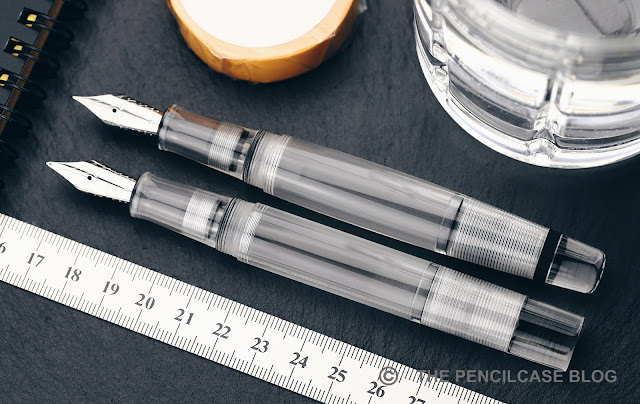
The Omar Demonstrator is again a seriously large pen. It makes sense that I enjoy it just as much as the original Koloro Demonstrator, because in essence... it's identical. That's to say, all threads and internals are machined to the exact same specifications on both pens. That also means that basically all parts are interchangeable with each other. So if you'd want, you could go around mix-and-matching your own unique design (Pro tip: the cap of the Koloro Demo on the Omar body looks quite sleek!). 

On the outside, the design is obviously different. We're looking at a much more 'sculpted' design, compared to the completely straight and angular Koloro Demo. The Omar has a more elegant, bulbous shape. Although on a pen this size, elegant is perhaps not the right word to use. It's still a chunky-looking, beefy pen.
Review: Opus 88 Omar Demonstrator fountain pen
Opus' pens are generally quite light on trims and decoration -perhaps a way of keeping the cost of the pen down? The Omar has a chunky clip, the shape of which I'm not particularly fond of. Where I found the clip on the Koloro Demo a bit flimsy, this one is too tight. Then again, these pens are probably too big to carry in a pocket anyway. 
Review: Opus 88 Omar Demonstrator fountain pen
The Omar has two wide, matte black metal rings, one at the cap finial, one at the back finial. Together with the large, chunky overall shape of the pen, the trim doesn't look particularly refined either. However, it does look sleek and creates a stark contrast against the transparent acrylic. The only downside about the (powder-coated?) matte black trim is its' proneness to scuffing and becoming glossy with use.
Review: Opus 88 Omar Demonstrator fountain pen
Where I've always been quite impressed with the build quality on Opus pens, the Omar manages to take that to the next level. Threads are crisp (also internally, quite important on a demonstrator pen of course) and machining marks are nowhere to be found. Polishing is exceptionally consistent. Surfaces inside the cap, barrel, and section are again chemically etched to create a nice matte finish, and once again the consistency with which they applied this etching is impressive. Opus can easily compete in a far higher price category when it comes to build quality. 
Review: Opus 88 Omar Demonstrator fountain pen
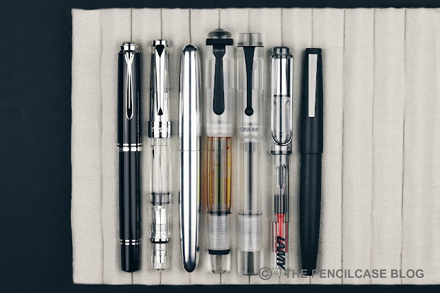
L to R: Pelikan M805, TWSBI 580Al, Ensso Piuma, Opus 88 Omar, Opus 88 Koloro Demonstrator, Lamy Safari, Lamy 2000
I was quite surprised when I realized the Omar is an even bigger pen than the already-large Koloro Demonstrator. It measures exactly 15cm (5.9") with the cap on and 13.7cm (5.4") without. It's a very bulky 1.8cm (0.7") in diameter at the widest point. So both in width and length, it trumps the Koloro Demonstrator or a Montblanc 149 for that matter. With its 34 grams, the Omar has a bit more heft than the Koloro Demo, too. 
Review: Opus 88 Omar Demonstrator fountain pen
Not a fan of oversized pens? Then it's safe to say the Omar may not make your shortlist. But it's not as terrible as it may seem. Despite its' mammoth size, the Omar Demo still manages to be a very comfortable pen to write with. The bulbous shape fits the hand naturally, and it narrows down towards the section to make for a grip section that's not too wide at all. The pen has just enough heft to let you feel it's there, yet not enough to cause fatigue. 

The section is a decent size, and has a nice taper to it, flaring out at the end. The shape of the section invites your grip more towards the front, keeping your fingers away from the threads. The threads themselves never bothered me, but there's a small step right behind them that's a bit noticeable.
Review: Opus 88 Omar Demonstrator fountain pen
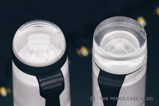
I'm not big on eyedroppers, but I do like Japanese eyedroppers. It's still a simple system (it can hardly be called a filling mechanism, I guess), but adds a shutoff valve to temper the massive 3.5ml-ish ink capacity when you need to. It's sealed shut when not in use, ideal for traveling (unlike normal eyedroppers), and the ink flow can be controlled by simply opening or closing the valve while you write. It's pretty great, apart from when you need to clean it out.
Review: Opus 88 Omar Demonstrator fountain pen
The stock JoWo nib that all Opus 88 pens come with is an excellent choice for everyday writers. The nibs are reliable (probably more so than those from Bock), albeit maybe a touch bland. The EF on this pen actually lays down a very fine line, and it has the feedback you should expect with a nib that fine. I quite like it for notetaking, and with an ink capacity like this, it lasts ages before needing a refill. To take better advantage of an ink capacity like this, pair it up with something broad or a stub nib, like the FANTASTIC Franklin-Christoph Music nib... or a Pilot Parallel?
Review: Opus 88 Omar Demonstrator fountain pen
Opus 88 scored massive internet points when the Pilot Parallel pen hack came up, and so I had to give it a go. You just unscrew the stock JoWo nib section as a whole (and remove the rubber o-ring right behind it) and throw in the nib and feed of a Parallel pen. Plenty simple. Congratulations, you now hold a pretty brilliant calligraphy pen with a MUCH more comfortable body than that of the Pilot Parallels and a ridiculously large ink capacity! Although for the OCD peeps like me: the frosted finish on the inside of the section does get messed up a bit when you do this pen hack.
Review: Opus 88 Omar Demonstrator fountain pen
My verdict on the Opus 88 Omar Demonstrator? There's a lot to like about it: First of all, the build quality is bar none. Secondly, I like how Opus has a way of coming up with designs that are exciting and just a little different. And above all -need I repeat it any more- the value proposition is pretty perfect. 108€/ 126$ Is definitely in that 'next-level pen' category, but it's a very fair price for the quality you get in return. I'd be tempted to put this up against the -also great- Leonardo Momento Zero Grande, but then you're looking at a price that's almost three times higher.
Appelboom
Note: This product was sent by Opus 88 and Appelboom, so I could write this review. I was in no way influenced in the making of this review, the opinions shared in this review are completely my own! This post contains affiliate links.
Review: Opus 88 Omar Demonstrator fountain pen

Sunday, December 31, 2017

MY FAVORITES OF 2017

The year has come to an end! So to close off 2017, here are some of my favorite products that I discovered this past year. I try out and review A TON of products each year, but these products just stood out from the crowd.

To give credits where credits are due, I completely stole this idea from Ed Jelley (edjelley.com) who is arguably the master of Lists and Buying Guides! Go check out his blog!

1. FRARA ROAD LEATHER PEN ROLL

My favorites of 2017: Frara Road Leather Pen Roll
The Frara Road Pen Roll has literally been by my side ever since I got it in for review back in August! It's a well-made and beautiful leather product made by a small South African brand. This wrap-style of carrying case is new to me, and it. just. works. The form factor is easy to carry, albeit a bit large, but it still manages to fit in my backpack without any issues. The leather quality is amazing, and it can carry six pens safely. Everywhere I took it with me, people commented on it and wanted to know where to get one. Perhaps this is my favourite product of the year. Period.
2. ENSSO PIUMA

My favorites of 2017: Ensso Piuma fountain pen
MINIMALIST. MACHINED. METAL. Those are perhaps the three keywords that best describe 2017 for me. Pens like the Namisu Nova, Karaskustoms EDK, Baron Fig Squire, Kaweco Brass Sport and perhaps my favorite: The Ensso Piuma! These metal pens have made up a big part of my daily carry in the past year. I just love the solid feeling, and solid performance they deliver. And as a chemist, the metallurgy behind the different metals fascinates me. 

The Ensso Piuma jump out from the rest because they were just so well-designed and well-made. It's not as easy to make a minimal product as people may  think, and Ensso just hit a homerun with these! The design is as sleek as it gets, but at the same time it's also manages to be a very comfortable writer (something the Namisu Nova -The honorable mention- lacked a bit). On top of that, I also like the #6 Bock nibs that you can find on most of these machined metal pens, which I think are excellent writers (especially the titanium ones are a lot of fun!).
(Read my full review)

WHERE TO BUY: ensso.com

3. PILOT CUSTOM 823 

My favourites of 2017: Pilot Custom 823 fountain pen
High-end Pilot pens like the 823 often get flak for being boring and uninspired designs. And while that may be true -The design of the 823 is about as classic as it gets-, it does provide a seriously impressive writing experience. The 823 is a pen you can write with non-stop. It's comfortable, smooth, reliable and it has an ink capacity that will last you several days of intense use. I got mine with a medium nib, and while I generally think medium nibs are boring, this is the most amazing boring medium I've used in a long while! 

True, this pen won't win beauty contests, and it may not win your heart because of that. But it's undeniably a first-class workhorse of a pen. 
WHERE TO BUY: stilografica.it

4. ROBERT OSTER SIGNATURE INKS

My favorites of 2017: Robert Oster Signature Inks

2017 Was the year of the inks apparently. A lot of new brands popped up, and my collection got even further out of hand with 57 new bottles (I'm almost ashamed of myself). 15 Of those new additions were from the hand of Australian brand Robert Oster, which is quite a subtle indication of how much I like them. In general, they are solid inks with excellent flow and behaviour. Some of them shade really well, some have killer sheen, and others I like purely for the color itself. 

WHERE TO BUY: appelboom.com

5. FRANKLIN CHRISTOPH MODEL 66 + MUSIC NIB

My favourites of 2017: Franklin-Christoph Model 66 fountain pen
I had been on the lookout for another Franklin-Christoph for a while. Because they are only available in the US, I kept holding off. But then my good friend Janine (@Janinescribbles on Instagram!) went to the DC pen show, and she was kind enough to bring one home for me! 

I went for an eye-searingly bright orange Model 66, which is a large desk-type pen. And I absolutely love it to bits! It's a large, quirky pen that grabs the attention. But more importantly, it's an amazing writer. The long, lightweight acrylic pen may not be the most practical to take with you (although it still fits my Visconti Dreamtouch pen cases...barely), but it's very comfortable and easygoing.
My favourites of 2017: Franklin-Christoph Model 66 fountain pen
This pen really sings, especially paired with the Franklin-Christoph Shadow Music nib (a three-tine 1.9mm stub). The music nib really brings the whole experience to the next level. The wet flow from the three tines provides a perfect writing experience, where I feel like other stubs often lack consistency and flow. The line is wide and crisp. I keep it inked up with Ky-No-Oto Yamabuki-Iro which has some of the best shading, and this nib takes full advantage of that.
(Full review to come!)

WHERE TO BUY: franklin-christoph.com

 6. EDISON PEARLETTE CANYON TRAIL

My favorites of 2017: Edison Pearlette Canyon Trail fountain pen
Top: Edison Collier Burnished Gold, Bottom: Edison Pearlette Canyon Trail.
Last but not least on my list is another semi-bespoke pen brand from the US: Edison! The Edison Collier surprised me last year, and this year again with the new Burnished Gold version (that I reviewed HERE). But my real favourite was the Pearlette. This was a surprise, and kind of an impulse buy at the Tilburg Pen show, but I haven't had the slightest regret! 

The Pearlette is a smaller pen, which is the main reason why it flew under my radar in the past. But this year's new Canyon Trail finish is downright mesmerizing. The material has an amazing depth to it, and the size is actually much more comfortable than I thought it would be. It's a bit of an adaptation from what I normally use, but it fits my hand just right (YMMV, of course).
WHERE TO BUY: scrittura-elegante.com

To end this post, first of all: Happy New Year everyone! I wish you all a happy and healthy 2018, filled with pens of course! Thanks also, for reading and supporting my blog. You're awesome, and you're the reason I keep doing this!

I think it's also the perfect time to thank my loyal sponsors for their continued support. These sponsors keep this blog going, and provide products for reviews and giveaways. Go give them a follow on social media, browse their webshops, and don't forget to use the discount codes that some of them provide for readers of The Pencilcase Blog! 

Disclaimer: I received some of these products for review. However that doesn't change the fact that I reached for these products the most during the past year, this list is based solely on which products I used and enjoyed most throughout the year. There are no affilate links in this post.