Showing posts with label affordable. Show all posts

Wednesday, July 1, 2020

REVIEW: FABER-CASTELL GRIP 2011 FOUNTAIN PEN

REVIEW: FABER-CASTELL GRIP 2011 FOUNTAIN PEN
I don't review enough pens in the 10-20$ price bracket. It's something I really want to change, because there are some real gems to be found in the entry-level range. Faber-Castell is one of the brands that often brings excellent bang for the buck in their lower-tiered offerings, and yet I don't spend enough time with their products.

I guess it's some kind of pen-snobbery once you start getting into more expensive pens. But really, that's just ignorant, and I know it. A while ago I got a couple of pens on loan from Appelboom, amongst which this new-ish Faber-Castell Grip 2011 fountain pen, but also a 1000$ Montblanc (the R. Kipling Writers Edition, should you want to know), and frankly the Faber-Castell more than held its' ground against pens many times the price.

The new Faber-Castell Grip 2011 fountain pen continues on their popular line of Grip 20XX stationery and school supplies. The Grip product range has been around for years and is quite extensive, so it's perhaps a bit of a surprise that it took them so long to add a fountain pen to the list. But hey, they did now, and the end result is more than decent, really. 
REVIEW: FABER-CASTELL GRIP 2011 FOUNTAIN PEN
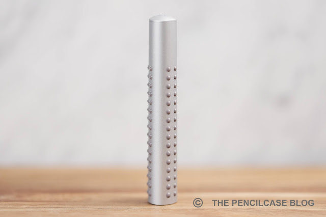
With their ergonomic triangular designs and easy-to-hold rubberized dots (hence the name 'Grip', obviously), the Grip products are marketed mainly towards a younger audience. The dots are the main design element that set the Grip products apart, including the new Grip 2011 fountain pen.

However, as I said, on most of the Grip 20XX products those rubberized dots serve the simple purpose of providing grip. On the fountain pen that added functionality is gone, unless you grip your pen all the way up on the barrel I guess. So the only reason they're there is to make the design stand out and create a uniform look across the entire product line. 
REVIEW: FABER-CASTELL GRIP 2011 FOUNTAIN PEN
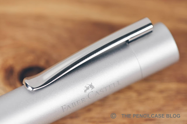
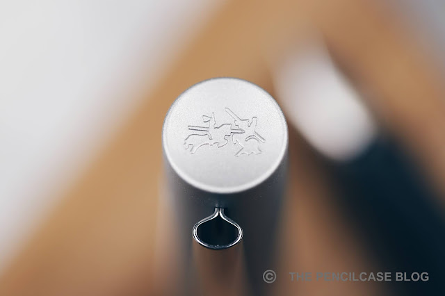
Other than the dots, the Grip 2011 fountain pen is a fairly standard-shaped pen. The cap is round and almost featureless. It has a concave finial on top, with Faber-Castell's jousting knights logo on it. Same as all other Grip products, the barrel has a triangular profile with nicely rounded edges. It's a fairly clean and minimal design really, and in this silver metallic colorway, it actually looks quite nice. Given that this product range is aimed at children mostly, it's still a surprisingly business-y-looking pen (although it's also available in some really bright colors, if "business-y" is not your thing!).
REVIEW: FABER-CASTELL GRIP 2011 FOUNTAIN PEN
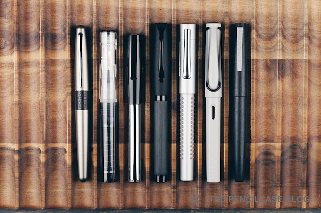
L to R: Pilot Metropolitan, TWSBI GO, Faber-Castell Loom, F-C Essentio, F-C Grip 2011, Lamy Safari, Lamy 2000
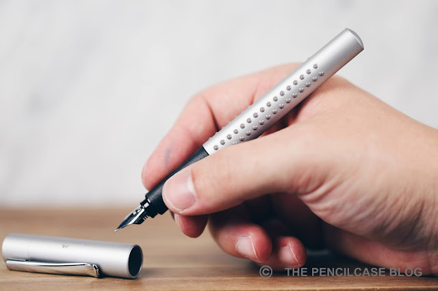
Some measurements then: the Grip 2011 is 13,9 cm (5.47") closed, and 13 cm (5.1") without the cap. It has a comfortable diameter, definitely not too thin. The triangular profile of the barrel continues underneath the cap, with a subtly shaped rubberized section. The section shape is quite interesting actually. It's not super-pronounced, so it doesn't force your grip and feel as restrictive like the notorious section of the Lamy Safari does. But at the same time, you definitely do feel that this is a shaped section. And if you don't have a 'traditional' triangular grip, it may very well still bother you. Aside from the section shape, the Grip is actually a really comfortable pen. The transition from section to barrel is seamless and the pen fits nicely in the hand. The 'dots' -even though you normally don't hold the pen on the barrel- do throw me off sometimes, they are definitely noticeable in the hand - a massage for the web of your hand, perhaps?
REVIEW: FABER-CASTELL GRIP 2011 FOUNTAIN PEN
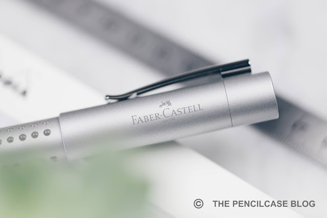
What Faber-Castell does absolutely great is make consistently high quality products, no matter the price range. The Grip 2011 is all-plastic, sure. But it's all constructed very precisely. The injection-molded plastic parts are thick and sturdy, and the cap snaps on reassuringly. It's a very light pen (15 gram total), but nothing rattles or feels poorly made, even the folded stainless steel clip feels surprisingly sturdy and has a nice firm spring-loaded action. Not at all bad for a 20$ pen!
REVIEW: FABER-CASTELL GRIP 2011 FOUNTAIN PEN
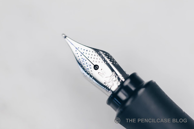
Then there's the nib. Faber-Castell's steel nibs are usually the star of the show, but the Grip (and a few of their other lower-end pens) utilize a slightly different nib and feed. So is it still as good? The nib has an almost identical design, the only visual difference is its slightly smaller size (a bit smaller than the usual #5 size nib). It's not removable either by the way, not that there's a need to remove it though.

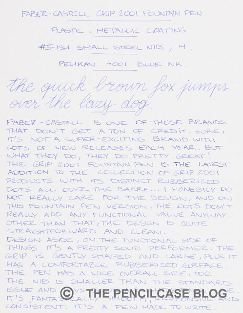
Performance-wise, this smaller nib is pretty much on the same level as FC's other nibs. It's smooth enough, though has perhaps a touch more feedback than the regular FC nibs. It writes consistently, as I've come to expect from them, and the ink flow is balanced but slightly on the wet side. Interestingly, from my (limited) testing of a couple of these nibs, I learned that this smaller nib writes a slightly narrower line compared to the regular #5-sized nibs. For this review, I tried a medium nib, but I'd say it's more of a medium-fine.
REVIEW: FABER-CASTELL GRIP 2011 FOUNTAIN PEN
The Faber-Castell Grip 2011 retails for 20€, or 23$ from Appelboom (Even 10% less if you use my discount code 'friend' on their website!). The design is -ehrm- different, I'm pretty neutral about it - I don't love it, but don't hate it either. The nib though? Absolutely perfect, just an all-round great writer. It's also well-made, sturdy clip, good ergonomics (if you don't mind the triangular grip!)... what more can you expect really? It ticks all the right boxes for a 20 dollar pen. So if you ask me, the Grip can easily compete with the usual workhorse pens in this price range, like the Lamy Safari or Pilot Metropolitan!
Appelboom pens
This product was provided on loan by Appelboom, so I could write this review. I was in no way influenced in the making of this review, the opinions shared in this review are completely my own! This post contains affiliate links.
 REVIEW: FABER-CASTELL GRIP 2011 FOUNTAIN PEN

Friday, January 18, 2019

REVIEW: TWSBI ECO T FOUNTAIN PEN

Review: TWSBI Eco T fountain pen
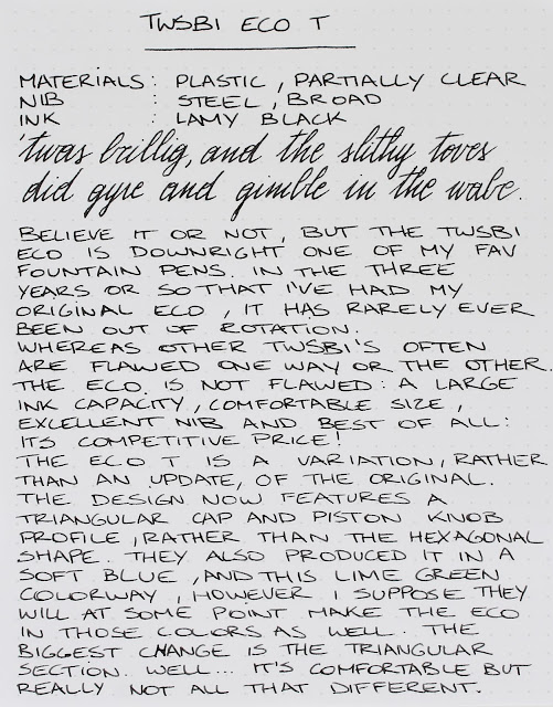
Believe it or not, but the TWSBI Eco (read my original review HERE) is perhaps one of my favorite everyday fountain pens. Sure, it won't win beauty contests, and it's not the most exciting writer in the world, but it's a powerhouse that simply functions extremely well. On top of that, the low price point makes it easily accessible for a large audience.

With the aptly named Eco T (T for Triangular), TWSBI aims to improve on the original design. Or well, maybe improve is a wrong way to put it. Rather, they are trying to make it more ergonomic for beginner fountain pen users, much like the Lamy Safari.
Review: TWSBI Eco T fountain pen
The design has largely remained the same, but the cap and blind cap now have a triangular profile instead of the hexagonal shape on the regular Eco. The grip section also has a slightly more triangular profile. Unfortunately, it's not an improvement on the rather meh design, but this yellow-green colorway is kind of fun (there's also a pretty neat light blue version available right now, but other than that, the color options aren't as varied as the regular Eco).
Review: TWSBI Eco T fountain pen
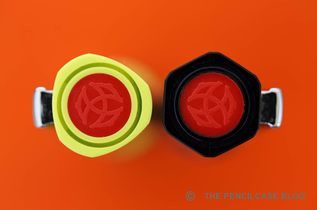
Can you see the difference? Left is the regular Eco, right is the Eco T
The more triangular shape of the section is supposedly to improve the ergonomics for beginner fountain pen users, but I found it difficult -if not impossible- to tell the new section on the Eco T apart from the old one (You be the judge in the photo above!). The improvement in ergonomics is equally minimal, but then again I never found the Eco to be uncomfortable in the first place. It guides your grip a bit more than the original, but not so much that it feels restrictive. It's definitely not as polarizing as the pronounced section shape of the Lamy Safari, so I think it should be a comfortable fit for most people.
Review: TWSBI Eco T fountain pen
L to R: Kaweco Brass Sport, TWSBI 580Al, TWSBI Eco, TWSBI Eco T, Lamy Lx, Lamy 2000
In terms of size, the Eco is a full-sized pen at 13,9 cm (5.5") closed and 13.2 cm (5.2") uncapped. The cap posts securely due to the rubber O-ring behind the piston knob, and it remains quite nicely balanced even when posted. However, I personally never felt the need to post the cap on this one. It's a lightweight plastic pen, coming in at 22g total, but it does feel surprisingly solid and sturdy.
Review: TWSBI Eco T fountain pen
The reason why I love the Eco (T) so much for everyday use is two-fold: For starters it's quite a tough pen. Even though it's one of the cheapest TWSBI offerings, it is also one of the most well-built and lacks the cracking issues that the more expensive models suffer(ed?) from. My original Eco is about three years old now, and it still stands strong after a LOT of use. The second reason I love the Eco is the massive ink capacity. The Eco is of course a piston-filler, and holds about 1.8ml of ink: more than twice the capacity of a standard international converter!
Review: TWSBI Eco T fountain pen
Not to forget, another good reason to look into TWSBI pens are the excellent nibs (I think they use JoWo nibs nowadays). I chose a broad nib on this particular pen, but have used pretty much all their nib sizes over the years and the writing experience is consistently reliable across the board. The broad steel nib is polished just enough to be both smooth and consistent. The ink flow is on the wetter side, but it's not a gusher. It's a stiff nib and it lacks character, but makes up for that with reliability. The rubber O-ring behind the threads helps to keep the cap tightly closed, but at the same time it also does an excellent job keeping the nib from drying out (even after multiple weeks of not being used, it starts up right away).
Review: TWSBI Eco T fountain pen
Even at 29$, you get a nicely presented package with wrench and silicon grease to service your pen
Few pens offer the kind of value for money that the TWSBI Eco does. More than 3 years after its release I still love everything about it: it holds up to everyday use, has a large ink capacity and writes reliably out of the box! The Eco T brings very little change to the original design, but why change something that is already quite excellent anyway? At 35€ (29$), it's one of the most affordable piston-filler fountain pens on the market. It's a great option, regardless of whether you are a long-time collector/user like me, or you just got into fountain pens and want to start using bottled ink.
Note: La Couronne Du Comte is a sponsor of this blog. I received this product free of charge. I was in no way influenced in the making of this review, the opinions shared in this review are completely my own! This post does not contain affilate links.
Review: TWSBI Eco T fountain pen

Thursday, May 3, 2018

NAMISU IXION FOUNTAIN PEN REVIEW

Namisu Ixion fountain pen review
Whew, this was a difficult review to write! The Namisu Ixion has probably been one of the most talked about pens in our community in the past couple months, and received a lot of criticism from bloggers and customers alike. I wanted to look at things differently, without drawing hasty conclusions or being influenced by other people's opinions. So here is my review...

When Namisu announced the Ixion on kickstarter June or August last year, I jumped on it faster than...well, fast! The rest of the kickstarter went less fast unfortunately, to the frustration of a lot of backers. It's Kickstarter of course, delays are to be expected. You buy a product that doesn't exist yet, and there are still a million things that could go wrong before it hits the shelves. However, it didn't help that Namisu is notoriously bad with their communication. 

Having worked with them in the past, their communication has always been so-so, I knew what to expect. But in the end they always came through with great products, which I think is the most important part. Imagine the opposite: a smooth-talk company that doesn't deliver in the end... Hah! THAT would be bad! [Cough, Visionnaire, cough].
Namisu Ixion fountain pen review
Simple but practical packaging: just a nylon sleeve 
A few months later than expected, the pens were sent out (still, not the worst delay I've seen on Kickstarter). What followed was a strange mix of happy customers, problems with nibs, lost packages,... Just generally, the entire project seemed cursed. 

While I don't want to ignore the issues that this kickstarter faced, I also don't feel like letting it impact the entire review. So let's focus on the positive stuff for now: In the end Namisu did one thing exceptionally well...they made a great pen!
Namisu Ixion fountain pen review
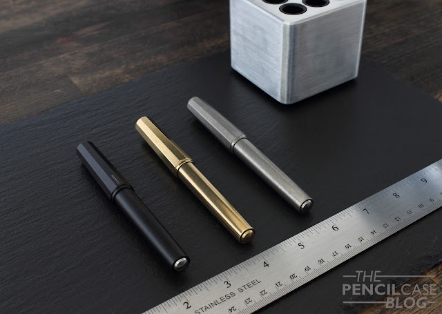
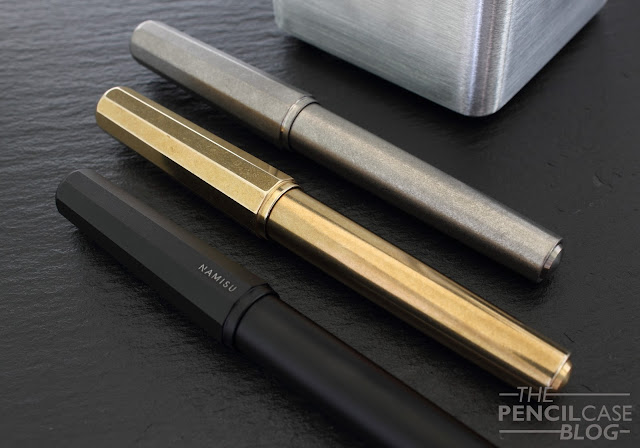
The Ixion is a bit of a departure from Namisu's traditional ultra-minimalist philosophy. It's still a simple design, but the combination of clipless faceted cap and round -slightly tapered- barrel is already a bit more elaborate than their earlier products. They also went for an interesting design choice with the finials, making them out of separate pieces (in either aluminium, brass, steel, or titanium) that slightly protrude from the cap and barrel. It's an interesting combination of shapes and subtle details, that I  think works very well. As some suggested, it's not too uncommon from the Kaweco Perkeo, although the Ixion has a more modern look with their metal construction.
Namisu Ixion fountain pen review
Something I don't really understand, is how this is their most affordable design yet. Given the more intricate and complex design than for example the Namisu Nova, it would seem more expensive to manufacture... But hey, more pen for less $$$, you won't hear me complain! Ok Scratch that, I did the maths wrong! The Ixion is actually ever so slightly more expensive. Although compared to their other products (like the Nova), the markup is still relatively small considering the more intricate production process.

Traditionally, Namisu utilizes four different metals for their pens, of which we can find three here: aluminium, brass and titanium (perhaps copper is still to come at some point?). Technically, steel is also used, but only for the finials and grip section. The brass and titanium pens received a stonewashed finish, which is excellent for hiding scuffs and scratches from daily use. The aluminium is available in a variety of anodised colors (red, blue, grey or black), and the finish is smooth and even. It is worth noting that the anodized finish will wear down with use, especially at the threads, but that's normal.
Namisu Ixion fountain pen review
Branding on the side of the cap of the aluminium version...
Namisu Ixion fountain pen review
Branding on the finials of the titanium and brass versions
As for those finials and sections, on the brass and aluminium versions, you get the choice between black anodized aluminium, brass or stainless steel trims. The titanium version comes with matching titanium trims, although you can buy additional sets of finials and grips to mix and match whatever way you like. All the options combined, this makes for a nice bit of customization.
Namisu Ixion fountain pen review
L to R: Ensso Piuma, Namisu Orion, Namisu Nova, Namisu Ixion, Lamy 2000, Lamy Safari
The Ixion is an average-sized pen, measuring 13.5cm (5.31") closed, and 12.8cm (5.04") uncapped. With a maximum diameter of around 1.5cm (0.59"), the ixion has a rather stout appearance. With the steel or brass finials, the aluminium pen is a bit heavier than what you'd usually expect, coming in at 39g (vs. 30g for the version with aluminium trims). The titanium and brass pens respectively weigh 45g and a hefty 85g.
Namisu Ixion fountain pen review
In the hand, this is perhaps one of the most comfortable Namisu pens yet. It's not overly long but it does post if necessary. The section has a comfortable taper, and a slight lip at the end. The threads on the brass and titanium pens are stonewashed so they are smooth and unobtrusive. On the aluminium pen, they are sharper and more noticeable. There's no step behind the threads. Whereas the Ensso Piuma still spans the crown for most comfortable metal pen I've used to date, the Ixion does come close.

To cut costs, the ixion didn't come with a converter (or cartridge), but they do fit international type carts and a standard Schmidt converter did the trick.

As for the writing experience; well they are stock Bock #6 nibs in either steel or titanium (or gold, if you want to pay the premium). My experience with Bock nibs is quite good. Of the 20+ nibs I've used from their make, only one or two (usually broader nibs) had some issues with skipping or hard starts.
Namisu Ixion fountain pen review
Bock nibs, not all of them equally straight or symmetrical, yet all of them write without any issues
Both on the Ixion Kickstarter comment section, and on other blogs, I came across a lot of complaints about the nibs. Because I didn't have any issues with my three pens, I was rather surprised by this, so I asked around as much as I could to learn other people's experiences.

The verdict? I don't know.

There are so many factors that can alter how, if at all, a nib writes. The geometry of the nib itself is one thing, but the assembly, the ink that's used, the paper, even the way you hold your pen... These are all seemingly small things that matter, so it's very hard to pinpoint exactly where things go wrong. There's definitely some quality control issues that circulate throughout various brands, so in the end, it's partially luck that will decide if you get a 'good' nib or not. On top of that, maybe a dud for one person might be the perfect nib for someone else?
Namisu Ixion fountain pen review
The titanium section is stonewashed, while the brass and steel sections have a lightly brushed finish
So probably Bock nibs just suit me and the way I write. They are a bit bouncy (at least in recent years they have been, probably due to a change in the production process), and provide just the right amount of feedback. They have a good flow, especially with a wet and lubricated ink. The wider nibs (medium or broad) occasionally suffer from some skipping or hard starts. But again, a good ink choice solves this problem in my experience.
Namisu Ixion fountain pen review
In the end I'm quite impressed with the product Namisu delivered. It's on the same quality level as the other Namisu pens I own, and the pricing is fairly similar. Even after the Kickstarter, when the Ixion becomes a standard model in their lineup, the pricing should still be rather competitive with similar products from other brands. I paid 30 GBP (38 USD), 38 GBP (49 USD) and 55 GBP (70 USD) respectively for the aluminium, brass and titanium versions, which was at a 40% Kickstarter discount. (Final retail prices will presumably be around 50 GBP, 64 GBP and 92 GBP respectively)

I think Adrien and Maria -the peeps behind the brand- were overwhelmed with the scale of the kickstarter (which outdid any of their earlier projects). But still, that doesn't take away that Namisu's communication has to improve for them to be able to keep their customer base happy. I kept following the comments on the kickstarter page, and I'm already seeing a positive evolution, with people getting replies to their emails and receiving replacements where necessary.

Note: This product was bought with my own funds. I was in no way influenced in the making of this review, the opinions shared in this review are completely my own! This post does not contain affiliate links.
Namisu Ixion fountain pen review

Wednesday, August 2, 2017

KAWECO PERKEO FOUNTAIN PEN REVIEW

Kaweco Perkeo fountain pen review
Lamy has the Safari, Pilot has the Metropolitan, Kaweco has the classic Sport. All extremely popular pens, all -not coincidentally- extremely affordable pens. But one of these pens is not like the others: The Kaweco Sport is a pocket pen, unlike the other two, full-sized pens. Kaweco, up until this point, didn't offer an affordable non-pocket fountain pen.

A pocket pen can be nice and useful, but it's not always ideal and it's definitely not everyone's cup of tea. That's why they now finally decided to up their game, expanding their entry-level offerings with a full-sized fountain pen: the Kaweco Perkeo. My thanks to Papier & Stift, for sending these over for review!
Kaweco Perkeo fountain pen review
No tin box packaging this time, just a plastic sleeve
Going up against something like the uber-popular Lamy Safari or Pilot Metropolitan obviously isn't an easy task. Especially because the entry-level market is small, with a select group of products that have an established position (some of them for decades, like the Safari). I personally think there are three things an affordable fountain pen should have: good size, good price, and good nib. Those three things combined are the recipe for success (at least if you ask me). 
Kaweco Perkeo fountain pen review
I'm a big fan of the subtle raised branding on the cap
Apart from those three 'vital' aspects, of course having a good design doesn't hurt. And it just so happens that Kaweco did an excellent job on designing the Perkeo! Kaweco is very loyal to their distinct design philosophy, which is good because it makes their pens recogniseable. The Perkeo is extra recogniseable because they incorporated a lot of design elements from the Sport into a full-sized pen. The cap seems like it's taken right off the Sport and placed on a longer, sixteen-sided (hexadecagonal) barrel.

Only that's not the case, the cap has the same overall shape, but the dimensions are completely different. As for the body, the hexadecagonal profile is interesting. I wasn't sure about it at first (would be interesting to see how a normal round body would look on this pen), but it adds some visual effect to the pen. Apart from the design aspect, the profile of the body also helps to prevent it from rolling around when uncapped.

One design aspect I haven't discussed yet are the color schemes. The Perkeo is available in four different two-tone color schemes, of which two are shown here: 'old chambray' (blue/white) and 'indian summer' (black/yellow). The other two available colorways are 'bad taste' (black/pink) and 'cotton candy' (grey/salmon pink). I like what they did with the colors, but they all are quite in-your-face. I think there should be at least one subtle color option available to make the Perkeo appealing to a wider audience, maybe all black would be cool (a bit like what Ana from Well-Appointed Desk did in her review of the Perkeo). Of course further color options might be an idea for yearly special editions, similar to what Lamy does with the Safari.
Kaweco Perkeo fountain pen review
The Perkeo has a clipless design, which is not that unusual with Kaweco pens. However, most other clipless Kaweco models can be 'upgraded' with a removable clip. The cap of the Perkeo has a completely different cap diameter, so any of the available removable clips won't fit. 

Personally, I'm not a clip person, I don't attach my pens to a shirt pocket or notebook so I generally quite like clipless designs because it makes the pen sleeker, and the clip is obsolete for my use anyway. However, on an inexpensive pen like this, I would've liked to see one anyway. It would make the Perkeo slightly more versatile and enjoyable for people that do use clips.

Speaking about versatility, there's a lot of disagreement about the triangular shaped section on the Lamy Safari. It's ideal for beginner fountain pen enthusiasts, but it's a nuisance for most others. Kaweco chose middle ground for their section design. It's still triangular in shape, but the profile is less pronounced, and thus slightly more comfortable if you don't have an 'ideal' grip. 
Kaweco Perkeo fountain pen review
L to R: Kaweco Ice Sport, TWSBI Eco, Pilot Metropolitan, Kaweco Perkeo, Lamy Safari, Lamy 2000
Kaweco Perkeo fountain pen review
The Kaweco Perkeo is without a doubt a comfortable full-sized pen, measuring in at 13.9 cm (5.47") closed, and 12.9 cm (5.07") without cap. It's a completely plastic pen, which explains the low 14 g total weight (the Lamy Safari is 2 grams heavier, probably from the metal clip). The cap can be posted, which changes absolutely nothing in terms of balance because the cap is so light. 

Despite being really light, Kaweco sure knows how to make a sturdy pen. My Kaweco classic Sport (one of my first fountain pens I ever bought) has always been a testimony to Kaweco's excellent build quality, and I think the Perkeo won't be any different. 
Kaweco Perkeo fountain pen review
Comparison of the smaller regular #5 kaweco nib (bottom), and larger Perkeo nib (top)
The Perkeo has a really cool trick up its sleeve... Ok maybe it's not a real trick, but nevertheless I was quite suprised when I found out that the Perkeo nibs are slightly larger than the regular small nibs (as seen on the Sport, and most other Kaweco models), which means they aren't interchangeable. To make things even more surprising: the nibs on the Perkeo even seems to be better than the regular nibs!

Why would the nib on Kaweco's cheapest pen be better than all other -more expensive- models? It makes no sense, but I did find both nibs (a polished steel F and black-coated M) surprisingly consistent and even a slight bit springy (both characteristics the other Kaweco nibs don't have). They really are quite good writers. The flow is on the wet side, and the nibs are well-polished. Available nib sizes seem to be limited to F and M for now.

I'm sincerely fascinated by how good these pens are. Kaweco nibs occasionally have some issues regarding consistency, but these were great out of the box (I didn't use a particularly wet or lubricated ink). A beginner fountain pen has to have a reliable and hassle-free nib, the Perkeo delivers.

Oh, BTW: have you noticed from the pictures that the black-coated nib looks kind of blue? Yeah, I don't know what's up with that either. I don't know if it's normal, or just a one-off mistake, but it doesn't seem to influence the performance so I don't really mind it too much (it just looks odd).
Kaweco Perkeo fountain pen review
It's not an easy task to take on established pens like the Lamy Safari, but I think the Perkeo could be Kaweco's chance. It's a solid, decent writer, with a great Kaweco-esque design, and it's very affordable. At just 13 EUR / 16 USD (prices vary between retailers), it's priced very competitive compared to the Safari and Metropolitan (the Metro is slightly less expensive in the states, but here in Europe it's priced higher). 

Note: this pen was sent to me by Papier und Stift, free of charge, so I could write this review.  I was in no way influenced in the making of this review, the opinions shared in this review are completely my own! This post does not contain affilate links.
Kaweco Perkeo fountain pen review