Showing posts with label flex writing. Show all posts

Wednesday, October 7, 2020

REVIEW: MONTBLANC MEISTERSTUCK 149 CALLIGRAPHY FLEX NIB FOUNTAIN PEN

REVIEW: MONTBLANC MEISTERSTUCK 149 CALLIGRAPHY FLEX NIB FOUNTAIN PEN
For probably the first time in the history of this blog, I'll try to keep it short today (keyword: "try"). Why? Well, the pen we'll take a look at today is really nothing different from the Montblanc 149 I already reviewed a few years ago (HERE)... except for the nib! This is Montblanc's Calligraphy special edition of their iconic flagship fountain pen, which comes with a specially developed flexible nib!

The Calligraphy Meisterstück with flexible nib is a special edition in a new series of "Calligraphy" pens with unique nibs (a new version with different specialty nib will supposedly still launch this year, effectively replacing the flexible nib variant). And I'm a bit late to the game with this review. My particular pen (that I purchased from site sponsor La Couronne Du Comte - Check out their new website, BTW!) took an unfortunate - and long - detour via Hamburg (Montblanc's HQ) because the nib slit was cut off-center. I typically don't complain about that sort of thing as long as it's not too bad or doesn't hamper performance. But on a 900€ pen, I feel like a little nitpicking is permitted. Oh, and it did actually make the nib noticeably scratchier, so I guess having it out of my hands for 6+ months to be replaced (perhaps it took the scenic route?) was the right - and necessary - judgment call to make. But it did, of course, delay this review to the point where this pen is nearing the end of its availability (sorry for that!).
REVIEW: MONTBLANC MEISTERSTUCK 149 CALLIGRAPHY FLEX NIB FOUNTAIN PEN
Anyway, as I said, this is just a plain, stock Meisterstück 149. The box has a custom imprint for the Calligraphy release on the outer sleeve, but inside is just the normal large clamshell box for a regular 149. A bottle of Montblanc's calligraphy ink isn't included, either. Even though Montblanc released two special edition inks along with the Calligraphy pens. A spectacular special edition 146 with gold leaf decoration was also available, which did set itself apart in terms of aesthetics. Combine the words 'gold leaf' and 'Montblanc' in a single sentence though, and the price gets steep... So I settled for the 149, which I imagine has the upper hand for flex writing anyway, since the larger #8-sized (in Montblanc's numbering #9) nib is already soft on its own. 
REVIEW: MONTBLANC MEISTERSTUCK 149 CALLIGRAPHY FLEX NIB FOUNTAIN PEN
Let's get straight to the business end: the flex nibs look fantastic. I think the monotone nib with simple but elegant figure-eight swirl is one of the best Montblanc nib designs I've seen in a while (maybe close second to the Heritage Rouge Et Noir's Snakehead design!). Montblanc typically excels in nib designs though, so I guess it's hardly a surprise that this too is an aesthetically pleasing release. 
REVIEW: MONTBLANC MEISTERSTUCK 149 CALLIGRAPHY FLEX NIB FOUNTAIN PEN
Functionally, I had high expectations for this pen. Montblanc typically goes for reliable performance with their nibs, so I was curious to see how that'd translate into their first venture in a modern flex nib. The answer is: good. Maybe even great. But as you'd expect, not without its limitations.

The nib tipping is ground noticeably finer than their typical nibs. It's supposedly an EF, but with a line as fine as 0.2 -0.3 mm without pressure, I'd say it's more like an EEF in Montblanc's standards. The fact that it's so fine is also why even the slightest off-center slit is an issue, the right tine was extremely thin on my faulty pen. Anyway, on the replacement pen I received, the nib is actually very pleasant to use, even for normal writing. It's surprisingly smooth for such an extremely fine nib, although of course, you should still expect a bit more feedback than with Montblanc's regular nibs. If you have a very light hand, it could serve for normal writing. 
REVIEW: MONTBLANC MEISTERSTUCK 149 CALLIGRAPHY FLEX NIB FOUNTAIN PEN
With the slightest pressure, the nib immediately starts opening up and you get a slightly wider EF to F line width, with noticeably heavier ink flow. The Calligraphy flex nib is positively soft when you start pushing it more. It takes a small but balanced amount of pressure, enough to give a controlled writing experience, but not too much as to cause fatigue. It's quite a responsive nib with good snapback, meaning that the tines close back up fairly quickly when varying pressure while writing - it doesn't feel mushy.

In terms of line variation, the internet says 0.3 mm EF (EEF) to 1.6 mm (BB), but I find that optimistic. I could consistently go up to 1.0-1.3 mm lines without feeling like I'm pushing the nib too far. In the grand scheme of things, this qualifies the Calligraphy Flex as a 'semi-flex' nib, not quite vintage full-flex. That said, the nib definitely benefits from the extremely narrow tipping. It automatically gives more impressive line variation even though the maximum line width isn't necessarily outlandish.
REVIEW: MONTBLANC MEISTERSTUCK 149 CALLIGRAPHY FLEX NIB FOUNTAIN PEN
The Calligraphy Flex nib seems to be mated to the standard, plastic 149-style feed. I don't know if it's adjusted to suit this nib's ink demand better, but I don't think so (it's relatively wet but not necessarily gushier than my 149 with BB nib). The plastic feed does a fair job - more than fair, actually - but it's definitely the weak link of this pen. Performance is a bit hit or miss. Sometimes it keeps up great, but often it buckles under rapid and continuous flexing, especially when you push the line variation to the max. It helps to take your time when writing, which holds true for any flex pen, really.
REVIEW: MONTBLANC MEISTERSTUCK 149 CALLIGRAPHY FLEX NIB FOUNTAIN PEN
I performed my writing "stress test" (see above) with Pelikan Edelstein Onyx, an ink I use for testing all flex nibs for a fair comparison. Onyx is a fairly well-behaved, wet ink, but you can see that at the end of the test it couldn't keep up with the relatively fast pace and heavy flexing. For a worst-case scenario like this, the feed's performance isn't half bad. Yet I can't help but think that an ebonite feed (like the 149 used to have!) could've helped in providing a richer, more consistent ink flow that's more able to keep up with a demanding nib like this.

Overall, the Calligraphy Flex performs very similarly to the Pilot #15 FA nib that I tried on the Custom 743 (review HERE), despite being two very different pens. Both have nibs that are very responsive and capable of providing excellent line variation. The Montblanc Calligraphy nib has maybe a slight edge over the FA nib because the line thickness starts out a bit finer. They are, however, also both limited by the performance of their feeds. 
REVIEW: MONTBLANC MEISTERSTUCK 149 CALLIGRAPHY FLEX NIB FOUNTAIN PEN
Montblanc being Montblanc, The Meisterstück 149 Calligraphy Flex is not a cheap gateway into modern flex pens. You have to be certain that flex nibs are the thing for you - and you specifically want one with a white star on the cap! - before putting 905€ (roughly 875$ without VAT, from La Couronne Du Comte) on the table for one. I think that speaks for itself. 905€ translates into a 100€ premium over the standard 149, a serious chunk of change for just a different nib! 

I do like it though. It's a pretty pen (if you like the classic Montblanc look) with a beautiful nib design IMHO. The extra-fine nib grind and very decent flexibility make for one of the more expressive line variations I've come across in modern flex nibs, and it's a pleasant writer overall. I've yet to find a modern flexible fountain pen without a single compromise, so even with the middling performance of the feed, the Montblanc's 149 Calligraphy Flex manages to rank quite highly in my search for the perfect modern flex!

PS: I failed to keep this post short, didn't I?
REVIEW: MONTBLANC MEISTERSTUCK 149 CALLIGRAPHY FLEX NIB FOUNTAIN PEN
Note: I purchased this product at a discount from site sponsor La Couronne Du Comte, so I could write this review. I was in no way influenced in the making of this review, the opinions shared in this review are completely my own! This post does not contain affiliate links.
REVIEW: MONTBLANC MEISTERSTUCK 149 CALLIGRAPHY FLEX NIB FOUNTAIN PEN

Monday, March 16, 2020

REVIEW: FOUNTAIN PEN REVOLUTION HIMALAYA ULTRA FLEX FOUNTAIN PEN

REVIEW: FOUNTAIN PEN REVOLUTION HIMALAYA ULTRA FLEX FOUNTAIN PEN
Ok. I'll admit, Indian fountain pens are a blind spot of mine. They have always been on my radar, but I didn't get around to actually trying some. It's never too late to change though, so for today, we're taking a look at an excellent option for getting into Indian pens: the Fountain Pen Revolution Himalaya.

Fountain Pen Revolution is a USA-based company that both sells Indian brands like Kanwrite, Guider, and Airmail, and also partnering with these manufacturers to create their own line of affordable, Indian-made fountain pens, sold under their own brand name. The Fountain Pen Revolution (FPR) pens start at just 7$, which is commendable on its own, but it also turns out that they have some excellent options if you're looking for an affordable flex pen... so that's more or less what we'll focus on in this review!
REVIEW: FOUNTAIN PEN REVOLUTION HIMALAYA ULTRA FLEX FOUNTAIN PEN
Just to be clear, the Fountain Pen Revolution Himalaya costs more than 7$, but it still sits at a very budget-friendly entry-level price point. You can tell that it's more expensive because they used a fancier acrylic instead of injection-molded parts. It's actually a good-looking pen, I have to say. The acrylic is a dark greyish-green with white swirls and beautiful pearlescent streaks throughout. It certainly doesn't come across as a budget pen, at least not from afar. 

Looking closer though, the metal trim kind of gives away that this isn't a 100$+ pen. The finish on the center band is a bit rough, and the cap lip is a bit sharp. The bent metal clip looks and feels a bit flimsy. Although in its defense, it IS nice and springy and therefore very easy to use. This particular pen had "gold plated" trims, but the plating is not great at all, it's even just non-existent in certain areas. The plating came right off with a quick polish, and I frankly like it a lot better now that it has a uniform chrome color. Chrome trim is an option as standard, so I'd pick that any day of the week.
REVIEW: FOUNTAIN PEN REVOLUTION HIMALAYA ULTRA FLEX FOUNTAIN PEN
Apart from the mediocre metal trim, the overall build quality is actually quite good. I expect that this pen -like many other Indian pens- is made by hand, which is pretty impressive at the price point we're seeing, but it also means that it's not all as impeccable as if it were injection-molded and completely machine-made (like a Lamy Safari, for example). Even so, the build quality is quite good. Every part fits together precisely, feels solid, and has a nicely polished finish
REVIEW: FOUNTAIN PEN REVOLUTION HIMALAYA ULTRA FLEX FOUNTAIN PEN
L to R: Pelikan M805, Pilot 78G, Platinum Prefounte, FPR Himalaya, Lamy 2000, Lamy Safari.
The Himalaya is a medium-sized pen that strikes an excellent balance between a not-too-large form factor, and still being very comfortable in the hand. It measures 13.4 cm (5.2") closed, and 12.4 cm (4.88") uncapped. Despite not typically posting my pens, this is one that does post quite comfortably without adding weight or too much length. At just 16 grams, it's a very lightweight pen. It's a fairly slender pen but the section retains a comfortable diameter and has a pleasant tapered shape. There's hardly any transition from section to barrel, and the threads are noticeable but not sharp to the touch -overall, this pen has all the right ingredients for a comfortable writing experience.
REVIEW: FOUNTAIN PEN REVOLUTION HIMALAYA ULTRA FLEX FOUNTAIN PEN
The piston is made from the typical smelly plastic you often find in Indian-made pens, and discolors quite easily.
For this review, I was sent the first version of the Himalaya, but they made some minor improvements shortly after. Both versions one and two are currently available for purchase, but I'd recommend paying the 3 to 6 dollars extra to get the updated version. 

Aesthetically, they remained completely identical, but the new version receives a more traditional screw-type converter. My review pen still has the push-pull piston converter, and it's a tricky one to get a full fill with it (even after multiple attempts). Another option would be to remove the converter altogether and use the pen as an eyedropper (some silicon grease on the barrel threads is all it takes to get a proper seal), but I'm not a huge fan of eyedroppers for daily use. 
REVIEW: FOUNTAIN PEN REVOLUTION HIMALAYA ULTRA FLEX FOUNTAIN PEN
An ebonite feed, impressive on a pen this price!
Let's talk about the part that actually impressed me most about this pen: the nib!

First of all, every FPR pen comes with a hand-cut ebonite feed. You'll typically only see ebonite feeds on very high-end pens, so this is a very nice thing to see on a pen this price.

The Himalaya v1 is available with a slightly smaller #5.5 (roughly the same as a #5 nib) or an upgraded #6-sized nib. The new version (v2) does away with the #5.5 nib option, which I think is a good decision because the larger nib fits the pen better, aesthetically.

Nib options are extensive: EF to M, B (+4$), stub (+4$), flex (+4$) and EF ultra flex nibs (+14$) are available in stainless steel, as well as fine, medium and flex in 14k gold (+119$). I went with the ultra flex nib for this pen because I'm currently exploring modern flex nib options (Spoiler alert, more flex pen reviews are coming in the near future!).
REVIEW: FOUNTAIN PEN REVOLUTION HIMALAYA ULTRA FLEX FOUNTAIN PEN
So what does "Ultra" flex mean? For 10$ extra, Kevin from FPR manually modifies each nib with additional cutouts on the sides of the nib and a widened ink channel on the ebonite feed. This improves the flexibility of the nib and creates a wetter ink flow that can keep up with the more demanding nib setup.

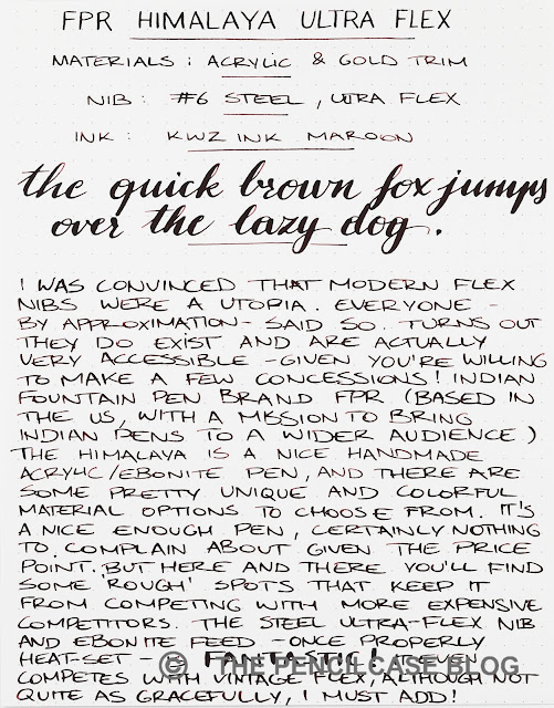
Line variation with this modified nib is impressive. VERY impressive even, down to the point where it can start to seriously compete with vintage flex -no small feat! You're looking at line variation from a western fine, to almost 2mm at the very maximum. The most impressive part is that it doesn't require nearly as much pressure as I expected. The cutouts effectively give this steel nibs a much more springy character than similar nibs without the modification, and it also seems a bit more forgiving in terms of snapback.

BUT, there is a catch! Affordable flex nib fountain pens like this one, have a reputation for being a bit finicky (think about Noodlers pens, for example), and may or may not require some work to get the most out of them. I think the nib and feed are heat-set out of the box, but I did it again a couple of times to optimize the position of the feed for the best possible ink flow. Heat-setting ebonite feeds is actually not that difficult (there are plenty of tutorials online, FPR also has instruction videos on their own website!), but it takes some time and willingness to tinker a little bit, which is not something every fountain pen user is looking for when buying a new pen.

Even when I was satisfied with the heat-set, ink flow could still sometimes behave temperamentally. Especially with heavy flex writing, it is prone to railroading and hard starting, and you can starve the ink flow when writing too fast. It's very picky about the ink you're using, the paper you're writing on, and even your writing angle... In short: there are a lot of factors that influence its behavior. 
REVIEW: FOUNTAIN PEN REVOLUTION HIMALAYA ULTRA FLEX FOUNTAIN PEN
Before buying, make sure that you're willing to tinker and experiment with this pen (that's part of the fun, even). This is certainly not the kind of 'plug-and-play' modern flex nib fountain pen that writes perfectly out of the box. In fact, one could argue that the perfect modern flex fountain pen doesn't even exist, there's always some kind of trade-off. In this case, you're giving up some ease-of-use and reliability in exchange for pretty excellent line variation.

With those sidenotes out of the way, would I still buy this pen? Yes. From what I've seen and tried so far, the FPR Himalaya Ultra Flex comes extremely close to the kind of line variation you'd expect from a vintage wet noodle flex nib. That's impressive for a 49$ pen (35$ for the pen + 14$ for the ultra flex nib), no matter how you look at it.

NOTE: This product was provided by Fountain Pen Revolution, so I could write this review. I was in no way influenced in the making of this review, the opinions shared in this review are completely my own. This post does not contain affiliate links.
REVIEW: FOUNTAIN PEN REVOLUTION HIMALAYA ULTRA FLEX FOUNTAIN PEN

Wednesday, July 26, 2017

AURORA 88 OTTANTOTTO ANNIVERSARIO FOUNTAIN PEN REVIEW

Aurora 88 Ottantotto Anniversario fountain pen reviewHuge anticipation preceded the new Aurora Ottantotto Anniversario limited edition, and with reason, as it was announced to come with a new flexible 14k nib. Who doesn't want some flex action these days?! 

But of course, anticipation means nothing when the product doesn't deliver. So the hype partially dissapeared when the first reviews hit, in which the flexible nib was written off as, well... not so flexible. Of course, the mixed reviews only made me want to try it out more (maybe my scientific background makes me a critical thinker, maybe I'm just stubborn... probably the latter.). So I caved when Dennis from La Couronne Du Comte showed me the brown version that was released last month. 
Aurora 88 Ottantotto Anniversario fountain pen review
But before we talk about whether or not the nib lives up to the expectations, let's just look at the pen itself, which is basically a regular Aurora Ottantotto. All eight versions of the Anniversario have one thing in common: they are all fairly simple variations on the regular Ottantotto model. Each version is made from a different color solid acrylic, or silver/gold (plated I suppose) metal. But neither of them has an exotic material, or special finish, something Aurora is usually known for. Each Anniversario is, in essence, a regular Ottantotto in a different color, nothing more than that. 
Aurora 88 Ottantotto Anniversario fountain pen review
But then of course that's what you pay for. The Anniversario's are priced similarly to the regular 88's, given that the flexible nib commands a 100-150$ premium over the normal nibs (which is in line with what they will cost in the future, when they will become readily availaible on more models). I would've expected something more exotic for an anniversary limited edition, but in the end Aurora really just wanted to focus on the new nibs, not the pen around it. So that's what they did, and the result is a good looking but maybe rather plain pen. 

And that's basically the first reason why the Anniversario hasn't received the attention it deserves. It's a plain pen, but it retails for more than most other Auroras, some with much more intricate and fascinating materials. The Nebulosa, for example, was released around the same time as the Anniversario pens, and it kind of overshadowed them in popularity. Frankly, I can't blame anyone for being more exited about the new Aurora Nebulosa, which shows off a beautiful and intricate purple acrylic.
Aurora 88 Ottantotto Anniversario fountain pen review
Whilst it may be rather plain, it's definitely not an ugly pen, far from it really. The Ottantotto, or 88, is a classy looking model. It's subtle all the way around, with minimal engraving on the center band, and a gently curved clip with a ball end. It won't turn heads, but then again a subdued design doesn't mean an ugly design.

The brown version has been my favourite from the moment I saw the lineup of colors that would be released, for the simple reason that I think the subtle brown color matches the overall subtlety of the pen. The choice of solid acrylic colors may have been a strange choice for an anniversary pen, but I think they pulled it off and made a classy looking pen.
Aurora 88 Ottantotto Anniversario fountain pen review
The Aurora Ottantotto is actually not too different from the Optima I reviewed a while ago (read here). It's basically the same pen, but with rounded top and bottom instead of the flattop design of the Optima. The center band is also different, but that's as far as the differences go. Because the Optima is basically an 88 with the top and bottom snipped off, there is a noticeable difference in size.
Aurora 88 Ottantotto Anniversario fountain pen review
L to R: Pelikan Souverän M800, Sailor Pro Gear, Aurora Optima, Aurora 88, Lamy Safari, Lamy 2000
The difference in length, added by the rounded finials, is actually quite significant. The 88 measures 13.7 cm closed (5.4"), and 13.1 cm open (5.16"), which is almost a centimeter longer than the Optima (The Optima actually being a rather small pen). Other than the difference in length, both pens actually have a similar diameter (perhaps even identical) of around 1.4 cm (0.55") at the widest point. The section is long and wide (avg. 1.1 cm/ 0.43"), and has a pleasant tapering shape which flares out near the nib. It's a fully acrylic pen, so the total weight of the pen is limited to around 21 grams without ink.

The section is identical to the one on the Optima, which I already found quite excellent. The added length of the 88 however, makes it even more comfortable in the hand. Everything combined, the 88 is an extremely comfortable pen to write with. I've never felt the need to post the cap, but it's actually quite comfortable and balanced (the cap sits rather deep on the pen body) with the cap posted.
Aurora 88 Ottantotto Anniversario fountain pen review
Let's take a look at the nib... Where do I start? Designwise, It's a simple but aesthetically pleasing nib that fits the design language of the rest of the pen. The imprint is based on a vintage design of earlier Aurora pens. I've read somewhere that imprints on flexible nibs are kept simple to reduce stress in the material, as repeated flexing can cause cracks in the nib.

As for how it performs, it's a perfectly fine Fine 14k nib (see what I did there?). It may be advertised as a flexible nib, but that doesn't mean it's not perfectly usable for everyday writing. Aurora nibs have a tendency to be slightly less polished, so you can expect a little more feedback but a lot more consistency. The ebonite feed provides a steady, slightly wet flow (I would assume it's tuned slightly wetter for optimal flex, although it seems to perform in line with the regular Aurora nibs I tried).
Aurora 88 Ottantotto Anniversario fountain pen review
The reason why this nib is actually very capable for everyday writing is because it's rather stiff (which may sound a little odd, given that it's a flexible nib). You shouldn't expect an incredibly soft, springy nib like on vintage flex, or even modern titanium or soft gold nibs. It's a snappy nib, very responsive, but it requires some pressure to flex.
Aurora 88 Ottantotto Anniversario fountain pen review
I'm not an expert on flex writing, but I did get some decent results out of it. The line variation is decent, but I'd call it a good semi-flex nib, calling it full flex is maybe slightly exaggerated. You'll be dissapointed if you're expecting wet noodle vintage flex like you see on Instagram (Thanks Azizah!), but you can still get very decent line variation from it nevertheles.

In my simple, not very accurate, test I could get line variation equivalent of EF to BB. Comparing to some other (semi-) flexible nibs I had on hand, the Aurora nib is definitely on the finer side, and I found it comparable in performance and flexibility to an EF titanium bock nib (although the titanium nibs feel softer and less responsive). Flex writing from something like the Wahl-Eversharp may look more impressive, but the fine nib is super wet and the line width appears much wider to begin with, so the actual variation is not necessarily better.
I've noticed a couple of people that had problems with the feed not being able to keep up with flexing, resulting in a lot of railroading. I've had it happen too, but I have a strong suspicion that it's mainly due to the choice of ink. Out of three different inks I tried (Aurora Black, Robert Oster Lemongrass, and Sailor Souten), only the Robert Oster ink (presumably the least lubricated and driest of all three) caused railroading issues. With the other two inks I could actually push it quite far without issues, even with fast writing.

There are a lot of pros and contras to this nib, but in the end I actually quite like it. It's perhaps a bit stiff, but because of that it's also perfectly usable for normal writing without having to keep a featherlight touch.
Aurora 88 Ottantotto Anniversario fountain pen review
Each color in the Anniversario range is a limited edition of just 188 pieces. Because of these limited runs, they are bound to sell out fast. In fact, some of the colors are already becoming scarce, so acting fast is key. To buy or not to buy? That depends, it's a tough choice if you're just interested in a flexible nib. It does give line variation, but it's nothing like a good vintage flex, and the same effect can be had with a 50$ titanium nib. If you were already looking to buy an Aurora anyway, and you're not too keen on the more elaborate material options, the Anniversario offers a subtle yet playful option that should be considered.

In the end I think Aurora did a great job on the complete package. I'm glad I own one, but I personally wouldn't buy it just for the nib. As I mentioned earlier, all Anniversario pens retail for 620 EUR / 650 USD. If you're just looking for a flexible nib, that's too steep. But as a complete package, the 150$ premium over the regular Ottantotto is actually quite fair.
Note: La Couronne Du Comte is a sponsor of this blog. I received a discount on the purchase of this product.  I was in no way influenced in the making of this review, the opinions shared in this review are completely my own! This post does not contain affilate links.
Aurora 88 Ottantotto Anniversario fountain pen review