Showing posts with label Montblanc. Show all posts

Wednesday, October 7, 2020

REVIEW: MONTBLANC MEISTERSTUCK 149 CALLIGRAPHY FLEX NIB FOUNTAIN PEN

REVIEW: MONTBLANC MEISTERSTUCK 149 CALLIGRAPHY FLEX NIB FOUNTAIN PEN
For probably the first time in the history of this blog, I'll try to keep it short today (keyword: "try"). Why? Well, the pen we'll take a look at today is really nothing different from the Montblanc 149 I already reviewed a few years ago (HERE)... except for the nib! This is Montblanc's Calligraphy special edition of their iconic flagship fountain pen, which comes with a specially developed flexible nib!

The Calligraphy Meisterstück with flexible nib is a special edition in a new series of "Calligraphy" pens with unique nibs (a new version with different specialty nib will supposedly still launch this year, effectively replacing the flexible nib variant). And I'm a bit late to the game with this review. My particular pen (that I purchased from site sponsor La Couronne Du Comte - Check out their new website, BTW!) took an unfortunate - and long - detour via Hamburg (Montblanc's HQ) because the nib slit was cut off-center. I typically don't complain about that sort of thing as long as it's not too bad or doesn't hamper performance. But on a 900€ pen, I feel like a little nitpicking is permitted. Oh, and it did actually make the nib noticeably scratchier, so I guess having it out of my hands for 6+ months to be replaced (perhaps it took the scenic route?) was the right - and necessary - judgment call to make. But it did, of course, delay this review to the point where this pen is nearing the end of its availability (sorry for that!).
REVIEW: MONTBLANC MEISTERSTUCK 149 CALLIGRAPHY FLEX NIB FOUNTAIN PEN
Anyway, as I said, this is just a plain, stock Meisterstück 149. The box has a custom imprint for the Calligraphy release on the outer sleeve, but inside is just the normal large clamshell box for a regular 149. A bottle of Montblanc's calligraphy ink isn't included, either. Even though Montblanc released two special edition inks along with the Calligraphy pens. A spectacular special edition 146 with gold leaf decoration was also available, which did set itself apart in terms of aesthetics. Combine the words 'gold leaf' and 'Montblanc' in a single sentence though, and the price gets steep... So I settled for the 149, which I imagine has the upper hand for flex writing anyway, since the larger #8-sized (in Montblanc's numbering #9) nib is already soft on its own. 
REVIEW: MONTBLANC MEISTERSTUCK 149 CALLIGRAPHY FLEX NIB FOUNTAIN PEN
Let's get straight to the business end: the flex nibs look fantastic. I think the monotone nib with simple but elegant figure-eight swirl is one of the best Montblanc nib designs I've seen in a while (maybe close second to the Heritage Rouge Et Noir's Snakehead design!). Montblanc typically excels in nib designs though, so I guess it's hardly a surprise that this too is an aesthetically pleasing release. 
REVIEW: MONTBLANC MEISTERSTUCK 149 CALLIGRAPHY FLEX NIB FOUNTAIN PEN
Functionally, I had high expectations for this pen. Montblanc typically goes for reliable performance with their nibs, so I was curious to see how that'd translate into their first venture in a modern flex nib. The answer is: good. Maybe even great. But as you'd expect, not without its limitations.

The nib tipping is ground noticeably finer than their typical nibs. It's supposedly an EF, but with a line as fine as 0.2 -0.3 mm without pressure, I'd say it's more like an EEF in Montblanc's standards. The fact that it's so fine is also why even the slightest off-center slit is an issue, the right tine was extremely thin on my faulty pen. Anyway, on the replacement pen I received, the nib is actually very pleasant to use, even for normal writing. It's surprisingly smooth for such an extremely fine nib, although of course, you should still expect a bit more feedback than with Montblanc's regular nibs. If you have a very light hand, it could serve for normal writing. 
REVIEW: MONTBLANC MEISTERSTUCK 149 CALLIGRAPHY FLEX NIB FOUNTAIN PEN
With the slightest pressure, the nib immediately starts opening up and you get a slightly wider EF to F line width, with noticeably heavier ink flow. The Calligraphy flex nib is positively soft when you start pushing it more. It takes a small but balanced amount of pressure, enough to give a controlled writing experience, but not too much as to cause fatigue. It's quite a responsive nib with good snapback, meaning that the tines close back up fairly quickly when varying pressure while writing - it doesn't feel mushy.

In terms of line variation, the internet says 0.3 mm EF (EEF) to 1.6 mm (BB), but I find that optimistic. I could consistently go up to 1.0-1.3 mm lines without feeling like I'm pushing the nib too far. In the grand scheme of things, this qualifies the Calligraphy Flex as a 'semi-flex' nib, not quite vintage full-flex. That said, the nib definitely benefits from the extremely narrow tipping. It automatically gives more impressive line variation even though the maximum line width isn't necessarily outlandish.
REVIEW: MONTBLANC MEISTERSTUCK 149 CALLIGRAPHY FLEX NIB FOUNTAIN PEN
The Calligraphy Flex nib seems to be mated to the standard, plastic 149-style feed. I don't know if it's adjusted to suit this nib's ink demand better, but I don't think so (it's relatively wet but not necessarily gushier than my 149 with BB nib). The plastic feed does a fair job - more than fair, actually - but it's definitely the weak link of this pen. Performance is a bit hit or miss. Sometimes it keeps up great, but often it buckles under rapid and continuous flexing, especially when you push the line variation to the max. It helps to take your time when writing, which holds true for any flex pen, really.
REVIEW: MONTBLANC MEISTERSTUCK 149 CALLIGRAPHY FLEX NIB FOUNTAIN PEN
I performed my writing "stress test" (see above) with Pelikan Edelstein Onyx, an ink I use for testing all flex nibs for a fair comparison. Onyx is a fairly well-behaved, wet ink, but you can see that at the end of the test it couldn't keep up with the relatively fast pace and heavy flexing. For a worst-case scenario like this, the feed's performance isn't half bad. Yet I can't help but think that an ebonite feed (like the 149 used to have!) could've helped in providing a richer, more consistent ink flow that's more able to keep up with a demanding nib like this.

Overall, the Calligraphy Flex performs very similarly to the Pilot #15 FA nib that I tried on the Custom 743 (review HERE), despite being two very different pens. Both have nibs that are very responsive and capable of providing excellent line variation. The Montblanc Calligraphy nib has maybe a slight edge over the FA nib because the line thickness starts out a bit finer. They are, however, also both limited by the performance of their feeds. 
REVIEW: MONTBLANC MEISTERSTUCK 149 CALLIGRAPHY FLEX NIB FOUNTAIN PEN
Montblanc being Montblanc, The Meisterstück 149 Calligraphy Flex is not a cheap gateway into modern flex pens. You have to be certain that flex nibs are the thing for you - and you specifically want one with a white star on the cap! - before putting 905€ (roughly 875$ without VAT, from La Couronne Du Comte) on the table for one. I think that speaks for itself. 905€ translates into a 100€ premium over the standard 149, a serious chunk of change for just a different nib! 

I do like it though. It's a pretty pen (if you like the classic Montblanc look) with a beautiful nib design IMHO. The extra-fine nib grind and very decent flexibility make for one of the more expressive line variations I've come across in modern flex nibs, and it's a pleasant writer overall. I've yet to find a modern flexible fountain pen without a single compromise, so even with the middling performance of the feed, the Montblanc's 149 Calligraphy Flex manages to rank quite highly in my search for the perfect modern flex!

PS: I failed to keep this post short, didn't I?
REVIEW: MONTBLANC MEISTERSTUCK 149 CALLIGRAPHY FLEX NIB FOUNTAIN PEN
Note: I purchased this product at a discount from site sponsor La Couronne Du Comte, so I could write this review. I was in no way influenced in the making of this review, the opinions shared in this review are completely my own! This post does not contain affiliate links.
REVIEW: MONTBLANC MEISTERSTUCK 149 CALLIGRAPHY FLEX NIB FOUNTAIN PEN

Friday, September 27, 2019

REVIEW: MONTBLANC WRITERS EDITION RUDYARD KIPLING FOUNTAIN PEN

Review: Montblanc Writers Edition Rudyard Kipling fountain pen
Exciting stuff! This is my first experience with one of Montblanc's revered Writers Editions, and interestingly this year's release is one I never thought I'd actually like: The Montblanc Writers Edition Homage to Rudyard Kipling is an oddball pen, and it's certainly quite 'out there' - which is usually not my cup of tea!
Review: Montblanc Writers Edition Rudyard Kipling fountain pen
All Writers Editions come appropriately packaged in a beautiful book-shaped box.
First of all, thanks to Appelboom for letting me loaning me this pen. As I said it's not one I'd usually be inclined to buy myself, but It was nice to spend some time with it and appreciate the insane level of detail Montblanc puts into these pens!

The Kipling is an homage to... y'know: Rudyard Kipling, author of Jungle Book. That's really the only reason his name rang a bell with me, to be honest. I just so happened to be a huge fan of Disney's animated movie adaptation of Jungle Book growing up, watching the VHS tapes (remember those?) at my grandparents' house. This entire Writers Edition of pens, notebooks, pen cases,.... is inspired by Kipling's Jungle Book. So maybe that's where my out-of-character fascination for this pen comes from?
Review: Montblanc Writers Edition Rudyard Kipling fountain pen
As I said, the Kipling is quite out there. Writer's editions in general tend to be quite extravagant designs, so that's something you can expect. Especially in the last few years MB has been experimenting with very prominent decorative elements in these pens (like last year's Homer with the horse head design). That's usually enough for me to back away, as I definitely lean more towards more conservative or minimal designs. The Kipling is a very top-heavy design that tapers down strongly from the top of the cap towards the back of the pen. It's a 'stout' and bulky shape, much like last year's Homer Writer's Edition.
Review: Montblanc Writers Edition Rudyard Kipling fountain pen
The Kipling feels oddly shaped, in a large part that's due to the brushed metal cap and barrel finials that sort of flare out. The cap finial especially, looks absolutely massive with its' huge white star - so you definitely don't mistake this for another brand - on top. The metal center band on the cap has the word Montblanc engraved on it in a very modern all-caps sans serif font.
Review: Montblanc Writers Edition Rudyard Kipling fountain pen
'If you can keep your head when all about you are losing theirs'...
Review: Montblanc Writers Edition Rudyard Kipling fountain pen
...'You'll be a man, my son'
The cap and barrel finials sport the first and last line of Kipling's poem 'IF'. It's a nice reference to the author's work, but I find it interesting that they chose to put it on there in an ever so slightly different font from the one on the center band. It's almost the same but not quite, which -to me- makes it feel mismatched. It's a small detail, but I don't really like how it turned out. I may have preferred a cursive font better for this. Maybe I'm just being picky, I don't know...
Review: Montblanc Writers Edition Rudyard Kipling fountain pen
Cap, barrel and section are made of resin, in a rather interesting green-grey shade that reminds me of an old school safari outfit. The barrel and cap are both matte, while the section received a glossy finish. I really quite like the muted color palette of this pen. It offsets the rather bold design of the pen nicely,  and I wish they had made the R. Kipling Jungle ink to match it - alas they did not. Like all Writers Editions, Rudyard Kipling's signature is engraved on the cap.
Review: Montblanc Writers Edition Rudyard Kipling fountain pen
Of course I've been avoiding the most important design aspect of the Rudyard: the big freaking wolf's head on the clip! It's what really makes (or breaks) the design of this pen. On one side, I think it's overkill. I mean, It's MASSIVE! On the other hand, it really defines the pen in a daring way (this is definitely NOT Montblanc playing it safe!) and it actually looks quite cool. Yeah I'm honestly surprised I like it as much as I do, given I'd usually steer clear from pens that scream for attention.
Review: Montblanc Writers Edition Rudyard Kipling fountain pen
L to R: Pelikan M805, Visconti Homo Sapiens Oversize, MB 149, MB R. Kipling, Lamy Safari, Lamy 2000
At 14,6 cm capped, the Kipling is a rather large pen and the imposing shape further accentuates that size. It uncaps to a fairly average but comfortable length of 12,8 cm, with a section diameter around 11 mm. That chunk of wolf-shaped metal on the clip obviously adds some heft in the mix, coming in at a total weight of 57 grams. The shape of the barrel finial doesn't allow for the cap to be posted.
Review: Montblanc Writers Edition Rudyard Kipling fountain pen
Comfort is a bit of a mixed bag. The section is not super long, so you'll naturally rest your grip on the threads and on the step behind it, which is rounded but noticeable. Despite a lot of metal parts, it's actually surprisingly balanced, but it is of course a rather heavy pen (even without the cap!). Clearly, function was not the number one priority on this pen, but it's not terrible either.
Review: Montblanc Writers Edition Rudyard Kipling fountain pen
A classy depiction of a globe adorns the nib face of the R. Kipling
The nib is fantastic. At this point I can't tell head from tail anymore on Montblanc's nib sizes. I've had mediums write like fines and fines write like mediums. This Fine nib too, writes more like a medium to me. But regardless, it's an excellent writer. It requires zero effort and just glides smoothly over the page with just enough feedback so you still notice that you're writing. Ink flow is dead-consistent and juicy, and the nib never hesitates or skips a beat. It's such a well-rounded and balanced writing experience. Hard to explain really, but it just feels right.
Review: Montblanc Writers Edition Rudyard Kipling fountain pen
Would I recommend this pen? Well it's a Montblanc, so you can already expect that it's not for everyone's budget. With the Writer's Editions, Montblanc generally targets an even more premium segment, mainly focused on collectors.

If I were to start a collection of animal-themed pens, the Montblanc Writers Edition R. Kipling would be high on my list. It's exceptionally well made, and the design - odd as it is - leaves an impression. It writes beautifully, too, so I can't really fault it. But do you really buy this pen to write with? Looking at it from a usability point of view, this 1000$ hunk of pen would probably not be my first choice, but take this out during a meeting and you'd most definitely turn some heads. The R. Kipling is limited to 9800 pieces and retails for 955€, or 1115$ (920$ without tax, from Appelboom)
Appelboom pen store banner
This product was provided on loan by Appelboom, so I could write this review. I was in no way influenced in the making of this review, the opinions shared in this review are completely my own! This post contains affiliate links.
Review: Montblanc Writers Edition Rudyard Kipling fountain pen

Monday, July 8, 2019

MONTBLANC'S INK CONUNDRUM?

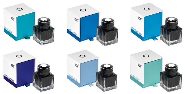
Montblanc The Blue Palette inks
Montblanc recently released yet another new range of inks: Six shades of blue (although I wouldn't describe the Turquoise as blue, but that's besides the point!), aptly named: 'the Blue Palette'. I thought their range of writing fluids was hard enough to comprehend as it was, with seemingly a million different types of ink, all priced differently. Yet apparently the people over at Montblanc HQ in Hamburg were willing to go one step further. 

Montblanc definitely noticed the increasing attention to inks, because they seem to be more invested in bringing out new inks each year. At the same time, they also changed their ink pricing structure in recent years. It started out with a general price hike across the board -Which is fair enough, that's what all brands do every year or so- but I'm pretty certain somewhere along the road they somehow lost track of what they were doing.

When we break down Montblanc's ink catalog (I'll use the EU pricing from MB's own website for this post to keep it as simple as possible), the standard range of inks (the shoe-shaped bottles) slowly went up in price in the past few years. The standard range recently received an aesthetic overhaul, so they now come with a white box and label similar to how the 'Colour of the Year' (Golden Yellow, Lucky Orange,...) are packaged. They still come in the shoe-shaped 60ml bottles, but the new look also comes with a new price of 20.4€, about 10% more than before the facelift. They renamed some colors and added a few new ones (like Manganese Orange or Pop Pink). Interestingly, a few 'old' bottles are still shown on MB's website, also at the new price. Although I assume those will all eventually be replaced and make way once retailers get through their current stock. For completeness' sake, there's also the two standard range permanent inks (60ml bottles) that go for 26.5€. Which seems like a reasonable upcharge for a permanent ink.

On the other hand, the special editions (like the Writers editions, Patron of Arts, Great Characters and Ink of the Year) have seen a much more drastic price increase in the past years. I seem to recall they once cost roughly the same as the standard range (let's say they used to cost about 20€), but for smaller 30ml bottles. Nowadays, the special edition inks come in larger 50ml bottles at almost double the cost. Ok, you get more for a higher price. That's not too unfair, but in the end the price/ml still went up.

Next up we have the 'Elixir' range. They aren't special editions, but I wouldn't exactly call them standard either. You don't see these very often, probably because they cost 60€ per bottle! The scented ones go for 70€. The price doesn't come from being a limited production, but rather this is Montblanc's premium range and they justify the cost because they are based on natural dyes. In itself, the idea of extracting dyes from nature instead of using synthetic derivatives is pretty cool. But at that price... yeah, no thanks Montblanc. 
Montblanc The Blue Palette inks
© Photos property of Montblanc
All of the above probably still made sense to you, but the new Blue Palette range will undoubtedly throw you off. It looks the same as the new standard range or Ink of the Year packaging, but they use the 30ml bottles from the old special edition inks. And here's the interesting part: from what I can tell they are part of the standard collection, yet at 25.4€ they cost 25% more for a much smaller bottle. I received a few samples of this new range in Appelboom's latest Inxperiment and they are nice colors for sure, but their premium price certainly struck me as odd when I first saw them.
Montblanc Ink pricing table
In case I hadn't bored you to death with numbers yet, I went ahead and put all this information in a table where I calculated the price/ml for each ink. Of course, the price/ml of the Blue Palette inks is high, very high. It's almost three times as much as the standard range, and easily surpasses the special edition inks, slowly inching closer to the *overpriced* Elixir inks! 

Don't get me wrong, I love Montblanc inks, yet I couldn't help but wonder why a brand would want to make things so complicated? Montblanc being Montblanc, they probably have a perfectly clever explanation for this pricing maze. My guess it's a gentle nudge towards another price change. I wouldn't be surprised if the Blue Palette is actually MB dipping their toes into the waters to test if lower priced and smaller special edition bottles would appeal more to a wider audience - similar to the tiny Iroshizuku or Sailor bottles. 

Personally, I used to buy most of their special releases but stopped doing so after they changed to the more expensive 50ml bottles. Simply because I didn't feel like dropping 35 euros for every single new release. I'm pretty sure I'd be more tempted to buy special editions at 25 euros per bottle. Of course the absolute price/ml is quite outrageous, but relatively speaking the investment is more bearable and most people probably don't need large 50ml bottles of every single color anyway. 

I'd love to hear other people's thoughts on this! Would you rather pay less for a much smaller bottle, or get the best price-per-ml deal?

Appelboom is a sponsor of this blog. I received this product free of charge. I was in no way influenced in the making of this article, the opinions shared in this review are completely my own! This article does not contain affiliate links. Use of photo(s) property of Montblanc falls under fair dealing.

Tuesday, April 3, 2018

MONTBLANC MEISTERSTUCK 149 FOUNTAIN PEN REVIEW

Montblanc Meisterstuck 149 fountain pen review
Something strange happened: I bought a Montblanc! I'm generally not THAT big on MB pens, but still this felt like quite a milestone in my collection. You see, the Montblanc Meisterstück 149 is kind of an icon. It's a must-have for every real collector... or at least that's what they tell you!

To some extent, I definitely agree. The 149 is the ultimate depiction of a fountain pen. Ask anyone to draw a fountain pen from memory, and you'll get something like this. Hell, there's at least a dozen brands that decided to eh, well... 'mimic' the design of the Montblanc Meisterstück fountain pen, I guess that says plenty.
Montblanc Meisterstuck 149 fountain pen review
Montblanc's Meisterstuck line (including the classic 149) achieved its luxury status and name recognition all across the globe. This is largely due to their excellent marketing that has established their 'high-end' status as a brand. But it's also just because of the great aesthetics of their pens. You see, the Montblanc Meisterstück is kind of a crowd pleaser. It's a simple, black resin pen, gold trims (also available with platinum and rose gold trim, but the yellow gold started it all), and well...not much more.
Montblanc Meisterstuck 149 fountain pen review
On the outside there's of course the white star logo, and some decorative bands, including the triple band around the base of the cap. But other than that, it's a clean and clutter-free design. The simple cigar shape is easy on the eyes. Even for a large pen like this, nothing about the design feels extravagant or out of place. It's timeless and elegant, chic but not gaudy.
Montblanc Meisterstuck 149 fountain pen review
It's this delicate balance that makes it so attractive for a wide audience, especially for business people that want a classy pen. But of course that white star has also become a symbol for luxury and wealth, so everyone will see that you just spent a ton on a fountain pen. Depending on the situation, I guess that can be both good and bad. In my case, I think this 'status' associated with Montblanc detracts a bit from the overall experience. It's perhaps a bit too much of a class symbol instead of just a nice pen. 

But to get back to the point, the Meisterstück is a classy yet simple pen. So much so, that it may actually seem a bit boring, I guess? With all the colorful and over the top flashy pens that are on the market these days, I'm sure that 99% of us pen addicts would much rather like to see Montblanc use different and more exciting materials. If you ever saw Sarj's (aka. the one man pen show) Custom-made 149 in Omas Arco brown celluloid... oh boy that's something else!
Montblanc Meisterstuck 149 fountain pen review
L to R: Pilot 823, Pelikan M800, Pelikan M1000, Visconti Homo Sapiens OS, Montblanc 149, Lamy Safari, Lamy 2000
However, one thing is certain: when it comes to size, the 149 is far from boring. This is a truly oversized pen, measuring in at 14.7 cm (5.78") capped, and 13.2 cm (5.2") uncapped. With a width of around 1.6 cm (0.63") at the widest point, and 1.3 cm (0.51") at the section, it's a pretty fat pen.

Because of this girth, the 149 will be a bit too large for a lot of people. In terms of usability, I feel like the 146 does a better job at being a comfortable and versatile writer, with a more reasonable diameter while remaining a comfortable length (The 146 is actually not much shorter than the 149!).
Montblanc Meisterstuck 149 fountain pen review
The 149 has gone through countless iterations throughout the years. The early versions were coveted for their softer nibs and ebonite feeds, and some versions also had a metal piston mechanism. Later versions came with plastic mechanisms, but the current models are again equipped with a metal mechanism. In terms of durability that's a huge plus, but the weight of the pen also benefits from this. The 149 weighs 32 grams in total, and the barrel is slightly more substantial because of the mechanism. It doesn't throw off the balance, but it's just enough to let you know you're writing with a large pen. Same as with the Pelikan M800 and M1000, that metal mechanism makes the 149 feel more premium and durable, even though it's still a resin pen.
Montblanc Meisterstuck 149 fountain pen review
What it's all about for me is the nib. Dennis (from La Couronne Du Comte) showed me a couple different 149's with different nib sizes, but it was quite an easy choice. I obviously went for the biggest nib he had in stock, which is this fantastic double broad! 

The #9 (which is MB language for a #8 size nib) two-tone 18k gold nib looks and writes fantastic. It may be my favourite part about the entire pen. The design of the nib face is classy and somewhat vintage-esque (The imprint design has remained largely the same throughout the years), and it's partially rhodium-plated to accentuate the design.

If I'm being really picky, perhaps the plating could've been done a bit more precise. The rhodium layer doesn't always perfectly align with the stamped design. But that's a minor detail, and you really have to look at it with a magnifying glass to see it.
Montblanc Meisterstuck 149 fountain pen review
Going for the BB nib was an obvious choice. I had tried a 149 with BB nib from a friend (Hey Marco! Check him out on Instagram!) and was immediately sold on the lush, wide and stub line characteristic this stock nib provides. The way these nibs are ground is quite interesting. The shape of the tipping material is almost identical to what you'd expect from a stub, instead of the usual round shape. Line variation is perhaps not as pronounced as with a 'real' stub. But on the other hand it is smoother and a bit more forgiving about the writing angle. The ink flow is rather heavy, which is good for a wide nib like this. Because of the size of the nib, it has a tiny bit of springiness, just to give the writing experience a 'cushioned' feel. It's definitely not a flexible nib by any means though. 
Montblanc Meisterstuck 149 fountain pen review
Overall, this is by far the best Montblanc nib I've used so far. Others were a bit inconsistent (a medium that wrote like a fine, and vice versa), but this one was exactly the way I expected it to be. The stub-like character makes it a bit more special and fun to write with than a normal round nib, which is a welcome extra on a pen in this price range. 
Montblanc Meisterstuck 149 fountain pen review
The 149 is a great pen. It's ultra-classy and stylish, and the writing experience has been nothing short of amazing. It writes like an 800 euro pen should, and then some. The fact that they still offer 'novelty' nib sizes, including a range of obliques and double broads, is also quite interesting for those that like something a little more exciting than fine or medium.

Yet I'm still having mixed feelings about the 149. I'm glad that I now own a Montblanc, but at the same time I don't feel like I need more of them. There are so many wonderful brands out there with more exciting designs and less jaw-dropping prices. It's a great pen, but it's not a pen that'll speak to everyone's imagination.

The Montblanc Meisterstück 149 retails for 775 EUR (yellow or rose gold trim) or 805 EUR for the platinum trim version (MSRP of 935-985 USD in the US), which is undoubtedly a lot of money. A lot of 149's are sold on the second hand market for a fraction of the cost. In this case, buying used is a great option if you want to make it a bit less painful for your wallet, but you have to know what to look for (and you should always be wary of fake Montblanc products that are unfortunately very common!)
Note: La Couronne Du Comte is a sponsor of this blog. This product was bought from LCDC with my own funds, and I was in no way solicited or influenced in the making of this post. This post does not contain affilate links.
Montblanc Meisterstuck 149 fountain pen review
I guess I'll never learn to NOT use light inks for my written reviews...

Friday, September 16, 2016

MONTBLANC HERITAGE ROUGE&NOIR FOUNTAIN PEN REVIEW

Montblanc Heritage Rouge et Noir fountain pen review
Montblanc's Rouge et Noir pens, part of the Heritage collection, take us back in time to one of their first pens to ever hit the market,110 years ago in 1906! I'll admit I'm usually not much of a Montblanc person, but when they come up with something interesting, I just have to take a closer look... and the Rouge et Noir collection classifies as 'interesting' without a doubt!

In 1906, pens were still mostly manufactured from ebonite (hard rubber). The current re-issue is divided in three 'tiers', two special editions made from precious resin, and a limited edition in hard rubber. The two pens I received on loan from Penworld to review are the 'cheaper' precious resin models, although knowing Montblanc, you'll understand that 'cheap' isn't exactly the term I should use.
Montblanc Heritage Rouge et Noir fountain pen review
They are quite something though, regardless of the price. I most likely won't spend this kind of money on them, but it's a unique, eye-catching pen for sure. 

Both the black and red version of the Rouge et Noir are completely identical when it comes to the general design, but the small details are what sets them apart. The skinny, not-all-too-long design is typical for vintage pens. The colorways are also based on vintage pens, the black resin version has a coral red cap finial with a slightly off-white Montblanc star emblem embedded in it. The Coral red version is entirely made out of coral red 'precious' resin. Both colorways have a very vintage look and feel to them, both because of the overall design, and the materials used. The coral red resin plays a pretty big role in the appearance of the pen, even on the black version. 
Montblanc Heritage Rouge et Noir fountain pen review
The most prominent design feature is of course the snake clip wrapped around the top of the cap. It's a big part of the marketing around this pen, and with reason because it's the first thing you notice about the Rouge et Noir. It's quite a stand-out feature, but definitey in a good way. The metal clip has a weathered appearance (similar to aged silver, yet it's not a silver clip) which is achieved through specialised galvanising methods (according to the MB website).

The prize difference between the two versions shows in the little details, such as the clip and the nib. The changes are small (The coral has small green (gem)stones as eyes in the snake clip, two-tone  nib design, white-filled montblanc logo on the cap), but they do succeed in giving the pen a more luxurious and 'finished' appearance, making the black version look somewhat like a half-finished afterthought. It's  a considerable price increase, but if I'd buy one, I'd go for the coral red model without a doubt. 
Montblanc Heritage Rouge et Noir fountain pen review
If you're looking for a larger pen, the Rouge et Noir will not be for you. In fact, most complaints I've seen so far are about the rather dissapointing size. As I mentioned in the beginning, vintage pens that are usually not as large as modern ones. In that regard, Montblanc did a good job recreating the vintage design. 
Montblanc Heritage Rouge et Noir fountain pen review
Not as much the length, but the narrow profile is something not everyone will appreciate.
For todays standards however, a lot of people will be dissapointed to find a pen that measures in at just 13.7cm closed, and 12.5cm open, with a profile of 1cm width at the cap, and just 0.85cm around the section. The length is not the real issue though, it's actually fairly average, and more than decent enough to fit most hands. But the skinny profile, especially at the section where it's not much thicker than a woodcased pencil, might put some people off. Being a special edition pen, I think most people would expect something a bit larger. I'm more used to larger pens myself, and I have to say it took quite a bit of getting used to something this slender. It's definitely usable, but it felt like my grip was a bit more cramped than it would with a bigger pen. 
Montblanc Heritage Rouge et Noir fountain pen review
To my surprise, both versions are actually piston fillers. Being so slender and relatively small, I can imagine the ink capacity won't be much to write home about, and there's no ink window to keep track of how much ink is left. So in this case I think I would've actually preferred a C/C filling system for practical reasons. It's also worth noting that the barrels are actually metal, with what I presume is a layer of laquer over it to match the color of the rest of the pen (however you can see a slight color difference between barrel and cap on the Coral version). This gives the pen a noticeable amount of heft when you pick it up. It's by no means heavy, but it definitely feels solid in the hand, despite the smaller size. 
Montblanc Heritage Rouge et Noir fountain pen review
To make up for the size, Montblanc once again delivers with a beautiful nib design. With the grand theme obviously being the snake, the 14k gold nib features a minimalistic depiction of a snake head. Especially on the Coral red version, with the two-tone nib, this design stands out. It's easily one of the most beautiful nibs I've come across. 
Montblanc Heritage Rouge et Noir fountain pen review
Apart from the nib, another feature that shows upon uncapping the pen, is the metal grip section. It has a brushed finish that actually doesn't feel slippery while writing, and the threads are at the front of the section, instead of at the transition from section to barrel, which makes it a rather comfortable pen to hold, despite the lack of girth.

The small nib is the same design as found on the previous Heritage fountain pen, the 1912 safety filler. The 1912 was praised for being a bit soft and bouncy, I didn't really experience that with this nib, but it's an excellent nib nevertheless. In fact, of the three Montblanc pens I've reviewed so far (Montblanc 146, Montblanc M and this one), this is easily the best one. Both the medium and fine nib I tried were responsive but smooth, and had a rich, consistent flow. One thing I've noticed with all the Montblancs I've used, is that their nib sizes vary quite wildly. For example: the fine on the Coral R&N ran quite noticeably wider than the medium on both the 146 and the black R&N, whilst the fine nib on the Montblanc M wrote almost identical compared to said medium nibs. Consistency in line width doesn't seem to be their strong suit (in my experience, that is), but other than that I can't say anything bad about the way their nibs perform. 
Montblanc Heritage Rouge et Noir fountain pen review
I think it's fair to say that the Montblanc Rouge et Noir is quite a mixed bag. On one end I really like it, and for a brief moment I actually considered buying one (but then my wallet talked me over on that). The design is refreshing, something that stands out from the current selection of modern pens, and with a strong nod to vintage design.
Montblanc Heritage Rouge et Noir fountain pen review
But on the other hand, it's quite expensive, you have to pay a premium to get all the details (honestly if you're considering buying one, immediately move up to the coral version, the black one is so much less exciting if you compare them side by side). And the size will be a big no-go for a lot of people (I actually don't know if the Ebonite limited edition is larger, but even if it is, you'd have to be willing to pay about 1000 Euros more for it).

The black model retails for 630 EUR, while the Coral comes in at 760 EUR. That's by no means cheap, but it's already a bit less compared to the Heritage 1912, and for a Montblanc special edition it's probably as low as it's going to get. Is it worth it? If you can get over the skinny profile, I think it could be.
Note: Penworld Supports this blog. I received these pens on loan, so I could write this review. I was in no way influenced in the making of this review, the opinions shared here are completely my own! This review does not contain any affilate links.
Montblanc Heritage Rouge et Noir fountain pen review