Showing posts with label flex fountain pen. Show all posts

Wednesday, October 7, 2020

REVIEW: MONTBLANC MEISTERSTUCK 149 CALLIGRAPHY FLEX NIB FOUNTAIN PEN

REVIEW: MONTBLANC MEISTERSTUCK 149 CALLIGRAPHY FLEX NIB FOUNTAIN PEN
For probably the first time in the history of this blog, I'll try to keep it short today (keyword: "try"). Why? Well, the pen we'll take a look at today is really nothing different from the Montblanc 149 I already reviewed a few years ago (HERE)... except for the nib! This is Montblanc's Calligraphy special edition of their iconic flagship fountain pen, which comes with a specially developed flexible nib!

The Calligraphy Meisterstück with flexible nib is a special edition in a new series of "Calligraphy" pens with unique nibs (a new version with different specialty nib will supposedly still launch this year, effectively replacing the flexible nib variant). And I'm a bit late to the game with this review. My particular pen (that I purchased from site sponsor La Couronne Du Comte - Check out their new website, BTW!) took an unfortunate - and long - detour via Hamburg (Montblanc's HQ) because the nib slit was cut off-center. I typically don't complain about that sort of thing as long as it's not too bad or doesn't hamper performance. But on a 900€ pen, I feel like a little nitpicking is permitted. Oh, and it did actually make the nib noticeably scratchier, so I guess having it out of my hands for 6+ months to be replaced (perhaps it took the scenic route?) was the right - and necessary - judgment call to make. But it did, of course, delay this review to the point where this pen is nearing the end of its availability (sorry for that!).
REVIEW: MONTBLANC MEISTERSTUCK 149 CALLIGRAPHY FLEX NIB FOUNTAIN PEN
Anyway, as I said, this is just a plain, stock Meisterstück 149. The box has a custom imprint for the Calligraphy release on the outer sleeve, but inside is just the normal large clamshell box for a regular 149. A bottle of Montblanc's calligraphy ink isn't included, either. Even though Montblanc released two special edition inks along with the Calligraphy pens. A spectacular special edition 146 with gold leaf decoration was also available, which did set itself apart in terms of aesthetics. Combine the words 'gold leaf' and 'Montblanc' in a single sentence though, and the price gets steep... So I settled for the 149, which I imagine has the upper hand for flex writing anyway, since the larger #8-sized (in Montblanc's numbering #9) nib is already soft on its own. 
REVIEW: MONTBLANC MEISTERSTUCK 149 CALLIGRAPHY FLEX NIB FOUNTAIN PEN
Let's get straight to the business end: the flex nibs look fantastic. I think the monotone nib with simple but elegant figure-eight swirl is one of the best Montblanc nib designs I've seen in a while (maybe close second to the Heritage Rouge Et Noir's Snakehead design!). Montblanc typically excels in nib designs though, so I guess it's hardly a surprise that this too is an aesthetically pleasing release. 
REVIEW: MONTBLANC MEISTERSTUCK 149 CALLIGRAPHY FLEX NIB FOUNTAIN PEN
Functionally, I had high expectations for this pen. Montblanc typically goes for reliable performance with their nibs, so I was curious to see how that'd translate into their first venture in a modern flex nib. The answer is: good. Maybe even great. But as you'd expect, not without its limitations.

The nib tipping is ground noticeably finer than their typical nibs. It's supposedly an EF, but with a line as fine as 0.2 -0.3 mm without pressure, I'd say it's more like an EEF in Montblanc's standards. The fact that it's so fine is also why even the slightest off-center slit is an issue, the right tine was extremely thin on my faulty pen. Anyway, on the replacement pen I received, the nib is actually very pleasant to use, even for normal writing. It's surprisingly smooth for such an extremely fine nib, although of course, you should still expect a bit more feedback than with Montblanc's regular nibs. If you have a very light hand, it could serve for normal writing. 
REVIEW: MONTBLANC MEISTERSTUCK 149 CALLIGRAPHY FLEX NIB FOUNTAIN PEN
With the slightest pressure, the nib immediately starts opening up and you get a slightly wider EF to F line width, with noticeably heavier ink flow. The Calligraphy flex nib is positively soft when you start pushing it more. It takes a small but balanced amount of pressure, enough to give a controlled writing experience, but not too much as to cause fatigue. It's quite a responsive nib with good snapback, meaning that the tines close back up fairly quickly when varying pressure while writing - it doesn't feel mushy.

In terms of line variation, the internet says 0.3 mm EF (EEF) to 1.6 mm (BB), but I find that optimistic. I could consistently go up to 1.0-1.3 mm lines without feeling like I'm pushing the nib too far. In the grand scheme of things, this qualifies the Calligraphy Flex as a 'semi-flex' nib, not quite vintage full-flex. That said, the nib definitely benefits from the extremely narrow tipping. It automatically gives more impressive line variation even though the maximum line width isn't necessarily outlandish.
REVIEW: MONTBLANC MEISTERSTUCK 149 CALLIGRAPHY FLEX NIB FOUNTAIN PEN
The Calligraphy Flex nib seems to be mated to the standard, plastic 149-style feed. I don't know if it's adjusted to suit this nib's ink demand better, but I don't think so (it's relatively wet but not necessarily gushier than my 149 with BB nib). The plastic feed does a fair job - more than fair, actually - but it's definitely the weak link of this pen. Performance is a bit hit or miss. Sometimes it keeps up great, but often it buckles under rapid and continuous flexing, especially when you push the line variation to the max. It helps to take your time when writing, which holds true for any flex pen, really.
REVIEW: MONTBLANC MEISTERSTUCK 149 CALLIGRAPHY FLEX NIB FOUNTAIN PEN
I performed my writing "stress test" (see above) with Pelikan Edelstein Onyx, an ink I use for testing all flex nibs for a fair comparison. Onyx is a fairly well-behaved, wet ink, but you can see that at the end of the test it couldn't keep up with the relatively fast pace and heavy flexing. For a worst-case scenario like this, the feed's performance isn't half bad. Yet I can't help but think that an ebonite feed (like the 149 used to have!) could've helped in providing a richer, more consistent ink flow that's more able to keep up with a demanding nib like this.

Overall, the Calligraphy Flex performs very similarly to the Pilot #15 FA nib that I tried on the Custom 743 (review HERE), despite being two very different pens. Both have nibs that are very responsive and capable of providing excellent line variation. The Montblanc Calligraphy nib has maybe a slight edge over the FA nib because the line thickness starts out a bit finer. They are, however, also both limited by the performance of their feeds. 
REVIEW: MONTBLANC MEISTERSTUCK 149 CALLIGRAPHY FLEX NIB FOUNTAIN PEN
Montblanc being Montblanc, The Meisterstück 149 Calligraphy Flex is not a cheap gateway into modern flex pens. You have to be certain that flex nibs are the thing for you - and you specifically want one with a white star on the cap! - before putting 905€ (roughly 875$ without VAT, from La Couronne Du Comte) on the table for one. I think that speaks for itself. 905€ translates into a 100€ premium over the standard 149, a serious chunk of change for just a different nib! 

I do like it though. It's a pretty pen (if you like the classic Montblanc look) with a beautiful nib design IMHO. The extra-fine nib grind and very decent flexibility make for one of the more expressive line variations I've come across in modern flex nibs, and it's a pleasant writer overall. I've yet to find a modern flexible fountain pen without a single compromise, so even with the middling performance of the feed, the Montblanc's 149 Calligraphy Flex manages to rank quite highly in my search for the perfect modern flex!

PS: I failed to keep this post short, didn't I?
REVIEW: MONTBLANC MEISTERSTUCK 149 CALLIGRAPHY FLEX NIB FOUNTAIN PEN
Note: I purchased this product at a discount from site sponsor La Couronne Du Comte, so I could write this review. I was in no way influenced in the making of this review, the opinions shared in this review are completely my own! This post does not contain affiliate links.
REVIEW: MONTBLANC MEISTERSTUCK 149 CALLIGRAPHY FLEX NIB FOUNTAIN PEN

Thursday, June 25, 2020

REVIEW: NOODLERS AHAB FLEX NIB FOUNTAIN PEN

REVIEW: NOODLERS AHAB FLEX NIB FOUNTAIN PEN
As you may (or may not) have noticed, I'm sort of on the search for the perfect modern flex nib fountain pen these days. I've reviewed a few flexy pens already, the most recent ones being the Pilot Custom 743 FA and FPR Himalaya, but today it's the turn of the Noodlers Ahab - Thanks to La Couronne Du Comte for sending this one over for review!

The Ahab is somewhat of a long-standing icon in the fountain pen hobby - although not always for the right reasons. The Ahab has sort of a bipolar reputation: some people love it, some people hate it. Me? I'm probably somewhere in the middle between those two camps. On the one hand, it's hard not to like it. For 20$ you get a lot of pen, with a couple cool features to boot. But it's far from the perfect everyday writer, either. 
REVIEW: NOODLERS AHAB FLEX NIB FOUNTAIN PEN
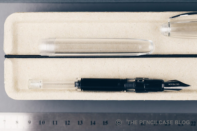
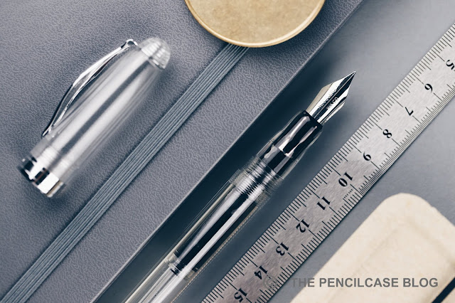
Let's start at the beginning though, and that's the looks. Surprisingly, I ended up appreciating the Ahab's design considerably more than I thought  I would. The Ahab has a story to tell, that of Moby Dick, to be more specific! The clip is modeled after the top view of a sperm whale (Google it, the resemblance is actually quite convincing!). The barrel, shaped after captain Ahab's prosthetic leg (made out of whalebone), is perhaps a bit more far-fetched, but I do very much appreciate the thought that went into the design of this pen. The demonstrator finish is definitely my favorite, as it shows the unique plunger-filling mechanism in all its glory. Apart from the metal trim and ebonite feed, every single part of this pen is transparent by the way, which makes for a pretty cool see-through and clean design. 
REVIEW: NOODLERS AHAB FLEX NIB FOUNTAIN PEN
Talking about the material this pen is made of... It may also be the first item on my list of negatives, unfortunately. Noodlers describes the material as some sort of 'vegetal resin', but unfortunately doesn't go on to specify which exact one. It looks good (maybe not as smooth and polished as I'd liken but that probably has more to do with the low price point than anything else), it feels warm to the touch and durable... but it SMELLS. SO. BAD. 

The best way I can describe it is sort of a putrid, sickly sweet smell. The smell is terrible out of the box - and may put people off of buying this pen - but it luckily lessens over time (although the parts on the inside of the cap, section, and barrel remain smelly on my review pen to this day - even though it has been continuously on my desk for the past 6 months or so). Some people apparently like the smell - I don't. 
REVIEW: NOODLERS AHAB FLEX NIB FOUNTAIN PEN
The Ahab is a nicely sized pen, I feel. It measures 14cm (5.5") capped, and 12.8cm (5") uncapped. The barrel is not too thin, and the section has that comfortable 'stepped' shape like we also see on the Leonardo pens nowadays (although Noodlers did this design first, I should add!). 
REVIEW: NOODLERS AHAB FLEX NIB FOUNTAIN PEN
The Ahab is certainly a comfortable pen to use, It's a good, balanced size, the all-resin construction is lightweight, and the threads are not that obtrusive to my grip. The cap posts, but not very deep and it often sits crooked on the back of the barrel...which annoys me a little bit. 
REVIEW: NOODLERS AHAB FLEX NIB FOUNTAIN PEN
In terms of construction and build quality, I really don't have much to complain about. I mean it's a 20$ pen and I view it as such. But for the price, everything fits together nicely and feels sturdy. Even the clip has a really nice and solid spring to it. 

I also particularly like the plunger-type filling system. It has a very high capacity (approx. 2mL) and is designed properly with a breather tube so it fills up completely with minimal effort (a night and day difference over the so-so mechanism of the FPR Himalaya). You can also remove the plunger and use the Ahab as an eyedropper. But you can't use regular cartridges or converters with this pen. Overall, I've seen a few Indian-made pens at this point (Noodlers pens are made in India, btw) and none have been quite as nicely made as this one. 
REVIEW: NOODLERS AHAB FLEX NIB FOUNTAIN PEN
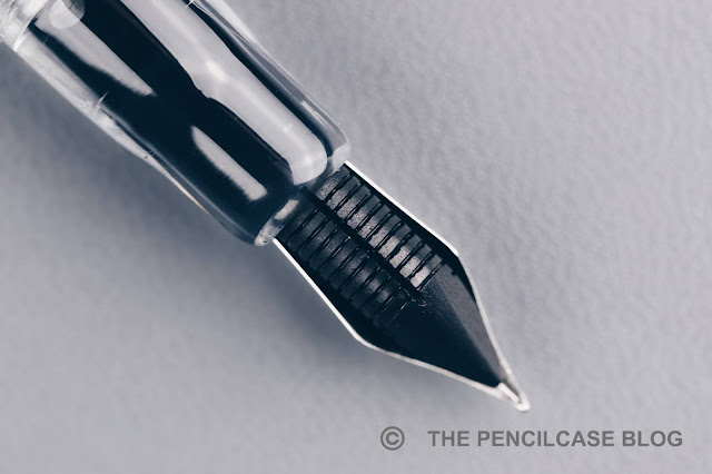
And then we get to the nib. This is another area of the Ahab where I'm a little divided. On one hand, I'm excited to see a flexible steel nib and ebonite feed on an affordable pen like this, on the other hand, it's not without its flaws. You see: I'm lazy and spoiled, and I expect some kind of instant gratification when I buy a pen, especially a modern one. Admittedly, fountain pens never really are the ideal choice for ease of use. But I at least expect a pen to write properly out of the box, and Noodlers pens have never been known for their nib consistency (I've had the same issues with the FPR Himalaya that has a similar nib and feed). 

Frankly, it might as well be borderline impossible to provide a flawless writing performance with a highly specialized nib and feed setup like this, at this price point. It's difficult to make a flex nib work, you know. So to keep costs down, you - as a customer - are more or less expected to take care of the nib tuning yourself. It's probably a bit of a nib lottery, some nibs might be good out of the box, some might take some tinkering. Mine fell under the latter category.
REVIEW: NOODLERS AHAB FLEX NIB FOUNTAIN PEN
Heat-setting the feed, and adjusting the nib to get a proper ink flow (especially for flex writing!) took me more than a couple tries and some swearing definitely was involved. I got it to a point where I can live with the writing performance, although  I  probably could've done a better job. This flex nib (fine-ish size) is smooth, but not buttery, and it can keep up with a decent amount of flexing (it opens up to about 1mm line widths). Solely for flex performance, the FPR Himalaya and it's custom modified 'super-flex' nib and feed certainly give much more dramatic line variation. The ink flow is not super heavy but manages to keep up most of the time. You definitely have to take your time when flex writing to avoid railroading, but that's a general remark for most flex pens. 
REVIEW: NOODLERS AHAB FLEX NIB FOUNTAIN PEN
The Noodlers Ahab costs 23€ (23$). That's not a lot. In fact, at that price, I'm willing to forgive the finicky flex nib and smelly resin as a trade-off for a cool design and decent potential if you put in some effort to get the performance dialed in. Is this the perfect modern flex pen? Nah, but it sure is a fun pen if you're willing to give it a try! 
NOTE: This product was provided by La Couronne Du Comte, so I could write this review. I was in no way influenced in the making of this review, the opinions shared in this review are completely my own! This post does not contain affiliate links.
REVIEW: NOODLERS AHAB FLEX NIB FOUNTAIN PEN