Showing posts with label Namisu. Show all posts

Monday, July 24, 2023

RE-REVIEW: NAMISU NOVA STUDIO FOUNTAIN PEN

RE-REVIEW: NAMISU NOVA STUDIO FOUNTAIN PEN
For a long time, the Namisu Nova was the pinnacle of minimal fountain pen design for me. I think it's even fair to say that Namisu was (one of) the brands that paved the way for the wide variety of machined, metal fountain pens we see nowadays.

But the original Namisu Nova dates back to 2015, so it's time for an update to bring it up to speed with the more 'evolved' design language of Namisu's more recent pens. Back in 2017, Namisu already toyed with the idea of a different version of the Nova, in the form of the Nova Studio Ebonite. Later, in 2020, they expanded the 'Studio' line with titanium and bronze versions (reviewed HERE), which existed alongside the original Nova. The Studio wasn't a standalone product though, until now. 
RE-REVIEW: NAMISU NOVA STUDIO FOUNTAIN PEN
With the latest update to the Nova Studio, which sees three new finishes and colorways we'll look at in this review, it seems that Namisu fully embraced the Studio as the successor to the brand's flagship pen (please note: I don't know if the original Nova line will effectively be discontinued, but it does seem that way, looking at their website). 
RE-REVIEW: NAMISU NOVA STUDIO FOUNTAIN PEN
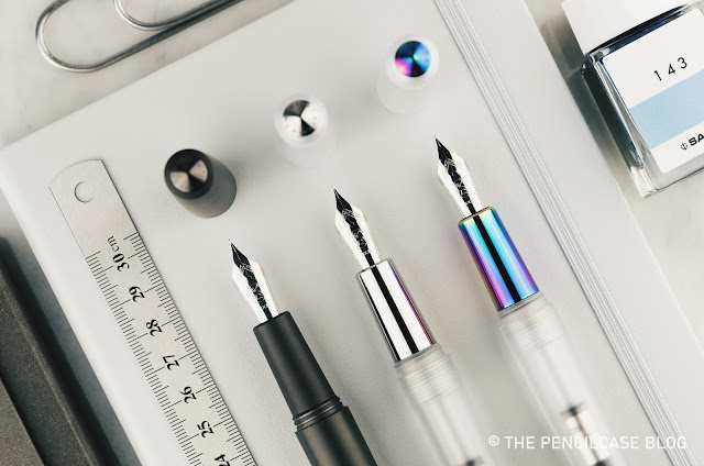
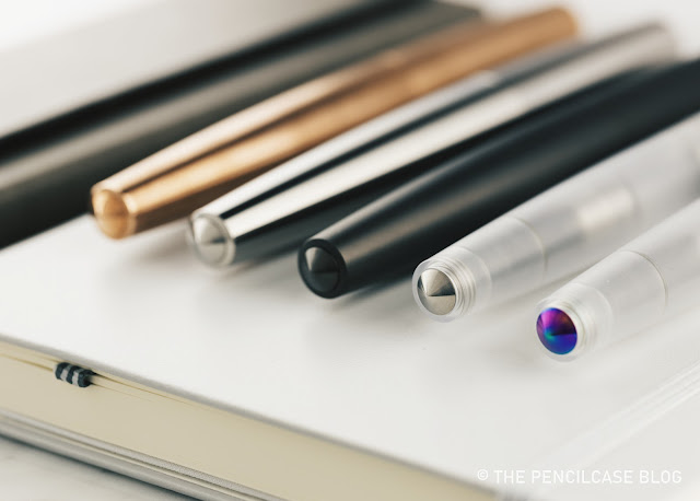
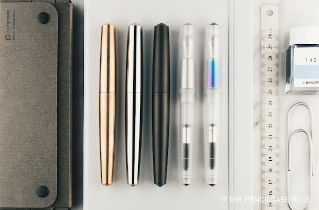
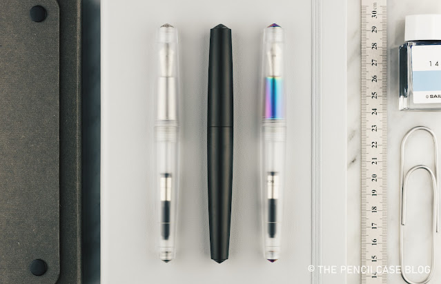
The Nova was by far the cleanest, most simple design in their catalog. In comparison, the Nova Studio leans closer towards Namisu's other, more industrial-styled pens like the Naos, Ixion, or N2. Not that it's such a huge departure from the original in terms of design, but the addition of separate finial 'inserts' in the cap and barrel creates a break in the otherwise clean lines of the Nova, offering a bit more visual interest. It also creates an opportunity for more special finishes, as demonstrated with the latest polycarbonate 'Frosted' versions of the Nova Studio
RE-REVIEW: NAMISU NOVA STUDIO FOUNTAIN PEN
The use of matte, translucent polycarbonate is a first for Namisu, but they executed it extremely well in my opinion. The material is machined and finished perfectly with a smooth, consistent matte finish inside and out. The cool thing is that you can now choose between two varieties of this pen, thanks to the titanium finials and section. Go clean and minimal with a natural titanium look, or a bit more flashy with titanium details that received a rainbow 'Petrol' PVD coating! 

Rainbow PVD coatings are quite trendy these days, but they're typically not my first pick. Though, despite my usual preference for a more muted color palate, this one caught my eye! The amount of color is not too much, nor too little... It's quite tastefully done, IMHO.
RE-REVIEW: NAMISU NOVA STUDIO FOUNTAIN PEN
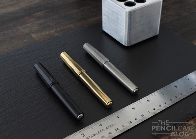
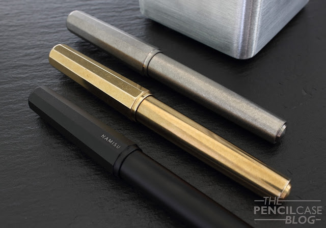
Alongside the new polycarbonate versions, the Studio also comes in either bronze, titanium, or a new black PVD-coated titanium finish. The latter has a nice and soft matte feeling in the hand. Finials are matched to the metals, but since they're just screw-fit into the cap and barrel, nothing would -hypothetically - prevent you from mixing and matching if you own different versions of the Studio! 
RE-REVIEW: NAMISU NOVA STUDIO FOUNTAIN PEN
The old Nova Studio on the left, and the new version on the right.
Dimension-wise, the updated Nova Studios differ slightly from the previous versions that I reviewed. Nothing changed on the outside, so it still measures 14.1 cm (5.55") when capped. The biggest change (the only one, really) is the section, which was extended by about 3 mm, while retaining the same tapered profile and average diameter (12 mm). This also translates to an uncapped length of 13.3 cm (5.24"), up from 13 cm (5.12"). It's a subtle change, but it does improve on what was arguably one of the biggest pitfalls of the Nova in the past: the rather short section, combined with the substantial step behind the threads. To be clear, that step is still there, but the elongated section helps keep your grip a bit further away. 
RE-REVIEW: NAMISU NOVA STUDIO FOUNTAIN PEN
With the addition of a polycarbonate version, the Nova Studio now offers something for everyone in terms of weight and balance: the polycarbonate comes in at just 23 g, the full titanium version bumps that up to 55 grams and the bronze version comes in at a super-hefty 106 (!) grams. The balance of the Studio also changes depending on the material: The polycarbonate model has a subtle front-balance due to the metal section, while the solid metal versions are more center-weighted. 
RE-REVIEW: NAMISU NOVA STUDIO FOUNTAIN PEN
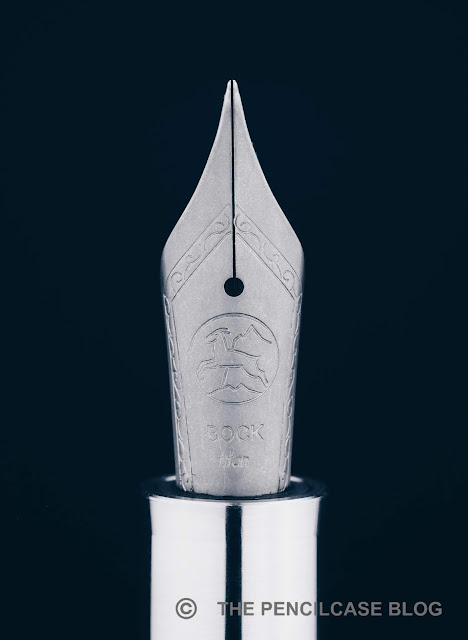
Since I've already reviewed multiple versions of the Nova (and literally dozens of pens with Bock nibs), I won't go too much into the writing experience. It's exactly what you can expect from a stock steel Bock nib, which is to say: a decent writing experience, though nothing particularly out of the ordinary. I will say that the design of the Nova Studio would benefit from a color-matched nib, especially on the polycarbonate 'Petrol' and black PVD titanium versions.
RE-REVIEW: NAMISU NOVA STUDIO FOUNTAIN PEN
I'm glad that, besides other interesting models, Namisu remains invested in their Nova line of pens. The clean, minimal design continues to be one of my personal favorites, and the new section design offers a small but welcome improvement to the writing comfort.

The addition of new finishes makes the Nova Studio a more diverse and interesting offering, with plenty of choices depending on your preferences. Pricing is a bit all over the place: The new polycarbonate versions come in cheapest at 80£/101$, bronze is a little more (85£/107$). The titanium versions command a rather substantial premium: 115£/146$ for the regular titanium and 130£/164$ for the new PVD black finish. Though right now, you can snag one up at a pretty good discount during Namisu's Summer sale.

The products shown in this review were sent to me by Namisu so I could write this review. I was in no way influenced in the making of this review; the opinions shared in this review are completely my own. This post does not contain affiliate links.

Friday, August 7, 2020

REVIEW: NAMISU NOVA STUDIO FOUNTAIN PEN

REVIEW: NAMISU NOVA STUDIO FOUNTAIN PEN
Back in 2016, Namisu launched the Nova. A pen that caused a short circuit somewhere in my brain I guess, because it was this pen that marked the beginning of my love for minimal design, metal fountain pens. Well, it actually took me about half a year to catch up to this relatively unknown -at that point- trend, because I didn’t buy a Nova straight away. 

The Namisu Nova Studio Ebonite (reviewed HERE) that I bought a while later - while not a metal pen - was my gateway into the brilliantly simple (Nakaya-like) shape of the Nova - to this day one of my favorite pen designs on the market. The Studio Ebonite also turned out to be the foundation for the pen we'll look at today, which is the latest iteration of the nova: The Namisu Nova Studio
REVIEW: NAMISU NOVA STUDIO FOUNTAIN PEN
The original Nova featured an ultra-minimal design, an exercise in clean lines, without unnecessary features or parts. Namisu turned to a bit more experimental and complex - but still minimal - designs after that, with combinations of different textures, metals, and shapes. The latest Naos (reviewed HERE) - another excellent pen - is probably the best example of this style. It seems to be the general direction they're trying to go in with their brand, and I think it fits their overall futuristic design language quite well. 
REVIEW: NAMISU NOVA STUDIO FOUNTAIN PEN
With minimal design, it's the small details that matter. And one of the small details that the Naos, Ixion, and Studio Ebonite all have in common is their coin-insert finials (ok, the Naos only has one on the barrel finial, but still). This is also what sets the Nova Studio apart from the regular Nova: it's all about those finials!

While an absolute design purist may find the separate finials on the Studio break up the clean lines, and distract from the ultra-minimalist, clutter-free look of the 'original' Namisu Nova, I think the finial design adds an understated but cool update to an already understated and cool pen. It makes the Nova appear a bit more refined - a bit more modern, even.
REVIEW: NAMISU NOVA STUDIO FOUNTAIN PEN
In essence that's about it, though. You can skip through the rest of this review if you just catch this: the Studio has coin insert finials, on which the Namisu - Studio name is engraved in a very small and subtle font. That’s the gist of it. I mean, of course, it’s still a Nova after all, the rest of the design is pretty much identical. 

Pretty much identical... But you know me, I'm the kind of person to ramble without end about the small stuff, so here are the other things that changed:
REVIEW: NAMISU NOVA STUDIO FOUNTAIN PEN
The bronze Studio (top) has a reddish hue almost like copper, both get a heavy patina over time.
The Nova Studio comes in titanium or bronze, with bronze replacing the usual brass or copper variants. Bronze seems to be all the hype these days in metal pen-land. It has the same heft as brass and copper, but the color is somewhere in between those two (leaning more towards the red hue of copper). The bronze studio has a lightly stonewashed finish on the cap and barrel, which contrasts with the polished cap and barrel finials. Under the cap, the section has a brushed/machined finish, which also has a bit more shine to it.

The titanium version of the Studio, on the other hand, has a more uniform brushed/machined finish on all parts of the pen, including the finials. It makes for a sleeker-looking pen, not in the least because the stonewashed bronze Studio gets a very dark brown patina over time, while the titanium pen retains its shiny, clean look.
REVIEW: NAMISU NOVA STUDIO FOUNTAIN PEN
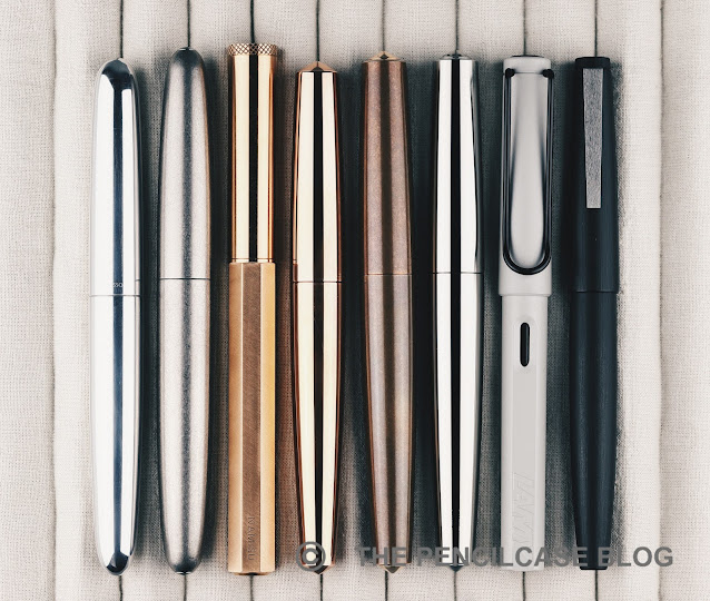
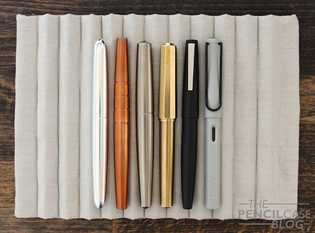
L to R: Ensso Piuma, Namisu Horizon Ti, Namisu Naos, Namisu Nova, Namisu Nova Studio (bronze & Ti), Lamy Safari, Lamy 2000
While the Nova Studio is still very much recognizable in terms of the general design and shape, its size hasn't remained completely unchanged. The Studio version is ever-so-slightly less tapered towards the barrel finial. It's a minute difference - we're talking less than half a mm (1/50th of an inch) thicker! - yet it's enough to give the pen a more robust appearance in my opinion. The Nova Studio also measures 14.1 cm (5.55") capped and 13 cm (5.12") uncapped, which is overall just 2mm (1/16th of an inch!) longer than the regular Nova. The changes are so subtle, you can see the difference when putting both pens side by side, but it's hardly noticeable when writing with them.

The Studio is also heavier. I wanted to write that it's noticeably heavier than the regular Nova, but to be honest I only found out when I actually weighed the pens! I guess I've grown so accustomed to heavier metal pens, I was surprised to see the bronze Studio tip the scales at 106g, and even the titanium version could be considered a true heavyweight at 55g (that makes them both about 10 to 15g heavier than their respective Nova counterparts!). It's not often that even a titanium pen weighs over 50 grams, so take that as a word of caution if you're not a fan of heavy metal...pens!

Since the Nova and Nova Studio aren't quite the same anyway, I'm a bit curious as to why Namisu didn't change up the overall shape and dimensions of the Studio more drastically, to clearly differentiate it. Although why change something that isn't broken, right?
REVIEW: NAMISU NOVA STUDIO FOUNTAIN PEN
New threads on the left, old on the right.
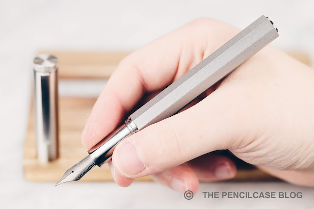
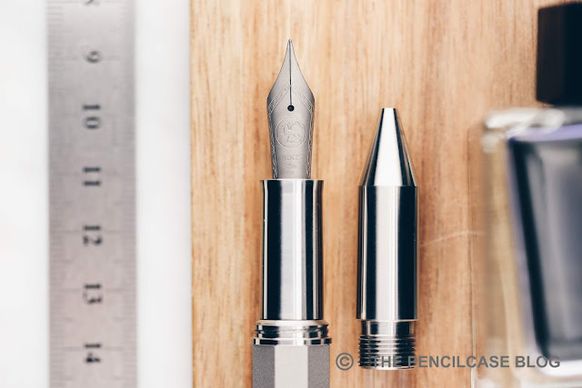
The section design has always been an area where the Nova still has room for improvement, yet it remained unchanged on this iteration. Ok, not entirely. Just like the rest of the pen, the section is about a millimeter or so longer, but again that's not the kind of change you'll actually notice in use. The straight, tapered section offers enough space to hold the pen, but you'd be hard-pressed to not at least brush up against the threads and the rather large step towards the barrel. In fact, comfort might've actually taken a slight step back as they redesigned the shape of the block threads on the Studio for some reason, which no longer has chamfered edges, making them noticeably sharper to the touch. I was surprised to see that since there isn't a single sharp or unfinished edge to be found on the rest of the pen.

While I aesthetically find the Namisu Nova one of the most pleasing pen designs out there (at least when looking solely at minimal designs), it does make a few compromises for the sake of minimalism. Especially the threads and step are possible downsides to take into consideration when making a purchase decision.
REVIEW: NAMISU NOVA STUDIO FOUNTAIN PEN
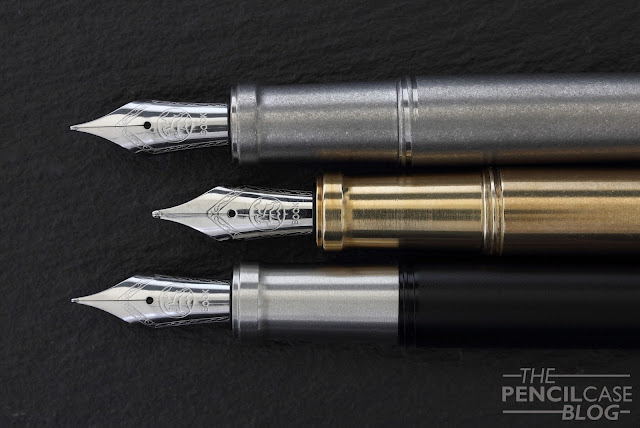
The writing end of the Studio is of course still a steel or titanium Bock-made #6 nib. While not perfect, I do feel like I've had a noticeably higher success rate with stock Bock nibs recently (I don't know if that's because the QC improved, or just pure luck on my part). The nibs on these two pens are both very close to perfectly tuned. 

The broad nib on the bronze pen is my favorite. It has a slightly stub-like line variation and is perfectly smooth. The medium-wet ink flow keeps up well. As broad nibs tend to be, it does have a slightly more noticeable sweet spot if rotated. It occasionally hard starts - though briefly, only on the first pen stroke after sitting unused for a while - but otherwise doesn't skip.
REVIEW: NAMISU NOVA STUDIO FOUNTAIN PEN
Some people have had enough of the 'minimal pen' trend of the last few years. Not me though. I can still very much get excited about a good minimal pen, and I'd certainly categorize the new Namisu Nova Studio as good. Aesthetically, I still think the Namisu Nova is one of the best designs in its category. If you agree with me and - just like me - are a bit of a fan of the Nova, the Nova Studio might be a welcome addition to your collection. The design is a nice evolution from the regular model, and I like that that they made a bronze version to change things up a bit. I don't consider it as an upgrade necessarily, it still very much looks and feels like the pen it's based on. 

That being said, no matter how positive my ramble about the design may be, these are very heavy pens, and the section design won't play nice with every grip. Two caveats that prevent me from calling it a great pen. Whether or not they're a dealbreaker for you, is of course highly subjective.  

The Namisu Nova Studio Bronze and titanium have an MSRP of 79£ and 110£ (approx. 105$ and 145$) respectively, but Namisu often runs sales so you can usually find them for less (at the time of writing, both are available at 15% off). That's slightly more expensive than the regular Namisu Nova, but in my mind still a very fair price point.

One of the products shown in this review was sent to me by Namisu so I could write this review. I was in no way influenced in the making of this review, the opinions shared in this review are completely my own! This post does not contain affiliate links.
REVIEW: NAMISU NOVA STUDIO FOUNTAIN PEN

Tuesday, March 3, 2020

QUICK LOOK: NAMISU NAOS 2-IN-1 FOUNTAIN PEN & ROLLERBALL

QUICK LOOK: NAMISU NAOS 2-IN-1 FOUNTAIN PEN & ROLLERBALL
2019 was maybe not the best year for Namisu. With a bad taste of the Ixion project still lingering (all in all not a bad product, but the campaign was plagued by communication issues and delays), their 2019 Kickstarter pen -Stratos- didn't catch on. And a mechanical watch campaign met the same fate, before completely vanishing into thin air (unfortunately so, because both the pen and watch looked cool!). Luckily, Adrian and Maria didn't give up just yet, and 2020 brought us a new Kickstarter pen from the UK-based design studio: the Namisu Naos

This is a quick look post, and so let's try to keep it short: I like the Namisu Naos... I REALLY like the Namisu Naos! Of course, I'm a sucker for anything remotely minimal in design, and made out of metal, so don't just take my word for it.
QUICK LOOK: NAMISU NAOS 2-IN-1 FOUNTAIN PEN & ROLLERBALL
One could argue that the Naos is just a rehash of the Ixion. True, the Ixion has a faceted (decagonal) cap and round barrel, where the Naos has a round cap and faceted (octagonal) barrel. But in any other way, the Naos looks and feels like a more mature and refined pen, that fits better in the Namisu design language.
QUICK LOOK: NAMISU NAOS 2-IN-1 FOUNTAIN PEN & ROLLERBALL
All machined edges and facets of the Naos are crisp and clean. Perhaps the only gripe I have is that some edges can be a bit TOO crisp and would benefit from being ever-so-slightly rounded off to feel a bit easier on the fingers. The crispness does add to the minimal design though, which together with the non-tapered overall shape of the pen, makes the Naos feel a lot more modern than the Ixion.
QUICK LOOK: NAMISU NAOS 2-IN-1 FOUNTAIN PEN & ROLLERBALL
The Naos shares some of its design elements with the Ixion (in the middle).
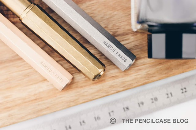
A small detail that makes its return from the Ixion, is the finial inlay on the back of the barrel. The ones on the Naos are completely flat, with a chamfered edge (as opposed to being slightly domed). The cap finial is completely flat, and the sides are lightly knurled so you can easily unscrew it to add or remove the optional (unfortunately a 10$ add-on) brushed stainless steel clip. The clip is very sturdy (read: not super-easy to use) and perfectly complements the design of the pen. Every small design element and detail is crisp and refined and makes for a very clean-looking pen.
QUICK LOOK: NAMISU NAOS 2-IN-1 FOUNTAIN PEN & ROLLERBALL
L to R: Ensso Piuma, Namisu Nova, Namisu Ixion, Namisu Naos, Lamy Safari, Lamy 2000
One of the reasons why I really like the Naos is its size. In case you didn't notice, the Naos is a fairly large pen. At 14,3 cm (5.63") closed, and 13.4 cm (5.27") uncapped, it's no small pen. The straight shape (1.36 cm/ 0.53" in diameter) adds to its sizeable appearance. In the hand, you'll notice the block threads, which are a bit sharp (especially on the titanium pen), but the section is decently sized and the slightly flared-out shape towards the nib helps prevent your fingers from slipping off.
QUICK LOOK: NAMISU NAOS 2-IN-1 FOUNTAIN PEN & ROLLERBALL
The barrel of the titanium pen received a sandblasted finish, on the bronze pen it is brushed diagonally to contrast the brushed finish of the cap and section.
There are three metal options to choose from, and each has a distinct finish and weight. Interestingly, not the aluminum, but the titanium pen is the lightest option this time, at a -still respectable- 40g total. The anodized aluminum (black, green or blue) comes in at 48g, and that's because the cap, section and finials are stainless steel (so really, only the barrel is actually aluminum). The heavyweight (80g!) is not made out of brass (an alloy of copper and zinc), but the more uncommon bronze (copper and tin), which has a distinctly more coppery-pink color. I like heavy pens, and I certainly like an uncommon material, so for me the winner is bronze, but be warned of the weight!
QUICK LOOK: NAMISU NAOS 2-IN-1 FOUNTAIN PEN & ROLLERBALL
One of the "selling points" of the Naos is the interchangeable rollerball section. You can choose which one comes stock with the pen (fountain pen or rollerball), and additional sections can be bought (a 13$ add-on) so you can switch between the two writing modes. I suppose that's quite neat, but in the grand scheme of things, it's mostly useful if you like the design but prefer a rollerball over the standard fountain pen option. I don't see myself switching it out often (or at all) afterward, especially because it's not just something you can do on the go.

(PS: the rollerball version comes with a Schmidt 5888F refill, which is a classic rollerball. Not my favorite, but I suppose it can be 'hacked' to use a gel-based refill.)
QUICK LOOK: NAMISU NAOS 2-IN-1 FOUNTAIN PEN & ROLLERBALL
Since I wanted to keep this post short (I know, I failed miserably, and I'm not even done rambling!), I didn't include a writing sample, but by now you'll probably know what to expect: a stock Bock nib. Love it or hate it, these nibs are a quintessential part of pretty much every metal/minimalist pen you can imagine. I quite like these nibs, and the two Naos samples I was sent, both wrote flawlessly out of the box. The titanium -as always- has a bit of softness, and yes you can get a slight bit of line variation out of it, but please don't take the writing sample on the Kickstarter page as an example... you'll most likely just bend the nib if you try this (titanium doesn't really spring back like gold flex nibs do).
QUICK LOOK: NAMISU NAOS 2-IN-1 FOUNTAIN PEN & ROLLERBALL
The branding on the barrel is quite extensive, especially for a minimalist brand... but it might change in the production version!
As usual, the Kickstarter campaign offers a chance to get one of these at a very reasonable price point, starting at 50$ for aluminum, 73$ for the bronze, and 90$ for the titanium version. The only pitfall would be the rather pricy add-ons (clip and additional grip sections) that quickly add to the cost. I'm really impressed by the Namisu Naos, it's a close tie with one of my all-time favorites, the Namisu Nova. The design is instantly recognizable as theirs, and yet it doesn't feel like a been-there-done-that rehash of yet another minimal pen.

Most importantly, it seems that Namisu has dealt with one of their biggest weaknesses, which was their rather poor communication. They've been very responsive on the Kickstarter campaign and also in my personal messages with them, it seems like they are on top of things. It's always tricky to write a conclusion on a product that hasn't even hit the market yet, but I have a good feeling about this one and I hope that feeling lasts until I have the final products in hand. In any case, my Kickstarter order is already in, so if you'd like to do the same, head over to their Kickstarter page (within the next three weeks!). They already passed their funding goal with ease, so the project is guaranteed to move forward into production!

This product was lent to me by Namisu so I could write this review. I was in no way influenced in the making of this review, the opinions shared in this review are completely my own! This post does not contain affiliate links.
QUICK LOOK: NAMISU NAOS 2-IN-1 FOUNTAIN PEN & ROLLERBALL

Thursday, May 3, 2018

NAMISU IXION FOUNTAIN PEN REVIEW

Namisu Ixion fountain pen review
Whew, this was a difficult review to write! The Namisu Ixion has probably been one of the most talked about pens in our community in the past couple months, and received a lot of criticism from bloggers and customers alike. I wanted to look at things differently, without drawing hasty conclusions or being influenced by other people's opinions. So here is my review...

When Namisu announced the Ixion on kickstarter June or August last year, I jumped on it faster than...well, fast! The rest of the kickstarter went less fast unfortunately, to the frustration of a lot of backers. It's Kickstarter of course, delays are to be expected. You buy a product that doesn't exist yet, and there are still a million things that could go wrong before it hits the shelves. However, it didn't help that Namisu is notoriously bad with their communication. 

Having worked with them in the past, their communication has always been so-so, I knew what to expect. But in the end they always came through with great products, which I think is the most important part. Imagine the opposite: a smooth-talk company that doesn't deliver in the end... Hah! THAT would be bad! [Cough, Visionnaire, cough].
Namisu Ixion fountain pen review
Simple but practical packaging: just a nylon sleeve 
A few months later than expected, the pens were sent out (still, not the worst delay I've seen on Kickstarter). What followed was a strange mix of happy customers, problems with nibs, lost packages,... Just generally, the entire project seemed cursed. 

While I don't want to ignore the issues that this kickstarter faced, I also don't feel like letting it impact the entire review. So let's focus on the positive stuff for now: In the end Namisu did one thing exceptionally well...they made a great pen!
Namisu Ixion fountain pen review
The Ixion is a bit of a departure from Namisu's traditional ultra-minimalist philosophy. It's still a simple design, but the combination of clipless faceted cap and round -slightly tapered- barrel is already a bit more elaborate than their earlier products. They also went for an interesting design choice with the finials, making them out of separate pieces (in either aluminium, brass, steel, or titanium) that slightly protrude from the cap and barrel. It's an interesting combination of shapes and subtle details, that I  think works very well. As some suggested, it's not too uncommon from the Kaweco Perkeo, although the Ixion has a more modern look with their metal construction.
Namisu Ixion fountain pen review
Something I don't really understand, is how this is their most affordable design yet. Given the more intricate and complex design than for example the Namisu Nova, it would seem more expensive to manufacture... But hey, more pen for less $$$, you won't hear me complain! Ok Scratch that, I did the maths wrong! The Ixion is actually ever so slightly more expensive. Although compared to their other products (like the Nova), the markup is still relatively small considering the more intricate production process.

Traditionally, Namisu utilizes four different metals for their pens, of which we can find three here: aluminium, brass and titanium (perhaps copper is still to come at some point?). Technically, steel is also used, but only for the finials and grip section. The brass and titanium pens received a stonewashed finish, which is excellent for hiding scuffs and scratches from daily use. The aluminium is available in a variety of anodised colors (red, blue, grey or black), and the finish is smooth and even. It is worth noting that the anodized finish will wear down with use, especially at the threads, but that's normal.
Namisu Ixion fountain pen review
Branding on the side of the cap of the aluminium version...
Namisu Ixion fountain pen review
Branding on the finials of the titanium and brass versions
As for those finials and sections, on the brass and aluminium versions, you get the choice between black anodized aluminium, brass or stainless steel trims. The titanium version comes with matching titanium trims, although you can buy additional sets of finials and grips to mix and match whatever way you like. All the options combined, this makes for a nice bit of customization.
Namisu Ixion fountain pen review
L to R: Ensso Piuma, Namisu Orion, Namisu Nova, Namisu Ixion, Lamy 2000, Lamy Safari
The Ixion is an average-sized pen, measuring 13.5cm (5.31") closed, and 12.8cm (5.04") uncapped. With a maximum diameter of around 1.5cm (0.59"), the ixion has a rather stout appearance. With the steel or brass finials, the aluminium pen is a bit heavier than what you'd usually expect, coming in at 39g (vs. 30g for the version with aluminium trims). The titanium and brass pens respectively weigh 45g and a hefty 85g.
Namisu Ixion fountain pen review
In the hand, this is perhaps one of the most comfortable Namisu pens yet. It's not overly long but it does post if necessary. The section has a comfortable taper, and a slight lip at the end. The threads on the brass and titanium pens are stonewashed so they are smooth and unobtrusive. On the aluminium pen, they are sharper and more noticeable. There's no step behind the threads. Whereas the Ensso Piuma still spans the crown for most comfortable metal pen I've used to date, the Ixion does come close.

To cut costs, the ixion didn't come with a converter (or cartridge), but they do fit international type carts and a standard Schmidt converter did the trick.

As for the writing experience; well they are stock Bock #6 nibs in either steel or titanium (or gold, if you want to pay the premium). My experience with Bock nibs is quite good. Of the 20+ nibs I've used from their make, only one or two (usually broader nibs) had some issues with skipping or hard starts.
Namisu Ixion fountain pen review
Bock nibs, not all of them equally straight or symmetrical, yet all of them write without any issues
Both on the Ixion Kickstarter comment section, and on other blogs, I came across a lot of complaints about the nibs. Because I didn't have any issues with my three pens, I was rather surprised by this, so I asked around as much as I could to learn other people's experiences.

The verdict? I don't know.

There are so many factors that can alter how, if at all, a nib writes. The geometry of the nib itself is one thing, but the assembly, the ink that's used, the paper, even the way you hold your pen... These are all seemingly small things that matter, so it's very hard to pinpoint exactly where things go wrong. There's definitely some quality control issues that circulate throughout various brands, so in the end, it's partially luck that will decide if you get a 'good' nib or not. On top of that, maybe a dud for one person might be the perfect nib for someone else?
Namisu Ixion fountain pen review
The titanium section is stonewashed, while the brass and steel sections have a lightly brushed finish
So probably Bock nibs just suit me and the way I write. They are a bit bouncy (at least in recent years they have been, probably due to a change in the production process), and provide just the right amount of feedback. They have a good flow, especially with a wet and lubricated ink. The wider nibs (medium or broad) occasionally suffer from some skipping or hard starts. But again, a good ink choice solves this problem in my experience.
Namisu Ixion fountain pen review
In the end I'm quite impressed with the product Namisu delivered. It's on the same quality level as the other Namisu pens I own, and the pricing is fairly similar. Even after the Kickstarter, when the Ixion becomes a standard model in their lineup, the pricing should still be rather competitive with similar products from other brands. I paid 30 GBP (38 USD), 38 GBP (49 USD) and 55 GBP (70 USD) respectively for the aluminium, brass and titanium versions, which was at a 40% Kickstarter discount. (Final retail prices will presumably be around 50 GBP, 64 GBP and 92 GBP respectively)

I think Adrien and Maria -the peeps behind the brand- were overwhelmed with the scale of the kickstarter (which outdid any of their earlier projects). But still, that doesn't take away that Namisu's communication has to improve for them to be able to keep their customer base happy. I kept following the comments on the kickstarter page, and I'm already seeing a positive evolution, with people getting replies to their emails and receiving replacements where necessary.

Note: This product was bought with my own funds. I was in no way influenced in the making of this review, the opinions shared in this review are completely my own! This post does not contain affiliate links.
Namisu Ixion fountain pen review

Monday, November 27, 2017

QUICK LOOK: NAMISU NOVA COPPER FOUNTAIN PEN REVIEW

Quick Look: Namisu Nova Copper fountain pen review
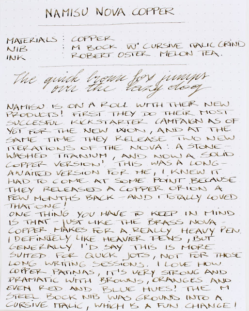
Namisu has been on a roll in the last year, with tons of new products. In July, they did another Kickstarter -their most succesful campaign as of yet- for the Ixion (which is bound to arrive fairly soon!). And at the same time they released two new iterations of the popular Nova fountain pen. Earlier, around June, they came up with the stonewashed titanium Nova (that I reviewed HERE), and two months later they released the Nova in the long-awaited solid copper finish!

Well, I say long-awaited because I was pretty confident that, after the copper orion earlier this year, a Nova in the same finish would eventually follow... And here it is!
Quick Look: Namisu Nova Copper fountain pen review
Copper, brass, titanium, titanium stonewashed, ebonite,... Yeah ok, I'm a hoarder!
As you may know, I've been very much into machined metal pens lately. There's something about them that makes me reach for these pens over all others. The craftsmanship, industrial machined look and robustness of an all-metal pen... It just really works for me.

On top of that, a lot of metal pen makers also incorporate a very distinct minimal aesthetic into their products. Which is a clear win in my book.
Quick Look: Namisu Nova Copper fountain pen review
The copper nova may be one of the most minimalist pens out there. Namisu sticks loyally to their clean, clipless designs (to the frustration of those that would like to finally see a more pocket-friendly design with clip in their product lineup). It may not be the most practical design, but I'd call that determination. They have their mind set on an aesthetic theme, and they strictly hold on to it.
Quick Look: Namisu Nova Copper fountain pen review
I, for one, am still partial to the clean cigar shaped design of the Nova. The bulkyness and gently curved line, the flattop design with the gently pointed finials... I like everything about the design, and I definitely think a clip would mess with the aesthetic (but then again, I don't really use the clip on any of my pens, so it's not a real loss for me).

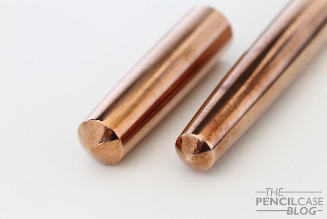
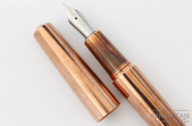
The copper finish is pretty amazing. It's cool when it arrives all polished and shiny, but it gets a million times cooler after a few days of use. The patina on this pen is honestly some of the best I've ever seen. It's much stronger than with brass (presumably because the patina is oxidized copper, and brass is only partially made up of copper, but I could be wrong on that). And it shows a wide range of colors, from dark brown to red and even blue when you look closely!

PS: yes, this pen makes your hands smell like pennies! 
Quick Look: Namisu Nova Copper fountain pen review
That patina though!
Comfort-wise, I like to hold this pen at a lower angle. Sort of in a more cradled position than I usually hold my pen. I think that's a way to support the weight of the pen, as it balances on the web of my hand between my thumb and index, instead of focusing all the weight in my grip. Make no mistake, this is a heavy pen (95g total, 69g uncapped!), so regardless of how you hold it, it weighs down considerably.
Quick Look: Namisu Nova Copper fountain pen review
Yet because of the way I hold the pen, I do find that I have a more relaxed grip (which is a bit counterintuive with a heavy pen like this). I just guide the nib across the page with my grip, while the pen rests in the web of my hand...if that makes any sense. Perhaps with longer writing sessions the weigh could start to become a problem, but then again this is not a pen I'd recommend solely for extensive writing sessions. For full details on measurements, you can go back to my review of the stonewashed titanium, or brass Nova.
Quick Look: Namisu Nova Copper fountain pen review
L to R: Kaweco Brass Sport, TWSBI Diamond 580Al, Namisu Nova Copper, Lamy Al-Star, Lamy 2000
Talking about writing... Of course the Nova Copper utilises the same #6 Bock nibs as all other Namisu pens. I've used and reviewed almost every steel and titanium Bock nib. I've had very good experiences with most, if not all of these nibs. They are smooth, wet and consistent writers straight out of the box. 

But there's no use in reviewing the same nib over and over again, so I thought I'd change it up a little this time: I ground the medium steel nib into a cursive italic. Of course a custom grind won't come with the pen, but it's a fast and affordable way to upgrade the writing experience and make the pen even more fun to use. There are a lot of really skilled nibmeisters out there who can do a much better job than I (Mike MasuyamaNibsmithNibgrinder,...) so I'd suggest checking them out if you want to spice up one of your pens!
Quick Look: Namisu Nova Copper fountain pen review
Closeup of the medium Cursive Italic grind
The medium curisve Italic grind is a step up from standard stub nibs. If you have some experience with stubs, but want more precise line variation at the trade-off of some smoothness. A cursive italic is sharper and less rounded off than a stub. This makes the line variation more pronounced and more consistent. Because of the sharper edges, you can't rotate the nib because the edges as it would make the edges of the nib dig into the paper. It's a nib with a learning curve, and it's not as smooth as a round or stub nib. But it's ideal for more advanced cursive writing or even calligraphy.
Quick Look: Namisu Nova Copper fountain pen review
Copper usually demands a pretty substantial premium with machined metal pens. But as usual, Namisu is pretty mild with their pricing: the Copper Namisu Nova retails for 69 GBP (90 USD), which is ten pounds less than the titanium version, and the same as the brass. Prices vary a bit, depending on the currency value, but at 75 GBP/ 85 EUR/ 99 USD they are about half the cost of similar machined pens made out of copper. If one thing, Namisu has their price point down, with excellent value for the price you pay.

Note: This product was provided by Namisu, free of charge, so I could write this review.  I was in no way influenced in the making of this review, the opinions shared in this review are completely my own! This post does not contain affilate links.
Quick Look: Namisu Nova Copper fountain pen review