Tuesday, July 28, 2020

REVIEW: KAWECO SUPRA STAINLESS STEEL FOUNTAIN PEN

REVIEW: KAWECO SUPRA STAINLESS STEEL FOUNTAIN PEN
Remember the Kaweco Supra brass (review HERE)? It was such a refreshing new product when it launched back in 2016. (yes, that was four years ago!) I think it was generally quite a well-conceived pen, there certainly was a bit of a hype surrounding it for a while (I don't think I exaggerate when I say Kaweco as a whole was a hype brand at that time!).

Back then, I naturally expected Kaweco to follow the same business strategy as with their uber-popular Sport and Lilliput pens: bring out new versions and special editions on a semi-regular basis to keep the product line fresh and relevant, and the customer's interest peaked.
REVIEW: KAWECO SUPRA STAINLESS STEEL FOUNTAIN PEN
But they didn't. Total radio silence about the Supra.

Four years went by, and just this year - when I thought all hope for a successor was lost - they decided to release the next installment in the Supra product line: the Kaweco Supra stainless steel. In my irrelevant opinion, that's about three years too late though. I feel like people lost interest, and maybe even forgot about the Supra altogether. 'Out of sight, out of mind' certainly applies here.
REVIEW: KAWECO SUPRA STAINLESS STEEL FOUNTAIN PEN
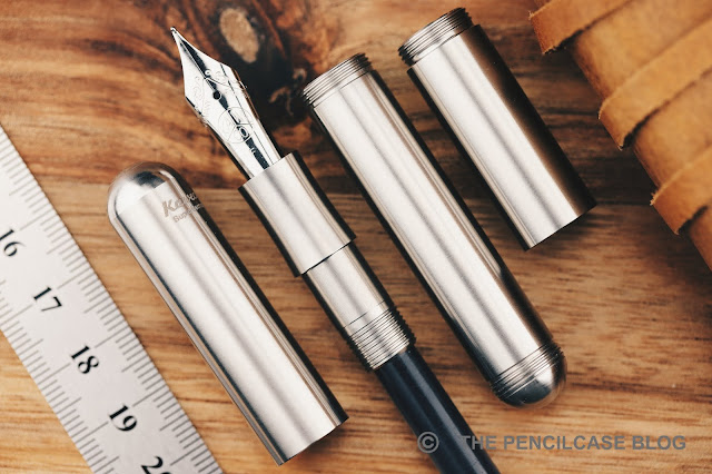
That's unfortunate because the Supra was is a cleverly designed, cool, well-built chameleon of a pen! Chameleon, obviously, because this pen adapts to the kind of use you want to get out of it. It shines as a pocket pen when the extension piece is removed, creating a pen that's a good bit shorter and even a bit thinner than the Kaweco Sport while still packing a full-sized writing experience and a #6 nib (So far, that's something only this pen and the Schon DSGN Pocket 6 are able to say).

I personally use the Supra with the extension piece in place about 80% of the time. I really like the looks of the Lilliput, but find the form factor just a bit too compact for a comfortable everyday writer. The Supra offers the same, pill-shaped, simple (I want to say 'minimal' but I already overuse that term to death) design as the Lilliput, but with a more normal footprint that I find more enjoyable to use.
REVIEW: KAWECO SUPRA STAINLESS STEEL FOUNTAIN PEN
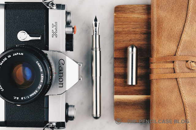
The addition of a stainless steel version should make a lot of people very happy since it offers the same hefty feel without the smell that brass and copper give off. From an aesthetic point of view, it's interesting how the all-stainless steel construction gives the Supra a clinically clean appearance, much more modern-looking than the brass Supra and its vintage-esque patina.
REVIEW: KAWECO SUPRA STAINLESS STEEL FOUNTAIN PEN
L to R: Ensso Piuma, Kaweco Sport, Lilliput, Supra Brass, Supra stainless steel (with extension), Lamy Safari, Lamy 2000
The more 'normal' footprint of the Supra equates to what's still, for all intents and purposes, a mid-sized to smaller pen. Especially capped, at just 13 cm (5.11"), it's comparatively short alongside a true average pen, like the Lamy 2000 or Safari (which have become somewhat of a 'sizing standard' in my reviews). Uncapped, it retains most of its length though, so at 12.5 cm (4.92") it still hits that sweet spot of a comfortable size without needing to post. Obviously, these are all measurements with the extension piece in place.
REVIEW: KAWECO SUPRA STAINLESS STEEL FOUNTAIN PEN
With both the extension in place, and the cap posted, the supra is really quite a long pen.
Without it, the Supra shrinks about 2.5 to 3 cm in length, making it effectively as long as the Lilliput. The extra girth of the Supra is the biggest contributor to making this pen feel more like a normal-sized pen.

Even though I prefer to hold the girthier Supra over the Lilliput, in absolute terms, comfort has never been the Supra's strong suit. The threads are cut deeply and have surprisingly sharp edges. Without the extension piece, the barrel has an almost imperceivable step behind the threads, but with the extension piece (which is wider than the barrel) in place, you do get a noticeable step right behind the threads. The section - while nicely concave-shaped - is short, so your grip automatically rests right on those sharp edges. I'm not typically one to complain about threads or steps, but in this case, there's definitely room for improvement.
REVIEW: KAWECO SUPRA STAINLESS STEEL FOUNTAIN PEN
It sort of speaks for itself, but the construction of the Supra is actually a lot beefier than that of the Lilliput. All parts are machined substantially thicker, and therefore a lot heavier as well (50g total). The machining is clean and precise, bringing the overall build quality to a very high standard. It looks and feels like a precision but also heavy-duty tool, ideal for in an EDC kit.

The Supra can technically take a full-sized converter (however, only with the extension piece in place!), but I continue to find myself using syringe-filled cartridges, just like I did in my original review. It's just a better trade-off than having to switch between converter and cartridge every time you want to add or remove the extension piece, and it's not like you get more ink capacity out of a converter anyway.
REVIEW: KAWECO SUPRA STAINLESS STEEL FOUNTAIN PEN
If you've recently read the Pen Addict's review of this exact pen, you'll notice that my writing experience was quite different from his. I did adjust the F steel nib a bit upon arrival, out of the box it was a bit too dry for my liking. A few passes with a brass shim increased the flow to a more balanced level that I was happy with. Other than that, the fine steel (Bock) nib has been an excellent writer that's perfectly polished -not too smooth, but still very little feedback- and responsive. I also found that, contrary to Brad's findings and my experience with a great deal of Bock nibs I own, it's a fairly stiff nib, although I don't really have a strong preference for one or the other.

At the end of the day, I've had a positive writing experience with this particular pen, but nib performance is, and always will be a case-per-case unknown. Maybe I got lucky and Brad didn't? Or maybe my writing style is better suited for Bock nibs? There's a lot of variables.

PS: I wanted to write that I feel like there should be a slip-on clip available for the Supra, even if it was just to prevent it from rolling off your desk - but it turns out they already make one! Only available in bronze though, but it's better than nothing.
REVIEW: KAWECO SUPRA STAINLESS STEEL FOUNTAIN PEN
I don't know if the Supra is a best-seller for Kaweco (probably not, with the fierce competition of their own Sport pens!) or even if it ever has been a popular model at all. But I can't stop wondering what it would've been like if they had updated it more steadily over the years. In any case, I hope they don't forget about it again, and maybe come up with a titanium or aluminium version in the not-too-distant future.

The Kaweco Supra is different, and even after four years I continue to like it simply because of that. True, it may not be my first pick for long, comfortable writing sessions, and the ability to swap between a full-sized and pocket pen on the go might be a gimmick to some people. But it does do a lot of other things very right: It's a fun design, the modularity can actually be practical for the right person, build quality is rock-solid (excellent for EDC?), and it still comes in at a relatively decent price: 110€ / 135$ for this new stainless steel version.

NOTE: This product was provided by Kaweco, so I could write this review. I was in no way influenced in the making of this review, the opinions shared in this review are completely my own! This post does not contain affiliate links.
REVIEW: KAWECO SUPRA STAINLESS STEEL FOUNTAIN PEN

Thursday, July 23, 2020

REVIEW: OTTO HUTT DESIGN 03 FOUNTAIN PEN

REVIEW: OTTO HUTT DESIGN 03 FOUNTAIN PEN
Of every Otto Hutt fountain pen I've tried so far at this point, I think the one that surprised me most is this one: the Otto Hutt Design 03! It's inherently a pen that wouldn't be my first pick, the only reason for that being the quite slender design. Though in the end, it turned out to be an incredibly interesting pen, for multiple reasons! 
REVIEW: OTTO HUTT DESIGN 03 FOUNTAIN PEN
The Design 03 is one of the newest Otto Hutt pens, the first pen that came out after they updated their brand for a more modern look and feel. Modern is certainly the word I'd use to describe the 03. The design game is absolutely on point with this one. The pill-like overall shape (technically it's called a stadium shape) that ends in two flattened-out finials (slightly convex finial on the back, a subtle - but noticeable convex shape on the cap finial!), immediately gives a very space-age look to the pen. 
REVIEW: OTTO HUTT DESIGN 03 FOUNTAIN PEN
The design is further accented with a small center band that's unadorned, and a clip-on clip that sits flush with the surface of the cap (I guess it's technically removable, but I definitely WILL NOT try that). I especially love how the angular and straight clip contrasts the smooth and rounded shape of the pen. On the fixture of the clip is the Otto Hutt branding, as well as a unique serial number.
REVIEW: OTTO HUTT DESIGN 03 FOUNTAIN PEN
The available colorways of the Design 03 again reflect the more modern approach of Otto Hutt since the rebrand, with matte coatings and trendy rose gold or black PVD trims. I'm most attracted to this matte, 'all-black' version, rounded up with glossy black PVD trims. Worth noting is that you'll see a two-tone gold and rhodium-plated nib in my images, but they now switched to all black PVD-coated nibs for the pens that have black trims - which rounds up the sleek all-black color scheme. 
REVIEW: OTTO HUTT DESIGN 03 FOUNTAIN PEN
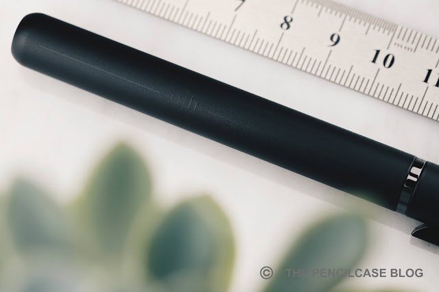
A somewhat unusual design quirk in the finish of the 03 are the two thin glossy black lines that are painted across the cap and barrel. It's super subtle, but it definitely sets the design even further apart from anything else. The new 'o | h' logo is also visible interrupting this line on the barrel, but the attentive reader will notice that it's actually upside down for right-handed writers... an interesting choice? 
 REVIEW: OTTO HUTT DESIGN 03 FOUNTAIN PEN
REVIEW: OTTO HUTT DESIGN 03 FOUNTAIN PEN
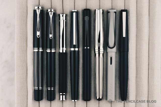
L to R: Pelikan M1005, Pelikan M805, Otto Hutt Design 04, Design 06, Design 03, Design 07, Lamy Safari, Lamy 2000
From the size comparison above, you'll see that the Design 03 is a fairly average-sized pen, I'd say. At 14 cm (5.51") capped, it's only a hair shorter than a Lamy Safari. It is, however, noticeably skinny (11 mm/ 0.43") across the entire length of the pen. Especially the section is noticeably thin, it tapers down to just 8 mm (0.31"), which required some getting used to because I don't often use thinner pens like this (the comparison below shows how thin it really is, compared to other Otto Hutt pens). The diameter, and a rather aggressive step towards the barrel, could potentially be a deal-breaker for some people. The snap cap means that there are no threads to be bothered by, though.
REVIEW: OTTO HUTT DESIGN 03 FOUNTAIN PEN
Top to bottom: Otto Hutt Design 03, Design 06, and Design 07.
The weight though! This pen has an incredible - sort of satisfying - heft to it, which totally caught me off-guard the first time I pulled it out of its box. Despite the fairly slender form factor, it still manages to hit about 58 grams on the scales. That's because the entire pen is made out of metal (build quality and overall fit and finish are excellent, btw!), brass I assume.

Uncapped, over half of that weight lies in the barrel, so it's a bit back-heavy. The Design 03's shape does not allow for the cap to post, but it measures a comfortable 12.5 cm (4.92") uncapped so I personally never found the need to post the cap anyway.
REVIEW: OTTO HUTT DESIGN 03 FOUNTAIN PEN
As mentioned, the design of the nib is actually not how you'll find it on the pen you can buy in-store today (both the steel and 18k gold nibs are now black PVD coated on the colorways with black PVD trim!). The two-tone 18k gold nib has quite a pretty logo imprint, and I actually don't mind the two-tone plating on it. Although as you can see, this particular example isn't plated very accurately on the design, which I assume is due to the fact that this is not an exact retail version of the pen - Other Otto Hutt pens I've seen have all had an impeccable plating finish on the nibs.

Otto Hutt likes to stick to smaller nibs on all but the Design 07, which means the 03 is outfitted with a #5-sized nib. For once, I actually think the slim and not-so-large footprint of the Design 03 is a very proportionate place to fit a #5 nib.
REVIEW: OTTO HUTT DESIGN 03 FOUNTAIN PEN
Enough about looks though, because this 18k medium nib is a FAN-TASTIC writer! It reminds me a lot of the writing characteristic of Montblanc, which is a pretty big compliment I'd say. The nib has a perfectly balanced smoothness to it - almost buttery, but not so much that it becomes unreliable in terms of skipping or hard starting. The ink flow is on the heavier side, which is right up my alley. It's a reliable writer, it starts right up, even after long periods of being unused, and I found that it had a remarkably forgiving sweet spot. 
REVIEW: OTTO HUTT DESIGN 03 FOUNTAIN PEN
I think Otto Hutt's rebranding was the best move they could've made to get some new exposure. The more modern design language of the Design 03 is a refreshing departure from the more classic older Otto Hutt pens, and it's very well-executed. The slightly smaller and slim form factor combined with its considerable heft makes for an absolutely fascinating pen to pick up and play around with. Though at the same time, writing comfort might be the 03's most controversial aspect - you either love how different it is or absolutely hate it. What's not controversial, is the nib performance: it's just all-round excellent. Their steel nibs are already, reliable, good quality writers, but this gold nib takes the entire experience to the next level! 

The Otto Hutt Design 03 prices start at 160€ and go up to 190€ for this all-black version - that's with a steel nib. The 18k gold nib is a 110€ option. Given the quality and excellent writing experience you get, I feel like 300€ (for the most expensive version) is actually a correct price point. So far, the Design 03 is not as widely available online as other Otto Hutt pens. You can order directly from the Otto Hutt webshop (although you might need Google translate to navigate the german site), or our site sponsor Penworld also has them in stock!

NOTE: This product was provided by Otto Hutt, so I could write this review. I was in no way influenced in the making of this review, the opinions shared in this review are completely my own! This post does not contain affiliate links.
REVIEW: OTTO HUTT DESIGN 03 FOUNTAIN PEN

Monday, July 20, 2020

REVIEW: ESTERBROOK ESTIE SPARKLE OVERSIZED FOUNTAIN PEN

REVIEW: ESTERBROOK ESTIE SPARKLE OVERSIZED FOUNTAIN PEN
I typically wouldn't consider myself the target demographic for products that have the word 'sparkle' in their name. So when Bryan from Esterbrook (and Kenro, red.) offered to send over a sample of their new Estie Sparkle oversized, I was actually this close to declining. As a pen-reviewer, I try to stay unbiased as much as possible. But in this case, I was worried I'd be too heavily biased against the pen's aesthetic, given it's soooo far out of my comfort zone. Turns out I was dead wrong for thinking that.

As soon as the box opened, I gasped a little. DAMN. THIS. THING. IS. BEAUTIFUL!

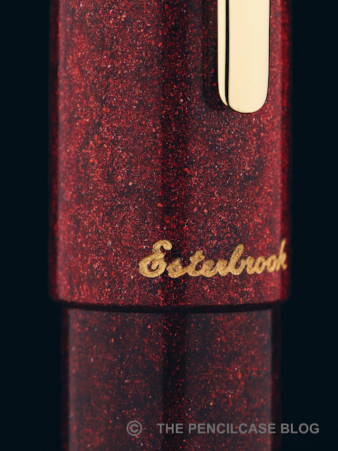
Don't forget, that's coming from the guy who, at the beginning of his pen-blogging career, didn't even think about straying away from colorless, black pens. I expected something obnoxiously gaudy and over the top, but instead this 'Garnet Red' Diamondcast Alumilite material (Made by McKenzie Penworks) strikes a perfect balance of bright red metallic particles captured in a deep, dark red (almost black in some places) acrylic. It sure does catch the eye when the light hits it, but it's really not as overpowering as I expected.
REVIEW: ESTERBROOK ESTIE SPARKLE OVERSIZED FOUNTAIN PEN
The white specks of diamond dust are subtle, but noticeable up close!
The unique thing about Diamondcast is that it is, well, made with real diamonds. Waste diamond dust from cutting gems, to be precise. The tiny white specks of diamond dust add an extra layer of sparkle to the red metallic flake that is best appreciated up close.

To be clear, this pen will not be everyone's cup of tea. But it wasn't too hard to persuade me, so  I guess everything is possible. On the other hand, if you're the kind of person that wants even more bling, the two other colorways ('Montana Sapphire' and 'Tanzanite Blue') are seemingly a bit more vibrant and in-your-face, at least going by the images I've seen online.
REVIEW: ESTERBROOK ESTIE SPARKLE OVERSIZED FOUNTAIN PEN
The Sparkle is a special edition that does command a rather hefty premium over the standard production colorways of the Estie (more on that later). However, apart from the Diamondcast material, the Estie Sparkle shares the exact same design as the regular Estie I reviewed a couple months ago (review HERE). That's a good thing if you ask me, because I really do enjoy the minimalist, clutter-free aesthetic of the Estie. The Oversized version of the Estie follows the same clean lines as the regular model, just overall a good bit bigger. The large size and clean design of the Estie oversized put all the emphasis on the striking Diamondcast material, and deservedly so. It really shines - literally!
REVIEW: ESTERBROOK ESTIE SPARKLE OVERSIZED FOUNTAIN PEN
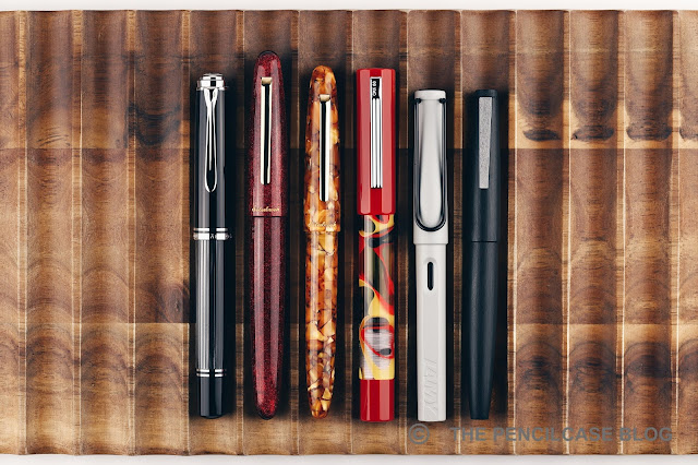
L to R: Pelikan M1005, Esterbrook Estie Sparkle OS, Estie Honeycomb, OPUS 88 Flow, Lamy Safari, Lamy 2000
What's also striking, is the size of the Estie Oversized! I probably should've seen that coming, since the regular model is already pretty much an oversized pen. But I was still quite surprised when I first opened the box. It's an absolutely huge pen, and especially the added width makes the oversized Estie feel considerably larger than its smaller sibling. Heck, it even makes a Pelikan M1000 or Montblanc 149 feel kind of small! Its size reflects in the weight as well. Since the barrel and cap walls are machined considerably thicker than on the regular model, it feels extremely solid in the hand, and should be able to withstand a good bit of (ab)use. It feels noticeably more substantial than the regular Estie, but at 33 grams it's still far from what I'd call heavy or unpleasant to use.
REVIEW: ESTERBROOK ESTIE SPARKLE OVERSIZED FOUNTAIN PEN
As far as I can tell, the Estie and Estie Oversized share the exact same section. I did find the Estie a particularly comfortable pen to use in my original review, but the copy-pasted section does introduce one caveat in the much larger (and wider) Oversized variant: where the regular Estie had almost no step at all - a huge plus in terms of comfort - the oversized adds its extra girth in the shape of a substantial step behind the all-metal section threads. While the block threads are subtle enough to go unnoticed in my grip, the step can definitely be felt depending on how you hold the pen. It's not an absolute dealbreaker for me, but in terms of absolute comfort, the regular Estie has a slightly more forgiving form factor.
REVIEW: ESTERBROOK ESTIE SPARKLE OVERSIZED FOUNTAIN PEN
The Estie Sparkle comes with the same JoWo-made steel nib and plastic feed as the regular Estie. The medium nib on my pen is perfectly smooth and lays down a rather wide and wet line. It's an excellent nib all-around, without a doubt, and the spring-loaded inner cap ensures a reliable ink flow that starts right up when you need it.

One negative is undoubtedly the rather high price of the Estie Oversized and this 'Sparkle' special edition in particular. The production run on these isn't particularly large I was told, so you do get something unique, but there's no denying that an MSRP of 395$ is quite a serious price hike over the 250$ base price of the oversized model (retail price of the Sparkle is 316$ from US vendors, 395€ from European vendors like La Couronne Du Comte or Appelboom). For a pen in that price range, I would've liked to see a gold nib as standard, or at least the option to upgrade to one. That shouldn't be too hard to do, given JoWo's gold and steel nibs are interchangeable, so I'm hoping Esterbrook will add this option at some point.

Being 'worth' that kind of money or not, is of course highly subjective and it maybe shouldn't depend solely on the nib material. Recently, we've seeing more and more brands jump into the higher echelons (+250$) with steel-nibbed pens, which rubs people the wrong way because these pens lack the perceived value that a gold-nibbed pen has. But let's be real here: apart from the prestige, the added value of the gold alloy is almost negligible, and performance-wise there's plenty of steel nibs - including this one - that can easily measure up to their gold counterparts.
REVIEW: ESTERBROOK ESTIE SPARKLE OVERSIZED FOUNTAIN PEN
If you can live with the price, the Esterbrook Estie Sparkle oversized is not only an excellent writer, it also pulls off a bold - but tasteful - aesthetic that surprised me in a pleasant way. I already liked the regular Estie, but they absolutely nailed it with the Sparkle, and I think they made the right choice to let the oversized model show off the color and depth of the Diamondcast material at its finest!

NOTE: This product was provided by Esterbrook (Kenro), so I could write this review. I was in no way influenced in the making of this review, the opinions shared in this review are completely my own! This post contains affiliate links.
REVIEW: ESTERBROOK ESTIE SPARKLE OVERSIZED FOUNTAIN PEN

Wednesday, July 1, 2020

REVIEW: FABER-CASTELL GRIP 2011 FOUNTAIN PEN

REVIEW: FABER-CASTELL GRIP 2011 FOUNTAIN PEN
I don't review enough pens in the 10-20$ price bracket. It's something I really want to change, because there are some real gems to be found in the entry-level range. Faber-Castell is one of the brands that often brings excellent bang for the buck in their lower-tiered offerings, and yet I don't spend enough time with their products.

I guess it's some kind of pen-snobbery once you start getting into more expensive pens. But really, that's just ignorant, and I know it. A while ago I got a couple of pens on loan from Appelboom, amongst which this new-ish Faber-Castell Grip 2011 fountain pen, but also a 1000$ Montblanc (the R. Kipling Writers Edition, should you want to know), and frankly the Faber-Castell more than held its' ground against pens many times the price.

The new Faber-Castell Grip 2011 fountain pen continues on their popular line of Grip 20XX stationery and school supplies. The Grip product range has been around for years and is quite extensive, so it's perhaps a bit of a surprise that it took them so long to add a fountain pen to the list. But hey, they did now, and the end result is more than decent, really. 
REVIEW: FABER-CASTELL GRIP 2011 FOUNTAIN PEN
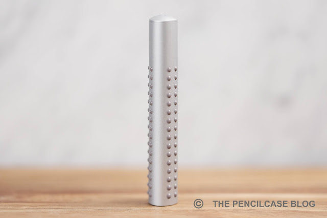
With their ergonomic triangular designs and easy-to-hold rubberized dots (hence the name 'Grip', obviously), the Grip products are marketed mainly towards a younger audience. The dots are the main design element that set the Grip products apart, including the new Grip 2011 fountain pen.

However, as I said, on most of the Grip 20XX products those rubberized dots serve the simple purpose of providing grip. On the fountain pen that added functionality is gone, unless you grip your pen all the way up on the barrel I guess. So the only reason they're there is to make the design stand out and create a uniform look across the entire product line. 
REVIEW: FABER-CASTELL GRIP 2011 FOUNTAIN PEN
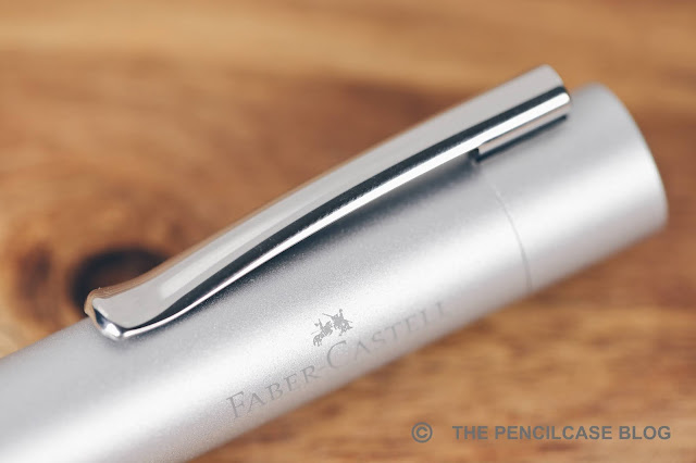
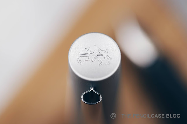
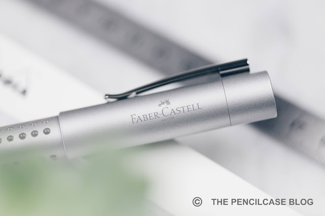
Other than the dots, the Grip 2011 fountain pen is a fairly standard-shaped pen. The cap is round and almost featureless. It has a concave finial on top, with Faber-Castell's jousting knights logo on it. Same as all other Grip products, the barrel has a triangular profile with nicely rounded edges. It's a fairly clean and minimal design really, and in this silver metallic colorway, it actually looks quite nice. Given that this product range is aimed at children mostly, it's still a surprisingly business-y-looking pen (although it's also available in some really bright colors, if "business-y" is not your thing!).
REVIEW: FABER-CASTELL GRIP 2011 FOUNTAIN PEN
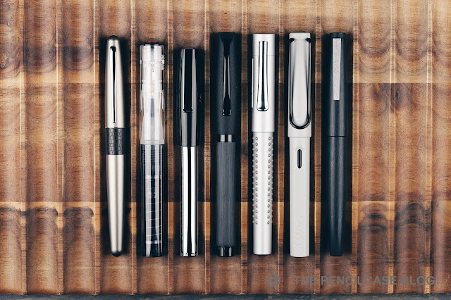
L to R: Pilot Metropolitan, TWSBI GO, Faber-Castell Loom, F-C Essentio, F-C Grip 2011, Lamy Safari, Lamy 2000
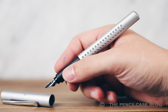
Some measurements then: the Grip 2011 is 13,9 cm (5.47") closed, and 13 cm (5.1") without the cap. It has a comfortable diameter, definitely not too thin. The triangular profile of the barrel continues underneath the cap, with a subtly shaped rubberized section. The section shape is quite interesting actually. It's not super-pronounced, so it doesn't force your grip and feel as restrictive like the notorious section of the Lamy Safari does. But at the same time, you definitely do feel that this is a shaped section. And if you don't have a 'traditional' triangular grip, it may very well still bother you. Aside from the section shape, the Grip is actually a really comfortable pen. The transition from section to barrel is seamless and the pen fits nicely in the hand. The 'dots' -even though you normally don't hold the pen on the barrel- do throw me off sometimes, they are definitely noticeable in the hand - a massage for the web of your hand, perhaps?
REVIEW: FABER-CASTELL GRIP 2011 FOUNTAIN PEN
What Faber-Castell does absolutely great is make consistently high quality products, no matter the price range. The Grip 2011 is all-plastic, sure. But it's all constructed very precisely. The injection-molded plastic parts are thick and sturdy, and the cap snaps on reassuringly. It's a very light pen (15 gram total), but nothing rattles or feels poorly made, even the folded stainless steel clip feels surprisingly sturdy and has a nice firm spring-loaded action. Not at all bad for a 20$ pen!
REVIEW: FABER-CASTELL GRIP 2011 FOUNTAIN PEN
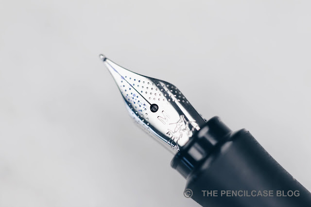
Then there's the nib. Faber-Castell's steel nibs are usually the star of the show, but the Grip (and a few of their other lower-end pens) utilize a slightly different nib and feed. So is it still as good? The nib has an almost identical design, the only visual difference is its slightly smaller size (a bit smaller than the usual #5 size nib). It's not removable either by the way, not that there's a need to remove it though.

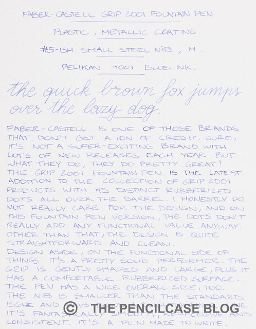
Performance-wise, this smaller nib is pretty much on the same level as FC's other nibs. It's smooth enough, though has perhaps a touch more feedback than the regular FC nibs. It writes consistently, as I've come to expect from them, and the ink flow is balanced but slightly on the wet side. Interestingly, from my (limited) testing of a couple of these nibs, I learned that this smaller nib writes a slightly narrower line compared to the regular #5-sized nibs. For this review, I tried a medium nib, but I'd say it's more of a medium-fine.
REVIEW: FABER-CASTELL GRIP 2011 FOUNTAIN PEN
The Faber-Castell Grip 2011 retails for 20€, or 23$ from Appelboom (Even 10% less if you use my discount code 'friend' on their website!). The design is -ehrm- different, I'm pretty neutral about it - I don't love it, but don't hate it either. The nib though? Absolutely perfect, just an all-round great writer. It's also well-made, sturdy clip, good ergonomics (if you don't mind the triangular grip!)... what more can you expect really? It ticks all the right boxes for a 20 dollar pen. So if you ask me, the Grip can easily compete with the usual workhorse pens in this price range, like the Lamy Safari or Pilot Metropolitan!
Appelboom pens
This product was provided on loan by Appelboom, so I could write this review. I was in no way influenced in the making of this review, the opinions shared in this review are completely my own! This post contains affiliate links.
 REVIEW: FABER-CASTELL GRIP 2011 FOUNTAIN PEN