
I don't review enough pens in the 10-20$ price bracket. It's something I really want to change, because there are some real gems to be found in the entry-level range. Faber-Castell is one of the brands that often brings excellent bang for the buck in their lower-tiered offerings, and yet I don't spend enough time with their products.
I guess it's some kind of pen-snobbery once you start getting into more expensive pens. But really, that's just ignorant, and I know it. A while ago I got a couple of pens on loan from Appelboom, amongst which this new-ish Faber-Castell Grip 2011 fountain pen, but also a 1000$ Montblanc (the R. Kipling Writers Edition, should you want to know), and frankly the Faber-Castell more than held its' ground against pens many times the price.
I guess it's some kind of pen-snobbery once you start getting into more expensive pens. But really, that's just ignorant, and I know it. A while ago I got a couple of pens on loan from Appelboom, amongst which this new-ish Faber-Castell Grip 2011 fountain pen, but also a 1000$ Montblanc (the R. Kipling Writers Edition, should you want to know), and frankly the Faber-Castell more than held its' ground against pens many times the price.
The new Faber-Castell Grip 2011 fountain pen continues on their popular line of Grip 20XX stationery and school supplies. The Grip product range has been around for years and is quite extensive, so it's perhaps a bit of a surprise that it took them so long to add a fountain pen to the list. But hey, they did now, and the end result is more than decent, really.
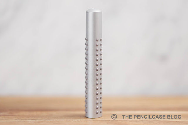
With their ergonomic triangular designs and easy-to-hold rubberized dots (hence the name 'Grip', obviously), the Grip products are marketed mainly towards a younger audience. The dots are the main design element that set the Grip products apart, including the new Grip 2011 fountain pen.
However, as I said, on most of the Grip 20XX products those rubberized dots serve the simple purpose of providing grip. On the fountain pen that added functionality is gone, unless you grip your pen all the way up on the barrel I guess. So the only reason they're there is to make the design stand out and create a uniform look across the entire product line.
However, as I said, on most of the Grip 20XX products those rubberized dots serve the simple purpose of providing grip. On the fountain pen that added functionality is gone, unless you grip your pen all the way up on the barrel I guess. So the only reason they're there is to make the design stand out and create a uniform look across the entire product line.
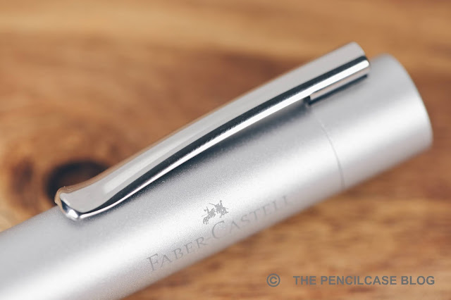
Other than the dots, the Grip 2011 fountain pen is a fairly standard-shaped pen. The cap is round and almost featureless. It has a concave finial on top, with Faber-Castell's jousting knights logo on it. Same as all other Grip products, the barrel has a triangular profile with nicely rounded edges. It's a fairly clean and minimal design really, and in this silver metallic colorway, it actually looks quite nice. Given that this product range is aimed at children mostly, it's still a surprisingly business-y-looking pen (although it's also available in some really bright colors, if "business-y" is not your thing!).
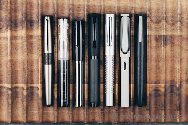 |
| L to R: Pilot Metropolitan, TWSBI GO, Faber-Castell Loom, F-C Essentio, F-C Grip 2011, Lamy Safari, Lamy 2000 |
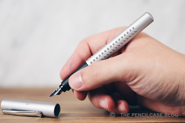
Some measurements then: the Grip 2011 is 13,9 cm (5.47") closed, and 13 cm (5.1") without the cap. It has a comfortable diameter, definitely not too thin. The triangular profile of the barrel continues underneath the cap, with a subtly shaped rubberized section. The section shape is quite interesting actually. It's not super-pronounced, so it doesn't force your grip and feel as restrictive like the notorious section of the Lamy Safari does. But at the same time, you definitely do feel that this is a shaped section. And if you don't have a 'traditional' triangular grip, it may very well still bother you. Aside from the section shape, the Grip is actually a really comfortable pen. The transition from section to barrel is seamless and the pen fits nicely in the hand. The 'dots' -even though you normally don't hold the pen on the barrel- do throw me off sometimes, they are definitely noticeable in the hand - a massage for the web of your hand, perhaps?
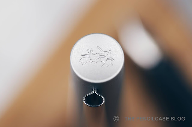
What Faber-Castell does absolutely great is make consistently high quality products, no matter the price range. The Grip 2011 is all-plastic, sure. But it's all constructed very precisely. The injection-molded plastic parts are thick and sturdy, and the cap snaps on reassuringly. It's a very light pen (15 gram total), but nothing rattles or feels poorly made, even the folded stainless steel clip feels surprisingly sturdy and has a nice firm spring-loaded action. Not at all bad for a 20$ pen!
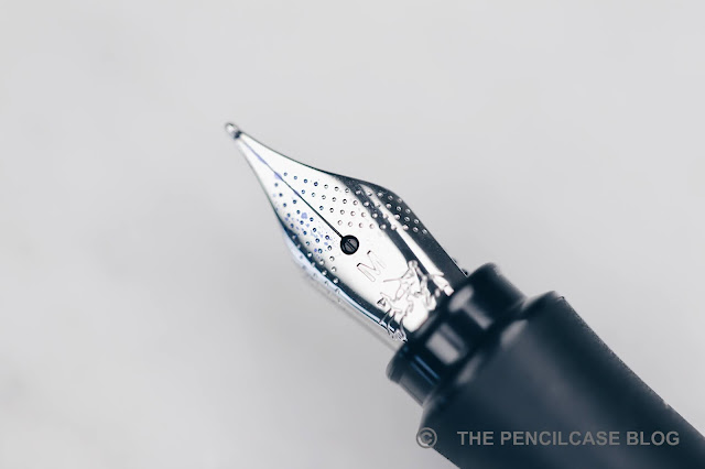
Then there's the nib. Faber-Castell's steel nibs are usually the star of the show, but the Grip (and a few of their other lower-end pens) utilize a slightly different nib and feed. So is it still as good? The nib has an almost identical design, the only visual difference is its slightly smaller size (a bit smaller than the usual #5 size nib). It's not removable either by the way, not that there's a need to remove it though.
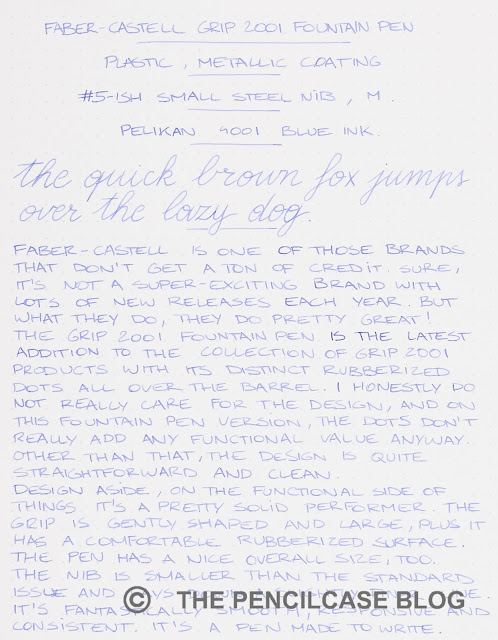
Performance-wise, this smaller nib is pretty much on the same level as FC's other nibs. It's smooth enough, though has perhaps a touch more feedback than the regular FC nibs. It writes consistently, as I've come to expect from them, and the ink flow is balanced but slightly on the wet side. Interestingly, from my (limited) testing of a couple of these nibs, I learned that this smaller nib writes a slightly narrower line compared to the regular #5-sized nibs. For this review, I tried a medium nib, but I'd say it's more of a medium-fine.
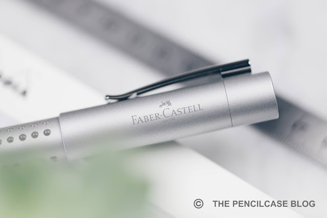
The Faber-Castell Grip 2011 retails for 20€, or 23$ from Appelboom (Even 10% less if you use my discount code 'friend' on their website!). The design is -ehrm- different, I'm pretty neutral about it - I don't love it, but don't hate it either. The nib though? Absolutely perfect, just an all-round great writer. It's also well-made, sturdy clip, good ergonomics (if you don't mind the triangular grip!)... what more can you expect really? It ticks all the right boxes for a 20 dollar pen. So if you ask me, the Grip can easily compete with the usual workhorse pens in this price range, like the Lamy Safari or Pilot Metropolitan!
This product was provided on loan by Appelboom, so I could write this review. I was in no way influenced in the making of this review, the opinions shared in this review are completely my own! This post contains affiliate links.


I bought one and find it quite disappointing. The nib is not at all on par with other fc steel nibs. It feels cheap, flimsy, with poor flow; I think they simply used the nib from their ultra cheap school pens. The pen is like a bad imitation of a Pilot Metropolitan, which is a much more solid and better pen, not to mention less expensive. Usually, I love fc products, but this one is a miss.
ReplyDeleteEs realmente sorprendente lo que afirma Anonymous at jul 5-2022. Que es una imitacion de la Metropolitan! Pero por Dios que está mirando!!!! Será que sí tiene una Pilot Metropolitan? O se equivocó de imagen.
DeleteEsta Grip 2011 es una pluma económica pero escruibe mejor que otras muchas más costosas. Muy suave, buen flujo; no d ela calidad de una E-motion de FC. Pero es excelente. ¿Qué estaba mirando el opinador?