When you think about it, there really aren't that many pen brands out there that focus solely on handlaquered urushi and Maki-e fountain pens. Off the top of my head I only know two: Nakaya and Danitrio! Of course there are others, but these two account for the majority of the pens that you will come across.
Especially Nakaya is by far one of the most well-known brands out there, but I think that is mainly due to their more reasonable pricing. I've personally always found Danitrio's designs to be more interesting, unfortunately they do come at a cost!
One of the designs from this American/Japanese brand (While the craftsmen and techniques are Japanese, their HQ is in California) that I have always been particularly fond of is the Mikado flattop. And it just so happens that I got the opportunity to try one, courtesy of
Sakura Fountain Pen Gallery, so big thanks to them!
Danitrio puts out a lot of very unique and intriguing designs: from a straight cylinder, or a dodecagonal faceted pen, to a pen with a ridiculously bulbuous shape (almost as if the pen is about to explode). They have a thing for exaggerated shapes, and even more so for very large pens! There are a couple relatively smaller and more 'normal' designs as well, but even those can be considered 'oversized' compared to typical western pens.
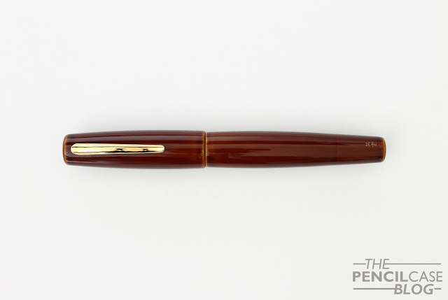
The Mikado has, what I think is a relatively traditional design, But it's the size that makes it special. It has a slightly bulbuous cigar shape, with flattened ends as the name suggests.
The Mikado doesn't have facets, and it has a single-color urushi paintjob. It can be had clipless or with clip, with the clip itself also often being laquered to match or contrast the rest of the pen. Danitrio only uses a single clip design for all their pens. The simple, curved shape matches the design of the Mikado particularly well.
I'm drawn to the simplicity of the Mikado. The reddish-brown urushi on this pen is called 'Ki-Dame', and it's made with the Tame-Nuri technique. I'm writing this as if I know a bunch about these laquering techniques, but I honestly don't understand a single word!
What I do understand is that urushi can be quite deceiving. In this case, Ki-dame stands for yellow Tame-Nuri laquer, however this doesn't look much like yellow at all. With the Tame-Nuri technique, a colored base layer -yellow in this case- is covered with multiple colorless layers. The colorless layers start out as a smoke brown color, but under the influence of light they become completely colorless over time. This means that, over use, the pen will become lighter and the yellow base color will show through more. An interesting bit of Wabi-Sabi!
 |
| The yellow base color of the Ki-Dame Tame-Nuri adds some depth to the finish |
Urushi laquer is applied in many thin layers, and each layer is sanded before the next one is applied. The cool thing with Tame-Nuri finishes is that the edges of the pen have a thinner layer of laquer, so the base color shows through more. This contrast is simple yet playful, and it provides some visual interest to an otherwise monotone pen. I like the combination of a big pen with a subtle finish like this. It's a stately pen and it's quite an eye-catcher, but it doesn't overdo it.
 |
| Each pen has a maker's signature at the bottom of the pen |
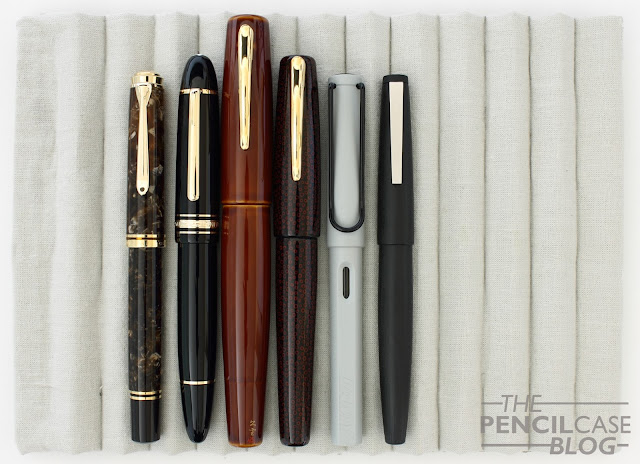
As I said earlier, Danitrio makes some pretty big pens. 'Big' might even be an understatement. Put the Mikado next to any standard 'western' pen -even a large one like the MB 149- and it completely dwarfs them!
There's actually a pretty sound explanation for why these pens are often so large. You see, most Danitrio pens -including the Mikado- are also used as a basis for Maki-e laquer art. The bigger the pen, the more intricate paintings can be made on it.
An oversized pen like this might not be everyone's cup of tea, and it sure isn't practical to take with you as it doesn't fit most pen cases. But from a comfort point of view, it does get away with it's size quite well. And with this I mean that, despite the size, it actually manages to be quite a comfortable pen to hold and write with.
 |
| L to R: Pelikan M800, Montblanc 149, Danitrio Mikado, Danitrio Takumi, Lamy Safari, Lamy 2000 |
Coming in at 16.3 cm (6.42") closed, and 14.2 cm (5.49") without the cap, and with a diameter of 2cm (0.78") at the widest point of the cap, this really is unlike anything else! The section is a good bit less wide, compared to the rest of the pen that is. With a total weight of 45g (27g uncapped), it feels solid but it's far from heavy. Of course that's to be expected from an ebonite pen.
In terms of comfort, I actually like the bulky overall shape. The section may be a little on the short side, given that there's a relatively large step behind the threads. But all in all it hasn't bothered me that much when in use. The wider diameter of the section makes me grip the pen more relaxed, as opposed to having a death-grip on thinner pens. But that could just be me. Suffice to say, I didn't ever think about posting the cap, it's obviously more than long enough without that.
A quick word about the filling system: the Danitrio Mikado is equipped with a Japanese eyedropper. It's the first time I ever used this specific filling system. A Japanese eyedropper is similar to a normal eyedropper, but additionally it features an integrated mechanism that resembles a vac filler. Inside the barrel, you'll find a plunger that closes off the ink flow towards the feed. But instead of operating the plunger up and down to fill the pen -as you would with a vacuum filler-, the only function of the plunger is to act as an ink shut-off.
To fill the pen, you simply unscrew the section and fill the entire barrel with ink using an eyedropper or syringe. To write, you unscrew the blind cap at the back of the barrel a few turns to move the plunger away from the feed, which allows the ink to flow. Usually, vac fillers can be used without loosening the blind cap. But especially when I picked up the pen after a day of not being in use, I found the flow quite dry and it would hard start without the shut-off valve opened.
 |
| love the design of the large #8 nib! |
You might think pens like this are just for show, but nothing is less true! Danitrio equips their pens with German Bock nibs, and they are absolutely fantastic in every way! The Mikado is a large pen, so it comes with the larger #8 nib. I love the two-tone design, it's by far the most beautiful I've ever seen, and the intricate design is meticulously plated to create the two-tone design.
But they don't just look great, they write great as well. Of course you shouldn't expect anything less on a 1500 dollar pen, but this 18k nib is tuned to absolute perfection. The large nib sits on an ebonite feed that provides a generous (sometimes perhaps a bit too generous) and consistent ink flow. I encountered a hard start every now and then, when the pen had been unused for a while. But I suspect this is most likely due to the ink shutoff which causes the remaining ink in the feed to dry out. The nib itself is not to blame for this, as it wouldn't hard start when I'd open up the valve before putting the pen to paper. In any case, a gentle shake was is all it took to get the flow back to normal again.As I said, I do recommend opening up the piston knob each time you write.
The nib is smooth, very smooth even. Yet despite the above mentioned occasional hard start, I never had any issues with skipping or inconsistency. Smoothness vs. consistency is a balance that proves to be difficult to maintain, yet Danitrio does this quite well.
1575 Euros, that's the pricetag we're looking at here. Undoubtedly a ridiculous amount of money to spend on a pen, but knowing the amount of craftsmanship and time that went into making it, kind of justifies the price for me. It's a bit rich for my blood for now, but a Danitrio Mikado has definitely been added to the (ever growing) wishlist!
This product was sent to me on loan by Sakura Fountain Pen Gallery so I could write this review. I was in no way influenced in the making of this review, the opinions shared in this review are completely my own! This post does not contain affilate links.


