Showing posts with label Karas Pen Co. Show all posts

Monday, August 10, 2020

REVIEW: KARAS PEN CO. INK V2 FOUNTAIN PEN

REVIEW: KARAS PEN CO. INK V2 FOUNTAIN PEN REVIEW
It was only very recently that I familiarized myself with the Karas Pen Co. INK fountain pen - A metal pen I considered buying at least a million times, because what metal pen collection would be complete without. A few months ago, I traded pens with a member of the Dutch FPNL Facebook group for a brass INK. A few weeks after that, Karas introduced the special edition Ink Pony Express, a precursor for the INK V2 that arrived just this week! So I OBVIOUSLY had to give that one a try as well, to see what's new! 

When Karas sent over one of these special edition Pony Express pens, my initial intention was to review it as such, showing the Pony Express with all the accompanying paraphernalia that come with the pen, referencing the short-lived horse-powered courier service connecting Missouri and California from 1860 to 1861. For super-speedy deliveries...in just ten days! (Given the instant gratification zeitgeist, I find the story of Pony Express delightfully ironic). But of course, me being slower than a sloth on sleeping pills (I felt like doing an alliteration!), this limited edition sold out long before I was ready to post about it. So instead, I decided to make this review about my first experience with the Karas Pen Co. INK fountain pen, and how V2 improves on it! 
REVIEW: KARAS PEN CO. INK V2 FOUNTAIN PEN REVIEW
The INK V2 is - IMHO- a pretty significant update over the previous version. And yet, from the outside you won't be able to tell the two apart. The INK has always been a rather unique and recognizable pen though, so I think it's good that they kept the rugged, industrial design language unchanged. While I wouldn't describe the design as 'minimal', the overall shape of the pen is kept very simple, with a straight cylindrical cap, and a featureless, round barrel that tapers slightly towards the back. 

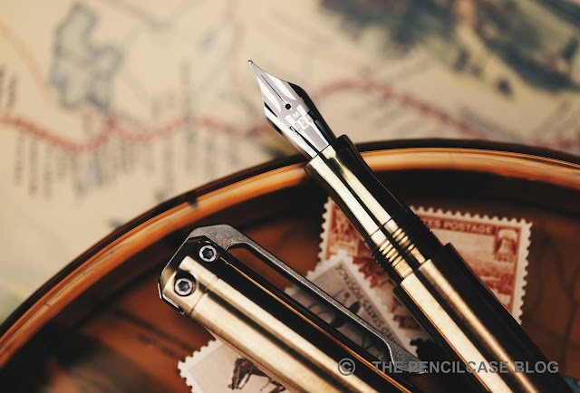
The attention is immediately drawn towards the top of the cap, where the interesting stuff is happening: The massive stonewashed clip made from thick stainless steel (note: the Pony Express has a similarly styled clip, made out of titanium) makes the entire design of the pen. The clip runs through the cap finial (extending a millimeter or so above the finial itself), and is attached by two hex screws that are prominently visible from the side of the cap.
REVIEW: KARAS PEN CO. INK V2 FOUNTAIN PEN REVIEW
Pony Express/V2 (top) vs. old INK (bottom), a noticeably beefier profile
When I think of Karas products, I think chunky and rugged vintage industrial looks, and the clip perfectly ties the INK in with that philosophy. Rugged is a keyword here, as it certainly doesn't look like the sort of clip that'll bend or break. It's a rather stiff clip, but the shape makes it surprisingly easy to use. On an interesting side-note, I noticed that the new clip has a noticeably thicker profile than on the old INK. I'm not sure if that design carries over to the steel clips on the INK V2, or if it's specific to the titanium clip of the Pony Express?
REVIEW: KARAS PEN CO. INK V2 FOUNTAIN PEN REVIEW
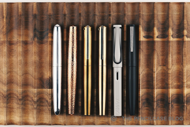
L to R: Ensso Piuma, Namisu Nova, Karas INK, INK V2, Lamy Safari, Lamy 2000
The INK is a beefy pen, but in a side-by-side comparison it's surprisingly not that large. With a length of 13.8 cm/ 5.245", it's only as long as a Lamy 2000. Without the cap, the INK measures 12.7 cm/ 5",  a comfortable size for my hand. With a maximum diameter of almost 1.5 cm/ .575" though, the INK certainly is a lot thicker than that Lamy 2000. 

The INK isn't just beefy, it's also heavy. The aluminium version weighs a little over 40 grams, hefty but probably still comfortable for a lot of people. The Pony Express I have in my hand is made of bronze, which is comparable to the 'standard edition' brass and copper INK V2 in terms of weight. All three of these surpass 110 grams total, which makes this probably one of the heaviest pens I've ever used. It's very heavy, for sure. And yet it's still surprisingly manageable, which I think is at least partially because of the comfortably shaped section design that provides a positive grip on an otherwise slick, metal pen. The cap does not post, but I never missed that.
REVIEW: KARAS PEN CO. INK V2 FOUNTAIN PEN REVIEW
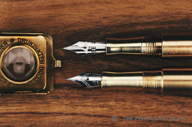
V2 on top, old version below
We're getting to the meat of this review, and why the INK V2 is such a drastic improvement over the previous version. Through some clever internal reshuffling underneath the cap, the inside of the INK looks drastically different from what we're used to seeing. The 'old' INK was one of the first pens to my knowledge that implemented a full-sized #6 nib into a pen that was originally designed to hold a smaller #5 nib (Let's not forget, the pen I now call 'old' is actually already an updated version, that came out back in 2015, 2 years after the original). To make space for the nib, it was recessed 5 mm into the section. 

In the meantime, Karas Pen Co. started doing custom laser-engraved designs on their nibs, so it's only reasonable that they'd like to show it off as best as they can. The section is therefore made shorter about 2 mm, and the nib itself extends 2mm further, relative to the rest of the pen. The section retains the same pinched shape but is actually more comfortable to hold, and that has everything to do with the threads right behind it. 

The threads were redesigned completely, which is the biggest merit of the INK in my opinion. The old threads were extremely sharp and I found them genuinely bothersome in my grip. The redesigned block threads have a shallow and flat profile, making them very unobtrusive. It's a night and day difference over the old design and a welcome change. The step behind said threads is still very much present and remains noticeable in the hand, but the edge is rounded enough to the point where it's not uncomfortably sharp. 
REVIEW: KARAS PEN CO. INK V2 FOUNTAIN PEN REVIEW
Inside the cap, the V2 brings another change that has already been implemented on other Karas pens: the 'Sta-Fast' cap system, as they call it. "The what now?" It's essentially just a rubber O-ring on the inside of the cap, right behind the threads. It catches on the section with just the right amount of friction to give a very satisfying resistance to the final quarter turn when capping and uncapping the pen. Not only does it make the cap stay put  (indeed somewhat of an issue on the old INK), it also creates an airtight seal to keep the nib from drying out. Nifty!

Overall, aside from the improvements that the V2 brings, It seems to me that the machining quality and finishing has also been bumped up a notch. Machining lines are still visible (giving the typical 'brushed' finish that pretty much all metal pens have) but the finish is much tidier and consistent across the entire pen. A few sharp edges here and there that I noticed on my old INK have also been addressed in the new version.
REVIEW: KARAS PEN CO. INK V2 FOUNTAIN PEN REVIEW
The nib, as mentioned, received an aesthetic overhaul with a completely laser-etched design that spans the entire surface of the nib. They started offering in the most recent years (my REVIEW of the Karas Vertex was the first time I saw them IRL), and it's a breath of fresh air amidst all those JoWo nibs with a mismatch of traditional stamped scrollwork and a tiny laser-etched logo in the middle (you'll undoubtedly know what I'm talking about). 
REVIEW: KARAS PEN CO. INK V2 FOUNTAIN PEN REVIEW
Underneath the very clean design, it's a stock Bock nib though. But! BIG BUT! Karas has taken on to individually testing and adjust each and every nib that leaves their factory. A small test sheet included with the pen reminds you of the extra mile Karas went into providing a more hassle-free writing experience. With Bock having the hit-or-miss reputation that it does, I can't stress enough how much peace of mind this brings (also for me as a reviewer, because I feel much more at ease recommending a Bock nib if I know it has been individually tested and adjusted!).

The QC shows, because the writing experience has been nothing short of excellent! The steel medium nib is glassy smooth yet remains surprisingly responsive at the same time. The nib lays down a true-to-size line. Ink flow is balanced, very consistent, and doesn't run dry even with fast writing. No skipping or hard starting to speak of, either (the latter probably in part due to the Sta-Fast cap!). Color me impressed.
REVIEW: KARAS PEN CO. INK V2 FOUNTAIN PEN REVIEW
It's taken me a while before trying the INK, but I'm glad I finally did! The design strikes me as typically Karas: rugged, definitely EDC-minded, but also with a quirky or unique edge that sets it apart - In this case, the unique clip that really ties together the entire design for me.

What's more impressive, is that Karas basically took every point of criticism I would've had about the old model, and improved on it, creating a pen that leaves me surprisingly little opportunity to fault it. Build quality and overall fit and finish are excellent, and clever details like the Sta-Fast cap and redesigned section and threads show the amount of thought that went into this redesign. Where I would've had my doubts with the original INK, the INK V2 is now a pretty comfortable pen to use - perhaps not perfect, but definitely much improved. And last but not least, the individually checked and tuned nibs are a fantastic selling point in and of itself. 

The Karas Pen Co. INK V2 starts at 95$ for the aluminium base model, and goes up to 185$ for the copper version. That's considerably more expensive than comparable metal pens from other brands. If I were reviewing the old INK, I would've made cost an issue (perhaps it's the reason why I held off on this pen for so long?). But in the case of the INK V2, I think the price is more than justified.

This product was sent to me by Karas Pen Co. so I could write this review. I was in no way influenced in the making of this review, the opinions shared in this review are completely my own! This post does not contain affilate links.
REVIEW: KARAS PEN CO. INK V2 FOUNTAIN PEN REVIEW

Wednesday, August 14, 2019

REVIEW: KARAS PEN CO. VERTEX FOUNTAIN PEN

Last year's Decograph (reviewed HERE) ushered in a new period for Karas Pen Co. in which they are trying hard to diversify their offerings. With their line of 'Signature' pens, they go for a clear departure from the heavy duty EDC metal pens that made Karas the brand they are today. However, both in design and execution, the Decograph was sort of a soft transition to a new style of pens. With its' various machined metal parts and angular industrial design, it still connects closely to their collection of metal pens.

This year's Karas Pen Co. Vertex is radically different from previous Karas products in a number of ways. A good kind of different, at least for the most part...

As always, a new Karas pen release means reviews popping up everywhere. Even though I'm a bit late to the game (by know you probably know that that's kind of my style), I still wanted to pitch in with my own thoughts on their latest product.
Designwise, I'm really digging where the guys from Karas are going with their Signature pens. The Vertex is a sleek-looking piece with a streamlined design that's a strong departure from the industrial, tough-looking pens you'd expect from the Arizona-based brand. It feels elegant and refined, with not a single sharp corner anywhere on the pen. The clean lines are offset by its stout, beefy overall form factor.

The Vertex is void of any ornamental details, not even a brand logo or inscription. The eye is immediately drawn to the ink window right below the cap that visually acts as a center band, and the concave flattop cap finial. It's a simple design, but it just all works together. 

If you've seen or used any of the Reaktor pens, the cap closure of the Vertex will feel awfully familiar. It's basically the same concept, where an o-ring inside the cap catches on the lip of the concave section. It's ingeniously simple, but it works really well and gives a satisfying pop when you open it. 
Pop the cap off, and you'll notice that the ink window and section are actually a single acrylic part. The ink window transitions smoothly into the large, concave-shaped section. Just the design of the section alone is commendable. It's a clever solution that looks great and adds to the clean, minimal lines of the pen. It's also more or less the epitome of what a comfortable section should be.
While the Karas team has spent the past year improving and finetuning the design, the Vertex already made its debut on several pen shows across the US. Following these small-scale runs in a wide variety of materials, they narrowed down the options for this general release. The standard production version comes in either black or transparent green acrylic (same as the Decograph) and black or white delrin. For the section, you can choose between a variety of transparent acrylics, from grey, red, blue and orange, to even the transparent coke bottle and Italian ice resins you might know from Franklin-Christoph. The section adds a refreshing bit of customization. And because it's visible both capped and uncapped, it really changes the entire look of the pen.

With the release of their 'Signature' pens, the guys at Karas also try to bring more variety to the table in the form of limited edition releases. With the release of the Vertex, they also announced three limited editions (40-50 pieces): Galeocerdo, Chrysopoeia and H-alpha -all made from Omas acrylics. 
Unfortunately my review sample took a while to reach across the pond, so at this point two of the three LE's (The pen that was sent to me for review, the 'Galeocerdo', made from Omas' silver pearl material and the 'chrysopoeia' in Curvo acrylic) already sold out - sorry! Only the third release, H-Alpha in -stunning- Omas' red swirl acrylic is still available for the moment. I assume the limited edition releases, just like with the Decograph, will most likely become a recurring thing. So that's something to keep an eye out for if you like more 'unique' material options.

Designwise, there's only one thing that doesn't work well with this pen in my opinion, and that's the box. It's a really nicely made keepsake box (to the point where it starts to feel a bit overkill, even), with a full machined aluminium construction and metal sliding lid. I just don't think the design fits this particular pen very well. A box -however nice it may be- is just a box though, so let's not overthink it.
L to R: Edison Beaumont, Karas Pen Co. Retrakt, Decograph, Vertex, Lamy 2000, Safari
The Vertex, at just 13.3 cm (5.25") capped, sits somewhere inbetween a full-sized and pocketable pen. However, it retains most of its length when uncapped at 12.7 cm (5"). The stout shape of the Vertex translates into a beefy diameter of 1.5 cm (.575") at the widest part of the barrel, and a fairly wide section. With just 16 g on the scale, it's extremely lightweight -not surprising with its all-acrylic construction. I typically don't post my pens, and the Vertex can get away with that no problem. Should you want to, the cap does post deep and securely. The Vertex' strong suit is definitely its comfortable design. It's not too heavy, not too big or too small, and the shape of the pen fits perfectly in your hand.

Being specialized in EDC pens, it feels like Karas made sure the Vertex could live up to the same standards of durability. Despite being lightweight, all parts are machined with incredibly thick walls so they feel robust and can stand up to some (ab)use. Fit and finish is excellent and the entire pen is nicely polished. It's a very refined piece.
The Vertex was originally designed as an eyedropper-only pen, but a converter will fit. Through the use of o-rings behind the nib unit and inside the barrel threads, it can theoretically be eyedroppered without the need of silicon grease. Being slightly OCD, I greased the threads anyway just to be sure. 

The problem is... I don't like the Vertex when eyedroppered. It provides a lush, wet ink flow and great ink capacity, but I found it doesn't play nice with the snap cap. As I mentioned before, the cap comes off with a satisfying pop. But the suction from uncapping can cause ink to burp inside the cap. They add a warning that you should always cap and uncap holding the pen vertically to account for the pressure change, but that didn't always work. 

So I went back to using a converter, which solved the issue to a certain extent. The converter doesn't visually ruin the look of the pen (with the cap on you can barely notice that it's not eyedroppered), and the ink flow is regulated much better. Nevertheless, it's not the fidgeter's pen as it can still occasionally burp ink when you cap and uncap nib-down. 
Can you spot the double Karas 'K' in there?
The writing end on the Vertex comes from Bock, as per usual. But instead of the standard #6 nib with stock Bock imprint, you're greeted by a really cool custom laser-etched Karas Pen Co. logo that takes up the entire nib face. As far as laser-etched nibs go, this is one of the best looking designs I've seen to date. They are also marked with the nib width, so no more guesstimating what size nib it is. The M nib on mine was perfectly smooth and responsive out of the box, and writes a beefy medium line. Converter-filled it's a moderately wet writer, but the flow gets considerably wetter when eyedroppered.
Honestly, I am surprised by the Vertex. The guys at Karas are going far outside of their comfort zone in making completely resin fountain pens. Yet on the first try (second if you count the Decograph), they managed to deliver a surprisingly complete package with a sleek and elegant design, good build quality, excellent comfort and clever details like the customizable section. It's safe to say they clearly know what they are doing. The burping issue prevents me from calling this pen perfect, but in many ways they come awfully close to it. 

As Anthony from UK Fountain Pens mentions in his review, the Vertex is undercutting similar products from the likes of Edison and Franklin-Christoph by 30 or even 40$. They're definitely closing in on that area of the market, and it's good to see a 'new' player disrupt things to keep a healthy competition going.

You're probably currently overwhelmed with reviews of this pen coming from all angles, but it doesn't happen very often that we all feel roughly the same way about a certain pen. This time around, it seems that we do (more or less), and I think that really goes to show how good the Vertex actually is. It's cool to see an established brand like Karas Pen Co. put in the effort to expand and try something completely different. If the Vertex is them testing the waters with something different, I can't wait to see what they come up with next!

This product was sent to me by Karas Pen Co. so I could write this review. I was in no way influenced in the making of this review, the opinions shared in this review are completely my own! This post does not contain affilate links.

Monday, August 6, 2018

REVIEW: KARAS PEN CO. REAKTOR GALAXIE (XL) & STARLINER (XL)

Karas Pen Co. Reaktor Galaxie ballpoint, Galaxie XL rollerball & Starliner (XL) fountain pen review and comparison post
As you've most likely seen more and more reviews of the brand spanking new line of Karas Pen Co. products -The Reaktor (Stage 1) pens- pop up, I figured it was about high time to drop in my own 2 cents about them. I was lucky enough to get their entire product line sent over, and I think by now I've spent enough time with them to give you my final verdict. The Reaktor product line can be broken up into four products (for now, as there will likely be more products added later on): the Galaxie, Starliner, Galaxie XL and Starliner XL. 

I'll be doing things a bit differently than most other reviewers who discussed each pen separately. Instead, this post will be both a review and comparison of all four models, to show the differences and similarities between the various types. This might become a rather lengthy review... so let's get right to it!
Karas Pen Co. Reaktor Galaxie ballpoint, Galaxie XL rollerball & Starliner (XL) fountain pen review and comparison post
Karas Pen Co. (aka. Karas Kustoms) has had quite an impressive track record so far, with some hugely popular pens like the Render K, Retrakt (reviewed HERE) or Ink. But looking at their latest releases, they are clearly taking a new direction to diversify their offerings. They used to focus primarily on the EDC community, with big, heavy and tough machined metal pens. Since last year they threw in the new Signature line of pens, with the fantastic Decograph (that I reviewed HERE) and now the Vertex (which premiered at the DC pen show last weekend). A third line was launched last week with the Reaktor and its first two products: the Galaxie XL and Starliner XL (the regular Galaxie and Starliner pens will be released later this month).

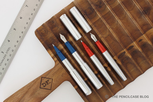
With stage 1 of the Reaktor pens, they are filling a gap in the lower-end product lineup, providing a cheaper alternative that retains the 'made in the USA' quality. Sort of a gateway drug into the hobby. As I mentioned earlier, the first stage of the Reaktor product line includes four different pens available in four colorways, making for a total of 16 different configurations. 
Karas Pen Co. Reaktor Galaxie ballpoint, Galaxie XL rollerball & Starliner (XL) fountain pen review and comparison post
Interestingly, the fountain pens (Starliner) and rollerball/ballpoint pens (Galaxie) each have their own design style, although they follow the same general form factor for the most part. Karas relies heavily on vintage 'Americana' influences for the Reaktor series. Both the Galaxie and Starliner found their inspiration in the space race and automotive industry (both pens being named after Ford cars), which reflects in certain prominent design features, as well as more subtle details.
Karas Pen Co. Reaktor Galaxie ballpoint, Galaxie XL rollerball & Starliner (XL) fountain pen review and comparison post
Cap and barrel details of the Galaxie
The Galaxie and Galaxie XL are immediately recogniseable by its intricately CNC'd cap finial, which represents hose fixtures found on space suits (take a look at this space suit from Buzz Aldrin, and you'll also see where they got the inspiration for the anodizing colors, not coincidentally also the colors of the US flag!). 
Karas Pen Co. Reaktor Galaxie ballpoint, Galaxie XL rollerball & Starliner (XL) fountain pen review and comparison post
3...2...1 LIFTOFF!
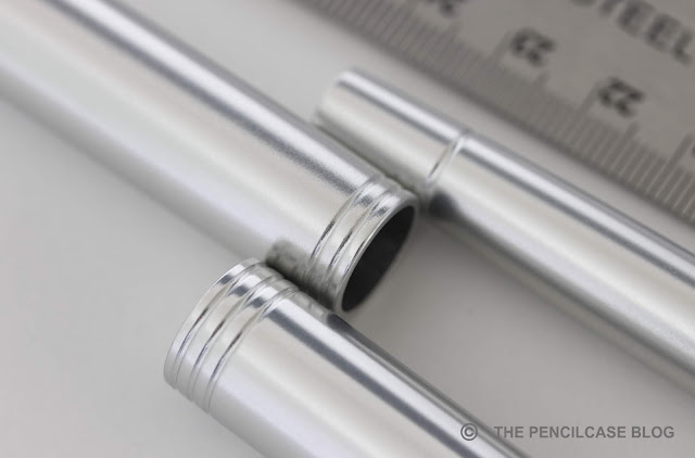
The Starliner and Starliner XL have a more subtle, but stately flat-top design. The cap and barrel finials have a subtle point machined in them, which bounces off the light to mimic the glint of a star (I think it kind of looks like the gravitational field of a star... I'm a geek, lol). The Starliner also includes a cool reference within the rings engraved all over the pen: 3 on the cap finial, 2 at the base of the cap and 1 at the back of the barrel. 3...2...2 LIFTOFF!

The overall shape of the pens is the same for both models: flattop with an oversized cap and narrower, strongly tapered barrel. The proportions are admittedly a bit quirky and unusual, which makes these pens immediately recognizable. 
Karas Pen Co. Reaktor Galaxie ballpoint, Galaxie XL rollerball & Starliner (XL) fountain pen review and comparison post
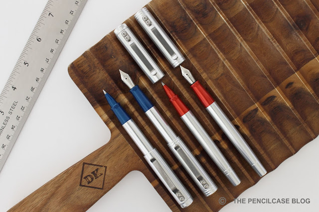
Then there's the two sizes that you can choose from: regular or XL. Apart from the obvious difference in size, the XL also differs because of the sprung steel clip. The smaller size is made to carry inside your pocket, while the XL can be attached to your pocket. Both pens are actually fairly compact. But the smaller model is a 'true' pocket pen that is extremely comfortable to just throw in your pocket and always have with you, whereas the XL is a more full-sized pen.

The Galaxie and Starliner are the first Karas pens that feature a snap cap. The mechanism is simple: a rubber o-ring inside the cap provides a 'bump' on which the flared edge of the section catches. Even though it's a somewhat unconventional mechanism, it works surprisingly well. The cap opens and closes with a reassuring 'snap' and I never worried that the cap may pop off inside my pants pocket. Worth pointing out is that the closure mechanism does allow for some side-to-side wiggle. The cap rattles a tiny bit, although I expected much worse.
Karas Pen Co. Reaktor Galaxie ballpoint, Galaxie XL rollerball & Starliner (XL) fountain pen review and comparison post
Silver - Black - Tumbled Raw
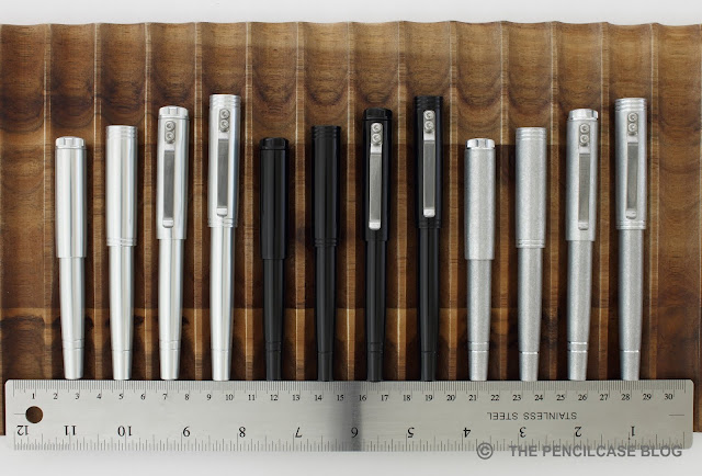
Because these pens sit at an entry-level price point, the material and finish options are restricted to aluminium in either silver or black anodized finish, or a tumbled finish. The silver annodised version is available with a blue or red anodized grip section to give a total of four colorways to choose from. I'm personally a big fan of the tumbled and black anodized finishes. The reasoning behind this narrowed down offering is simply to cut on production costs.
Karas Pen Co. Reaktor Galaxie ballpoint, Galaxie XL rollerball & Starliner (XL) fountain pen review and comparison post
L to R: Schon DSGN The Clip, Karas Pen Co. Fountain K, Karas Pen Co. Retrakt, Karas Pen Co. Galaxie XL/Starliner XL/ Galaxie/Starliner, Lamy Safari, Lamy 2000
Karas Pen Co. Reaktor Galaxie ballpoint, Galaxie XL rollerball & Starliner (XL) fountain pen review and comparison post
Galaxy and Starliner, posted and unposted
Karas Pen Co. Reaktor Galaxie ballpoint, Galaxie XL rollerball & Starliner (XL) fountain pen review and comparison post
L to R: Galaxie, Starliner
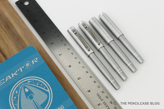
The Galaxie ballpoint pen and Starliner fountain pen are pocket-sized pens, and measure 11cm (4.3") and 11.5cm (4.5") respectively when closed. Uncapped, both pens drop below 11cm, which is too short for anything but a quick jot. The cap posts securely with a firm push, and the o-ring inside the cap holds it in place. The cap posts deeply onto the barrel, making for a total length of 11.5cm (4.5") for the Galaxie and 12.5cm (4.9") for the Starliner. Both pens weigh in at 24g total, which is not particularly heavy, but enough to give a solid feel in the hand.
Karas Pen Co. Reaktor Galaxie ballpoint, Galaxie XL rollerball & Starliner (XL) fountain pen review and comparison post
Galaxie XL and Starliner XL
The larger Galaxie XL rollerball and Starliner XL fountain pen receive a modest bump in length: 12.3cm and 12.8cm respectively. Uncapped, the Galaxie XL rollerball is a bit short for me, measuring 11.6cm (4.56"), but the Starliner XL fountain pen has a slightly longer section which brings up to a more comfortable length of 12.5cm (4.9"). Posted, both pens have a comfortable length (12.9cm/5.1" for the Galaxie XL and 13.7cm/5.4" for the Starliner XL), and the oversized cap gives it a more central-weighted feel in the hand. The clip and slightly larger dimensions increase the total weight to 29g, which is still relatively lightweight.
Karas Pen Co. Reaktor Galaxie ballpoint, Galaxie XL rollerball & Starliner (XL) fountain pen review and comparison post
L to R: Galaxie XL, Galaxie XL posted, Starliner XL, Starliner XL posted
All four pens have a similar section shape, but the Starliner fountain pens have the advantage of a slightly longer section. The widest part of the section measures 1.1cm (0.43"), and tapers down strongly towards the nib, where it flares out again to provide a secure grip. The section design, combined with the lack of threads and a smooth transition from barrel to section, makes the Galaxie and Starliner pens all extremely comfortable and balanced writers. Granted, the regular Galaxie and Starliner HAVE to be posted to comfortably fit my hand, whereas the XL's are comfortable either way.
Karas Pen Co. Reaktor Galaxie ballpoint, Galaxie XL rollerball & Starliner (XL) fountain pen review and comparison post
The Starliner pens use 076 nib units from Bock. L to R: Bock #5, Bock 076, Bock #6
New for Karas pens are the Bock 076 nibs used on the Starliner fountain pens. Up until a month or two ago, I had only seen this nib size on the TWSBI 580. And now in a relatively short time, both the Stilform Kosmos Ink (reviewed HERE) and these Starliners make use of them. In size, the 076 sits in between the #5 and #6, but shares the housing with the #5 nibs so these are interchangeable.
Karas Pen Co. Reaktor Galaxie ballpoint, Galaxie XL rollerball & Starliner (XL) fountain pen review and comparison post
In terms of performance, I'd also rate them in between the #5 and #6. I'm not a huge fan of the small #5 because I find the ink flow can sometimes be a bit unpredictable. The nibs on the Starliner are smooth and responsive, all the way from EF to B. The ink flow seems better and more consistent than on the #5's. I really enjoyed using these pens for EDC, and never had issues with any of them (the rubber o-ring also does a pretty good job keeping the nib from drying out). Bock nibs are often criticized for being lackluster, but they get the job done just fine. 
Karas Pen Co. Reaktor Galaxie ballpoint, Galaxie XL rollerball & Starliner (XL) fountain pen review and comparison post
The Galaxie and Galaxie XL use different refills. Where the Galaxie is meant as a ballpoint, and utilizes the Parker-style G2 refills, the XL can accomodate the larger Pilot G2 rollerball refills. The Galaxie comes loaded with a Schmidt Megaline P950 medium refill in black. This pressurized refill works well and lays down a line that is relatively dark and consistent. I personally prefer the Schmidt Easyflow 9000 which are smoother and darker (although more prone to smearing). But of course you can swap the refill out for whatever suits you best. 
Karas Pen Co. Reaktor Galaxie ballpoint, Galaxie XL rollerball & Starliner (XL) fountain pen review and comparison post
The Galaxie XL comes with a 0.5mm Pilot G2 refill in black, which is an excellent refill for my taste. It works consistently in my hands , and lays down a crisp line that suits my needs just fine (some prefer the finer 0.38mm tip size). 
Karas Pen Co. Reaktor Galaxie ballpoint, Galaxie XL rollerball & Starliner (XL) fountain pen review and comparison post
Karas wanted to fill a gap in the low end of their catalog. And if you ask me, they did a great job filling the vacancy with this new Reaktor line. The Reaktor pens start at 40$ for the Galaxie, and go up from there (45$ for the Galaxie XL, 50$ for the Starliner and 55$ for the Starliner XL), which even includes domestic shipping! These pens offer incredible value for money at a price point previously unseen on the market of USA-made metal pens. 

Does that mean they had to chimp on quality? I don't think so. They managed to cut costs by implementing some clever tricks: a smaller nib, only one material and four finishes (specifically those finishes that are easiest to manufacture consistently, to minimize losses through faulty parts). You also won't find the regular packaging here, but instead the pens will come in color-coded pen tubes, which are cheaper and easier to ship because they are smaller.

Along with the recent Signature line, the new Reaktor pens prove that the people at Karas Pen Co. are working hard to bring products to the market that diversify their offerings, which will appeal to a wider audience. In this case, the Galaxie and Starliner are fantastic options for people that are just starting out in the hobby, or if you are looking for a cheap but durable EDC option.

This product was sent to me by Karas Pen Co. so I could write this review. I was in no way influenced in the making of this review, the opinions shared in this review are completely my own! This post does not contain affilate links.
Karas Pen Co. Reaktor Galaxie ballpoint, Galaxie XL rollerball & Starliner (XL) fountain pen review and comparison post