Sunday, February 24, 2019

REVIEW: SCRIBO FEEL FOUNTAIN PEN

Review: Scribo (Scrittura Bolognese) Feel fountain pen
Omas has been dead and buried for 3 years already (can you believe it's been that long already?!), but brands like ASC and Scrittura Bolognese (Scribo) have since filled the void, so there's actually quite a few interesting things going on surrounding the iconic Italian brand. Closest to being an actual 'reincarnation' of Omas is Scribo, founded by ex-employees of the brand (I'd consider ASC to be more of an 'homage', if anything). Up until now, Scribo sort of went under the radar in building up towards their first 'real' production pen. In the meantime, they released two high-end limited editions, and a store-exclusive for Write Here in the UK (that I reviewed HERE). 

But now they finally released their first production pen: the Scribo Feel! I had been talking with Luca -founder of Scribo- for a while already,  and he recently asked me if I wanted to take the Feel for a spin. Uhm...YES PLEASE! 
Review: Scribo (Scrittura Bolognese) Feel fountain pen
Simple but tasteful presentation
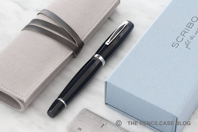
I'm usually not one to spend too much time on packaging, but in this case I think it deserves some attention. The Feel comes packaged in an eye-catching baby-blue cardboard box that is very study yet not excessive. Inside, the pen is held in a pretty neat canvas/faux leather pen wrap (holds two pens and a polishing cloth). Paperwork comes packaged in a separate cardboard sleeve, and I also received a complementary bottle of 'Scribo'-branded blue-black ink (although I'm not sure if the ink is part of the retail presentation). I've seen a lot of packaging come and go, but painfully few brands realize that -no matter how excessive and ridiculously over the top- packaging is still packaging, and contributes relatively little to the overall experience of the pen after the initial 'unboxing'. While I certainly think presentation is important, I much prefer this simple but functional presentation over a massive wooden box that I has to be stowed away somewhere in between the trillion other useless boxes.
Review: Scribo (Scrittura Bolognese) Feel fountain pen
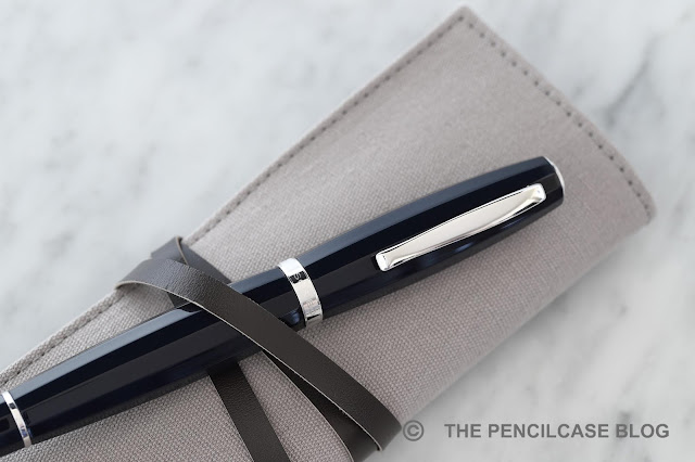
When I first saw product shots of the Feel, my initial thoughts were something along the lines of: 'Well... [cough]... that's an interesting pen.' It's a rather bold design (both figuratively and literally!) inspired by Doric columns, but it works surprisingly well in person. The design is a bit out there, and at the same time it's executed in a way that it looks quite understated. I very much came to appreciate the aesthetic having held it in person. It's a large, bulky pen with a strongly bulbous shape on both cap and barrel. The entire pen has a dodecagonal (12-sided) profile.
Review: Scribo (Scrittura Bolognese) Feel fountain pen
'It looks like it ate too much", was Ed's (as in: Ed Jelley) first reaction when I showed it to him. And that may be about the most apt description I've heard so far. Despite the unusual shape, it's actually quite simple in appearance with very little decorative details. The clip has a slight curvature to it, but is otherwise very simple. The center band and cap finial are both rhodium-plated metal and are very lightly engraved. The engraving is tasteful, but it could've stood out a bit more IMHO (I really like the quill logo on the cap, but it doesn't really stand out). This is really a pen you'll want to see in person, as pictures (at least in my opinion) didn't really do it justice. It's stately, but elegant because of its curvy shape. Is it the best-looking pen out there? Maybe not, but it certainly didn't polarize me as much as I anticipated it would.

Maybe the daring shape of the pen is also why they kept the material options quite simple. A lot of people will probably be disappointed by the lack of extravagant celluloid and colorful resins that Omas used to be known for, instead Scribo let the design of the pen speak for itself with two understated blue resins (blue certainly seems to be the theme here!). The opaque dark blue with rhodium trim is plain, and appears almost black in low light and in pictures. The light blue/grey version with ruthenium trim is perhaps a bit more out there, but it's still a fairly subtle resin pen and the dark trim looks understated.
 Review: Scribo (Scrittura Bolognese) Feel fountain pen
Review: Scribo (Scrittura Bolognese) Feel fountain pen
L to R: Pelikan M800,, Omas Arte Italiana Paragon, Scribo Write Here, Scribo Feel, Lamy Safari, Lamy 2000
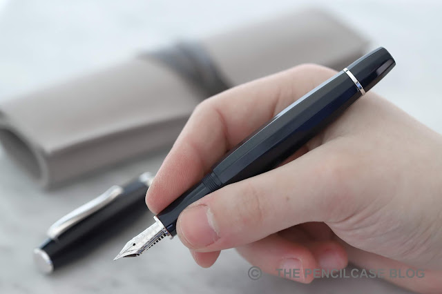
The Feel is a stately pen. It's meant to be Scribo's flagship model, and it's definitely sized accordingly. It's 14.8 cm (5.83") long, and 17 mm (0.67") wide at the 'fattest' point. With an uncapped length of 13.3 cm (5.25") it's large, and it better be because the cap can't be posted. The bulbous shape makes the entire pen appear very wide, but it narrows down considerably towards the middle of the pen and the section, which is a comfortable 11-12 mm (0.47") in diameter. The all-resin construction weighs in at a solid but comfortable 36.7 g total. Most of the weight is in the cap, so it's large but balanced in the hand.
Review: Scribo (Scrittura Bolognese) Feel fountain pen
Uncapping the pen, you'll notice that the walls of the cap are quite thick, and thus there's quite a step from barrel to section. It's quite noticeable when you hold the pen, but the curved barrel somewhat helps 'masking' the transition to the section. The section is also made from resin and features the same dodecagonal profile to match the rest of the pen. The section is long enough to hold comfortably and the threads are quite unobtrusive. 
Review: Scribo (Scrittura Bolognese) Feel fountain pen
'Feel the writing'
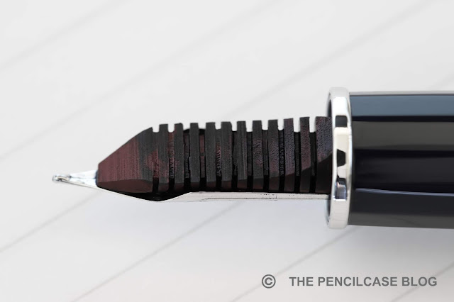
The nib -I said it before, and I'll say it again here- is right on the money! The Scribo nibs are made with custom tools specifically and exclusively made for Omas. Scribo bought those tools during Omas' liquidation. Hence, they are now capable of making their own nibs, identical in specifications to the Omas ones. 
Review: Scribo (Scrittura Bolognese) Feel fountain pen
And I'm glad to say they didn't change anything, apart from the engraving design of course. Of the three Scribo nibs I've used so far, all of them have been nothing short of perfect. The ebonite feed provides a wet (WET!) flow, and keeps up well. The nib is buttery smooth, but surprisingly responsive considering just how smooth it is. It starts right up when it hits the page (even after not being used for a while) and hasn't skipped on me once. The 18k 'non-flex' nib (here in medium) has a nice bounce to it while you write, but if you want a moderate amount of line variation, there is also a 14k 'flexible' version (available in all four line widths, EF-F-M-B).

The Feel has a piston-filling mechanism that holds about 1.5 ml of ink. To be honest, my only real gripe with this pen is that it lacks an ink window. Especially considering how wet this nib writes, I found myself refilling it quite often and there's no way of knowing how much ink is left. A minor nuisance in all, but worth mentioning if you do a lot of writing. 
Review: Scribo (Scrittura Bolognese) Feel fountain pen
To be honest, the Scribo Feel probably wouldn't be my first choice when I'd walk into a pen shop. Yet having had one on my desk for the past couple weeks, I found myself quite drawn to it. It's different, a bit our there design-wise, but at the same time it's quite subtle. If anything, the design is a pleasant change from the usual 'thirteen in a dozen cigar-shaped pen with gold trim', and maybe that's a good thing. Is it worth the MSRP of 650€? That's a tough question. The Omas-quality nibs are a huge plus in my book, but of course it's quite a lump sum of money to put down if you really don't like the design. Ideally, I would've liked to have seen it in the 550-600€ range. 

Remember how at the beginning of this review, I said Scribo is the 'reincarnation' of Omas? Maybe I should reconsider on that. How I see it, there were two scenarios for Scribo: either they completely followed in the footsteps of Omas and kept true to the old Omas designs. Or they went a completely different route to develop their own brand identity. While the first one would've definitely been the easiest to resonate with Omas enthusiasts and gain a following, I'd say they went with option two with the Scribo Feel. They are clearly putting in the effort to differentiate, while still building on their knowledge and expertise from Omas. With the Feel, they definitely show that they can think out of the box, so I look forward to what they can bring in the future!

This product was provided on loan by Scrittura Bolognese, so I could write this review. I was in no way influenced in the making of this review, the opinions shared in this review are completely my own! This post does not contain affiliate links.
Review: Scribo (Scrittura Bolognese) Feel fountain pen

Saturday, February 16, 2019

QUICK LOOK: BARON FIG SQUIRE COPPER PEN REVIEW

Quick Look: Baron Fig Squire copper pen review
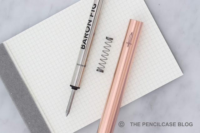
I know, I know! It's a bit late to do a 'quick look' review when the 'new' copper version of the ever-so popular Baron Fig Squire has already been around for more than three months... In fact I'm so terribly late that -in the meantime- Baron Fig already introduced another iteration of their pen: the Squire Brass (same as the special edition lock & Key, but now part of the standard production line). Better late than never though, right? 
Quick Look: Baron Fig Squire copper pen review
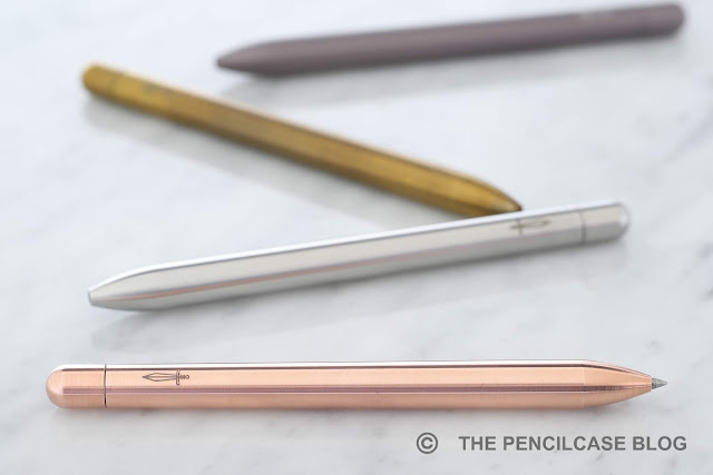
The Squire may have lost some of its popularity since the original launch back in 2016 (review HERE), and there's some fierce competition from other small makers and brands (Such as Karas Pen Co., Tactile Turn, or even the brand new Mark One by Studio Neat). But in my opinion it still holds strong today. That's in part because Baron Fig managed to keep their lineup of Squire pens fresh by constantly releasing new limited edition colorways and various material options in their so-called Precious Metals collection.

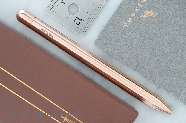
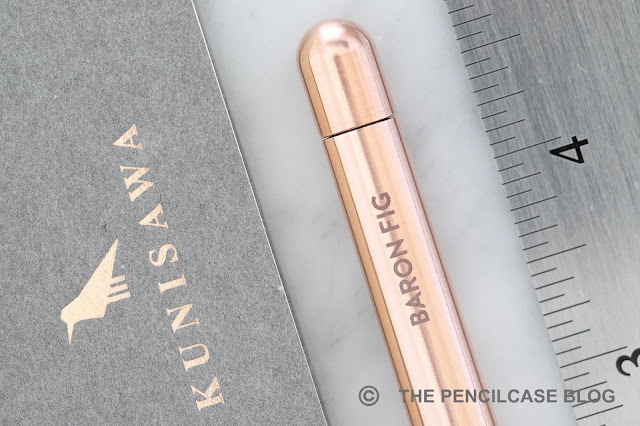
Another reason why I still consider the Squire is its fantastic design. The minimal teardrop-shaped Squire is still one of the sexiest pen designs I've come across. Let's face it, Baron Fig knows how to make a clever-looking and sleek product. It's a clean and uninterrupted, clipless shape, which is of course minimal but not always practical... The shape and size of the Squire lend itself perfectly to being pocket carried, which sometimes makes me wish it has a clip. If you want, Baron Fig sells neat leather pen sleeves, which offer some protection and a place to store your pen without having it roll all over the place. 
Quick Look: Baron Fig Squire copper pen review
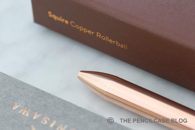
Personally, this solid copper version of the Squire is probably my favorite so far... But then again, I AM quite partial to copper pens. Part of the appeal for me is definitely in the patina it creates. I just love to watch a pristine, shiny pink-colored copper pen create its own unique character after a short while of use, taking on fantastic hues of red, brown and blue. 
Quick Look: Baron Fig Squire copper pen review
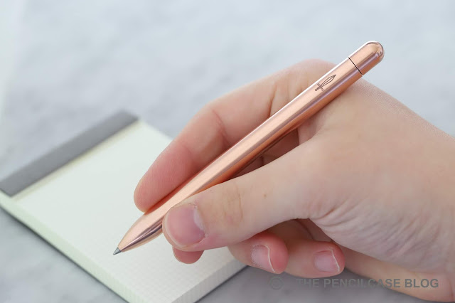
Copper is obviously also a lot heavier than aluminium, and I think the Squire in particular lends itself perfectly to these heavier metals (brass, copper, stainless steel). At 50 grams, it's twice the weight of an aluminium Squire, giving it a very solid feel in the hand. Yet at the same time, it's not too outrageously heavy because of the relatively compact form factor. Contrary to larger, beefier pens made of copper (like the copper Namisu Nova), the Squire never felt like it weighed me down or caused any fatigue while writing. (For a full discussion of dimensions, and size comparison, you can check out my review of the original Squire!) 

If you still want the extra heft, but don't like the smell of pennies that you get from copper or brass pens, the stainless steel version (review HERE) offers a similar heft but with a more industrial, silvery steel look. The choice is up to you. 
Quick Look: Baron Fig Squire copper pen review
Since my last review of a Squire, my preference has shifted slightly towards gel ink pens, as I've been using the Pilot G2 a lot lately. The Schmidt P8126 rollerball refill that ships with the Squire still comes in at a very strong second place though, and it remains the most consistent performing rollerball refill I've tried to date. It lays down a consistent, black line. The ink dries fast and doesn't smear, but it does tend to bleed through lesser-quality paper (which is the main reason why I switched to gel ink, which is a bit less prone to bleeding and feathering).
Quick Look: Baron Fig Squire copper pen review
Price-wise, the copper Squire sits at the upper-end of Baron Fig's offerings, coming in at 95$. The upcharge -compared to the brass (75$) or stainless steel (85$) version- seems somewhat high. It's certainly not cheap for a minimal pen, and let's be honest: not everyone is a fan of copper pens (both due to their weight and the penny smell).

That being said, after 3 years the Baron Fig Squire still brings a smile to my face every time I use it. The design is great -from packaging to branding-, it's a comfortable pen to use and you can't really go wrong with the Schmidt rollerball refill. If copper is not your thing, there are plenty of other finishes to choose from, each with their own characteristics and look (at some point I'm hoping they'll also add a titanium version, which would complete the 'precious metals' collection IMHO).

This product was sent to me by Baron Fig so I could write this review. I was in no way influenced in the making of this review, the opinions shared in this review are completely my own! This post does not contain affilate links.
Quick Look: Baron Fig Squire copper pen review

Monday, February 4, 2019

PAPER REVIEW: KUNISAWA FIND NOTEBOOKS

Paper review: Kunisawa Find notebooks
Some products start off so strong that you're convinced you'll never find any flaws to them... but then things take a turn for the worse. The Kunisawa Find notebook collection is one of those products. A pity really, because I was really quite was blown away by this extensive selection of Japanese stationery at first!
Paper review: Kunisawa Find notebooks
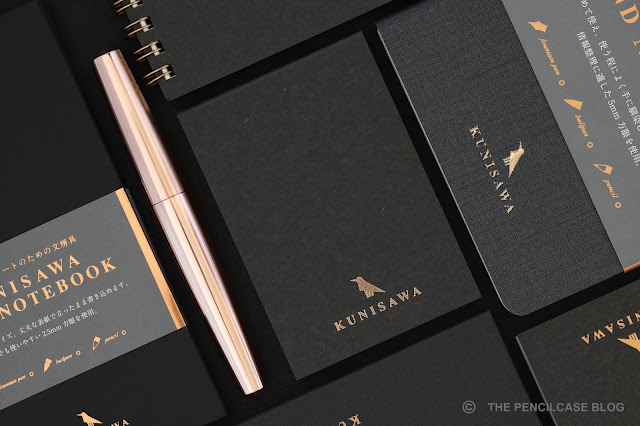
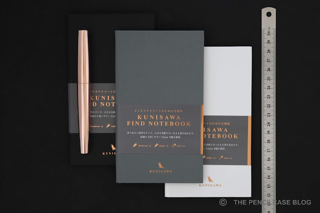
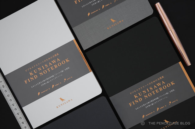
It all started out as a love on first sight-situation. Everything from the design to the precise packaging of the Kunisawa Find products is what I've come to expect from Japanese stationery: minimal design, subtle colors, neat and precise manufacturing,... These have it all. The aesthetic is focused around a business-y monochrome black-grey-white color scheme (with a few exceptions of brown and blue here and there) that are offset by copper accents such as the hot-foiled logo and gilded edges. The result is a stylish and varied set of notebooks, reporter pads, sticky notes,... 'plain' enough to be used in a professional environment, but with a distinct touch that sets them apart from the rest. 
Paper review: Kunisawa Find notebooks
One small detail about the design that I particularly enjoy, is that they use different cover materials for their different products. The hardcover notebooks have plastic covers with different textured finishes, while the ring-bound books are made with cardboard and the 'Soft' notebook has a textured PU foam cover -all of them in matching colorways of course. The variety in materials gives each product its own look and feel.
Paper review: Kunisawa Find notebooks
The logo represents the three-legged crow 'Yatagarasu', a Japanese mythical creature representing the god of guidance.
Then there's the wide range of products to choose from:
Paper review: Kunisawa Find notebooks
Find Sticky Memo. A7 size with 80 adhesive sheets, blank.
Paper review: Kunisawa Find notebooks
Find Block Memo. A7 size with 80 sheets, 2.5mm grid ruled.
Paper review: Kunisawa Find notebooks
Find Pocket Note. Spiral-bound hardcover notepad, 9x15cm. 50 sheets (100 pages), 5mm grid ruled.
Paper review: Kunisawa Find notebooks
Find Smart Note. A compact and slim hardcover notebook. 9x17 cm with 40 sheets (80pages) and gilt edges, 2.5mm grid ruled. Lays open completely flat.
Paper review: Kunisawa Find notebooks
Find Soft Note. A 12x21 cm softcover with flexible PU cover (very flexible!). 96 sheets (192 pages), 5mm grid ruled. Doesn't lay open flat because of the more flexible spine.
Paper review: Kunisawa Find notebooks
Find Slim Note. A thin A5 softcover notebook. 40 Sheets (80 pages) with gilt edges, 5mm grid ruled. Lays open almost completely flat.
Paper review: Kunisawa Find notebooks
Find Ring Note. A5 spiral-bound softcover. 80 Sheets (160 pages), 5mm grid ruled. 
Paper review: Kunisawa Find notebooks
Find Hard Note. Semi-hardcover A5 bound notebook. 96 Sheets (192 pages) with gilt edges, 5mm grid ruled. Lays open almost completely flat.

Functionally, all Kunisawa products follow a very minimalist approach, similar to other Japanese notebooks. All Find notebooks are as barebones as it gets: no numbered pages, no page marker, no elastic closure or back pocket. The only exceptions are the Find Note Soft and Find Note Hard, which come with a thin grey page marker ribbon. If you like your notebooks quite feature-packed, Kunisawa is likely not the brand for you.

Up until this point, I have absolutely zero complaints. I can live without numbered pages or a bookmark, but I expect to find decent paper on the inside. Unfortunately, that's an area where Kunisawa couldn't always live up to my (high) expectations.

All Find stationery utilizes the exact same 'Foolscap' paper (The term Foolscap most likely got lost in translation at some point as it's not a brand name, but rather a type and size of letter paper). The cream-colored paper seems to be around 80 gsm in weight (I couldn't find any actual specs to back this up). It's relatively smooth but not glassy smooth, so it's also suitable for use with pencil. All Find notebooks come with 5mm grid paper, except the Find Block Memo and Smart Note, which have a tiny 2.5mm grid. I wasn't so sure if a grid this small would be usable, but in practice it's really quite enjoyable to write on and I found that my writing would naturally fit inside the ruling. The light grey grid is noticeable, but not too obtrusive in my opinion.
Paper review: Kunisawa Find notebooks
Good vs Bad. Nice crisp lines on the left, feathering and a flat, bland line on the right.
Paper review: Kunisawa Find notebooks
Good vs Bad. Little to no bleedthrough on the left, quite severe bleedthrough on the right.
Paper review: Kunisawa Find notebooks
Excellent shading and sheen on the left. On the right is one of the 'mediochre' samples which shows little to no sheen but still shows decent shading.
Paper review: Kunisawa Find notebooks
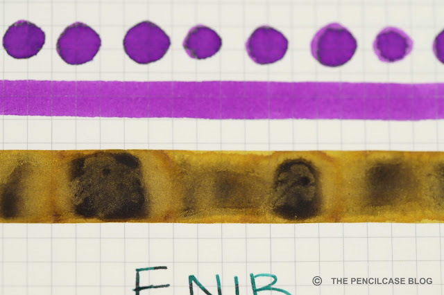
Very interesting shading/oxidation effect of Platinum Classic Citrus Black ink swab. This is one of the good paper samples.
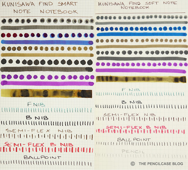
As you can probably tell from the photos above, the problem is that -despite all using the same paper- they don't all perform equally well. I tested each different product with various fountain pens, cotton swabs, dip nibs,... and some performed absolutely perfect (zero feathering, almost no bleedthrough and ink dried crisply with nice shading and sheen), where others couldn't hold up to fountain pen use. 

Kunisawa sent samples to a couple different reviewers, and paper quality results seemed to be completely random throughout their product lineup. I'm fairly convinced that it's not a matter of bad paper choice (some samples I tested were legitimately excellent), but rather poor (or lack of) quality control that allowed a faulty batch of paper to slip through the net and get spread across different products. I emailed back and forth with Kunisawa about the paper issues and they in turn communicated it with their paper manufacturer. They acknowledged the issue and seemed to be working to fix it. 
Paper review: Kunisawa Find notebooks
"I do not seek, I find."
As it stands now, It's difficult to recommend any of the Kunisawa Find products, since there is no way of knowing which ones will perform well and which ones won't. Especially at their rather premium price point (up to 27$ for the A5 Find Note Hard notebook), there's no room for error. Kunisawa is a promising brand that I'll certainly keep an eye on. Their design philosophy and build quality is already on point, but I really hope they can fix the inconsistency in paper quality. Some of the products I tested had downright excellent paper, so I'd be all on board if they could provide that kind of quality across the board.

This product was sent to me by Kunisawa so I could write this review. I was in no way influenced in the making of this review, the opinions shared in this review are completely my own! This post does not contain affiliate links. 
Paper review: Kunisawa Find notebooks
Good paper left, bad paper right.
Paper review: Kunisawa Find notebooks
Good paper left, bad paper right.