Monday, April 30, 2018

LAMY LX FOUNTAIN PEN REVIEW

Lamy Lx fountain pen review
The Safari and Al-star are undoubtedly the two first pens that come to mind when thinking about German brand Lamy. They are easily the most popular models, so it makes sense that the well-known Bauhaus brand tries to expand on this success. And so the Lx -or Live Deluxe- was born!

But... the Safari and Al-star are of course affordable pens. Their success is based mostly on the fact that they are excellent writers at an accessible price, nothing about them screams 'luxury'. With the Lx they wanted to incorporate a more luxurious look and feel in the same tried and trusted design of the Al-star, so how does that work? 
Lamy Lx fountain pen review
Well, more than one year after the original release (yes, it's already THAT long ago!), the Lx struggles to catch on in the market. It's now part of the standard product lineup (not a special edition as was first anticipated), but I've heard many retailers complain about the dissapointing sales once the original excitement for the 'Iphone colors' diminished... 

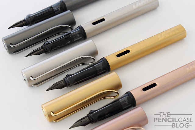
And that has everything to do with the rather high price of the Lx. So with that in mind, and with the 'hype' (if you can even call it that) way behind us, let's look at the pen in its own respect: how do I like it now? My thanks to Milligram for sending over the Palladium version which, together with my Ruthenium and my parents' Gold and Rose Gold, made it possible to show you all four versions side by side!
Lamy Lx fountain pen review
The Lx is an interesting pen really. From afar it's impossible to tell it apart from the Al-star. It's VERY similar, but on the same time it's as if they took the Al-star and put it on steroids. It's a more 'premium' version of an entry-level pen... which is a bit strange really. You see, no matter how you look at it, it's hard to see it as the Lx, and not 'just another Al-star'. But before we draw any conclusions, let's look at what the Lx has to offer:

The more refined finish and detailing on the Lx sets it apart as a more elegant version of the Al-Star, but it follows the exact same design for the most part. The straight cylindrical shape of the rather wide cap continues in the barrel, which has two flat sides. Not much special, nothing ornate... in true Lamy style. But the devil is in the details! The body finishes are more refined and the colors have a nice pearlescent finish to them. 
Lamy Lx fountain pen review
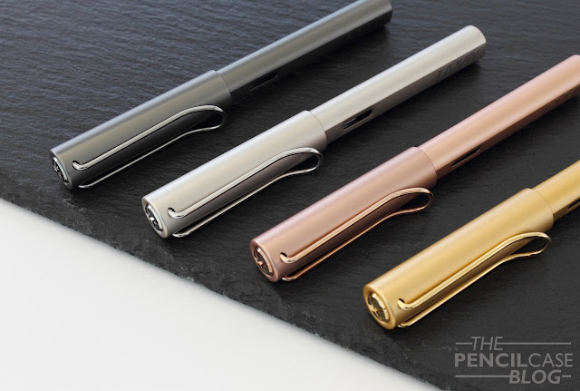
The 'biggest' changes are definitely the metal trims on top and bottom finial. It's funny how such a seemingly small detail can do so much in terms of appearance. For me this actually does succeed in setting the Lx apart quite a bit, as I'm not at all a fan of those black plastic inserts in the Al-star. The same finish of the finials is also found on the metal wire clip, which are also plated to match the rest of the pen.

The matching color of the anodized barrel and plated trims helps give the pen a more uniform, less cluttered look. The only thing I wish they would've also changed is the black plastic ring behind the section. It would've been really nice to see this made from the same plated metal as the rest of the trims. 
Lamy Lx fountain pen review
Branding is clean and unobtrusive, despite taking up quite some real estate on the barrel
There are two other details that set the Lx apart from the rest. One of which is the logo on the flat side of the barrel, which is now raised and has a glossy finish to make it stand out, but not too much. A small, but noticeable improvement over the cheap-looking stamped logo on the Al-star.
Lamy Lx fountain pen review
The second change is the nib, which received a small facelift. The black nib received a different coating compared to the regular black nibs. It's a deeper black color and it's glossier. The nib face also has a laser-etched design similar to the black-plated 14k gold Lamy nibs on the Lamy Imporium.
Lamy Lx fountain pen review
Oh, and I'd almost forget about the packaging. A big part of the upgrade (and probably also the price) comes from the matching anodized aluminium presentation case that each Lx comes in. It makes for a nice gift, and can be used as desk storage for your pen. Personally though, I'm not that big on the packaging. Apart from the initial moment of receiving the pen, it doesn't offer much added value for me. It's big and bulky to use as a carrying case, and the anodized finish is a paradise for scratches and bumps if you decide to throw it into your purse or bag.
Lamy Lx fountain pen review
L to R: Pelikan M805, Lamy aion, Lamy Studio, Lamy Lx, Lamy Safari, Lamy 2000
The Lx -just like the Al-star and Safari- is a relatively sizeable pen. it measures in at 13.9 cm (5.5") closed, and remains a comfortable 13 cm (5.1") uncapped. The aluminium and plastic construction makes for a very lightweight pen that -in combination with the triangular shaped section- makes for a rather comfortable writing experience. Shaped sections like this are the fundation for one of those forever ongoing arguments between good and bad. It's very much a personal preference, you'll find out rather fast if you love or hate it. For me, it's comfortable up until a certain point. I can write with it for quite a while, but eventually I'll start feeling the need to adjust my grip.

Then for the writing end: these new nibs are about 90% the same as any other steel Lamy nib. Nothing you haven't seen or used before... I was fairly convinced at first that they had a somewhat 'grittier' feel on the paper with more feedback. But when I did a side-by-side comparison with regular steel Lamy nibs, I couldn't notice any difference. Lamy doesn't overpolish their nibs, so they always have some feedback to them. In return, this ensures that the nibs provide a consistent flow of ink and a crisp line without skips. 
Lamy Lx fountain pen review
Overall, the Lx is a bit of a tough call. The price increase is rather steep, and in essence it's still the same pen as the Al-star. I think they did an excellent job on the small details such as the finials, the colors and even the presentation. So much so that it feels like a more 'complete' Al-star... It's what the Al-star maybe should be? In that regard, it's not difficult to acknowledge that Lamy did something very right when designing the Lx. But it's without a doubt a rather large premium to pay. 

If I nitpick about the small details (and I do!), the Lx will always have my preference over any Al-star. So ultimately, if you should pay the premium depends on how much you personally care about the little details. Prices vary quite strongly depending on where you live: 55 EUR seems the going rate in Europe, while the MSRP is around 70 USD in the US. If you're in Australia, Milligram has them for 99 AUD.

GIVEAWAY CLOSED: NOW FOR THE BEST PART: YOU CAN WIN A BRAND NEW LAMY LX FOUNTAIN PEN FOR YOURSELF, COURTESY OF MILLIGRAM! ALL YOU HAVE TO DO IS ENTER IN THE RAFFLECOPTER WIDGET BELOW. GOOD LUCK!
RULES: Giveaway ends 5/8/2018. Winner will be chosen via random.org, and announced in a separate post. The winner will be contacted directly via email, if he/she fails to reply within one week, a new winner will be picked. Only entries with valid email address are eligible to win. Invalid entries are denied.

This product was sent to me by Milligram so I could write this review. I was in no way influenced in the making of this review, the opinions shared in this review are completely my own! This post does not contain affilate links.
Lamy Lx fountain pen review

Sunday, April 22, 2018

QUICK LOOK: LAMY SAFARI ALL BLACK & AL-STAR VIBRANT PINK SPECIAL EDITIONS!

QUICK LOOK: LAMY SAFARI ALL BLACK & AL-STAR VIBRANT PINK SPECIAL EDITIONS!
Some may disagree with me, but I think Lamy has been on a great run in the past couple years with their annual Safari and Al-star releases. The last three special editions have been rather consistent in terms of what we could expect: a bright and colorful new Al-star color, and a contrasting dark and subtle Safari.
QUICK LOOK: LAMY SAFARI ALL BLACK & AL-STAR VIBRANT PINK SPECIAL EDITIONS!
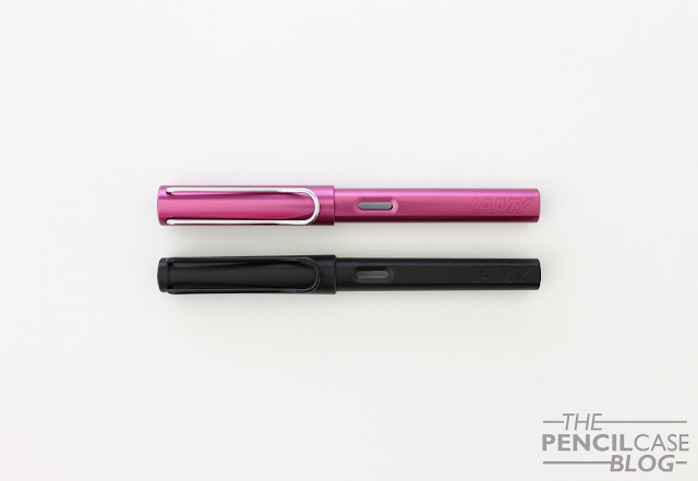
Yet this year I think they outdid themselves on the combination of the two! The All Black met some criticism that it's not different enough from the standard 'Umbra' Safari (judge for yourself from the picture below), but I love how it came out. Over the years I've come to enjoy more colorful materials and finishes (If you've been following this blog since the beginning, you'll know that I used to be quite exclusively into monotone pens!), but I will still grab for the subtle and subdued colorways when I can. 

The All Black is indeed very similar to the Umbra, but especially side by side there's a difference to be noticed. The Umbra isn't really grey either, it's more like a really dark brown. I tried my best to show the very nuanced difference in the picture below. In any case, both are simple and office-appropriate, colors. Whether you choose the Umbra or All Black, both are sleek pens suited for everyday use, without drawing too much attention to your pen.
QUICK LOOK: LAMY SAFARI ALL BLACK & AL-STAR VIBRANT PINK SPECIAL EDITIONS!
Umbra (used, so the finish has become glossier over time) on the left, All Black on the right.
As much as I like the subtlety of the All Black, the Vibrant Pink also grew on me in the past weeks! Pink and black match exceptionally well, so I think they did a great job putting these two colors together. Yes, the pink may be a slightly girly pen, and it may turn heads in the meeting room. But heck, why not! Want a pink pen, just go for it! For what it's worth, I think they went with a classy shade of pink, more like magenta, not Barbie-like hot pink.
QUICK LOOK: LAMY SAFARI ALL BLACK & AL-STAR VIBRANT PINK SPECIAL EDITIONS!
As I said, Lamy has been pretty consistent over the past three years, there's quite a noticeable trend when you put the most recent Safaris and Al-stars next to each other! Continuing the trend, the All Black received the same matte finish as its direct predecessors, and the Vibrant pink is again a very vibrant (well, duh!) and fresh color, ideal for spring!
QUICK LOOK: LAMY SAFARI ALL BLACK & AL-STAR VIBRANT PINK SPECIAL EDITIONS!
Put them side by side, and you'll realise just how much Lamy loves red and pink!
QUICK LOOK: LAMY SAFARI ALL BLACK & AL-STAR VIBRANT PINK SPECIAL EDITIONS!
Of course along with the new special edition pens, come new special edition inks. Well almost... Remember last year's debacle with the Pacific blue 'special edition' ink that was just Lamy Turquoise in a slightly different packaging? Well they haven't learned from their mistakes over in Heidelberg, because this year they tried the same trick with the All Black ink! It's just the regular black ink, again in an ever-so-slightly different cardboard box. Not cool Lamy! 
QUICK LOOK: LAMY SAFARI ALL BLACK & AL-STAR VIBRANT PINK SPECIAL EDITIONS!
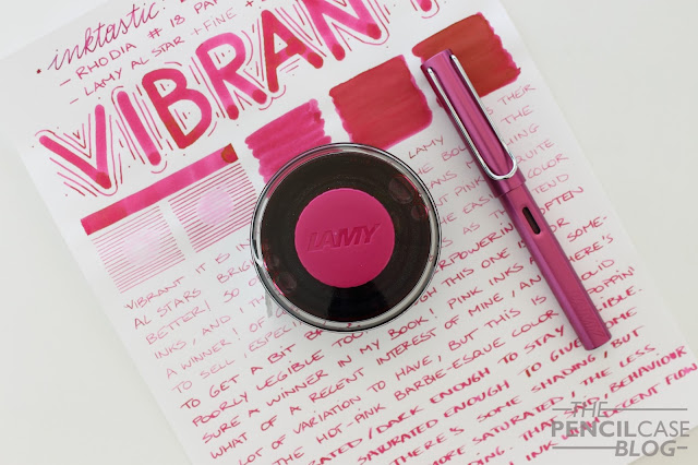
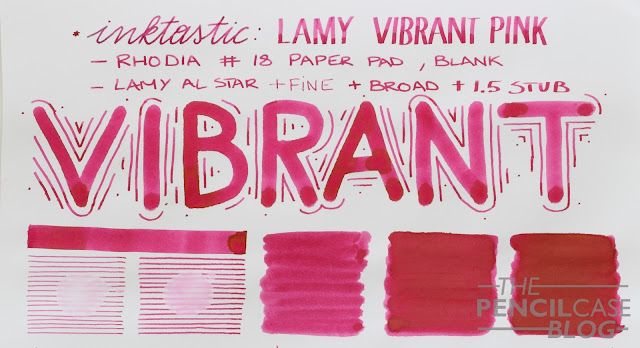
Fortunately the Vibrant Pink ink IS a new color, and it's a strong release too if you ask me! Just like the Dark Lilac ink -that I obsessively hoarded as much as I could- Vibrant pink is a nice shade that is plenty saturated and quite legible. The saturation gives this ink a fantastic green-gold sheen, just like Dark Lilac... I'm smitten! 
QUICK LOOK: LAMY SAFARI ALL BLACK & AL-STAR VIBRANT PINK SPECIAL EDITIONS!
Dat sheen tho!
Overall, I'm quite pleased with what Lamy came up with this year. The Safari and Al-star special editions continue to grab my attention each year, and both the pens are affordable enough to continue buying them. The price point they are at makes them excellent collectibles, and on top of that they are also just really good pens for everyday use.
QUICK LOOK: LAMY SAFARI ALL BLACK & AL-STAR VIBRANT PINK SPECIAL EDITIONS!
Yes, the All Black ink was a bit of a dissapointment. I secretly expected a grey ink to accompany it, which oviously didn't happen. But perhaps this means we can hope for a re-release of the awesome Griso Grey as next year's special edition (still my all-time favourite color!) with a Griso Grey ink? At this point all we can do is guess, but it would be pretty awesome!

The Safari All Black retails for around 20 EUR (30 USD), and the Al-star goes for 27 EUR (37 USD). The ink is 2 EUR for five proprietary Lamy cartridges, or 11 EUR (12 USD) for a 50ml bottle. Both the pens and inks are decently priced, but especially the Vibrant Pink ink is hard not to recommend at this price point. The All Black ink can be ignored, save your 12$ for next year's release...
La Couronne Du Comte and Penworld are sponsors of this blog. I received a discount on the purchase of these products, so I could write this review. I was in no way influenced in the making of this review, nor was I otherwise compensated monetarily. The opinions shared in this review are completely my own. This post does not contain affilate links.
QUICK LOOK: LAMY SAFARI ALL BLACK & AL-STAR VIBRANT PINK SPECIAL EDITIONS!
Bonus picture, just look at that magnificent green-gold sheen!

Monday, April 16, 2018

OHTO MARUTA SHARP MECHANICAL PENCIL REVIEW

Ohto Maruta Sharp mechanical pencil review
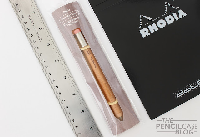
I rarely review pencils here (I probably should've picked a different name than 'The PENCILcase Blog'!), but that doesn't take away the fact I can often enjoy a nice mechanical pencil, leadholder or even woodcased pencil from time to time! The one we're looking at today is quite an interesting one: the Ohto Maruta 2mm mechanical pencil! Thanks to Papier & Stift for sending it over!

Why is it interesting? Well it's basically a mechanical pencil, disguised as a woodcased pencil. I suppose the reasoning behind this design is quite simply to create a different aesthetic. It could also be a sneaky way to trick die-hard woodcased pencil users into buying a mechanical one, although I doubt that?
Ohto Maruta Sharp mechanical pencil review
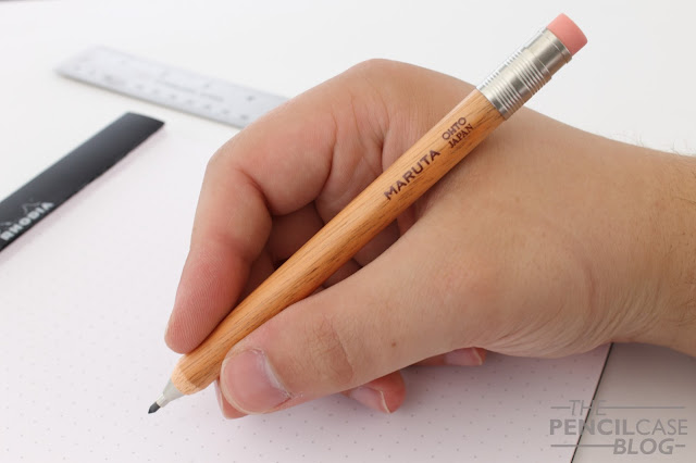
The Maruta, which is Japanese for 'log', looks and feels like a generic jumbo-sized woodcased pencil with a round profile, silver ferrule and pink eraser. But push the eraser, and a 2mm pops out from the front! 

For a 10$ pencil, Ohto put a surprising amount of effort in the details. This genuinely looks like a woodcased pencil from afar. All the metal parts are nicely machined and have a satin finish. The tip of the pencil is actualy 'sharpened' into a cone, which transitions into the metal tip. The wood received a clear coat of laquer, and the brand and model name are stamped in brown paint near the ferrule. The overall product is simple and clean, just like the average #2.
Ohto Maruta Sharp mechanical pencil review
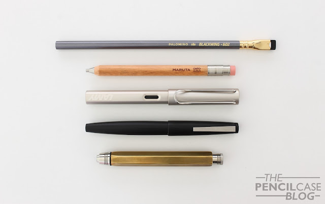
Top to bottom: unsharpened Blackwing 602, Ohto Maruta, Lamy Lx, Lamy 2000, David Hayward hexagonal leadholder.
In terms of size, the Maruta is short for a pencil, but normal sized compared to other pens or mechanical pencils. It measures 13.6 cm (5.35") without the lead extended. The diameter of 1 cm (0.39") is comparable to the dimensions of a jumbo pencil, which makes it easier and more comfortable to grip than a normal woodcased pencil.

It's lightweight, but not as light as a pencil due to the metal parts at the front and back of the pencil (It's slightly back-weighted, but not to the extent where it's actually noticeable in use). The wood has a very nice, smooth satin finish. While this is nice to look at, it's a bit slippery in the hand.
Ohto Maruta Sharp mechanical pencil review
As I already said, the machining on the metal parts, such as the 'ferrule' is actually really nice, especially for a 10$ product. Everything fits nicely, but the metal push button does rattle quite noticeably. The button can be pulled out to refill leads (or you can just push a new lead in from the front), and the eraser can be replaced.
Ohto Maruta Sharp mechanical pencil review
The knock mechanism advances the 2 mm lead by approx. 1.5 mm each time. The lead has little to no play inside the metal tip. Ohto Maruta Sharp mechanical pencil review
As far as the writing goes... The choice of 2mm leads is useful for drawing or sketching but I also like to write with pencils like this because the leads are available in a wide variety of grades (I prefer HB or B for general writing, a balance between smooth, dark lines and point retention). The Maruta comes with one HB lead in the pencil, which I found kind of soft for HB, and rather dark. I swapped it out with my favourite 2mm lead: Staedtler Mars Carbon HB. Of course there's plenty of other lead options, you could even get some coloured leads in this size to play around with! 
Ohto Maruta Sharp mechanical pencil review
For just under 10 euros (via Stift & Papier) which translates to about 12.5 USD), the Ohto Maruta is a fun pencil that won't break the bank. It's very well made (Japanese quality!), especially given the price. And I like that it takes 2mm leads, which is something else from the usual 0.5mm mechanical pencils. 

Note: This product was provided by Papier & Stift, free of charge, so I could write this review.  I was in no way influenced in the making of this review, the opinions shared in this review are completely my own! This post does not contain affilate links.
Ohto Maruta Sharp mechanical pencil review

Wednesday, April 11, 2018

EDISON PEARLETTE FOUNTAIN PEN REVIEW

Edison Pearlette fountain pen review
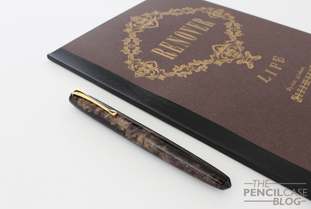
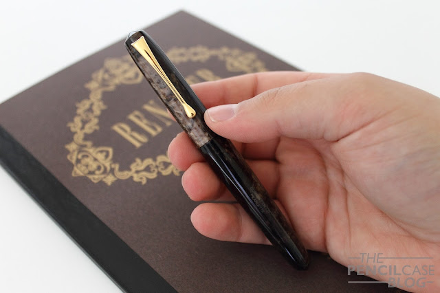
The Edison Pearlette had never been on my radar before. I like the design and shape a lot, just the way I also think the full-sized Pearl is one of Edison's best designs, but I kept telling myself that the Pearlette would be too small for my taste. 

But then when they came out with the three new production colors (completely wiping the old material options off the table to freshen things up), I must say that Canyon trail brown... it looked damn fine! When I came by the Scrittura Elegante stand at last year's Tilburg Pen Show, I couldn't resist. 
Edison Pearlette fountain pen review
Seeing it in person, really shows the beauty of this little pen. I tried my best with the pictures in this review, but there is nothing like seeing that chatoyance (I know some people dislike using this word, does someone know a better alternative?) in person. Believe me.
Edison Pearlette fountain pen review
The Pearlette is -as the name suggests- the little sister of the Edison Pearl. In my opinion, the Pearl is the best design by far from the US based pen maker. But unfortunately the Pearl isn't part of their regular production line, and can only be bought as a custom pen (which adds significantly to the pricetag). 
Edison Pearlette fountain pen review
The pattern in the material never really lines up. Yes, that's a minor nuissance...
Designwise, the pearlette is a simple cigar-shaped pen with pointed cap and barrel finial. The design is completed with an elegant, curved clip that ends in a teardrop-shaped tip. As is common with 'bespoke' pens (Ok, Edison production pens aren't exactly bespoke, but they definitely fit the category in terms of design and overall appearance), there's relatively little trim or detailing to speak of. It's a clean and fuzz-free pen.
Edison Pearlette fountain pen review
L to R: Kaweco Sport, TWSBI Mini, Pelikan M805, Edison Collier, Edison Pearlette, Lamy Safari, Lamy 2000
The elegant and petite design, the stunning yet classy Canyon Brown acrylic, and the fact that it actually fits my hand perfectly... This is a fun little pen! Make no mistake though, it IS small. Probably too small for some people. It measures 12.8cm closed, and 11.8cm uncapped. It's relatively thin too, at an average of just 8mm around the section, where it loses quite a bit of girth because of the relatively large step. The all-acrylic construction keeps the weight low as well, with a total of just 15 grams. 
Edison Pearlette fountain pen review
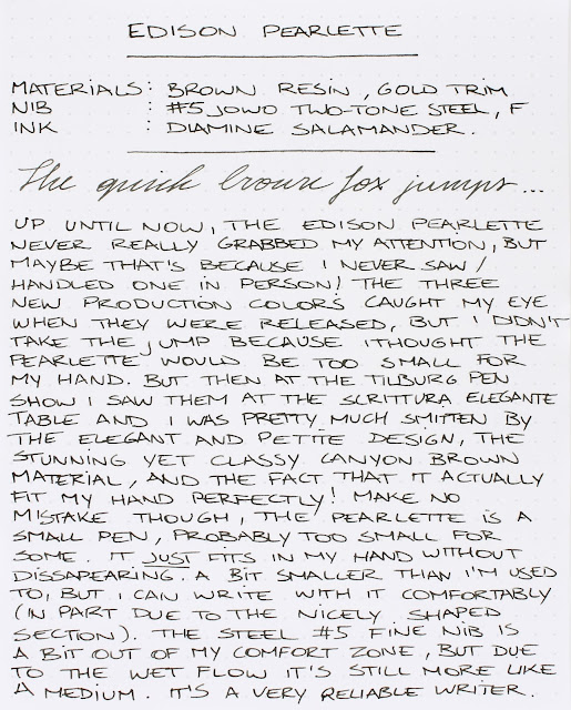
For me, it JUST fits my hand without dissapearing, but it's quite a bit smaller than I'm normally used to. I can write comfortably with it, in part due to the nicely shaped section which keeps my grip close towards the nib. The step is noticeable, but I never found it bothersome or uncomfortable. 
Edison Pearlette fountain pen review
Smaller pens in general are somewhat out of my comfort zone, and so is the steel #5 JoWo fine nib. The nib has the stock JoWo design with a few flourishes and the two-tone plating, and the Edison logo is laser-engraved in the middle. Designwise, these are not my absolute favourite, but it's not exactly an ugly nib either.

It lays down a crisp, line. But due to the relatively rich flow, it's still close to a western medium. Being a fine nib, it gives some feedback when you write, but it's pleasant. It's a reliable, skip-free writer, but the steel nib has relatively little character (I generally prefer #6 nibs, which I find tend to have a bit more character to them.).
Edison Pearlette fountain pen review
Every production model from Edison comes at the same price of 160 EUR (via Scrittura Elegante)/169 USD. On one hand that's not cheap for a steel-nibbed pen, on the other hand it's an affordable step into the world of 'bespoke' pens, or at least the closest thing to it! 
Scrittura Elegante
Scrittura Elegante is a sponsor of this blog. I received a discount on the purchase of this product, so I could write this review. I was in no way influenced in the making of this review, the opinions shared in this review are completely my own! This post does not contain affilate links.
Edison Pearlette fountain pen review

Tuesday, April 3, 2018

MONTBLANC MEISTERSTUCK 149 FOUNTAIN PEN REVIEW

Montblanc Meisterstuck 149 fountain pen review
Something strange happened: I bought a Montblanc! I'm generally not THAT big on MB pens, but still this felt like quite a milestone in my collection. You see, the Montblanc Meisterstück 149 is kind of an icon. It's a must-have for every real collector... or at least that's what they tell you!

To some extent, I definitely agree. The 149 is the ultimate depiction of a fountain pen. Ask anyone to draw a fountain pen from memory, and you'll get something like this. Hell, there's at least a dozen brands that decided to eh, well... 'mimic' the design of the Montblanc Meisterstück fountain pen, I guess that says plenty.
Montblanc Meisterstuck 149 fountain pen review
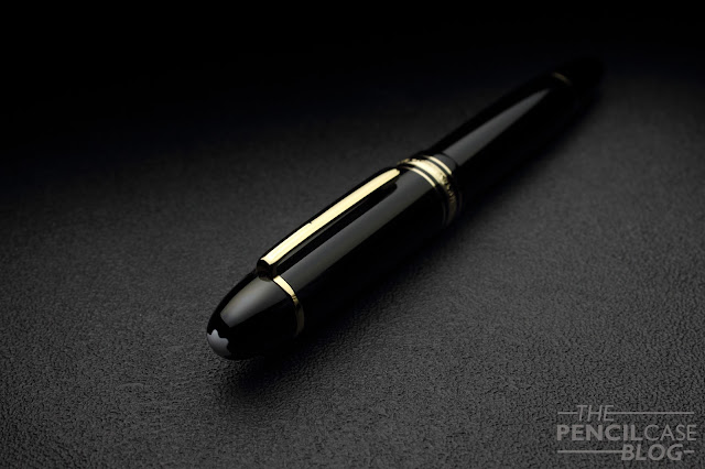
Montblanc's Meisterstuck line (including the classic 149) achieved its luxury status and name recognition all across the globe. This is largely due to their excellent marketing that has established their 'high-end' status as a brand. But it's also just because of the great aesthetics of their pens. You see, the Montblanc Meisterstück is kind of a crowd pleaser. It's a simple, black resin pen, gold trims (also available with platinum and rose gold trim, but the yellow gold started it all), and well...not much more.
Montblanc Meisterstuck 149 fountain pen review
On the outside there's of course the white star logo, and some decorative bands, including the triple band around the base of the cap. But other than that, it's a clean and clutter-free design. The simple cigar shape is easy on the eyes. Even for a large pen like this, nothing about the design feels extravagant or out of place. It's timeless and elegant, chic but not gaudy.
Montblanc Meisterstuck 149 fountain pen review
It's this delicate balance that makes it so attractive for a wide audience, especially for business people that want a classy pen. But of course that white star has also become a symbol for luxury and wealth, so everyone will see that you just spent a ton on a fountain pen. Depending on the situation, I guess that can be both good and bad. In my case, I think this 'status' associated with Montblanc detracts a bit from the overall experience. It's perhaps a bit too much of a class symbol instead of just a nice pen. 

But to get back to the point, the Meisterstück is a classy yet simple pen. So much so, that it may actually seem a bit boring, I guess? With all the colorful and over the top flashy pens that are on the market these days, I'm sure that 99% of us pen addicts would much rather like to see Montblanc use different and more exciting materials. If you ever saw Sarj's (aka. the one man pen show) Custom-made 149 in Omas Arco brown celluloid... oh boy that's something else!
Montblanc Meisterstuck 149 fountain pen review
L to R: Pilot 823, Pelikan M800, Pelikan M1000, Visconti Homo Sapiens OS, Montblanc 149, Lamy Safari, Lamy 2000
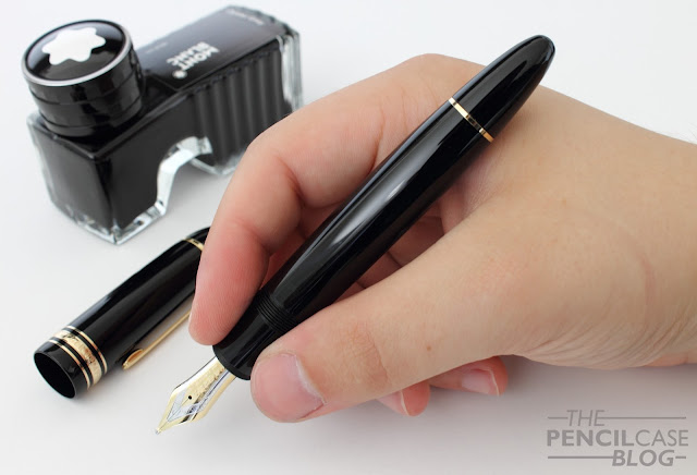
However, one thing is certain: when it comes to size, the 149 is far from boring. This is a truly oversized pen, measuring in at 14.7 cm (5.78") capped, and 13.2 cm (5.2") uncapped. With a width of around 1.6 cm (0.63") at the widest point, and 1.3 cm (0.51") at the section, it's a pretty fat pen.

Because of this girth, the 149 will be a bit too large for a lot of people. In terms of usability, I feel like the 146 does a better job at being a comfortable and versatile writer, with a more reasonable diameter while remaining a comfortable length (The 146 is actually not much shorter than the 149!).
Montblanc Meisterstuck 149 fountain pen review
The 149 has gone through countless iterations throughout the years. The early versions were coveted for their softer nibs and ebonite feeds, and some versions also had a metal piston mechanism. Later versions came with plastic mechanisms, but the current models are again equipped with a metal mechanism. In terms of durability that's a huge plus, but the weight of the pen also benefits from this. The 149 weighs 32 grams in total, and the barrel is slightly more substantial because of the mechanism. It doesn't throw off the balance, but it's just enough to let you know you're writing with a large pen. Same as with the Pelikan M800 and M1000, that metal mechanism makes the 149 feel more premium and durable, even though it's still a resin pen.
Montblanc Meisterstuck 149 fountain pen review
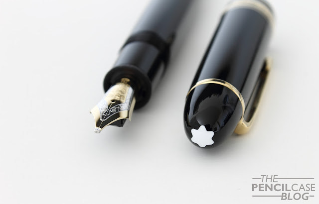
What it's all about for me is the nib. Dennis (from La Couronne Du Comte) showed me a couple different 149's with different nib sizes, but it was quite an easy choice. I obviously went for the biggest nib he had in stock, which is this fantastic double broad! 

The #9 (which is MB language for a #8 size nib) two-tone 18k gold nib looks and writes fantastic. It may be my favourite part about the entire pen. The design of the nib face is classy and somewhat vintage-esque (The imprint design has remained largely the same throughout the years), and it's partially rhodium-plated to accentuate the design.

If I'm being really picky, perhaps the plating could've been done a bit more precise. The rhodium layer doesn't always perfectly align with the stamped design. But that's a minor detail, and you really have to look at it with a magnifying glass to see it.
Montblanc Meisterstuck 149 fountain pen review
Going for the BB nib was an obvious choice. I had tried a 149 with BB nib from a friend (Hey Marco! Check him out on Instagram!) and was immediately sold on the lush, wide and stub line characteristic this stock nib provides. The way these nibs are ground is quite interesting. The shape of the tipping material is almost identical to what you'd expect from a stub, instead of the usual round shape. Line variation is perhaps not as pronounced as with a 'real' stub. But on the other hand it is smoother and a bit more forgiving about the writing angle. The ink flow is rather heavy, which is good for a wide nib like this. Because of the size of the nib, it has a tiny bit of springiness, just to give the writing experience a 'cushioned' feel. It's definitely not a flexible nib by any means though. 
Montblanc Meisterstuck 149 fountain pen review
Overall, this is by far the best Montblanc nib I've used so far. Others were a bit inconsistent (a medium that wrote like a fine, and vice versa), but this one was exactly the way I expected it to be. The stub-like character makes it a bit more special and fun to write with than a normal round nib, which is a welcome extra on a pen in this price range. 
Montblanc Meisterstuck 149 fountain pen review
The 149 is a great pen. It's ultra-classy and stylish, and the writing experience has been nothing short of amazing. It writes like an 800 euro pen should, and then some. The fact that they still offer 'novelty' nib sizes, including a range of obliques and double broads, is also quite interesting for those that like something a little more exciting than fine or medium.

Yet I'm still having mixed feelings about the 149. I'm glad that I now own a Montblanc, but at the same time I don't feel like I need more of them. There are so many wonderful brands out there with more exciting designs and less jaw-dropping prices. It's a great pen, but it's not a pen that'll speak to everyone's imagination.

The Montblanc Meisterstück 149 retails for 775 EUR (yellow or rose gold trim) or 805 EUR for the platinum trim version (MSRP of 935-985 USD in the US), which is undoubtedly a lot of money. A lot of 149's are sold on the second hand market for a fraction of the cost. In this case, buying used is a great option if you want to make it a bit less painful for your wallet, but you have to know what to look for (and you should always be wary of fake Montblanc products that are unfortunately very common!)
Note: La Couronne Du Comte is a sponsor of this blog. This product was bought from LCDC with my own funds, and I was in no way solicited or influenced in the making of this post. This post does not contain affilate links.
Montblanc Meisterstuck 149 fountain pen review
I guess I'll never learn to NOT use light inks for my written reviews...