Friday, February 24, 2017

INKTASTIC: SAILOR YAMA-DORI INK REVIEW

Remember J.Herbin's Emerald of Chivor? Well Sailor Jentle Yama-Dori is kind of what I was looking for after I fell in love with EoC: a teal ink with lots of shading and sheen, BUT -very important- sans the gold particles!
This ink ticks the right boxes. The resemblance with EoC is noticeable, but it's not an exact copy. First of all, of course, no gold particles. For me that's a good enough reason to pick this ink over EoC, anyday. Apart from the shimmer, there are certain slight differences: it's a bit darker, the shading is a bit less pronounced, but all in all the nuance is subtle.
The blue-green (teal) tone is accentuated by beautiful red sheen. A lot of sheen! Whereas other inks only show sheen on high quality paper, with Yama-Dori you don't even have to use Tomoe river or Rhodia paper. Even on cheap paper there's plenty of sheen to drool at.
Being a Sailor ink, it's a decent performer. I've fallen in love with Sailor's inks because they feel so smooth and lubricated, and they give a good flow. The colors are always nicely saturated, which brings out those good properties like sheen and shading.
A bottle of Sailor Jentle ink will run you about 18 EUR/ 20 USD (50ml). That's a relatively premium price, but the colors are really nice so they are tempting enough to buy anyway! 
Note: La Couronne Du Comte is a sponsor of this blog. I received a discount on the purchase of this product.  I was in no way influenced in the making of this review, the opinions shared in this review are completely my own! This post does not contain affilate links.

Friday, February 17, 2017

LAMY STUDIO FOUNTAIN PEN REVIEW

Lamy Studio fountain pen review
The Lamy Studio is can be seen as a possible 'next step' for the pen enthousiast that outgrew the Lamy Safari, or for those that just want to expand their collection. It's a pen that is actually seriously underrated in my opinion, since it's one of the most flexible products in the Lamy catalog, with varying finishes at different price points, it offers something for everyone.
Lamy Studio fountain pen review
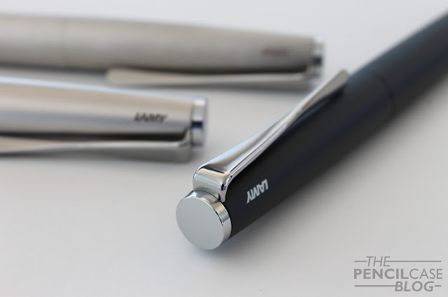
The Studio is a simple flattop pen, no bells and whistles for the most part... Apart from one distinct design feature: the unique 'propeller-style' twisted clip. It's a simple but beautiful aesthetic detail that defines the entire pen. Apart from looking good, the clip also functions quite well. It ends in a nicely rounded circular shape, which makes it easy to clip onto something.

Right next to the clip, you can find a small laser-engraved logo. Lamy's minimal branding (apart from that on the Safari and Al-Star) is something I always enjoy seeing. It's very unobtrusive, and I actually like the way it looks, in contrast to some pens where I think the branding disturbs the design.
Lamy Studio fountain pen review
At 14cm closed, and 12.6cm open, the Studio falls in the standard size range. The weight of the pen varies slightly depending on what version you get. The entry-level brushed steel version weighs only 25 grams total, other versions come in slightly higher at 31 grams. It's a decent standard sized pen that can be used comfortably without posting. The finial on the back of the barrel has a slight ridge, which allows for the cap to be posted securely, although I personally find it shifts the balance a bit too much towards the back.
Lamy Studio fountain pen review
L to R: TWSBI Eco, Pilot Vanishing Point, Lamy Studio, Lamy safari, Lamy 2000
Lamy Studio fountain pen review
I personally find this one of the most comfortable pens Lamy makes, apart from maybe the macrolon 2000. But experiences regarding comfort vary quite wildly if you read different reviews. It all depends on one thing: the grip section!

Depending on the model, you can either get a rubberised grip (brushed steel version), a glossy chrome grip, or a matte palladium grip on the palladium version. In most cases you'll end up with a glossy chrome grip. The other two offer a decent grip and are really comfortable (long, nicely shaped, very small step from section to barrel), but the chrome version can be a dealbreaker. I honestly don't understand why they would want to make so many different sections...
Lamy Studio fountain pen review
L to R: rubberised section, glossy chrome section, palladium section
With this in mind, I'd personally recommend getting the cheapest version, the brushed steel. The rubberised section is comfortable and grippy, and it's actually the most affordable option. It's a bit unfortunate that they don't offer the rubberised grips on all the colors and finishes, so you'll have to take it into account when you're making a choice. 

On to the nib. Here you'll also find some differences, depending on which finish and color you choose. The brushed steel, matte black and imperial blue finishes all come with steel nibs, but the palladium and Platinium versions come standard with a 14k gold nib. Again, these configurations are as-is, so you can't get a blue version with a gold nib, or a palladium version with a steel one, but you can buy nibs separately and swap them out yourself. 
Lamy Studio fountain pen review
The nibs, both steel and gold, are excellent writers. I'm a fan of Lamy nibs -let's make that clear-, they write consistent and smooth, and they are usually well-tuned. The gold nibs have a slight edge in my opinion, because they have a little softness to them, which gives some bounce when you write (don't expect much line variation though!).

As I said in the beginning of this review, the Lamy Studio is a pen with a lot of potential. Prices start at 47.5 EUR (71.2 USD) for the brushed steel version, and go up from there. For the Palladium version with gold nib, you'll pay around 170 EUR/ 160 USD. The Platinium version, which is quite hard to find, sits somewhere in the 200+ range. In such a wide price range, you'll easily find something that suits you most.
Lamy Studio fountain pen review

Sunday, February 12, 2017

ABOUT BIAS AND OPINIONS

Do you trust me?

Going off of the things I have read on social media and forums recently, there seems to be a trust issue developing. Which is really unfortunate because we definitely don't write blogs to start arguments or to tell lies (at least in our pen community that's not the case). In this post I'd like to talk about biased reviews, and how it inevitably correlates to personal preferences. I think this is a bit of a grey zone among pen bloggers, where everyone has an opinion, but nobody has a satisfying answer to all the questions that exist about it.

The stir is based around this: Some bloggers -me included- receive items for free from shops and brands. We review them as we would other items, or don't we? A lot of readers express the uncertainty they feel when they read our reviews: 'are those bloggers telling the truth about that product?' Or are we biased? Are we liars?

Personal opinion and preference

Well, the answer isn't as easy as you might think. Some people don't seem to understand that bloggers are just normal people too. Just like anybody else, we have preferences and we know what we like and don't like. It's inevitable that those preferences become a part of the reviews we write.

We -I'm speaking for myself here, but I think it applies to other bloggers as well- try to give you the objective, hard facts about a product, but these facts are combined with personal opinions to make for an enjoyable review. A completely objective review doesn't exist with pens, or it would have to be a useless and boring specs list and nothing more.

Pens, especially fountain pens, are a very personal experience. For example: I like oversized pens, broad, smooth, springy nibs and a rich ink flow, but you might like the exact opposite. So if I say I like a certain pen, but you buy it and end up hating it, does that mean that I lied? No of course I didn't, but I did express my personal preference and told you how I enjoy that specific product, and in the end it turned out that our preferences differ. In fact, if you'd look at someone's blog as a whole, it's basically one big expression of his or her preferences, and that's not something you can work around, it's part of who we are as a person.

Bias

This brings us back to bias. Bias follows from those personal preferences. We're even biased down to which products we choose to review or not. I won't pick a product that I know I won't like, I don't feel like giving a product a bad review because it's not for me, after all it would probably just leave a wrong impression anyway.

'What about those free products you receive, aren't you inclined to give it a better review than products you bought?' Well first of all, completely off-topic: let me point out that -especially for me as a student- receiving products to review is a neccesary evil. If it wasn't for the brands and shops that choose to support me, I would've run out of products to write about after the first few months. I'm not rich, so I can't just buy everything I want, but I do want to provide interesting and up to date reviews, so there really isn't much of an option there.

To get to the point, are the reviews we write influenced by receiving the products for free? You have to believe me when I say that I try very hard not to be affected by this. But it isn't easy, and I honestly can't promise that I never write something a little nicer than I maybe should've. Again those preferences come into play: if I'm a fan of a certain brand, I might sometimes be a little easier on it than I would with other brands.

I personally try to avoid unconsciously getting trapped in bias by following a certain mindset: I'm a fairly friendly guy (I think at least) and I try to always look for the best in a product. I don't feel the need to completely bash a product because one aspect about it wasn't good. After all, a negative review will also be based on personal opinion. I try to look at as many different aspects of a product while summing up pro's and con's and putting them in the right perspective. This way you can decide for yourself wether or not the product would be something you'd like.

To conclude

I hope I've made my point that it's pretty much impossible to completely avoid bias in reviews, just because people will always have a personal opinion. But there are solutions that could help. The best advice I can give is to always stay sceptical! If you're reading a review to see wether or not you should buy a certain pen, think for yourself: 'Does that pen look comfortable?, from the experience the blogger wrote down, does it sound like it would be something you'd enjoy?' If you think a certain blogger has a different taste and opinion than you, maybe look for other reviews by other bloggers, and compare them to form a more generalised idea. If you read five different reviews and they all say the same thing, it's probably trustworthy (but even then your mileage may vary, it's not an exact science!).

I hope I gave some insight about how I think about all this, and perhaps it helps to clarify how reviews should be interpreted, and what you should and shouldn't expect from me, but also other bloggers. If only there would be a way to write reviews that everyone will agree with, but unfortunately that doesn't exist.

To follow up on the matter of personal opinion, I have updated my about page, at the bottom of the page you can find a link to an article where I specify my personal tastes and preferences for pens, paper and inks. This should be able to help you decide wether or not my personal preferences will differ from yours, I hope it helps!

Saturday, February 11, 2017

BEHIND THE SCENES

A late introduction

I've been holding off on this for, well ever since I started this blog. I didn't see the need to put myself out there. In fact I started this blog with the idea of keeping it entirely anonymous. 

So here I am! My name is Dries, and if you want to read more about me, go check out the 'about' page. I updated it a bit, and even added a goofy picture (yeah that's me over there on the right!). You know, just to show that it's not just some computer algorithm running this website. 

Over the years I came to understand that a big part of the pen community is the personal interaction, making new friends. Writing reviews is the core business, but besides that there's a lot of interaction going on. Maybe you just want a friendly chat, or maybe you have an issue or a question about pens. I've learned A LOT from other bloggers, and I'm eager to share the little I know with others. 

As part of that social interaction, I started being a more active member on the Facebook FPN page. I feel like it's a good way to come in touch with (potential) readers of the blog, but it can also be a way to get in touch with me. Same goes for other social media like Twitter or Instagram. Especially the latter is definitely one I try to be very active on. Instagram offers a nice and casual way to show what I'm working on for the blog, and the pen community is very well-represented on it, with a bunch of great people to follow and interact with, definitely worth checking out if you haven't already!

But then comes the biggest challenge. You might say 'OK we know your name now, and we know what you look like, but we don't REALLY KNOW you', and that's absolutely right! Now of course I'm not going to start rambling about my personal life too much, or what I do besides playing with pens and writing this blog (apart from studying chemistry, not much, should you ask). But there are certain things I could tell that would be relevant to the blog, and how you - as a reader- experience it. I'm talking about how I got into this hobby, what my personal preferences are, what I use, why and how, etc...

Especially personal preference is a topic I'd like to touch on in one of my next posts, because there's a lot of discussion about blogger bias, and the objectiveness of reviews, and I think it should be adressed to help resolve the issue and to create a transparent community where you -as a reader- know what to expect from a blog.

So there you have it, I guess this was more of a state of the union than it is an introduction... But at least you'll know where to find me if you want to! Feel free to contact me if you have questions or remarks, you can check my contact page or all the above mentioned social media platforms to get in touch.

Thanks for reading!
Dries

Thursday, February 9, 2017

NAMISU X-01 PEN REVIEW

Namisu X-01 pen review
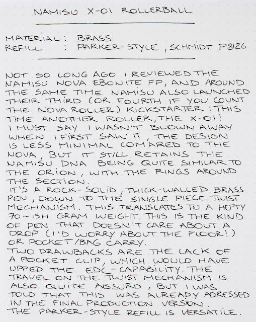
Around the same time when I reviewed the Nova fountain pen in the ebonite finish, Namisu came up with a new pen project: the X-01. It's their fourth kickstarter already, and the second rollerball/ballpoint (The previous one being the Nova rollerball). 
Namisu X-01 pen review
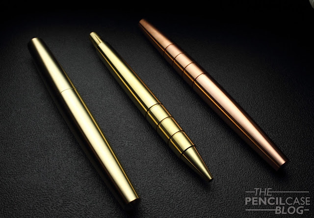
L to R: Namisu Nova Brass, X-01 Brass, Orion Copper
The design of the X-01 is largely inspired by the Namisu Orion, but obviously now in a ballpoint pen shape. It may have lost some of that clean design that the Orion and Nova had, but they still did a pretty great job of keeping everything simple and straightforward. 

If I have to be really picky on the design, there's just one small detail that I'm not a huge fan of: the machined lines on the twist knob. I think it would've looked better without the machining, and I don't feel like it adds much practical value either. The twist mechanism works so smooth and effortless that you don't need the extra grip these lines provide.
Namisu X-01 pen review
Here you can clearly see how it develops patina after just a few days of carry, the barrel and twist knob were polished
I was sent a prototype version of the brass X-01. Apart from brass, you can also choose for aluminium or Titanium. I like brass, it's a neat material that feels hefty and solid, and it gets some really neat patina after a while. It also makes your hands smell like pennies, which is something I personally quite like, although it could also be a downside for some people.

The brass version is the heaviest of the three, and weighs in at a little over 70 grams. That's some serious heffor a pen, and I'm pretty sure a lot of people would probably find it too heavy. I personally like heavier pens, but even I sometimes found it fatiguing to write with for longer periods. In their kickstarter campaign, they recommend the brass version for short notes or signatures, whereas the other versions are more suited for longer writing sessions.

If you want to play safe, the lighter aluminium (27g) and titanium (41g) versions are definitely the better choice. The brass version has some unique properties, but it's either hit or miss depending on your personal taste.
Namisu X-01 pen review
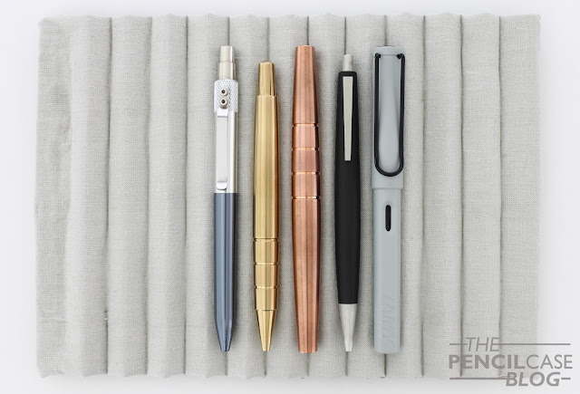
L to R: KarasKustoms Retrakt, Namisu X-01, Namisu Orion, Lamy 2000 pen, Lamy Safari
Measuring in at 13.2cm (5.2in), the X-01 hits a sweet spot of being compact enough for pocket carry, yet remains long enough to be held comfortably. The machined ridges around the section make for a very tactile experience, and provide decent grip to an otherwise slick pen. The ridges are quite deep which makes them noticeable in the hand, but the edges are bevelled so they don't dig into your fingers as much as I initially feared they would.

The X-01 has the potential of being a great pocket-carry, EDC pen. However, in true Namisu style, you'll have to do without a pocket clip. While that means it won't interfere with how you hold your pen, it also limits the ways you can carry it with you. Other than that it's a pen that's made to be used. The parts are all solid metal, and everything fits together perfectly. Just by looking at it, and holding it in your hand, you can feel that this is the kind of pen that can handle years of intense use without breaking a sweat.Namisu X-01 pen review
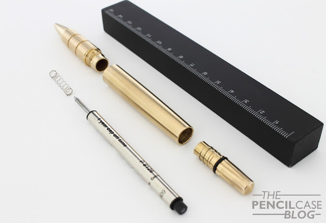
The twist action mechanism is custom machined for this pen, and the knob and mechanism are all just one piece which is quite a neat bit of engineering. One remark is that the mechanism has a ridiculous amount of travel to fully retract or extend the refill (two and a half turns!), but the people from Namisu pointed out that this will be improved in the final production version.  

As for the refill, the X-01 comes standard with a Schmidt P8126 rollerball ready to go. Schmidt refills are definitely a good way to go, so no complaints there. An added benefit is that normal parker-style refills also fit, so you have quite a wide variety of options to go with.
Namisu X-01 pen review
It's no secret that I'm a fan of minimal design, so the X-01 is off to a good start there (at least in my book), but it also turned out to be quite a functional pen that I reached for more often than I thought I would. It's a cool, rock-solid pen, that I think would definitely be suited for EDC.

The kickstarter campaign for the X-01 (that you can find HERE) is almost over, with just three days left on the clock. So if you're interested, there's no time to waste! Prices are very reasonable, starting at 35 GBP (44 USD) for the aluminium version, 46 GBP (58 USD) for the brass, and 69 GBP (86 USD) for the titanium version. Of course those will go up a bit after the Kickstarter, but their pricing is generally very sharp (especially considering the quality you get) so I expect that the price for the X-01 will remain competitive in the future as well.

Note: This product was sent to me by Namisu, free of charge, so I could write this review.  I was in no way influenced in the making of this review, the opinions shared in this review are completely my own! This post does not contain affilate links.
Namisu X-01 pen review

Monday, February 6, 2017

KAWECO STUDENT DEMONSTRATOR FOUNTAIN PEN REVIEW

Kaweco student demonstrator fountain pen review
If you think Kaweco, you think pocket pens like the Sport and Lilliput, right? Those are great little pens, perfect for EDC use. But let's be honest, a pocket pen isn't always the best option. Moving up to a full-sized pen is the obvious next step if you don't NEED that pocketability and/or are looking for more comfort without having to fiddle around with posting the cap (which can be frustrating if you have to write a lot). 

If you browse Kaweco's complete product line, you'll find quite a few full-sized pens, amongst which the fantastic new Kaweco Supra that I reviewed recently. For those that don't like the rather experimental design of the Supra (or the price!), There's also the Kaweco Student, a completely different pen with a more traditional design and a more forgiving price tag.
Kaweco student demonstrator fountain pen review
I've taken a look at the Kaweco Student before, a couple years ago (review can be found HERE), and my opinion actually hasn't changed much in those two years, most of it still holds true today. I still think it's a pretty cool pen, especially in this more reasonable price range, and it definitely offers a more comfortable writing experience compared to the pocket pens.
Kaweco student demonstrator fountain pen review
The gently curved clip gives the entire pen a vintage look and feel
What's new? Quite simply the new demonstrator colorway it comes in!

In the past, you could choose from five opaque colors (white, black, yellow, blue and red), which are nice, but they don't really make for a particularly eye-catching pen. The new clear demonstrator version is a bit more exciting from a design perspective. It has a slightly more modern appearance, but still with that hint of vintage that all Kaweco pens have (mostly due to the nice arched clip I think). The transparent design lets you see the internals, as well as how much ink is left inside, which is always useful.

[UPDATE] This pen is not meant for eyedropper conversion due to the metal section. Feel free to try for yourself, but do it at own risk since inks and metal don't always go well together... So in this case you're limited to using a cartridge or converter, and you should be aware that it only fits Kaweco's own full sized converter, which is slightly smaller than a regular converter (like the ones Schmidt makes).
Kaweco student demonstrator fountain pen review
Speaking about design, the Student can also be found with other manufacturers (under different names of course). One of those 'identical twins' is the Monteverde Artista, a pen I've had for quite some years now. But I only noticed how similar it was when I got a hold of the demonstrator Kaweco Student. All the injection moulded plastic parts are exactly the same on both pens, but the metal hardware -including the section- is different. 

When you know that the Gutberlet group (three companies, of which Kaweco is one brand) is mainly a parts building company. The most likely explanation would be that they also sell these pen parts to other brands who then assemble them with different hardware. While selling out your product seems a bit strange, I assume the main reason would be to lower production costs.
Kaweco student demonstrator fountain pen review
the same...but different
When talking about dimensions, the term 'full-sized' should probably be taken with a grain of salt. Measuring in at 13.1cm (5.2 In) closed, and 11.9cm (4.7 In) open, it comes in below pens like the Pilot Metropolitan or Lamy 2000, which I'd consider a good average. The difference is subtle, but whereas I consider 12.5cm when open ideal, under 12cm feels a little short in the hand. You can see that I grip it fairly low towards the nib. If I'd hold it higher up, like I normally would, the back of the pen would almost dissapear in my hand. Luckily, the cap can be posted quite securely if necessary. 
Kaweco student demonstrator fountain pen review
L to R: Pilot Metropolitan, Kaweco Ice Sport, Kaweco Student, TWSBI Eco, Lamy Vista
The metal section still is -and probably always will be- one of the biggest let-downs for a lot of people. The shape of the section does help providing more grip and the section has a comfortable length and width, but it's still chrome-plated metal so it'll always feel a bit slippery.
Kaweco student demonstrator fountain pen review
Since I've reviewed about a dozen different Kaweco's that all (with the exception of two) share the same nib unit, there isn't much I can write that hasn't already been told yet. The small steel nibs don't always perform as consistent as they should, but in this case it wrote a smooth, wet line.

After a while, I swapped the nib it came with out for a broad nib that I ground into an architect/hebrew, which gives really cool line variation with a wide horizontal stroke, and narrow downstroke. I've gotten the hang of grinding my own nibs recently, and the architect is definitely one of my favourites. I'd highly suggest getting a grind from a professional nib grinder (of which there are plenty out there), it can give an entirely new dimension to your writing!
Kaweco student demonstrator fountain pen review
The Student Demonstrator is a simple update to a pen that already proved its' worth in my book, but the new clear design gives it a more modern, cooler look. It's a solid addition to Kaweco's product catalogue, next to their pocket pens, and it offers good functionality at a reasonable price. At 44 EUR/ 58 USD, it's relatively affordable. But it's still priced higher than some other interesting beginner fountain pen options out there, like the Faber-Castell Loom or Lamy Al-Star. 

Note: This pen was sent to me free of charge by Kaweco, so I could write this review.  I was in no way influenced in the making of this review, the opinions shared in this review are completely my own! This post does not contain affilate links.
Kaweco student demonstrator fountain pen review
Sorry for the unreadable written review! I've learnt my lesson: light grey inks do not play well for this kind of thing...