

When I got the word that Lamy would do a reissue of the Lamy Persona, I didn't immediately believe it. Reusing an old design didn't seem like something Lamy would do, but yet here we are. The Persona used to be the high-end model in Lamy's collection about 20 years back. With its pricetag in the 300-400 euro range, the Imporium follows in the footsteps of the Persona as the flagship offering from Lamy.
 |
| Persona Titanium on top, Imporium BlkBlk at the bottom. |
The Persona was a bit of a strange bird within Lamy's product range when it launched. That's to say, the design was a bit unusual, not really comparable to most of their other products. Fast forward about twenty years, and the Imporium still stands out from the crowd. Of course that's to be expected, as both pens are of course designed by one and the same person: Mario Bellini.

The main design feature is the fluted barrel, remniscent of a Greek column. The cap is simple and has a rounded fineal, which contrasts the flat end at the back of the barrel. On the outside, the only thing that changed (apart from the color scheme) is the clip.


The Persona has a pretty neat clip design, that sits flush with the cap. In order to use it, you have to push down on the ridged part near the fineal, which extends the clip away from the cap. However, while really cool on paper, it's quite a hassle getting it clipped onto something one-handedly. The Imporium's clip looks somewhat similar in shape, but it's not recessed into the cap. The clip is spring loaded, and has a profile that allows it to slip onto fabric quite easily. Branding on the clip has moved from the front to the side, which is less intrusive (even though it was already quite subtle on the Persona).

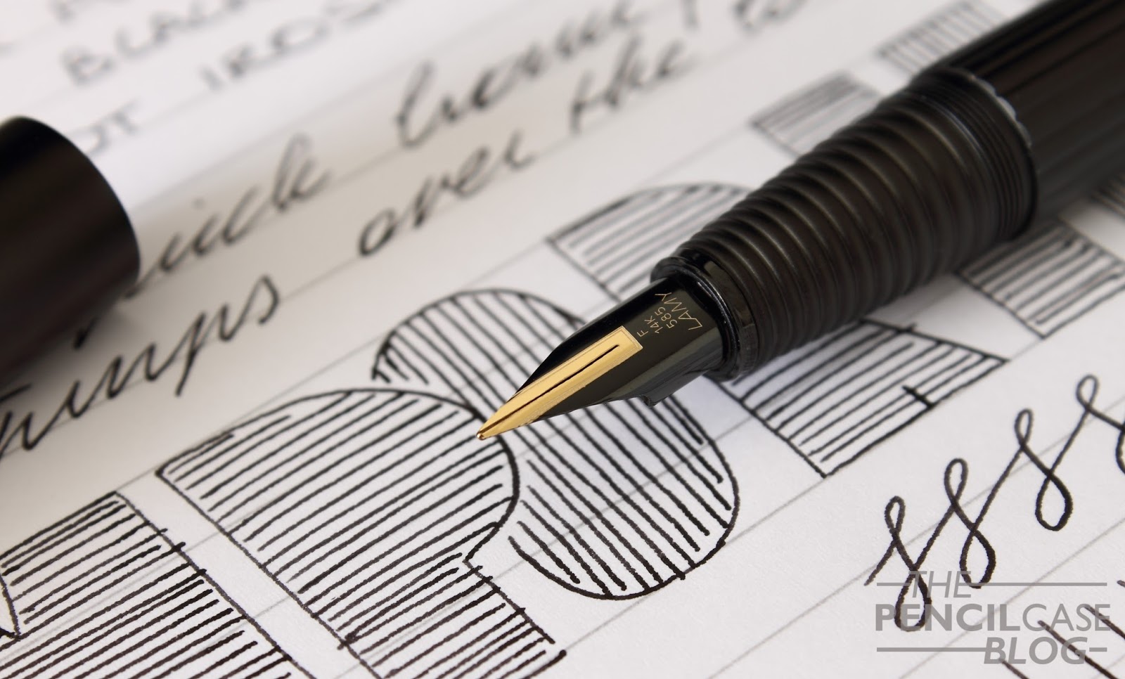
Uncapping the Imporium reveals a grip section with the same ribbed design as the barrel. Only this time the ribbed pattern goes across instead of lengthwise. The grip on the Imporium is a few mm longer, but has the same tapered shape as the Persona. The only issue I have with the Imporium lies right behind the section: the threads. The Persona has a threaded cap, but the threads seem to be too fine and shallow, which causes it to crossthread an awful lot. In that respect, the Persona clearly has the upper-hand, with its block threads that feel much more solid.
 |
| The mediochre threads on the Imporium are the only downside I could find. |

The Persona I have is the Blkblk version, which features a black on black color scheme. The barrel is metal (I suspect brass), and has a matte black PVD coating. The clip (and the small decorative disc at the bottom of the barrel) received the same PVD coating, but polished to a shine. It makes for a stealthy, all-black pen. The sleek look is -in my opinion- a bit nicer than the titanium and gold finish my Persona has, but for those that want a slightly brighter pen, there's also a titanium with platinum, or black with gold trim option available.

Sizewise, the Imporium is rather similar in dimensions and weight to the Persona, which puts it amongst the largest pens in Lamy's product line-up. Closed, it measures in at 14.2cm, whereas the Persona is slightly longer, at 14.5cm. Without the cap, both are exactly the same length, 12.2cm. The body of both pens measures 13mm at the widest point, but the cap of the Imporium is just a bit thinner, at 14mm (compared to the 15mm of the Persona). At over 45 grams capped, both the Persona and Imporium are quite hefty pens, however, the cap takes about 20 grams on itself, so uncapped it's not too bad.

It's well-balanced, and the ribbed section provides a good grip. The threads are almost not noticeable because they are so shallow, but the small step right behind the threads can be a bit sharp. The Imporium is quite a comfortable pen to write with, yet I find the transition from section to barrel just a bit better on the Persona. Nevertheless, there's no reason to complain about comfort here.
The nib on the Imporium also got a makeover, coming from the semi-tubular nib on the Persona, it's now almost identical in design to the usual Lamy nibs. To match the appearance of the pen, it's also coated black.

I went for a fine nib on the Imporium. A bit of a departure from what I'd usually pick, but it can't always be broad nibs. Lamy's gold nibs have a very characteristic performance. They tend to be a bit picky when it comes to ink choice, but with a wet ink (Lamy's own inks or Pilot Iroshizuku are my favourites) they write wonderfully. Lamy makes smooth nibs, but they don't overpolish either. You can definitely feel a bit of feedback when you write, especially with finer nibs like this. Lamy is pretty good at striking the right balance between smoothness and responsiveness. The Imporium's fine nib is still on the wide side compared to japanese nibs, yet for a Western nib, it actually puts down a rather fine line. The nib is responsive, and reliable, even after sitting untouched for quite a while. Lamy's gold nibs have the slightest bit of spring to it, which gives a 'cushioned' feel when you write.

The design of the Imporium won't be everyone's favourite, as it's quite a bit different from the usual Bauhaus looks we're used to from Lamy. The -sort of- premium pricetag might also hold people back. However compared to other high-end pens, I think 375 EUR is rather acceptable. As far as price goes, there seems to be quite a gap between the European and American market, with US prices of over 500 USD.
Note: Penworld Supports this blog. I received a discount on this purchase, so I could write this review. I was in no way influenced in the making of this review, the opinions shared here are completely my own! This review does not contain any affilate links.

I really like your arty black and white shots of the two pens on different backgrounds - a nice tribute to the Lamy monochrome style! I do like the Imporium, but I can't help feeling that the original Persona's nib suits the style better. (Is the new nib interchangeable with other Lamy pens like the gold nibbed Studio and Accent?)
ReplyDeleteThanks! I thought I'd try something different! I personally think the Imporium's nib fits in better with the overall 'art deco'-ish theme of the pen, but it doesn't stand out from the rest like the Persona's nib did. It's a personal matter but I certainly understand your point. The good thing about the Imporium's nib is that it indeed swaps out with other Lamy nibs!
DeleteThis reminds me of the Pilot MYU 701 and their later M90. Anyway I have the Persona and the threads on the cap are nearly impossible to cross thread. On the Imporium if you you turn the cap ccw you should quickly find the lead thread. Both are lovely Art Deco looking pens and are quite rugged. Great comparison, much appreciated.
ReplyDeleteIndeed a counter-turn helps a great deal with the crossthreading. Still, I wish they had kept the Persona's threads!
DeleteThanks for reading, Dries