Tuesday, April 26, 2016

PARAFERNALIA NERI PEN & LEADHOLDER REVIEW

Parafernalia Neri Pen and Leadholder review
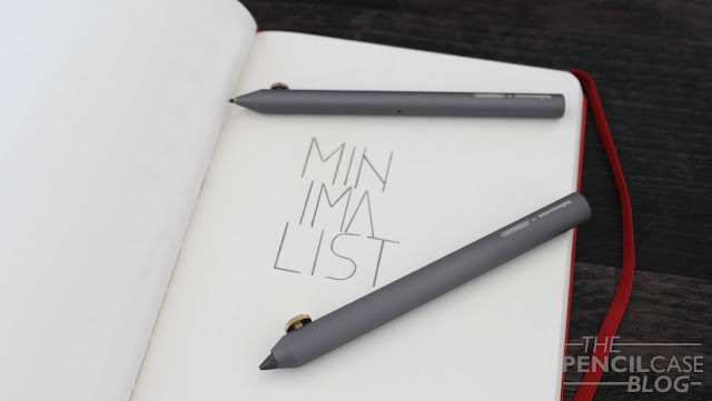
If you think about it, Minimalism is somewhat of a strange beast. In our modern day society where everything has to be bigger, better, more efficiënt and what not, minimalism does the exact opposite by going back to the absolute basics. In the pen business, there are quite a lot of brands that aim at producing minimalist writing utensils. Yet not every brand is willing to go really far with the minimalism philosophy. Why? Well, because we humans are used to comfort, and minimalism takes away those 'unneccesary' features that provide comfort.

But do we really need flashy features? No. And I'm glad Parafernalia took the challenge and risk of going to the bare minimum. 'An exercise in minimalism', Parafernalia calls it, which is a great way to describe what minimalism is all about. 
Parafernalia Neri Pen and Leadholder review
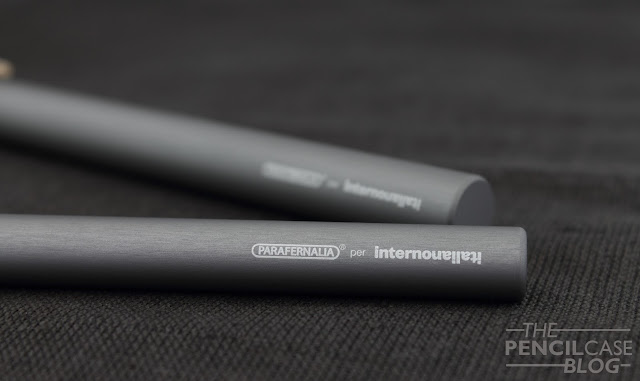
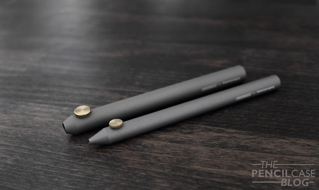
The Neri is a pretty nondescript item if you first see it. It's a grey anodised cilinder with a brass thumb screw and a conically shaped tip, and that's it (minimalism, right?). Both pen and pencil are pretty much identical, except for dimensions. The aluminium barrel is available in three anodized colors, aluminium, anthracite (this one), and black. Because this is a collab between Parafernalia and InternoItaliano, both companies logo's are laser-etched at the back of the barrel. The branding is quite prominently visible, yet both brands have a logo that goes quite well with the minimal theme, so it doesn't really distract from the overall appearance.
Parafernalia Neri Pen and Leadholder review
Let's talk about the most prominent -and only- feature on the Neri writing instruments: the brass thumb screw. Parafernalia/ designer Giulio Iacchetti was inspired by the mechanism used in compasses for the mechanism in the neri. unscrew the thumb screw, pull out the lead or pen refill (or let gravity do the job for you), and tighten the screw again. It's a bit weird at first, but with some practice it's actually possible to use single-handedly.
Parafernalia Neri Pen and Leadholder review
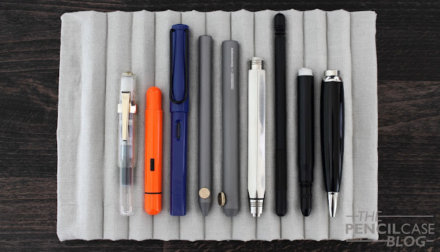
Both writing utensils are almost identical in design, yet there's an easy way to tell them apart by looking at the dimensions. The pen measures 13.3cm (5.23 In), and has a 1cm diameter (0.39 In), whilst the leadholder measures in at 12.8cm (5 In), and a width of 1.2cm (0.47 In). It's a subtle difference, but it succeeds in giving both pieces a completely different feel in the hand. The addded width of the leadholder (similar to how most leadholders usually are a bit 'fatter') provides a more relaxed grip, perfect for doodling and sketching. The Neri are machined from a solid piece of aluminium, which gives them just the right amount of heft. The leadholder is slightly heavier (33g) than the pen (28g). But in practice I find the difference negligible, in fact I find that the ballpoint feels 'denser' in the hand. 
Parafernalia Neri Pen and Leadholder review
Because both are relatively compact, they feel nicely balanced in the hand. If I had to choose, I'd say the sightly wider leadholder is a bit more comfy, but the difference is minor. The only thing that can cause discomfort, is the thumb screw. My grip is always a bit higher up, which is ideal in this case. But depending on how you hold your pen, it could get in the way. On the other hand I also found the thumb scew to provide some grip, because the otherwise smooth barrel can feel a bit slippery at times. 

Because of this, rather vague, description of how it feels in the hand, I'll put it differently: if the clip placement on the Pilot Vanishing Point annoys you, the thumbscrew on the Neri pen and pencil will probably get in your way as well. If you though the VP was uncomfortable, this might be something to consider when looking at these. 
Parafernalia Neri Pen and Leadholder review
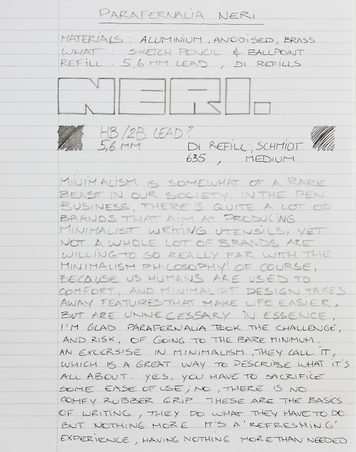
The Neri pen takes D1 refills, because of course the refills have to have a straight cillindrical shape due to the unique mechanism. D1 refills are quite widespread, and come in a good variety of colors and types. The ballpoint comes supplied with a single medium black schmidt refill. Schmidt makes some pretty good refills, so I didn't feel the need to swap it out. 
Parafernalia Neri Pen and Leadholder review
The 5.6mm leadholder obviously came with a 5.6mm lead, that feels a bit firmer than the 2B leads I'm used to. Another small detail that shows the amount of thought put in the Neri, is the small breather hole in the pen body, which prevents the refill from getting stuck inside the barrel (not that the tolerances are that high, but it's still good that they thought about the possibility). The leadholder has a slightly wider opening, so small variations in lead thickness won't cause issues (some brands, including Parafernalia, advertise their leads as 5.5mm, but those are essentially the same). 
Parafernalia Neri Pen and Leadholder review
With the Neri, Parafernalia showed, once again, that they are really good at designing awesome products. The Parafernalia Linea was, and still is, my absolute favourite leadholder (Linea review HERE). The Neri, both pen and pencil, show that minimal design -in some cases- can be taken pretty far without sacrificing too much comfort or functionality. That being said, I'd still mainly recommend the Neri products for their design and cool-factor. If you want something purely functional, and design doesn't bother you anyway, you might have to look elsewhere. 

Prices vary slightly here in the EU, there's InternoItaliano (the company for which this model was designed), that sells them at 42 EUR per piece, or 80 EUR for the set. One of my sponsors, Fontoplumo, also happens to carry Parafernalia, and has the Neri for 49 EUR per piece. (Non-EU peeps of course have the benefit of not paying VAT!). Prices are on the higher side, especially for Parafernalia, but as I said they're worth a shot if you like good design.

Note: This product was provided free of charge by Parafernalia, so I could write this review. I was in no way influenced in the making of this review, the opinions shared here are completely my own! This review does not contain any affilate links.
Parafernalia Neri Pen and Leadholder review

Monday, April 25, 2016

GIVEAWAY WINNER ANOUNCEMENT! (FRANKLIN-CHRISTOPH POCKET 40)

Touchdown! The Franklin-Christoph Pocket 40 giveaway has ended! Thanks to everyone who participated, we received 177 entries this time, that's awesome! Also, big thanks to the kind people over at Massdrop, who sponsored this giveaway! If you didn't win, but still want one of these pens, head over to Massdrop and grab one for yourself there!
So here's the winning entry:

Number 98 corresponded to the comment from  Elisabeth P., congrats!  

Here's the winning entry from Elisabeth!


Thanks again for all the support, and thanks for entering the giveaway! If you didn't win, don't worry: there will be more giveaways in the future!

(The winner was contacted by Massdrop directly, and will receive her prize soon!)


Saturday, April 23, 2016

REMINDER: FRANKLIN-CHRISTOPH GIVEAWAY! (ONLY 24H LEFT!)

Just 24 hours left to participate in the Franklin-Christoph Giveaway! Hurry up if you want to win this awesome Franklin Christoph Pocket 40 fountain pen in the Massdrop exclusive Blue-Violet&Ice color!

PARTICIPATE HERE!


Saturday, April 16, 2016

[ENDED!] GIVEAWAY: WIN A FRANKLIN-CHRISTOPH POCKET 40 FOUNTAIN PEN!

The awesome folks over at Massdrop decided to generously offer a brand new Franklin-Christoph Pocket 40 fountain pen in the Massdrop exclusive Blue&Ice finish to give away! I recently reviewed this cool pocket pen, so go check that out if you want more info about this pen (Click here to go to the review!).

TO ENTER, ALL YOU HAVE TO DO IS LEAVE YOUR MASSDROP ACCOUNT NAME IN THE COMMENT SECTION BELOW! If you don't have a Massdrop account yet, sign up here first (no credit card or purchase required!).


GIVEAWAY CLOSED! winner will be announced later this week!


Giveaway will run from 16 April 2016 and ends within one week, Sunday 24 April 2016 at 12:00 AM (GMT+1). OPEN WORLDWIDE! Good luck everyone!


TERMS AND CONDITIONS:
  • Contest is open WORLDWIDE!
  • The competition starts 16/04/2016 and ends 24/04/2016 12:00AM (GMT+1).
  • The winner will be announced after the contest closes, and will be announced here, on the blog. 
  • The winner is chosen at random, all entries will be arranged in one list, and random.org will choose the winning entry. The prize will be sent directly by Massdrop.
  • Make sure your entry is valid! (Play fair please!) You can only leave one comment. If your comment doesn't show up immediately, try refreshing the page!

FRANKLIN-CHRISTOPH POCKET 40 REVIEW

Franklin-Christoph Pocket 40 review
Franklin-Christoph is one of the trending pen manufacturers for the moment. Especially if you're active on Instagram, you must have noticed the FC 'hype' that has been going on for a while now. Franklin-Christoph is one of the bigger players on the American fountain pen market. They manufacture a wide range of fountain pens and other writing utensils -but mostly fountain pens- with a unique and immediately recognisable character .
Franklin-Christoph Pocket 40 review
I'm always willing to try new products from different brands. So when Massdrop gave me the oportunity to try out this Pocket 40 ice, I immediately said yes. Basically, I was sold the moment they mentioned the 'ice' finish, because part of Franklin-Christophs immense success is based on that very pen and finish! The particular model Massdrop sent me is the Ice&Blue-Violet, which is a Massdrop exclusive for now (it's supposed to become a standard edition in the future), there's also an inverted color option: Blue-Violet&Ice, which features a blue barrel and cap, but with a transparent acrylic section and fineal in the Ice finish.
Thanks to the generosity of Massdrop, I'll be giving away the Pocket 40 Blue-Violet&Ice, details about that can be found in this post!
Franklin-Christoph Pocket 40 review
The pocket 40 is of course... a pocket pen! It's probably one of their most well-known pen models, due to it being (one of) the first models that featured the Ice finish.

But what is this so-called 'Ice' finish exactly? Well, because these are all-acrylic pens, a lot of people use them eyedropper-filled. Of course having a demonstrator pen eyedroppered is awesome, but the folks over at FC went beyond that, and added a custom, rough finish to the inside of the barrel and cap. This texture adds a lot of visual interest to the pen, with ink sloshing around inside, that gets stuck on the texture.
Franklin-Christoph Pocket 40 review
The pocket pen on itself is remarkably similar to a Kaweco sport when it comes to the general form factor. Large cap, small body. Other than that, it follows a completely different design philosophy. It's a bit chunkier, and a touch longer. It doesn't show that much, because it's a demonstrator, but the design is actually quite funky. Of course the Kaweco Sport also looks 'odd' in a way, but the pocket 40 has even more exaggerated proportions, which give it a unique look.

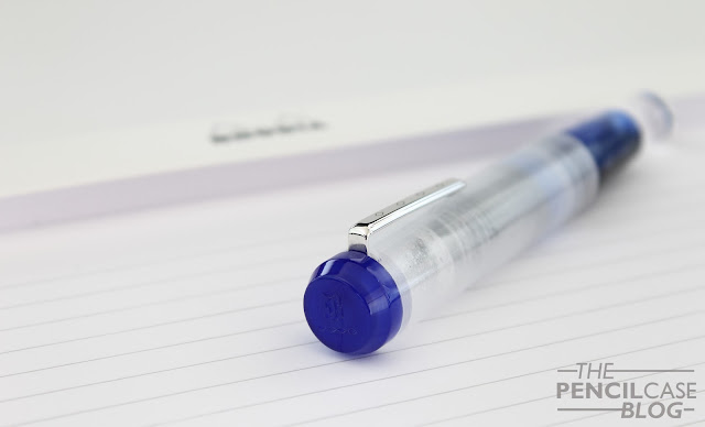
Closed, the cap is of course the most prominent part of the pen: It's a straight cillindrical shape, and has a blue fineal with a beveled edge (a trademark on all Franklin-Christoph pens.). It has a very small internally attached clip, unlike the Kaweco (sorry, I can't help comparing it to the Kaweco Sport), that actually  works better than I expected based on the way it looks. The barrel has a pronounced curvature towards the back, where it gets narrower to allow for the cap to post. The combination of clean beveled edges and straight lines makes the Pocket 40 a very interesting pen to look at, conservative but modern at the same time.
Franklin-Christoph Pocket 40 review
But of course, there's also that Ice finish inside the cap and barrel. It's -as I said- one of the reasons this pen got so popular, and I can see why. It's a strange finish, it looks as if FC was lazy and decided to not polish the interior bits of the pen. Yet as you look closer, the 'grain' of the ice finish is much more uniform than it would be if it just came straight of the lathe. However, I still would've preferred it to be slighty more uniform across the pen. In my pen, the cap has noticeable machining marks, but I did some research and it's supposed to look more even across the board. I suspect my copy might have been an early prototype for this Kickstarter-exclusive Ice&Blue model, so that would explain the more irregular finish.
Franklin-Christoph Pocket 40 review
Sizewise, the pocket 40 really is a true pocket pen! Compared to something like the TWSBI Diamond Mini, it looks tiny! On the other hand, it's marginally bigger than the Kaweco Classic Sport, at 10.7cm closed (4.21 In), and just 9.6cm open (3.78 In). Of course it's meant to be posted, which brings it in at 13.2cm (5.2 In), which is just a fraction longer than, for example: a Lamy safari unposted. It's a fairly beefy pen because of the cap, but around the grip section it's a fairly average and comfortable 9-10mm wide.
Franklin-Christoph Pocket 40 review
There are two drawbacks to the Pocket 40 though: First off, I'm not a huge fan of how it posts. It's actually quite an annoying flaw, because posting on a pocket pen is quite a big deal. The cap sits quite far down, but it feels like the barrel should have been slightly less tapered, so that there wouldn't be as much lateral play on the cap, which causes it to loosen and come off. It's quite annoying when the pen falls apart in the middle of a sentence, and unfortunately it happened quite a lot during the past few weeks. The second issue would be the uneven ice finish in the cap of this particular pen, but as I said before, it should just be a one-off problem.
Franklin-Christoph Pocket 40 review
Despite the posting issues, it's a really comfortable pen to use. It's light, and the cap doesn't weigh it down. The section has a taper towards the nib, but doesn't have a particularly ergonomic shape. Nevertheless, it's comfortable to hold, the section is long enough so you don't have to place your fingers on the threads. But even so, the block threads are almost not noticeable during use, unless you really rub your finger over them.

Being the Ice version, I obviously eyedropper-filled it to see the effect it creates. I just used some TWSBI silicon oil to seal the threads, and it held up just fine, however for longer use I'd recommend getting a more viscous silicon grease. The pen cleans fairly well, despite the tricky surface on the inside, but a faint hue of the ink remains visible when you just flush it out with water (Maybe an ultrasonic cleaner, or some pen soap or pen cleaning solution might get rid of that, but it didn't bother me to the extent that I cared to try).
Franklin-Christoph Pocket 40 review
On to the nib! Being a smaller pen, it utilises a smaller, #5 sized nib. It has some scrollwork and a laser-etched FC logo inside a diamond shape (the diamond shape can also be found on the fineal and the clip). As always, I'm not a huge fan of laser-engraved nibs, but it looks clean so I won't complain.
Franklin-Christoph Pocket 40 review
The nib performed close to what I would call perfect, right out of the box. It's quite a wet writer, consistent throughout. It gives some feedback, but I'd consider that normal for a fine nib. It's also a 'true' fine, perhaps a bit outside my comfort zone (which is broad nibs), but really pleasant for everyday writing tasks. It's a steel nib, so of course it's quite rigid. There's always the option to go for a gold nib, or get a Masuyama nib grind directly through Franklin-Christoph (These options aren't available through Massdrop).

As for where to buy this particular model and finish, for now you'll have to wait for the Drop on Massdrop to restart, which can acchieved through requesting a re-launch on the drop page. In the near future, it might become available through the Franklin-Christoph website directly, but of course there's also a number of other finishes available there. Price on the Pocket 40 with steel nib is 130 USD (About 116 EUR at the current rate), but of course it can be found cheaper on Massdrop if you can wait for the drop to re-open!

Want a Franklin-Christoph Pocket 40 fountain pen? Check out my giveaway HEREBig thanks to the people over at Massdrop! 

Note: I  received this pen free of charge from Massdrop, so I could write this review. I was in no way influenced in the making of this review, the opinions shared here are completely my own! This review does not contain any affilate links.

Thursday, April 7, 2016

LAMY IMPORIUM FOUNTAIN PEN REVIEW

Lamy Imporium Fountain pen Review
When I got the word that Lamy would do a reissue of the Lamy Persona, I didn't immediately believe it. Reusing an old design didn't seem like something Lamy would do, but yet here we are. The Persona used to be the high-end model in Lamy's collection about 20 years back. With its pricetag in the 300-400 euro range, the Imporium follows in the footsteps of the Persona as the flagship offering from Lamy.
Lamy Imporium Fountain pen Review
Persona Titanium on top, Imporium BlkBlk at the bottom.
The Persona was a bit of a strange bird within Lamy's product range when it launched. That's to say, the design was a bit unusual, not really comparable to most of their other products. Fast forward about twenty years, and the Imporium still stands out from the crowd. Of course that's to be expected, as both pens are of course designed by one and the same person: Mario Bellini.
Lamy Imporium Fountain pen Review
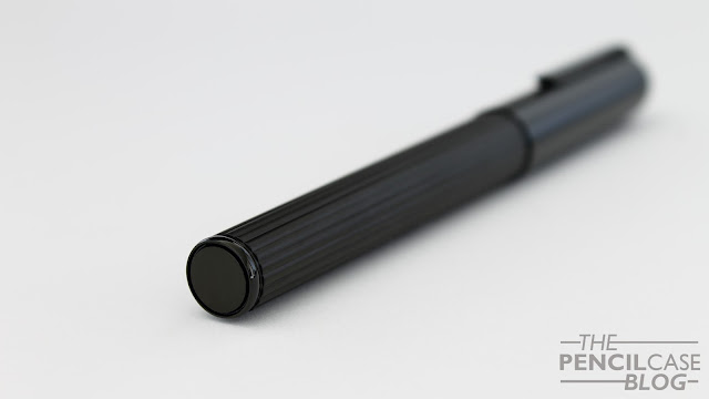
The main design feature is the fluted barrel, remniscent of a Greek column. The cap is simple and has a rounded fineal, which contrasts the flat end at the back of the barrel. On the outside, the only thing that changed (apart from the color scheme) is the clip. 
Lamy Imporium Fountain pen Review
The Persona has a pretty neat clip design, that sits flush with the cap. In order to use it, you have to push down on the ridged part near the fineal, which extends the clip away from the cap. However, while really cool on paper, it's quite a hassle getting it clipped onto something one-handedly. The Imporium's clip looks somewhat similar in shape, but it's not recessed into the cap. The clip is spring loaded, and has a profile that allows it to slip onto fabric quite easily. Branding on the clip has moved from the front to the side, which is less intrusive (even though it was already quite subtle on the Persona).
Lamy Imporium Fountain pen Review
Uncapping the Imporium reveals a grip section with the same ribbed design as the barrel. Only this time the ribbed pattern goes across instead of lengthwise. The grip on the Imporium is a few mm longer, but has the same tapered shape as the Persona. The only issue I have with the Imporium lies right behind the section: the threads. The Persona has a threaded cap, but the threads seem to be too fine and shallow, which causes it to crossthread an awful lot. In that respect, the Persona clearly has the upper-hand, with its block threads that feel much more solid.
Lamy Imporium Fountain pen Review
The mediochre threads on the Imporium are the only downside I could find.
Lamy Imporium Fountain pen Review
The Persona I have is the Blkblk version, which features a black on black color scheme. The barrel is metal (I suspect brass), and has a matte black PVD coating. The clip (and the small decorative disc at the bottom of the barrel) received the same PVD coating, but polished to a shine. It makes for a stealthy, all-black pen. The sleek look is -in my opinion- a bit nicer than the titanium and gold finish my Persona has, but for those that want a slightly brighter pen, there's also a titanium with platinum, or black with gold trim option available. 
Lamy Imporium Fountain pen Review
Sizewise, the Imporium is rather similar in dimensions and weight to the Persona, which puts it amongst the largest pens in Lamy's product line-up. Closed, it measures in at 14.2cm, whereas the Persona is slightly longer, at 14.5cm. Without the cap, both are exactly the same length, 12.2cm. The body of both pens measures 13mm at the widest point, but the cap of the Imporium is just a bit thinner, at 14mm (compared to the 15mm of the Persona). At over 45 grams capped, both the Persona and Imporium are quite hefty pens, however, the cap takes about 20 grams on itself, so uncapped it's not too bad. 
Lamy Imporium Fountain pen Review
It's well-balanced, and the ribbed section provides a good grip. The threads are almost not noticeable because they are so shallow, but the small step right behind the threads can be a bit sharp. The Imporium is quite a comfortable pen to write with, yet I find the transition from section to barrel just a bit better on the Persona. Nevertheless, there's no reason to complain about comfort here.
Lamy Imporium Fountain pen Review
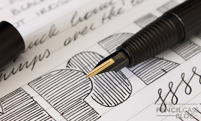
The nib on the Imporium also got a makeover, coming from the semi-tubular nib on the Persona, it's now almost identical in design to the usual Lamy nibs. To match the appearance of the pen, it's also coated black. 
Lamy Imporium Fountain pen Review
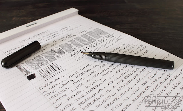
I went for a fine nib on the Imporium. A bit of a departure from what I'd usually pick, but it can't always be broad nibs. Lamy's gold nibs have a very characteristic performance. They tend to be a bit picky when it comes to ink choice, but with a wet ink (Lamy's own inks or Pilot Iroshizuku are my favourites) they write wonderfully. Lamy makes smooth nibs, but they don't overpolish either. You can definitely feel a bit of feedback when you write, especially with finer nibs like this. Lamy is pretty good at striking the right balance between smoothness and responsiveness. The Imporium's fine nib is still on the wide side compared to japanese nibs, yet for a Western nib, it actually puts down a rather fine line. The nib is responsive, and reliable, even after sitting untouched for quite a while. Lamy's gold nibs have the slightest bit of spring to it, which gives a 'cushioned' feel when you write.
Lamy Imporium Fountain pen Review
The design of the Imporium won't be everyone's favourite, as it's quite a bit different from the usual Bauhaus looks we're used to from Lamy. The -sort of- premium pricetag might also hold people back. However compared to other high-end pens, I think 375 EUR is rather acceptable. As far as price goes, there seems to be quite a gap between the European and American market, with US prices of over 500 USD.

Note: Penworld Supports this blog. I received a discount on this purchase, so I could write this review. I was in no way influenced in the making of this review, the opinions shared here are completely my own! This review does not contain any affilate links.
Lamy Imporium Fountain pen Review