Showing posts with label quick look. Show all posts

Thursday, February 18, 2021

REVIEW: LEONARDO MOMENTO ZERO GRANDE #8 NIB FOUNTAIN PEN

REVIEW: LEONARDO MOMENTO ZERO GRANDE #8 NIB FOUNTAIN PEN
Flecks of green, orange AND blue? A wild color choice for someone like me. But oh my, just look at it!
How to make a great pen even greater? That's the question Leonardo must've been pondering on. And the answer, as it turns out, is simple: just make it physically 'greater'!

Ok, to be fair, it's not that the MZ Grande #8 is effectively a better pen than the regular versions. It's just different, and it's - yet another - choice in the stables of Leonardo. So obviously I think it's warranted to take a closer at this specific version as well! Once again, a quick thank you to Leonardo Officina Italiana, for making this review possible!
REVIEW: LEONARDO MOMENTO ZERO GRANDE #8 NIB FOUNTAIN PEN
To be clear, the #8 is close to identical to the regular Momento Zero Grande (reviewed HERE), and you can get them in the same material options of the regular collection (this particular one is the wild, but lovely, 'Girasole'!) the difference is all about the nib (as you'd expect). While I've never found the #6 nibs on the Leonardo Momento Zero Grande to look particularly out of place (In part because the strong taper of the section transitions quite naturally into the #6-sized nibs), a pen as large as the MZ Grande undoubtedly makes an excellent candidate for a #8 nib transplant. 
REVIEW: LEONARDO MOMENTO ZERO GRANDE #8 NIB FOUNTAIN PEN
Identical, other than the slightly larger cap
The nib isn't the only aspect of the new MZ Grande #8 that is physically greater than the standard #6 version, the pen itself also grew a bit! The change in size is all in the cap, to accommodate for the substantially larger nib, of course. The slightly stretched-out cap doesn't really make the proportions of the pen feel off, though I do think the cap does have a slightly chunkier look and feel. The difference is quite minimal though, I feel like you really have to put both versions side by side to really see which is which. 
REVIEW: LEONARDO MOMENTO ZERO GRANDE #8 NIB FOUNTAIN PEN
L to R: Pelikan M1005, Montblanc 149, Leonardo MZ Grande, Furore Grande, MZ Grande #8, Lamy Safari, Lamy 2000
The Leonardo Momento Zero Grande #8 measures 15.4 cm/ 6.06" capped - 3 mm longer than the regular version of the MZ Grande - but is otherwise identical to the regular version of the MZ Grande (check my previous review HERE, for the full specs!). If the MZ Grande wasn't a large enough pen, this #8-nibbed behemoth surely will be enough? It's hard to really grasp the scale of these pens until you put them next to a Pelikan M1000 or Montblanc 149, both of which are absolutely dwarfed in the comparison.

Comfort-wise (looking at this mainly in function of how comfort changes with the #8 nib, because it's otherwise identical to the normal #6-nibbed version), I sometimes feel like I have less control over large #8-sized nibs because of the distance between your grip and the paper. However, the MZ Grande #8 handles the large nib quite well because the shape of the section naturally puts your grip quite close to the nib. 
REVIEW: LEONARDO MOMENTO ZERO GRANDE #8 NIB FOUNTAIN PEN
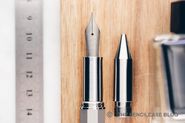
The #8 nib is a standard-issue 14k (only gold nibs available for the #8 size!) example from the stables of Bock (despite Leonardo's recent switch to JoWo nibs for all their other nibs). The engraved details remain the same from the #6 nibs, and I find the way these nibs aren't over-decorated - just the Leonardo logo front and center - quite pleasant. 
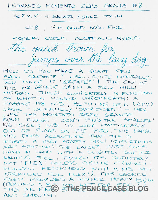
The 14k fine nib balances very well between smoothness and subtle feedback, and is an enjoyable and responsive writer because of that. The massive nib rests on an equally massive ebonite feed - I believe also made in-house by Leonardo? - which once again provides ample flow. Especially for this fine nib, the feed easily manages to keep up of course. Depending on your preferences, the ink flow can certainly be seen as overwhelming, probably not ideal for everyday writing (I'm looking at you, crappy office paper!). 

The fine nib runs on the wider side of a western fine, close to medium, which is to be expected by to the rich ink flow and inherent softness of this large nib. Talking about softness: the #8 nib does provide a noticeably cushioned, soft writing feel, but it's clearly not aimed at line variation. You can coax some wider lines out of it with slight pressure, but I wouldn't recommend taking the risk, as you could spring it if you're not careful.
Large nibs carry an inherent large premium, and the Leonardo Momento Zero Grande #8 unfortunately isn't any different in that regard. The #8 will set you back around 660€ / 645$ (The #8 is available only on special order through most retailers, like Casa Della Stilografica! Use discount code 'Firenze' for 10% off!) Though that does net you a 14k nib (no other nib materials are available in the #8 size), it's still a rather hefty 160€ premium over the 500€ of the 14k gold #6 nib version! That's substantial, and to be honest, the choice totally boils down to a personal preference (is the #8 nib worth it for you?). Functionally, you'll be fine with either of the two (heck, even the steel nibs are pretty great writers!).

NOTE: I received a discount on the purchase of this product by Leonardo Officina Italiana, so I could write this review. I was in no way influenced in the making of this review, the opinions shared in this review are completely my own. This post does not contain affiliate links.
Monday, February 15, 2021

QUICK LOOK: LEONARDO MOMENTO ZERO GRANDE PURA FOUNTAIN PEN

QUICK LOOK: LEONARDO MOMENTO ZERO GRANDE PURA FOUNTAIN PEN
Yesterday we took a look at the Momento Zero Grande 2020 (review HERE) from Leonardo Officina Italiana, and today I have somewhat of a world-premiere (nothing short of a miracle, given how terribly slow I usually am at publishing reviews!): a first quick look at the all-new Leonardo MZ Grande 'Pura' collection! If you follow Leonardo on Instagram, you may have already caught a glimpse of the Pura in his stories. It certainly didn't get past me unnoticed!

I'll let the photos do most of the talking here, but there are three simple reasons why I'm so excited about this new colorway:
QUICK LOOK: LEONARDO MOMENTO ZERO GRANDE PURA FOUNTAIN PEN
The - now sold out - Stilo&Stile Frosted special edition
1) A few months ago I purchased the Stilo&Stile x Leonardo Momento Zero Grande 'Frosted' - a clear frosted demonstrator - and couldn't help but wonder how cool this would look in colored demonstrator finishes...
QUICK LOOK: LEONARDO MOMENTO ZERO GRANDE PURA FOUNTAIN PEN
2) Since the newly introduced colorways for the MZ Grande 2020 collection focused strongly on bright and colorful materials (with the 'Primary Manipulation' collaborations with Jonathon Brooks being a highlight for many people!)... a more muted, simple, black pen was still missing from the lineup... 
QUICK LOOK: LEONARDO MOMENTO ZERO GRANDE PURA FOUNTAIN PEN
3) As much as I like 'subtle' black pens, the Pura also comes in orange - YES PLEASE! Especially in the version with sleek, black-coated ruthenium trims and nib, this is a winner in my book.
QUICK LOOK: LEONARDO MOMENTO ZERO GRANDE PURA FOUNTAIN PEN
Lastly, a translucent blue colorway completes the set. Although I'm obviously most drawn towards the black/grey and orange colors, the blue one is quite nice too. They make for a nice set, and I wouldn't be surprised if we'd see more experimenting with different colors in the future (what about a green or red Pura, or pink?) 

All Pura pens are finished with a satin-matte (sandblasted?) surface treatment. The finish feels smooth to the touch, almost soft, in a weirdly satisfying way. The frosted effect seems to be applied on both the outside and inside of the pen, for a consistent look across the entire pen. As with any matte finish, I do expect these pens to gradually become shinier with long-term use, so 'buyer beware' if you're not a fan of wabi-sabi.
QUICK LOOK: LEONARDO MOMENTO ZERO GRANDE PURA FOUNTAIN PEN
The Pura pens also offers quite a bit of variety in terms of trim options. Of course, there are the usual rhodium and gold-plated options, but you can also go for black ruthenium trims for an ultra-sleek look, which is a first on the Momento Zero Grande. As I already mentioned, I really like the combo of orange+ruthenium, but also on the black version, it looks really cool. 

Because the pens are completely translucent, the trim option strongly impacts the overall looks of the Pura. The rhodium trims accentuate the color of the acrylic, while the black trims make it appear more muted and darker overall. The gold trims, on the other hand, emphasize the classic Italian design elements on - what I think is - a predominantly modern-looking set of pens. 
QUICK LOOK: LEONARDO MOMENTO ZERO GRANDE PURA FOUNTAIN PEN
The translucent acrylics offer a somewhat rare opportunity to see the innards of the Momento Zero. In my review of the MZ Grande 2020 yesterday, I mentioned that having an ink window is not an option on the standard lineup... well this is your chance if you DO like to see approximately how much ink is left. 

Of course, the risk of a  translucent material is that it will also show the slightest imperfection or finish inconsistency. For the most part though, that's not really an issue, as the finish is consistent and even across the entire pen and construction seems precise. Though if you're really picky, a few areas inside the cap show light machining marks, and around the three cap rings (which are glued in place) the glue is ever-so-slightly visible.
QUICK LOOK: LEONARDO MOMENTO ZERO GRANDE PURA FOUNTAIN PEN
I think the Leonardo Momento Zero Pura offers a nice change from the usual multi-colored, complex acrylics that Leonardo uses for most of their pens. The monotone, demonstrator aesthetic is a nice change of pace, and especially the black demonstrator offers something for those that want a more subdued, business-appropriate pen. 

The Pura collection is bound to release soon. Going by previous pricing of other MZ Grande editions, I expect the MZ Grande Pura to hit the same MSRP of 295€/ 295$ without VAT (at Site Sponsor Casa Della Stilografica, use discount code 'Firenze' for 10% off!). The Pura collection will be part of the standard offering for at least the course of 2021.

NOTE: I received a discount on the purchase of this product by Leonardo Officina Italiana, so I could write this review. I was in no way influenced in the making of this review, the opinions shared in this review are completely my own. This post does not contain affiliate links.
QUICK LOOK: LEONARDO MOMENTO ZERO GRANDE PURA FOUNTAIN PEN

Tuesday, March 3, 2020

QUICK LOOK: NAMISU NAOS 2-IN-1 FOUNTAIN PEN & ROLLERBALL

QUICK LOOK: NAMISU NAOS 2-IN-1 FOUNTAIN PEN & ROLLERBALL
2019 was maybe not the best year for Namisu. With a bad taste of the Ixion project still lingering (all in all not a bad product, but the campaign was plagued by communication issues and delays), their 2019 Kickstarter pen -Stratos- didn't catch on. And a mechanical watch campaign met the same fate, before completely vanishing into thin air (unfortunately so, because both the pen and watch looked cool!). Luckily, Adrian and Maria didn't give up just yet, and 2020 brought us a new Kickstarter pen from the UK-based design studio: the Namisu Naos! 

This is a quick look post, and so let's try to keep it short: I like the Namisu Naos... I REALLY like the Namisu Naos! Of course, I'm a sucker for anything remotely minimal in design, and made out of metal, so don't just take my word for it.
QUICK LOOK: NAMISU NAOS 2-IN-1 FOUNTAIN PEN & ROLLERBALL
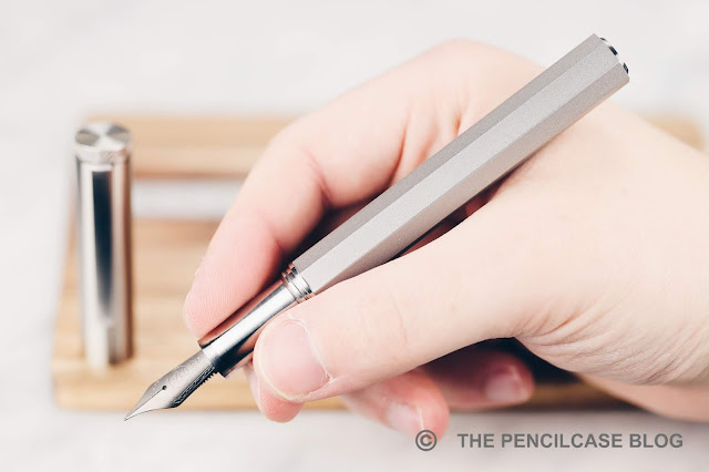
One could argue that the Naos is just a rehash of the Ixion. True, the Ixion has a faceted (decagonal) cap and round barrel, where the Naos has a round cap and faceted (octagonal) barrel. But in any other way, the Naos looks and feels like a more mature and refined pen, that fits better in the Namisu design language.
QUICK LOOK: NAMISU NAOS 2-IN-1 FOUNTAIN PEN & ROLLERBALL
All machined edges and facets of the Naos are crisp and clean. Perhaps the only gripe I have is that some edges can be a bit TOO crisp and would benefit from being ever-so-slightly rounded off to feel a bit easier on the fingers. The crispness does add to the minimal design though, which together with the non-tapered overall shape of the pen, makes the Naos feel a lot more modern than the Ixion.
QUICK LOOK: NAMISU NAOS 2-IN-1 FOUNTAIN PEN & ROLLERBALL
The Naos shares some of its design elements with the Ixion (in the middle).
A small detail that makes its return from the Ixion, is the finial inlay on the back of the barrel. The ones on the Naos are completely flat, with a chamfered edge (as opposed to being slightly domed). The cap finial is completely flat, and the sides are lightly knurled so you can easily unscrew it to add or remove the optional (unfortunately a 10$ add-on) brushed stainless steel clip. The clip is very sturdy (read: not super-easy to use) and perfectly complements the design of the pen. Every small design element and detail is crisp and refined and makes for a very clean-looking pen.
QUICK LOOK: NAMISU NAOS 2-IN-1 FOUNTAIN PEN & ROLLERBALL
L to R: Ensso Piuma, Namisu Nova, Namisu Ixion, Namisu Naos, Lamy Safari, Lamy 2000
One of the reasons why I really like the Naos is its size. In case you didn't notice, the Naos is a fairly large pen. At 14,3 cm (5.63") closed, and 13.4 cm (5.27") uncapped, it's no small pen. The straight shape (1.36 cm/ 0.53" in diameter) adds to its sizeable appearance. In the hand, you'll notice the block threads, which are a bit sharp (especially on the titanium pen), but the section is decently sized and the slightly flared-out shape towards the nib helps prevent your fingers from slipping off.
QUICK LOOK: NAMISU NAOS 2-IN-1 FOUNTAIN PEN & ROLLERBALL
The barrel of the titanium pen received a sandblasted finish, on the bronze pen it is brushed diagonally to contrast the brushed finish of the cap and section.
There are three metal options to choose from, and each has a distinct finish and weight. Interestingly, not the aluminum, but the titanium pen is the lightest option this time, at a -still respectable- 40g total. The anodized aluminum (black, green or blue) comes in at 48g, and that's because the cap, section and finials are stainless steel (so really, only the barrel is actually aluminum). The heavyweight (80g!) is not made out of brass (an alloy of copper and zinc), but the more uncommon bronze (copper and tin), which has a distinctly more coppery-pink color. I like heavy pens, and I certainly like an uncommon material, so for me the winner is bronze, but be warned of the weight!
QUICK LOOK: NAMISU NAOS 2-IN-1 FOUNTAIN PEN & ROLLERBALL
One of the "selling points" of the Naos is the interchangeable rollerball section. You can choose which one comes stock with the pen (fountain pen or rollerball), and additional sections can be bought (a 13$ add-on) so you can switch between the two writing modes. I suppose that's quite neat, but in the grand scheme of things, it's mostly useful if you like the design but prefer a rollerball over the standard fountain pen option. I don't see myself switching it out often (or at all) afterward, especially because it's not just something you can do on the go.

(PS: the rollerball version comes with a Schmidt 5888F refill, which is a classic rollerball. Not my favorite, but I suppose it can be 'hacked' to use a gel-based refill.)
QUICK LOOK: NAMISU NAOS 2-IN-1 FOUNTAIN PEN & ROLLERBALL
Since I wanted to keep this post short (I know, I failed miserably, and I'm not even done rambling!), I didn't include a writing sample, but by now you'll probably know what to expect: a stock Bock nib. Love it or hate it, these nibs are a quintessential part of pretty much every metal/minimalist pen you can imagine. I quite like these nibs, and the two Naos samples I was sent, both wrote flawlessly out of the box. The titanium -as always- has a bit of softness, and yes you can get a slight bit of line variation out of it, but please don't take the writing sample on the Kickstarter page as an example... you'll most likely just bend the nib if you try this (titanium doesn't really spring back like gold flex nibs do).
QUICK LOOK: NAMISU NAOS 2-IN-1 FOUNTAIN PEN & ROLLERBALL
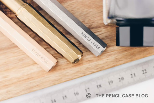
The branding on the barrel is quite extensive, especially for a minimalist brand... but it might change in the production version!
As usual, the Kickstarter campaign offers a chance to get one of these at a very reasonable price point, starting at 50$ for aluminum, 73$ for the bronze, and 90$ for the titanium version. The only pitfall would be the rather pricy add-ons (clip and additional grip sections) that quickly add to the cost. I'm really impressed by the Namisu Naos, it's a close tie with one of my all-time favorites, the Namisu Nova. The design is instantly recognizable as theirs, and yet it doesn't feel like a been-there-done-that rehash of yet another minimal pen.

Most importantly, it seems that Namisu has dealt with one of their biggest weaknesses, which was their rather poor communication. They've been very responsive on the Kickstarter campaign and also in my personal messages with them, it seems like they are on top of things. It's always tricky to write a conclusion on a product that hasn't even hit the market yet, but I have a good feeling about this one and I hope that feeling lasts until I have the final products in hand. In any case, my Kickstarter order is already in, so if you'd like to do the same, head over to their Kickstarter page (within the next three weeks!). They already passed their funding goal with ease, so the project is guaranteed to move forward into production!

This product was lent to me by Namisu so I could write this review. I was in no way influenced in the making of this review, the opinions shared in this review are completely my own! This post does not contain affiliate links.
QUICK LOOK: NAMISU NAOS 2-IN-1 FOUNTAIN PEN & ROLLERBALL

Sunday, November 18, 2018

REVIEW: PELIKAN SOUVERAN M800 STONE GARDEN SPECIAL EDITION FOUNTAIN PEN

Review: Pelikan Souverän M800 Stone Garden Special edition fountain pen
I'll admit that I'm a rather loyal collector of the Pelikan Souverän M8XX special editions. Yet, I've been able to restrain myself and hold off on quite a few recent editions like the Vibrant Blue and Ocean Swirl. I guess they weren't really my thing anyway, as I wasn't that big on the vibrant colorways of those releases.
Review: Pelikan Souverän M800 Stone Garden Special edition fountain pen
And then they announced their latest release, the M800 Stone Garden, a few months ago... The same tried and true Souverän pen (that I reviewed multiple times before), but once again built up from a completely new combination of materials. The color combo is definitely unique, combining a dark blue resin for the cap, section and piston knob, and a beautiful brown-blue marbled material for the barrel. As I'm usually not a fan of blue pens, I wasn't immediately hooked. But the subdued color scheme ultimately pulled me over. My thanks to Appelboom for sending one over to take a look at in this review!
Review: Pelikan Souverän M800 Stone Garden Special edition fountain pen
In person, this is an absolutely stunning pen. The material has a marble-like diagonal striation to it, and the blue and brown flecks create a shimmering light and dark contrast. Combined with the gold trim, this is an extremely classy pen. I love how the Souverän pens can appear classic -almost in a vintage way- or modern and sleek, depending on the materials they use (case in point: the Stone Garden vs. the M815 Metal Stripe!).

One thing I don't really like, is how the pattern is interrupted by a single seam along the length of the barrel. Pelikan creates the barrel by hot-forming sheets of resin into tubes (called the 'binde'), so you'll always have a seam somewhere, it's just not visible on most materials they use. It's not too obvious, as it took me a good while to even notice it, so it certainly isn't a deal-breaker for me.
Review: Pelikan Souverän M800 Stone Garden Special edition fountain pen
The Souverän M800 is a fairly large pen, measuring 14.1 cm (5.57") capped, and 12.7 cm (5") uncapped. It posts securely, creating a pen that measures 16.6 cm (6.53"). The brass piston mechanism adds just the right amount of heft, giving a total weight of 30 g. I've raved about the M8XX on multiple occasions before, it's pretty much the perfect size for my hand (with the M6XX a close second, especially if you have smaller hands!). I forgot to take a size comparison photo of the Stone Garden, but you can find one in my review of last years Renaissance Brown special edition!
Review: Pelikan Souverän M800 Stone Garden Special edition fountain pen
The nib on this Stone Garden is new to me, because it's actually the first time that I got to play with the EF on one of Pelikan's high-end models. I figured, since the latest price increase, that I shouldn't wait any longer to get one... God forbid they might go up in price again in the future (The current  55€ premium you pay for an EF nib is already quite absurd!)
Review: Pelikan Souverän M800 Stone Garden Special edition fountain pen
In terms of performance, what can I say? It's an excellent nib. As you may know, I'm usually not drawn towards the finer end of the nib spectrum, but this one is hard to knock. It's a solid performer. Maybe a tad bit boring because of the inherent stiffness of the M800 nibs (when I do buy finer nibs, I like a bit of 'cushioning' in my writing), but the ink flow is consistent (surprisingly not overly wet) and it's ample smooth. When comparing this to a Japanese EF, the line it puts down is still about twice as wide, but nevertheless it should be perfectly usable even when you have small handwriting.
Review: Pelikan Souverän M800 Stone Garden Special edition fountain pen
I like the new Stone Garden (Who'd have thunk it!). Even though blue pens don't tend to be my first choice, I think they did a fantastic job on the color combination here. It's a classy-looking pen, which is how I tend to like my Pelikans (The Burnt Orange, Tortoise brown, Renaissance,...). I think a professional and subdued color scheme works better with the Souverän design than a more vibrant material (like the new Vibrant Orange m600), but I guess that's just my personal preference.

In general -but especially with the special editions- Pelikan is slowly pulling up their prices. Where they once offered a competitive price compared to say, Montblanc, that price gap is now slowly fading away. The Pelikan Souverän M800 Stone Garden retails for 519€ (612$) here in Europe. But for the non-EU audience that buy from overseas (like from Appelboom, for example) the price drops down to 437€ (500$) without VAT. The price hike for EF nibs will add about 55€ (65$), which I feel is quite unfair for people that prefer a finer nib.
Appelboom.com banner
Note: Appelboom is a sponsor of this blog. I received a discount on the purchase of this product. I was in no way influenced in the making of this review, the opinions shared in this review are completely my own! This post contains affiliate links. When shopping through these links, you support my blog, additionally you can use the above discount code to enjoy 10% off your order.
Review: Pelikan Souverän M800 Stone Garden Special edition fountain pen