Four years into this blogging thing, and here comes my very first review of a Parker pen! Why did I wait so long? Well, let's just say I might have been a bit negatively biased about Parker. My experiences with their pens hasn't always been very good, and their conservative business strategy -not too many new exciting products being released- didn't exactly make me eager to try out more.
Yet it seems like today could be a turning point. I won't say I went from pessimistic to huge fan all of a sudden, but the time I got to spend with this new Parker Duofold Centennial Big Red definitely changed my perspective. My thanks to Appelboom Pennen for providing this pen on loan for review!
Yet it seems like today could be a turning point. I won't say I went from pessimistic to huge fan all of a sudden, but the time I got to spend with this new Parker Duofold Centennial Big Red definitely changed my perspective. My thanks to Appelboom Pennen for providing this pen on loan for review!
 |
| Kudos to the designer of the box. I love the unique, vintage vibe of the presentation! |
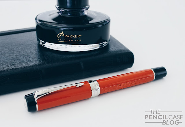
I've always found the Duofold the most 'intriguing' Parker pen. Designwise, but also because of the rich history connected to it. This new version of the Duofold, called the 'Big Red', honours the red hard rubber Duofolds of back in the day with a renewed design that combines modern elements but also design elements remniscent of the Big Red of a century ago!
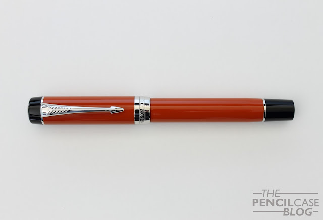
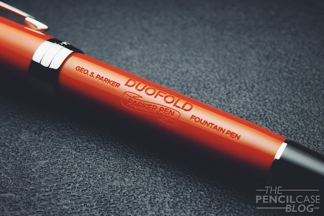
Comparing the old Parker Duofold pens from back in the early 1920's with the new one, it's not hard to spot the similarities. It still has the same stately, flattop design, it still comes in that typical terracotta red with black finials and section (although now made from a resin instead of hard rubber). They even reproduced the old barrel inscriptions of the early versions (which I absolutely love, it gives the pen an instant vintage look!). The pen is finished with palladium trims, which I think adds a bit of modern to the mix.
I must say I'm impressed with the amount of detail and impeccable fit and finish on this pen. On the finial you can find a large metal insert with the ace of spades logo that defines the Duofold pens, the same ace logo can be found on the two-tone nib, but more on that later. The major change in this 2016 version of the Duofold, is the wide, metal center band. It appears much heavier and robust compared to the two thin bands on the previous versions. It's a matter of personal taste, but I actually do like the way it looks on this pen, especially paired with the red resin.
The Duofold comes in two sizes, the smaller 'International' and the larger 'Centennial'. The Big red pictured here is the Centennial, and the black Duofold next to it is an older version in the International size. The difference in length is just a couple mm, but it's the difference in diameter that gives the Centennial a much larger look and feel.
Even though the Centennial feels like a large, substantial pen, it only measures 13.7cm (5.4") closed, and 12.8cm (5.04") open. The cap is fairly wide, at 1.4cm (0.55"), but the barrel is a bit slimmer at 1.3cm (0.51"), and the section narrows down to approximately 1cm (0.39"), which is a comfortable width. The Duofold is mostly made out of acrylic resin, but with a couple metal parts, such as the section and cap band. This makes for a total weight of around 28-29 grams, enough to make it feel solid, but not too heavy.
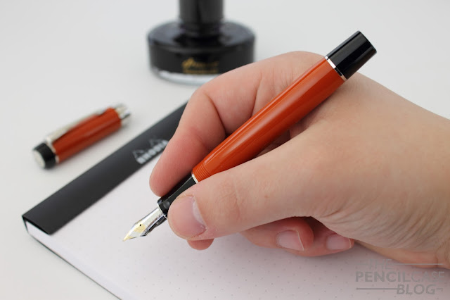
In the hand, this is actually one of the more comfortable pens I've used in a while. The section has a comfortable taper to it, and flares out a bit towards the front. There are no sharp edges, no step from section to barrel and the threads are shallow and smooth. The size is just right, not too large, not too small, and not too wide either. All in all an incredibly comfortable pen to write with, that feels balanced in the hand. The cap can be posted, but it doesn't sit deep on the barrel. I personally didn't feel the need to post it, since it is more than long enough unposted.
The large #6 18k gold nib tops it off in a very pleasant way. To begin with, t's a good-looking nib with a nice design. As I said, it features the same ace of spades design as found on the cap finial. I don't exactly know where this connection with the Ace of spades symbol comes from, but I do know that it's visually quite striking.
Obviously I was mostly curious about how it performed, as I had previously had some mediochre writing experiences with Parker. But this one is actually spot-on. The fine nib is smooth but well-tuned, not over-polished in any way. The line width seems quite true to western standards (perhaps ever-so-slightly on the wider side). The nib is fairly stiff, as I expected, however that's not necessarily a bad thing. I filled it with Pelikan 4001 Royal Blue, which is a fairly neutral ink, and it showed a relatively wet and consistent flow.
The Parker Duofold Centennial retails for 'just' 435 EUR (585 USD, Appelboom). Since this can be considered the flagship pen from Parker, that's quite a sharp price compared to the flagship offerings from other major brands. For the money, you get a very well made pen with quite an extensive history (maybe one of THE most iconic pens in the history of fountain pens?). I was hesitant in trying it out, but it turned out to be a capable performer, so much so that I think I'll have to revisit my opinion about Parker.
Note: Appelboom is a sponsor of this blog. This product was sent on loan, free of charge, so I could write this review. I was in no way influenced in the making of this review, the opinions shared in this review are completely my own! This post contains affiliate links.


That pen IS gorgeous. I'm fairly new to fountain pens (still getting along fine with my Pilot Metropolitan), so I think I'll have to try a few other things out before I can think about spending nearly six bills on a pen. In the meantime, I've got a dozen Skilcraft U.S. Government pens on order.
ReplyDeleteIt is useful to point out that this is a cartridge/converter style pen. It does perhaps go some way to explaining the more modest price for a 'flagship' pen.
ReplyDeletewont buy as its cartridge pen
DeleteWe get a converter too.Parker automatically provides deluxe converter on its high end pens
DeleteIn the Book, The Sherlockian, the pen is described with black on the blind cap, red on the barrel. What is a blind cap?
ReplyDeleteThe blind cap is the small part at the back end of the barrel. It's a name that originates from when vintage piston fountain pens (such as some vintage Parker pens) had a small cap that covered up the piston knob for the filling mechanism. The name stuck, but for example on this particular pen (which is cartridge/converter-filled) the black piece at the back of the barrel is purely an aesthetic detail.
Delete