Thursday, October 27, 2016

PELIKAN SOUVERÄN M400 TORTOISE BROWN FOUNTAIN PEN REVIEW

Pelikan has made quite a few beautiful and interesting special edition pens over the last couple years. But one of them stands out from the rest: the Pelikan Souverän M800 Tortoise brown (2013 special edition). It was by far the most popular release, which shows in the ridiculous price they currently fetch on the second-hand market (upwards of 1000$!).

It just so happens to be that I bought my first Pelikan (an all black M805) at the exact moment that the M800 tortoise was sold. Yet for some stupid reason I decided to get the boring black pen. Worst decision ever now that I look back on it. And so I -along with many other pelikan enthousiasts- have been begging for a re-release ever since.
Sometime early August, Pelikan -out of the blue- announced the M400 Tortoise brown. It took me approximately 5 minutes to contact a pen store to pre-order one. Needless to say, I wouldn't miss out on it again!

I've reviewed a bunch of Pelikan products here over the past couple years, but the only Souverän model I hadn't tried out yet is the M400 size. Because all the Souverän pens are generally quite comparable, I'll try to stick to the differences between other models in this post. If you want to read more about Pelikan pens, go check out my other Pelikan Reviews.
Let's begin with the absolutely gorgeous Tortoise Brown material, the star of the show. Just like the green/red/blue striped colorways, the tortoise consists of a striped resin barrel. What makes it so special is the color variation and chatoyance this material offers. The brown-orange-silver-black streaks are mesmerizing to look at, and it has a warm orange glow when the light hits it just right. The color of the barrel is accentuated by gold-plated hardware, and a dark brown resin, that appears almost black, for the cap, section and piston knob (same as on the M800 Burnt Orange).
The Souverän series uses a pretty clever (yet sometimes confusing) number system to indicate the different models and finishes. It starts with the M300, the smallest fountain pen, and it goes up to the M1000, the 'flagship' oversized version of that same fountain pen. One up from the M300, which is a true pocket pen, you'll find the M400. The fact that it's only slightly bigger made me wonder if it's big enough to be comfortable in use. After all, we're not talking about a cheap pen, so it should be comfortable to use.
But in practice there isn't much to complain about sizewise. The M400 is a considerable step up from the M300. It's still a smaller than average pen when closed, but uncapped it measures in at 12.2cm, only a few mm shorter than the lamy 2000 for example. I can easily get away with it unposted (and if necessary, the cap can be posted securely).
For me personally, the width of the M400 poses a more noticeable difference than the length. Around the section, it measures in at just over 9mm, which is comparable to a kaweco sport grip section. It's comfortable to hold, and it's by no means a narrow pen, but I do prefer the more beefy M800 grip section as I'm more used to slightly larger pens in general.
In terms of comfort, I can't really complain though, the size is just a matter of preference. Pelikan does a great job with their grip sections. There is no step, only the threads that can possibly get in your way, but even those are in general quite shallow and not very sharp. The section is short, so I automatically hold it a little closer to the nib, which in terms makes the shorter barrel less noticeable. Because every Souverän pen under the M800 size is made with a plastic piston mechanism, it's also noticeably lighter than the bigger models, almost unsubstantial, but in return you get a fatigue-free writing experience.
The other difference with the larger M800 and M1000 -apart from the piston mechanism- is the nib. It sports the same two tone design with the pelikan logo, but it's made from 14k gold instead of 18k. Does that make it any different? In my experience not really. I found it to be a bit softer than the M800 nibs, but any nib apart from the M800 size generally is a bit softer, the M800 is the odd bird in the flock (#pelikanpun)
A special treat for the tortoise brown is that you can get one with the quite-hard-to-find Italic Broad nib, so I obviously went for that one. To my biggest surprise, it was perfectly tuned out of the box (seems like Pelikan upped their QC game in the last couple years?), it's a crisp stub with good line variation. The crispness comes at a price of having a very small sweetspot, meaning you can't rotate the pen or it'll skip and scratch. It may take some practice to hold correctly, but t's a joy to use when you get the hang of it. The flow is on the wet side, as we're used to from Pelikan, but paired with their slightly drier edelstein inks it makes for a balanced match.
Sometimes it's hard to conclude a review, but in this case my recommendation is quite simple: If you're sold on the absolutely stunning Toroise Brown material, you should act fast and get one of these, once they are gone, they are gone (and trust me, these won't stick around long!). Chances are Pelikan will release other models in this finish, but god knows how long that will take (They should really make this part of the permanent Souverän collection!)

Retail price, because this is a smaller model, is actually quite reasonable. In the US they go for 380 USD, here in Europe they retail for 325 EUR (that's still with VAT!), and of course you can get an additional 10% off with the discount codes provided by the blog's sponsors!
Note: Penworld Supports this blog. I received a discount on this purchase, so I could write this review. I was in no way influenced in the making of this review, the opinions shared here are completely my own. This review does not contain any affilate links.

Friday, October 21, 2016

INKTASTIC: PILOT IROSHIZUKU ASA-GAO INK REVIEW


Inktastic Pilot Iroshizuku Asa-Gao ink review
I never thought I'd say this about a blue ink, but this ink is quite amazing. I'm really not much of a blue fan, especially royal blue inks never really do much for me. As a result, I use black almost exclusively as my go-to daily use inks (mostly Lamy black because it's cheap and well-behaved).
Inktastic Pilot Iroshizuku Asa-Gao ink review
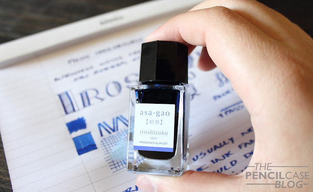
But every now and then I get the urge to buy blue inks. I bought this three-pack of 15ml Iroshizuku bottles from Penworld when I visited their store a few months ago. I thought it looked quite neat, and it had two inks in it that I really wanted to give a go (Take-Sumi black and Yama-budo magenta). It also had Asa-Gao in it, but I considered that an extra... until I came home and swabbed them! 
Inktastic Pilot Iroshizuku Asa-Gao ink review
Asa-Gao is anything but a boring royal blue. I'd describe it as a cross-over between a typical royal blue and a bright turquoise blue like Sailor Jentle Souten or Iroshizuku Kon-Peki. Asa-Gao is considerably more saturated than most regular blue inks, and it balances slightly to a more turquoise hue. It's without a doubt one of the brightest and most saturated blue inks I have used so far, which makes it -in my opinion- infinitely better than regular royal blue inks that are often rather unsaturated and bland. 
Inktastic Pilot Iroshizuku Asa-Gao ink review
A similar color would be P.W.Akkerman Binnenhof Blues, which leans more towards royal blue where Asa-Gao has a hint of turquoise in it. Diamine Blue velvet, one of my more recent discoveries, is perhaps an even better match, only a little less vibrant. Next to Iroshizuku Kon Peki (reviewed HERE), you can see that Kon-Peki is actually turquoise with a hint of blue in it, the opposite of Asa-Gao.
Inktastic Pilot Iroshizuku Asa-Gao ink review
Performance is as you'd expect from an Iroshizuku ink. Flow is definitely on the wet side, which could make for slightly longer dry times in certain nibs and on certain papers. It's well-behaved as far as I know, and it has a very decent amount of shading. Most noticeable is the strong red sheen, which seems to be a common factor with a lot of blue inks, and for me it's one of the major selling points of this ink.
Inktastic Pilot Iroshizuku Asa-Gao ink review
Iroshizuku inks are expensive. Ridiculously expensive even! I haven't bought a full bottle in a year or so, which is a shame because they have some stunning colors, like Asa-Gao. The mini bottles are a decent solution if you want to give a certain color a go, but don't feel like committing to a full bottle. But on the flipside, you'll eventually end up needing more because these small bottles are only 15ml. I haven't seen these bottles for sale individually here in Europe, but in the US you can find shops that sell them per bottle for 14 USD a piece. A set of three will set you back 33USD, but you can't always choose which three colors you want, so you could end up with doubles.
Note: Penworld Supports this blog. I received a discount on this purchase, so I could write this review. I was in no way influenced in the making of this review, the opinions shared here are completely my own. This review does not contain any affilate links.
Inktastic Pilot Iroshizuku Asa-Gao ink review

Sunday, October 16, 2016

LAMY 2000 50TH ANNIVERSARY BLACK AMBER FOUNTAIN PEN REVIEW

Lamy 2000 50th anniversary Black Amber fountain pen review
Let's talk about what is probably the most controversial pen of the year: the Lamy 2000 50th anniversary 'Black Amber'! 

But before we begin, a short intermezzo about 'preferences':
As every normal human being, I have preferences. In the pen scene, one of those preferences happens to be the brand Lamy. Their minimalist, simple design appeals to me, and I generally like how they write. But as I said that's just part of my personal preferences, I like the way their nibs write, others may hate them. I don't think we -bloggers in general- specify this enough, but your mileage may vary, different blogs will tell different stories because behind the blog is a normal person that just writes his or her opinion. I'm writing this now because I know that some people will not agree on my opinion about this pen, probably more so than with other reviews. Just keep the above in mind when you read this -and any other review for that matter! I might actually do a blog post about this later on because it seems quite a 'hot' topic within the pen community at the moment.
Lamy 2000 50th anniversary Black Amber fountain pen review
The simple, but stylish presentation box, it comes with a bottle of Lamy Blue black ink
Loooong before the first product pictures of the Black Amber were released, people speculated -en masse- about what it would or could end up looking like. Loads of thoughts passed the revue, some extravagant (gold everywhere, neon colors,...), others more conservative and in line with Lamy's design philosophy. I actually read some really good ideas on forums: all-titanium, brushed demonstrator macrolon,...
Lamy 2000 50th anniversary Black Amber fountain pen review
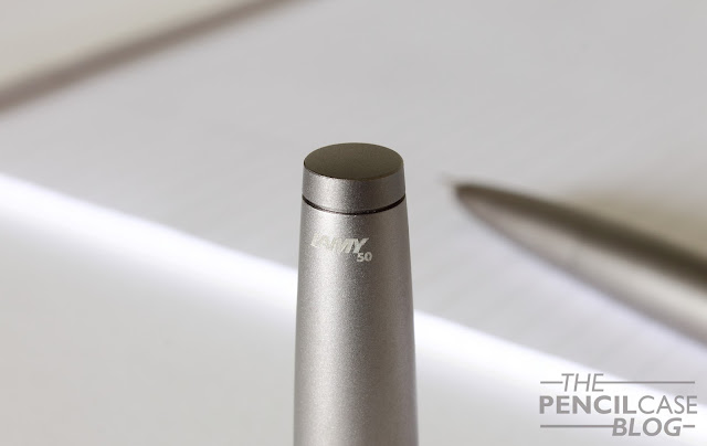
A small and unobtrusive engraved '50' marks this anniversary edition. It's simple and unobtrusive, as we're used to from Lamy.
But none of those things eventually turned out to be what Lamy went with. Don't get me wrong, I would've liked a titanium 2000, but the criticism I read online after the first product shots and the -admittedly quite high- price were released? Phew! Never judge a book by its cover I'd say. So I gave the Black Amber a chance to prove itself in real life.
Lamy 2000 50th anniversary Black Amber fountain pen review
And in person, it's totally unlike any of the product shots I had seen from Lamy. They went for a special galvanised coating over the regular Lamy 2000M, which has a matte satin finish instead of the usual brushed finish. The coating is indeed someting of a warm, greyish color, depending on the lighting conditions, so I can actually understand where they got the name from. My only gripe so far is that I don't know how durable this finish will be over prolonged use. So far it's still looks like new, but only time will tell how it holds up. 

The surface of the pen is smooth and soft to the touch. It's slightly less tactile than the brushed finish, but that doesn't seem to make it more or less slippery than the macrolon or 2000M. An interesting property of the coating is that it picks up fingerprints very easily, which makes it appear darker. This is one of very few pens that I don't wipe all the time because I actually like the 'dirty' aged effect it creates. 
Lamy 2000 50th anniversary Black Amber fountain pen review
It's of course still a lamy 2000 underneat, and apart from the finish it's nothing different from the steel 2000M. The clip and nib are still platinum coated, the nib is still 14k gold and is interchangeable with the other 2000 models. It's still the same trusty old pen, but in a new coat(ing). The choice of steel for the construction of this anniversary edition -even though the macrolon version is THE original- makes for a premium-feeling, luxurious pen, appropriate for celebrating Lamy's 50th birthday. 
Lamy 2000 50th anniversary Black Amber fountain pen review
The Black Amber is, just like the 2000M, quite a heavy pen. As I said, the added weight makes for a more premium feel in the hand. When compared to the 2000 Macrolon, a lot of people find the steel and black amber too heavy, and the difference is indeed quite huge. Especially when capped, where the macrolon is super comfortable, the steel versions are imbalanced and unpleasant to use. Uncapped at 12.5cm, it's just the right length for me to be comfortable, and with 30 grams it's more reasonable in weight as well.  
Lamy 2000 50th anniversary Black Amber fountain pen review
Since I already have a couple Lamy 2000's, I decided to go for a nib size that I hadn't tried yet: Broad (what else!). Compared to their other nib sizes, that seem to run a bit wider than average, this one is actually about average for a broad. It does have a noticeable stubby character to it because of the way it is ground, this gives your writing some character without being finnicky like regular stubs. It's not a gusher but it has a more than decent ink flow, although it also noticeably depends on your ink choice (something I already noticed earlier on some other Lamy pens).
Lamy 2000 50th anniversary Black Amber fountain pen review
Three of a kind. The same but different.
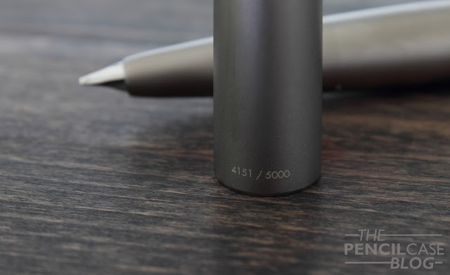
For what it's worth: the Black Amber is Lamy's first ever numbered limited edition pen. This certainly adds some value to the pen, perceived value of course, but it's quite common practise to pay more for something exclusive. From this point of view, I can think of many pens and brands that ask much more for their limited editions. I think Lamy can hold their own in the limited edition market, it's just a big transition from what they used to focus on before with a collection of more affordable pens.
Lamy 2000 50th anniversary Black Amber fountain pen review
But now comes the really important question: Is it really worth the retail price of 495EUR/ 470USD? Probably not. A lot of pens in this price range are probably not really worth the money. But of course there's always an argument to be made for why buying that really expensive pen is justified (You just really need it, right?). For me it's worth the money because of a mixture of exclusivity and personal emotional value (It's the brand that got both me and my dad started into collecting pens!), so it made sense to get their anniversary pen to complete the collection. If you just want a Lamy 2000 to write with, the regular macrolon and steel versions will definitely offer a better value for you.
Note: Penworld Supports this blog. I received a discount on this purchase, so I could write this review. I was in no way influenced in the making of this review, the opinions shared here are completely my own. This review does not contain any affilate links.
Lamy 2000 50th anniversary Black Amber fountain pen review

Wednesday, October 12, 2016

RECAP: INSIGHTS X STATIONERY SHOW 2016

Just like any other industry, stationery and pen brands do their best to announce new products every year. But before the general audience gets to see the novelties, they are introduced to the vendors and stores during so called 'stationery shows'. Basically a huge pen show, but closed for the general public, without direct sales (meaning you can't buy new products directly at the show), and with more than just pens (stationery in the widest sense of the word).
I was lucky to be invited -along with a couple other bloggers- to a blogger meeting at the Nuremberg Insights X stationery show last weekend. It's only the second edition of this particular show, but it already features around 260 brands spread over multiple halls with a combined size of three football fields! Needless to say it was quite an overwhelming experience, but a great one! I met a bunch of interesting brands, both known and unknown (to me), and the people behind those brands of course.
Before the picture overload, I just want to thank the organisation team behind the Insights X expo. I'd also like to thank all the brands that I had the pleasure of talking to, it's impossible to list them all here, but i'd encourage you to visit the exhibitor list on the Insights X website, and check them out for yourself. Last but not least, it was the perfect opportunity to meet some other (pen) bloggers: GourmetPens, SBREBrown, AllThingsStationery and Bleistift!

As I said earlier, it's stationery in the widest sense imaginable, from kids' backpacks to greeting cards and everything in between. The show was split up into six categories: luxury writing, desk acccessories, paper, bags, artist supplies and stationery. Of course I personally spent most time browsing the various pen brand exhibitors, more than enough to explore there. We also visited a couple non-pen brands too of course.

Along with the visit, we were also overloaded with a bunch of goodies and samples of new products. Part of those products were relevant to this blog, and thus will be reviewed at some point. But of course there were also some less interesting products (I'm talking about kids' crafts products, coloring pencils, small toys,...). We didn't really know what to do with these, and it would've been a waste to throw it away, so we decided to donate to the children's department of the mental hospital where my mother works. 
But enough talking, I'll leave the rest of this post speak for itself with the pictures I took during the show. It's impossible to pack everything in one post, but here's a selection of what I found most interesting...

KAWECO
Not pictured here are the two novelty colors of the ACsport pens: Orange and green! They did look fantastic in real life though, I assume you'll see them pop up online and in stores in the near future...
'Make your own Kaweco Sport pen', at the Kaweco stand of course!

The Faber-Castell Booth, filled to the brim with new exciting product, I'm especially interested in the new affordable luxury pens, all with the same high-quality steel nibs we're used to from them!

UNI-BALL
Uni-Ball and their ever so popular jetstream pens, available in a bunch of styles and prices.

STABILO

By far the most colorful and playful booth at the show, courtesy of Stabilo
Some interesting new products from Stabilo: Pastell highlighters, woodcased pencils with a slip-on touchscreen pencil cap, and a new learning fountain pen for kids with an adjustable nib.
Also from Stabilo, these colorful neon jumbo triangular woodcased pencils!

Some lesser-known brands were present as well, such as Cleo Skribent with their beautiful luxury fountain pens in exotic materials like ebonite and wood.
Some really impressive luxury Online pens, with a more premium design and finish than the school pens they are most known for. 

STAEDTLER
The usual Staedtler Premium product line. Nothing new so far, but I was informed about an upcoming lower-priced premium pen coming in 2017!
...the droolworthy, but also really expensive princeps collection from Staedtler

LABAN
Laban pens were a first for me, hadn't seen their pens in person before and was thoroughly impressed with the wide variety of styles and materials they produce! The vintage ebonite pens lower left were my personal favourite.

Brands like these made up about 60 percent of the show, zipit was one of the most interesting ones, with their pencil cases made from one long zipper. 

KUM with their Masterpiece sharpeners, about as fancy as a handheld sharpener will get...

A wall of Leuchtturm notebooks.

ZEBRA
The Zebra stand brought a mechanical pencil with unbreakable leads! You could actualy rip the paper and the lead wouldn't budge, very impressive.

HINDUSTAN PENCIL CO. 
The Hindustan pencil company (known for their Natarah pencils) introduced their new subbrand: Sivo. This new brand provides high-quality pencils and school supplies for children. 

A novelty for me personally: Scrikss pens from Turkey. They brought some pretty classy designs with them, something worth keeping an eye out for...

PLATINUM
From the other side of the world: Platinum. We were honoured to be able to sit along the table with the Vice President of the brand: Mr. Takeuchi.  The new Nova Orange Platinum Plaisir was present at their booth, but we were more distracted by that handsome Izumo Urokomon in the lower right corner!
(This post does not contain affilate links.)