Friday, December 30, 2016

Tuesday, December 27, 2016

RHODIA RHODIARAMA SOFTCOVER NOTEBOOK REVIEW

Rhodia Rhodiarama A5 softcover notebook review
Rhodia has been flying under my radar for a while when it comes to notebooks. I always use rhodia notepads to write reviews on, but I mostly used Leuchtturm notebooks in the past few years (that I still haven't reviewed!), which have great paper that shows off inks with loads of shading and sheen. But Leuchtturm isn't the only brand that knows how to make a notebook! There are other viable options on the market if you're looking for a fountain-pen friendly notebook, and Rhodia is one of the brands to prove that.
Rhodia Rhodiarama A5 softcover notebook review
The particular notebook we're looking at today is the Rhodiarama softcover A5 notebook. It's the first softcover I've used in this size, but there are a couple advantages that make me want more of this. A5 is my favourite size for a notebook, it's portable, but it's still usable without having to contort your hand in all kinds of uncomfortable writing positions (I generally find smaller, pocket sized notebooks bothersome to use).

This Rhodiarama makes for an even more comfortable writing experience because it's thinner (80 sheets vs. 125 sheets in a Leuchtturm hardcover), which makes it easier to write on, especially near the bottom of the page.
Rhodia Rhodiarama A5 softcover notebook review
Top to bottom: Field notes, Leuchtturm A5 notebook, Rhodia Rhodiarama A5 softcover, L!fe Tsubame notebook.
Rhodia Rhodiarama A5 softcover notebook review
The Rhodiarama comes in a bunch of bright, but also less bright (like this Taupe color) colorways, all with orange elastic closure and orange paper on the inside of the cover. The cover is made of a soft and supple faux-leather material. Worth noting is that the soft cover also allows the notebook to lay open quite flat (and stay open, most importantly). It has a pocket in the back and one pagemarker. It doesn't feature numbered pages, nor a content table, so if you are looking for flashy features, you'll be dissapointed.
Rhodia Rhodiarama A5 softcover notebook review
But then we come to the performance part, and this is where the Rhodiarama shines! The lined 90gsm ivory white paper is smooth, as expected from Rhodia. It seems to be more fountain pen friendly than the last Rhodia webnotebook I reviewed a couple years ago (review can be found HERE). If they actually changed the paper since then, I don't know, but in any case it performs as desired so I can't complain.
Rhodia Rhodiarama A5 softcover notebook review
It takes ink like a champ, any line width and wetness I could throw at it, including a very wet 10mm dip nib. None of the writing samples bled through the page, even the dip nib couldn't make it feather or bleed. In terms of bleedthrough/ showthrough, it definitely beats the Leuchtturm. Both sides of the pages can be used without any issues with ghosting (showthrough). Dry times are slower than on Leuchtturm paper, which is due to the smoother vellum paper that Rhodia uses (Leuchtturm paper is more absorbent and dries slightly faster).

Shading and sheen show well. Writing looks crisp and defined. Smooth paper like this is often more prone to grease from your hands, which can make certain nibs skip. I like to keep a guide sheet underneath my hand when I write to avoid just that.
Rhodia Rhodiarama A5 softcover notebook review
10mm dip nib and q-tip ink swabs show loads of well-defined shading. 

Rhodia Rhodiarama A5 softcover notebook review
The back of the page shows no bleedthrough, and very little showthrough.
My experiences with the Rhodiarama notebook has put them back on the map for me. It's a simple but good-looking notebook without too much flashy features, but the paper is fantastic for fountain pen use, which is of course the most important aspect! You can pick up the Rhodiarama softcover notebook for 14 EUR/ 21USD (A5 size) from various retailers. 

Note: this notebook was sent to me by Exaclair USA, free of charge, so I could write this review.  I was in no way influenced in the making of this review, the opinions shared in this review are completely my own! This post does not contain affilate links.
Rhodia Rhodiarama A5 softcover notebook review

Wednesday, December 21, 2016

SAILOR 105TH ANNIVERSAIRY ZUISEI FOUNTAIN PEN REVIEW

Sailor 105th anniversairy Zuisei fountain pen review
Yes. I'm well-aware of the fact that I don't review enough Japanese fountain pens. It's something I haven't put my focus on yet, which has previously always been European brands (like Pelikan, Lamy, or the many Italian brands). But every now and then I get the opportunity to review something really cool. Something I wouldn't immediately buy myself. 

I recently got the opportunity to take a look at the new Sailor ZuiSei 105th anniversary pen, provided by the German-based store Papier & Stift! This is definitely not a pen I'd buy on my own initiative, but that's just a decision based on my budget. If I had the money...
Sailor 105th anniversairy Zuisei fountain pen review
The experience starts with the balsa-wood box, inside is a rice-paper envelope with warranty and information booklets, and a beautiful blue pen kimono.
The ZuiSei is a unique pen in a couple of ways. First of all: the remarkable and unusual pentagonal profile throughout the entire cap and body of the pen, but also the beautiful blue-black striped ebonite!
Sailor 105th anniversairy Zuisei fountain pen review
The ebonite is absolutely stunning, but as Brad -penaddict- Dowdy mentioned on Instagram, it's also one of the hardest materials to photograph. The color variation is noticeably more pronounced in person than it'll appear in these pictures, with petrol-blue, black and grey stripes. Unlike acrylic, ebonite doesn't have depth, but the striped pattern looks so crisp, and the pentagonal profile does a great job showing off the different streaks of color. A neat little detail is that the pattern in the ebonite on the cap and barrel line up.
Sailor 105th anniversairy Zuisei fountain pen review
L to R: Pelikan M800, Pelikan M1000, Sailor Zuisei, Omas Arte Italiana Paragon, Lamy safari, Lamy 2000
Something I didn't expect, was how big this pen is. Usually, Sailor makes fairly small, maybe medium-sized pens, but this isn't just big, it's oversized! At 16cm (6.3in) capped, and 13.9cm (5.5in) uncapped, this pen easily beats anything I have in my personal collection. My Omas Paragon looks small in comparison, the M1000 next to it just looks downright tiny! Despite the completely ebonite construction, it has a satisfying weight to it (around 40 grams total).
Sailor 105th anniversairy Zuisei fountain pen review
It's quite a wide pen as well, or at least on the outside where it measures approximately 1.7cm (0.66in) in diameter. Underneath the cap, I was suprised to find a small black plastic section, and the same nib size as found on the 1911 Large and Pro Gear. I can understand that they reuse an existing section and nib, but I would've expected at least one in the King Of Pens size (one step up from the regular models). Not only would it have matched the huge cap and barrel of the ZuiSei better, it would've also been more fitting on a pen in this price class!
Sailor 105th anniversairy Zuisei fountain pen review
The biggest pen of the lot, but one of the smallest nibs...
To be honest, it even looks out of place on a huge pen like this. On the 1911 large, which isn't a very large pen at all, it looks decent. But it's not even the equivalent of a western #6 size, so it looks tiny and out of balance on a pen that is 16cm long. A bit dissapointing, but oh well... 
Sailor 105th anniversairy Zuisei fountain pen review
The Sailor 1911 Large next to the Zuisei
I was a bit worried about comfort with a huge pen like this, but in the end it's really not that bad. The pen has a snap cap, so there are no threads to worry about. There is a little step towards the barrel, but the transition is relatively easy on the fingers, even if you hold it right there. I also think the wide barrel helps in providing a less cramped grip. I personally prefer slightly wider pens, but of course your mileage may vary on that. In any case, I found it to be a surprisingly comfortable pen to write with, despite the fact that it's really more of a collector's piece than it is an everyday carry pen! 
Sailor 105th anniversairy Zuisei fountain pen review
Limited edition of 500 pieces
Part of the reason why I enjoyed using it so much, is the nib. It's visually dissapointing because it's so small (the nib itself looks good, but it just feels out of place on a big pen like this). But performance-wise it scores top marks. 

That's actually an odd thing to say for someone like me that is used to western nibs. Not that Japanese nibs aren't good, quite the opposite, but they aren't exactly in line with what I usually prefer: smoothness, softness, and a wide nib. I like my double broads, so Japanese extra-extra fine nibs aren't exactly my cup of tea! 
Sailor 105th anniversairy Zuisei fountain pen review
Luckily, Papier und Stift knew my preferences, and they sent one with a Broad nib. It still has Japanese characteristics, but I found it to be remarkably close to what I would call the ideal broad nib! It's stiff, but has a wonderfully wet ink flow (especially when paired with the already wet Sailor Jentle inks). The tipping is ground in a rather wide contact spot, so line width is actually not that far off from Western standards. 

As is to be expected from Japanese nibs, they are tuned to write unconditionally. That means you'll clearly notice some feedback when you write -similar to a graphite pencil-. This is the kind of feedback you want, it doesn't catch on the paper, and it writes all the time. Japanese brands -contrary to some Western brands- don't overpolish their nibs, which makes them less temperamental and more consistent. So far this theory still holds true, as I didn't experience a single hesitation or skip. Even with fast writing, it would still keep a consistently wet flow. 
Sailor 105th anniversairy Zuisei fountain pen review
The Sailor Zuisei is without a doubt a beautiful pen. The oversize pentagonal design and gorgeous ebonite material make this a great limited edition. But unfortunately it comes at a hefty price! At 950 EUR, this is definitely aimed at the serious collector, but it's also an excellent performer (it's not just good looks!).

If you want just the performance, you'll find more 'affordable' Sailor pens with the exact same nib within the 1911 Large and Pro Gear collections. You'll only have to settle for a completely different design in a smaller package.

Note: this pen was lent to me by Papier & Stift, free of charge, so I could write this review.  I was in no way influenced in the making of this review, the opinions shared in this review are completely my own! This post does not contain affilate links.
Sailor 105th anniversairy Zuisei fountain pen review

Thursday, December 15, 2016

TOP 5 BEST BEGINNER FOUNTAIN PENS

As with any hobby, starting out with fountain pens can be a bit scary. Where to start? The wide variety of brands, materials, sizes, nibs,... can be difficult to choose from. Even pricing and price differences can be confusing. It's perfectly possible to find a very decent pen in the 15-50$ price range, but you need to know where to look.

In this buying guide I'll show you around five of the best fountain pens to start off with. These are some of my personal favourites in the 15-50$ range. They should give you a head start into the fountain pen world, without breaking the bank.

Something mportant to keep in mind though: These are five pens that are generally quite well-regarded, but your mileage may vary. Personal taste and preference plays a huge role in finding the perfect pen, so you might have to experiment with a few different styles, sizes, materials before you find out what you're looking for.
At the bottom of the page, you can find a few size comparisons. More in-depth reviews can be found through the links underneath each section.

You can purchase all the pens discussed above from any of my sponsors. As an added bonus, some will give you a small discount when you use the provided discount code at checkout!


KAWECO SPORT

PRICE: 17.5 EUR / 25 USD

Kaweco's 'sport' pens are recogniseably by their distinct pocket design with the large cap. This small plastic pen (more expensive metal versions are also available) is meant to be used with the cap posted on the back to transform it into a full-sized pen that is comfortable to use. If you're looking for a valid EDC choice, you should look no further and go with one of these! They come in a wide variety of colors and finishes (Each finish has it's own name: Classic, Ice and Skyline), and you can choose from a bunch of nib sizes (extra fine to double broad).


LAMY SAFARI

PRICE: 18.5 EUR / 29.6 USD
PURCHASE: Penworld | La Couronne Du Comte | Appelboom | Fontoplumo

Lamy is one of the most widely recognised brands in the world, and part of their succes is based on the iconic Lamy Safari fountain pen. The Safari is a sturdy plastic fountain pen with a unique, modern design, and comes in a bunch of bright colors (shown above is the transparent 'Vista'). The grip section has a triangular shape, which helps you to hold the pen at the correct angle. Nibs can easily be replaced and are sold separately, so you don't have to buy a completely new pen if you want to change the nib size. 


PILOT METROPOLITAN

PRICE: 19 EUR / 15 USD

Moving on to the Pilot Metropolitan. Possibly the best value for money of all the pens listed here! For just 15 dollars you get a stylish metal pen with a japanese quality nib. The benefit of Japanese pen brands is that they make really fine and precise nibs. If you like to write small, you might want to check out the fine nibs on the Pilot Metropolitan. 


FABER-CASTELL LOOM

PRICE: from 29 EUR / 40 USD

We're moving up the ladder with the Faber-Castell Loom. If you are willing to spend a little more, the Loom will provide you with a modern and cool design and a sturdy metal body. The nibs are the biggest selling point for me. Every pen in this top 5 writes good, but Faber-Castell knows how to deliver just that little bit more! Not only do the steel nibs look good, they write super smooth, and can easily compete with pens many times its price! 


TWSBI ECO

PRICE: 35 EUR / 29 USD
PURCHASE: Scrittura Elegante | Fontoplumo |  La Couronne Du Comte | Appelboom

Last but not least, a pen from the Taiwanese company TWSBI. As one of the younger pen manufacturers around, they gained worldwide popularity for their affordable piston-filled fountain pens. What that means is that you can fill this pen directly from a bottle of ink with the plunger system inside (You can't use it with traditional ink cartridges like the previous pens, which is something to keep in mind). They use transparent materials which allow you to look at the piston mechanism inside the pen, and you can keep track of how much ink is left.

Lamy 2000 as a reference on the far right.
Note: This post does not contain any affilate links.

Friday, December 9, 2016

MONTEVERDE MOUNTAINS OF THE WORLD FOUNTAIN PEN REVIEW

Monteverde Mountains of the World Denali fountain pen review
If you're looking for a pen in the 50-100 dollar price range, there are quite a few good options. One of the options that often gets overlooked is Monteverde, with their wide range of products, starting at around 50$. One of their newest pens, also in the sub-100$ range, is the Monteverde 'Mountains of the World' collection. With a name like that, I couldn't help but be intrigued!
Monteverde Mountains of the World Denali fountain pen review
The name is definitely quite interesting. The Mountains of the world pens are inspired by some of the highest mountains, depicted by three unique and colorful acrylic resins. This particular version is the 'Denali' A blue acrylic with white swirls, depicting the snow-covered peaks of the 6194m high Denali mountain in Alaska.
Monteverde Mountains of the World Denali fountain pen review
The Mountains of the World pens (I'll just call it 'Denali' from now on) are defined by a rather traditional design. Monteverde pens are usually aimed at a younger audience, with often translates into quite special and unique designs, but this one is actually rather classy and elegant.

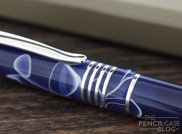
The long cigar shape is accentuated by a metal finial at the end of the barrel, which -apart from being a nice design element- also weighs down the back of the pen to keep it balanced. Below a simple, gently curved clip, you can find four narrow center bands, as well as one extra band on the barrel of the pen that sticks out from under the cap.
Monteverde Mountains of the World Denali fountain pen review
lots o' rings!
If I'm being really picky, I would've probably preferred a couple less center bands. Combined with the swirly material they make for a somewhat 'busy' appearance. But that's really my only gripe. What I do like about the center bands, is that they went through the extra effort of putting a small ring of acrylic in between every band. With a lot of pens (even with much more expensive pens), the space in between center bands is often just enamel-filled. A+ for effort!Monteverde Mountains of the World Denali fountain pen review
Monteverde Mountains of the World Denali fountain pen review
The Denali is a large pen, at just under 15cm capped (5.9in) and 13cm open (5.1in). In contrast to some other pens this size, it's not overly wide, which makes it comfortable in the hand, without fatigue. The metal parts give the pen a solid and comfortable weight of 30 grams (total), and 20 grams without the cap. 

In general, the build quality and fit and finish is very good, but the threads are a bit of an issue -or could become one after extended use- because they are metal on acrylic (which could wear down over time). The threads catch a bit, so opening and closing doesn't feel as smooth as I'd like, but at least they don't seem to crossthread, and I haven't experienced any significant wear and tear so far.
Monteverde Mountains of the World Denali fountain pen review
L to R: Kaweco sport, Lamy 2000, Monteverde Denali, Lamy safari, TWSBI eco, Pilot Metropolitan
Uncapping the pen reveals a straight black section without taper. It's long enough to be comfortable, but if you hold it higher up, you'll notice the metal threads and the small step towards the barrel. The pen sits nicely balanced in the hand because of the metal parts on both the section and back of the pen that distribute the weight evenly. The cap can be posted, but only very shallow, which makes it ridiculously long (and at 13cm open, it should be long enough unposted anyway).
Monteverde Mountains of the World Denali fountain pen review
Then we come to the nib, which is definitely a strong suit of the Denali. It's a large steel #6 nib with a simple mountain logo and some text engraved on the nib face. I opted for a 1.1mm stub, which is untipped so it's just the bare steel you're writing with. Untipped nibs are said to be less durable because steel isn't as hard as the usual tipping material, but in essence you'll have little or no issues with the nib wearing down (at least not in one lifetime).
Monteverde Mountains of the World Denali fountain pen review
The stub writes a nice wet line, and has crisp, well-defined line variation in the horizontal and downstroke. You should always expect slightly more feedback from an untipped nib, but in return you get really crisp lines which is especially useful if you like lettering or calligraphy. Flow is slightly above average, which is good for a wider nib. I did find the nib to be somewhat prone to drying out, but didn't experience any skipping once it gets going.
Monteverde Mountains of the World Denali fountain pen review
The Monteverde Mountains of the World Denali is a very capable pen. I have to admit it's not the most exciting pen ever, but it's well made and the nib is reall For 85 EUR / 68 USD, you get a classy pen finished in a nice acrylic material (two other color options are also available). 
Note: Scrittura Elegante is a sponsor of this blog, I received this product free of charge, so I could write this review.  I was in no way influenced in the making of this review, the opinions shared in this review are completely my own! This post does not contain affilate links.
Monteverde Mountains of the World Denali fountain pen review

Saturday, December 3, 2016

BARON FIG ARCHER PENCIL REVIEW

Baron Fig started as a Kickstarter project for a minimalist design notebook in 2013, the Baron Fig Confidant. In the few years of being in business, they expanded their product line to where they now offer four minimalist, core products. With one hardcover notebook, a series of softcover notebooks, a pen and now a woodcased pencil, they offer the essentials you need to write, draw or doodle.
The final addition is the Archer, a woodcased pencil, following the same minimalist design found in all Baron Fig products. Minimalism is their core business, and that starts right at the beginning, with the packaging. The dozen pencils are presented in a small grey tube with a clean graphic design of the pencil along the length. The first thing everyone -including me- seems to think when you see the packaging: 'No way twelve pencils are in there!' And yet when you open it: sure thing, twelve pencils tightly packed together!
The cedarwood barrel casing of the Archer pencil is finished with a semi-matte, grey laquer that is advertised as anti-slip. It doesn't have a rubberized feel to it, but it is indeed nice to grip (if it's less slippery than other pencils, I don't necessarily think so). The end of the pencil is topped off with a matte black dipped end. I'm personally a fan of erasers ends on pencils from a practical point of view, but here they chose to go for the most minimal finish.
The baron fig and arrow logos are screen-printed right underneath the black end on opposite sides of the pencil barrel. Whereas I miss the eraser (and wish they went for a slightly less minimal approach in that area), I can definitely appreciate the simple and cleanly stamped logos.
The cedar wood casing sharpens quite well, and the graphite cores sit nicely centered inside. The HB hardness (the only hardness available) is a balanced option for writing and drawing. In comparison with some other pencils (Faber-Castell Grip 2001, Rhodia #2, Palomino Blackwing classic, Caran d'Ache Swiss Wood) I found it to be noticeably more crisp and sharp. It gives a bit more feedback when you write, which makes it feel like writing with a harder H pencil, but the line darkness is comparable to other HB pencils. I personally quite like the more tactile writing experience, point retention is quite good, I could easily write half an A4 page on smooth Rhodia paper without having to sharpen (YMMV if you use different paper), but of course for longer writing sessions you should still keep a sharpener at hand.
For a first venture into pencils, Baron Fig certainly did a great job. Their background of pristine, minimal design shows through in the clean and tidy look of the Archer. Their minimal approach means you won't find an eraser, which is something I missed, but in return you get a well-balanced, light pencil. The HB graphite core isn't the smoothest out there, but it keeps a sharp point and it leaves behind a dark line.

At 15 USD for a dozen pencils, Baron Fig certainly hit a decent price point between the really cheap (but lesser quality) school pencils, and the really expensive pencils (like Blackwings), I'm eager to see more... and in fact there will be more! Baron Fig just launched their subscription system, in which they will release a new special edition of every product they make (that's right, FOUR special edition products every season!), including the Archer, (you can check out the subscriptions HERE).

Note: These pencils were sent to me by Baron Fig, free of charge, so I could write this review.  I was in no way influenced in the making of this review, the opinions shared in this review are completely my own! This post does not contain affilate links.