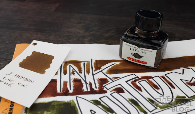
From the moment I started brainstorming about the Autum edition, I knew it would become my favourite season to do an Ink Mashup about. Most of you will know that I love subdued inks, so there are quite a few ink colors in my collection that suit this time of year!
I chose four of my favourite colors, just like I did in the previous ink mashup. It was quite a difficult choice, and I still feel that I should have included one or two more, so I guess I'll leave some honorable mentions at the end.
Now as I said, I chose rather subdued inks. I based my choice on the colors of the trees that can be found this time of year. I probably could have gone with some more extravagant choices, as there are quite a few orange, purples, reds around when you look outside, but I decided not to delve into those too much here. Mostly for the sake of having inks that can actually be used on a daily basis.
The first one, and also one of my long time favourites, is Lie De Thé from J.Herbin. It's a lovely ochre-brown, not too dark, not too light, and with a nice bit of shading. Fallen leaves on the ground, that's what this color reminds me of.
The second ink is a new one to me, but it already made it into this post, which is definitely a sign. Hazelnut Brown from Graf Von Faber Castell is a more lively brown, a warmer shade, and a bit darker on the page as well. This ink is currently in one of my rotation pens, and I'm quite enjoying it. It's not super special when it's used in a finer nib, but it's a good quality ink for sure.
Third on the list is an ink from the British company Diamine. Safari is part of an eight-piece set of inks, made for the 150th anniversary of the brand. It's a relatively dark khaki green ink, that has quite a nice amount of shading to speak of. As with all Diamine inks I've used, it's a nicely behaved ink. I'll probably do a proper review of this ink within the next couple of weeks...
If there's one thing I find fascinating about Fall season, it's that some trees turn bright red. These red trees bring some life to the gloomy and dark scenery. Hence the final ink in this mashup ,a brighter color coming from Montblanc: Corn Poppy Red. This red ink was originally supposed to be a limited edition - I think-, but it has been around for quite a while, and it doesn't seem like it will dissapear too soon. That's definitely a good thing, because I like it a lot! It's a slightly darker red compared to the ones I've seen so far, and it's also the most shading red ink I have.
What did you think of this selection? Did it remind you of the Autumn hues? And last but not least: what ink Mashup theme would you like to see next?


Great collection of inks! Lie de Thé is already one of my favorites and the Diamine Safari looks like something I'll definitely need to try out.
ReplyDelete