Sunday, May 31, 2015

THE LISTS

Karaskustoms Cube with a Karaskustoms Retrakt, Lamy All-Star, and Kaweco sport
People are often intrigued by 'the best' of everything. Why not? I mean, if you're going to spend money on something, why not do some research to find out what will get you the best for your money! 

That's why, from now on, you can find -what I think are- the best fountain pens, pens, pencils, inks and accessories on 'THE LISTS' page. These Top 5's feature all products that I think are the best you can get, at least for the moment! You should of course, always remember that these lists are my personal opinion, and that my preferences are most likely different than yours. However they can still give a good general idea! 
Visconti Homo Sapiens Steel oversize, Pelikan Souverän M805 Stresemann, and Lamy All-Star Copperorange
PS: I've done reviews on a lot of the products featured on The lists, so you can click through to read the reviews. If I haven't done a review about a certain product, I'll probably write about it in the near future!

PPS: The ranking of each item within the top 5 has no specific meaning or value, they are all considered roughly equally good.

I hope you like what I came up with!
Lamy 2000 fountain pen on a bottle of J.Herbin Gris Nuage ink

Wednesday, May 27, 2015

NUUNA GRAPHIC NOTEBOOK REVIEW

Nuuna Graphic L notebook and Lamy Al-Star Copperorange fountain pen
Nuuna. Never heard of it? Well me neither! Until a couple of months ago, when Cultpens (not affilated) started carrying their notebooks. I was intrigued with the product specs on these: Jeans fabric covers, mirror covers, even heat-sensitive designs (you read that right! Heat-sensitive!). However their price also intrigued me! These things definitely don't come cheap, so they just had to be amazing quality, right?
Nuuna Graphic L notebook
Let's start from the beginning: These notebooks look good! I have to admit I bought it mostly for its looks. And it certainly doesn't dissapoint in that regard. The 'jeans' fabric cover looks and feels like a mixture of fibrous paper and felt, which is actually very pleasant to the touch. The soft material is covered with a bright orange paint that contrasts nicely with the subtle gray base color. As I said in the beginning, these notebooks come in a variety of different styles and colors, and they all look really nice. (I chose this one because I didn't really have much choice in the store I got it from.)
Nuuna Graphic L notebook
Nuuna Graphic L notebook writing test
One of the coolest things about it, is the fact that the dotgrid on the pages inside is actually matched with the color of the cover, so mine came with very bright orange dots.

These orange dots are actually really useful. I was somewhat afraid that bright neon orange would interfere like crazy with my writing, but that doesn't seem to be the case at all! My only gripe here is that -being the Large notebook (A5 size), I would have preferred the dots to be slightly more spread out.
Nuuna Graphic L notebook and Kaweco Sport Skyline
Nuuna Graphic L notebook bleedtrough test
Unfortunately, where it shines in build quality and unique design, it lacks in paper quality. Which is unfortunately the most important aspect of a notebook for us fountain pen users! I can say in advance that, if you're a ballpoint pen or pencil user, you won't have any issues with it at all.
Still noticeable feathering with my Kaweco Sport (medium nib)
On paper (Oh, the pun!), specs are surprisingly good: 256 pages, 120gsm paper (Munken paper, not sure if that's supposed to ring a bell). But in reality most fountain pens will still have a hard time. I found the biggest issue to be the fibrous nature of the paper, which makes pretty much every fountain pen feather (even the finer nibs). I wrote the written review with a Kaweco Sport Skyline with medium nib. The results with this pen were rather acceptable, though feathering and showtrough was still consistently present. As you can see in the writing sample, the Nuuna was no match for my Pelikan M1000 BB nib and permanent marker! These two did most damage (obviously), with considerable bleedthrough and pretty bad feathering.
Not completely flat, but enough to stay open on itself.
Now for the shocking part: these notebooks (this is the large size) cost as much as 24 EUR/ 28 USD! That's a whole lot of money, I can't remember ever paying more for a notebook! With the poor fountain pen results in mind, would I buy this again? Perhaps yes, but solely for the awesome and original design, not for the paper quality. I definitely wouldn't recommend using it with fountain pens. Fountain pen users beware!

Saturday, May 23, 2015

KARASKUSTOMS RETRAKT TU-TONE REVIEW

Before I started this blog, I never used rollerballs, I despised them, and I cursed at them for not working the way I wanted. 
But since then, some things have changed, and my hate for rollerballs lessened. There's still a bit of a love-hate thing going on, but at least we're finally getting somewhere...
KarasKustoms Retrakt Tu-tone rollerball
Now to be honest, I heard a lot of good stuff about the guys over at karaskustoms, but I never dealt with them before. A few months back I reviewed the pre-release of the Karaskustoms Cube, which was the very first time I used one of their products!  Apart from the cube they sent me, I also got a retrakt, in the new 'Tu-tone' grey color, but I never got around to reviewing it. I did however, use it an awful lot (which is definitely a good sign!)
KarasKustoms Retrakt Tu-tone rollerball
The Retrakt is a solid aluminium pen, completely made in-house (apart from the click-mechanism). The all-aluminium build makes it both strong and relatively light. The click mechanism is what they call a 'silent' knock. It's not dead-silent of course, but it's definitely quieter than your average clicky pen. Back when I got it, my only concern with the mechanism was durability, as it consists of some very small metal parts. However, after a few months of pretty frequent use, I haven't had any issues, so I'll assume it's sturdier than I expected at first. The retrakt is a little over 14 cm (5 3/5") long, and 1.1cm (a litte under 1/2") wide at the widest point. Which makes it a decently sized pen that should fit most hands.

I'm quite digging the industrial, simple design. Especially the thick metal clip is really cool, however not the most practical to attach over thicker fabric (it's rather stiff) The small knurled section above the clip adds to the industrial design, and almost has something vintage to it. The design is pretty typical for Karaskustoms, like Bauhaus looks are typical for Lamy, you could say.
KarasKustoms Retrakt Tu-tone rollerball
New to the 'Tu-tone' version of the retrakt, is the annodised aluminum barrel, available in a variety of colors. I got the grey one, and I really like the color. My pictures don't really do the color any justice. In real life, it's not nearly as dark, and it has a slight blue-ish tint to it. The annodised finish has also proven itself to be quite tough, as it looks exactly the same as it did six months ago!
KarasKustoms Retrakt Tu-tone rollerball
Writing experience has actually been quite good. Given the fact that I'm not a huge rollerball fan, that does say quite a lot. It came with a Shmidt Safety ceramic roller refill in black (fine). Schmidt refills are generally quite good, so no real complaints there. I definitely won't pick it over a fountain pen, but sometimes, having a decent rollerball can be quite good as well. In those occasions, I'll most likely grab the Retrakt. 

A cool feature I haven't mentioned yet, is the fact that they include an extra spring and a piece of rubber tube, with which you can 'hack' the Retrakt to fit a wide array of different ballpoint and rollerball refills!
KarasKustoms Retrakt Tu-tone rollerball
At 45 USD, the retrakt is actually quite affordable. This durable EDC pen is definitely good value for money!

Note: this pen was sent to me by KarasKustoms, so I could write this review.  I was in no way influenced in the making of this review, nor was I monetarily compensated. The opinions shared in this review are completely my own!
KarasKustoms Retrakt Tu-tone rollerball written review

Saturday, May 16, 2015

VISCONTI HOMO SAPIENS STEEL REVIEW

Visconti Homo Sapiens Oversize Steel fountain pen
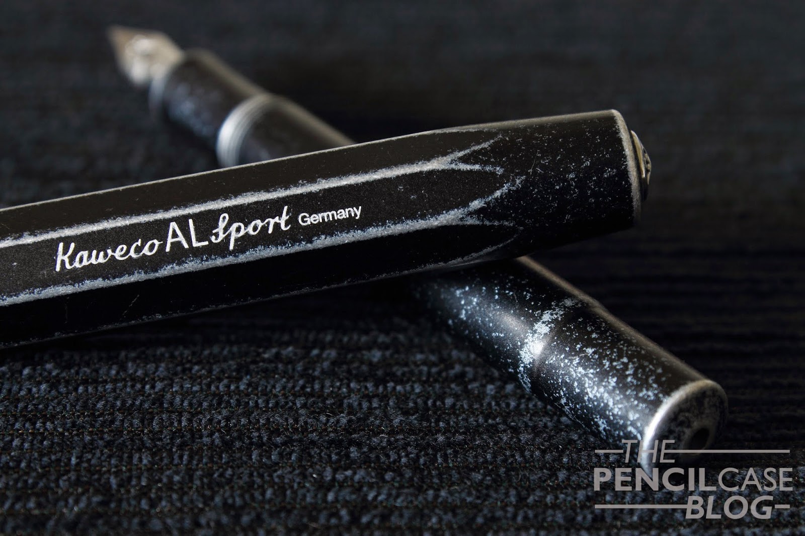
Visconti is a pretty well-known Italian brand. They make really nice, eye-catching pens, amongst which a lot of very expensive limited editions. However, their standard production line definitely deserves some attention as well!

Probably the most intriguing pen from their basic offerings is this: the Homo Sapiens! It's a pretty nondescript, low-profile pen, made from a unique material: lava! Visconti used a combination of lava stone from the Etna, and resin to construct all parts of the pen. The result is a pretty cool looking fountain pen with some cool tricks up its sleeve.
Visconti Homo Sapiens Oversize Steel fountain pen
If you're not the kind of person that wants to attract all the attention with your pen, you probably won't be looking at Visconti's offerings in the first place. But if you'd have to choose one, the Homo sapiens would quite possibly be your best choice. In fact, the reason why I held off on buying this pen for many years is because it looks almost too basic and too understated. (and probably also because it's quite expensive, I'm not going to lie) However, underneath the rough appearance of matte black (actually more of a grey-ish color) lava, you'll find the same high quality and unique character of Visconti.
Visconti Homo Sapiens Oversize Steel fountain pen
So I've already mentioned it at least twice, but the special thing about this pen is the material its made out of. The combination of lava and resin makes for a warm, soft material that is slightly porous. Due to this porous nature, it'll absorb moisture from your hand, which enables you to keep a solid grip on the pen. This might sound a bit weird (that's because it IS weird!), but in fact, if you hold it in your hand, you'll notice that it's a very pleasant and comfortable material. Aside from the comfort, it's also quite scratch resistant, and Visconti claims that it's very shatter-resistant as well. I haven't tried the latter, but I did find that it is indeed quite scratch-resistant (or at least you won't notice small scratches and scuffs on this rough material)
Visconti Homo Sapiens Oversize Steel fountain pen
The Homo Sapiens comes in a few different options. I bought the Steel oversized version, there's also a normal size and the choice of bronze or gold trims. Sizewise, the oversized model is indeed oversized (Stating the obvious!). It's comparable in length and girth to a Pelikan M1000 or Montblanc 149, so it's indeed quite big. For the people that prefer a slightly more normal pen, the standard version might be the better choice, and it saves you a considerable amount of money too! Visconti Homo Sapiens Oversize Steel, Pelikan Souverän Stresemann, Lamy Al-Star Copperorange.
In the pictures above and below, you can see that it's quite a beastly pen. Compared to the Visconti, the Pelikan M805 Stresemann and Lamy Al-Star Copperorange appear small!
Visconti Homo Sapiens Oversize Steel, Pelikan Souverän Stresemann, Lamy Al-Star Copperorange.
As the name suggests, the Homo sapiens Steel has steel trims. Visconti claims to use a special type of steel, 'Marine steel', that doesn't rust or corrode, however the two rings on the cap are a bit dull, which makes me doubt the corrosion-resistance. I was slightly dissapointed by this, especially because all other trims appear better polished. The appearance of the cap rings and the overall slightly 'rough' (read: not as much eye for detail as some other brands) fit and finish is something I didn't really expect on a pen in this price category. It might be a standalone case, but overall I expected slightly higher standards from a reputable brand like Visconti.

As with all other Visconti pens, the Homo Sapiens uses the 'My Pen'-system, which allows for the metal fineal on the cap to be replaced with something else (initials, gems,...). For those that are actually interrested in using this, it's there. But honestly I couldn't care less about it.
Nib Closeup of Visconti Homo Sapiens Oversize Steel
Nib Closeup Visconti Homo Sapiens Oversize Steel
The Homo Sapiens Steel comes with a normal piston filler, or rather 'captured converter' ' (due to the porous material, they couldn't just leave the inside of the barrel exposed to ink.). The fact that it uses a smaller captured converter is noticeable with the wide nib I chose, as I have to refill it quite often!
Properly filling the pen is not as easy as it looks, though, because you wouldn't want to just dip the whole section in your ink section (unless you want you pen to have the color of the ink you used, as well as ink all over your hands when you use it!). That's why Visconti designed a clever little tool to get an easy fill: the Travelling Inkwell.

This small inkwell, sized roughly like a pen (in theory, you should be able to even fit it into certain pen cases), has a rubber seal that holds the pen in place, and protects the section from getting ink all over it. You push the nib in it, turn it around, and fill it like you normally would. It actually works quite well, however turning it upside down feels slightly counterintuïtive. The inkwell is an excellent tool to get a good fill without screwing up the section of the Homo Sapiens.
Inking the Visconti Homo Sapiens Oversize Steel with Iroshizuku Fuyu-Gaki
Inking the Visconti Homo Sapiens Oversize Steel with Iroshizuku Fuyu-Gaki and Visconti Travelling Inkwell
When you're done filling up the pen, you can finally enjoy (hopefully) what I think is the best part about this pen. As you know from the first part of this review, I wasn't overwhelmed by the eye for detail and fit and finish of the Homo Sapiens, but as soon as I start writing with the 23k Palladium 1.3mm stub nib, I remember why I like this pen so much. 

The Palladium nib, dubbed 'dreamtouch' because it requires almost no pressure to write, is a joy to use. The material and size of the nib give it some spring, and the flow is definitely on the wet side. The 1.3mm stub is stock, and I was a bit worried that it wouldn't perform well since I heard of people that couldn't get it to perform consistently. However I haven't found that to be an issue at all! It starts right up, and only stops when I want it to. No skips or stuttering in the flow whatsoever. On a smoothness scale, I'd place it somewhere between a Lamy (enjoyable but with feedback) and my Pelikan M1000 BB (buttery smooth). As far as writing experience goes, I can only conclude one thing: I need more of these nibs in my life!
Nib comparison Visconti Homo Sapiens, Pelikan Souverän Stresemann, Lamy Copperorange
Visconti Homo Sapiens Steel Oversize
There's only one issue: price. I got mine right before they went up in price, a couple of months ago. I'd say 400 EUR(the price it was at before) is quite decent (even when knowing that there are pens with better fit and finish and amount of detail available for less). The price it's at right now, 550 EUR / 700 USD might be a bit too much for me. 
Visconti Homo Sapiens Steel Oversize Written Review

Sunday, May 10, 2015

INKTASTIC: PILOT IROSHIZUKU KON-PEKI

Pilot Iroshizuku Kon-Peki Ink
Pilot makes some pretty great inks in their Iroshizuku line, that much is certain. But there's one ink that tends to get by far the most attention: Kon-Peki! You could say it's the superstar of inks, almost anyone into pens knows Kon-Peki. And it's the favourite 'blue' ink of pretty much everyone who had the pleasure of using it!
Pilot Iroshizuku Kon-Peki Ink
I disagree with the public opinion though: it's not my favourite 'blue' (notice the conveniently placed quotation marks!). But it is, on the other hand, my favourite Turquoise ink! 
Really, I don't know if I'm the only one on this, but to me, Kon-Peki is more of a Turquoise than it is blue! That being said, it's much darker than most turquoise inks. Which is actually a good thing because I don't really like using turquoise inks on a daily basis as they are often too light. 
Pilot Iroshizuku Kon-Peki Ink writing sample
Pilot Iroshizuku Kon-Peki Ink and swab
As with all Iroshizuku inks, Kon-Peki performs spot-on (why did I even bother mentioning this)! Properties are good, it has shading, it dries fast and it even has a slight bit of red sheen in some places! 
Pilot Iroshizuku Kon-Peki Ink waterproof test
Not much of a waterproof ink, lines remain faintly visible after the water test.
As you can see in the swab comparison below, Kon-Peki lies somewhere in between a bright blue like P.W. Akkerman Binnenhof Blues, and a Turquoise like Lamy's offering. I can't help but notice the similarities with Pelikan Edelstein Topaz, which is pretty much identical in color (at a much lower price), though it lacks the vibrant saturation, and more defined shading of Kon-Peki! (After having used both, I'd pick Kon-Peki over the Edelstein ink. But I doubt if you'd ever see the difference without comparing them!)
Pilot Iroshizuku Kon-Peki Ink swab comparison
Price seems to be the everlasting and only issue with this ink. At almost 40 EUR for a bottle, it's by far the most expensive ink I can think of! This price issue seems to be mostly situated here, in the EU though, as American prices are much lower (25-30 USD)!
Pilot Iroshizuku Kon-Peki Ink written review

Monday, May 4, 2015

KAWECO AL-SPORT STONEWASHED REVIEW

There's this French saying that I really like: 'On ne discute pas des goûts et des couleurs' Which, in essence, means as much as: there's no need to argue about taste or personal preference. So why do I start blabbing French? Because it totally fits the pen I'll be talking about today!
Kaweco is, despite staying true to their original vintage designs, one of the few pen brands that doesn't mind going for a radical aproach. A year or so ago, they came up with the Al Sport raw, a highly polished aluminium pen, incredibly susceptible to scuffs and scratches, advertisements even came with a warning that it isn't for the faint of heart! Well, with this pen, I feel like they went yet another step further. They took some perfectly fine Al-Sport fountain pens (in blue and black annodized finish), and threw them in a a mixer with some polishing stones. Result: a pen that looks like it has lived in your pants pocket for years, the Al-Sport Stonewashed!  
Now honestly, when I first heard of this, I wasn't too sure about it. I never thought I'd like this worn-in finish. I'm the kind of guy that prefers to keep my pens in a pen pouch to keep them from getting damaged. Even the pocket friendly Kaweco sport pens don't leave the house outside their pen pouch! 
That being said, buying a pen like this, that already looks beat up, forces you to actually (ab)use it. Where I would never put a normal pen in my jeans pocket, this one basically lived in my pants, it belongs there. You don't have to worry about scratching it even more, because frankly, you wouldn't even notice any additional scratches! 
Aside from the benefits of not having to care about the condition of the pen, I also found a few negative sides about this new finish. Though admittedly some of these issues are very personal, and they might not bother you the least!

For starters, I think the worn effect is a bit too even. All corners and edges have the exact same amount of wear, which doesn't feel natural (Of course it isn't, natural wear and tear like this would take ages!) Secondly, I don't really like the feel of it. It doesn't look smooth at all, but apart from a few deeper dings and scratches, it's actually a lot smoother than the regular matte black Al-Sport. Why I don't like it is a mystery, but I do know that I prefer the matte finish on the untreated black Al-Sport!
Other than the different appearance, the Al-Sport Stonewashed is still just an Al-Sport. it's a small pen, one of the very few 'real' pocket pens I can think of. And it has an odd-looking design. The Sport pens from Kaweco have already proven to be a real succes, and I'm just one of many people that really like these little pens. This new stonewashed finish on the other hand, might be more of a 'niche' pen, only for the people that are really into wabi-sabi! As I said in the beginning of this review, preferences can be personal, but apart from the peculiar finish, there's no denying that this overall design works. It's a functional pen, small when stored, but large enough when you're writing!
The performance of this specific one was a bit of a mixed feeling. It performed pretty good out of the box, and it writes smoothly. But unlike my other Kaweco's, it's not a wet writer. The steel medium is rather dry, but not to the point where it would skip or stop writing. Personally I would have preferred a slightly wetter nib! Other than that, it wrote just fine, and I'm sure a bit of tweaking could have made it a lot wetter, but I didn't want to mess with it as it isn't my pen!
A cool little detail I didn't talk about yet, is this new 'deluxe' clip. I never liked the cheap-looking squared-off clips, so I think it's great that you now have the choice between the old clip or this, slightly more expensive, new design! These deluxe clips come in three finishes: bronze(the one I have), chrome or gold. I think the way this bronze clip ages, suits the Stonewashed finish nicely!
Would I buy this pen? That's the question. And my answer would probably be no, or at least not at full retail price. It actually costs a bit more than the regular Al-Sport pens, at 63 EUR or 83 USD. Which, on average, makes it about ten percent more expensive than its non-trashed brother!

Note: this pen was lent to me by Kaweco, so I could write this review.  I was in no way influenced in the making of this review, nor was I monetarily compensated. The opinions shared in this review are completely my own!