I'm a total sucker for Gravitas pens if you hadn't noticed yet, an addiction fueled by the fact that Ben Walsh (founder of Gravitas Pens) always seems to know exactly what I want in a pen! The last Gravitas pen I reviewed was the Entry, quite a while ago: a well-rounded design, tough construction, great ergonomics, all at a reasonably wallet-friendly price point.
One of the unique things about the Entry is its slender form factor, something you don't often see on metal fountain pens. Though with my personal preference for oversized pens, I imagined how cool it would be to have a slightly more oversized version of the Entry... Luckily, Ben was already one step ahead of me and by the time I published my review of the Gravitas Entry, he had released this: the Gravitas Sentry!
From an aesthetic point of view, the Sentry is probably one of my favorite pens of the moment, at least as far as metal pen designs go. Admittedly, the Entry already ticked a lot of boxes for me, so there wasn't much I'd change about it. It shares the simple flat-top design with pointed finials of the Entry. The cap-to-body ratio of the Sentry is still noticeably exaggerated, with a long barrel and shorter-than-usual cap, which creates a pleasing imbalance in the design. Compared to the Entry, the Sentry just gained some weight (literally). Everything is a bit wider, which is especially noticeable on the barrel: gone is the almost paintbrush-like, thin barrel of the Entry, which is now noticeably thicker, though with a similar gentle taper to it.
 |
| Put them side by side, and the Entry appears even more slender! The Flagship model, on the other hand, makes even the Sentry look dainty! |
I find the added bulkyness gives the Sentry more pleasing overall proportions than the rather slim Entry. It's hard to put a finger on it, but the way Gravitas executed the flat-top, pointed finial design on the Sentry is just very pleasing to the eye. The Sentry is not quite as minimal and brutalist as the Namisu Nova (which remains another personal favorite). Also within Gravitas' own range of pens, the Sentry definitely feels more refined and elegantly shaped compared to the super-robust and bulky 'Flagship' fountain pen.
Just like the smaller Entry, the Sentry is unadorned on the outside, apart from the clean and minimal Gravitas logo engraved right above the cap edge. The large Sentry is an ideal canvas to show off the laser-etched designs that Gravitas is known for, though so far only the 'Skittles' Sentry can be ordered with etched designs on it (though I'm certain that'll change in the future).
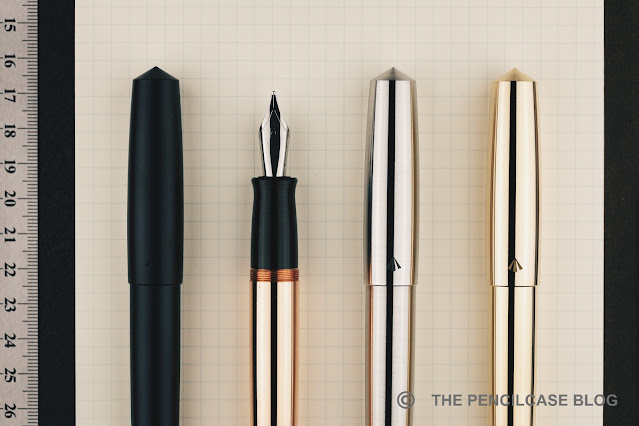
Just like the Entry, the Sentry is available in a plethora of colors and materials: a bunch of anodized aluminium colors, as well as the special 'Skittles' finish, brushed stainless steel, and polished brass or copper.
Under the cap, we again find the PVD-coated black stainless steel sections that are also on the Entry. The black section provides some visual contrast, especially against the raw steel, copper, and brass versions of the Sentry. I would've hoped for matched section materials to create a more seamless look, though I do agree with Ben's reasoning that the steel section partially mitigates the 'penny smell' typically associated with brass and copper pens. The section has machined grooves for grip, a feature that is now standard on all of Gravitas' fountain pen designs (including the original 'Flagship' fountain pen).
Machining on the edges and finials is super-crisp (Some have even described the pointed finials of the Entry and Sentry as 'sharp'. While they sure are pointy, I wouldn't go as far as saying you can actually hurt yourself on them.), showing off the very precise machining and tight construction tolerances, a constant throughout all of Gravitas' pens.
 |
| L to R: Namisu Nova, Ensso Piuma, Gravitas Pocket, Gravitas Delrin, Gravitas Sentry, Gravitas Entry, Gravitas Flagship, Lamy 2000, Lamy Safari |
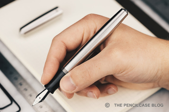
But also in terms of writing comfort, the Sentry scores high marks. Though that comes with the disclaimer that I always tend to gravitate towards large and oversized pens. The features I already enjoyed about the Entry remain: a grippy concave, ridged section, a smooth and comfortable transition towards the barrel, and threads that are hardly noticeable in your grip.
The Sentry and Entry are much closer in length than I first thought, only about a millimeter apart (the Sentry measures 14.6 cm/ 5.75", the Entry 14.5 cm/ 5.71"). Uncapped, the Sentry still measures 13.9 cm/ 5.47", plenty long enough to fit comfortably in any hand. Posting the cap is technically possible, but makes little sense. It doesn't extend the pen very much, yet adds a whole lot of weight that you definitely don't need.
 |
| Sentry on the left, Entry in the middle, and Flagship on the right, note how the Sentry's section is even wider than that of the Flagship! |
Roughly 2 mm added to the overall diameter, that's the key difference between the Sentry and Entry. While that may not sound like much, it drastically changes how the Sentry looks and feels. The added diameter continues in the section, which is a substantial 13 mm/ 0.51" at the widest point (even at the narrowest point, the section still measures a generous 11 mm/ 0.43"). Together with the pronounced concave curve in the section profile, the added thickness makes the Sentry a very comfortable and fatigue-free pen to write with, whereas the Entry feels a bit narrow at times - at least in my hand.
The Sentry being an oversized and chonky pen made out of metal, you can of course expect some weight. If you don't like too much heft, turn straight to the aluminium version for your best bet at a fairly nimble pen - even that one, due to its stainless steel section, still weighs in at a hefty 40 grams! For the stainless steel, brass and copper versions, the total weight jumps up to 84, 89 and 94 grams respectively.
It goes without saying that the Sentry caters specifically to those that like large, heavy and oversized pens. If you're not certain about what type of pen you prefer, the Entry remains an easier pen to recommend to a wider audience, because of its more middle-of-the-road dimensions.
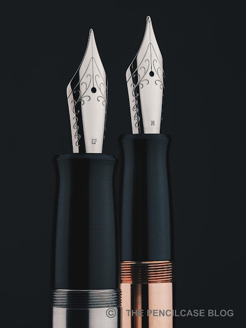
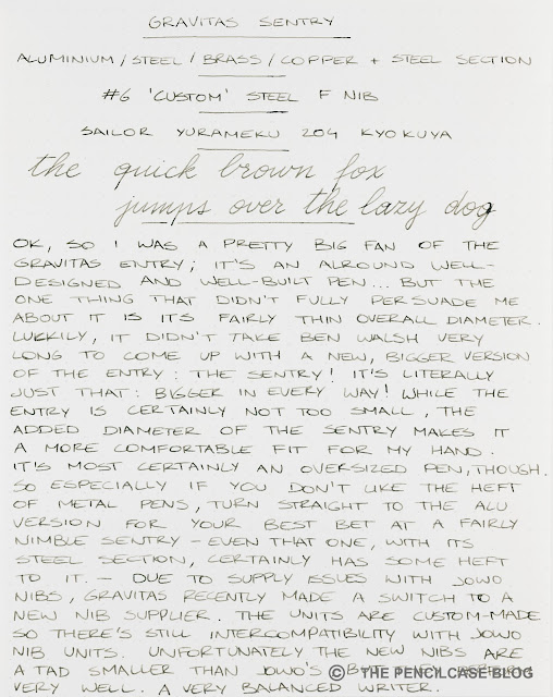
Not pictured here (because I got these pens a while ago!) are the new custom nibs that Gravitas now uses. Due to supply issues with JoWo, Ben recently made the decision to design his own nib units and have them manufactured by a different supplier (though to the same spec as the JoWo nib units, so nib units can still be interchanged).
Unfortunately the new nibs are a tad smaller than JoWo's #6, but compared to the flourished design of JoWo's nibs, they do provide a more clean and minimal look with just the stamped (not laser-etched!) Gravitas logo on them. The new nibs are tuned very well (something Ben does in-house for all his nibs). It's quite smooth, with a line width that runs a touch finer compared to JoWo and Bock (I tried the fine and it's definitely more like a JoWo extra fine). Ink flow also seems to be a bit more towards the balanced side compared to similar JoWo nibs.
The Gravitas Sentry starts at 95€ for the anodized aluminium versions, steel or brass versions move up to 100€, while the copper version comes in at 105€. While that does put the Sentry at a slight premium over the Entry (which starts at 80€ for the aluminium versions), both pens are close enough in price to not let that be the main differentiator between the two.
The choice then boils down to a simple matter of preference, between the very reasonably-sized Entry or the oversized -though very comfortable!- Sentry. To nobody's surprise, I think both are great pens, but my personal choice definitely goes to the Sentry. It has rapidly become a new personal favorite, and I expect it to remain a top pick in my daily carry for quite a while!
Some of the products featured in this review were sent to me by Gravitas. I was in no way influenced in the making of this review, the opinions shared in this review are completely my own! This post does not contain affilate links.


No comments:
Post a Comment