Visconti's flagship pen, the Visconti Homo Sapiens (already somewhat of an icon, despite its relatively modest 10 years of existence!) has seen an absolutely incredible variety of styles and finishes over the years: From the absolute classic Homo Sapiens Bronze age or - now discontinued - Steel Age (reviewed HERE) made from Visconti's proprietary lava resin, the various acrylic versions (such as the Chiantishire, that I reviewed HERE), the modern Evolution, one of the various version with an ink window (such as the current HS Crystal), down to the more affordable resin 'Elegance' version... It's fair to say Visconti has experimented quite a bit with its Homo Sapiens product line, and they're far from done!
 |
| Two distinctly different variations, yet the Homo Sapiens design is recognizable from a mile away! |
The latest iteration of the Homo Sapiens to leave the factory in Firenze is this one: the Visconti Homo Sapiens Lava Color - an interesting departure from the tried-and-true 'modern classic'. My thanks go out to Visconti, for sending this pen over for review.
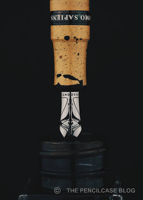
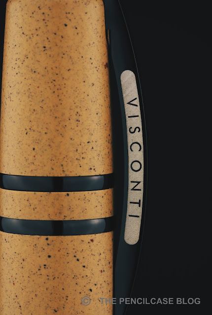
The name 'Lava Color' of course indicates the most prominent feature of this Homo Sapiens: the material! Gone is the matte grey-black, lava-infused resin, and in comes a pop of color with three earthy tones that stay within the volcano theme (Earth red, Ash white, and 'Tuff' - a volcanic rock type - yellow). The resins are still a mixture of basaltic lava and resin, though this time the material has a pleasant muted color, even in this yellow 'tuff' colorway, it remains quite muted. The HS Lava Color retains the soft, matte feeling of the original HS, though I do suspect the ratio lava-to-resin has shifted more towards resin for this one (the original HS supposedly contains upwards of 50% lava, this one certainly looks more resin-based). The material has a pleasing speckled look from the lava powder sprinkled into the resin.
 |
| Ink wipes right off this 'anti-stain' treated material |
The new colored resin also has a neat trick up its sleeves, one I wish my Steel Age also had: the resin received an 'anti-stain' treatment, which prevents the material from absorbing ink and moisture into the pores of the lava rock. Since my Steel Age did pick up some light stains on the section from refilling, I'm happy to see that this treatment actually works really well. Otherwise, these lighter colored materials would be an absolute nightmare to keep clean!
Across the many iterations the Homo Sapiens went through, its design has always remained unique and distinctive. It's difficult to put a label on the Homo Sapiens, yet perhaps that is exactly the reason why it appeals to so many people. Especially for a brand like Visconti - who don't shy away from a rather experimental or elaborate design -, the Homo Sapiens is a remarkably sober-looking pen.
It doesn't draw too much attention with its chunky, straight, flat-top design, and yet the two wide decorative bands across the cap, and an even wider center band on the barrel just below the cap, define the look of the Homo Sapiens. The Homo Sapiens strays from the traditional, classic Italian design, nor does it feel very modern. Although the mix of colored resins and black trims does give the Lava Color a much younger, more modern appearance, I have to say.
The Ponte Vecchio 'bridge' clip of course makes a return, and it's the first Visconti I've held in my hands that has their laser-etched logo engraved on the sides of the clip, instead of the enamel-filled logo. While the enamel added a luxurious touch, I actually prefer the laser engraving as it's more consistent and clean-looking.
The Ponte Vecchio 'bridge' clip of course makes a return, and it's the first Visconti I've held in my hands that has their laser-etched logo engraved on the sides of the clip, instead of the enamel-filled logo. While the enamel added a luxurious touch, I actually prefer the laser engraving as it's more consistent and clean-looking.
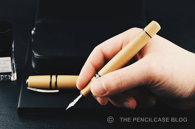
Another change I'm quite excited about is the shift towards a magnetic cap. Visconti is no stranger to using magnetic caps, yet it's the first time (to my knowledge) that they've implemented it on the Homo Sapiens. The result, I have to say, is absolutely excellent! The traditional hook-safe mechanism found on other Homo Sapiens models is great, but the 'hooks' can be a bit harsh on your grip depending on how you hold your pen. The magnetic closure takes away any form of threads or hooks, and instead, you get a smooth and comfortable step towards the center band, which isn't obtrusive at all in my grip. The magnetic closure is secure and practical to use. It has also proven to be perfectly airtight to prevent the nib from drying out. The magnets in the cap and section do add a noticeable heft to the pen, though, which might make this pen lean on the heavy side for some users.
 |
| L to R: Montblanc 149, Pelikan M1005, Leonardo Momento Zero Gande, Visconti HS Steel Age, Visconti HS Lava Color, Lamy 2000, Lamy Safari |
Build quality and construction is excellent, from the perfectly coated black metal trims to the smooth and consistent finish of the 'lava' material... except for one area: The cap lip on my particular pen looks rather rough and unfinished. I'm not certain if this is the case on all pens, but certainly, it's something that could be improved.
The Lava Color utilizes Visconti's standard Power Filler filling system - not the 'Double Reservoir' version. The latter has the superior ink capacity, though it tends to be reserved almost exclusively for limited editions. That said, the normal Power Filler, which is just Visconti's name for a vacuum filler, still has a fairly 1.5 mL ink capacity.
That brings us to the nib. And let's be honest, Visconti certainly doesn't have a perfect track record in this department! The spotty quality of their Palladium Dreamtouch nibs eventually led Visconti to step away from the, back to 18k gold nibs (also made by Bock), and ultimately Visconti's in-house produced 14k gold nibs!
The looks of the in-house nibs are vastly different from the very classic design of the older nibs, though I've come to appreciate the more modern imprint that has the Visconti 'V' logo cleverly embedded in it!
Of course, I was anxious to try out Visconti's own creation, and I was relieved to find a stellar nib out of the box. This particular pen came with a Broad nib, and it's exactly what I expect from a Western B. The tipping is nice and round and produces a true-to-size, consistent line. It's not overpolished, so it still has a subtle but pleasant amount of feedback to it, and I didn't encounter any skipping or hard starting issues (even after leaving the pen unused for quite some time). Compared to the soft Palladium nibs from before, these new nibs definitely lean on the firm side, though. The plastic feed remains unchanged from older Visconti nibs and offers a consistent ink flow that leans noticeably on the wet side.
If Visconti can keep the quality consistently at the (high) level they're showing off here, this is yet another (the new Bock-made 18k nibs are reportedly also already a lot better than the Palladium nibs used to be) step in the right direction for them.
Even after countless reiterations, Visconti still manages to bring a lot of new and refreshing elements to the Homo Sapiens with this Lava Color collection. All those new features do add up to a small price hike, when compared to the classic HS Bronze age, though the difference isn't that drastic. That's not to say this is a cheap pen, of course. Yet, for 720€/ 695$ (at our site sponsor Appelboom. Don't forget the discount code 'friend' for 10% off!), the HS Lava Color does have many features I'd look for in a premium pen, all packaged in a design that deserves to be called iconic in my opinion. Especially if they can keep up the nib quality, I can't really fault it.
Note: This product was provided by Visconti so I could write this review. I was in no way influenced in the making of this review, the opinions shared in this review are completely my own! This post does not contain affiliate links.


No comments:
Post a Comment