Sunday, March 25, 2018

LAMY AION FOUNTAIN PEN REVIEW

Lamy aion fountain pen review
It's finally time to take a look at the Lamy aion. I originally intended to write a review immediately after the release. Well... in the end it took me a lot longer than expected. Theoretically that's a good thing though: the longer I take to write a review, the better I like the product! In case of the Lamy aion, that rule certainly applies. 

The Lamy aion faced somewhat of a cold, 'meh' response when it was first announced. My reaction, on the other hand, was definitely filled with a lot more excitement. I'm quite partial to the brand of course, I'm sure you know if you've been following this blog for a while. So don't take my word for it. 
Lamy aion fountain pen review
Lamy receiving flak with new releases seems to be a recurring theme (Remember the debacle with the 2000 Anniversary Black Amber?) When Lamy announced the aion, it was immediately written off as the lovechild of the Lamy 2000 and Studio, a pen that -I quote: "lacked creativity". 

Honestly, I never really understood the comparison with the 2000 and Studio in the first place, because they are nothing alike in my opinion. But most of all, I thought the criticism about the lack of creativity was rather unfair. Lamy is known for pure and minimal designs. It's their style and that's either something you like or not. If you expected flashy materials (ok, ignore the Safari and Al-Star for a moment) or elaborate details, that was guaranteed to end up in disappointment. 
Lamy aion fountain pen review
Let's cut straight to the chase: I think Lamy did a fantastic job on this one. It's not a design to turn heads, but again that's not Lamy's style. It's large -I'll get back to that in a minute- yet in all its' robustness and bulky appearance, they managed to make it appear elegant and sleek. 

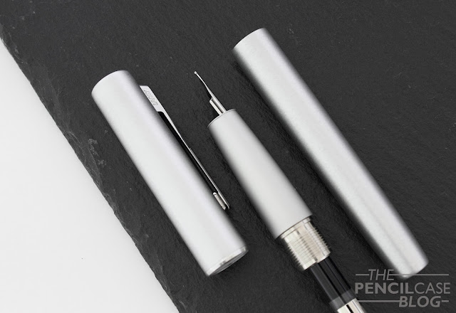
If anything, it's not the symbiosis of the Studio/2000 but the design style of Apple products that this pen reminds me of. The deep-drawn unibody aluminium barrel and cap give the pen a seamless look, as does the monotone color and use of multiple textures. I really like how they worked with contrasting finishes: brushed aluminium on the body and a satin finish on the grip section. It combines nicely and is finished with a contrasting chrome-plated ring on the cap.
Lamy aion fountain pen review
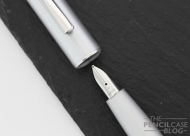
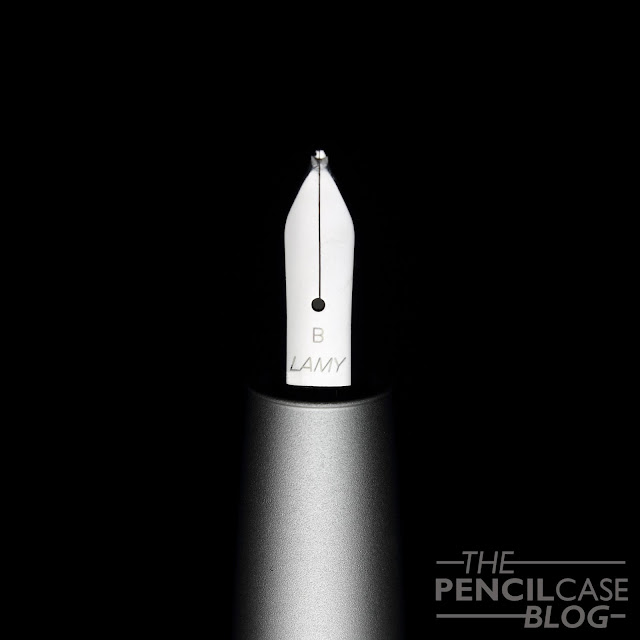
The simple, rectangular clip is somewhat similar to the one on the Lamy CP1, but has more rounded corners. Actually rounded corners are quite the central theme on the aion. Between the rounded finials on the cap and barrel, and the rounded edges on the clip, it also marks the introduction of a new nib design with, you guessed it... a more rounded profile! 
Lamy aion fountain pen review
Standard design on the left, new Aion nib on the right
All in all, the nib doesn't look much different from the standard one. But I have to admit that it works together nicely with the rest of the design elements on this pen. The aion is a pretty complete package with a very minimal, peaceful design. Regardless of what some may think of it, I think the design is quite on point. 

The only part about this pen I don't like is the name of the silver version: 'Olive Silver'?. I don't know where they came up with the 'Olive' part, it's just silver.
Lamy aion fountain pen review
L to R: TWSBI Eco, Pelikan M805, Lamy Aion, Lamy Studio, Lamy Safari, Lamy 2000.
Lamy aion fountain pen review
As I mentioned earlier, the aion is quite a large pen. It measures 14.3 cm (5.6") closed, and 13.7 cm (5.4") uncapped. It's not an overly girthy pen, with a grip section that averages at around 11 mm (0.43"). The aion has a completely metal build, and especially the solid metal section adds quite a bit of heft to give a total weight of 33 grams. 
Lamy aion fountain pen review
In terms of comfort, the aion is about as good as it gets! A long pen weighted around the section and no threads or step to interfere with your grip. It would've been even better if the section had the same subtle brushed texture as the rest of the pen. The satin finish is nice to hold, but it gets a touch slippery at times. 
Lamy aion fountain pen review
Now for that new nib. It really isn't that much of a difference from the old one in terms of performance. I've heard people find it smoother than the normal ones, but in practice I found little to no difference. That's not a bad thing though, I always enjoy using Lamy's nibs. 

The steel nib strikes a fine balance between smoothness and feedback. Lamy nibs typically aren't overpolished, which in turn makes them reliable and consistent writers. That's what they are: simple, no-nonsense reliable performers. No fuzz, just like their designs!
Lamy aion fountain pen review
The best part about the aion, I think is the affordability. The aion comes in at 49 EUR (71.2 USD), which positions it in between the entry-level Al-Star and more 'premium' Studio. Given the excellent, sturdy metal build quality and sleek design, I think that's a very fair price point, and it's worth your consideration if you're looking for an upgrade over the Safari or Al-star.

GIVEAWAY CLOSED! NOW FOR THE BEST PART: YOU CAN WIN A BRAND NEW LAMY AION FOUNTAIN PEN FOR YOURSELF, COURTESY OF CASA DELLA STILOGRAFICA! ALL YOU HAVE TO DO IS ENTER IN THE RAFFLECOPTER WIDGET BELOW. GOOD LUCK!
RULES: Giveaway ends 4/1/ 2018. Winner will be chosen via random.org, and announced in a separate post. The winner will be contacted directly via email, if he/she fails to reply within one week, a new winner will be picked. Only entries with valid email address are eligible to win. Invalid entries are denied.

Note: I received a discount on the purchase of this product from sponsor Casa Della Stilografica.  I was in no way influenced in the making of this review, the opinions shared in this review are completely my own! This post does not contain affilate links.
Lamy aion fountain pen review

Sunday, March 18, 2018

RIIND 'THE PEN' REVIEW

Riind The Pen. review
RIIND. The Pen. 'The Pen that rewrites them all'... Pretentious? Maybe, but it has to be said that 'the Pen' has seen a LOT of use in the past months that I had it in hands. It's a rollerball pen(or gel ink, or ballpoint, depending on the refill you choose), yes. But it did kind of win me over the more I wrote with it. In fact, I wrote most of my recent exams with it. Why? Like it or not, but fountain pens aren't always the most practical solution, especially if you have to write non-stop for 4 hours on the worst possible copy paper. 

So the Riind pen, why do I like it? 
Riind The Pen. review
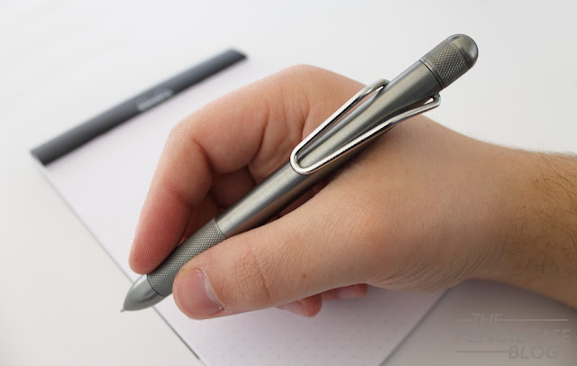
Well first off is the design. The Pen (I'll just type it with a capital letter because it's the name of the pen, right? Or doesn't it have a name at all??? Really confusing.) is a beefy, long pen with a rather simple general shape that's easy on the eyes. Just a straight cylinder with nicely rounded ends. 

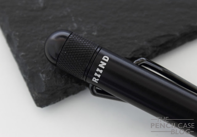
I guess you could call it a 'minimal' design, but I'd choose to use terms like futuristic, and industrial. The knurled grip and twist knob give the pen some visual interest (and add functionality of course), and it makes the pen look rugged at the same time. The knurling is noticeable in the hand, but doesn't feel abrasive or sharp. Apart from the knurled sections, the anodised aluminium has a lightly brushed finish to it, which adds to the raw and industrial appearance of the pen.
Riind The Pen. review
Your eye will immediately be drawn towards the unique steel wire clip, so let's talk about that: This asymmetrical folded steel wire clip is somewhat remniscent of the Lamy Safari, but has quite a strange shape. When you see it for the first time, you'd most likely think it's broken. But the shape -with one end of the clip attached to the barrel slightly higher than the other- actually gives it its spring-loaded action. 
Riind The Pen. review
The design of the clip is quite clever, although not the most functional in the real world. For starters, it's quite stiff and sits snugly against the barrel; clipping it onto something requires two hands. Secondly, the fact that one side is attached to the barrel almost a centimeter lower, means that it doesn't clip very deeply. Oh, and they call it 'virtually indestructible', well I'm glad they said virtually because... well, I broke it. Admitted, I'm a bit of an asshole, and upon reading their statement I may have pushed it a little too far, but I can now say that it CANNOT bend indefinitely. However, credit where credit is due: it  just popped out of the socket at one side. An easy fix, and it still works just fine after putting it back in.
Riind The Pen. review
Not the biggest fan of the laser-engraved logo on the back of the barrel, but it's relatively unobtrusive.
The Pen is entirely made out of anodized aluminium, and is available in three subtle colors: clear (natural aluminium), grey and black anodised. Both the clear and grey versions come with a chrome-colored steel clip, the black one can come with either a black or chrome clip. Which makes for a total of four different available colorways. I received both the grey/chrome and black/black versions. Both have a very different look to them. The grey one looks refined, whereas the all-black version is sleek and stealthy.
Riind The Pen. review
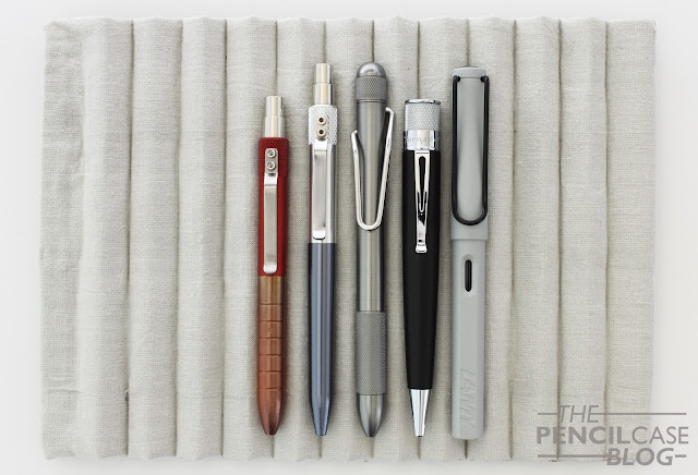
L to R: Karas Pen Co EDK, Retrakt, Riind The Pen, Retro 51 Tornado Big Shot, Lamy Safari.
The Pen is a rather sizeable writing instrument. It measures in at 14.2 cm (5.6") long with the refill retracted, and has a diameter of 1.14cm (0.45") across the entire length of the pen. It's a surprisingly beefy pen, and has a solid weight of 29 grams. For me, it hits the sweet spot in terms of size and weight, and the knurled section makes it sit comfortably in my hand. Everything about this pen feels solid and well-made. If you unscrew the nose cone to change the refill, you can see how thick the barrel is, so I dare to say it's well-suited for EDC.
Riind The Pen. review
Then there's probably the coolest thing about the entire Pen: the twist knob! The 'Continuous Cam' mechanism makes it able to turn it BOTH WAYS, AND IT KEEPS ON TURNING!! You probably think I'm going insane (after all, I DO spend my days reviewing pens...), but this really is super cool. It's such a silly detail, but it's very handy (you don't have to remember which way to turn, making it easy and fast to deploy), and it's fun to fidget with. The twist action is solid and robust, and especially in the beginning it can be quite stiff. But the knurling helps to twist it with one hand with a firm snap. I've literally been playing with it for months now, and the mechanism still feels solid and has virtually zero play... The people behind Riind didn't go to MIT for nothing! 
Riind The Pen. review
But enough about the twist knob. After all, what's a pen if it doesn't write properly? That's why the Riind is -supposedly- compatible with over 35 different refills, so you'll always find one that fits your fancy. There's a pretty long list of compatible refills on their website (that you can find here). I didn't bother changing out the refill it came with, which is a Pilot G2 gel ink refill (0.5mm). I'm not a gel ink fan necessarily, but the Pilot G2 puts a smile on my face every time I use it. It leaves a dark and consistent line, doesn't smudge easily, and doesn't bleed through (something my #1 favourite rollerball refill, the Schmidt P8126, does.). The Pilot G2 is also generally quite affordable and easy to get, and comes in a variety of colors to choose from.
Riind The Pen. review
All in all, Riind did a fantastic job on their debut product, 'The Pen'. It won't win any prizes for most creative name, but it does score high marks in all other areas. To answer the question that I asked myself at the beginning of this review: Why do I like it? Well, the Riind Pen succeeds at combining an interesting, industrial design with a comfortable form factor. It has some original features (some more useful than others) that set it apart from other pens out there, and most importantly: it very pleasant to write with! 

But all that does come at a cost. It was one of the biggest gripes during their Kickstarter campaign in 2016, and it certainly is now, when you have to pay the full retail of 100 USD. That's not cheap. Especially considering there are other comparable offerings on the market that sell for considerably less (Think about Karas Pen Co. Retrakt, Tactile Turn Shaker,...). Considering the quality and design you get, 100$ is not outrageously expensive, but it's not exactly an impulse buy either. If they could reduce the price by maybe 10 or 20 dollars, it would be a no-brainer for me. 

This product was sent to me on loan by Riind so I could write this review. I was in no way influenced in the making of this review, the opinions shared in this review are completely my own! This post does not contain affilate links.
Riind The Pen. review

Wednesday, March 7, 2018

WAHL-EVERSHARP DECOBAND FOUNTAIN PEN REVIEW

Wahl-Eversharp Decoband fountain pen review
There are lots of brands that I haven't had the pleasure of trying out yet. Which, unfortunately, is a side-effect of living in Europe, where a lot of brands that are popular in the USA, are not that easy to come by. 

Wahl-Eversharp is definitely one of those American brands that I've been dying to try, especially because of all the glowing reviews of the pens they make. Luckily, with the release of the Decoband, the brand started to break through internationally. A pleasant evolution of course. Having the option to try before you buy is not an unnecessary luxury, especially when we are talking about pens in the 1000$ realm! 

I'd like to thank Catherine from Sakura Fountain Pen Gallery for letting me try out the Decoband, let's dive right in...
Wahl-Eversharp Decoband fountain pen review
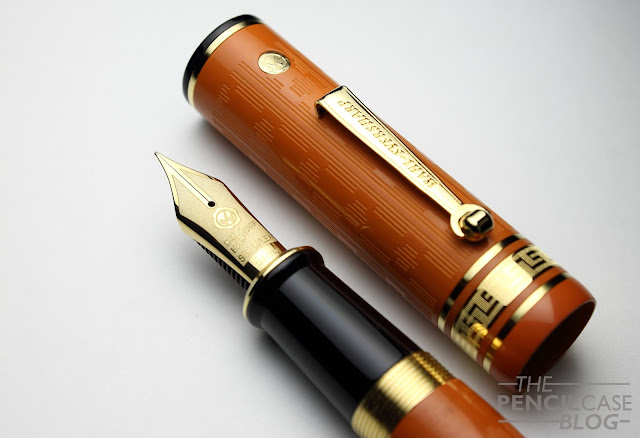
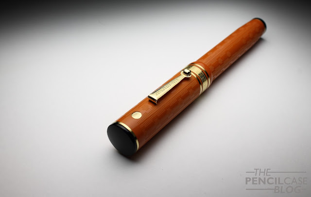
One of the appealing aspects of Wahl-Eversharp pens is their inspiration drawn from vintage design. Both models, the Skyline and Decoband, are directly inspired on vintage Wahl-Eversharp pens from the early 1900's. I'm always a sucker for vintage design (when done right),  and the people that revived Wahl definitely have an eye for making good looking pens. The Decoband is a stately pen with flattop design. The impressive size accentuates the flattop design, and makes it a very imposing pen. On top of that, it's also VERY orange!
Wahl-Eversharp Decoband fountain pen review
The orange ebonite with etched guilloche pattern does a fantastic job making the Decoband represent its vintage predecessors even more. It has something to do with the specific shade of orange. It's ebonite, so it has a very specific color and structure. It's sort of a pale orange, as if they had a fresh piece of material and let it sit on the shelf for a few decades. I love the way ebonite looks and feels -not so much the burnt rubber smell it has-, and on top of that it has an inherently vintage look and feel to it. 
Wahl-Eversharp Decoband fountain pen review
A stately pen needs stately details, and that usually begins with the clip. This is one of the few areas where I think they kind of missed the ball. The design is nice, and fits the general picture, so that's good. But the production is somewhat below par. The edges are a bit rough and still show cutting marks, and the face of the clip has a strangely textured structure that doesn't look intentional. I might sound picky, but on a pen this price, I definitely won't overlook any small imperfections. 

Luckily, the rest of the pen is pretty much flawless. The large triple center band with greek key design draws the attention, and so does the double checkmark gold seal medallion right above the clip. The same Greek key design returns on the metal barrel of the pneumatic filling system, a great detail, even though it isn't visible apart from when you are filling the pen! I would've liked it even better if they plated the touchdown mechanism to match the rest of the gold-plated accents.
Wahl-Eversharp Decoband fountain pen review
L to R: Pelikan M800, Pelikan M1000, Montblanc 149, Wahl-Eversharp Decoband, Lamy Safari, Lamy 2000
The Decoband, as already mentioned, is a sizeable pen. It measures 15cm (5.9") closed, which is large but not excessive. An Edison Collier, for example, is the same length. But what makes the Decoband so imposing is the diameter: a whopping 1.8cm (0.7") at the widest point, and it barely tapers down at either side. Uncapped, it still comes in at 14.2cm (5.59"), and it weighs in at a ridiculous 58 grams total, due to the almost entirely metal inner construction of the mechanism and section. 
Wahl-Eversharp Decoband fountain pen review
But then we come to comfort. A pen as big and heavy as this might not sound very comfortable, but the section makes up for a lot. It's on the wider side (1.35cm average, 0.53"), as is the rest of the pen. But it's long and comfortably tapered with a pronounced flared shape at the end. The threads are metal, and I have to give Wahl-Eversharp credit for making incredibly smooth threads that are almost noy noticeable. Behind the threads, there's a very small transition from section to barrel. The lack of large steps is exactly why I love pen designs with a cap that is wider than the barrel. It makes for an incredibly comfortable pen to hold. 

On top of that, it is long and nicely weighted along the entire length of the pen. The balance is quite central, which makes it sit balanced in the hand. Some pens are big and unwieldy, others just work. This one definitely works for me (keep in mind that I do tend to lean towards larger pens in general), and I actually find the large dimensions and weight help with flex writing.
Wahl-Eversharp Decoband fountain pen review
The Decoband comes with a rather interesting filling system, called: 'Chilton Style' pneumatic filler. The back of the pen unscrews, which allows a long metal sleeve to be pulled out of the barrel. You then put the nib in your ink of choice, cover the small air hole on the back finial, and push down to retract the metal sleeve back into the barrel. This creates pressure inside the sleeve, which in turn compresses the ink sac inside. When you remove your finger from the breather hole, the sac expands, drawing up ink (this takes a few seconds, so you have to keep the nib submerged to allow the pen to fill itself). 

It's one of the more complex filling systems I've used to date, and it requires some patience to learn how to use it (There's no ink window, so I tried it a couple times with water to ensure that I was getting a good fill). It's an original way to fill the pen, and it actually works quite well. The Wahl-Eversharp website claims a 2.1ml ink capacity. Realistically, I think you should expect slightly less from a single fill, but still that's quite a decent amount of ink.
Wahl-Eversharp Decoband fountain pen review
I'm sure the most exciting part of the Decoband - at least for some people- is the new 18k gold 'Superflex' nib. With a name like that, you create high expectations. So high that it's inevitable to start comparing this nib to vintage flex, and unfortunately it's still not that. It does flex, but I'd definitely still call it semi-flex! 

Line variation is good, but it could've been better if they ground the nib down to maybe an EF. It wouldn't change the flexibility, but it would at least make the line variation more pronounced. It's softer and much easier to flex than the 'flexible' nibs on the Aurora Anniversario that I reviewed a while ago (You can find this review HERE). Although I'm not sure if that's a good or a bad thing. It makes the nib feel a bit 'mushy' and unresponsive, if that makes any sense. The Aurora nibs definitely have a more controlled and crisp feel to them, but the line variation is less pronounced. The fine-ish (western fine, more like a medium) nib is superbly smooth and the custom made ebonite feed provides it with a really heavy flow that is ideal for flex writing. 

The wet flow is bothersome when writing without pressure. It occasionally takes forever to dry, depending on the ink and paper used. But on the upside, I never had any issues with railroading when utilizing the full potential of the semi-flexible nib. It stuttered once when I was testing how fast I could write with pressure, but that's not really a fair criticism. Taking it slow is always a good rule when you want to write with a flexible nib. Even vintage flex can't keep up indefinitely. Something that helps with the consistent flow is the design of the ebonite feed. It's made up of two parts, with one part that pushes upward against the nib ever so slightly. This improves the contact between nib and feed, so that the ink flow isn't interrupted when flexing the nib. 
Wahl-Eversharp Decoband fountain pen review
All in all, the Wahl-Eversharp Superflex a very capable semi-flex nib. I did a small comparison between some modern semi-flex nibs (unfortunately I don't have any vintage flex pens to compare to), and it's definitely one of the better nibs I tried. (I also added an enlarged flex writing sample at the end of this review, underneath the written review scan)

Oh wait! I haven't even talked about how good this monotone #8 nib looks! It has a pretty unique laser-etched nib face, with the company name and gold seal logo added in relief (basically an inverse engraving, if you know what I mean). The matte engraved surface of the nib is quite unique, and it catches the ink in a beautful way when you fill the pen! 

One small point of criticism about the nib: it did come ever-so-slightly out of alignment out of the box (so to speak, I didn't get the box as I had this pen on loan). It wasn't to an extent where it bothered me, and it took me a while before I noticed upon closer inspection of the nib. Nothing a small nudge couldn't fix, but of course these are mistakes that should be avoided on a pen in this price range! 
Wahl-Eversharp Decoband fountain pen review
The Decoband is quite as I expected: an imposing and solid pen! It's a quality product, and I now know why Syd and Emmanuel -the guys responsible for the rebirth of Wahl-Eversharp, and more recently Omas- receive such high praise. This is definitely a worthy homage to the vintage pens. 

It's an expensive pen, there's no way around that. The Wahl-Eversharp Decoband comes in at 860 USD (980 EUR including taxes when you buy from Sakura Fountain Pen Gallery). The Gatsby version with etched guilloche pattern, such as the one I reviewed here, commands a premium over the standard versions of 35 USD when bought directly from the Wahl-Eversharp website. Here in Europe, the price increase for the Gatsby finish is 170 EUR. Before you ask, I absolutely have no clue why the premium is so much higher here in Europe.

Saying you get your money's worth on a pen in this price range is always open for speculation. But I sincerely think that you get a pen that has a lot to it, with a fantastic design and a great semi-flexible nib. Especially if you like larger pens, this is one that you should take a look at! If the premium for the Gatsby (available in black or orange ebonite) is worth it, is a matter of personal taste. I quite like the guilloche pattern in combination with the orange ebonite, but I'd personally be more inclined to buy the 'rosewood' ebonite version.

This product was sent to me on loan by Sakura Fountain Pen Gallery so I could write this review. I was in no way influenced in the making of this review, the opinions shared in this review are completely my own! This post does not contain affilate links.
Wahl-Eversharp Decoband fountain pen review
Flexible writing sample, on Rhodia Dotpad paper.