Wednesday, September 28, 2016

KAWECO SUPRA FOUNTAIN PEN REVIEW

Kaweco Supra fountain pen review
Kaweco is known for some more experimental pen designs: the Sport pens are a fine example of that their not-so-mainstream design philosophy. And that unique design works, the Kaweco Sport pens are perhaps the most widely known pocket pens around! But it doesn't stop there: a couple months ago they came up with what could be their most daring design so far, and it's a clear winner, that much I can already say!

Talking about popular Kaweco products, the Lilliput is definitely another one that comes to mind. The wide variety of available materials/finishes, and the ultimate pocketability makes it a favourite of many. But that same small size that some people love, is what puts others off. Kaweco apparently noticed this, and came up with the Supra, basically a Lilliput on steroids (I know, I'm only the billionth blogger who says this. It's just exactly what you'll think when you see them!).
Kaweco Supra fountain pen review
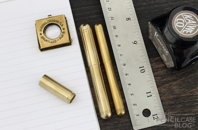
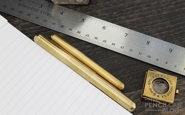
The Supra has a fairly minimal design, similar to the design of the Lilliput, on which is it obviously based. the bullet shape with rounded edges is simple but striking, especially in this larger size. The unique part of the Supra is obviously the removable extension piece. If you want a pocket pen, you can just take the extension out, and it transforms into a very pocketable pen, barely any bigger than the Lilliput, but a bit wider. If you prefer a more comfortable full-sized pen without having to post the cap, the extension piece comes into play, and adds about 3cm to the overal length of the pen.
Kaweco Supra fountain pen review
The removable section does affect the design of the pen just a little bit. It's definitely form follows function, because the added pair of threads on the extension makes for an inevitable step along the middle of the barrel (think about it, if the diameter of the extension would be the same as the rest of the pen, it would be impossible to connect all the pieces!). In terms of comfort, you'll also notice the added diameter of the extension piece because it does create slightly higher step from section to barrel. All parts on this pen are machined extremely precise, and the corners and threads can be a little sharp. This is definitely something to keep in mind in terms of comfort, although it hasn't been a dealbreaker for me so far, and I've used it quite a bit already.

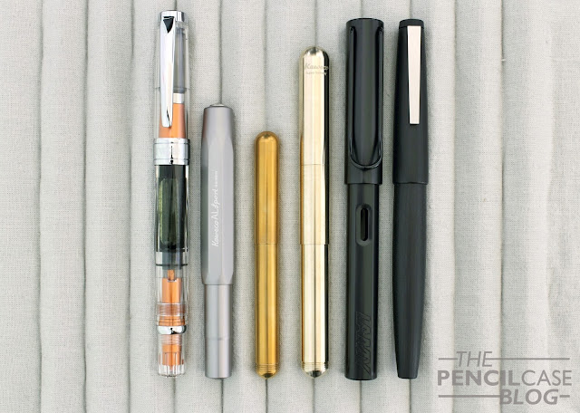
The Supra is obviously a bit larger than the Lilliput. It weighs in at just over 50 grams total with the extension piece, which is almost double that of the brass Lilliput (the aluminium Lilliput is even lighter). Yet because it's a full-sized pen it doesn't feel overly heavy in the hand.
Kaweco Supra fountain pen review
Lengthwise, the Supra measures 10 cm closed, and 13.4 cm posted without the extension, which is comparable to the Lilliput. But with the extension, the Supra grows to a length of 13 cm closed, and 12.5 cm open, which is about average for a fountain pen, and definitely enough to provide a comfortable fit for most hands. The most obvious change is the added diameter, at 9.9 mm around the section, it’s a couple mm thicker than the Lilliput. While that might not sound like much, it’s certainly noticeable in the hand. So for those that thought the Lilliput was a bit too thin, too unsubstantial, the Supra improves in this area as well.
Kaweco Supra fountain pen review
A benefit of using the extension is that it's long enough to hold a standard international converter. That means you won't have to deal with those finnicky mini converters Kaweco provides (that never seem to perform as they should). The downside is that you'll have to switch back to cartridges when you decide to remove the section. I currently stick to syringe-filling empty cartridges, that way I can use the Supra in both configurations and still use whatever ink I want.
Kaweco Supra fountain pen review
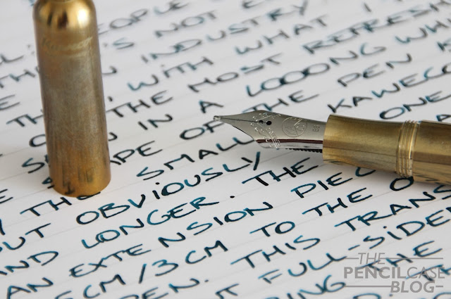
The nib on the Supra was probably the biggest surprise for me when I first saw product shots of it. Kaweco finally decided to use their #6 nibs again, which I had previously only seen on the full-sized Kaweco Elite. I really like these larger nibs Kaweco offers, which is why I'd love to see them on more of their pens in the future (obviously not on their pocket pens, that would look ridiculous!). The nibs have essentially the exact same design, which is simple but classy. They are available in the same wide variety of nib sizes, from EF to BB (of course I went with BB), and seem to perform rather comparable to their smaller counterparts.
Kaweco Supra fountain pen review
I swapped out the double broad with the fine nib of my Kaweco Elite a couple of times (as you can see in the pictures), and both performed really well. The BB hard starts every now and then, but it usually picks up after the first stroke and writes consistently after that. It felt like the flow seems to be just the slightest bit wetter with these larger nibs, but overall the difference is negligible and your mileage may vary (it could also depend on the rather wet ink I used).
Kaweco Supra fountain pen review
The Supra is without a doubt one of the most refreshing, and interesting new pens of the moment. People often complain that there isn't enough innovation and new products on the pen market, but I think Kaweco does a decent job with their new products. Even though I'd usually find myself using the Supra with the extension piece, I know a lot of people will switch regularly between the two setups, especially if you're into EDC and pocket carry, the Supra should be on your wishlist.
Kaweco Supra fountain pen review
The Supra retails for 90 EUR/ 125 USD. That's not at all cheap, but I find it more than worth the money. It's fun to use, has an innovative design, and it's a rock-solid pen, I can't think of any reasons not to like it.

Note: this pen was sent to me by The Pen Company, free of charge, so I could write this review.  I was in no way influenced in the making of this review, the opinions shared in this review are completely my own! This post does not contain affilate links.
Kaweco Supra fountain pen review

Monday, September 26, 2016

RECAP: TILBURG PEN SHOW 2016

For the first time in three years I didn't forget to take a picture of the awesome sea-creature skeleton hanging in the middle of the Nature Museum Tilburg, where the pen show is hosted!
Speechless. That's what I was after the Tilburg pen show. On the two hour ride back home I still couldn't believe it. I just listened to music and soaked up all the awesome of the past eight-nine hours. It was amazing, once more. Really every year the Tilburg pen show is a treat, but this year it was extra special. After last year it became clear that it isn't just for the pens -I mean obviously also just a little bit for the pens...- but for the wonderful, crazy, kind-hearted people that you get surrounded with.

I honestly don't have words to describe the feeling, it's just being indulged in one big happy fountain pen family for a couple hours. And once it's over it feels like a part of you was left behind at the show, waiting for you to return next year.

'Oh come on Dries! Cut the emotional rambling!' - I hear you think, but this is legitimately how I feel, I can't help it. I just wish every day could be like being at a pen show, meeting like-minded people, talking, exchanging pens and inks, having a good laugh,... It's like the utopia for pen addicts, zoned out of the real world for a couple hours, away from all the crap.

But let's just quickly recap the Tilburg Pen Show (edition 28 already by the way!):
As was the case last year, one of the most prominent pen collectors/sellers in the galaxy honoured us again with his attendance: Sarj Minhas, aka. Mr. one man pen show. Even though I didn't buy anything from his table, I had a wonderful chat with him again, and of course I drooled at all his pens - hard not to...
More of Sarj's table.
The lovely Frank and Agatha from Fontoplumo were at the same table as last year, and brought us a lovely new special edition pen: a Fontoplumo exclusive Conid Kingsize called the Monarch. I didn't get the pen (a bit above my budget, quite a bit), but I did get the matching special edition KWZ Monarch ink!
Cliff Harrington and his wife also traditionally attend the show with a collection of beautiful vintage pens. I didn't get a chance to talk with him this time around, but if you see him at a pen show, definitely go say hi, such a great guy!
And I'm obviously still forgetting a bunch of people, like Dennis from La Couronne Du Comte and his awesome team both at the show and in the store (double the fun!), Petra and Sjoerd from Scrittura Elegante, two relatively new pen show exhibitors, but already irreplaceable with a variety of pens, paper and inks that perfectly complements the Tilburg show! 

But of course then there was also this colorful bunch (yes that's SBRE Brown in the Harlequin suit, don't ask me why!) that made the show whole! From left to right that's: Michael, Cris, Stephen, Azizah, Eric, Tarah, myself, and Janine! Thanks for the wonderful day guys, and thanks to all the other people that I got to meet but aren't in this picture, you know who you are! Also thanks to Jeanne, who does a splendid job organising the show year after year!
 And last but not least of course some pics of this year's -relatively modest- haul:
A Diplomat Excellence A Venetia fountain pen
A Monteverde Mountains of the world fountain pen, courtesy of Scrittura Elegante
A kick-ass 60 pen case for five bucks (#stealoftheshow), some inks, and some notebooks!

Friday, September 16, 2016

MONTBLANC HERITAGE ROUGE&NOIR FOUNTAIN PEN REVIEW

Montblanc Heritage Rouge et Noir fountain pen review
Montblanc's Rouge et Noir pens, part of the Heritage collection, take us back in time to one of their first pens to ever hit the market,110 years ago in 1906! I'll admit I'm usually not much of a Montblanc person, but when they come up with something interesting, I just have to take a closer look... and the Rouge et Noir collection classifies as 'interesting' without a doubt!

In 1906, pens were still mostly manufactured from ebonite (hard rubber). The current re-issue is divided in three 'tiers', two special editions made from precious resin, and a limited edition in hard rubber. The two pens I received on loan from Penworld to review are the 'cheaper' precious resin models, although knowing Montblanc, you'll understand that 'cheap' isn't exactly the term I should use.
Montblanc Heritage Rouge et Noir fountain pen review
They are quite something though, regardless of the price. I most likely won't spend this kind of money on them, but it's a unique, eye-catching pen for sure. 

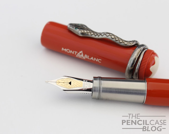
Both the black and red version of the Rouge et Noir are completely identical when it comes to the general design, but the small details are what sets them apart. The skinny, not-all-too-long design is typical for vintage pens. The colorways are also based on vintage pens, the black resin version has a coral red cap finial with a slightly off-white Montblanc star emblem embedded in it. The Coral red version is entirely made out of coral red 'precious' resin. Both colorways have a very vintage look and feel to them, both because of the overall design, and the materials used. The coral red resin plays a pretty big role in the appearance of the pen, even on the black version. 
Montblanc Heritage Rouge et Noir fountain pen review
The most prominent design feature is of course the snake clip wrapped around the top of the cap. It's a big part of the marketing around this pen, and with reason because it's the first thing you notice about the Rouge et Noir. It's quite a stand-out feature, but definitey in a good way. The metal clip has a weathered appearance (similar to aged silver, yet it's not a silver clip) which is achieved through specialised galvanising methods (according to the MB website).

The prize difference between the two versions shows in the little details, such as the clip and the nib. The changes are small (The coral has small green (gem)stones as eyes in the snake clip, two-tone  nib design, white-filled montblanc logo on the cap), but they do succeed in giving the pen a more luxurious and 'finished' appearance, making the black version look somewhat like a half-finished afterthought. It's  a considerable price increase, but if I'd buy one, I'd go for the coral red model without a doubt. 
Montblanc Heritage Rouge et Noir fountain pen review
If you're looking for a larger pen, the Rouge et Noir will not be for you. In fact, most complaints I've seen so far are about the rather dissapointing size. As I mentioned in the beginning, vintage pens that are usually not as large as modern ones. In that regard, Montblanc did a good job recreating the vintage design. 
Montblanc Heritage Rouge et Noir fountain pen review
Not as much the length, but the narrow profile is something not everyone will appreciate.
For todays standards however, a lot of people will be dissapointed to find a pen that measures in at just 13.7cm closed, and 12.5cm open, with a profile of 1cm width at the cap, and just 0.85cm around the section. The length is not the real issue though, it's actually fairly average, and more than decent enough to fit most hands. But the skinny profile, especially at the section where it's not much thicker than a woodcased pencil, might put some people off. Being a special edition pen, I think most people would expect something a bit larger. I'm more used to larger pens myself, and I have to say it took quite a bit of getting used to something this slender. It's definitely usable, but it felt like my grip was a bit more cramped than it would with a bigger pen. 
Montblanc Heritage Rouge et Noir fountain pen review
To my surprise, both versions are actually piston fillers. Being so slender and relatively small, I can imagine the ink capacity won't be much to write home about, and there's no ink window to keep track of how much ink is left. So in this case I think I would've actually preferred a C/C filling system for practical reasons. It's also worth noting that the barrels are actually metal, with what I presume is a layer of laquer over it to match the color of the rest of the pen (however you can see a slight color difference between barrel and cap on the Coral version). This gives the pen a noticeable amount of heft when you pick it up. It's by no means heavy, but it definitely feels solid in the hand, despite the smaller size. 
Montblanc Heritage Rouge et Noir fountain pen review
To make up for the size, Montblanc once again delivers with a beautiful nib design. With the grand theme obviously being the snake, the 14k gold nib features a minimalistic depiction of a snake head. Especially on the Coral red version, with the two-tone nib, this design stands out. It's easily one of the most beautiful nibs I've come across. 
Montblanc Heritage Rouge et Noir fountain pen review
Apart from the nib, another feature that shows upon uncapping the pen, is the metal grip section. It has a brushed finish that actually doesn't feel slippery while writing, and the threads are at the front of the section, instead of at the transition from section to barrel, which makes it a rather comfortable pen to hold, despite the lack of girth.

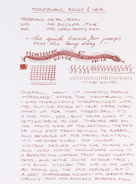
The small nib is the same design as found on the previous Heritage fountain pen, the 1912 safety filler. The 1912 was praised for being a bit soft and bouncy, I didn't really experience that with this nib, but it's an excellent nib nevertheless. In fact, of the three Montblanc pens I've reviewed so far (Montblanc 146, Montblanc M and this one), this is easily the best one. Both the medium and fine nib I tried were responsive but smooth, and had a rich, consistent flow. One thing I've noticed with all the Montblancs I've used, is that their nib sizes vary quite wildly. For example: the fine on the Coral R&N ran quite noticeably wider than the medium on both the 146 and the black R&N, whilst the fine nib on the Montblanc M wrote almost identical compared to said medium nibs. Consistency in line width doesn't seem to be their strong suit (in my experience, that is), but other than that I can't say anything bad about the way their nibs perform. 
Montblanc Heritage Rouge et Noir fountain pen review
I think it's fair to say that the Montblanc Rouge et Noir is quite a mixed bag. On one end I really like it, and for a brief moment I actually considered buying one (but then my wallet talked me over on that). The design is refreshing, something that stands out from the current selection of modern pens, and with a strong nod to vintage design.
Montblanc Heritage Rouge et Noir fountain pen review
But on the other hand, it's quite expensive, you have to pay a premium to get all the details (honestly if you're considering buying one, immediately move up to the coral version, the black one is so much less exciting if you compare them side by side). And the size will be a big no-go for a lot of people (I actually don't know if the Ebonite limited edition is larger, but even if it is, you'd have to be willing to pay about 1000 Euros more for it).

The black model retails for 630 EUR, while the Coral comes in at 760 EUR. That's by no means cheap, but it's already a bit less compared to the Heritage 1912, and for a Montblanc special edition it's probably as low as it's going to get. Is it worth it? If you can get over the skinny profile, I think it could be.
Note: Penworld Supports this blog. I received these pens on loan, so I could write this review. I was in no way influenced in the making of this review, the opinions shared here are completely my own! This review does not contain any affilate links.
Montblanc Heritage Rouge et Noir fountain pen review

Friday, September 9, 2016

INKTASTIC: SAILOR JENTLE OKU-YAMA INK REVIEW

Sailor Jentle Oku-Yama ink review
Certain brands are known for their very high quality inks, but Sailor is often forgotten in that regard. In the last few months, I've been quite on a Sailor ink craze. I bought three bottles of the current Jentle ink collection (I write 'current' because a new collection is supposed to be released soon, and I don't know if the current inks will continue to be available. I sure hope they'll stick!) Sailor has earned a spot on top of my favourites list without a doubt. 

If only I would've noticed a little earlier on... To think that I almost passed up on this ink when I was visiting La Couronne du Comte is just ridiculous! Of all the awesome Sailor inks, Oku-Yama is one of the best (who am I kidding, they are all great!).
Sailor Jentle Oku-Yama ink review
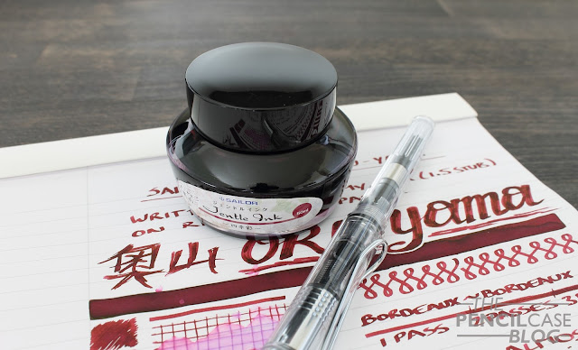
I'd call the color bordeaux red, but I'm not a wine drinker myself, so don't take my word for it I guess... It's remarkably similar to Diamine Oxblood and Diamine Red Dragon when used in finer nibs (I've confused myself more than once when I had both this and Diamine Red Dragon inked up). 

What I do know is that Oku-Yama, as well as most other Sailor Jentle inks I've used so far, is a well-saturated color with noticeable lubrication and a fairly wet flow. Writing with them feels as if these inks are a bit more viscous (a slight oily texture). Put this in a smooth broad nib, and it's pure bliss!
Sailor Jentle Oku-Yama ink review
There's some good shading going on, but it's not really pronounced on the page because the base color is already very saturated. Without a doubt, one of the best properties of this ink is its' sheen! It has a pretty strong gold sheen when you hold it at the right angle towards the light. In my experience most -if not all- Sailor inks have a good deal of sheen, especially for those that like to use Tomoe River paper that's a very nice extra to an already amazing ink!
Sailor Jentle Oku-Yama ink review
Behaviour is good, dry times seem especially decent for an ink that 'feels' quite wet and lubricated. I've read up on some articles that mention Sailor inks are a bit more 'agressive' chemically, which basically means you should exert a slight amount of care and caution when you use one of these inks. So far however, I haven't had any issues with any of the Sailor inks I have, and I've been using multiple ones in various pens for the last couple months. 
Sailor Jentle Oku-Yama ink review
Price is my only concern, but only because I know I'll want them all eventually! They are not the cheapest, at 18 EUR/ 20 USD for a bottle of 50ml. But I definitely think Oku-Yama and the other beautiful colors are worth a try.
Note: La Couronne Du Comte is a sponsor of this blog, I received a discount on this purchase, so I could write this review. I was in no way influenced in the making of this review, the opinions shared here are completely my own! This review does not contain any affilate links.
Sailor Jentle Oku-Yama ink review

Friday, September 2, 2016

MONTEGRAPPA NEROUNO FOUNTAIN PEN REVIEW

Montegrappa NeroUno Fountain pen review
I've had the Montegrappa NeroUno on my radar for over five years now, ever since I tried it at one of the first editions of the Tilburg Pen show I ever went to. The super classy design and solid construction, the unique inlaid nib, down to something as trivial as the smoothness of the cap threads, I fell in love with it. Unfortunately, at that time, my pen budget didn't even come anywhere near its' retail price, so I slowly forgot about it. Until recently! A few months back, it came to my attention that Montegrappa was about to change the nib design to match the rest of their current collection. That was about all it took for me to get one.

The Montegrappa NeroUno has been living in my 'daily carry' for the last four or five months now. In fact, it hasn't been uninked for a second, which is quite rare if you're like me and switch pens every five seconds!
Montegrappa NeroUno Fountain pen review
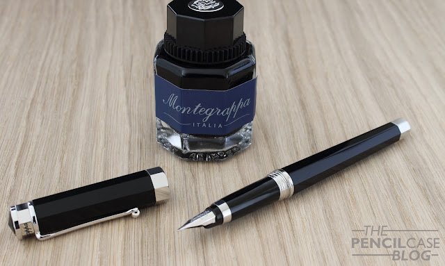
Montegrappa makes pretty pens, that's no secret. It's hard to put a finger on the exact style, but I'd say this one is definitely a classic, more conservative looking pen. The octagonal profile that runs along the entire pen's length (including on the finials and center band) isn't too uncommon on Italian pens (Omas immediately comes to mind with their dodecahedral designs), as is the traditional clip with the rolling wheel, a design element that has pretty much become a trademark for many Italian pen manufacturers.
Montegrappa NeroUno Fountain pen review
But even more so than the octagonal profile, or typical clip, one of the most prominent design features of the NeroUno is the metal cap finial, It's a feature that can be found on a number of Montegrappa pens. It has the same octagonal profile as the rest of the pen, and for some reason it's remniscent of a crown. Across the finial is the brand name Montegrappa in black enamel. The flat top of the finial is made of a slightly pointed piece of black resin. It's the center of attention, and with reason! It's easily the most elaborate finial I've ever seen on a pen, and it gives the pen its unique character.
Montegrappa NeroUno Fountain pen review
L to R: Conid Minimalistica, Pelikan Souverän M805, Montegrappa NeroUno, Lamy Imporium, Lamy 2000, Montblanc M
Something I didn't expect from pictures online, is that the NeroUno is actually a fairly large pen. I'd almost call it oversized if it were a bit wider (it narrows down considerably near the back end of the pen). With a closed length of 14.3cm and 13.3cm uncapped, it fits right in between the Pelikan M800's and M1000's.
Montegrappa NeroUno Fountain pen review
Despite its rather large size, I think the Nerouno is a one of those pens that could work for a lot of people, even those that aren't really 'into' larger pens. Reason for that is the rather average girth. Especially around the section it isn't nearly as bulky as the Omas Paragon or Delta Dolcevita, even though they are quite similar in length. Instead, it measures in at 10 to 11mm around the grip section, a normal and comfortable girth for everyday writing.

The nib is somewhat of a difficult story, but not because of the way it performs... As I mentioned earlier on, Montegrappa was supposed to gradually phase out the old nibs and transition to a new nib design with the characteristic montegrappa octagon pattern on the nib face, yet so far there's little or no info on wether that's actually happening. So far I can't find retailers that explicitly sell the new version, but that's a good thing because I honestly like the old design a lot better.
Montegrappa NeroUno Fountain pen review
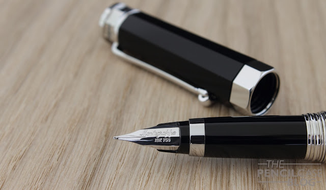
The semi-hooded/ inlaid nib is small (especially for a pen this size) and pretty much identical in shape to the nibs Lamy uses. The words 'Montegrappa' and '18k750' are stamped along the length of the nib (not across like on most nibs). It's such a simple design, but it just works.

All the design features together, while clunky at first sight, actually make for a really attractive, elegant pen overall. The nib plays a big part in the design of the pen, which is why I'm glad that I got one with the old nib design.
Montegrappa NeroUno Fountain pen review
Performance-wise, the Nerouno is definitely a reliable pen. It's not the smoothest nib, in fact it has some noticeable tooth to it (similar to Aurora nibs). It's made for writing, and that's exactly what it does best: it offers a very balanced, consistent writing experience as soon as you pick it up. The benefit of not being overly smooth is that it writes all the time, it doesn't skip or hesitate. The 18k nib is ever so slightly soft, which gives it some bounce, but you don't get much line variation out of it. For a fine nib, it has a prety rich flow, definitely on the wetter side. I'd say it lays down a fairly average 'european' fine line, but that's quite relative. It's definitely not comparable to japanese fine nibs, you'll have to look elswhere for those.
Montegrappa NeroUno Fountain pen review
Believe it or not, the NeroUno is actually one of the more affordable offerings from Montegrappa. Does that mean it's cheap? Well, no. Not at all really, but if you want to get a luxury Montegrappa pen with a gold nib, this is the most economical starting point. The way I see this pen, it could be a strong competitor for Montblanc if you want a classy 'business' pen. It should definitely be on your shortlist if you're looking for that kind of pen!

Prices on the NeroUno vary wildly here in Europe, ranging from 325 to 450EUR (or around 475USD). Depending on what you pay, I think it definitely delivers in quality and performance, but of course it's still a high-end pen no matter how you look at it.
Note:Fontoplumo is a sponsor of this blog. I received a discount on this purchase, so I could write this review. I was in no way influenced in the making of this review, the opinions shared here are completely my own! This review does not contain any affilate links.
Montegrappa NeroUno Fountain pen review