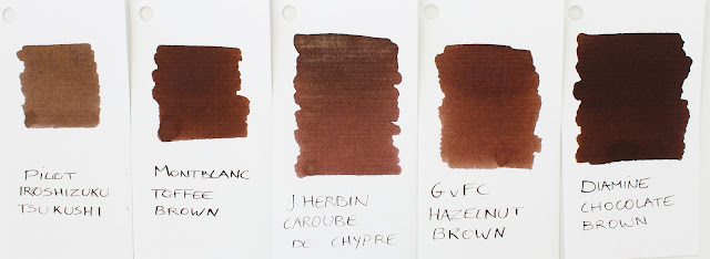
For this year, J.Herbin came up with 'Caroube de Chypre', a brown ink inspired by the Carob pods Herbin (the guy who started out the J.Herbin ink company in the year 1670) brought from Cyprus (In French that makes for 'Caroube de Chypre').
Let me just tell you right away how I feel about Caroube de Chypre: Meh. It's somewhat mediochre, especially after last year's bold and bright Emerald of Chivor. J.Herbin definitely didn't make it easy on themselves, Emerald had a lot going for it, even when disregarding the particles. It had sheen, shading, and an original, vibrant base color; everything you could want from an ink! I feel like that's the main reason why Caroube can't seem to impress me, because it's definitely a good ink in it's own right.

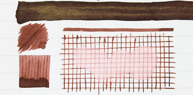
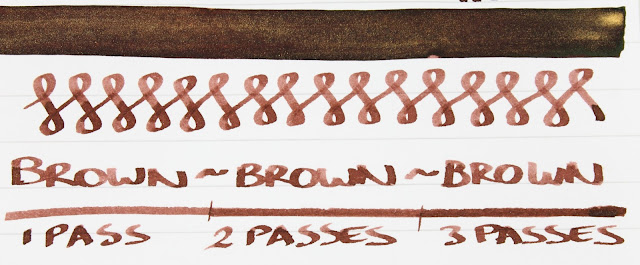
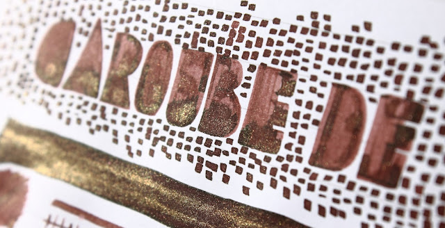
One thing J.Herbin already got down with Emerald of Chivor is shading, and they pretty much nailed it with Caroube too. It has a fairly light base color with loads of shading on top. Sheen is not as pronounced, and I didn't get it to show in any of the pictures. But there is some green hue in certain areas where the ink gets the chance to pool up. Of course there's also the gold particles that bring an extra dimension to this ink. I still can't say I'm a huge fan of gold flecks in my ink, but it does look neat when the light catches it, let's just keep it at that.
It's a pretty well-behaved ink, like Emerald (especially compared to the Diamine Shimmertastic inks that were a bit more troublesome in my experience), with no issues of clogging or interrupted flow to note so far. Performance-wise, you can't say J.Herbin didn't deliver.
Caroube de Chypre is not as magical, not as inspired as Emerald of Chivor. It has gold flecks in them, yes, but even so I it's not the most attention-grabbing ink, which might be positive in a way, as it's a more generally usable ink (although filling in your taxes with glittery ink might still be a bit weird). Would I recommend it over EoC? No, but I also can't think of a good reason not to buy it if you're interested, it's not a bad ink at all.
Here in Europe, All 1670 inks retail for 14 EUR, which is a decent price compared to the -rather hefty- 26 USD in the States.
Note: La Couronne Du Comte is a sponsor of this blog. I received a discount on this purchase, so I could write this review. I was in no way influenced in the making of this review, the opinions shared here are completely my own! This review does not contain any affilate links.


No comments:
Post a Comment