Saturday, March 26, 2016

SAILOR 1911 FUDE DE MANNEN FOUNTAIN PEN REVIEW

Sailor is a well-established name within the fountain pen community. It's the first brand that comes to mind when most people think about luxury Japanese fountain pens. Their high-end fountain pens are right up there with other great brands like Montblanc, Pelikan... And to top it off, their in-house nibmeisters produce some of the finest and most unique nibs in the world!

But of course their premium pens, come at a premium price! Particularly the specialty nibs can add hundreds of dollars to the price of their pens. Well, that's where the Sailor 1911 Fude De Mannen steps in! It's basically a stripped-down version of the Sailor 1911 fountain pen with a really special steel nib, and at a particularly interesting price point!
Designwise, it's -as I said- quite similar to the regular 1911 and 1911 large. But differences in price show in terms of build quality and detail. For example, injection-molded plastic was used, instead of the more 'luxurious' cast resin on their more expensive pens. Trims are also less elaborate, the cap band was reduced to just one ring, and has less detailed engraving on it. Decorative rings around the clip and at the back of the barrel are also gone.
It won't win any beauty contest, but it does the job, and from a distance it looks more expensive than it really is. Construction isn't as precise, there are still some seams visible on the plastic, and the cap fineal doesn't sit completely flush. Other than that it's a pretty solid pen, while still remaining very light because of the plastic construction.
Dimensionwise, it's also rather similar to the more expensive classic 1911 (not the 1911 Large). It measures 13.5cm closed (5.25in), and 11.5 open unposted (4.5in). It's a small pen for my taste, I use it posted more often than not, also because this gives more control over the nib. It posts comfortably at around 14.5cm (5.75in), and the cap doesn't weigh it down. In fact, the whole pen is rather light. The injection molded plastic clearly isn't as thick as the resin on the more expensive Sailors, which takes away the quality feel. I know it's unfair to compare the fude with a pen ten times its price, but just so you know: this isn't the kind of pen you'd buy for the look and feel!
Which brings me straight to the reason you WOULD actually want to buy this pen: the nib of course! 

Aesthetically, it's a really strange thing. It's a rather flat piece of gold-plated steel, with less of the curved profile you'd find on most other nibs (however, the gold Sailor nibs are also somewhat more flat than other brands' nibs!). The tines, instead of being nice and straight, bend at a 60° angle, at about 2mm from the tip. This is the 'Fude' part in the name of the pen. Fude refers to a brush-like drawing medium, and usually you'll find brush-tip markers labeled fude. This nib basically recreates the effect a 'fude' brush pen creates, which gives expressive, bold strokes. Useful for example, when you would write japanese 'kanji' symbols, but also just fun to mess around with.
Depending on the angle you hold the pen, it's possible to create a range of strokes, from very fine when holding the pen at a 90° angle, to a 2mm wide stroke when holding it at the 60° sweetspot. It's a fun nib to experiment with. If I was somewhat good at calligraphy or drawing, I'm sure that would create nice effects too. This is one of those 'fun but impractical' pens, if you're looking for an EDC writer and nothing more, you'll have to look elsewhere. 
Because of the rather unusual shape of the nib, I expected it to have some issues right out of the box. But in reality, it's really quite a good performer! It's a well-tuned nib with a wet flow, given that I used it with a rather wet ink (Iroshizuku Yama-Budo). It's quite responsive, especially given the fact that you're putting a bent piece of metal to the paper. It didn't skip or cause trouble so far, and it starts up right away, even after a few days of being unused!
Raise your hand if you like to mess around with pen and ink, and if you like doodling or drawing with your pens... If you just put your hand in the air, then yes, there might be a reason for you to buy this pen! The Sailor Fude is somewhat equivalent to the ever-so popular Pilot parallel pens: it's a powerful tool in the right hands, but it's also just good fun to mess around with for people like me who have no artistic skill whatsoever. The 1911 Fude goes for around 31 EUR (For non-EU residents: 28 USD without VAT at The PenCompany!), which is a fair price all things considered.

Note: This product was provided free of charge by The Pen Company, so I could write this review. I was in no way influenced in the making of this review, the opinions shared here are completely my own! This review does not contain any affilate links.

Sunday, March 20, 2016

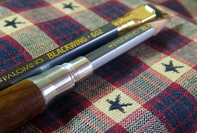
THE TIMBER TWIST BULLET PENCIL - INTERVIEW WITH JON FONTANE

Remember those Metalshop bullet pencils I reviewed a while back (Read the review)? Well, there's something new from Metalshop: the Timber Twist bullet pencil (Currently on Kickstarter)! I got in touch with the man behind the brand, Jon Fontane, and asked him some questions about him and his business... an interview, basically! 
Timber Twist Bullet pencil
Let's start at the beginning: what inspired you to come up with a modern version of the bullet pencil?
All this is because of Instagram.  Back in early 2014 Metal Shop was trying to find its way.  It was a new brand and I was still finalizing my previous business.  The brand had little direction.  I typically like to jump in with both feet and figure things out as they come.  We had a small mix of machined metal products, a few variations on bottle openers and a brass cigar stand/ashtray.  We had a direction, we wanted to make unique products that would stand the test the time. 

I would often do small pop up markets but would find that my price point was high being that everything was done in small batches and all made in America.  I decided to wholesale some of the things I liked best and add a mix to my overall product line at these events.  It would also then position my booth as the go to for men's gifts at a variety of price points.  I picked up some solid cologne, some Field Notes and some flavored toothpicks.  But what I really wanted to sell were these extremely handsome hand sewn handkerchiefs by a small maker named Huckleberrywoodchuck. Jay (aka Huckleberrywoodchuck) also sold vintage bulllet pencils that he lovingly restored....I instantly thought that they were the coolest thing I had ever seen.  I picked up a handful and had the light bulb moment to put a modern touch on them.  After the first market with them, that thought was reinforced, people loved them!
So that's it!  I called Jay, said let's make these and the rest is history. 

In comparison to other bullet pencils (old and new), where does the twist stand out from the crowd?

Well that is where the name came from. It's the twisting action. The vintage bullet pencils were all friction fit.  So you jammed the pencil into the bullet and the bullet friction fit into the tube or body.  The problem was sometimes it could be difficult to get the worn down nub out of the bullet.  So we decided to add threads.  Everywhere!  Not just to screw the nub into the bullet but for all the actions, opening, closing, even the eraser end.  So thread = Twist!  It also allows for our version to be more modular.  While some people are more traditional others may want a pocket clip, so we created a pocket clip  system with a cap that threads on to keep it in place.  The Twist is also a tiny bit longer than vintage bullet pencils, not much, just a bit. 

So the threads really differentiate the Twist and adds a modular function.  Prefer a pen? We have it! Cap/clip?Sure...or just go with the standard eraser, whatever you want.  Its a little bit of a secret but I'll share it anyway, we have a fountain pen attachment in the works.  I guess the final point to make would be the concerning the durability.  Using aluminum and, in the new products case, wood/aluminum, the Twist and Timber Twist are built to last a long long time.
Timber Twist Bullet pencil
How did the Timber twist come about? What inspired you to resort to wood for the successor of the twist?

It's an interesting story. I had just engaged with a second shop to help with production demands.  My main shop has limited large scale production so I met with a screw machine shop. These machines are cool.  You simply insert a long piece of stock and the machine does all the operations at once.  So as demand for the original Twist grew I needed to be able to decrease production time. I was visiting to pick up a batch of the Twist tubes and one of their lead machinists came out and just said, "these would be cool in wood." Well it was a total light bulb going off moment. I look at my sales guy (who totally gets what Metal Shop is all about) and he just said, "yes, we can do that." Prior to that, the thought of wood hadn't really crossed my mind.  Actually I was about to tell them we needed to do copper!
So that encounter started it all and since then I've purchased a lathe and been perfecting the sanding and polish process.

I can imagine adding a wooden section to the barrel implies some drastic changes to the production of the twist? Will we notice some changes to the construction with the timber (regarding weight, balance,...)?

The Timber feels a lot lighter!  But in reality its only a few tenths of an ounce lighter.  What is great about the product and how we designed the Timber Twist is that everything works with everything.  So you can have an original Twist at home, take the bullet off of that and use it on your Timber Twist. Same holds true for the pocket clip system and the pen pieces. Where things are different is in production. The body piece (or tube) is just a single unit for the original Twist. Now the Timber Twist version is actually three different pieces that are assembled by hand.

For the OCD pencil enthousiasts (like me), what pencil would you suggest that matches the wood barrels of the Timber?
Oh you know what I'm going to say here, Blackwing all the way.  And now with the Volumes there is even more variety!
Timber Twist Bullet pencil
Just out of curiosity: I really like the full-brass twist! Would, by any chance, a full brass timber join the aluminium models currently available?
Maybe....well probably...actually yes, eventually.  Thought was given to do a brass anodize to keep that weight nice and light.  For the Kickstarter though I'm trying to keep things simple.  At some point testing will begin on using actually brass.  I'm curious to see how that impacts the overall feel.

Of course there's the current Kickstarter campaign going on at the moment...
This is actually Kickstarter #2 for the Twist.  The original Twist was on Kickstarter in October of 2014.  Learned a LOT of lessons from that.  I was very aggressive with fulfillment....the campaign ended on November 1st and I guaranteed holiday delivery.  We actually made it, with the exception of backers that added the pen attachment. 

So with this campaign we built in a little extra time though I say under promise/over deliver. We are also keeping this one simple, only four reward levels to choose from, Single Timber Twist with aluminum, Single with brass, the "Box Set" which is two pencils with each bullet and the "Trifecta" (all three and you get to choose your bullet material).  There are three wood options, Red Cedar, Mahogany and Walnut.  We will sand them on a lathe and do a friction polish finish.  We will also offer a sanded only version as we have had a few people ask for that.  The other lesson learned from the first campaign is to be careful with options and upgrades.  Not only is it confusing for backers but it caused some serious sleepless nights during fulfillment figuring it all out.  One exception may occur.  If the fountain pen attachment meets my standards I think I'm going to have to offer that upgrade!

All is going great so far.  We reached our funding goal and now I'm trying to see how much more we can do, which means more time on the lathe for me!
---

Big thanks to Jon for taking the time to do this interview! Should you be interested in the Timber Twist, you can find it here: Timber Twist Kickstarter

Sunday, March 6, 2016

GIVEAWAY WINNER ANOUNCEMENT! (LAMY AL STAR CHARGED GREEN)

Our Lamy Al Star Charged Green giveaway has ended! Thanks to everyone who participated, we received 115 entries this time, which is awesome! Also, big thanks to the kind people over at Appelboom, who sponsored this giveaway! If you didn't win, but still want one of these Charged green Al stars, head over to Appelboom.com and grab one for yourself there! (You can get a 10% discount with the code 'friend')
This was the first giveaway we did without using rafflecopter, but I decided to mimick the rafflecopter system to pick the winner. Numbers were assigned to the entries (1 to 57 for the comments on the giveaway page, and 58 - 115 for the reposts on Instagram), and random.org picked the winning number. (Obviously my 2 original posts on Instagram weren't counted as entries)

So here's the winning entry:


Number 94 corresponded to the Instagram repost from @coffeedaddict, congrats! 


Thanks again for all the support, and thanks for entering the giveaway! If you didn't win, don't worry: there will be more giveaways in the future!

(The winner is contacted through DM on Instagram, and will receive his prize soon.)

Here's the winning entry from @coffeedaddict!

Friday, March 4, 2016

MONTBLANC M FOUNTAIN PEN REVIEW

Montblanc M
With the M (by Marc Newson), Montblanc brought a radically different product to the fountain pen market. Compared to the ever-so popular Meisterstück 146, with its conservative looks, the M appears to come straight from the future, which is kind of what Montblanc aimed at...
Montblanc M
The M is Montblanc's take on a modern, young pen. It's a fairly simple design, but with some details that make it unique.

The clean, rounded, cigar shape in black 'precious' resin is accentuated by a flat side on the barrel that runs about a third of the length. The usual white star logo is well-represented, both on the top of the cap, and on the flat side The flat side is -how should I put this?- a distinct design choice. I don't fully grasp the benefit of it. Maybe Montblanc wanted to come up with something different? In that case, they definitely succeeded, I'm just not a huge fan.
Montblanc M
Another, rather unique detail that I DO actually appreciate, can be found inside the cap. The closure mechanism is magnetic, but unlike other magnetic caps, the cap of the M always lines up perfectly with the flat side on the barrel. That's not just a lucky coincidence, it's actually designed to align itself (you'll notice that it won't close all the way unless it's aligned). Despite this being another, rather useless feature, my OCD definitely appreciates the correct alignment of cap and barrel!
Montblanc M
So the M is designed by Marc Newson, the man that also helps design Apple products. Apple products are designed to be user-friendly (most of the time), so I kinda expected that to be the case with this pen as well. Unfortunately it's not. My issue here is the annoyingly short and uncomfortable section.
Montblanc M
Some pens get away with a short section, some are even very comfortable (like with the Pelikan Souveräns), but not this one. You see, the key to designing a proper section is either to make it long enough, or to get rid of annoying steps from section to barrel so that you are able to rest your fingers a bit further back. I'm going back to my Pelikan example, Souveräns all have a rather short section, even the huge M1000 has, but they are nicely contoured, and they sit completely flush with the barrel, there's no annoying transition that might get in the way with your grip.
And that's exactly where Montblanc, or Newson, missed the ball completely. It's a shame really, it had potential, but as soon as I opened the cap, I knew I would be dissapointed. The section is just plain bad. it's too short, the ribbed metal provides zero grip, and the step from section to barrel is so obnoxious, it's just not comfortable to hold. Only if you have small hands, and hold your pen very close to the nib, I can see this work for you. For me it's just almost unusable.
Montblanc M
Filling the M is also a bit of a hassle. Remember the flat side on the barrel? Well apparently, because of this 'aesthetic' design choice, Montblanc's converter won't fit. Cartridges (of the standard international variety) it is then! UPDATE: A kind reader pointed out to me that it will take certain standard-sized convertors from other brands, such as the Monteverde Converter!

Even though the M seems small in the hand for some reason, it's a solid mid-range sized pen. It comes in at just under 14cm closed, which is just a fraction shorter than the Pelikan M800, or Montblanc 146 that are in the same price category. Open, it's about 12.5cm, which is around average. The cap doesn't post at all, so if you want a larger pen, you'll be in for a dissapointment. Despite the mostly resin construction, it gains some weight from the metal section. This also means that it's noticeably front-weighted, but it's by no means heavy.
Montblanc M
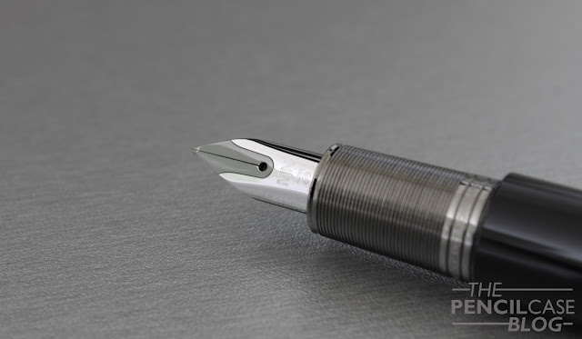
The writing experience (not taking comfort into account) is actually quite positive. The nib seems to be the same as the one used on the Starwalker fountain pens (Although I don't have a Starwalker to confirm this), but with a different imprint and finish. It's small, and has a shape that reminds of Lamy nibs. The design is simple, but nice, with a subtle two-tone rhodium and ruthenium design. The 14k gold nib writes like I thought it would, which is the selling point of Montblanc pens: reliability. It's a balanced, responsive western fine. It starts up as soon as it hits the paper, with a steady ink flow throughout.
Montblanc M
The strangest feed I've come across in a long time. It fits the overall sleek design though.
The M is a remarkable pen, both in positive, but also negative ways. I'm dissapointed in the fact that MB didn't try to make it somewhat ergonomic. The design is hit or miss, and even though I'm not a fan, I appreciate the fact that they went for something different.
Montblanc M
Another issue, is of course cost. The price is high, and I personally don't think it's worth it. At 500 EUR/ 570 USD, there are far better deals to be done. The Meisterstück 146, for example, resides somewhere in the same price class, but it provides a more complete package, especially regarding comfort.

Note: I  received this pen on loan, so I could write this review. I was in no way influenced in the making of this review, the opinions shared here are completely my own! This review does not contain any affilate links.
Montblanc M