...with lots of pens of course!
Thursday, December 31, 2015
Sunday, December 27, 2015
MONTBLANC MEISTERSTUCK 146 'LEGRAND' FOUNTAIN PEN REVIEW
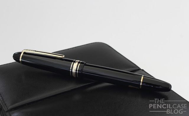
Yet, as a blogger, it's almost inevitable: at some point I had to review a Montblanc pen, and that time is now. I got a Montblanc Meisterstück 146 -also known as the 'LeGrand'- fountain pen on loan from the lovely people over at Penworld, so let's see if it can persuade me this time around...
I must say, straight out of the box, I wasn't thoroughly impressed. With the price in mind -roughly 600 EUR, give or take- I couldn't help but find the unboxing experience slightly underwhelming. The pen comes in a pretty standard black 'faux-leather' clamshell box, held in place with an -admittedly very soft- piece of fabric lining that cradles the pen. With the prestige and 'grandeur' associated with MB, I expected more, to say the least.

When comparing to two similarly priced recent purchases (Omas Paragon and Delta Dolcevita Oversize), I couldn't help but think the clamshell box didn't fit in. Packaging is only a small part, and some people don't care about boxes at all. But if you ask me, packaging reflects the amount of attention to detail, and pride of a brand. If you look at Omas' boxes, you'll see that they are proud of what they make, otherwise they wouldn't put that much effort into their packaging.
I missed that feeling here...
I hear some of you thinking: But couldn't it be that , instead of wasting time and money on packaging, MB focuses on the actual product instead,... Well don't get me wrong, it's a nice pen and in certain areas it has wonderful amount of detail put into it. But when looking into more detail, it still lacks in certain areas.
For example, tolerances aren't perfect all the way around. The clip ring doesn't sit flush with the fineal (most likely due to the curvature of the cap at that point, but I'm sure they could've figured out a way to work around that by now). I also found a strange gap between the decorative ring and the piston knob, as if it wouldn't close all the way. Finally, there's also a noticeable bit of play when the cap is closed. On the positive side, the cap not being as tight, does mean that it doesn't marr up the barrel, in contrast to some other resin pens (such as Pelikans).
A positive aspect would be that the 'precious' resin (the MB way of saying plastic, basically just plain resin) is actually really durable. In my experience, it's nearly impossible to keep resin pens -especially black ones- from scuffing up. But the 146 still looks as new after a few weeks of use, which is already quite impressive. Overall, apart from the two or three small flaws I could find, it's a well-built pen, and it feels quite solid. But I can't say that it relfects what a 600 euro pen should look like, the build quality is good, but nothing out of the ordinairy.
When uncapping the 146, you'll immediately notice the ink window. It's definitely one of the most functional ink windows I've seen in a long time. It lets in a lot of light, and it's actually large enough to see how much ink is left, in contrast to the Lamy 2000 for example, which has one of the most unusable ink windows.
The section is relatively short for such a sizeable pen (I'll come back to the dimensions later), with remarkably similar dimensions to the Pelikan Souverän M800. The threads are somewhat noticeable, depending on wether or not the threads rest on your middle finger. The transition from section to threads seems to be slightly more pronounced than on the M800. I'd prefer the M800 for comfort, but it's a close call.
Overall dimensions are pretty similar to the M800 as well, except that it's a bit longer, and less wide (or at least it feels less girthy due to the tapered shape). It's a sizeable pen, at 14.5cm long capped (5 11/16 Inch), and 12.6cm uncapped (just under 5 Inches). It posts at 16.2cm (6 5/16 Inches), which is still usable, but it's more than long enough to be comfortable unposted.
 |
| L to R: Lamy 2000, MB 146, Pelikan M805, Delta Dolcevita OS. |
The 14k gold, two-tone nib is something different, to say the least. It's a beautiful nib, easily one of the more intricately designed ones I've come across. The design gives it a bit of a vintage vibe, with very small and precise engravings and scrollwork. As for how it writes, I'll have to come back to my explanation of different nib styles: the MB is definitely part of the second category: the more balanced, fine-tuned nibs that are made to write at all times, instead of being overpolished to give the smoothest possible writing experience. The medium nib gives a noticeable amount of feedback , not scratchy, but there's definitely some drag on the page.

I mentioned that I prefer smoother nibs in general, even if that means that it'll be a bit more finnicky. There's no denying, however, that a well-balanced nib like this also has its benefits: it just works! I've used a couple of nibs similar to this (Graf Von Faber-Castell, St.Dupont,...), and they all share the ability to not skip at all. You pick it up, it starts writing, simple. Maybe it's that reliability what people love about Montblanc pens? Anyway, it's definitely a good writer, with excellent moderate flow, and a nice true to size line width. Really the only issue I could find here, is that it might take some time to get used to the feedback when coming from something really smooth like a Pelikan.
I don't think I'd buy one right away, but I think I start to understand what is so attractive about Montblanc's offerings (apart from the white star prestige!): Reliability! As I mentioned earlier, I don't need a pen that writes flawlessly, I seek something a bit more exciting. If you do prefer a consistent writing experience over anything, and you want the attire of writing with a white star, then perhaps you might want to take a look at Montblanc's offerings. For a mere 600 EUR, you can get one. Peanuts, right?
Note: Penworld Supports this blog. I was able to get this pen on loan, so I could write this review. I was in no way influenced in the making of this review, the opinions shared here are completely my own! This review does not contain any affilate links.
Tuesday, December 15, 2015
DELTA DOLCEVITA OVERSIZE REVIEW
The pen I'll talk about today is obviouly the fourth one on the list: The Delta Dolcevita Oversize! I got a heads-up from my local B&M store that Delta would cease distribution through all pen stores except one online store in Italy. Once again, I felt like it would be now or never, so I ordered one right away! It might sound like the Delta was a bit of an impulse buy, but that isn't exactly true. It had been on my wishlist for quite a few years, but so far, every time I wanted to get one, something else came up.
I bought the Dolcevita pretty much sight unseen - something I do quite often, as I usually want that one pen or nib that isn't in stock at my local B&M! But since I saw one at the Tilburg pen show about a month earlier, and drooled all over it, I figured it was well worth the gamble. I have a Delta Journal that I really enjoy, so I was quite confident that my purchase wouldn't turn out to be a bust! Luckily it didn't dissapoint me when it arrived!
The Dolcevita is Delta's 'signature' collection. Where Montblanc has Meisterstück, and Pelikan has Souverän, Delta has its Dolcevita pens. Pretty much all Delta pens however, share a somewhat similar design philosophy: Bulky, large, straight lines, with elaborate finishes and unique little details, that's what sets these pens apart!
The Dolcevita is, in that regard, no different. The flat-top design is rather simple and straightforward (Except for the unusual, but barely noticeable taper of the barrel, that gets slightly narrower towards the nib) The beautiful sterling silver, hand-engraved cap band, Art-Déco clip, and stunning orange flecked Resin

The orange resin has become a trademark for the Dolcevita product line. And while it's quite pronounced (read: NOT subtle!), it's actually one of the major selling points for a lot of people. I used to hate colorful pens, but over the last couple of years, I've come to appreciate a nice resin or celluloid. Especially if it's an iconic one like the green stripes of the Pelikan Souverän, or the orange resin on this one! It's a really rich material, with a lot of depth and chatoyance. It's quite hard to put my finger on what exactly there is to like about it, but it just grabs your attention and it doesn't let go.
 |
| Edison Collier, Lamy Al-Star, Lamy 2000, Delta Dolcevita OS. Pelikan M800 |
I must say, after hearing some complaints about it being too wide to be used comfortably, I was affraid that I would encounter the same problem. In practice, it isn't all that bad though. It takes some getting used to, but even I -with my relatively small hands- find it quite enjoyable, even for longer writing sessions. It's not an overly weighty pen, given the size, which probably benefits the comfort.
The cap can be posted, but I find it better weighted and balanced unposted. There are a couple metal parts in and around te body of the pen, which give it a satisfying, but not exhausting, weight.
Apart from looking sharp, it also writes wonderfully. It's a bit of a mixture between the really smooth overpolished nibs from brands like Omas and Pelikan, and a more controlled, balanced nib as found on Montblancs or Japanese pens.
The broad nib performs out of the box just like pretty much anyone would expect a good pen to write. It's definitely a bit on the wet side, which is my preference, but perhaps not everyone would like a gusher like this. It's teamed up with a rather unique looking flat ebonite feed, that provides a -more than- generous flow. As I said, the nib is not overly polished, which is noticeable in the ever so slight amount of feedback it gives. In my review of the Omas Paragon, I mentioned that I prefer nibs that are slightly overpolished, but in this case, the slight feedback and generous ink flow combine into one of the most pleasant writing experiences I can think of. It's more than smooth enough, but not so that it starts picking up bad habits such as hard starts and skipping, an enjoyable balance.
One thing that did surprise me, is that despite the large #8 size, the nib is not overly springy. I thought it would compare to the Pelikan Souverän M1000 nibs, where you can definitely feel the softness, and maybe even get a bit of line variation out of it, but that wasn't the case here. It feels somewhat 'cushioned', if that makes sense, but there's definitely no line variation to be had.
 |
| NIBBAGE! |
'The Bold and the beautiful'. that's exactly what this pen is. But I love every bit of it. I'd even dare to say that the Dolcevita wouldn't be as attractive if it wasn't as extraordinary!
Delta's recent 'bold' (got the pun?) move, is...regrettable to say the least. I'd love to recommend this pen to everyone, but the thing is: I don't know for how long there will be something to recommend. I have my doubts about the effectiveness of Delta's new business strategy. I wouldn't be surprised if they too, get into financial trouble sooner or later (an unpleasant trend that seems to be unfolding in the pen industry)... But let's not think about that, right?
If you happen to have a spare 600 EUR / 720 USD laying around, if you really want a bold new pen, or maybe, just maybe,...if you're as crazy as me and you want a few 'essentials' in your collection, than you should definitely look into the Delta Dolcevita Oversize!
Note: Penworld Supports this blog. I received a discount on this purchase, so I could write this review. I was in no way influenced in the making of this review, the opinions shared here are completely my own! This review does not contain any affilate links.
Friday, December 4, 2015
AMALFI LEATHER JOURNAL REVIEW

Unfortunately, I can't say I'm an avid notebook user. I don't keep a (daily) journal, I don't use notebooks for notetaking or sketching,... But I do like buying them (don't ask me why!). And thus, when I found this beautiful leather journal at the Scrittura Elegante stand, while wandering around at the Tilburg Pen Show, I couldn't resist throwing my money it's way!
I must admit I bought the Amalfi journal purely for the aesthetics. I didn't know anything about the paper inside, but frankly that didn't bother me at that moment.

The design of the Amalfi is based on journals from back in the days... back in the medieval days that is! In fact, quite recently, when I was watching Marco Polo (a Netflix series that I found rather amusing to watch), Marco used a very similar journal to jot down his ideas and findings - Quite cool -
Amalfi used an incredibly soft, supple piece of leather for this journal. It's not overly thick, perhaps I would've preferred it to be slightly thicker and sturdier, but it definitely feels solid and sturdy enough, so I guess I can't complain. It's stitched all the way around, and as far as I can see, it's manufactured very precisely and with great attention to detail.

The book is kept closed the old-fashioned way, with a long -reaaaaaaally long- leather lace. This leather strip is attached to the right side flap of the cover. you just close the notebook, fold the flap over, and wrap the lace around it about three times. You can then just tuck the end underneath to secure it, et voilà! you're set! I really like this old-fashioned closure, yet it's definitely not the fastest or most convenient system. I guess if you want to, you could cut off part of the lace, so you don't have to wrap it around as much, but still, it'll never be the most practical closure you can find.
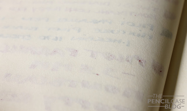
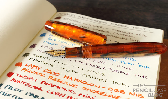
Now for the notebook refill that comes with it... Well I'll say this up front: it's not the best paper I've ever used. Let's start with the positive aspects though: I like the design of the refill, it's not fancy or anything, but you can clearly see that the people who made it, thought it through. It doesn't have a hard spine. It's just a normal glued notebook, but instead of the thick cardboard stock that's used for the front and back, they covered the spine with thin paper. This makes the spine more flexible, which allows for the notebook to stay open and lay relatively flat, a nice little detail. The refill comes with 256 pages, and the paper is rather heavy, which is good. Yet that's where the good things end...
 |
| Montblanc inks performed noticeabky better, with less feathering and bleedthrough |
 |
| Mostly showthrough on the other side, but also some occasional bleedthrough |

That being said, you can just swap the refill out for something else if you want. I tried to put the Leuchturm A5 notebook in here, which worked perfectly, yet I'd suggest cutting off the elastic if you're sure about using it in the Amalfi cover, as the elastic band adds quite a bit of annoying bulk.
So yeah, overall I quite like this notebook. The leather cover is really neat, nicely finished and classy. The stock refill that came with it isn't great, but the universal size of the cover makes it possible to put a variety of your favourite notebooks in it, which solves the only real issue I could find.
 |
| Pencil and rollerball work just fine |
Note: Scrittura Elegante Supports this blog. I received this product at a discount, so I could write this review. I was in no way influenced in the making of this review, the opinions shared here are completely my own! This review does not contain any affilate links.


