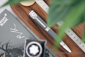
Exciting stuff! This is my first experience with one of Montblanc's revered Writers Editions, and interestingly this year's release is one I never thought I'd actually like: The Montblanc Writers Edition Homage to Rudyard Kipling is an oddball pen, and it's certainly quite 'out there' - which is usually not my cup of tea!
 |
| All Writers Editions come appropriately packaged in a beautiful book-shaped box. |
First of all, thanks to Appelboom for letting me loaning me this pen. As I said it's not one I'd usually be inclined to buy myself, but It was nice to spend some time with it and appreciate the insane level of detail Montblanc puts into these pens!
The Kipling is an homage to... y'know: Rudyard Kipling, author of Jungle Book. That's really the only reason his name rang a bell with me, to be honest. I just so happened to be a huge fan of Disney's animated movie adaptation of Jungle Book growing up, watching the VHS tapes (remember those?) at my grandparents' house. This entire Writers Edition of pens, notebooks, pen cases,.... is inspired by Kipling's Jungle Book. So maybe that's where my out-of-character fascination for this pen comes from?
The Kipling is an homage to... y'know: Rudyard Kipling, author of Jungle Book. That's really the only reason his name rang a bell with me, to be honest. I just so happened to be a huge fan of Disney's animated movie adaptation of Jungle Book growing up, watching the VHS tapes (remember those?) at my grandparents' house. This entire Writers Edition of pens, notebooks, pen cases,.... is inspired by Kipling's Jungle Book. So maybe that's where my out-of-character fascination for this pen comes from?

As I said, the Kipling is quite out there. Writer's editions in general tend to be quite extravagant designs, so that's something you can expect. Especially in the last few years MB has been experimenting with very prominent decorative elements in these pens (like last year's Homer with the horse head design). That's usually enough for me to back away, as I definitely lean more towards more conservative or minimal designs. The Kipling is a very top-heavy design that tapers down strongly from the top of the cap towards the back of the pen. It's a 'stout' and bulky shape, much like last year's Homer Writer's Edition.

The Kipling feels oddly shaped, in a large part that's due to the brushed metal cap and barrel finials that sort of flare out. The cap finial especially, looks absolutely massive with its' huge white star - so you definitely don't mistake this for another brand - on top. The metal center band on the cap has the word Montblanc engraved on it in a very modern all-caps sans serif font.
 |
| 'If you can keep your head when all about you are losing theirs'... |
 |
| ...'You'll be a man, my son' |
The cap and barrel finials sport the first and last line of Kipling's poem 'IF'. It's a nice reference to the author's work, but I find it interesting that they chose to put it on there in an ever so slightly different font from the one on the center band. It's almost the same but not quite, which -to me- makes it feel mismatched. It's a small detail, but I don't really like how it turned out. I may have preferred a cursive font better for this. Maybe I'm just being picky, I don't know...
 Cap, barrel and section are made of resin, in a rather interesting green-grey shade that reminds me of an old school safari outfit. The barrel and cap are both matte, while the section received a glossy finish. I really quite like the muted color palette of this pen. It offsets the rather bold design of the pen nicely, and I wish they had made the R. Kipling Jungle ink to match it - alas they did not. Like all Writers Editions, Rudyard Kipling's signature is engraved on the cap.


Of course I've been avoiding the most important design aspect of the Rudyard: the big freaking wolf's head on the clip! It's what really makes (or breaks) the design of this pen. On one side, I think it's overkill. I mean, It's MASSIVE! On the other hand, it really defines the pen in a daring way (this is definitely NOT Montblanc playing it safe!) and it actually looks quite cool. Yeah I'm honestly surprised I like it as much as I do, given I'd usually steer clear from pens that scream for attention.

 |
| L to R: Pelikan M805, Visconti Homo Sapiens Oversize, MB 149, MB R. Kipling, Lamy Safari, Lamy 2000 |
At 14,6 cm capped, the Kipling is a rather large pen and the imposing shape further accentuates that size. It uncaps to a fairly average but comfortable length of 12,8 cm, with a section diameter around 11 mm. That chunk of wolf-shaped metal on the clip obviously adds some heft in the mix, coming in at a total weight of 57 grams. The shape of the barrel finial doesn't allow for the cap to be posted.


Comfort is a bit of a mixed bag. The section is not super long, so you'll naturally rest your grip on the threads and on the step behind it, which is rounded but noticeable. Despite a lot of metal parts, it's actually surprisingly balanced, but it is of course a rather heavy pen (even without the cap!). Clearly, function was not the number one priority on this pen, but it's not terrible either.
 |
| A classy depiction of a globe adorns the nib face of the R. Kipling |
The nib is fantastic. At this point I can't tell head from tail anymore on Montblanc's nib sizes. I've had mediums write like fines and fines write like mediums. This Fine nib too, writes more like a medium to me. But regardless, it's an excellent writer. It requires zero effort and just glides smoothly over the page with just enough feedback so you still notice that you're writing. Ink flow is dead-consistent and juicy, and the nib never hesitates or skips a beat. It's such a well-rounded and balanced writing experience. Hard to explain really, but it just feels right.

Would I recommend this pen? Well it's a Montblanc, so you can already expect that it's not for everyone's budget. With the Writer's Editions, Montblanc generally targets an even more premium segment, mainly focused on collectors.
If I were to start a collection of animal-themed pens, the Montblanc Writers Edition R. Kipling would be high on my list. It's exceptionally well made, and the design - odd as it is - leaves an impression. It writes beautifully, too, so I can't really fault it. But do you really buy this pen to write with? Looking at it from a usability point of view, this 1000$ hunk of pen would probably not be my first choice, but take this out during a meeting and you'd most definitely turn some heads. The R. Kipling is limited to 9800 pieces and retails for 955€, or 1115$ (920$ without tax, from Appelboom)
This product was provided on loan by Appelboom, so I could write this review. I was in no way influenced in the making of this review, the opinions shared in this review are completely my own! This post contains affiliate links.


My experience with Montblanc pens with plated metal rings is that these easily corrode to the point of the plating chipping off, especially when I use Permanent inks. I believe it is the Iron component in the ink formulation that causes a corrrosive reaction to the plating. So I never use permanent ink or load an expensive FP such as this Kipling or any Limted Edition MB pens with permanent ink for a long time. May I have your expert opinion and comments please?
ReplyDelete